Reading the RBA FSR on bank capital

One of the frustrating things about the Reserve Bank’s consultation on its proposal to greatly increase the amount of capital (locally incorporated) banks have to have to conduct their current level of business in New Zealand, is its utter refusal to produce any serious analysis comparing and contrasting their proposals to the rules (actual and prospective) in Australia.   The larger New Zealand banks are, after all, quite substantial subsidiaries of the very same Australian banking groups.    If there is a case to be made either that the New Zealand proposals are not more materially demanding than those in Australia, or that, if they are, there is a sound economic case for our regulators to take a materially more demanding stance than their Australian counterparts, surely you would expect that a regulator serious about consultation, allegedly open to persuasion (and working for a government that once boasted that it would be the “most open and transparent”) would make such a case.   But months have gone on and there has been nothing.

It is striking that over the entire period when the consultation has been open we have not had a Financial Stability Report from the Reserve Bank (I guess it is just the way the timing worked, but still…).      With proposals out for consultation that would force banks to have much higher risk-weighted capital ratios, working to the statutory goal focused on the soundness of the financial system, you’d have to assume that any FSR would conclude that the financial system at present was really quite rickety.   Perhaps they will when the next FSR comes out late next month, but (a) it would be a very big change of message from past FSRs, and thus (b) I’m not expecting anything of the sort.

A reader pointed out that the Reserve Bank of Australia released its latest Financial Stability Review last week.   The RBA isn’t the regulator of the financial system, but works closely with APRA, and has some systemic responsibilities (including the analysis and reporting ones reflected in the FSRs).   Capital requirements (on both sides of the Tasman) feature in the chapter on the Australian financial system.

The discussion starts this way (ADI = Australian deposit-taking institution).

RBA 1

You’ll recall that the Reserve Bank of New Zealand’s proposal would (a) require major banks to have a minimum CET1 ratio of 16 per cent of risk-weighted assets, and (b) would measure risk-weighted assets in a more demanding way than Australia does.

Here is graph 3.6 –  a really nice chart with lots of information in a small space.

RBA 2

The first panel is the one of most relevance here, relating as it does to the four banks that have major operations in New Zealand.   The regulatory minima are shown in the two shades of purple, and the additional capital held above those regulatory minima is in blue.   Three of the four banks are already at the “unquestionably strong” benchmark level.

I also found the the second panel (other listed deposit-taking entities) interesting.  In a post earlier in the year, I suggested that too-big-to-fail arguments weren’t a compelling reason for higher minimum regulatory capital requirements, as there wasn’t obvious evidence that entities that no one regarded as too-big-to-fail were required by market pressures to have capital ratios materially above those prevailing at larger institutions.   This chart may suggest this point holds in Australia too (deposit insurance muddies the water, but does not apply to wholesale creditors).

The RBA discussion goes on

rba 3.png

with a footnote elaborating the point

RBA 4

Unlike the Reserve Bank of New Zealand, they don’t just claim it is hard to do international comparisons, and then blame copyright to defend not presenting any analysis.    And APRA has actually published its analysis comparing  the way risk weights etc are applied in Australia and other countries.

So the Reserve Bank of Australia (and, presumably, APRA) claims that the capital ratios applying to the major Australian banking groups are in the upper quartile internationally, based on actual CET1 ratios of “only” around 10.5 per cent.   The Reserve Bank of New Zealand, by contrast, has tried to claim –  with no real analysis, just a bit of gubernatorial arm-waving –  that its proposed CET1 minima of 16 per cent (measured materially more conservatively again) would also be inside the range of requirements in other advanced countries, probably also in the upper quartile.

At a substantive level, the two claims are just not consistent.    Perhaps the Australian authorities are wrong in their claims, but I doubt it.  I could advance several reasons to have more confidence in the Australia regulators’ claims:

  • they have a much deeper pool of expertise than the Reserve Bank of New Zealand, and two agencies (RBA and APRA) able to peer review work in the area before it is published,
  • the Australian parent banking groups are all listed companies and there is considerable broker analytical resource devoted to monitoring and making sense of the performance of those banks and the constraints on them,
  • for what they are worth, the credit ratings of the Australian banking groups are consistent with them having capital ratios and risk profiles in the upper (safer) part of the distribution of advanced country banks,
  • the Reserve Bank of New Zealand has simply avoided the Australian comparisons in all the material it has released (so far).

Whatever the absolute position, we can be totally confident that the Reserve Bank of New Zealand’s CET1 minima are far more demanding than those APRA applies to the Australian banking groups  (16 per cent minimum –  perhaps 17-18 per cent actual –  vs the benchmark actual of 10.5 per cent in Australia, where the New Zealand requirements will be measured in a more conservative way.  Not one shred of argumentation has been advanced by the Reserve Bank of New Zealand to explain why they, in their wisdom, think New Zealand banks need so much higher risk-weighted capital ratios.   There might be a case to be made –  something about risk profiles, or reckless Australian regulators perhaps –  but they just haven’t made it  (and it would have to be a pretty compelling case given that the major New Zealand banks have large parents –  to whom the regulator might expect to look in a crisis –  whereas the Australian banking groups don’t).   That simply isn’t good enough.

The RBA goes on to discuss the Reserve Bank of New Zealand’s proposals.

rba 5

That text correctly notes not suggest that the headline CET1 ratios required here would be much larger than those applying to the Australian banking groups, but would be measured in a more conservative way than has been the case hitherto (and more conservatively than APRA will be allowing Australian banks to do).

The rest of the paragraph interested me, especially that final sentence.  It appears to suggest that the rules would apply differently depending whether the capital of the New Zealand subsidiaries was increased through retained earnings or through a direct subscription of new equity by the parent.  In economic substance the two are the same, and regulatory provisions should be drawn in a way that reflects the substance.  But the paragraph is perhaps a reminder that one possibility open to the Australian parents, if the Reserve Bank persists with its proposals, is a divestment in full or in part.  Comments from the Reserve Bank Governor and Deputy Governor have suggested that they would not be averse to such an outcome, and might even welcome it.  I think a much less cavalier approach is warranted and that the New Zealand generally benefits from having banks which are part of much larger groups.

The RBA discussion also has a chart show bank profits in Australia since 2006 (I truncated a bigger chart so the dates aren’t showing).

rba 6

As they note, return on equity is less than it was in the mid-2000s, not inconsistent with the higher capital ratios (reduced variance of earnings) in place now.     The (simple) chart is perhaps consistent with the Reserve Bank of New Zealand’s story that banks will come to accept lower ROEs on their New Zealand operations over time if higher capital ratios are imposed, but (a) the transition may still be difficult (especially for sectors with few competing lenders), and (b) there is no guarantee, since shareholders will focus on overall group risk/return, not the standalone characteristics of one individual unlisted subsidiary.

Part of the Reserve Bank of New Zealand’s attempt to obfuscate the Australian comparisons is to muddy the waters by suggesting something along the lines of ‘total capital requirements will end up being much the same, but our banks will have much better quality capital’.

As you can see from their own text, the Australian authorities put much more weight on the core (CET1) ratios, where Australia’s (quite demanding by international standards) expectations will be a lot less than those proposed for New Zealand.  But the Reserve Bank of Australia text touches on the additional loss-absorbing capital as well.

RBA 7

RBA 8

Here is the summary of the APRA proposals.  These additional requirements, if confirmed, would be able to be met with ‘any form of capital’, including (for example) the contingent-convertible bonds (typically hold by wholesale investors, and which convert to equity in certain pre-specificed distress conditions) which the Reserve Bank of New Zealand has taken such a dim view of (to disallow for capital purposes).  This additional loss-absorbing capacity is typically regarded as much cheaper than CET1 capital, and (coming on top of upper quartile CET1 funding) serves just as well in protecting the interests of creditors in the event of a failure of a major financial institution.   For any banking regulator interested at all in efficiency that should count strongly in its favour, but even more so in New Zealand where the big banks are subsidiaries of the Australian banking groups, failures will inevitably (and rightly) be handled on a trans-Tasman basis, and where most of what matters is securing a substantial share of residual assets for New Zealand depositors and creditors.

But even allowing for all that, look at the nice summary chart from APRA of their proposals

APRA 1

If fully implemented:

  • the APRA proposal for Australian banking groups would amount to a 16 per cent total capital ratio requirement, with risk-weighted assets measured the Australian way, while
  • by contrast, the Reserve Bank of New Zealand proposal would involve a 16 per cent CET1 capital ratio minimum requirement (8 per cent in Australia – the CET1 and CCB components), with risk-weighted assets measured the New Zealand way, and
  • the Reserve Bank proposal include a plan to raise the minimum risk-weights (in a not unsensible way, considered in isolation) that would mean a 16 per cent CET1 requirement in New Zealand might be equivalent to something like 19 per cent range in Australia.  The proposed floor –  risk-weighted assets calculated using internal models, relative to the standardised approach –  in Australia is, in line with Basle III. 72.5 per cent, and the RBNZ is proposing a 90 per cent floor: apply a ratio of 90/72.5 to give an indication of the scale of the possible effect).

The simple summary is that (even if the Reserve Bank of New Zealand ends up scrapping any Tier 2 capital requirements, and it seems quite ambivalent about them in the consultation document) its capital requirements will be (a) materially higher than those applied to Australia to the parent banking groups, (b) materially more costly, because of a largely-irrational aversion to forms of capital other than CET1, even though we have good reason to take seriously the claims of the Australian authorities (and the sense of the rating agencies) that Australian banks are already among the better-capitalised in the world.

In hundreds of pages of material, slowly released over several months, the Reserve Bank of New Zealand has not provided a shred of evidence, or even argumentation, for why locally-incorporated banks operating here should face such an additional regulatory burden, with the attendant economic risks and costs.  Add in the refusal of the Bank to provide a decent cost-benefit analysis as part of the consultation (they promise only at the end of it all, when there is no further chance for public input, and no appeals), and there are few grounds to have confidence in what the Governor (prosecutor, judge, and jury –  with no appeal court) in his own case is suggesting.   We should expect better. The Minister of Finance (and the supine Board) should be demanding more.

For anyone in Wellington next week and interested, Ian Harrison (who used to do a lot of the Reserve Bank modelling work around bank capital) is doing a lunchtime lecture/seminar on the Reserve Bank proposals next Wednesday.   You might think I’m fairly critical of the Reserve Bank. Ian is more so, and tells me he has chased every reference in every document the Bank has published in support of its case, and still isn’t remotely persuaded of the merits of the Governor’s claims.

House prices and building: Australia and NZ

You may, like me, be intrigued by the stories emerging from Australia about falling house prices.    The fall in nationwide house prices isn’t that large –  still less than we experienced in New Zealand in 2008 – but (a) the economy isn’t in a recession, and (b) there is little sign yet that the falls are about to end soon.  Lower house prices would seem likely to mostly be “a good thing” –  cheaper goods and services typically are – and the banks are well-capitalised to cope with even some serious combination of bad economic times and falling house prices.  But on the other hand, whatever was causing this particular fall, I’d heard little to suggest that land-use rules were being substantially liberalised in Australia (any more than in New Zealand), so I’ve been –  and remain –  quite sceptical about the idea that Australian house prices would fall sharply and stay down.  And, of course, of anything similar in New Zealand.

Time will tell, but out of curiosity I decided to dig out a few numbers.   The first was a comparison of residential investment as a share of GDP.   This chart is in nominal (current price terms).

res nz and aus 1

And this is in real terms (which isn’t strictly kosher and is an approach frowned on by SNZ, but some analysts do it anyway).

res nz and aus 2

There are differences between the two charts, but the bit that caught my eye was that New Zealand has been devoting a larger share of GDP to house-building (and additions and alternations etc) than Australia for almost the entire decade.

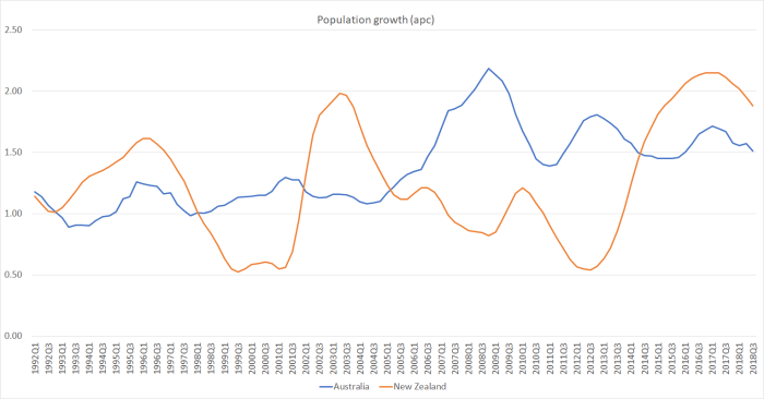
Population growth is one of the biggest determinants of how much accommodation will be demanded.  Here is annual population growth in the two countries.

popn nz and aus

Over the last four to five years, our population growth rate has run quite a bit ahead of Australia’s.   All else equal, one percentage point faster population growth requires something like two percentage points of GDP larger share of residential investment (the net stock of residential dwellings – themselves depreciated –  is well above 100 per cent of GDP).

At least two other things complicate comparisons.  First, a big chunk of residential investment spending in New Zealand for several years after the Canterbury earthquakes was about repair and rebuild, not adding to the housing stock (relative to the pre-quake situation) at all.  There was nothing comparable in Australia, and so all else equal one should have expected a larger share of resources devoted to housebuilding here than in Australia.  And the other relevant factor is that intensification often involves the demolition (and loss) of existing dwellings: even in normal (non-quake) times not all new dwelling approvals add to the housing stock.

New Zealand has a reasonably long-running quarterly series on the estimated number of private dwellings.   I could only find the comparable Australia series back to 2011.  But this is what trends in the number of people per dwelling look like over the last few years.

people per dwelling

On the face of it, that is a pretty startling difference. (I did find reference to some Australia census data suggesting that in 1991 population per dwelling in Australia was also around 2.7.)

A declining ratio of people per dwelling is what might one expect in functioning house and land markets.  After all, both countries are getting richer, birth rates are lower than they used to be, people are living longer (ie a larger share of life after kids have left home), lifelong marriage from an early age doesn’t seem to be becoming more a thing.  But it –  a fall in the ratio –  is much harder to achieve when regulatory obstacles mean house prices are driven sky-high.   Then people squash together a bit more.

Another way of looking at the last few years of that chart is that over the seven years to September 2018 Australia had population growth of 11.8 per cent and the stock of dwellings increased by 12.7 per cent.  In New Zealand, over the same period, the population is estimated to have risen by  11.6 per cent and the stock of dwellings increased by only 8.6 per cent.   For the entire housing stock –  slow-moving at best –  that is a really big difference.

I haven’t mentioned (a) the large share of apartments built in Australia in recent years (which some look on favourably –  the Reserve Bank here always used to tout that record –  and others are more inclined to mutter about future potential urban slums etc), or (b) differences in credit conditions on the two sides of the Tasman (responsible, on some tellings, for the recent weakness of the housing market).

But looking across the numbers I’ve presented here, and bearing in mind that there has been little or no effective liberalisation of land use laws in New Zealand (or a fix to the construction products market), it is hard to see any good reason to expect that we will see any material or sustained drop in house and urban land prices here.

house prices jan 19

There will be a recession along eventually, ringfencing and a capital gains tax (both dubious new economic distortions) might dampen things a little, and the Reserve Bank’s capital proposals if implemented might exacerbate any downturn, but in the end if land remains artifically scarce (a bit like new cars in 1950s New Zealand) it remains hard to envisage a serious or substantial adjustment.   And responsibility for that failure –  and failure it is –  has to be sheeted home to the political parties that vie to govern us, notably National and Labour.

Australia: not even close to the most successful economy

In another useful reminder as to why I don’t subscribe to The Economist –  with a news, politics, and international affairs junkie 15 year old I’m tempted from time to time – it was hard to go past the heading of that magazine’s lead story this week:

What the world can learn from Australia: It is perhaps the most successful rich country

In the text, they make it clear that the “most successful” claim specifically includes economic success.

Okay, I’m happy to grant that Australia has done well around fiscal policy –  government revenue and expenditure as a share of GDP have been stable and moderate, and government debt has been kept low.   But Switzerland does about as well, and Sweden has much lower net government debt (large net assets), and both those countries manage productivity levels that are reasonably materially higher (almost 10 per cent more) than Australia.

Productivity is, in the old phrase, if not everything in the longer-term about economic performance then almost everything.  And here is a simple chart showing two comparisons, using OECD data which start in 1970.   The first line compares Australia’s real GDP per hour worked to the median of the top-tier group I’ve used in various posts and articles this year (the US, France, Belgium, Netherlands, Germany and Denmark).   And the second line compares Australia to Norway.

australia performance

Did anyone in The Economist think of Norway –  not only does it have much higher average productivity (think oil and gas and few people –  and good institutions/smart people) but huge net government financial assets?

Average productivity in that frontier group of six is 20 per cent higher than in Australia.  In Norway it is 50 per cent higher.  And 50 years ago, Australia outperformed the median member of the six, and was level pegging with Norway.   Sure, the last 25 years or so haven’t been too bad, but at that rate of convergence it would take another couple of hundred years  (or more) to catch up again to the top tier group.    And even the very modest convergence has been supported by massive new natural resource developments.  Blessed with those opportunities if a country can’t do better than Australia has done, there looks to be something quite badly wrong.

And here is the ABS measure of real net national disposable income per capita, which takes account of (a) changes in the terms of trade, and (b) the portion of the GDP gains accruing to Australians.

RNNDI

They had a good 15 years, but there has been no growth in this measure of real purchasing power this decade.

What might be so very wrong?   Well, I’m sure there are plenty of micro regulatory things Australia  –  like every country –  could do better.      But what really stands out about Australia, relative to the other countries, is its rate of population growth.   Indeed, this is what The Economist really seems to like about Australia, lauding the country’s “enthusiasm” for immigration.   Whether one looks from 1970, or just over the last quarter century or even the last decade, Australia’s rate of population growth has materially outstripped those of the other countries.   In the last 25 years, Australia’s population (UN annual numbers) increased by 41 per cent, while the population of the median of those high productivity group of six rose by 13 per cent.    The difference isn’t wholly about migration, but immigration is the bit governments make choices about.

In a country with an export base almost entirely dependent on a fixed stock of natural resources –  farm products, mineral products, tourism – and actually with foreign trade shares of GDP among the very lowest in the OECD, it is bordering on the insane to be actively importing lots and lots more people (as successive Australian governments have been doing in the last 15 years or so).     It is a quite different matter in countries –  like most advanced OECD countries now –  that are trading the fruit of ideas, or that are tightly bound into sophisticated manufacturing supply chains.  But this is Australia –  one of the most remote countries on that planet which (like New Zealand) has failed over decades to develop many outward-oriented industries that don’t depend largely on natural resources (or immigration subsidies around export education).    The fruit of the (vast) natural resources is, to a first approximation, just spread more thinly.   Being based in a global city –  the ultimate ideas trading location –  in northern Europe I guess these considerations simply never occur to The Economist’s writers, who probably enjoy the beaches and the climate when they jet into Australia without troubling themselves over whether or not the natives are actually earning leading first world incomes.  Hint: they aren’t (any longer).

And thus I end up agreeing with The Economist. 

“Even more remarkable is Australia’s enthusiasm for immigration”

Truly astonishing in fact, in the specific circumstances of Australia.  The enthusiasm of Australian governments for high immigration to Australia is just as wrongheaded –  and more culpable –  as that of The Economist’s editorial writers.  All sorts of daft ideas have had their day over history.   This one –  at least in modern Australia –  seems based more on belief and ideology than any serious evidence that Australians themselves might actually be benefiting from the immigration.

(And that without even considering the house prices, traffic congestion etc –  all of which, immigration advocates will note, could –  in principle – be fixed separately, but of course in practice aren’t. )

UPDATE: A post from a couple of months back that made similar points, but with some different data and a longer time horizon.


A couple of (RBA) housing finance charts

Comment on the Governor’s sprawling speech “Geopolitics, New Zealand and the Winds of Change” (curiously, a speech in which “geopolitics” didn’t appear at all) is held over until tomorrow.

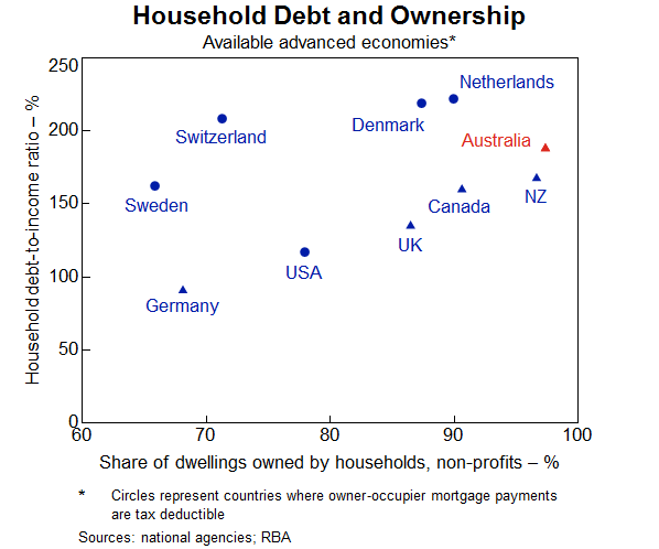
But I was reading an interesting speech from a senior RBA official, Assistant Governor Michele Bullock, which happened to include this chart.

bullock

It captures a couple of important points relevant to thinking about household debt.   You quite often see comment about how high the level of household debt is in New Zealand.  But Bullock’s chart illustrates a pretty straightforward point: when almost all your housing stock is owned by households (whether owner-occupiers or investors) you’d expect that, all else equal, household debt relative to household income (or GDP for that matter) would be higher than in countries where a larger share of housing stock is owned by other sectors.  Of the countries Bullock shows data for, New Zealand and Australia have the highest share of the housing stock owned by the household sector.  New Zealand is very close to the median country in this sample, notwithstanding the high share of houses owned by households.

The chart highlights another important point sometimes lost sight of in international comparisons (but which our own Reserve Bank sometimes acknowledges).  In some countries, interest on an owner-occupied mortgage is tax deductible.  That might, all else equal, encourage household to take on more net debt (cost of borrowing and bringing forward consumption is lower), but it certainly tends to encourage people not to rush to pay off the mortgage even as they may be accumulating financial assets (and the tax treatment of some financial assets is also often quite favourable relative to, say, the situation in New Zealand).   And so Sweden, Switzerland, Denmark and Norway have much more gross household debt outstanding –  but not necessarily any more financial system risk –  than countries with similar household sector ownership of the housing stock but a different tax treatment.   (The US is a bit of an outlier here, and from the look of it the data may not be fully comparable.)

Of course, what Bullock doesn’t highlight in her chart is two things:

  • Australia and New Zealand have high house price to income ratios by international standards, which tends to boost the amount of household debt required to accommodate such prices, and
  • Australia’s compulsory private superannuation system will, all else equal, tend to mean that Australian households will more often have substantial financial assets tied up in superannuation schemes while at the same time having large outstanding mortgage debt.  (Kiwisaver, more recent and on a smaller scale, will now be tending to have the same sort of effect in New Zealand.)

There was one other interesting chart in the Bullock speech.

bullock 2

For all the talk about households taking on more and more debt, the median advanced country’s ratio of household debt to income hasn’t changed materially in a decade, despite the fall in global interest rates.  Of course, all else equal, if interest rates had been higher debt would have been lower, but so would real and nominal GDP, asset prices, inflation (but, pace Lars Svensson, debt to GDP ratios might not have been much lower)…..and unemployment would have been higher.   All else is never equal, and it is important to remember that interest rates are low for a reason (or set of reasons) grounded in the fundamentals of the really economy, factors which central bankers and banking regulators have little influence over.

Political ructions and a better economic performance

Years ago we in New Zealand sometimes had the gruesome spectacle of governing party coups (and the like).  There was the failed (“Colonels’ coup”) attempt to oust Muldoon in 1980, the ructions that led to Lange’s departure in 1988 and then (unelected) Palmer’s a year later, and the ousting of Jim Bolger in late 1997, and then the break-up of the governing coalition a year later.  But you have to be a certain age to remember any, let alone all, of those.

In Australia, by contrast they’ve been two a penny in the last decade.   It isn’t exactly the rate at which Italian governments used to turn over until relatively recently, or French governments in the ill-fated Fourth Republic (22 prime ministerships in 12 years) but it is quite extraordinary by Anglo country standards.  Has there ever been a time previously –  in New Zealand, the UK, Ireland, Canada, Australia – when four people in a row who successfully led their party to an election victory –  limping home in Turnbull’s and Gillard’s cases –  didn’t complete the subsequent (three years) term?  Perhaps Turnbull will, in fact, limp on, but even if he does it is hard to see to what end.

A mere three years ago, when Turnbull ousted Abbott I wrote a post about the strange phenomenon then gripping the Australian centre-right: New Zealand envy.  Here was Turnbull speaking just after his coup.

“John Key has been able to achieve very significant economic reforms in New Zealand by doing just that, by taking on and explaining complex issues and then making the case for them. And I, that is certainly something that I believe we should do and Julie and I are very keen to do that again.”

As I noted, it was very hard to think of such “very significant economic reforms”.  Moreover, as I illustrated in that post, New Zealand seemed to have drifted a bit further behind Australia economically over the previous few years.

I noticed Julia Gillard yesterday engaging in a bit of New Zealand envy, suggesting (probably tongue in cheek) that Australians might well consider moving to New Zealand.  Only, surely, if they wanted to be colder as well as poorer.  Recall that Australian incomes are far higher than those in New Zealand, the main reason why for the last 40 years so many New Zealanders (net) have gone to Australia, and so few Australians have come to New Zealand.   Even just since 1991, a net 470.000 New Zealanders have gone to Australia, and only 49000 (net) other passport holders have come to New Zealand from Australia.

And, like it or not, political instability (including ructions in successive ruling parties) doesn’t seem to have been a material factor impairing economic performance.  That was so for France and Italy after the war, and if –  as I illustrated last week –  if Australia’s economic performance hasn’t been great, given its resource bounty, it has still been better than New Zealand’s.

Here I’m going to focus on the period since the end of 2007, for two reasons.  First, it was about the time the Rudd government took office which –  although it wasn’t apparent at the time –  was the beginning of the era of Australian political instability.  And, second, because it is just prior to the recession of 2008/09.  In New Zealand, Labour was still in office for most of 2008, but comparisons from troughs of recessions are rarely very meaningful (and if Australia didn’t have a recession in the sense of a couple of negative quarters of GDP, it still had a big fall in income measures –  as commodity prices fell –  and a material rise in the unemployment rate).

First, there is an important background feature that governments don’t have any material influence over; the terms of trade.

aus nz tot

Australia’s terms of trade have been much more volatile than those of New Zealand over the last decade or so, but taken over the whole period there hasn’t been that much difference.  Both countries have benefited from the movement in world prices to about the same extent (Australia had also had a substantial lift from about 2002, not mirrored in the New Zealand numbers).

Then there are the headline national accounts comparisons: real GDP per capita.

real gdp pc aus nz

On that measure, at the end of the period there has been no change in the relative position of the two economies  (although the gap between the two lines for much of the period is lost output that is never likely to be got back).  No sign of any catch-up, although also no falling further behind either.

The terms of trade can make a material difference to economic wellbeing, and terms of trade gains are not directly reflected in the real GDP numbers (although the indirect effects – any increases in consumption or investment etc in response –  are there).   But on this occasion we don’t need to worry too much about that point because, as the first chart illustrates, over the full period both countries’ terms of trade have risen by about the same amount.

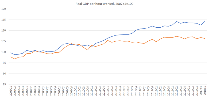
But if real GDP per capita in the two countries has grown by about the same percentage in each country over the last decade, there has been a really big difference in the composition of that growth, and not one that is positive for New Zealand in the longer term.   I have shown the labour productivity chart previously, but here it is again anyway.

aus nz rgdp phw

Some years we match Australian productivity growth, and occasionally even exceed it, but over the period since the end of 2007, labour productivity growth in Australia has exceeded that in New Zealand by about 8 percentage points.  That is a lot, especially when New Zealand was starting from so far behind.

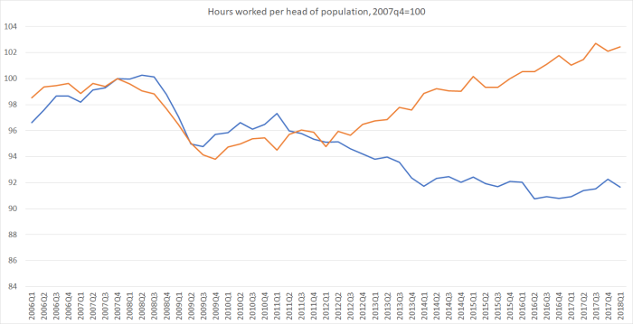
And here is a large component of the difference.  I’ve set hours worked per head of population equal to 100 in both countries in 2007q4, and shown how that measure has changed in each country since then.

hours worked per head

It looks a lot like that old story: New Zealand (in orange) more or less manages to “keep up” (not see real GDP per capita drop further behind) simply by working more hours.  That is no sustainable route to greater national prosperity, especially when hours worked per capita are already quite high by advanced country standards.

Of course, some will probably want to claim this as some sort of New Zealand success story –  “look at all those people we have in work etc etc”.   But working more hours isn’t some “good thing” for its own sake, and the unemployment rate is the best summary measure of whether there is slack in the labour market.   If Australia’s unemployment rate had increased materially more than New Zealand’s then one probably could tell a (cyclical) New Zealand success story.  But here are the two unemployment rates.

nz aus U rates

Most people reckon Australia’s NAIRU is higher than New Zealand’s (and that is a long-term negative for Australia, and the wellbeing of Australians), but that was so before the crisis too. In fact, the gap between New Zealand and Australian unemployment rates now (around 1 per cent) is exactly the same as the gap at the end of 2007.   Just as is the case in New Zealand, most Australian residents who actually want jobs have them.  So I don’t count the increase in hours worked here as any sort of mark of success.

None of this –  higher productivity growth in Australia in particular –  should be any great surprise.  If one looks across the OECD’s Going for Growth structural indicators (for example) the two countries score about as well, or poorly (on some indicators), as each other.  But Australia has seen come on stream huge new mineral production –  a new endowment they could tap –  and we’ve had nothing comparable (to what extent that is because similar resources aren’t there, or because policy choices prevent them being utilised is a topic for another day).  But with no other new opportunities apparent to match the new minerals –  and see the shrinkage in our foreign trade shares – our structural position relative to Australia has weakened further.

I’m not going to illustrate housing markets –  in any case mostly a state matter in Australia as I understand it –  but in both countries the best that can be said is that the outcomes, for ordinary people, have been lamentable, and disgraceful.

There is an argument sometimes mounted that the earthquakes were a significant drag that Australia didn’t have to face.  In terms of the existing stock of wealth, there is some truth in that (even recognising that much of the loss was reinsured abroad).  And the rebuild process –  which peaked several years ago now –  did take resources that couldn’t be used for other things.   But (a) on official estimates we had utilised capacity (output gap and unemployment gap) for most of the time, and (b) if there really were abundant international opportunities for firms here, bidding for capital and labour resources, we might have expected to see persistent upward pressure on our interest rates relative to those in the rest of the world, and associated inflation pressures.  We’ve not seen the inflation pressures at all (any more than in Australia) and the upward pressure on our interest rates relative to the rest of world occurred only while our Reserve Bank was messing up –  driving up the OCR before having to about-face and more than fully reverse themselves.

There isn’t a choice between chronic political infighting (of the Australian sort) and improved prosperity, but if there were I reckon I’d take the prosperity.  As it is, at least relative to New Zealand, Australia looks to have had both.  If there is an understandable tendency to rather look down on the political machinations, we should at least pause to ponder (again) our own long – and continuing – relative economic decline.

And now back to watching the gruesome spectacle across the Tasman.


How poorly have Australians done?

Much of this blog focuses on the dismal long-term performance of the New Zealand economy.  A common benchmark is to compare our performance against Australia: once (and for a long time) we more or less matched them, these days we languish well behind, and as a result a huge number of New Zealanders have left for better opportunities abroad, notably in Australia  –  still, fortunately, a place where New Zealanders are relatively easily able to move, if not (any longer) to securely settle.

But how has Australia itself done?

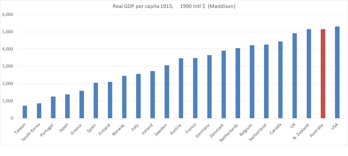
Here is how things were 100 years or so ago, in 1913 –  the eve of World War One, the end of the first great age of globalisation.  And Australia itself had finally recovered from the devastating crash, financial crisis etc, after 1890.  The data are real GDP per capita (in 1990 dollars) from the Maddison database.

1913 GDP

Australia (and New Zealand), far from the industrial heartland of the North Atlantic (recall that the Industrial Revolution had spread out from the UK, and then places like Belgium, Netherlands and northern France), in 1913 had per capita incomes twice those of places like Norway and Italy, 50 per cent more than France and Germany, 25 per cent more than Belgium and the Netherlands.  Only the United States matched us (some years a touch higher, some a touch lower).

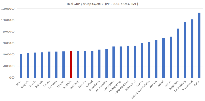
And here are the top 25 countries from the latest IMF WEO database.

2017 GDP pc

You could toss out some or all Macao (tiny, and really just past of China), San Marino (really tiny), Hong Kong (China), Ireland (numbers not really reflective of Irish incomes because of the corporate tax system) or Luxembourg (much GDP is produced by people living in neighbouring countries but working in Luxembourg) if you want, and Australia would still only just get into the top 15.   Australian per capita is now less than that of most of the countries in the first chart –  only just edging out Taiwan.

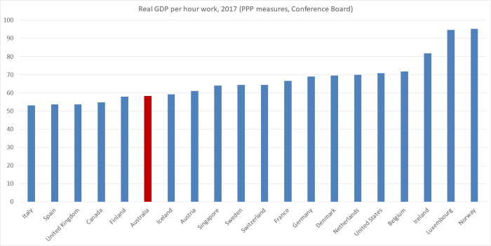
Comparable productivity data going back a long way are scarce. The Conference Board data on real GDP per hour worked start in 1950.   There is only data for about 30 countries for 1950 (mostly the advanced countries).  But of those countries, only the US and Switzerland were ahead of Australia.

2017 real GDP phw

Again, you could safely ignore the Irish number, but doing so doesn’t change the story.  Australia has slipped a long way back, and is now nowhere near (say) that bracket of Germany, Denmark, Netherlands, the US, and Belgium. (Taiwan –  see previous paragraph – is just behind Italy on this measure).

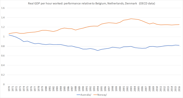
Here is one way of looking at the performance over decades.  Both Australia and  Norway abound in mineral resources (in Norway’s case mostly oil and gas, in Australia’s a huge range).    Belgium, Netherlands, and Denmark are three high-performing European countries, where the data aren’t complicated by tax systems (Ireland), absorbing a failed communist state (Germany) and the like.

aus norway 2

Back in 1970, both Australia and Norway (before the minerals booms really got underway) had slightly higher average levels of productivity than the average for those other three northern European countries.  In Norway, the development of the oil and gas resources from the 1970s seems to have contributed to a marked widening in average productivity (and incomes) in Norway’s favour.  That margin has narrowed a bit in the last decade –  oil itself is past its peak in Norway –  but there is a still a large margin (over Europe’s other high productivity economies).  And what of Australia?  Even now, after a decade with the challenges of the euro crisis, the marked slowing in productivity growth at the global frontiers, and with the huge new mineral resources that have been opened up and brought to market by Australia, Australian average productivity still languishes a long way behind.  Even now –  after their reforms (80s and 90s) and their new resources – the margin between Australian productivity and that of these northern European countries is only about where it was in the mid-80s.  At that time, there was a great deal of angst (similar to NZ) about Australian’s relative decline.  In fact, Paul Keating’s “banana republic” line dates from then.  There has been no reconvergence since then.

With staggering volumes of newly-economic resources able to be brought to market, it is really a quite remarkably mediocre economic performance.   One might quibble about things like Australian labour market laws, but Australia is a functioning market economy that still scores quite highly on economic freedom indices.  This is no Venezuela.

And yet, for all its riches –  and you see (in the second chart above) the difference natural resources can make – Australia is no better than a middling performer among the (old) OECD countries it once mostly far-outstripped.

I’m not here to scoff –  New Zealand has, after all, done so much worse, and the embarrassing exodus stems from that –  but to analyse and learn.   I’ll offer some thoughts on reasons why in another post, probably next week.

The PRC and New Zealand: an Australian perspective

In response to my post yesterday about the Asia NZ Foundation roundtable on foreign interference/influence in New Zealand, I received this comment, which I’m elevating into a post of its own because of its source, and because otherwise only a small number of readers would now see it.

When officials are assuring you everything is under control, that’s the moment you know that everything is not under control. As a long-term New Zealand watcher I am deeply disturbed to see how the political and bureaucratic establishment in Wellington wants the problem of Chinese interference in domestic politics to be swept under the carpet.

The idea that the Australian debate on this topic is ‘unhelpful’ is simply ridiculous. Successive Australian governments have ignored the problem but now it has become so painfully obvious that Canberra has had no choice other than to take a stand and set some limits on Chinese Communist Party interference. I believe that a substantial reason why Canberra acted was because of the public focus on the problem.

China will continue to suborn the NZ political system unless your Government is prepared to push back. If the problem is not addressed in time this will become a serious problem for the NZ-Australia bilateral relationship.

My suggestion is that the Australian and NZ Prime Ministers should meet with their intelligence agency heads and have a frank, closed-door discussion about the extent of the problem of Chinese interference in both our countries. We can actually help each other here.

Pretending there is no problem, or failing even to utter Beijing’s name isn’t sophisticated statecraft, its just a failure to come to grips with a major problem for both our countries.

The comment is from Peter Jennings, who has been Executive Director of the Australian Strategic Policy Institute since 2012.

Peter has worked at senior levels in the Australian Public Service on defence and national security. Career highlights include being Deputy Secretary for Strategy in the Defence Department (2009-12); Chief of Staff to the Minister for Defence (1996-98) and Senior Adviser for Strategic Policy to the Prime Minister (2002-03).

I’ll leave his much-more-informed comment as it stands, just observing of his suggestion of a meeting of our two Prime Ministers etc, that for such an event to occur there would have to be a willingness and desire among political leaders on this side of the Tasman to acknowledge and confront the issue.  In fact, what we see in public is a desire to minimise, or to deny that there are, any serious issues, and to refuse to deal even with issues in plain sight.

A visiting Australian politician

A fairly prominent Australian politician was in town last week.   Andrew Leigh was previously a professor of economics at ANU, and for the last eight years has been a Federal Labor MP.  He is the Shadow Assistant Treasurer, Shadow Minister for Competition and Productivity (and spokesman on various other minor portfolios), and so presumably fairly likely to become a Federal government minister if the next election result follows the polls and Labor is elected.

Leigh was here to give a couple of lectures in the series being sponsored by the NGO Presbyterian Support Northern on topics related to child poverty and wellbeing.  As it happens, next month I’m also giving one of the lectures in this series –  on the role productivity growth plays in ending poverty – and if anyone is interested you can book  one of the (free) sessions here   (there is one in Auckland and one in Wellington).

I didn’t get to hear Andrew Leigh while he was here, but both his Auckland text  and his Wellington text are available on line.   The substance of both addresses is well worth reading –  he is a widely-published researcher on inequality (the Auckland address) and has just published a book about the use of randomised control trials as a tool in better evaluating which policy interventions might work and which don’t (the focus of the Wellington address).   I don’t claim to be a fan of the Australian Labor Party, but politics is likely to be better for having at least a few people, preferably on both sides of politics, able to address serious issues this seriously.

Having said that, I was mildly amused by the introduction to his Wellington speech.   I guess it is standard advice to butter up, and flatter just a bit, your audience.

New Zealand has turned out to be a pretty good predictor of what’s likely to happen next in Australia.

New Zealand women won the right to vote nine years earlier than Australian women.

Your country enacted same sex marriage four years before we did.

You even gave Barnaby Joyce citizenship before we did.

So to be in New Zealand isn’t just a chance to see the sun rise a couple of hours earlier – it’s also an opportunity to get a sneak peak into some of the things that might shape Australia’s future.

And I have to say that as a member of the Labor opposition in Australia, I’m keenly hoping that this year or next will see Australia’s voters follow your lead in electing a progressive government.

I’m pretty sure that, even if it got a good laugh, he is wrong about Barnaby Joyce –  a citizen by birth of both countries, and there was only a single birth.

But no mention at all –  none, as far as I could see across two speeches –  of the most striking area of New Zealand/Australia comparisons where Leigh must surely hope that New Zealand doesn’t offer a “sneak peak” into Australia’s future.  And that is the, not trivial, matter of relative productivity and prosperity.

As I noted yesterday, for 100 years or so (from the time of our gold rushes onward) New Zealand and Australia are estimated to have had average real per capita incomes that were much the same.   Each country had specific idiosyncratic events and influences, so that at times we did better, and then for a time they did better.  Those differences were reflected in the trans-Tasman migration data –  at times the (significant) net flow was one way, and at times the other way.

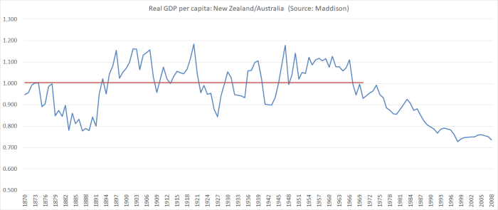
The standard collection of such data is that by former OECD researcher Angus Maddison  Here is the chart of the data he judged best (no doubt far from ideal in both cases), starting from 1870 when he first reports annual numbers for New Zealand.  (Maddison died a few years ago so the data aren’t updated to the present.)

aus vs nz real gdp pc

The red line is the average of the series for the full period 1870 to 1970: on average, on these measures, New Zealand had very very slightly higher average incomes than Australia.  On different measures you might get a slightly different picture, but the overall story won’t change much.  The performance of our two economies was pretty similar.  But it is no longer.   The IMF’s current estimate is that New Zealand real GDP per capita, converted at purchasing power parity exchange rates, is about 76 per cent of that of Australia.

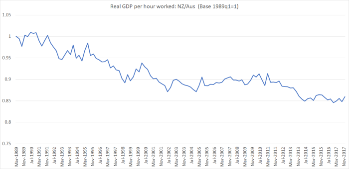
We don’t have a time series of productivity data for the historical period, and although Australia has an official series of real GDP per hour worked back to 1959, here official data can only take us back to the late 1980s.    In this chart, I’ve shown the relative performance of labour productivity (real GDP per hour worked) in the two countries since 1989 (for New Zealand, using the average of production and expenditure GDP measures, and the average of the QES and HLFS hours series, as in earlier posts).

real GDp per hour aus vs nz

In 29 years, we’ve lost a lot more ground –  15 percentage points-  relative to Australia.  It isn’t a particularly steady process (at least as represented in these data) but the trend decline shows no sign of ending, let alone reversing.

And thus when, as in one of his speeches, Andrew Leigh notes that

It is not as though the child poverty rate is noticeably different in our two countries. According to the OECD, the child poverty rate – measured as the share of children living in households with disposable incomes of less than half the median – is 13 percent in Australia and 14 percent in New Zealand.

what he is omitting is that incomes in Australia are a lot higher, and thus so too is the relative poverty line measure he is using.  Australia’s poor should be less badly off than our poor, because Australia’s relative economic performance is so much better.

For Australia’s sake, I hope New Zealand’s path doesn’t foreshadow their own.  Then again, in some respects it already has.    On the Maddison numbers, back in 1870 both New Zealand and Australia were more prosperous than the United States.  As recently as 1938, we were about equal with the US.  And now, we do particularly poorly, but Australia’s relative performance is nothing to write home about.

rel to US

Interestingly, Leigh touches on one possible aspect of the story.

Third is to recognise the role that foreign investment plays in sustaining employment. As you know, the antipodes enjoyed among the highest wages in the world at the end of the nineteenth century. One reason for this was the high amount of land per person. While Europeans lived cheek-by-jowl, there was plenty of room to swing a sheep in Australia and New Zealand. In economic terms, one reason that wages were high was that the capital to labour ratio was high.

Today, both Australia and New Zealand have strong immigration programs. Migrants can fill skill gaps and start businesses, boost innovation and encourage exports. But they also have the inevitable impact of lowering the capital to labour ratio. To the extent that migrants are adding to the number of workers available to do a given job, this may put downward pressure on wages.

It was former Treasury Secretary Ken Henry who pointed out to me that foreign investment has the opposite effect. By increasing the available capital, it pushes up the capital to labour ratio. So by accepting foreign investment as well as migrants, a country can keep its capital to labour ratio constant, and therefore its wage rates.

I think that is partly true and partly not.  As he notes, in the 19th century what marked out both countries was abundant land – which in turn attracted both migrants and foreign investment.  These days, foreign direct investment can help improve prospects –  and I’m strongly supportive of us being open to FDI –  but FDI doesn’t add to the stock of land and natural resources (even if it can help exploit those resources more fully), and even when regulatory restrictions are out of the way, it flows in the direction of opportunity.  Neither country has been particularly successful in seeing internationally competitive industries not based on our natural resources develop.  Attractive opportunities in either location don’t seem thick on the ground,

It is, nonetheless, good to see a left-wing politician openly addressing these issues.  Would that it were happening here.

Leigh’s other speech was devoted to the merits of randomised trials of proposed or actual policy interventions or welfare programmes.  In many areas, they are the single best way of identifying what works and what doesn’t.  Here are a couple of examples from his text (in this case, of programmes that proved not to work).

In some cases, the Education Endowment Foundation trialled programs that sounded promising, but failed to deliver. The Chatterbooks program was created for chil­dren who were falling behind in English. Hosted by libraries on a Saturday morning and led by trained reading instructors the program gave primary school students a chance to read and discuss a new chil­dren’s book. Chatterbooks is the kind of program that warms the cockles of your heart. Alas, a randomised trial found that it produced zero improvement in reading abilities.

Another Education Endowment Foundation trial tested the claim that learning music makes you smarter. Students were randomly assigned either to music or drama classes, and then tested for literacy and numeracy. The researchers found no difference between the two groups; suggesting either that learning music isn’t as good for your brain as we’d thought, or that drama les­sons are equally beneficial.

In a similar vein, a recent randomised trial of free school breakfast programs in New Zealand schools found that it reduced hunger rates (by 8.6 units on the ‘Freddy satiety scale’, in case you’re curious). However, free breakfasts did not improve school attendance or academic achievement for low-income children.

Unfortunately, attractive as this approach is, it isn’t really an option for most of the sorts of policy interventions I write about here, which are economywide by construction.  One can’t split the country into 100 different monetary regions, and apply different OCRs to each (chosen randomly) –  and nor, frankly, should one want to.   Even if some global dictator could do it across countries, there are far too few countries (and so many differences across them) for the results to be anything as valid as those from an evaluation of (say) a school music programme with (say) 500 kids split randomly into groups participating and not participating in the programme.  The same goes for aggregate fiscal policies, or immigration policies.  One might, perhaps, be able to do randomised trials around small aspects of, say, the Essential Skills visa programme, but not about overall approaches to immigration.  I

Instead, we are forced back onto looking what is really a small range of countries (say 40 advanced countries), over relatively short periods of history (the last couple of hundred years), and –  given that and all the other individually confounding factors –  it is perhaps less surprising that people of goodwill still differ on quite what role some of these policy interventions have to play, and what their overall effects are.  Of course, many other areas of policy are much the same –  think foreign affairs and defence –  and the difficulty of reaching of conclusive results doesn’t change the importance of ongoing analysis, research and debate, testing and evaluating the relevant comparisons and insights that history (our own and others), theory, and current experience appear to be offering.

Savings rates in international context

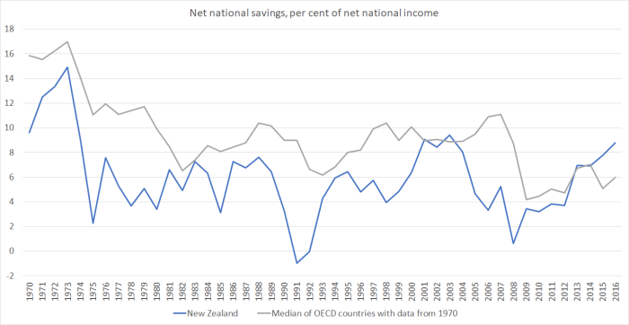
In putting together yesterday’s post, I stumbled on something I hadn’t noticed previously.  In yesterday’s post I showed only New Zealand saving rates –  in particular, net national savings (ie savings of New Zealand resident entities, after allowing for depreciation) as a share of net national income.  The net national savings rate has picked up quite a bit in the last few years, although not to historically exceptional levels.

But here are the New Zealand and Australian net national savings rates plotted on the same chart.

net nat savings nz and aus

For the last couple of years, the net savings rate of New Zealanders has been higher than that of Australians.  I wouldn’t want to make very much of a couple of years data, and over, say, the last 25 years, the average savings rate of New Zealanders has still been a little lower than that of Australians.  But even that average gap has been much smaller over that period than over, say, the previous 20 years.

It isn’t a story you would typically hear from those who argue that savings behaviour is at the heart of New Zealand’s economic challenges.   Some will point to the compulsory private savings system now in place in Australia (phased in from 1992).  There is no easy way of assessing the counterfactual –  what if the system had never been introduced? –  but there is no obvious sign that the system has led to a lift in national savings rates in Australia, whether absolutely or relative to New Zealand.  Others will (rightly) highlight the big tax changes implemented here in the late 1980s which materially increased the tax burden on income earned by savers (in a way pretty inconsistent with the recommendations of a lot of economic theory).  I don’t think those changes were appropriate, or even fair, and would favour a less onerous regime.  But in the decades since the changes were made, our savings rates have been closer to those in Australia (where a less onerous tax regime applies as well) than they were in the earlier decades.

One policy change that may have made a difference is overall fiscal policy: the improvement in New Zealand’s overall fiscal position (reduction in general government debt) has been larger than that in Australia (largely reflecting the fact that we were in a bigger fiscal hole 25 or 30 years ago).   Higher average rates of public saving may have lifted average national savings rates to some extent.

What about other countries.  In a paper I wrote some years ago for a Reserve Bank/Treasury conference, I illustrated that over time New Zealand’s savings rate hadn’t been much different from that of some other Anglo countries.  Here is a more recent version of that sort of chart.

net nat savings anglo

New Zealand’s national savings rates have typically been below those in the OECD group of advanced countries as a whole (and perhaps particularly some of the more economically successful of those countries –  whether by chance, cause, or effect).   But even on that score the last few years look a little different.   This chart compares New Zealand against the median of the 22 OECD countries for which there is consistent data over the full period.

net national savings oecd

It is quite a striking change, and the reasons aren’t at all clear (see yesterday’s post on the puzzles around the New Zealand data).  Perhaps in time some of the rise in the New Zealand savings rate will end up being revised away.  Perhaps the lift will prove real, but temporary (as, say, happened for a few years around 2000). But if not, the apparent change in the relationship between our savings rate and those in other advanced countries should help keep our real interest rates –  and our real exchange rate –  a bit lower than otherwise.  If sustained, that would be expected to lift our economic prospects a bit, all else equal.

But it is worth remembering that, all else equal, a country with materially faster population growth than its peers should typically expect to have a higher national savings rate over time than its peers.   All else is never equal of course, but New Zealand continues to have a population growth rate well above that of the median advanced country.


Central bank e-cash

After my post last week, prompted by the Reserve Bank’s recent statement that

Work is currently under-way to assess the future demand for New Zealand fiat currency and to consider whether it would be feasible for the Reserve Bank to replace the physical currency that currently circulates with a digital alternative.

I exchanged notes with a few readers with some in-depth thoughts on the issue, and found my way to some other relevant material including the recent first report of the Swedish central bank’s e-krona project.    And I noticed that Phil Lowe, Governor of the Reserve Bank of Australia, was giving a speech on exactly that topic – “An eAUD?” –  yesterday.  I gather that among advanced country central banks this is now treated as quite a high priority issue.    But it is also interesting that –  contrary to the Reserve Bank of New Zealand comment about their work –  both the RBA and the Riksbank are only talking about the possibility of electronic retail cash as a a complement to physical currency, rather than a replacement for it (and Sweden already has one of the very lowest currency to GDP ratios of any country anywhere).

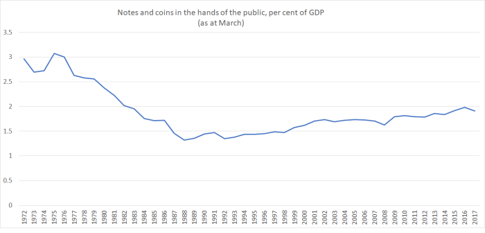
Lowe’s speech was interesting, but also unsatisfying and unconvincing in a number of important areas.    As a New Zealand reader –  from a country with many of the same banks (and presumably banking technology options) –  I was struck by the contrast in what has been happening to currency to GDP ratios in the two countries.   Lowe illustrates that the share of transactions being effected by cash is also dropping sharply in Australia.  But here is the New Zealand currency to GDP chart I ran last week

notes and coin

And here is comparable Australian chart from Lowe’s speech.

Aus currency to GDP
45 years ago, the levels of the two series were very similar.  Since then, the trends have been very different and now there are many more physical AUDs in circulation (relative to GDP) than NZDs.   But there is nothing in Lowe’s speech about just why so much physical currency continues to be held in Australia –  far more than any plausible transactions demands (supported by evidence from payments practices data) would support.    Ken Rogoff suggested, in a US context, that the bulk must be held to facilitate illegal activities, or tax evasion in respect of otherwise legal activities.   Perhaps Lowe felt it wasn’t his place to venture far into territory around lost tax revenue, crime etc, but it was still a surprise to see no mention at all, when the RBA seems largely content with currency physical currency arrangements.

I was also rather surprised to see no serious engagement with the issues around the near-zero lower bound on nominal interest rates, which arises because of the option to convert unlimited amounts of bank deposits etc into zero-interest physical currency, an option that would be likely to be exercised on a large scale if official interest rates were dropped much below, say, -0.75 per cent.  Like New Zealand, Australia hasn’t yet approached the near-zero bound.  Neither had the US, Japan, Switzerland, Sweden, or the euro-area, until they did.   But Australia’s official interest rate is now only 1.5 per cent.  Perhaps it will be raised a bit before the next serious recession hits, but no prudent central banker could be discounting the possibility that even the RBA will hit the effective floor –  and limits of conventional monetary policy –  when that next recession comes.    Dealing effectively with that floor  –  by significantly winding back access to physical cash –  should be one important consideration when central banks are considering e-cash options.  But Lowe doesn’t even mention the issue, and while the limits of monetary policy might not have been of much interest to his immediate listeners (the Australian Payment Summit), interest in his speech –  and the issue –  goes much wider than the immediate audience.   (Strangely, in the Riksbank’s work they also talk in terms of zero-interest e-cash options –  albeit with the flexibility to change that at a later date –  and thus don’t really grapple either with the near-zero bound problem.)

To me, the heart of Lowe’s speech was his discussion of the possibility of the Reserve Bank of Australia issuing one or other of two types of eAUDs.

  • An electronic form of banknotes could coexist with the electronic payment systems operated by the banks, although the case for this new form of money is not yet established. If an electronic form of Australian dollar banknotes was to become a commonly used payment method, it would probably best be issued by the RBA and distributed by financial institutions, just as physical banknotes are today.

  • Another possibility that is sometimes suggested for encouraging the shift to electronic payments would be for the RBA to offer every Australian an exchange settlement account with easy, low-cost payments functionality. To be clear, we see no case for doing this.

I’m not sure I have a particularly good sense of what the first option involves, but here is how Lowe describes the possibility

The technologies for doing this on an economy-wide scale are still developing. It is possible that it could be achieved through a distributed ledger, although there are other possibilities as well. The issuing authority could issue electronic currency in the form of files or ‘tokens’. These tokens could be stored in digital wallets, provided by financial institutions and others. These tokens could then be used for payments in a similar way that physical banknotes are used today.

But he doesn’t seem keen, and so I’m going to focus my discussion in the rest of this post on the second of his options.   The issues and risks are pretty similar for both options, and I favour (provisionally) something like the second option.

At present, central banks offer exchange settlement accounts to facilitate the interbank settlement of transactions (the RBNZ policy is here –  something they must be reviewing, as there was an RFP for work in this area a few months ago).   These accounts facilitate payments, but they also allow entities given access to such accounts to hold electronic claims on the Reserve Bank (that are free of credit risk).  Central bank physical banknotes are also credit risk-free claims on the central bank.   But one set of claims is newer technology, regularly updated, enabling banks to both easily make payments and store value, while the other is a declining technology.

Here is how Lowe describes the option in this area

Another possible change that some have suggested would encourage the shift to electronic payments would be for the central bank to issue every person a bank account – for each Australian to have their own exchange settlement account with the RBA. In addition to serving as deposit accounts, these accounts could be used for low-cost electronic payments, in a similar way that third-party payment providers currently use accounts at the RBA to make payments between themselves. Some advocates of this model also suggest that the central bank could pay interest on these accounts or even charge interest if the policy rate was negative.

I’m not sure anyone argues for this approach to “encourage the shift to electronic payments”, but rather to reflect the world we now find ourselves in, in which electronic payments media and (records of) stores of value overwhelmingly dominate.   If favoured banks and financial institutions are allowed access to risk-free overnigh electronic balances, why shouldn’t ordinary Australians (or New Zealanders) have such access?  After all, at the absurd extreme, central banks could still insist that to the extent banks wanted to deal with them, they did so in physical banknotes.  It would be wildly inefficient to do so, but it could be done.  But if it doesn’t make sense to restrict such “big end of town” transactions to physical currency, why does it make sense to restrict ordinary citizens’ access to central bank outside money?

But the RBA is firmly opposed to change of this sort.

On this issue, we have reached a conclusion, rather than just develop a hypothesis. The conclusion is that we do not see it as in the public interest to go down this route.

Why?   Lowe raises three concerns, of which two are substantive and one is mostly rhetorical.

If we did go down this route, the RBA would find itself in direct competition with the private banking sector, both in terms of deposits and payment services. In doing so, the nature of commercial banking as we know it today would be reshaped. The RBA could find itself not just as the nation’s central bank, but as a type of large commercial bank as well.

In times of stress, it is highly likely that people might want to run from what funds they still hold in commercial bank accounts to their account at the RBA. This would make the remaining private banking system prone to runs.

On both counts, I think he is largely wrong, and that any issues are quite readily manageable.

It isn’t at all clear why (many of) the public would want to use an RBA (or RBNZ) exchange settlement account for routine transactions services.  Revealed preference suggests that people are mostly very happy to run the modest credit risk associated with using private bank deposit and payment services.  Almost all of us now use bank deposits for most of our transactions –  even when physical cash is a perfectly feasible alternative (eg there is no additional cost in time or anything else to, say, taking out $400 from an ATM once a week rather than say $200).  And in the handful of places where private banknotes still circulate (eg Scotland) there doesn’t seem to be any unease about taking them, or transacting with them.

In addition, banks can offer bundled products –  cheaper fees for example where you have your mortgage, or term deposits, with the same bank as your transaction account.  No one proposes that central banks will be offering mortgages, term deposits or any of the rest of the gamut of products the typical commercial bank makes available.

I’m not aware that anyone is suggesting central banks should set out to out-compete banks.  The argument for making central bank e-cash readily available is about a fallback –  a residual option, much as cash is now for many purposes.   Central banks almost inevitably would lag behind commercial banks in their technology anyway, which wouldn’t make a central bank transactions account product particularly attractive.   And it could easily be kept that way –  don’t offer provision for regular direct debits etc, don’t allow overdrafts at all, keep the fees just a bit higher than those on commercial bank accounts, and –  of course –  be prepared to adjust the interest rates paid (or charged) on credit balances to limit potential demand.    What would be on offer would be a basic credit-risk free product –  something similar to the fairly basic products central banks provide to banks themselves.  Frankly, I’d be a bit surprised if there was much (normal times) demand at all (and I think back to the days –  decades ago –  when the Reserve Bank offered –  in direct competition with the private banks –  cheque accounts to its own staff; perhaps some people used theirs extensively,  but I used it hardly at all).

Lowe’s other concern –  and I’ve seen this concern in other places too –  is that provision of e-cash for ordinary citizens might destabilise the banking system.    As he noted earlier in his speech “it is likely that the process of switching from commercial bank deposits to digital banknotes would be easier than switching to physical banknotes. In other words, it might be easier to run on the banking system.”

Frankly, if the only thing that prevents runs on the banking system is that it is too hard to run to cash, central banks and regulators have bigger problems that they might need to address directly.  Runs are often quite rational –  there are real issues with the “victims” funding and/or asset quality.  If it really were easier to run with electronic central bank cash, banks – and their regulators –  might need to look to the size of the capital and liquidity buffers.   As it is, Lowe seems to be suggesting banks can free-ride on technical obstacles their (retail) depositors face.

But I’m not really persuaded that simply making available a basic retail e-central bank cash option would either increase the prevalence of runs or threaten the stability of the financial system.     When there is a concern about an individual bank (or non-bank) people “run” electronically anyway –  mostly they don’t withdraw their deposits into physical cash, but into liabilities of another private institution (and we seem to have been seeing such a quiet run on UDC in recent months).   Wholesale runs –  the sort that took down Bear Stearns and Lehmans –  all happen electronically.  Banks themselves can run straight to central bank cash, when they cut lines on each other.  Is the Governor really suggesting that it is just fine that wholesale investors should find it easy to run but not retail investors?  In practice, that is what he is saying.  In a systemic run –  or a period of heightened systemic unease – it is very easy for wholesale investors to find a safe asset (whether exchange settlement account balances for banks, or government bonds/ Treasury bills for others).  It isn’t for retail investors.  And recall that in New Zealand we have no deposit insurance.

If I’m uneasy at all about the idea of making available an eNZD (or AUD) for retail users –  a basic store of value/means of payment technology with no credit risk –  it is that demand would be very limited in normal times, and that if there ever was a systemic crisis it might prove very hard to scale the product quickly to adequately demand.   There are probably ways of resolving that concern, but it does need more work.

One other concern I’ve heard expressed if this if the central bank issued retail e-cash it would create a reinvestment problem –  what would the Reserve Bank buy and hold on the other side of its balance sheet (with associated credit and quasi-fiscal risks).  This is mostly a non-problem for several reasons:

  • normal times demand is likely to be low, and can be kept fairly low through pricing,
  • retail e-cash would probably go hand in hand with steps to reduce the stock of physical cash (and central banks already reinvest the proceeds of the sale of notes),
  • in a crisis, central banks have this issue anyway –  the substantial liquidity injections typically involve material credit risk anyway, and
  • in practice, many central banks typically reinvest the proceeds of note issue (or subscribed capital) in government bonds (predominant approach in New Zealand) or foreign reserves (typically mostly the government bonds of other countries).

With an integrated approach to gradually reduce the stock of physical currency, while making available a retail e-cash product, I would expect that if anything central bank balance sheets would shrink somewhat (especially in Australia, with a higher currency to GDP ratio) rather than grow.   Steps in that direction would:

  • help deal with the zero lower bound problem,
  • reduce the tax evasion etc issues apparently associated with large holdings of physical cash, and
  • provide ordinary citizens with the same sort of basic risk mitigant/payments product open to banks.

Finally, I said that one of Phil Lowe’s counter-arguments was mostly rhetorical. That was this one

The point here is that exchange settlement accounts are for settlement of interbank obligations between institutions that operate third-party payment businesses to address systemic risk – something that is central to our mandate. A decision to offer exchange settlement accounts for day-to-day use would be a step into a completely different policy area.

Well, yes, as conceived at present exchange settlement accounts are about interbank dealings.  That is a core part of the RBA’s (and RBNZ”s) responsibilities.  But the provision of basic “outside money” –  credit risk free –  has also long been a core part of both central bank’s responsibilitiies.  Retail e-cash helps fulfil that part of those mandates in a technological age.