The Treasury on Auckland and immigration

The Treasury yesterday released its latest Long-Term Fiscal Statement.  These documents, in some form or other, are now required under the Public Finance Act to be published at least every four years.  I was once a fan, but I’ve become progressively more sceptical about their value.  There is a requirement to focus at least 40 years ahead, which sounds very prudent and responsible.    But, in fact, it doesn’t take much analysis to realise that (a) permanently increasing the share of government expenditure without increasing commensurately government revenue will, over time, run government finances into trouble, and (b) that offering a flat universal pension payment to an ever-increasing share of the population is a good example of a policy that increases the share of government expenditure in GDP.  We all know that.  Even politicians know that.  And although Treasury often produces an interesting range of background analysis, there really isn’t much more to it than that.  Changes in productivity growth rate assumptions don’t matter much (long-term fiscally) and nor do changes in immigration assumptions.  What matters is permanent (well, long-term) spending and revenue choices.     And from a purely technocratic perspective – and Treasury are supposed to be technocrats, not politicians – the headline out of yesterday’s release should probably really be “there is no great urgency about doing anything much over the next 20 years”.  In this chart, from the report,  in 2035 spending as a share of GDP, on historical patterns and existing laws, is only around where it was in 2010.   ltfs

John Key –  the Prime Minister who refuses to do anything about NZS – almost certainly won’t be in office that long.

There were several interesting background papers Treasury released yesterday.  If I get time over the next few weeks, I might write about some of them here.  For now though, I simply wanted to highlight some interesting material in the main report on a couple of my favourite topics: Auckland’s economic (under)performance, and immigration policy.   I’m not entirely sure why either section was included in the report –  which is about fiscal projections – but there they are.

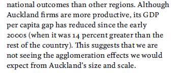
First, Auckland.  Here there are some encouraging signs that Treasury is finally recognising the problem.  A few months ago I was quite critical of a cheerleading speech about Auckland given by the Secretary to the Treasury.  And in the LTFS, the text starts off quite upbeat

akld text.png

I was drumming my fingers at this point, but then I got to the second half of the paragraph.

akld-text-2

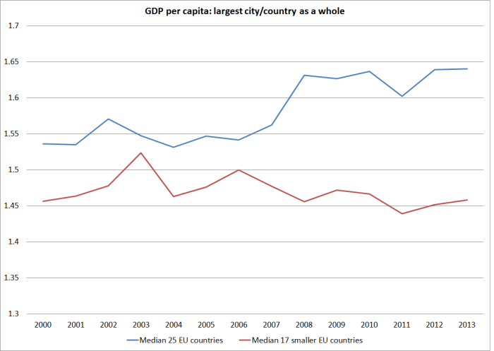
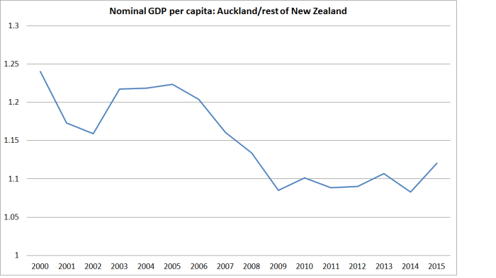
There was much more that could have been said, but for Treasury to acknowledge quite openly –  the plain statistical fact –  that Auckland incomes have been falling relative to those in the rest of the country, despite the huge infusion of additional people (“most skilled migrants anywhere in the OECD” as I heard Steven Joyce say again this morning) should be seen as pretty damning.  There is something very wrong with the model: as they add “this suggests we are not seeing the agglomeration effects we would expect from Auckland’s size and scale”.  Perhaps there is no guarantee –  or even reason to think –  that putting an extra million people or so (the increase in Auckland’s population in the last 50 years or so)  in a remote corner of the South Pacific would generate particularly favourable productivity results.

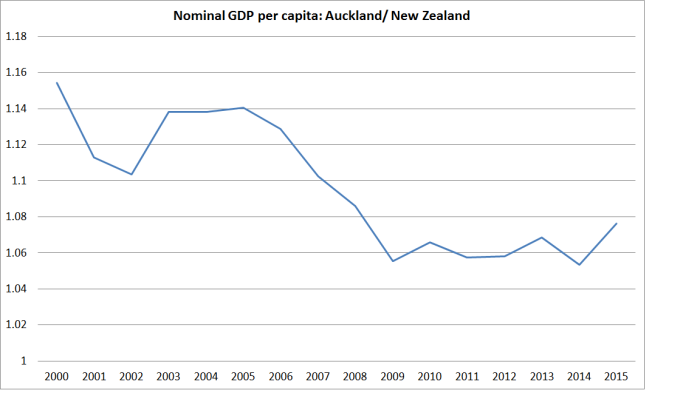
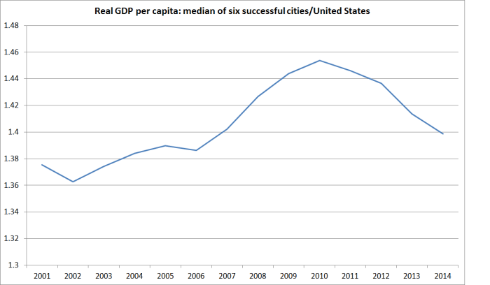
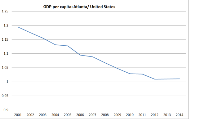
As I’ve noted previously, not only is Auckland’s GDP per capita less high relative to the rest of the country than it was even 15 years ago –  the point Treasury now acknowledges –  but that margin is small compared to what we see in other countries.  I ran this chart, looking at other large cities, in a post a few months ago.

gdp pc cross EU city margins

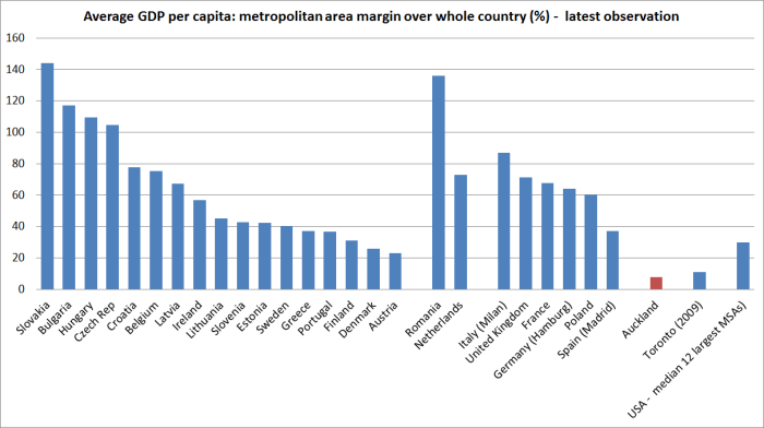
Auckland does poorly.  To me, that isn’t surprising.  This is a strongly natural resource based economy.  There is no sign –  and no sign Treasury points to –  that it has needed lots more people, and especially not in Auckland.

But Treasury, while clearly a bit troubled, isn’t willing to abandon the faith just yet.  The section on Auckland goes on.   There are a couple of anodyne paragraphs on Auckland as gateway (people and goods), and Auckland’s transport system,  and then we are right back to credal statements.

akld-text-3

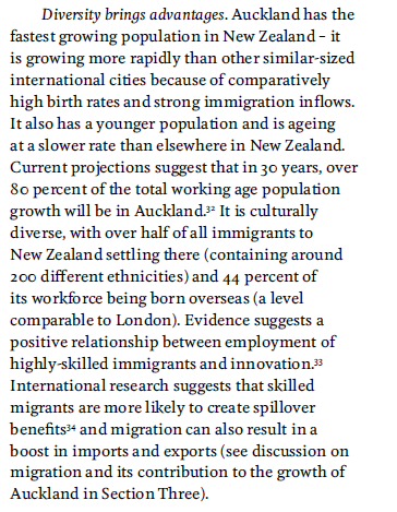
Perhaps diversity does bring advantages, but in the specific case of Auckland, there is just no evidence of solid economic gains.  As Treasury notes, Auckland has a fast-growing population, a young population, a culturally diverse popuation, and a very high proportion of people born overseas.   But it has a disappointingly poor-  and worsening –  relative economic performance.  In my hard copy of the report I had scrawled next to the comment about London “just a shame, we don’t have their GDP performance”.  In the chart above, you can see the contrast between London and Auckland.    We really should expect more than faith-based claims from the government’s premier economic advisory agency.  As Treasury knows, for example, there is no evidence of a causal relationship between immigtration to New Zealand and growth in innovation, productivity or exports.

(For those interested in the Auckland underperformance issues, the October issue of North and South magazine had a nice article on  The Delusions of Aucklanders (and perhaps those advising governments). The article is now available on the new Bauer Media website, Noted.)

Some pages on from the Auckland discussion, Treasury has a page on immigration.  It also starts off with a strongly credal tone –  keep the faith.

akld-text-4

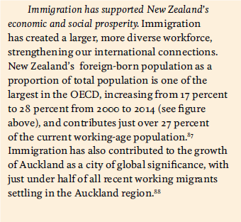
After finishing guffawing at the rather desperate “Auckland as a city of global significance” –  had the 9th floor of the Beehive requested that touch, or did they not need to ask? – we might simply ask for some evidence.  You might think it would trouble Treasury, even a little, that with one of the largest immigration programmes in the world –  of people who, by world standards, are not that badly skilled –  we’ve had 25 years of one of the lowest rates of productivity growth in the world.  Even Treasury acknowledges that failure.  Perhaps there isn’t a causal relationship.  Perhaps the productivity performance would have been even worse without the immigration.  But not a hint of doubt is allowed into this discussion from our premier economic agency.

But then the drafting gets a little more cagey.

akld 5.png

Note very carefully the “can”.  Yes, in principle, a good immigration policy can support productivity etc in the right places/circumstances.  But Treasury can, and does, advance no evidence that it has, in fact, done so in New Zealand.   They really want the public to believe in the programme, while being skilful enough drafters not to allow themselves to be pinned down to have made claims that the economic performance of New Zealanders is actually better as a result of the large scale immigration programme.   There is no hint of any evidence that using immigration policy in “addressing short-term skill shortages” makes any difference to longer-term per capita growth and productivity (and I’ve seen no literature on that point internationallly either).  And actually, Treasury’s own scenarios suggest that immigration also makes very little difference to the longer-term fiscal challenges.

They conclude, perhaps a little uneasily, reverting to rather more jargon-ridden text.

akld-6

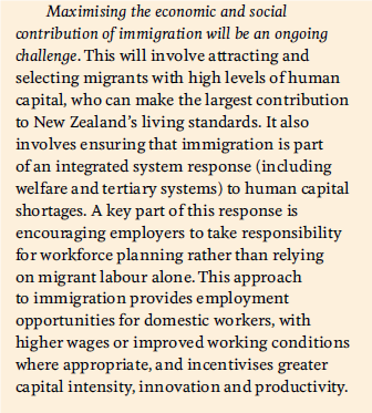
Be very wary of bureaucrats proposing “integrated system responses”, when markets have ways of dealing with issues.  Typically, when demand for additional labour and human capital is high, returns to that sort of labour rise, which attracts more people into those jobs, and to developing those skills.  “Skill shortages” –  or even “workforce planning” – just aren’t some sort of a chronic problem governments need to address.  Excess demand for labour is either a sign that monetary policy is a bit loose, or that wages (for that sector or industry, or across the board) should be rising.   And if Treasury –  or MBIE or ministers –  could produce strong evidence that our immigration policy really had boosted productivity and the material living standards of New Zealanders, that would be one thing.  But they can’t –  and don’t.   And don’t forget, that the same OECD survey Steven Joyce was citing again this morning shows that native New Zealanders already have some of the very highest skill levels in any OECD country.

Overall, I guess one gets a sense that Treasury is slowly losing confidence in bits of its story.  They now are prepared to acknowledge (at least part of) the sustained underperformance of Auckland.  They have raised some doubts about excess reliance of some industries on immigrants.  And they still can’t cite any real evidence of sustained gains in the living standards of New Zealanders from the large scale non-citizen immigration programme.  But rather than openly addressing the genuine uncertainty – and in what seems a slightly desperate attempt to keep spirits up, and encourage people to “keep with the programme”  – we are left with what are little more than slogans, simply asserting the alleged economic gains to New Zealanders from diversity and high rates of non-citizen immigration.  A reasonable response should be “well, show us the evidence”.

At the session Treasury hosted yesterday for the release of the LTFS, we were informed that the Productivity Commission is releasing next Monday its “narrative”, in which they will attempt to explain why the New Zealand economy has underperformed for so long, and (presumably) some thoughts on how best to reverse that.  I will look forward to that document –  there aren’t enough developed competing narratives around a really important issue – and I will no doubt be writing about it here.  Given the Productivity Commission’s statist tendencies, I’m not optimistic, but I will be particularly interested in how they deal with the immigration policy and Auckland issues, both in explaining the underperformance of the last few decades, and in contemplating a better way ahead.

Even Treasury has lost hope?

Pottering around the web, and working my way through my emails, on my return from holiday, I found a couple of things from The Treasury that caught my eye.

The first was the release of new risk-free rates and CPI inflation assumptions –  inputs that are required to be used in preparing the government financial statements.  Treasury releases these every few months.  They don’t get much attention –  presumably outside government agency accounting departments –  but out of curiosity I opened the latest one.  And as I dug into the history of these assumptions what I found was really quite startling.

When I was at the Reserve Bank we often used to bemoan the fact that Treasury’s published inflation forecasts never seemed to settle anywhere near the midpoint of the target range.  In fact, for a long time the Treasury approach seemed quite reasonable –  after all, in the first 15 years or so of inflation targeting, the average annual inflation outcomes had been around 0.5 percentage points higher than the (successively revised) target midpoints.  Reasonable people can debate why that happened, but it did.  It was unusual –  in most inflation-targeting countries, out-turns had averaged nearer the midpoint of the respective targets  – but as the midpoint wasn’t mentioned in the PTA it wasn’t a major accountability issue.  Don Brash took the midpoint quite seriously, while Alan Bollard wasn’t too bothered by it, but under both Governors inflation had averaged higher than the midpoint.

The Treasury’s continued assumption/forecast that inflation would settle back to around 2.5 per cent had become more frustrating, and questionable, in the years since the 2008/09 recession.  Actual inflation outcomes had begun to persistently undershoot the midpoint of the target, and the midpoint of the target range had been explicitly added to the Policy Targets Agreement in 2012.  The Bank, the Treasury, and the Minister of Finance all agreed that the focus of monetary policy should be the midpoint.

These are the assumptions Treasury published two year ago.

tsy inflation 1

At the time, it seemed like the ultimate in very slowly adapting, backward-looking, expectations.  By this time last year, they had markedly revised down their assumptions for the next few years (it wasn’t until 2030 that they assumed that inflation got back above even 1.75 per cent), but still assumed that in the very long-term inflation would eventually revert to 2.5 per cent.    If the Reserve Bank was, as it said, concerned to see long-term expectations centre on 2 per cent, there was still some (rather limited) cover in the Treasury assumptions for a moderately “hawkish” stance.  “Not even Treasury yet takes the 2 per cent midpoint that seriously” they might have argued.

But not any more.  Here are latest CPI inflation assumptions from The Treasury.

tsy inflation 2

They have had to dramatically extend the horizon they provide numbers for to encompass the eventual return to their long-run assumptions.  But it is 30 years from now before they assume inflation gets back even to 1.75 per cent, and almost 40 years to get back to 2 per cent.

I’m not sure quite what is going on here.  On the one hand, Treasury is the chief adviser to the Minister of Finance, who has signed a Policy Targets Agreement with the Governor of the Reserve Bank requiring him to focus on a 2 per cent midpoint.  And on the other hand, it is pretty much common ground that monetary policy works with a lag of perhaps a couple of years.  Anything beyond, say, 2018 is definitely an outcome monetary policy can control.  The PTA needs to be renegotiated next year, but not long ago the Secretary to the Treasury was quoted saying that he didn’t think Treasury would be suggesting major PTA changes. And yet Treasury thinks the best guess for inflation for the next 25 to 30 years is something well below the target they and the Minister are asking the Reserve Bank to achieve.

Of course, with yet another surprisingly weak CPI outcome just released, building on years of undershooting the target, Treasury might yet be right (between Reserve Bank policy (mis)judgements and the global deflationary environment).  But whether they are or not, what should disconcert the Governor –  and the Board, and those monitoring the Bank, such as Parliament’s Finance and Expenditure Committee –  is that not even Treasury believes him any longer.  They might say otherwise in their official advice – which we haven’t seen –  but these are the numbers they consciously chose to publish.

And, of course, it is not as if Treasury is alone in its doubts.  For all that the Reserve Bank likes to quote surveys of a handful of local bank economists, the market has its own approximate “price” for implied future inflation.  This chart takes the 10 year nominal government bond yield, and subtracts the yields on inflation-indexed bonds.  It isn’t a precise measure for various reasons, including the changing maturity dates on the various bonds, but the picture is pretty clear and persistent.

iibs july 16

As late as two years ago, the implied inflation expectations for the next 10 years were very close to 2 per cent.  Now they are around 0.65 per cent.

A persistently easier stance of monetary policy is much overdue.  Not even Treasury seems to take the 2 per cent midpoint very seriously now.

(UPDATE: Someone at Treasury pointed me to their relatively recent –  and useful – methodology note, which explains the relatively mechanical approach they currently take to updating the CPI inflation asumptions.  I don’t think it really changes my story, since the considered judgement has gone into the decision as to how best to represent a reasonable future path for inflation.  The Treasury has consciously chosen to put a considerable weight on indexed bond pricing, while the Reserve Bank excludes that information completely from the inflation expectations curve it regularly cites in its updates.)

On another matter, I have lauded the Treasury’s approach to the Official Information Act issues. They seem to take seriously their obligation under the Act, and although they receive a lot of requests (about 350 in the last year) have not sought to charge anyone.  They withhold material from time to time, but I’ve had enough confidence that they were playing by the rules that I have never sought to challenge those decisions, asking the Ombudsman for a review.  That changed this morning.

A while ago I asked for

Copies of any material prepared by The Treasury this year on regional economic performance, particularly in New Zealand. I am particularly interested in any analysis or advice –  whether supplied to the Minister or his office, or for use internally – on the economic performance of Auckland relative to the rest of the country (whether cyclically or structurally).

I wasn’t expecting much; perhaps some anodyne comments on some or other aspect of recent data, including perhaps the regional GDP data released in March.  But while I was away, I got this reply

oia akld 2

It is all very well and good for Treasury to be updating its analysis and advice.  But I asked for what they have already provided, not what they might (or might not) include in future “strategic documents”, such as the next Long-Term Fiscal Statement, which does not have to be published until July next year.

Given that they are not even willing to publish the titles or dates of any documents (whether internal or provided to the Minister) it does raise the question as to what Treasury has to hide.  Given the woeful underperformance of Auckland –  considered in per capita GDP terms – perhaps Treasury is finally awakening to the fact that something is wrong with the Think Big Auckland strategy?  That might be awkward for the government, but isn’t a good basis –  under the OIA –  for withholding material, especially in such a blanket way.

As a reminder, here is how badly Auckland has done

Over time

akld rel to nz gdp pc

And in comparison to the largest cities in other advanced countries

gdp pc cross EU city margins

I’m not sure what Treasury is hiding, or why. Perhaps the Secretary is reacting defensively to my criticisms of his recent speech?  But it was that speech that prompted my original request, to see what analysis lay behind his upbeat claims about Auckland.

As an organization Treasury is better than the standard being displayed here: we see the good side of Treasury again in the recent pro-active release of Budget background papers. It is time for them to reconsider, and to release any analysis or advice they have prepared on the Auckland’s economic performance.  I’ve asked the Ombudsman to review the decision.

Makhlouf again

In almost any well-functioning country, The Treasury should be one of the very best government agencies: a repository of wisdom, experience, rigour, and the skepticism that comes from seeing all too many “bright ideas” put forward over the years.  If the Secretary to the Treasury is going to give public speeches –  and there are reasonable arguments that someone in that role shouldn’t (one doesn’t come across public speeches from the chief executives of MBIE or MFAT, two other major departments) –  we might reasonably expect something judicious and rigorous, and which provides at least some fresh and interesting insights on the issues he is addressing.    It should be a public reflection of the very best of the sort of insight and advice The Treasury is offering their primary “customer”, the Minister of Finance.

As an example, speeches by Ken Henry, the former head of the Australian Federal Treasury, almost always met that standard –  I looked forward to reading them, and expected to see some or other issue or argument a little differently as a result.  It isn’t about whether or not one agrees with the points the speaker is making – often one learns most from thinking hard about cases made by able advocates of an alternative view –  but about the quality of what is on offer.

The speeches of our current Secretary to the Treasury simply don’t reach that standard.  On Thursday I wrote about Gabs Makhlouf’s recent speech about disruptive technological change.  Only a true believer can have felt better for reading it –  deriving, perhaps, a sense of validation in having such a senior official, a pillar of the establishment, say it.

Perhaps more disconcerting was Makhlouf’s speech earlier this week titled (apparently with reference to the title of Oscar Wilde’s famous play, The Importance of Being Earnest: A Trivial Comedy for Serious People) The Importance of Being Auckland: Strengths, Challenges, and the Impact on New Zealand, delivered to something called the “Committee for Auckland Advisory Group Summit”.

It is a disappointingly poor speech –  I wish I could say I was surprised, but I wasn’t really.  It was a piece that combined lightweight analysis, (very) selective choices of evidence, and a use of rhetoric that might have been becoming from a Cabinet minister pursuing voters, but should have been beneath a senior public servant.  It was all too similar to previous speeches: not just one bad example amid an otherwise solid record.

There were three main parts of the speech.  I don’t have anything to say on the material on infrastructure, much of which is simply a list of points from another report.

Makhlouf begins with a celebration, in a section headed “Auckland’s Strengths”.  The text reaffirms Makhlouf’s position as a true believer: a rapidly growing population is apparently something to celebrate, and the cultural/ethnic diversity of the city is “exciting”.  Here is what he has to say

Why do I find this exciting? It’s because high levels of diversity provide dividends including through increases in innovation and productivity.

Auckland’s diversity is particularly critical for our international connections. There’s much more to international connections than trade. It’s the other international flows – flows of capital and people, and the accompanying flow of ideas – which are the key to reinventing trade, and which will lay the foundation for a more prosperous New Zealand in the long-run.

The high number of overseas-born Aucklanders can bring new skills, new ideas and a diversity of perspectives and experiences that help to make our businesses more innovative and productive. And perhaps most importantly, they often retain strong personal and cultural connections to other parts of the world, which opens up, and helps us to pursue, new business opportunities.

Auckland is truly New Zealand’s gateway to the world. It’s not just that there is a big number of companies here doing business internationally. It’s the port and airport linking the country to global markets; and tertiary institutions, researchers and innovators linking us to global knowledge.

Which might all sound fine,  until one starts to look for the evidence.  And there simply isn’t any.  Perhaps 25 years ago it was a plausible hypothesis for how things might work out if only we adopted the sort of policies that have been pursued. But after 25 years surely the Secretary to the Treasury can’t get away with simply repeating the rhetoric, offering no evidence, confronting no contrary indicators, all simply with the caveat that in “the long run” things will be fine and prosperous.  How many more generations does Makhouf think we should wait to see his preferred policies producing this “more prosperous New Zealand in the long run”?

If the Secretary to the Treasury was going to address the economic issues around Auckland, one might have hoped there would be at least passing reference to:

He might also have linked to the recent presentation by Jacques Poot (in a Treasury guest lecture), in which Poot was keen not to sound very optimistic about just how large those economic benefits of diversity really are, or to the work of Bart Frijns – an (immigrant) professor in Auckland (see last sentence of the extract above) –  whose recent work suggests that on some measures, in some contexts, there may be net costs, not benefits at all.

Of course, one can’t say everything in a single speech, but when a credible case could be made that the Auckland-centred model is in serious trouble, it is bordering on the seriously unprofessional to not even allude to any of these sorts of points, even if only to explain why the Secretary interprets then differently than, say, I might.

So keen was Makhlouf not to undermine his good news creative fiction about the Auckland economy that the one difficulty he does allude to is buried under a different heading “Social Outcomes”.

Let me start with social outcomes. Auckland scores well on quality of life indicators but other measures suggest not everyone is able to enjoy what Auckland has to offer. Social outcomes vary significantly across Auckland, highlighting the potential importance of sub-regional thinking and analysis to lift social outcomes across the board in Auckland.

Issues with the labour market contribute to patchy social outcomes across the city. While Auckland has higher productivity than other urban centres in New Zealand, it also has an underutilised labour force. For example, the five year average unemployment rate in South Auckland is 11.7 percent compared with 6.3 percent for the rest of Auckland and 6 percent for New Zealand overall. That’s the sort of discrepancy that has a real impact on the quality of life of families and communities.

To the first paragraph one can only say “And?”   In what city –  or decent-sized town –  ever did “social outcomes” not “vary significantly”?

Similarly, differences in the unemployment rate across groups within cities will occur everywhere –  if we had the data, I’m sure the unemployment rate would be higher (and probably the participation rate lower) in Porirua than in Karori/Kelburn.  It might be good if were not so, but it isn’t obviously an Auckland-specific issue.   After all, across the country as a whole, the average unemployment rate over the last five years for Europeans has been 4.3 per cent, while that for Maori has been 14.7 per cent, and that for Pacific populations has been 13.4 per cent.  Given that the population of South Auckland is disproportionately Maori/Pacific, the issues in South Auckland seem most likely to be mainly national than (intra-Auckland) suburban.

But there is an Auckland underperformance that might almost escape you if you didn’t read that second paragraph quite slowly and carefully.  The unemployment rate in Auckland is higher than that in the rest of New Zealand.   For a long time, that wasn’t so.

auckland U makhlouf

The chart shows the gap between the unemployment rate for New Zealand as a whole.  Over the history of the HLFS until around 2007, Auckland’s unemployment rate averaged a bit below that of the rest of the country.  There was some clear cyclicality to the gap –  Auckland’s economy/labour market seems to have been more badly hit in recessions (I’ve highlighted the 1991 and 1997/98 recessions) and does relatively better in good times.  In a well-functioning economy, that better performance is what I’d expect.  After all, the Auckland labour market is so much deeper, and more diversified, than that in other centres, that it should be easier for workers and firms to find each other, matching the  skills offered and required, than in a smaller area, typically prone to more idiosyncratic shocks.

But even by the end of the last boom, Auckland’s advantage seemed to be fading.  And in every single quarter since the start of 2007 –  nine years now –  Auckland’s unemployment rate has been above that in the country as a whole.  The gap is slowly closing again –  but the operative word is “slowly”.  It is a quite stunning example of the (frankly rather surprising) extent of Auckland’s economic underperformance.  It certainly has “social” implications for the people adversely affected, but make no mistake, it is a striking economic issue.    And with barely a mention by the government’s chief economic adviser in a speech on the importance of Auckland’s economy.

I was going to write quite a bit about the second half of Makhlouf’s speech, on house prices and housing supply.  I have lots of scrawls in the margins of those sections, about both substance and style.    Like Graeme Wheeler, Makhlouf appears to have it in for “speculators”.  And I’m sure, for example, that Makhlouf’s comments that central and local government have “been working well together” in “addressing the housing challenge” must be a great comfort to those priced out of the market by the combination of central and local governments rules and policies.  They are probably more interested in outcomes –  which are shockingly bad – than in knowing that the bureaucrats are working well together.

But perhaps the line that caught my eye most was one that Treasury consciously chose to highlight on its Twitter feed: “Auckland NIMBYism hurting New Zealand”.    Perhaps “NIMBY” is a convenient shorthand in the popular press, and among sloganeers.  One might have hoped that the Secretary to the Treasury might have avoided clearly pejorative labelling of people, whose interests stands in the way of his preferences.  There is no analysis –  even by way of allusion – to the fact that in most new residential developments, private covenants (voluntary contracts) provide exactly the sorts of binding protections (and more) that residents of Orakei or Epsom might be looking to councils for in the current Auckland debate.  Reasonable people might differ on where the lines should be drawn, and quite which existing features of communities should be able to be protected.  But to simply decry the interests of property owners seems closer to demagoguery than to detached analysis and insightful policy advice.  It also occurred to me to wonder quite what the longstanding residents and property owners in existing suburbs might make of someone fairly fresh off the plane from the UK telling them how their suburbs should be changed.  I’m quite sure that Makhlouf has the best interests of New Zealanders at heart, but when you are a newly-arrived outsider, sometimes you need to be conscious of quite how you sound, and quite what your stake is in the country you are advising on, relative (say) to those who have lived their whole lives in Auckland.

In closing his speech, Makhlouf offered this odd paragraph:

The famous photographer Sir Cecil Beaton once appealed to people to “be anything that will assert integrity of purpose and imaginative vision against the play-it-safers, the creatures of the commonplace, the slaves of the ordinary.”   From what I can see, many Aucklanders are heeding that call in their own way.  And having the right infrastructure, supported by economic incentives that send clear, efficient and effective signals, will enable Aucklanders to continue to exercise their dynamism and diversity and to do the best that they can do.

When I looked up Beaton, his seemed a somewhat reckless life, ending in financial stress.  Perhaps it is the style the dreaded “speculators” emulate –  but then we already know Makhlouf disapproves of them.  Surely most people, in most places, in most times, crave the security of a home, an income, a family, the commonplace things that mostly conduce to sustained happiness (and prosperity for that matter). Risk is, of course, part of life, and many of the great financial successes involved some mix of great risk and great luck.  But we seem to be in an upside-down world in which a Secretary to the Treasury (self-described cautious guardian of the government’s finances) scorns the natural concerns of the vast mass of people.  One might add, that  –  with the full support of the Treasury –  we’ve been eschewing the commonplace, and the “play-it-safers” in our Think Big policy for Auckland over the last 25 years.     And there is little good –  for the vast mass of Aucklanders (and New Zealanders) – to show for it.

Makhlouf quotes various English figures in his speech.  I’ve always been quite keen on Kipling.  In his famous poem “If” comes the lines

If you can make one heap of all your winnings
    And risk it on one turn of pitch-and-toss,
And lose, and start again at your beginnings
    And never breathe a word about your loss;
you’ll be a Man, my son!
I’m not sure that giant policy experiments, showing no sign of paying off 25 years on, are really quite what Kipling had in mind.  But I’m sure that simply ignoring the signs that things aren’t going well wasn’t.
New Zealanders deserve a great deal better from the Secretary to the Treasury.


Outperforming cities…but not Auckland

My post the other day put the decline in Auckland’s GDP per capita (relative to that of the rest of the country) in some international context using BEA data on the average per capita GDP of various large US cities.  As one would have expected, the average per capita in the typical US large city had been rising a little faster than GDP in the US as a whole.

The US data are interesting, but the US is an extremely large country.  By contrast, in Europe that are lots of small countries, and (in particular) small countries with a single dominant city.  In that respect at least, European experiences might be more interesting to compare Auckland’s experience against.

Eurostat publishes a huge quantity of regional per capita nominal GDP data for the 28 EU member countries.  For a few (Malta, Luxembourg, and Cyprus) there wasn’t meaningful data distinguishing the performance of the biggest city from the rest of the country –  and in Luxembourg, the data are problematic anyway, since GDP captures economic activity occurring in a country, while many people who work in Luxembourg live in surrounding countries.  But that left 25 EU countries, and I went through the data to identify, as accurately as I could, the data for the metropolitan region capturing the largest city in each country.  Again, the data are likely to be only indicative –  in every metropolitan area, there will be some cases where people work in the area (so their output is in GDP) but live somewhere else (so the person isn’t in the population numbers for that region).

For a few large countries there is no single dominant city.  It isn’t an issue in the United Kingdom, France or Poland, where London, Paris and Warsaw respectively dominate,  But for Spain, Germany and Italy it is.  For illustrative purposes, I used data for Madrid, Hamburg, and Milan respectively.

Eurostat publishes data for 2000 to 2014, but for some cities the data are only available to 2013.   For each country, I took the average per capita income of the largest city and calculated that as a ratio of the whole country’s GDP.

This chart shows the behavior over time in the ratio for the median country.  I’ve shown two lines: one for the 17 countries with populations less than around 10 million, and one for all 25 countries.

eu time series

For all 25 countries, the median had increased over this period.  For the smaller countries, there been basically no change over the full period.  It is quite different from the picture for Auckland.

akld rel to nz gdp pc

I’m not sure why the smaller EU countries did less well on this measure than the full EU sample, but the smaller countries included the countries worst hit by the 2008/09 recession and the subsequent euro crisis.  There might be some cyclicality in the relative performance of the largest city does (doing really well in boom times, but suffering more than most in downturns –  we see a bit of this in Auckland, which feels the demand effects of fluctuations in migration more than most places).

Auckland’s average GDP per capita is higher than that in New Zealand as a whole (and around 12 per cent than that in the rest of New Zealand excluding Auckland), even if that gap has been closing.  But how does that levels gap compare?

In this chart, I’ve shown the latest observations for how much higher (%) average per capita GDP is in the big city  than for the country as a whole for each of the EU country –  grouped by small, medium and large.  I’ve also shown the median for the twelve largest US MSAs (as per my post the other day), the Auckland numbers, and the experimental numbers for Toronto (from a Statistics Canada research paper) for 2009.

gdp pc cross EU city margins

A few things catch the eye.  The first is that, at least among the smaller EU countries, it is the ones which have been catching up where the cities are doing best relative to the rest of their respective countries (eg Slovakia, Bulgaria, Hungary, and the Czech Republic).  New Zealand was supposed to have been catching up, but hasn’t.

The second thing that catches the eye is just how low the margin between average Auckland incomes and those in the country as a whole is, by comparison with these other countries.

But the third thing that caught my eye, was that the Toronto wasn’t much different.  Toronto doesn’t dominate Canada in the way Auckland does New Zealand: Toronto’s population is only about 50 per cent larger than that of Montreal.    The Statistics Canada data are only experimental, and they provide estimates for only 2001, 2005 and 2009, but on those estimates both Toronto (in particular) and Montreal had seen a fall in their average per capita GDP relative to that in Canada as a whole.

These days, Canada has higher GDP per capita than New Zealand does (it was the other way round prior to World War Two), but Canada’s productivity growth in recent decades has been about as mediocre as that of New Zealand.  Canada has much larger industrial manufacturing sectors than New Zealand does –  much of it tied into the US automotive industry –  but at heart much of Canada’s prosperity continues to derive from the ability to utilize its vast natural resources.  It isn’t an economy whose prosperity seems to be led from its big cities –  any more than New Zealand is.    That said, Toronto –  in such close proximity to the US –  seems a much more likely place for successful global companies to base themselves long-term than Auckland.

Canada also operates large scale non-citizen immigration programmes –  indeed, the new Canadian government has just announced a material increase in the target rate of immigration (and an reorientation away from economic migration –  towards refugee and family). Without knowing more about the Canadian data, I’d be hesitant in drawing too many parallels –  and Canada has not faced the same real interest and real exchange rate challenges New Zealand has.

But at least for New Zealand the striking underperformance of our largest city should raise real questions about strategies designed to (or having the effect of) drawing more and more people into Auckland (from abroad –  New Zealanders aren’t being attracted), in a country where per capita prosperity seems to rest –  and seems likely to continue to rest –  on the ability of our people to utilize, ever more smartly, a largely fixed stock of natural resources.

NB: Note that the US figures are measures of real GDP, while for the other countries the data are nominal GDP.    For cities other than the US, this will probably have the effect of overstating the margins by which big city per capita GDP exceeds that in the rest of the country, since many prices (including for example housing services prices, but also labour-intensive services) will typically be higher in big cites than in the rest of the country.

How have big cities done in the US?

I’ve written several times about the apparent economic underperformance of Auckland –  apparent, that is, in the official annual regional GDP per capita data that Statistics New Zealand publishes.

We only have the data for the period since 2000, and no doubt more recent periods in particular will be subject to revisions. And there is noise in the data from year to year.  But whereas in 2000 average GDP per capita is estimated to have been 24 per cent above that in the rest of New Zealand, by the year to March 2015, that margin had shrunk to only 12 per cent.

ngdp akld ronz

That shouldn’t have been happening if the advocates of our “economic strategy” had been correct: between the agglomeration gains from cities, a rapidly rising population increasingly concentrating the population in our one moderately-large city, and all the claimed spillover effects from a skills-based immigration programme, everything should have been set for Auckland to have continued to outstrip the rest of New Zealand.  But it just hasn’t happened –  if anything, rather the reverse.   As I noted the other day, Census data suggest that until the mid 1990s more New Zealanders were moving to Auckland than were leaving.  But even that flow has reversed (albeit on a small scale) over the years since then –  the years that coincide with Auckland’s relative per capita economic decline.

There aren’t comparable official data in Australia (regional GDP data are all at a state level), but in the US the BEA publishes real per capita GDP estimates for each of the metropolitan statistical areas (MSAs).    The data are available from 2001 to 2014.

Here is a chart showing the median real GDP per capita for six areas people often think of when they think of the economic success of US cities (Boston, Houston, New York, San Francisco, San Jose, and Washington DC ) relative to GDP per capita for the US as a whole.

real gdp pc us cities

There is some variability, but over these 13 years as a whole average per capita incomes in these cities –  already much higher relative to the rest of the country than is the case in Auckland –  have increased a little further.  The change over the full period isn’t large –  but nor would one expect it to have been.  But the change is in the direction one would have expected.

Those six cities aren’t all of the biggest MSAs in  the United States.  The others in the top twelve (each with populations above 4.5 million)  are centred on Chicago, Dallas, Miami, Los Angeles, Atlanta, Philadelphia.  If we take the whole group of 12 cities, the median city had average GDP per capita 24 per cent higher than that in the United States as a whole in 2001.  In 2014, that margin has increased to 29.7 per cent.

Of course, in a country with a lot of big cities there is quite a diversity of experiences (different shocks, changing opportunities etc).  In five of these twelve MSAs, average GDP per capita had actually fallen relative to the US as a whole over this thirteen year period.  Most of the falls were pretty small, and might be not much more than normal year to year variance.   But Atlanta did stand out.

atlanta

The fall, relative to the rest of the United States, has been even larger than the relative decline of Auckland.

I don’t know much about the Atlanta economy.  There has been very rapid population growth –  from just over 4 million people in 2001, to around 5.7 million now.   And they have managed that growth while having median house prices of around US$180000, and a price to income ratio near 3.  That is major achievement in its own right.  But it is also one that makes me a little skeptical of claims that fixing Auckland’s dysfunctional housing and land supply market would materially boost per capita income prospects in Auckland (a claim the Productivity Commission has signed up to).

Auckland’s economic underperformance is real, and should be troubling.  It isn’t a “quality problem“, but reflects a serious failure of the economic strategy pursued by both this government and its predecessor.  Fixing the land supply market should be a policy priority in its own right, but it looks like a quite different issue to fixing the issues around Auckland’s overall economic underperformance.  That looks more like the fruit of an immigration policy that funnels huge numbers of people into Auckland, which doesn’t seem to be a natural location for generating lots of  highly-remunerative economic opportunities.  When our largest city has so badly underperformed over fifteen years, despite all the hopes and aspirations, it is time for politicians and official agencies to start facing up to the uncomfortable data.


“Quality problems”

Sometimes I find the Prime Minister’s claims about the New Zealand economy, and Auckland, almost breathtaking.  There is an insouciance about them that almost defies belief. They certainly defy data.

In a speech to an Auckland business audience yesterday –  there is a report here, and also video footage –  the Prime Minister repeated his breezy claims that Auckland’s “challenges” around housing and transport are “a quality problem”, and a “sign of success”, and that both the city and the country are doing “incredibly well”.

Perhaps that is how it appears when you are already wealthy, live in a large house in a prime inner suburb, and have a taxpayer-provided chauffeur at your constant disposal.  Neither housing nor traffic problems must impinge terribly much.

I’ve commented on a lot of the detailed issues previously, including the Prime Minister’s apparent vision of New Zealand as a Switzerland of the South Pacific, and am not going to go through all the detail again here.

But let’s just repeat some of it in summary:

  • Auckland has some of the highest house price to income ratios anywhere in the advanced world.  And we know that there are plenty of larger fast-growing cities in the United States where prices and price to income ratios are much lower.  Auckland prices –  and actually those in much of the rest of the country –  are a sign of policy failure, not a sign of success.
  • Despite extremely rapid population growth  –  relative to the rest of the country, and by the standards of largest cities in OECD economies –  Auckland’s economy seems to have been persistently underperforming.  The sheer size of the economy keeps growing, but per capita income growth has lagged behind.   Using SNZ regional nominal GDP data, Auckland average incomes were 12 per cent above those in the rest of New Zealand in 2015, but they had been 24 per cent higher in 2000. A curious definition of success.  We don’t have regional real GDP data, but the ANZ’s regional trends indicators (which try to proxy regional real GDP growth) suggest much the same sort of underperformance, dating back even further than 2000.  Per capita income growth supports living standards and consumption growth prospects.  Auckland’s economy has been seriously underperforming on that count, despite all the rhetoric about the importance of agglomeration gains in our one moderately-large city.

As it happens, for most of the last decade even the unemployment rate in Auckland has been consistently higher than that in the rest of the country, even though Auckland has a much deeper labour market and one might have supposed that matching labour demand and supply in a changing economy would be that much more frictionless there than in other regions.

auckland U
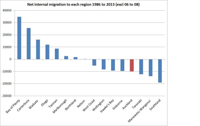
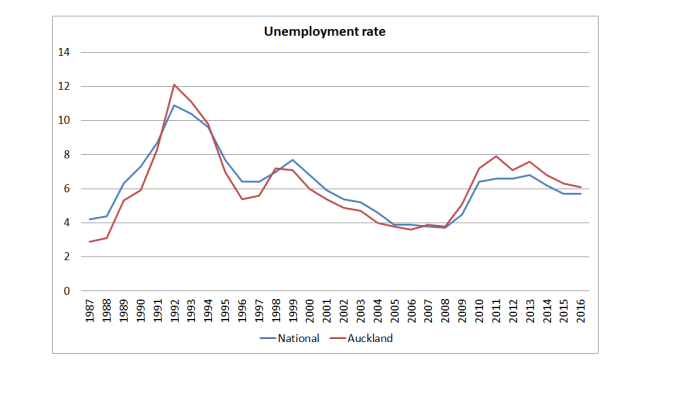
And it isn’t just that Christchurch has had a very low unemployment rate through the repair and rebuild period.  Graphing the Auckland unemployment rate against that of the median region produces much the same picture.

The Prime Minister goes on

“You’ve got net migration not just strong from India, China and Australia but actually net migration from around the country,” Key said.

Well, sort of.    Actually, in the last year around a net 3500 New Zealanders left for Australia, and a slightly smaller (net) number of Australians arrived.  Net inward migration is not a trans-Tasman phenomenon at present –  except, of course, in the sense that a more usual state of affairs has been a large net outflow.

In fact, our net inward migration results almost entirely from the government’s immigration policy choices.

I hadn’t really appreciated the extent of the increase in the number of people arriving on work and residence visas (ie every single one needing explicit government approval) in the last couple of year.

plt arrivals work and residenceAnd the massive increase in student visa numbers (mostly to second tier non-university entities), many of whom later acquire residence, is on top of that.

All of which might be a cause to celebrate if there were any sign that these massive migration inflows –  probably the second strongest wave of immigration in the last 100 years – was doing any good in lifting the incomes or living standards of New Zealanders (and particularly Auckland, where the largest proportion of migrants end up).

But there seems to be no evidence of that at all. Certainly government agencies haven’t been willing or able to produce any.  If anything, there is reason to worry that the policy-driven influx of people is undermining income prospects of New Zealanders.

And what about the claim that people are coming to Auckland (“net migration”) from the rest of the country?  That really caught my eye when I saw it yesterday. Perhaps the Prime Minister has access to some data not generally available, but it isn’t the story in the official data, and hasn’t been for sometime now.

In our quinquennial censuses Statistics New Zealand asks where people were living five years previously, which enables them to produce data on internal migration.  As censuses have long been done at five yearly intervals, that generally provides a comprehensive estimate (and I stress “estimate” because not everyone who fills in the census seems clear on where they lived five years previously).  Because of the Christchurch earthquakes, the scheduled 2011 census was postponed to 2013.  The results of that census give us a picture of internal regional migration from 2008 to 2013.

internal migration 08 to 13Net, a small number of New Zealanders left Auckland for other parts of the country.  Relative to Auckland’s population, the estimated outflow is tiny, but there is just no sign of New Zealanders flocking to the “success” of Auckland (and note that this period includes the outflow of people from Christchurch in couple of years after the earthquakes). Perhaps things have been different in the last three years, for which we don’t yet have data.

But if so, it would be quite a reversal. SNZ has compiled this data back  as far as the 1986 to 1991 five-yearly period.  The last five yearly period in which Auckland experienced a net inflow of people from elsewhere in the country was from 1991 to 1996.

Here is chart which covers the estimated net internal migration to each region for the period 1986 to 2013 (with the two years 2006 to 2008 missing, because they weren’t captured by any of the censuses).

internal migration 86 to 13.png

Internal migration has certainly happened on a significant scale (gross and net).  But, net, it hasn’t been to Auckland.

Add in the huge outflow of New Zealanders to other countries (mostly Australia) over that period, and it looks a lot like New Zealanders avoiding Auckland.  And that shouldn’t really be surprising: despite its really pleasant physical location, housing has become increasingly unaffordable and income growth has lagged behind.    Other places do worse (as a share of population), but Auckland was supposed to the beacon of opportunity and our future economic prosperity.

Of course, one can always attract foreigners from poorer countries,  and that is what successive governments have done (especially, in effect, in Auckland).  But that isn’t a sign of economic success.  It is, instead, an economic (and social) strategy (“critical economic lever” is MBIE’s term), and one which increasingly looks to have failed –  at least if the benchmark is, at it should be, benefits to the living standards and incomes of New Zealanders.

As for the Prime Minister’s final claim, that the New Zealand economy is doing “incredibly well”, words almost fail me.  At a cyclical level, our unemployment rate at 5.7 per cent is still uncomfortably high (and much higher than it was when the government took office, and currently the same as Australia’s when we’ve typically managed better unemployment outcomes).  Productivity growth –  whether labour or MFP – remains mediocre at best, and there is no sign whatever that New Zealand is making up any of the ground lost relative to other OECD countries in the last 50 years or more.

Most people in New Zealand who want to work have jobs, and material living standards for most are still quite comfortable.  But it is the continuation of a long slow relative decline.  And nothing the current government –  or its predecessor –  has done has done anything to begin to reverse that decline.  The big-Auckland “strategy” does increasingly look to have been something really quite bad, worsening living standards for Aucklanders (especially in conjunction with the “rigged” dysfunctional land supply market), and dragging down prospects for the rest of New Zealand.

As I said at the start, the insouciance in the face of all this underperformance almost defies belief.  But what matters much more is that it simply defies the data.


Regional GDP revisited: has Auckland really been that weak?

In a couple of posts earlier last week, I used the regional (nominal) GDP data, showing how weak Auckland’s per capita GDP growth appears to have been over the last 15 years (the period for which the data exist).   And it didn’t appear that terms of trade changes could explain the regional patterns, since most of the gains in New Zealand’s terms of trade has reached our shores in the form of lower import prices, the effects of which should have been quite pervasive across the economy.

But as I got to the end of the second of those posts, I started to get a bit uneasy about the data.  I had noted that over the 15 years, Auckland’s population had increased by 30 per cent, and that of the rest of the country by only 13 per cent.  And yet, over the years (to 2013, for which we have detailed industry breakdowns), construction had been a smaller segment of Auckland’s GDP than in most other regions in the country. This was the chart:

construction share of gdp

I started digging into the data a bit further, and also got in touch with Statistics New Zealand (who provided me with some prompt, very helpful, assistance, including suggesting that some readers might be interested in how they put the numbers together).  My digging didn’t resolve any puzzles, but it didn’t highlight any very obvious errors either.

In a city with a rapidly growing population one would normally see a larger share of GDP devoted to construction (than at other times, or other places).  Construction isn’t just about houses, but the whole panoply of structures that a growing population needs over time.

Over the 15 years to 2015, Auckland accounted for 50 per cent of all the population growth in New Zealand.  And yet here is the Auckland share of the value of all building consents, and the Auckland share of the construction component of GDP (for which we only have regional data to 2013).

akld consents

One wouldn’t expect an exact mapping, since the two series are measuring quite different things (quite a bit of construction won’t need a building consent), but both are a long way below Auckland’s share of population growth  (and Auckland’s share of population growth was highest in 2001 and 2002).

The regional GDP data also have two components that should normally have a strong relationship with housing, and also with population growth.  These are:

Rental, hiring, and real estate services
Owner-occupied property operation

The latter series is straightforward –  in effect, the rental value of living in an owner-occupied house, which is proxied using market rental data.

The “rental, hiring, and real estate services” is more complex.  It includes various sub-categories, for which the data are not provided separately.  Here is what is included, from a table SNZ sent me:

reg gdp categories

Ideally, I would like to look at only the LL12 and LL2 components, and thus exclude the non real estate leasing services (eg cars, machinery etc), but the data aren’t publicly available.

Surely, I thought, if Auckland’s population has been growing so much faster than the population in the rest of the country, this should be reflected in faster growth in these components of GDP.  I didn’t really expect it in respect of owner-occupied dwellings, because although Auckland rents have risen a bit faster than those in the rest of the country, rates of owner-occupation have been falling faster.  But everyone needs to live somewhere, renting if not owning, so I thought the effect should still show up if I combined the two components.  After all, the rental component also includes non-residential property, and more people generally implies more offices and shops too.

But this scatter plot is what I came up with (population growth on the x axis and growth in the sum of the two GDP components on the y axis):

housing scatter plot

I’d expected to see an upward-sloping relationship (recall, these aren’t GDP per capita components, but total GDP).  As I put it to SNZ, isn’t it a bit puzzling that growth in these two nominal GDP components over 13 years was greater in Southland than in Auckland?  Given where all the other regions sit, in a well-functioning housing market surely one might have expected the growth in these GDP components for Auckland to be up in the 140 to 160 range?

SNZ were able to tell me that there was a large growth, from a low base, in non-financial non real estate asset leasing in Southland.  That might help explain why these GDP components together grew surprisingly fast in Southland.  But it doesn’t explain why Auckland has been so weak relative to almost all the other regions (given the extent of its population growth).

Here is a chart showing Auckland’s share of total nominal GDP for each of these two components.

akld shares

And yet over this period Auckland’s share of the total population increased from 31 per cent to 33.5 per cent.

I guess that, overall, this is not wholly inconsistent with the divergence that has opened up in the population per dwelling numbers: trending down in the rest of the country but not in Auckland as house prices become increasingly unaffordable.

Out of curiosity, I redid the per capita regional GDP numbers excluding these two real estate related components.  In my original chart, Auckland had the third slowest growth in nominal per capita GDP from 200 to 2015.   In this alternative chart, we have the data only to 2013.    Over that period, Auckland had the slowest per capita total nominal GDP growth of any region.

What about on this adjusted, non-real estate, measure?

adjusted regional GDP growth

It doesn’t improve the picture.

I’m still not quite sure what to make of all this.  Ideally, we would have regional real GDP  data, but unfortunately that does not appear likely any time soon.  But on the basis of what we have, Auckland seems to have done particularly poorly over the last 15 years, despite (or partly because?) all the policy-induced population growth.  Some of that seems to relate to the poorly functioning housing supply market.  But even abstracting from the direct effects of that, it has to be seen as a pretty disappointing outcome, leaving many questions on the table.

(It also leaves me with some new questions, which I have not yet attempted to work through in my own mind, about my explanation for New Zealand’s persistently high (relative to other countries) real interest rates.  A topic for another day.)


Can the terms of trade explain Auckland’s apparent underperformance?

My post follow-up post yesterday on Auckland’s surprising weak performance in the regional nominal GDP data over the last 15 years prompted a reader to get in touch suggesting that changes in the terms of trade over the period were sufficient to explain why the provincial areas generally seemed to have done well, and Auckland and Wellington had not.

I had been conscious of the possible role for terms of trade changes in explaining the patterns –  these, after all, were nominal GDP data, and ideally we would have liked real series – but hadn’t gone much beyond that.

To see the issue, I’ve set up a very simple stylized version of New Zealand.  This New Zealand has just two, highly stylized, regions.  One produces all the foreign exports of the country (Region A), and the other (Region B) generates lots of domestic services, many of which are supplied to Region A.  You could think of these services as being banking, electricity generation, advertising or whatever.  And each region produces lots of stuff that is consumed within its own region, and each also assumes the same amount of foreign imports.  Both regions have GDP of 500, and Consumption of 500.  (For this little illustrative exercise, I’m just assuming away investment, and any current account deficits/surpluses.)

Region A Region B NZ
Consumption 500 500 1000
Exports 200 0 200
Services trade within country -100 100 0
Imports -100 -100 -200
Nominal GDP 500 500 1000

Now what happens if the terms of trade double?

It depends greatly on whether import or export prices change.

Export prices double:  Region A  Region B  NZ
Nominal GDP 700 500 1200

If foreign export prices double, then the value of region A’s exports will jump from 200 to 400, and the value of nominal GDP in region A will increase to 700.   Region B’s nominal GDP is unaffected (it doesn’t export anything internationally).  Over time, if the higher prices are sustained, it is likely that there will be other consequential changes: consumption in A will tend to rise, and with it both foreign imports and purchases from region B.  But the shock has clearly favoured region A, raising its nominal GDP relative to that of region B.

But what if the terms of trade double through a halving of import prices?

Import prices halve  Region A  Region B  NZ
GDP –  zero pass-through 550 550 1100
GDP – full pass-through 500 500 1200

The immediate impact depends in part on what happens to domestic prices.  If import prices halve, and none of that is passed through to consumers, nominal GDP in both regions will rise by 50 (the size of the reduction in the import spend).  If the lower import prices are fully passed through to consumers, nominal GDP won’t change at all  in either region (lower consumption prices will offset the lower import spend).  Again, over time the gain in the terms of trade will affect behavior (presumably there would be more consumption, and perhaps a higher volume of imports), but for these purposes all that matters is that the shock has hit the two regions equally.

This is all deliberately highly stylized, and says nothing about actual New Zealand (although you might be thinking that somewhere like Auckland might resemble region B and Southland or Taranaki might resemble region A: in the most recent year for which we have detailed industry breakdowns, 13 per cent of Auckland’s GDP was from primary sectors and manufacturing, while 56 per cent of Taranaki’s was).

The terms of trade increased very substantially in New Zealand from 2000 to 2015 (March years), the period covered by the regional GDP data.  The increase over that period was 31.7 per cent.

But most of the gain has been realised in the form of lower import prices.  Export prices have increased, in New Zealand dollar terms (and the nominal GDP series are NZD series), by only about as much as the consumption and investment deflators.  What stands out is that import prices have fallen by 4 per cent over 15 years.  What has been going on?

national acs deflators

First, the real international prices of a lot of imports have been falling –  a beneficial effect of the rise of China and other emerging manufacturing centres.   And, second, the exchange rate has risen very substantially over that period (up 33 per cent on the Reserve Bank’s TWI measure).  Global prices of many of New Zealand’s exports certainly rose over that period, and New Zealand as a whole was better off as a result, but the higher exchange rate meant that, on average, export-focused regions didn’t get the gains of the higher terms of trade (nominal GDP in those regions wouldn’t have risen systematically faster than that in less export-oriented regions).  If we take the six components of the ANZ Commodity Price Index over the 2000 to 2015 period, meat and dairy prices rose modestly in real NZD terms, while the other components (horticulture, seafood, aluminium and forestry) saw falls in their real NZD prices over the full 2000 to 2015 period.    Much of this process is discussed at greater length in an Analytical Note published by the Reserve Bank a couple of years ago.

Instead, the terms of trade gains came mostly in the form of cheaper real import prices, benefiting people in all regions (including Auckland).

Ideally, we would still like to have region-specific GDP deflators.  In some regions with a heavy weight on dairy exports, the rise in the terms of trade may help explain with that particular region’s nominal GDP per capita has done quite so well relative to Auckland’s over this particular 15 year period but (a) the rises in real NZD dairy prices over the full period weren’t that large (around 15 per cent, if deflating with the private consumption deflator), and (b) even in the Waikato total agriculture is only around 10 per cent of GDP).  The differences in GDP per capita growth rates across regions (illustrated in yesterday’s post) swamp anything that can be explained largely by terms of trade effects.

Wellington-boosters (such as the dreadful Wellington City Council, its “economic development” agency, and the myriad of “booster” mayoral candidates) probably take some consolation from the fact that, according to the regional GDP data, if Wellington hasn’t been doing overly well, at least it hasn’t done much worse than Auckland.  I’m not sure they should take such comfort.  Over this 15 year period, the private consumption deflator has increased by 31 per cent, but the government consumption deflator has increased by 51 per cent.  The production of government consumption goods makes up a great deal of economic activity in Wellington  (“public administration, defence and safety”  is around 11 per cent of Wellington’s GDP and 3 per cent of Auckland’s).  If we had real per capita GDP data for the regions, Wellington might be lagging even more  –  and specifically further behind Auckland –  than the nominal data suggest.

On the other hand, I wondered if there was at least one factor overstating Auckland’s performance.  In the national accounts deflators, the deflator for residential investment increased by 85 per cent over the 15 year period, while the private consumption deflator had increased by only 31 per cent.  And it isn’t just residential construction activity that has seen large price increases: here are the construction-related components from the Capital Goods Price Index for the same period.

cgpi

Surely, I thought, Auckland’s rapid population growth over this period (see earlier posts) would have meant a larger share of Auckland’s GDP was in construction-related activities.  If so, the higher inflation rates for these sectors would tend to boost nominal GDP.

We only have detailed industry breakdowns by region to 2013, but I was a little surprised that when I calculated the average share of construction in each region’s GDP over 2000 to 2013 this is what I came up with.

construction share of gdp

Auckland has certainly had a lot more construction activity (share of GDP) than Wellington, but beyond that I have no idea what to make of the results.  They don’t seem very plausible numbers,  but then SNZ collects the data.

There is no point putting too much weight on regional nominal GDP data.  But they do throw up some results that were unexpected (at least by me), and the apparent underperformance of Auckland over this particular 15 year period doesn’t seem easily able to be explained away simply by the effects of terms of trade changes. (Even if it could, it might be troubling that so many people were gravitating to a region that  – the market was signalling –  relative price changes were not favouring.)

And, to repeat a point I made yesterday, there is no necessary reason why simply putting more people in Auckland would raise the productivity of the city.  To those who assure me that agglomeration economies are real, I respond, well, yes, of course.  The question is not, and has never been, whether many (although not all –  see natural resource extraction) high value functions/industries/activities function most productively in big cities.  The economics of agglomeration helps describe why big cities exist.  But the question –  an analytical one, but one New Zealand practical policymakers need to think seriously about –  is whether Auckland is one of the places where firms undertaking many increasingly high value activities will increasingly choose to cluster.    There is no necessary reason why it should be.  Most places aren’t.  There are reasons why there aren’t half a million people in Invercargill or Launceston –  or Helena, Montana or Kearney, Nebraska .  Wishing it were otherwise does not make it so.

There seems to be a strong element of wishful thinking (or “build it and they will come”) about the policymakers’ (and their advisers’) Auckland story.  One could mount an argument –  not necessarily a fully compelling one, but one with substantial elements of truth to it –  that Auckland’s current relative size is largely a function of two big policy interventions.  The first was the high level of manufacturing protectionism that prevailed from the 1930s to the 1980s. Manufacturing firms all over the country benefited, but if one was producing things just for the local market, being in the biggest city made a lot of sense.  The South Auckland manufacturing base grew up during that period.  And the large scale immigration programmes ended up with the same effect, boosting Auckland’s population dramatically (particularly as immigration became increasingly non-Anglo), and generating a deal of economic activity in non-tradables sectors simply to support the infrastructural needs (broadly defined) of a rising population.  But there has never been any sign that Auckland is a location that has the economic opportunities that encourage the growth of new high –productivity industries successfully taking on world markets.  New Zealand’s export base remains overwhelmingly natural resource based –  dairy, wool, meat, fish, oil and gas, gold, wine, forestry, and tourism (most of the appeal is the landscape not the great art or glorious cathedrals).

I’d really like to be wrong, but where is the evidence that incredibly strong population growth in our major city, fuelled largely by immigration policy (New Zealanders, net, have tended to be leaving Auckland, not drawn to its great opportunities), is generating the national benefits the advocates would claim for it?  At present, it looks as though this Think Big strategy is perhaps even more flawed than the 1980s energy version (fortunately called to a halt quite quickly) was.