The Governor said what?

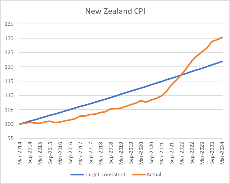
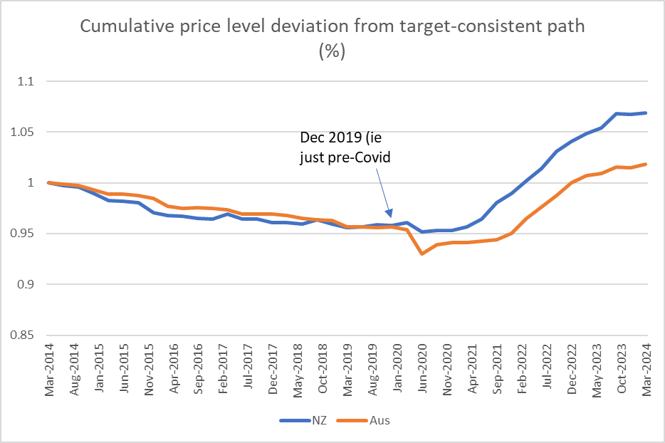
I’m sure there are more important issues right now amid the spiralling decline in New Zealand public institutions. One could argue there are even more important matters around the Reserve Bank (you know, the body that lost $11-12 billion for taxpayers’ in its reckless Covid interventions, gave us the worst core inflation for decades (still outside the target range several years on), and still has outstanding billions of dollars of concessional loans to banks (this even as the Governor openly bags banks for being too profitable for his tastes)).

But this one caught my eye.

Just before the last MPS a few weeks ago the Bank sent out a routine advisory about post-MPS engagements senior managers would be doing. It included this snippet

Quite probably no one much outside Queenstown and lakes area gave it another thought. The clear implication was that there’d be nothing new or newsworthy in what the Governor was saying.

But I happened to be in Dunedin a couple of days later, where I stumbled on this article in the local paper

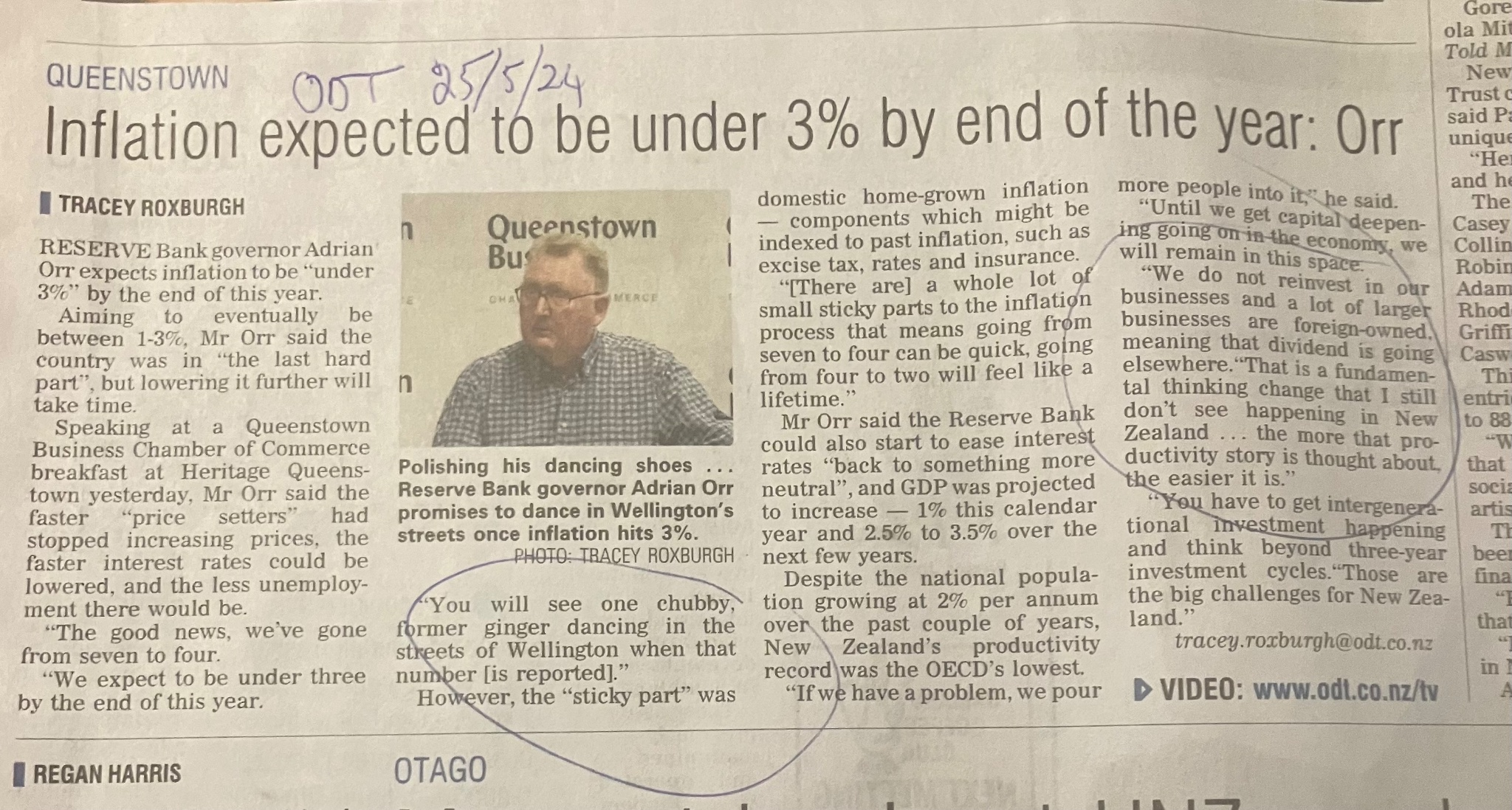
which made it quite clear that even if Orr had been using presentation slides from the MPS that hadn’t come even close to being the limits of what he’d said.

Again, there were a few things that caught my eye.

First, there was that weird – but not new from Orr – suggestion that “price setters” might choose to alter their behaviour to help out the Bank. Rather odd really. Not only do those firms have shareholders to whom they owe legal duties, but next time inflation undershoots the target midpoint should we expect the Governor to be urging firms to make a bit more profit by helping him out and raising their prices? Charitably, I guess that probably wasn’t what he had in mind, but whatever his intent he feeds a narrative in which core inflation is anyone’s responsibility other than the Bank’s and MPC’s.

Then there was that crass line about “you’ll see one chubby former ginger dancing in the streets of Wellington when that number [inflation under 3 per cent] is reported”. I’m guessing those whose businesses were closed down, those whose jobs were lost in the process, probably won’t be sharing in the Governor’s jubilation.

Look, I’m quite sure the Governor will genuinely be pleased when inflation is below 3 per cent – hopefully, even more so when it gets near the 2 per cent midpoint he is required to focus on – but this is the same Governor who has never expressed even a shred of contrition for his part in the inflation (let alone those huge, utterly unnecessary losses – which would have paid for many many (eg) cancer drugs). It was the sort of juvenile line one might expect from a junior official. From a Governor one might have hoped for a little more gravitas. Yes, even from Orr.

But what really prompted me to write this post was those comments on productivity, immigration, and related issues. Remarkably – and they really are quite remarkable comments from a long-serving advanced country central bank Governor – they’ve had no other coverage anywhere, and seem to have sparked no follow-up comments to (for example) the Minister of Finance, the person who is responsible to Parliament and public for the Reserve Bank and the Governor.

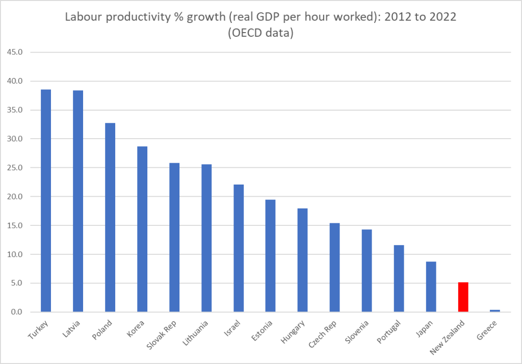
He is reported as having said that “New Zealand’s productivity record was the OECD’s lowest” in the last couple of years. I’m not sure quite which data he is using. but our productivity growth (or lack of it) has been pretty bad. In fairness so has productivity growth in a bunch of other OECD countries (the US tends to stand out at the other end of the scale). And this is, it seems according to the Governor, due to our immigration policy. Big news if true, especially when it comes from…..the Governor of the Reserve Bank (even if it is a matter for which he and the Bank have had no responsibility whatever). He goes on – and here we get quote marks – “if we have a problem, we pour more people into it”. Look, I have been quite vocal over the last decade or more on the way I think immigration policy has been systematically harming New Zealand’s (and Australia’s for that matter) longer-term productivity performance) but a) I’m just a private commentator, while he’s the Governor, and b) I don’t think even I’d be quite that reductionist, especially in a formal setting (like a speech from the central bank Governor).

And then he is reported as going on: “Until we get capital deepening going on in the economy, we will remain in this space” [presumably meaning low productivity growth]. Which is all rather mechanistic and not very insightful at all. There aren’t just lumps of capital that some central planner decides to allocate more of, but firms in markets, making profit-maximising choices against the backdrop of the opportunities they perceive and the regulatory etc environment governments impose.

And, to save you scrolling up and down, here is the crowning set of quotes

Not entirely clear who “we” is here, but presumably he means businesses operating in New Zealand taken as a whole. And note that his comment is about reinvestment, not investment per se (as it happens, total investment as a share of GDP has been higher in New Zealand most of the last 15 years than the median of the IMF grouping of advanced countries), so quite what is he on about? We know that New Zealand has a corporate tax system (dividend imputation) that does not generally double-tax profits earned by companies with New Zealand shareholders, and so – like Australia – tends to have quite high dividend payout rates. But what is the Governor’s beef? Is he seriously arguing for a more distortionary tax system, to stop companies distributing profits as readily? You might have thought that if he was going to weigh in on such issues he might have highlighted that we (and Australia) now have one of the highest company tax rates in the world, and company tax rates really bit on foreign investment (since foreign investors can’t use imputation credits).

But no. In fact, what we get from these comments is that the Governor isn’t very happy about the foreign investment we do have. In fact, unlike almost every serious economic commentator (and in fact the government), he seems to think there is too much of it, falling back on that rank populism beloved of the Greens, the left wing of the Labour Party…..oh, and the marketing department of TSB Bank (my photo from a few years ago). Oh no, the dividends are going to…..well, the people that provided the capital.

As it happened, when I looked up the detailed balance of payments data, there had been $21.4 billion of reinvested earnings by foreign-owned companies operating here in the five years to March 2023. Quite probably some of it was more or less compelled by Orr’s own OTT additional requirements for bank capital (the staggeringly expensive insurance policy that was never subject to a proper cost-benefit analysis) – and the banks are the biggest foreign investors (collectively) in New Zealand. But you are left wondering quite what Orr is on about, and based on what. Just more of the unedifying Australian bank-bashing that he has become known for (recall how keen he seemed when those capital proposals were around for one of the Australian banks to divest and throw their business on the tender mercies of the NZX).

But just what, substantively, was the Governor on about? And how did he conclude that it was his place – charged with delivering price stability (oops) and maintaining financial system stability – to be suggesting, and it does seem to be the implication, that really we’d be better off with less foreign investment? This the same Governor who in the same speech seemed (see above) to be lamenting the relative lack of capital investment in New Zealand.

The account in the ODT ends with a couple of rather cryptic comments. The first (“that is a fundamental thinking change…”) seems to relate to his lament about foreign-owned firms paying investors dividends – which is presumably what they do when they don’t have great investment opportunities presenting themselves here. But, according to Orr, somehow the answer lies there: on this count “the more that productivity story is thought about the easier it is”. What, we should discourage foreign investors and somehow prevail on those who remain to invest here even when it isn’t financially attractive to do so? I can’t imagine that that is really what he means, but it is certainly what it sounds like.

And then an old favourite of Orr’s – with almost nothing whatever to do with his actual responsibilities – is all that talk about needing “intergenerational investment”. One supposes that perhaps he had in mind really long-lived infrastructure projects – things New Zealand entities, many of them government ones, seem woefully bad at executing in a cost-effective way – but actually depreciation (whether of the market value of new ideas, or of physical capital) means that most investments anywhere are much shorter-lived than “intergenerational”. And if the Governor thinks he can be confident about what ‘intergenerational” opportunities are out there that private firms might sensibly lay hold off, perhaps he might reflect on his own state of knowledge about the things he’s actually responsible for. That inflation, for example, wasn’t exactly something he set out to deliver.

It really is woeful stuff coming from the Governor of the Reserve Bank. If one of his junior managers had gone off reservation with such thoughts at a briefing far from home one might put it down to youthful enthusiasm and inexperience. But this is one of the most powerful government officials in the land, the long-serving Governor of our central bank. And, sure, it no doubt wasn’t a fully scripted speech, but…..he was apparently on-the-record (and even if he wasn’t central bank Governors are supposed to speak guardedly, perhaps especially about things that aren’t their responsibility)….and the onus is on him when he speaks to speak well and not just throw out glib populist lines.

But it seems that – once again – there is no price to pay. The ODT journalist who wrote the story even had her email address in the article, so it would have been very easy for specialist political or business journalists to have followed up on these loose comments (and who knows what else he might have said – ODT readers probably having a limited appetite for reports of the Governor), but apparently not. No one seems to have challenged the Minister of Finance, about whether it was really appropriate for the Governor – who hasn’t been doing his day job well – to be masquerading as some sort of Green Party economic nationalist stand-in (but then just a week ago the same Minister told the press the Orr was not her responsibility – even though the Act explicitly says otherwise).

What does the rest of the world (markets and RB watchers) make of it? I guess if they didn’t happen to read the ODT they’d not have known.

Once again, it really isn’t good enough. Another government agency head still in place after failing badly (my 20 reasons why Orr should never have been reappointed, not then including the inflation numbers). And a government that seems to barely care (in Orr’s case, there is still no sign of any attempt to clip his wings – eg foreshadowing deep budget cuts, letters of expectations, forcing the MPC to be more open, appointing a Board chair who make actually represent the public interest etc; really just nothing).

There was an old line of Alan Greenspan’s that “if you think I have been particularly clear you have probably misunderstood what I said”. Orr, by contrast, straying beyond his bailiwick seems quite troublingly clear. Is there any other advanced country central bank Governor who is on record in recent times lamenting (simultaneously) the lack of investment in his economy, and the presence of too much FDI?

Comparing Treasury and Reserve Bank forecasts

I put a range of charts on Twitter late last week illustrating why, from a macroeconomic perspective, I found the government’s Budget deeply underwhelming. I won’t repeat them but will just show two here.

The first is the Treasury’s estimate of how the bit of the operating deficit not explained just by swings in the economic cycle change from 2023/24 (which was largely determined by last year’s Labour Budget) to 2024/25 (influenced by this year’s Budget choices)

On both these Treasury metrics, things are expected to be a bit worse in 2024/25 than in 2023/24. Not a lot necessarily, but things are heading in the wrong direction: a larger share of the groceries are being paid for by borrowing. And, sure, the projections have the deficits eventually tailing off and returning to surplus eventually – as they have for each of the last few years – but those numbers rely on more fiscal drag and rather arbitrary indications of what future Budget operating allowances might be. Perhaps they will deliver, or perhaps not. We don’t know and neither really do they. At this stage, anything beyond 24/25 is little than aspirational vapourware.

And consistent with that, the Treasury’s fiscal impulse measure – designed to measure the overall of fiscal activity on aggregate demand (with the central bank in mind) – is just slightly positive. Fiscal choices for the coming year aren’t estimated to ease pressure on demand and interest rates at all.

When the starting point is quite a large structural deficit, that seems, shall we say, less than ideal. Perhaps the more so when history (and common logic) suggests that the first year of a new government is usually by far the best time for a government to make tough fiscal choices and adjustments. (I dug out some old Reserve Bank estimates the other day and way back in 1976, the first Budget of that new government had a fiscal impulse of around -6 per cent of GDP. Muldoon had inherited a bigger mess than Luxon/Willis did, but…..a deficit is a deficit, and inflation and interest rates have been a problem.) If the 24/25 Budget wasn’t the year for hard choices, which one will be?

But for this post, I was more interested in comparing some of the Treasury macroeconomic forecasts in the Budget documents with those published by the Reserve Bank the previous week. Here I should stress an important difference: the Treasury economic forecasts were finished on 5 April and the Bank’s weren’t finished until a few days prior to the MPS. But my impression is that there wasn’t much in the way of crucial or very surprising domestic economic data in that period.

First, compare the outlooks for real GDP per person of working age (the RB doesn’t publish per capita projections, so this is the basis on which we can do a comparison).

Neither line represents a particularly rosy outlook. Even Treasury has us just barely back to the 22/23 level of GDP per working age population by 2026/27, but over that full period the difference between the two sets of forecasts builds to something quite substantial (a gap of 1.7 percentage points by 2026/27).

After the MPS I wrote here about how there seemed to be nothing robust behind the recovery the Reserve Bank was forecasting for next year (given that interest rates stayed high, lags were long, net immigration was declining etc), but I think one important difference between the two sets of forecasts is nearer in time.

There are really striking differences in how The Treasury and the Reserve Bank see excess demand having evolved over the last couple of years. Output gaps aren’t directly observable, but the most recent hard GDP data is still for December last year, but whether for that quarter or the estimate for the March quarter the difference in the two estimates is almost 1 per cent of GDP. On the Treasury numbers there was a significant negative output gap – posing a powerful drag on inflation all else equal – while the Reserve Bank reckons that output gap was only around zero.

Perhaps Treasury would have revised their thinking after the CPI if they’d had been able to incorporate those numbers in their forecasts, but there is nothing in the BEFU document that seems to suggest so.

If inflation has been a problem and you think that the economy has recently been only at around capacity then it isn’t too surprising that you have rather weak real GDP forecasts for the period ahead (especially the coming year). Both agencies build their forecasts around inflation eventually getting back to target midpoint; the difference is about what doing that will take.

The Reserve Bank reckons the OCR next June quarter will no lower than it is now, and may have gone higher in the interim. The Treasury forecasts the 90 day bank bill rate, and they reckon that will already be a lot lower (4.5 per cent) by next June. Quite who is closer to right (or least wrong) will matter.

As I say, perhaps the difference mostly come down to timing – the Reserve Bank had the CPI and Treasury did not – but frankly it seems too large a difference to be explained by a single inflation number.

One uncertainty is quite how fiscal policy affects the Bank’s picture. As they noted, their numbers didn’t include the Budget numbers themselves, but Westpac has noted – presumably from something the Bank has said – that the MPC had been briefed on the broad direction of fiscal policy (as you would hope, since it is one of the reasons for having the Secretary to the Treasury as a non-voting ex officio member of the MPC), and speculated that perhaps the Bank’s hawkish tone might have been explained in some sense by that understanding of the fiscals. I’m not sure what to make of that, and after all, the Bank’s chief economist was then at pains to play down the apparent hawkishness in the days following the MPS, with his weird line that somehow it was all just “model output”. More generally, the Bank has been taking a weird approach to fiscal policy over the last year, since that awkward 2023 expansionary Budget, ignoring conventional conceptions of the fiscal impulse and trying to focus attention on real government consumption and investment (in turn very different from either total government spending or a deficit/surplus measure). But for what it is worth, as the chart above shows the fiscal impulse for 2024/25 is estimated to be very slightly positive, and at the time of the HYEFU it had been estimated to be about -2.5 percentage points negative.

At very least, whatever was in the Budget simply wasn’t any help in easing pressure on demand and interest rates. Quite where too from here is going to depend a lot on just how much disinflationary pressure was already building up in the system from a now fairly prolonged period of contractionary interest rates. Given how weak last year was, and how weak things like business surveys still are, my sense would be quite a lot. But time will tell.

Underwhelming

An article in this morning’s Post, reporting comments from Paul Conway, chief economist of the Reserve Bank, prompted me to go and listen to the Governor’s MPS press conference. I’d largely given up watching them.

This was the most interesting bit of the article

although it was followed with more comments trying to reframe what the Bank had published in the MPS only a couple of days ago.

The Bank has been publishing a so-called endogenous track for short-term interest rates, as a central indication of what it believes to be required to deliver inflation at or near target 1 to 2 years ahead, for more than 25 years now. If the current crop of MPC members doesn’t yet understand how their numbers will be interpreted, that is more of a reflection on the MPC, and their chief economics adviser, than on the tool. (I’m not a big fan of publishing medium-term interest rate projections – never have been – but it is hardly a new or unfamiliar tool).

So when you published an OCR track that is revised up and out

you know the likely reaction, likely questions etc. And when you complement that numerical track by explicitly stating that the MPC actively considered raising the OCR at this very meeting, you shouldn’t be surprised you are going to be challenged. On a central track, where the OCR is averaging 5.65 per cent in the December quarter, that is consistent with a high probability of an OCR increase later this year.

If the Bank didn’t want people to take that interpretation (and both Conway’s comments in this article, and his and Orr’s comments at the press conference suggest they didn’t), they should have published different numbers. The comments from Conway in the Post article suggest that somehow the OCR projection track was outside their control – product of “its modelling tool” – when it has always been clear that the projections are the MPC’s, not some staff model (which itself has considerable human interventions pretty routinely). Perhaps it is different now, but in the many many years when I sat on the equivalent of the MPC, we used to spending huge amounts of time (arguably at times inordinate) on those last tweaks to the interest rate track, bearing in mind how any numbers would be read by outsiders. There was never a time when any published forecasts – and particularly for the interest rate track – were just some sort of machine-generated product.

Listening to the press conference for the first time in a while just confirmed a sense of how inadequate the MPC, and its chair, are for the job they’ve been charged with. They didn’t have a straight story to tell, and they were trying to back away from the clear implication of numbers they’d chosen to publish. To which one could add yet another appearance saying nothing of substance from the deputy chief executive responsible for macroeconomics and monetary policy at the Bank, or a Governor who chose to opine on productivity growth or the lack of it, suggesting that things were different (better) in Australia, even though recent productivity growth there has been just as weak as in New Zealand. Why are these people – having delivered us the inflationary mess in the first place – still in office? New Zealanders deserve better from officials – supposedly expert ones – delegated so much power. Apart from anything else they deserve real expertise and real accountability.

But then there was also a sense of how weak the media scrutiny was. Was it really the case that no journalist had wondered quite how economic growth was supposed to rebound, on these projections, with real interest rates already restrictive and set to rise further, fiscal policy restrictive, no help from the world economy, and with an expected further downturn in the net immigration impulse? In any case, none asked. None asked why if the OCR had helped lower the output gap by almost 5 percentage points so far, a continuing high OCR, rising further in real terms (as inflation and expectations fall but the OCR doesn’t), was only going to lower the output gap by a little more than 1 percentage point.

And remarkably no journalist asked, and no central banker mentioned, the very real lags in monetary policy. If the real OCR keeps rising to at least the middle of next year, won’t that be acting as a material drag on economic activity and inflation for a couple of years after that? And yet, on the Bank’s projections – the ones the Governor was presenting and journalists were supposedly questioning – quarterly inflation is back at target midpoint by the middle of next year, and – on the Bank’s telling – goes no lower from there.

The puzzles are real.

Excess demand and the Reserve Bank

After my post yesterday I had a few people get in touch, spanning the positions from what one might call extremely dovish to extremely hawkish. My key chart in that post was this one.

Pretty much any way one looked at real interest rates they (a) had been rising, and (b) on the Bank’s forecasts were set to continue to rise for another year or more, and yet – on those same forecasts – growth was set to return. It might not look like spectacular per capita growth next year, but on these numbers we are set to get back to slightly above average (for the pre-Covid decade) per capita growth before there have been any OCR cuts at all (in a period when fiscal policy is likely to be contractionary and the migration boost to demand and activity is expected to shrink). It was, and is, a puzzle.

One person objected to the use of per capita measures of GDP. As it happens, the pattern looks much the same, just a bit less marked, if one uses headline changes in real GDP. We go from an average quarterly contraction over the last five published quarters of -0.15% to quarterly growth of about 0.7% even as real interest rates rise and before the first OCR cut occurs in August next year.

The objection to using per capita numbers reflected a view – that some international agencies seem to like (the then chief economist of the OECD tried it out here a few years ago) – that it was almost inevitable that immigration surges would initially dampen GDP per capita, which would then recover over time as the migrants were absorbed. Perhaps there is something to this sort of model where many migrants are irregular or refugees, but this is New Zealand, where most migrants arrive on pre-approved work visas. Refugee numbers here are small, and illegal arrivals (as distinct from people overstaying visas) smaller still.

The New Zealand experience, over many decades, has tended to be that immigration shocks add more to demand (including derived demand for labour) than to supply in the short-run. And the experience of the last couple of years doesn’t seem inconsistent with that. There was a big unexpected influx, and yet there was no temporary dip in the ratio of employment to working age population: as it happened the absolute peak in the employment rate was in the same quarter as the estimated net migration peak (note that the Reserve Bank’s output gap estimate in fact peaked a few quarters earlier).

So I’m sticking with there being a puzzle. Where is this growth rebound supposed to be coming from, as monetary conditions tighten, fiscal policy tightens, net migration falls (further) and the world economy is assumed to jog along much as it has been?

But the real prompt for another post was looking at the output gap estimates themselves. In this week’s MPS there has been quite a big revision to the Bank’s estimates of the output gap (for the most recent estimated quarter, March 2024) and through all last year. On these numbers, only in the March quarter does the Reserve Bank think the economy crossed over to having (very slightly) excess capacity.

One could argue that it is consistent with their (prior) view that inflation has become more problematic than they realised, and harder to get down. One might also argue that perhaps the latest estimate lines up with the latest unemployment rate which, at 4.3 per cent, is probably around economists’ estimates of the NAIRU. Correct or not, a few more deeply negative GDP per capita quarters would quickly take the output gap deeply negative (monetary policy – and any other influences – has already taken the output gap down by 3 full percentage points of GDP in just 18 months.

But my interest is more in what the Reserve Bank’s revisions are now saying about just how overheated the New Zealand economy actually got in 2022. Here is a chart of the Bank’s output gap estimates over time.

As late as (say) August 2022 they thought the excess demand had peaked in late 2021 at under 3 per cent of GDP (large enough by any historical standards). Now, after successive revisions, not only is the (estimated) peak much later (September quarter of 2022) but it is much larger (4.3 per cent of GDP). All the quarters either side of that peak have also been revised up quite materially.

So big revisions upwards. But how do those estimates now compare with history? This is a chart of the Bank’s current output gap estimates this century

The economy was overheating in the mid 00s, and core inflation got a bit above 3 per cent. But it was nothing like as serious as the (now) estimated overheating in 2021 and 2022. And this was what the Bank simply totally failed to recognise for far too long (recall it was not until February 2022 that the OCR had even been raised back to the level it was just prior to Covid). Even now it is revising up its view of the extent of its own misjudgement and resulting policy mistakes. It was by far the biggest monetary policy mistake in the 34 years of Reserve Bank operational autonomy…..and no one seems to have paid any price at all (Governor and MPC members were all reappointed).

18 months or so ago the Bank came out with a review of its own performance, which unsurprisingly wasn’t very critical at all. Yes, we were told, it was clear with the benefit of hindsight they should have started tightening earlier, but it might only have been by a quarter and wouldn’t really have made much difference to outcomes. It was implausible even at the time – failing to grapple with the severity of the misread of the economy and associated capacity pressures. It has become literally incredible as time has gone on. Did others make similar misjudgements? Of course. But others weren’t delegated the power to run monetary policy, and the responsibility to get it right. No one forced them to take the job, purportedly delegated to people of real expertise.

A common response is some mix of claims that (a) other central banks were just as bad, and b) the Reserve Bank of New Zealand was relatively early in starting tightening. Even if the first claim were correct, it is no excuse: central bankers abroad also voluntarily accepted a mandate and failed to deliver. But it also isn’t really true. It is hard to get consistent output gap estimates across time and across countries, but the IMF is one source

On their current estimates – presumably different techniques to the RBNZ’s estimates – in both 2021 and 2022 New Zealand had the largest positive output gap of any of the advanced economies for which the IMF produces numbers. Imbalances of that extent occur because our Reserve Bank got it (rather badly) wrong, acting late and (for too long) sluggishly relative to the inflation pressures in our own economy (and even among this group of countries, the RBNZ was only the 3rd to start tightening; among OECD central banks it was 7th).

But accountability doesn’t appear to be something that mattered either to the previous government (concerned perhaps that suggesting the Bank had done poorly would reflect poorly on them who appointed the MPC) or to the current one (which tends to play down any role for the Bank, presumably to tar Labour with the blame for the high inflation, while claiming the credit for themselves when inflation settles down again).

And just one final (puzzling) chart. I noticed a few quarters ago (last August) that the Bank’s then output gap projections had about as much space above the zero line as below (probably a bit more below as it still hadn’t got back to zero by the end of the projection period). But this time – and it has been transitioning towards this over the last couple of MPSs – and focusing on the orange line (this week’s estimates), there is far more space above the zero line than there is below. In other words, on these numbers, we got to enjoy the excess output but don’t pay any sort of equivalent or commensurate price in lost output.

It doesn’t make a lot of sense (and would be something very different than we saw in the previous cycle, after 2008). Perhaps there really wasn’t quite as much excess demand at peak as they now think? Perhaps more pain (lost output relative to potential) will be required than they are saying (which might well come about quite easily if the implausible growth rebound they are projecting just doesn’t occur over the next few quarters).

I’m really not sure what is going on. But it doesn’t leave one with any more confidence that the Bank knows what it is doing than we can have now about how they handled the period from mid 2020 to mid 2022, which delivered us this persistently high inflation – and attendant arbitrary wealth redistributions – in the first place.

A puzzle

The Reserve Bank’s Monetary Policy Statement yesterday seems to have caught the market on the hop. Such things would be less likely if (a) we had a better MPC, and (b) they actually communicated (speeches and the like). A steady flow of supporting empirical research might help as well. But immediate market surprises aren’t really my prime focus or interest.

My interest is more in things like this, showing (all using RB forecast data)

  • the real OCR (OCR less annual CPI inflation to that particular quarter)
  • real GDP growth per working age population person (the RB doesn’t provide total population forecasts, so this is a proxy for per capita GDP growth). I’ve shown the actual data in red and the forecast data in blue

On the Reserve Bank’s projections, the OCR itself does not begin to be cut until the September quarter of next year (these forecasts once again push out any easing by another quarter or so). So even in nominal terms there is no monetary policy relief for another 15 months (and the exchange rate isn’t forecast to change either). Getting a good sense of real rates isn’t so easy. Inflation expectations never got as high as headline inflation, so those really deeply negative numbers on the left of my chart might be a little misleading. But….for the last year or so both inflation and measures of inflation expectations have been falling while the OCR has not: unquestionably, the real OCR has been rising further. On the Reserve Bank’s own numbers real interest rates seem set to increase further over the next 12-15 months (after all, most inflation expectations measures are influenced somewhat by recent experiences of inflation data).

So, real interest rates keep rising, and yet on the Reserve Bank’s telling the economy starts recovering, and by next September quarter is already back to generating real growth per WAP person of 0.3 per cent per quarter (annualised rate of about 1.2 per cent, which is hardly stellar but in an economy with basically no productivity growth in recent years certainly isn’t to be sniffed at – after all in the most recent year this measure of real GDP per capita has fallen by about 3.5 per cent)¹.

Where, you might wonder, is all this recovery in growth, to not-unrespectable levels, coming from? It is a good question. It isn’t from a stronger world economy (the assumptions the Bank is using there don’t show much change in growth rates), it isn’t going to be from looser fiscal policy (and certainly not on the dated numbers the Bank has to use, pending next week’s Budget), and as I noted it isn’t going to be from monetary policy (on the Bank’s numbers: rising real interest rates and an unchanged exchange rate). Fans of the government might mention its reform agenda etc etc, but…..there doesn’t seem to be much of one, and (more importantly here) the Bank doesn’t mention one as any sort of explanation. If anything, business confidence etc is weakening, with no sign of some contagious outbreak of animal spirits and associated entrepreneurship and investment. Oh, and the impulse to demand from the unexpected and very large surge in immigration isn’t going to be repeated (again on RB forecasts). The Bank’s forecasts have net migration halving from the rate experienced in the second half of last year.

The story just doesn’t ring true. I don’t think anyone doubts that the big increase in interest rates over the period to May last year (when the OCR got to the current 5.5 per cent) has played a significant part in the very weak economic performance of the New Zealand economy over the last 18 months (see chart). And we know – and the Reserve Bank often tells people – that there are non-trivial lags: monetary policy does not have its full effect on real economic activity anything like instantly, and a lag of perhaps 18 months is often cited. And although there is an argument that unexpected changes in interest rates might matter, no one really doubts that a persistent period of interest rates at any particular level (away from some conception of neutral, and these rates are above neutral on the Bank’s own telling) is going to have material economic impacts. So what is it that leads the Reserve Bank to think that we are now through the worst (of the GDP per capita contractions) and are on our way back to growth? I read the (very short) Economic Projections chapter in the Monetary Policy Statement and there was no hint of an explanation there either.

And then when the OCR does finally come down (in their projections) there isn’t much sign of a robust economic response to that either – unless the Bank thinks the lags are so long those effects won’t be seen until after mid-2027. But in that case, we’d be right back to the question: why do they think the economy is now about to pick itself up quite a lot from the deeply negative per capita GDP growth experience?

The story simply doesn’t seem to make a lot of sense. I’ve seen a few comments suggesting that the MPC is simply trying to bluff the markets – they don’t want to cut the OCR, and just needed some vaguely plausible headline numbers to back that preference. I’d be rather surprised if that was the real story, but when we have this immaculate recovery – even as monetary policy remains hostile, forecast immigration trends remain hostile, and fiscal policy is hardly supportive either – it is really hard to know quite what is going on.

As for the inflation outlook itself, I’m not really persuaded it is quite as worrying as the Reserve Bank suggests. As a couple of straws in the wind recall that construction costs are among the most cyclical (and labour intensive) parts of the CPI, and residential construction activity is probably the most cyclically variable part of the economy. With inflation in those sectors now running below historical averages, it probably bodes well for inflation in other service sectors.

Perhaps the Bank is right to worry, but it would be more persuasive in doing so if (a) they had a more compelling economic story (see above), and b) they offered more analysis and forecasting of inflation in core or underlying terms. A fair bit of the discussion in New Zealand proceeds around a tradables vs non-tradables split (and in my time, decades ago, as forecasting manager at the RB I actually introduced the first such breakdown) but…it is very uncommon internationally, has had some use when (as in times past) the New Zealand exchange rate was very volatile, but may not shed much light especially when – as at present – the adverse idiosyncratic shocks (that monetary policy might reasonably look through) are very much concentrated in the so-called non-tradables sector. Here, I’m not thinking of relatively strong rent increases, which are clearly a function of domestic demand and supply pressures, but of local authority rates increases (which have many of the characteristics of any indirect tax shock) and of insurance increases, which seem to have only a limited amount to do with anything domestic at all (and not to domestic pressure on real resources) and much more to do with adverse shocks to global risk-bearing capacity etc. They are real hits to consumer purchasing power, but would almost certainly be filtered out in any forecast of, say, trimmed mean inflation. It is quite a curious gap in the Bank’s projections that they make no attempt to do such forecasts (by contrast, and for example, the RBA does).

¹  Over the last full economic cycle (2007Q4 to 2019Q4) real GDP per working age person increased at a median annual rate of 1.1 per cent.

Reading the MPS numbers thinking about the fiscal situation

The Reserve Bank doesn’t do independent fiscal forecasts so there is no news in the fiscal numbers in today’s Monetary Policy Statement themselves. The last official Treasury forecasts don’t take account of whatever the government is planning in next week’s Budget, and as the Bank notes they will need to update their assessment in light of whatever the spending and tax plans prove to be.

So I was more interested in the Bank’s numbers for the things they do forecast independently, and which in turn have implications for both the tax revenue the government could expect to collect on any given set of tax rates and for the likely expenditure pressures (from things like population growth and inflation).

One of the lines the Minister of Finance has repeatedly sought to use over her time in office is something about how much worse the economy was than they had appreciated (or had been clear) pre-election, to soften us up (it appeared) for yet more delay in getting back to fiscal surplus (see, we can’t really help it, it was done to us, and no one told us). It has always been an unsatisfactory argument (to say the least) since the previous projections (say, those in the PREFU and those in National’s fiscal plan) weren’t for a return to surplus for a couple more years anyway (2026/27) and by then whatever the forecast fiscal outcome, it is purely a matter of policy choice.

Now, the Budget numbers out next week will use The Treasury’s forecasts as their base. But here are the nominal GDP projections the Reserve Bank was making (a) at the August 2023 Monetary Policy Statement (ie the last set of forecasts pre-election), and b) today. Nominal activity is what gets taxed.

There is a slightly larger gap opening up a couple of years out (when, of course, who knows; both sets of numbers are just anyone’s guess out there) but as late as the June quarter next year the two observations are exactly the same, as they are (a 0.1% difference) for the last pre-PREFU quarter, 2023Q2.

Ah, perhaps you are thinking, but what about inflation. If there is more inflation than was previously forecast the revenue just won’t go as far.

But there isn’t anything much in that sort of story either.

There were some historical revisions late last year to the estimated level of real GDP. Those revisions don’t have any material implications for anything much, since life had already been lived through that period, and (in any case) it is nominal GDP that more closely approximates the tax base.

But in this chart I’ve shown the ratio of the RB’s latest forecasts for real GDP to those it did last August, and it is certainly true that over the full forecast period the latest forecasts are a couple of per cent weaker than last August’s forecasts.

Here is a slightly more obscure chart: the same sort of ratio but this time for the Bank’s estimates of real potential GDP per working age population. Things worsen there by about 1 per cent relative to the position thought to have prevailed just prior to the election.

And if weaker GDP per person implies some loss of productivity (some things the government might be purchasing won’t be getting relatively cheaper), it also suggests that (eg) public service wage pressures and NZS adjustments should be less than they might otherwise be.

The key point? At least on the Reserve Bank’s telling – and they could of course have a very different view than the Treasury – there just isn’t that much there. We are set to be less well-off per person than the Bank thought just prior to the election, but nominal GDP and the CPI forecasts have barely changed, and even the real output changes aren’t particularly large in the scheme of things (nothing at all like the extent of the revisions that followed in the wake of the 2008 recession). What we have, on the Bank’s numbers, is a recession and a protracted period of excess capacity (slack) that is not quite as deep, but quite as protracted, as the Bank suggested to any and all readers (Opposition politicians included) just prior to the election.

Some old documents (of no immediate interest)

This is really just a quick information post.

The Reserve Bank’s website has a complete set of Monetary Policy Statements from and including December 1996 onwards, but for some reason they have not put online the first few years of Monetary Policy Statements (which began being published, under the provisions of the Reserve Bank of New Zealand Act 1989, in April 1990). New Zealand’s inflation targeting regime (origins and early development here) took formal shape (with attendant legal obligations) when that Act came into effect, and the first Policy Targets Agreement between the Governor and the Minister of Finance was signed on 2 March 1990.

In the early years of inflation targeting there were (as the law required) only two Monetary Policy Statements a year. At the start, these documents were very light on specific forecast content. The Monetary Policy Statements were complemented by published Economic Forecasts documents, which had been released twice a year for some years (but which then had little impact on anything, and were once – in a meeting with the Minister of Finance I was attending – memorably disowned by the Bank’s Deputy Governor as “just the Economics Department’s view”). With the commencement of formal inflation targeting, and a growing recognition of the crucial importance of inflation forecasts in an inflation-targeting regime, the Economic Forecasts document took on a somewhat greater degree of prominence. For some years (until 1997) the Bank published both documents, in time on a schedule of alternating quarters (before eventually moving to the still-current model of four Monetary Policy Statements a year).

The Economic Forecasts documents for the period 1990 to 1997 are thus potentially of use to anyone seeking to study the entire New Zealand inflation targeting experience, and particularly the experience in the early years when we pathbreaking to some extent (often more like “groping in the murk”), and running a monetary policy implementation approach that was idiosyncratic to say the least. Neither they nor the early Monetary Policy Statements have been readily available.

I had had in my own files hard copies of some of these publications (with bits and pieces stuffed in them, including the September 1992 forecasts for which I was responsible and which the then Opposition Finance spokesman had described as “looking as though a public relations firm had written it” – on this occasion reality (notably fiscal reality) turned out better than the numbers he hadn’t liked)

But this complete set became available through the efforts of my son, who is doing an honours thesis in 2024 on some technical aspects of New Zealand monetary policy in recent decades. He requested the documents from the Bank and was provided with the full set from 1990 to 1997 (and my understanding is that it took a bit of work from the Bank, for which thanks). With his permission I am posting them here as a more permanent record and to make them generally available to anyone interested.

There is a full page, with a link on the front of this website, with links to all these documents

Two central banks

I got curious yesterday about how the Australia/New Zealand real exchange rate had changed over the last decade, and so dug out the data on the changes in the two countries’ CPIs. Over the 10 years from March 2014 to March 2024, New Zealand’s CPI had risen by 30.3 per cent and Australia’s CPI had risen by 30.4 per cent.

And that piqued my interest because the two countries have different inflation targets: New Zealand’s centred on 2 per cent per annum and Australia’s centred on 2.5 per cent.

So I drew myself this chart

Over the full 10 years, the two CPIs have increased by almost exactly the same amount, but they haven’t kept pace with each other steadily over that full period. Up to just prior to Covid, the Australian CPI had been increasing faster than New Zealand’s, as one might have expected given that the RBA had been given a higher inflation target than the RBNZ.

Now, before anyone objects, I should get in and note that in neither country is there a price level target. But if economies are subject to fairly similar shocks over a period of time one should normally expect a country with a higher inflation target to have experienced a higher cumulative price level increase than a country with a lower target.

Over the 10 years here is Australia’s CPI relative to the price level that would have been implied by being consistently at target midpoint

and the same chart for New Zealand

And in this chart I’ve put it all together

Over the half-decade or so to the end of 2019, the RBA and the RBNZ had both ended up undershooting (on average) their targets by about the same extent. If you look closely, the RBNZ was undershooting more earlier, and the RBA more towards the end of the decade, but there wasn’t a great deal in the difference.

But where the difference really becomes apparent is in the years (four of them) since Covid hit. Over that period, the RBNZ has generated/tolerated much more of an increase in the price level, in excess of what is implied by their target, than the RBA did. (And for those – like Orr – who like to try distraction with things like oil shocks, wars and rumours of wars, and supply chain disruptions, Australia faced all those too.)

There is a lot of focus in Australia – and apparently reasonably enough – on whether the RBA has yet done enough with monetary policy. It has certainly been puzzling that they reckoned they could get away with materially lower policy rates than in other Anglo countries, in the face of (still) near-record low rates of unemployment and a quite stimulatory fiscal policy. But so far, and overall, they’ve done a bit less badly than the Reserve Bank of New Zealand through the last four years taken together.

It remains somewhat remarkable how little serious accountability there has been for serious Reserve Bank policy errors, for which now pretty much everyone (except them) is paying the price. in one form or another.

(By the way, for anyone interested, the NZD/AUD exchange rate averaged 0.933 in the March 2014 quarter and 0.932 in the March 2024 quarter, so over that particular 10 year period there was no change in the real exchange rate at all.)

Words and (in)actions

When I wrote yesterday morning’s post, highlighting how poorly both New Zealand and its Anglo peer countries have been doing in respect of productivity in recent times (ie, in the case of New Zealand, Australia, and Canada even worse than usual), little did I know that the Prime Minister was about to announce a bold new economic performance goal. I wasn’t even aware he was giving a pre-Budget speech yesterday.

But there it was

Now, read it carefully. If it were just the first sentence in 1. it would be largely devoid of content. Even pessimists, with long experience of the underperforming New Zealand economy, probably reckon that the average level of productivity in the New Zealand economy will be higher in 2040 than it is now (these are the sorts of lines that go up over decades, under all but the most adverse circumstances). But the Prime Minister doesn’t stop there. The second sentence is clearly a statement about relative performance: the Prime Minister’s “vision” is for a New Zealand where there is a net return of New Zealanders (after 50-60 years of trend (often large) outflows), because they can have a “better life” here and aren’t driven to move abroad by the lure of “higher incomes” there. His “vision” seems to be that economic growth in New Zealand over the next 16 years will be so strong that we’ll have matched – perhaps even exceeded – what is on offer abroad. As we all know, by far the largest net outflow of New Zealanders is to Australia. The “vision” seems to be to catch Australia.

Wouldn’t that be great? Australia is far from being a leading-edge economy but it is the easiest exit option for most New Zealanders, and has done much better than New Zealand for decades now. For those who are into trans-Tasman rivalries, it must be quite embarrassing for our country to have done so much worse than them, when for many decades we pretty much level-pegged.

As for the PM, he reminded us of his firm focus (“resolutely and unapologetically”) on “delivery”

So having set out a bold vision what is the Prime Minister offering as a policy programme to achieve it? It isn’t, after all, a small ambition. (By my reckoning, using IMF data, catching Australia’s GDP per capita by 2040 would require New Zealand’s per capita real growth rate to exceed Australia’s by about 1.45 percentage points each and every on average for 17 years – so if Australia managed 1 per cent average per capita real GDP growth, we’d have to average almost 2.5 per cent year in year out. Over the last 17 years we’ve managed about 1 per cent per capita real growth.)

The Prime Minister does lay out some substance on the early days

Personally, I’d give a tick to almost all those (but not too keen on allowing small panels of Cabinet ministers to decide which private sector projects get favoured treatment). It is mostly good stuff. But to a first approximation what it mostly does is undo stuff the previous government did and restore something like the policy set of 2017. But if productivity growth in the years up to 2017 was less bad than it has been here – and in Australia and Canada – more recently, we weren’t making any progress then either in closing gaps to the rest of the advanced world. And where it is still mostly prospective (“charting out a course of systematic RMA reform”), it is welcome, and sounds good, but…..we’ve heard lines about fixing the RMA before, including from the previous National government.

And that was sort of the problem with the entire economic strand of his 2040 vision. It brought to mind this

I hadn’t previously noticed the transition from “concrete goal” to “vision”, but whatever the language, it all made no difference whatsoever.

The Taskforce that was set up to advise on meeting the 2025 goal noted at the start of its first report that there had been a lot of talk over the years.

(I don’t suppose the Taskforce really believed that last couple of sentences, but…..the Prime Minister himself had been party to setting a “concrete goal” so he might as well be treated as taking it seriously.)

Of course, it all came to nothing and nothing about the goal (whether “concrete goal” or “vision”) was achieved. (I had some part in assisting the 2025 Taskforce, but the substantive issue is not the Taskforce, but the goal – which is what would greatly have benefited New Zealanders had it been seriously pursued. It wasn’t.)

Here is the summary chart, comparing GDP per capita (in PPP terms) between the two countries since 2007 (just prior to the severe recession on 2008/09). There are two different measures, but they both tell the story: no progress at all has been made in the intervening years to closing the gap in real GDP per capita to Australia.

In the short-term governments (government policy settings) can’t do much about the terms of trade, but generally Australia’s have been stronger than ours.

Productivity is more amenable to policy settings. If anything the gap has widened over the period covered by the original 2025 goal (these lines are indexed to a common value at the start of the period. Using annual OECD data, in PPP terms, the average level of labour productivity in Australia is about 28 per cent higher than that in New Zealand, larger than the gap in real GDP for capita (the latter also reflecting the higher employment rate in New Zealand).

Who knows if Mr Luxon is any more serious about his “vision” – laudable on its own terms – than John Key was about the 2025 goal. No doubt both of them would be quite happy if things happened to have turned out that way (wouldn’t we all) but Key and his government did nothing even close to being equal to the task to make it happen. There seems little basis – whether in PM’s speech, his campaigning last year, or anything about what his government is and isn’t doing now – for believing it will be any different this time. Most likely, it is just another positive-sounding rhetorical line that will disappear, even from prime ministerial speeches, almost as soon as it appeared.

It would be great to be proved wrong on that, because the people who pay the price of empty political aspirational rhetoric never matched by policy seriously equal to the task aren’t Prime Ministers, who eventually move on to gilded retirements, but the children and grandchildren of ordinary New Zealanders.

If, as he should be, the Prime Minister is serious about that aspiration of New Zealanders (net) coming home not just because mountains and beaches make it a nice place for many to live, but because economic performance means you don’t have to leave for a higher income, the concrete policies need to start matching the rhetoric. In the PM’s own words, delivery matters.

UPDATE: As if to reinforce my scepticism I came across this in a Stuff article

On the assumption that his answer has been fairly reported, really what can one say. It is just devoid of any substance whatever, and meanwhile his government in practice shows no sign of ending the corporate welfare handouts (which are what reinforce any sense of dependency, at least among the favoured firms).

Productivity growth: 4 Anglos

In my post last week on The Treasury’s recent note on productivity, I highlighted that the weak labour productivity growth evident in New Zealand over the last decade wasn’t something we’d shared with the OECD countries that were around our level of average productivity. This chart was from that post.

But as I also noted, it might have been worth Treasury having a look at Australia and Canada (richer and more productive than us, but with some important structural similarities, and neither in recent decades having been productivity growth star performers).

For many countries it is quite difficult to get whole-economy quarterly labour productivity data. But Australia, Canada and the UK publish such series, and I’ve done so for New Zealand (using the average of the two real GDP series and HLFS hours data). The data are all available to 2023Q4, although in all cases no doubt with the caveat of being subject to revision as fuller data emerge for the most recent periods.

First, a quick quiz. Which of the four Anglo countries do you think is which in this chart (I went back to end of 2015 to start from before the Brexit referendum)? Note that none of the lockdown period numbers are likely to be very reliable, and may just reflect differing assumptions the various statistical agencies made. But in all four countries, lockdowns are now well in the past.

The answer? And somewhat to my surprise…..best of a poorly performing bunch of countries over this eight year period was the UK, Brexit and all.

And how about the period since just prior to Covid (there is some noise in the quarterly data so I’ve used the 2019 average as the base)?

I’d usually highlight New Zealand in a different colour, but….it is hard to highlight (exceedingly close to) zero.

Given the potential for revisions I wouldn’t put much weight on it, but……for what the data are worth…..there is no reason to doubt that the recent productivity performances of New Zealand, Australia, and Canada have been rather similarly poor, and especially so since Covid.

It is worth making these comparisons for various reasons, but including because it is all too easy for partisans to highlight their own country’s experience, blaming everything on the rhetorical predilections and headline choices of whoever happens to have held office in this period. Over the full Covid period (in the chart just above), we had a Labour government, Canada had a government that seemed similarly “left wing”, but then for much of the period Australia had a centre-right Coalition government, and the UK…. has had the Tories (who sometimes appeared very similar to Ardern, but are notionally at least of the centre-right).

But lest you are tempted again by thought that everyone is just as bad as each other and global forces mean productivity growth was just impossible over this period, consider the US

They don’t produce whole-economy real GDP per hour worked data, and you’d expect the business sector to do better than the economy as a whole (ie including government). But I had look at how large the differences might be (using the annual US GDP per hour worked estimates from the OECD) and it is pretty clear that the US economy as a whole – an economy very much closer to the productivity frontier – has managed materially faster labour productivity growth over recent years than the 4 Anglos focused on in this post.

Countries can still manage robust productivity growth. Perhaps especially countries that are well behind the productivity frontier (see first chart in this post), but….apparently not with the policy mixes of the New Zealand, Australian, and Canadian governments.