The Reserve Bank of New Zealand has long been averse to references to a “natural rate of unemployment” or its cognate a “non-accelerating inflation rate of unemployment” (NAIRU). It started decades ago, when the unemployment rate was still very high, emerging from the structural reforms and disinflation efforts of the late 80s. We didn’t want to lay ourselves open to charges, eg from Jim Anderton, that we regarded unemployment as natural or inevitable, or were indifferent to it, let alone that we were in some sense targeting a high rate of unemployment. Such a criticism would have had little or no analytical foundation – we and most mainstream economists held that a NAIRU or “natural” rate of unemployment was influenced largely by labour market regulation, welfare provisions, demographics, and other structural aspects (eg rate of turnover in the labour market) that were quite independent of monetary policy. But the risk was about politics not economics, and every election there were parties looking to change the Reserve Bank Act. And so we never referrred to NAIRUs if we could avoid it – which we almost always could – preferring to focus discussions of excess capacity etc on (equally unobservable) concepts such as the output gap. In our formal models of the economy, a NAIRU or a long-run natural rate could be found lurking, but it made little difference to anything (inflation forecasts ran off output gap estimates and forecasts, not unemployment gaps).
Other central banks do things a bit differently, perhaps partly because in some cases (notably Australia and the US) there is explicit reference to employment/unemployment in monetary policy mandates those central banks are working to. In a recent article, the Reserve Bank of Australia observed that
“When updating the economic forecasts each quarter, Bank staff use the latest estimate of the NAIRU as an input into the forecasts for inflation and wage growth”
It may not make their monetary policy decisions consistently any better than those here, but it is a difference in forecasting approach, and in how the RBA is prepared to talk about the contribution of unemployment gaps (as one indicator of excess capacity) to changes in the inflation rate.
I’ve been arguing for some years – first inside the Bank, and more recently outside – that our Reserve Bank put too little emphasis (basically none) on unemployment gaps (between the actual unemployment rates and the best estimate of a NAIRU). It has been the only central bank in the advanced world to start two tightening cycles since 2009, only to have to reverse both, and I had noted that this outcome (the reversals) wasn’t that surprising when for years the unemployment rate had been above any plausible estimate of the NAIRU. The Bank sought to fob off criticisms like this with a new higher-tech indicator of labour market capacity (LUCI) – touted by the Deputy Governor in a speech, used in MPSs etc – only for that indicator to end badly and quietly disappear.
But since the change of government – a government promising to add an explicit employment dimension to the Bank’s monetary policy objective (now only 12 days to go til the new Governor and we still haven’t seen the new PTA version) – there has been some pressure for the Bank to be a bit more explicit about how it sees, and thinks about, excess capacity in the labour market, including through a NAIRU lens. In last month’s Monetary Policy Statement, they told us their point estimate of the NAIRU (4.7 per cent) and in the subsequent press conference, the Governors told us about the confidence bands around those estimates. All this was referenced to an as-yet-unpublished staff research paper (which still seems an odd inversion – senior management touting the results before the research has had any external scrutiny).
Last week, the research paper was published. Like all RB research paper it carries a disclaimer that the views are not necessarily those of the Reserve Bank, but given the sensitivity of the issue, and the reliance on the paper at the MPS press conference, it seems safe to assume that the paper contains nothing that current management is unhappy with. What the new Governor will make of it only time will tell.
There was interesting material on the very first page, where the authors talk about the role of monetary policy.
The focus of monetary policy is to minimise fluctuations in cyclical unemployment, as indicated by the gap between the unemployment rate and the NAIRU, while also maintaining its objective of price stability.
I would very much agree. In fact, that way of stating the goal of monetary policy isn’t far from the sort of wording I suggested be used in the amended Reserve Bank Act. Active discretionary monetary policy exists for economic stabilisation purposes, subject to a price stability constraint. But the words are very different from what one has typically seen from the Reserve Bank over the years (including, for example, in their Briefing to the Incoming Minister late last year).
But the focus of the research paper isn’t on policy, but on estimation. The authors use a couple of different techniques to estimate time-varying NAIRUs. Since the NAIRU isn’t directly observable, it needs to be backed-out of the other observable data (on, eg, inflation, wages, unemployment, inflation expectations) and there are various ways to do that. The authors draw a distinction between a “natural rate of unemployment” and the NAIRU: the former, conceptually is slower moving (in response to changes in structural fundamentals – regulation, demographics etc), while the NAIRU can be more cyclical but tends back over time to the longer-term natural rate. I’m not myself convinced the distinction is that important – and may actually be harmful rhetorically – but here I’m mostly just reporting what the Bank has done.
The first set of estimates of the NAIRU are done using a Phillips curve, in which wage or price inflation is a function of inflation expectations, the gap between the NAIRU and the unemployment rate, and some near-term supply shocks (eg oil price shocks). Here is their chart showing the three variants the estimate, and the average of those variants.

Perhaps it might trouble you (as it does me) but the authors never mention that their current estimates of the New Zealand NAIRU, using this (pretty common) approach, are that it has been increasing for the last few years. Frankly, it doesn’t seem very likely that the “true” NAIRU has been increasing – there hadn’t been an increase in labour market regulation, the welfare system hadn’t been becoming more generous, and demographic factors (a rising share of older workers) have been tending to lower the NAIRU.
As it happens, the authors have some other estimates, this time derived from a small structural model of the economy.

Even on this, rather more variable, measure, the current central estimate of the NAIRU is a bit higher than the authors estimate it was in 2014. But the rather bigger concern is probably the extent to which over 2008 to 2015, the estimated NAIRU on this model seems to jump around so much with the actual unemployment rate. Again, the authors offer no thoughts on why this is, or why the pattern looks different than what we observed in the first half of their sample. Is there a suggestion that the model has trouble explaining inflation with the variables it uses, and thus all the work is being done by implicitly assuming that what can’t otherwise be explained must be down to the (unobserved) NAIRU changing? Without more supporting analysis I just don’t find it persuasive that the NAIRU suddenly shot up so much in 2008/09. For what it is worth, however, do note that the actual unemployment rate was well above the NAIRU (beyond those grey confidence bands) for years.
Here is what the picture looks like when both sets of estimates are shown on the same chart.
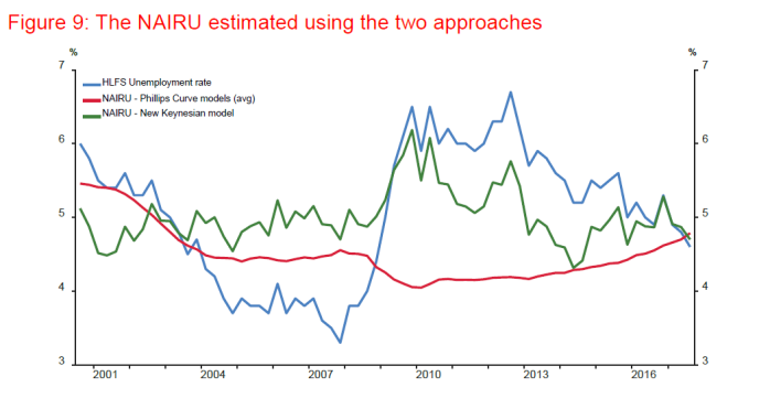
On one measure, the NAIRU fell during the 08/09 recession, and on the other it rose sharply. On one measure the NAIRU has been steadily rising for several years, while on the other it has been jerkily falling. No doubt the Bank would like you to focus on the end-point, when the two sets of estimates are very close, but the chart does have a bit of a “a stopped clock is right twice a day” look to it. When the historical estimates coincide it seems to be more by chance than anything else, with no sign of any consistent convergence.
I noted the end-point, where the two estimates are roughly the same. But end-points are a significant problem for estimating these sorts of time-varying variables. The authors note that in passing but, somewhat surprisingly, they give us no sense of how material those revisions can be, and have been in the past. I went back to the authors and asked
I presume you’ve done real-time estimates for earlier periods, and then checked how – if at all – the addition of the more recent data alters the estimates of the NAIRU for those earlier periods, but if so do you have any comments on how significant an issue it is?
To which their response was
An assessment of the real-time properties of the NAIRU and the implied unemployment gap was beyond the scope of our paper.
Which seems like quite a glaring omission, if these sorts of model-based estimates of a time-varying NAIRU are expected to play any role in forecasting, or in articulating the policy story (as the Governors did in February).
As it happens, the Reserve Bank of Australia published a piece on estimating NAIRUs etc last year. As a Bulletin article it is a very accessible treatment of the issue. The author used the (reduced form) Phillips curve models (of the sort our Reserve Bank used in the first chart above).

The solid black line is the current estimate of Australia’s NAIRU over the whole of history. But the coloured lines show the “real-time” estimates at various points in the past. In 1997 for example (pink line) they thought the NAIRU was increasing much more – and thus there was less excess labour market capacity – than they now think (or, their model now estimates) was the case. In 2009 there was a stark difference in the other direction. Using this model, the RBA would have materially underestimated how tight the labour market actually was.
It would be surprising if a comparable New Zealand picture looked much different, but it would be nice if the Reserve Bank authors would show us the results. These end-point problems don’t mean that the model estimates are useless, but rather that they are much more useful for identifying historical NAIRUs (valuable for all sorts of research) than for getting a good fix on what is going on right now (the immediate policy problem). That is true of many estimates of output gaps, core inflation (eg the RB sectoral core measure) and so on.
Having said that, at least the Australian estimates suggest that Australia’s NAIRU has been pretty steadily falling for the last 20 years or so, with only small cyclical dislocations. Quite why the Reserve Bank of New Zealand’s Phillips curve models suggest our NAIRU has been rising – when demographics and welfare changes typically point the other way – would be worth some further examination, reflection, and commentary (especially if Governors are going to cite these estimates as more or less official).
Comparing the two articles, I noticed that the RBA had used a measure of core inflation – their favoured measure, the trimmed mean – for their Phillips curve estimates, while the RBNZ authors had used headline CPI inflation (ex GST). Given all the noise in the latter series – eg changes in taxes and government charges – I wondered why the authors didn’t use, say, the sectoral factor model estimate of core inflation (the Reserve Bank’s favoured measure). It would be interesting to know whether the NAIRU results for the last half decade (when core inflation has been very stable) would be materially different. It might also be worth thinking about using a different wages variable. The authors use the headline LCI measure, as a proxy for unit labour costs. But we have actual measures of unit labour costs (at least for the measured sector), and the authors could also think about using, say, the LCI analytical adjusted series and then adjusting that for growth in real GDP per hour worked (a series that has itself been revised quite a bit in the last year). No model estimate is going to be perfect, but there does seem to be some way to go in refining/reporting analysis research in this area.
I have argued previously that the Reserve Bank should be required to report its estimates of the NAIRU, and offer commentary in the MPS on the contribution monetary policy is making to closing any unemployment gaps. I’d have no problem with the Bank publishing these sorts of model estimates, but I’d have in mind primarily something a bit more like the Federal Reserve projections, in which the members of the (new, forthcoming) statutory Monetary Policy Committee would be required to publish their own estimates of the long-run sustainable rate of unemployment that they expect the actual unemployment rate would converge to (absent new shocks or structural changes). The individual estimates are combined and reported as a range. No doubt those individual estimates will have been informed by various different models, but in the end they represent best policymaker judgement, not the unadorned result of a single model (end-point) problems and all.
And finally, the Reserve Bank (aided and abetted by the Board) has always refused to concede it made a mistake with its (eventually reversed) tightening cycle of 2014 – sold, when they started out, as the beginning of 200 basis points of increases. The absence of any emphasis on the unemployment rate, or unemployment gaps, was part of what got them into trouble. In the latest research paper there is a chart comparing the Bank’s current estimates of the NAIRU (see above) with their current estimates of the output gap.
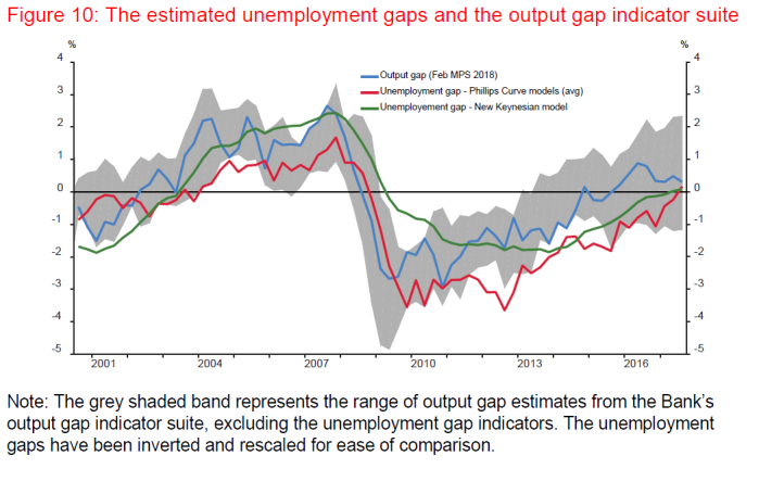
The tightening cycle was being foreshadowed in 2013, it was implemented in 2014, it was maintained well into 2015. And through that entire period, their unemployment gap estimates were outside the range of the output gap estimates.
We don’t have their real-time estimates of the unemployment gap, but we do have their real-time output gap estimates. They might now reckon that the output gap in mid 2014 (blue line) was still about -1 per cent but in the June 2014 MPS they thought it was more like +1.5 per cent.

The failure to give anything like adequate weight to the direct indicators of excess capacity from the labour market (ie the unemployment rate and estimates of the NAIRU) looks – as it felt internally at the time – to have contributed materially to the 2014 policy mistake.
(In this post, I’m not weighing into the specific question of what exactly the level of the NAIRU is right now, and the Bank does emphasise that there are confidence bands around its specific estimates, but I’m aware that is also possible to produce estimates in which the current NAIRU would be 4 per cent or even below.)
