Every three months or so the hard copy Herald comes with a hefty supplement, the OneRoof Property Report. Yesterday was the latest such supplement. I skip straight to the detailed tables at the back which report, at suburb and district council level, the numbers from the OneRoof-Valocity House Value Index. It is a measure of average (not median) prices, draws on “a range of sources, including settled sales data” and is described as “based on a composite of statistical models and are fully stratified”. The numbers are up to the end of October.
What caught my eye when flicking through the tables was that they had not just percentage changes for the most recent quarter and year, but also enabled comparisons to pre-Covid levels and to the Covid-era peaks.
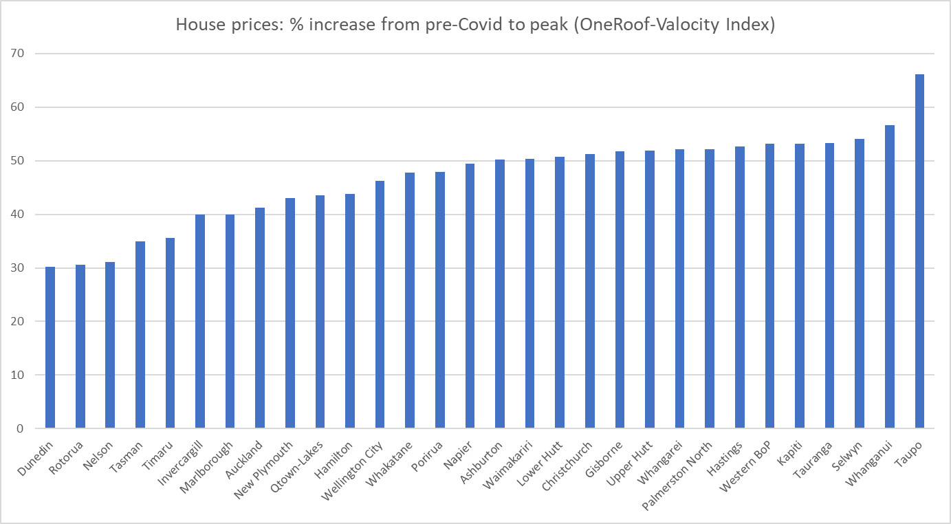
First, a reminder of that extraordinary period (mostly in late 2020 and 2021) when house prices rose sharply almost everywhere. Since I was having to do all these percentage changes manually I mostly only did the larger population places.
They really were staggering changes. There are a few surprises – I’m at a loss to know why the increase in average prices was materially larger in Taupo than anywhere else – but it is probably more striking just how consistently huge the price increases were, between 40 and 55 per cent, often in little more than a year.
Prices have generally fallen back from those peaks (except in Timaru where the latest observation is also the peak).
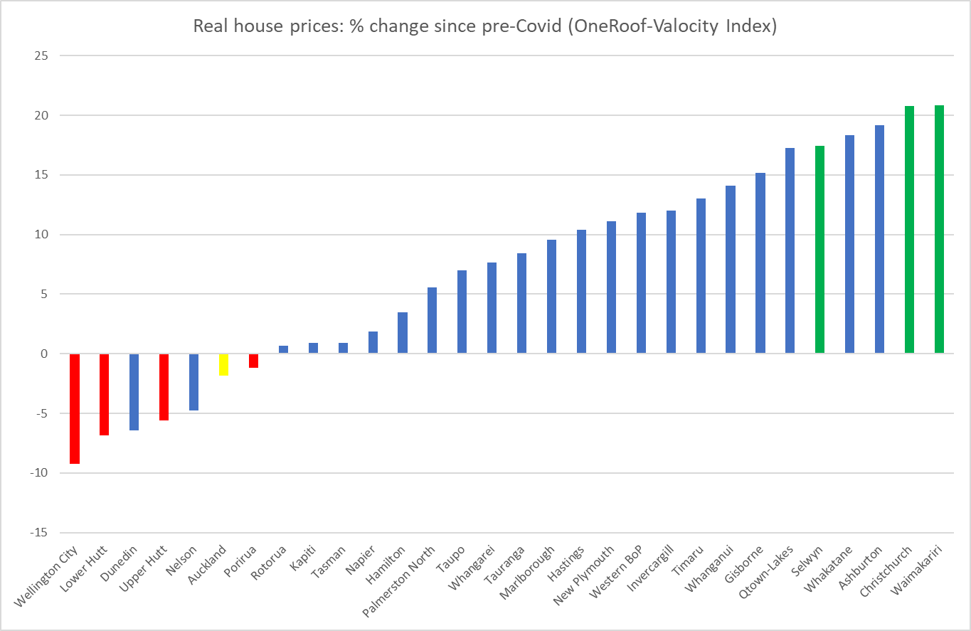
But what I was more interested in was where prices were now in real (inflation-adjusted) terms relative to those just prior to Covid. That’s this chart (with the Wellington districts highlighted in red, the Christchurch ones in green, and the mega-region Auckland shown in yellow).
There are really big differences across towns and cities in just a (bit under) four-year period, and no particular bunching around some typical rate of increase (decrease), even bearing in mind that a third of the population is in Auckland.
The dominant story of the 2020/21 increase in house prices seemed to be the toxic combination of extremely low interest rates in a fully-employed and overheating economy in the presence of supply constraints on bringing new residential land and houses to market (all despite an unexpected negative population shock). That story makes a lot of sense, including in the contrast to the 2008/09 recession when much larger cuts in interest rates went hand in hand with lower nominal house prices (there were big negative output and unemployment gaps opening up then).
But as we emerge through the other side of the entire Covid period, it is less clear what explains the divergent pattern of real house price changes over the full period. A non-trivial part of any story about the overall market must be interest rates – the OCR was 1 per cent just prior to Covid and is 5.5 per cent now (with implications for all the retail rates) – but we have an integrated financial market and thus the same interest rates (and tax rates for that matter) in Wellington as in Christchurch.
Supporters of the incoming government might note that Wellington house prices have fallen most in real terms and point out that the prospects of reduced public service numbers might be playing a part. Except that over most of four years public service numbers were rising, often quite strongly, and over the latest three months, when a victory for a National-led government came to seem much more certain, Wellington house prices haven’t done anything materially different than those in Auckland (both up a couple of per cent).
Models which emphasise the importance of supply constraints, land-use restrictions etc (models I champion) suggest that for any given state of economic activity and resource pressure, one should expect to see more responsiveness of house prices to interest rate changes the more binding the supply constraints are. It is an appealing story for Wellington (especially Wellington city) – interest rates have risen a long way- but whether it is really the main explanation would take much more systematic analysis (including trying to take account of the bipartisan limited land use reform legislative change in 2021, and expectations that a new government will alter those measures). But it is hardly as if Christchurch is some paragon of liberal land use.
Perhaps too there is some convergence at work. After all, even now Christchurch house prices are far below those in Auckland, and non-trivially lower than those in Wellington, and people are potentially mobile within New Zealand, especially when the labour market is buoyant.
I don’t purport to have a fully convincing story. The point of the post was mostly just to put the chart out there. And to note that despite the large and rapid increase in interest rates (nominal, but increasingly real too, going by any plausible measure of inflation expectations) real house prices in most of the country are at best basically unchanged from the end of 2019 (in Auckland’s case) or are materially higher than they were then.
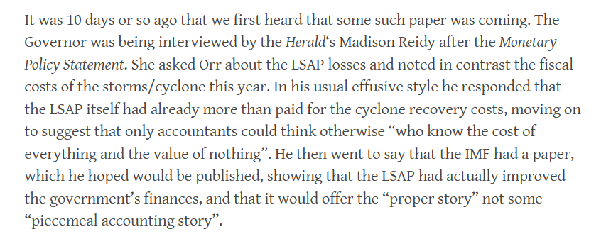
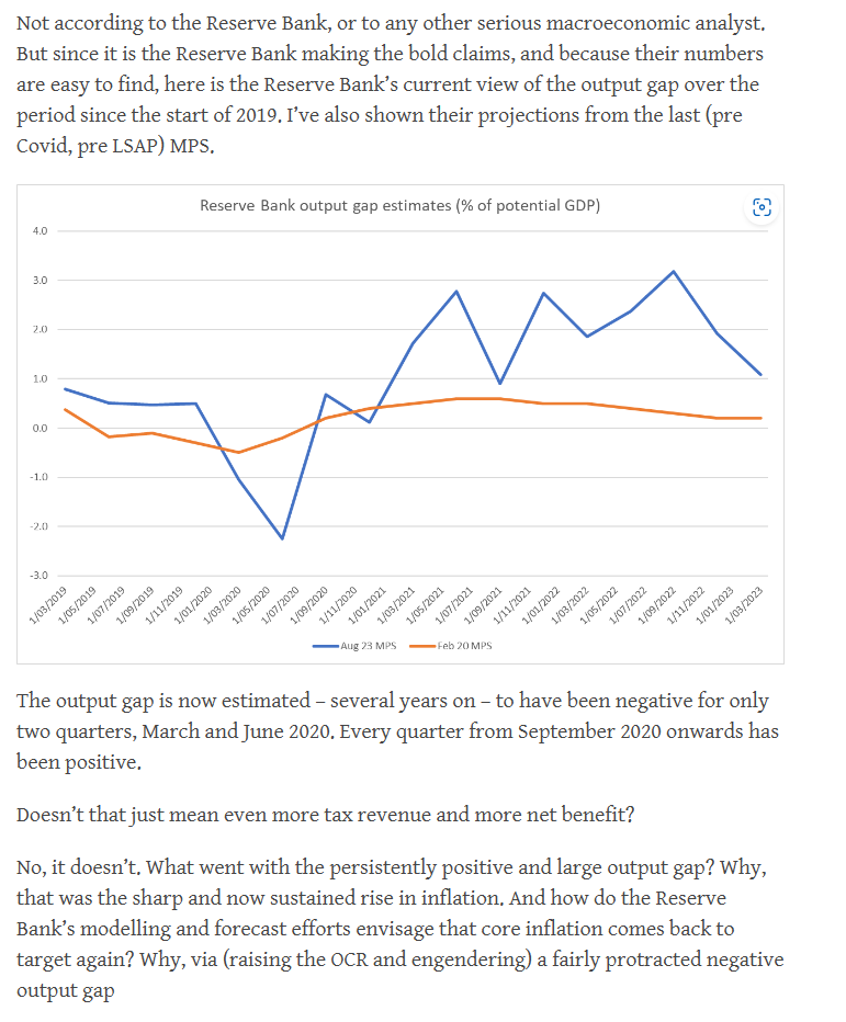
It was in mid-August that this particular bit of shameless Reserve Bank spin got going. From a post in late August
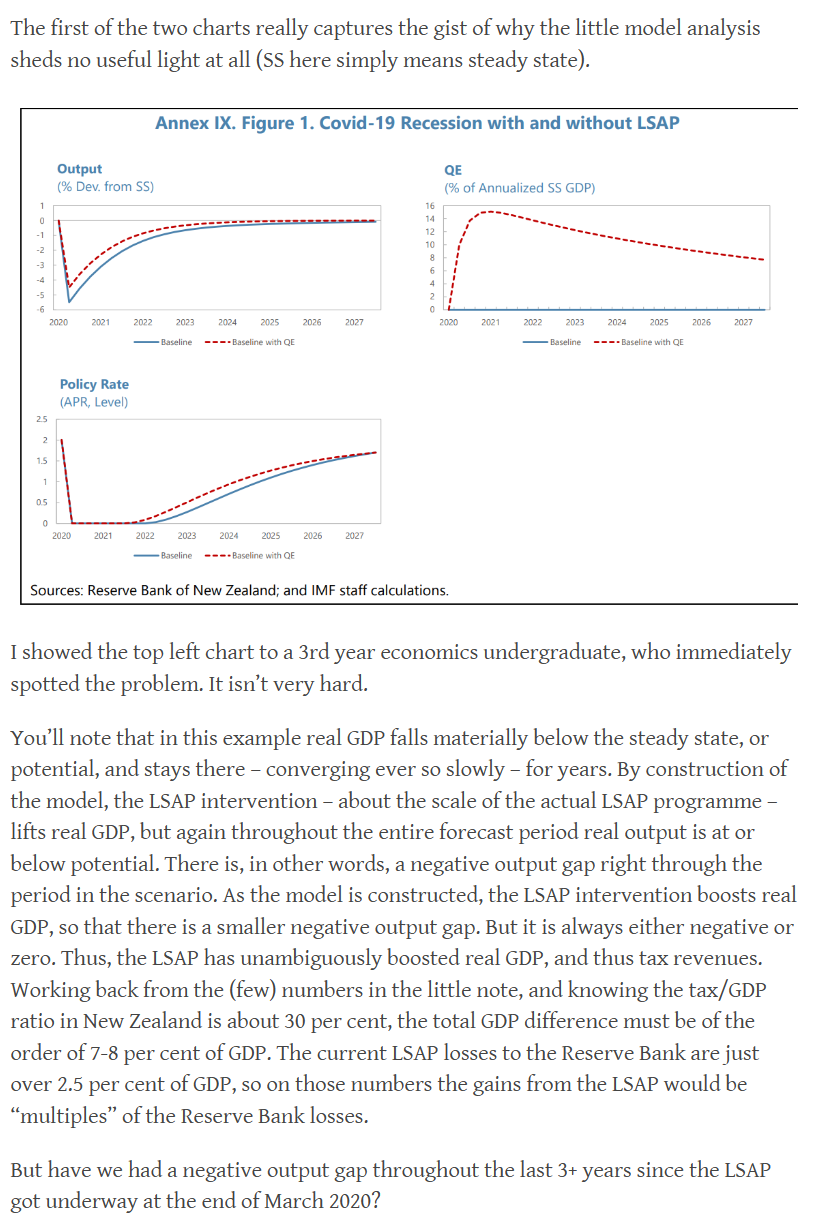
It proved to be nonsense of course. Once we had access to the short little IMF piece, published at the back of the Fund’s Article IV review, it was clear that it all amounted to a case of “if you assume big beneficial economic effects from the LSAP, then you get material tax revenue gains”, which might be set against the actual losses on the trade.
But the IMF’s picture bore not the slightest relationship to New Zealand reality through the LSAP period.
But none of that stops the Bank.
Here was their Annual Report, which will have been signed off by the Bank’s Board – the ones with little or no subject expertise.
And then this week their deputy chief executive responsible for monetary policy and markets – the one with no subject expertise at all – was at it in a speech given to investors etc in Sydney.
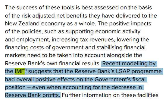
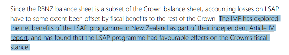
Now I have not seen any analyst endorse that little IMF exercise. And you can sort of tell that even the Bank knows it is shonky (but convenient). Note that both in the Annual Report and Silk’s speech they are careful not themselves to claim that the LSAP was profitable for the taxpayer, just to report (what is factually accurate) that the IMF – or at least a couple of back office researchers, given a couple of hours to play with a toy model – said it was. Silk herself only claims that the losses (they aren’t just “accounting losses” but real ones for taxpayers) are offset “to some extent” by other fiscal benefits to the Crown (and there might be even some very slight extent to which that is so, but it is by no means guaranteed). And the Annual Report text takes a similar approach – citing the IMF, without actually endorsing its work, but leading the casual reader to assume they did. The Bank knows better and simply choose egregious spin – the sort of dishonesty we might have got used to from politicians, but shouldn’t have to put up with from independent technocrats.
But here we are dealing with Quigley and Orr, who know better but seem to have a tenuous relationship with truth and serious analysis whenever something otherwise suits. And Silk, who may know no better – but can surely read, if she were at all curious – who is the senior manager with overall responsibility for the Bank’s macro and monetary policy analysis.
None of them should be in their roles (Silk should simply never have been appointed to hers). But will the new government care enough to do anything about this situation, or will spin and dishonesty continue to characterise our central bank, while those with the power to do anything about the situation get on with simply holding office?
I did a couple of media interviews this morning on the fiscal challenges facing the new government if, as seems likely from other reports, the foreign buyers tax promised by National can’t be got across the line when the agreements with ACT and New Zealand First are reached. Preparing for those prompted me to refresh my memory of a few of the relevant numbers.
There are several relevant points:
if the work I was part of before the election was roughly right (and we may never know if the tax is indeed stillborn), the fiscal challenges with the tax would not have been a lot less than they will be without it. National’s costings assumed revenue of about $735m a year, and our work (and the experiences in places like Vancouver) suggested that something not much above $200m was more likely.
since total government revenue this year is forecast to be $134bn and GDP to be $417bn, the estimated annual revenue from the foreign buyers tax (on National’s own numbers) was always fairly modest in macroeconomic terms (under 0.2 per cent of GDP, when the fiscal deficit this year is forecast by The Treasury to be 2.7 per cent of GDP).
National, like Labour, has suggested it will deliver operating balance surpluses from 2026/27, without being at all specific as to how they would get from here to there (structural deficits do not simply fix themselves), and was inclined during the campaign to play down the severity of the deficit, in favour of an emphasis (like Labour’s) on new shiny baubles to lure in the voters. These two charts (using the recent IMF numbers for comparison) were from a post the day before the election.
All of which is to say that there were pressing fiscal challenges whether or not the foreign buyers tax went ahead, and the scale of those challenges isn’t much changed if it can’t be proceeded with. There might be a larger political challenge – remember the emphasis National put on everything being fully-costed and funded – but then again in MMP any pre-election programme is to some extent only an opening bid in post-election government-formation discussions.
This is the summary table from National’s fiscal plan document.
You’ll see that in the first full year (24/25) the plan envisaged being modestly net positive fiscally (that $537m in the bottom line), mostly because the promised interest deductibility changes would be phased in.
So the new government – or National more specifically- could just argue that for the first year anyway the loss of the foreign buyers tax still left their numbers for that year – the next year’s Budget – looking okay (lose $700m, but they already have a margin of $500m). And if they wanted to change tack and accept that argument I and others had made that the foreign buyers tax revenue wasn’t going to be disinflationary (since it was mostly coming from people outside the economy, so wasn’t reducing domestic private spending) they could even argue that scrapping it wouldn’t materially complicate the fight against inflation.
Or they could delay/rephase any of a number of the other specific items in that table. Delay the income tax cuts by a quarter and you save $500m in the first year, and push back the interest deductibility changes and childcare subsidies by a year and you save another $500m in the first year (perhaps a little more to the extent interest rates are a bit higher now than was allowed for in the costings). Rejigging the first year on the table – 24/25 – really isn’t a particular problem (at least if the foreign buyers tax were the only material change to National’s plan).
But it would further increase the challenges – which will already be severe – on both the 2024 and 2025 Budgets, which will mainly determine whether there is a serious chance that in election year 2026 the Minister of Finance will be able to produce a budget that year with a credible prospect of an operating surplus for 2026/27. It isn’t impossible that the extent of the increased pressure might be small – there are several more rounds of Treasury fiscal and economic forecasts to come (including one next month) and the outlook could be a little less unfavourable than it has been (although things could go the other way too) – but it wouldn’t be a promising start after the last few years of fiscal incontinence.
One way of covering any gap over time is, of course, fiscal drag. Recall that National was very non-committal on future adjustments to tax brackets for inflation.
The more government formation locks in fiscal pressures now the less likely any future band adjustments become.
My bottom line in all this is that on its own the loss of the foreign buyers tax isn’t critical or determinative, but it should simply sharpen the focus on the key questions that were there all along even just on National’s own programme: are they willing and able to make hard choices across successive budgets to get the government accounts back to surplus, and can they do it (as they promised, with all the options they ruled out) without cutting into programmes, or taking some of their own promises off the table. I’m somewhat sceptical – and there are some easy, low-value, programmes they should not have committed to keep (eg fees-free, winter energy payments, Kiwisaver subsidies) – but at present we really don’t have a lot to go on (eg all the attention has been on a possible NZ First win around the foreign buyers tax, and not at all on what ACT might succeed in securing). But National might have been on stronger ground had it spent more time in the campaign highlighting the fiscal mess Labour was leaving and less on shiny new baubles it was offering.
2.5 months ago, when National’s Back Pocket Boost plan was released I made a quick comment on Twitter that promising tax cuts in the current climate was almost a definition of fiscal irresponsibility. The deficits they’ve inherited aren’t National’s fault but they will very shortly be its responsibility (shared with partners, but National is the biggest party and Willis is to be the Minister of Finance), and the focus should have been first on closing those structural deficits, not on upfront tax cuts and vapourware commitments to surplus one day, but not yet.
In this morning’s edition The Post has a double-page article about what Nicola Willis might be like as Minister of Finance. Those of my comments that were included are here
My bottom line was actually very similar to that of CTU economist, Labour champion, and former political adviser to Grant Robertson who was quoted as saying that only time will tell whether Willis makes a good finance minister, specifically “you don’t master these things overnight”. That said, I was a bit less impressed by the one campaign event I saw her at (the Stuff finance debate). I’m anything but a fan of Robertson – I think he ends up having been the worst Minister of Finance New Zealand has had in the post-liberalisation decades – but I thought Robertson had the better of her. Despite the government’s poor economic record and Willis’s apparent past debating prowess, perhaps 9 years’ experience as Labour’s finance person counted?
Willis comes to the job with relatively limited experience in the portfolio. Contrast her 18 months as the spokesperson with the 9 years Michael Cullen had before taking office (having sat in Cabinet for three years before that), or the similar background Bill English had had by 2008 (he hadn’t been spokesman for that long, but had briefly held a finance portfolio late in the previous National government). David Caygill and Steven Joyce both came to the job late in their respective governments’ terms, having served as senior economic ministers for years previously. Willis’s record is perhaps closest to that of Grant Robertson (neither had an economics background, and Robertson had had only 3 years as opposition finance spokesman). Neither has ever run anything much previously either, so again there isn’t a great deal to go on.
One might think of three aspects of the role of Minister of Finance:
senior political operator and parliamentary figure,
manager of the government’s finances,
lead figure in overall economic strategy.
The first of those isn’t really my territory. But it was probably where Robertson did best. He seemed to be a very effective figure in the House and a formidable debater etc. That isn’t nothing, especially when (as they will, for any government) things go badly at times. Perhaps Willis will be similarly effective (she was, like Robertson, primarily a political operative by background).
But beyond that it is very hard to know. One could mount an argument that at least in the first couple of years Robertson didn’t do a bad job at all managing the government’s finances (the left thought him far too disciplined), but he’d inherited a fairly easy position (budget surpluses, unemployment falling etc). The problems really became apparent once the worst of the Covid disruptions were over, and instead of insisting on steering a path back to surplus (in an overheated economy), Robertson presided over additionally expansionary budgets both last year and this, such that he bequeaths large deficits in a country that for 25 years had largely avoided them. There seemed to be an inability or unwillingness to say no (and that in a government with no pressures from coalition etc parties).
How will Willis do in that role? There really is no way of knowing at this point. No doubt officials in Treasury have been beavering away for weeks preparing advice for an incoming Minister of Finance, one who plans to bring down some sort of mini-Budget within what will be not much more than her first five weeks in office, and will quickly have to focus on next year’s Budget. But as to what hard calls she is willing to make, or to insist on (both her Prime Minister and the other parties will have different views on things) no one knows. There is no track record (or nor really can there be, especially when neither she nor Luxon has previously served as a minister).
I’m not overly optimistic, including because of the reluctance to put the seriousness of the fiscal situation front and centre during the campaign, preferring to run a campaign in which – like Labour’s – (faced with large deficits) it was more a contest of who had had the shiniest new baubles to bribe voters with, financed by proposed tax changes that – like Labour’s – had little no economic merit, and around which there were also serious questions about the revenue they might raise. As to the foreign buyers’ tax business, my unease was less about whether or not the revenue estimates are roughly right – in macro terms it was always second order – than about the way she and her leader handled the issue, refusing transparency, refusing to release any of the modelling, relying on “trust us” assertions when it wasn’t particularly obvious why – with the best will in the world – we would. Verification helps underpin trust, and there was none of the former.
Being Minister, backed by a phalanx of Treasury staff and analysis, is different than being opposition spokesperson in a campaign. But it isn’t Treasury that makes the hard political calls (and too often in the last few years Treasury itself seemed more inclined to favour bigger government over balanced budgets). There is clearly now some political mood for restraint – even Labour seemed to get it in the last few weeks – but how well, and for how long, will that shape Beehive decisionmaking when the pressures from the numerous vested interests (of all sorts) mount?
My own unease is greatest around that “lead figure in overall economic strategy” role. There will be other senior ministers no doubt, but a Minister of Finance who is deputy leader of the main governing party should be able to be looked to as the key player in this area. And it is where, in her time as finance spokesperson, there is little sign that she has any more credible a model – or any more substantive interest – than Grant Robertson had for (for example) reversing the decades of economywide productivity growth failure. We shouldn’t look to the (any) Minister of Finance as some sort of economic guru, but there is little or no sign that Willis is greatly interested or has made any effort to surround herself with advice, expertise, or even active debate about what might be needed. The risk is that holding office will be sufficient, rather than doing something much in it. There is, of course, the 100 point economic plan (which when I read it I probably agreed with a majority of the items in it) but a list that long really is a list rather than a strategy backed by a compelling narrative. And it isn’t as if The Treasury seems to have much to offer there either (as distinct from narrower expenditure control stuff).
Who knows. We’ll see before long I guess. If I’m “not a big fan” – and I’m not – it is a long time since I’ve had much confidence in any senior New Zealand political figure (or most of their top bureaucratic advisers – an issue for Willis since The Treasury is weakly led, and entities she will be responsible for like the Reserve Bank and Productivity Commissions are worse. What, if anything, she is prepared to do about the leadership of these three agencies will be an early test). It would be great to be pleasantly surprised.
(In the snippet above I included Bryce Wilkinson’s comments, partly because he runs a quite different line about Michael Cullen than the quote from me. The background to my own comment was the observation that one didn’t need to have an economics background to be an effective Minister of Finance. Cullen’s politics were very different to my own, but I have here several times defended his fiscal management, noting that he proved to have been very badly advised by Treasury, which told him that even in the face of expansionary budgets late in his term the Crown accounts would remain in operating surplus over the forecast period. That proved to be very wrong, but it is The Treasury that is paid to do the numbers and provide those reckonings. A couple of posts on that are here and here.
All that said, when I wrote about Cullen’s book I ended the post this way
Those last few lines are the sort of thing that could fairly be said of pretty much all our Ministers of Finance for decades.
It would be great if Nicola Willis were to be different. But there aren’t yet many positive straws in the wind.
By which I mean here the New Zealand housing markets (though how many other glaring New Zealand policy failures could the term be used of?).
I’ve written a couple of columns for the Wellington magazine Capital on housing policy issues (here and here for the 2021 ones) and a few weeks ago the editor asked if I’d do another one. It had to be finalised before the election, which was fine with me as whatever superficial differences there were between the policies in this area of the two main parties none seemed seriously interested in, or to have policies to deliver, dramatically and sustainably lower house prices.
I noticed this morning that the magazine is on the news-stands, but I doubt it is a magazine that is much available or read outside Wellington, so here is a link to close to the final text. Word limits mean one can’t cover everything, or anything in great depth. With a bit more space I’d have made the point that squabbles over interest deductibility, foreign buyers’ bans/taxes and so on really should be peripheral to the heart of the issue, making it easy to bring land into housing use, and easy to build.
The two sides of politics have recently been offering competing (if overlapping) visions of a better-functioning market. Labour and its allies tend to be reluctant to see increases in the physical footprint of our cities and they back the recent law change in which, for example, three-storey dwellings can be put up almost anywhere. They are keen on encouraging intensification, almost as end in itself. For them single-family homes, with a backyard and garden, in our cities are some throwback to the 1950s, or a future preserve of the relatively wealthy. In and around greater Wellington, the regional council seems intent on further restricting greenfields development.
National, by contrast, is now offering a different model in which local councils can make choices: they have to zone enough land residential to cover 30 years of future housebuilding needs, but that can be done by focusing on intensification or by increasing the physical footprint of cities.
Neither seems to offer a path towards a well-functioning market characterised durably by much cheaper prices for houses and peripheral urban land. Labour’s approach might well increase urban intensity, but nothing in the international experience suggests that will lower house or land prices. National’s approach will tend to increase the physical footprint of some cities – in others, probably including Wellington, a council with an ideological commitment to density will probably opt to stick with the Labour approach – but still falls far short of creating genuine competition, where owners of land in and around urban area are aggressively competing to attract developers and buyers, keeping down house prices (and, over time, rents).
We need to get councils out of the mix completely, and enable real choice and competition. On the one hand, allow any geologically-suitable land to be built on to any height, so long as the builders and developers face the costs of providing water services etc. If someone wants to – although it is hard to imagine – build a 20-storey apartment block on a big property in the Ohariu Valley there is simply no pressing public policy reason to stop them. But we also need to enable small groups of individual property owners (perhaps at the scale of a city block) to act collectively, and cheaply, to limit development on their own properties, but only on their properties, if that is their choice. This model seems to have worked very well in big and fast-growing Houston, which has seen not only the expansion of the physical footprint of the city, but also a lot of intensification. Provide that option – akin to the covenants seen in plenty of new private subdivisions, allowing for the terms to be amended by supermajority (perhaps 75 per cent of owners) – owners can collectively make their own choices, at their own cost, about the development rules for their own blocks of land. Subsequent choices for more intensive development can also then be managed collectively.
We could, and should, do so much better. Renting and buying should be easy and cheap. The path to such outcomes – as in so many other sectors – is aggressive competition. Sadly, our councils and our main political parties aren’t too keen on competition, and still think governments should get to determine the shape of developments. The young and the poor pay the price.
That penultimate paragraph champions an approach I have been running for some years now. I wrote a post last year on the Houston experience, drawing from the book “Arbitrary Lines” by an American (centre-left I’m sure) urban planner, Nolan Gray. Here are the last few paragraphs of that post.
It is easy to develop on the margins of Houston, it is fairly easy to develop in much of the existing city, but those individual groups of landowners who want to have collective rules for their own properties can do so, and the local authority will enforce those rules on those properties. Deed restrictions are not set in stone for ever, but appear to be often time-limited and requiring a further (super-majority) vote of the then owners (a different group than 25 years earlier typically) at expiry to renew them.
It seems like a model that has a lot to offer here, and which should be looked at more closely by (a) officials, and (b) political parties exploring the best durable way ahead for New Zealand.
Those not operating in good faith – or at least much more interested in other agendas than a) widely affordable housing, and b) property rights (individual and collective) – would no doubt hate it. And, for the moment, they have the momentum – National and Labour last year rushed through legislation that stripped away many existing restrictions, and as a technical matter the government can if it likes force individual city councils to do as it insists. But governments can lose elections too, and if we are serious about much lower sustainable real house prices – and it isn’t clear how many central or local government figures are – we need durable models. The Houston model has proved to work, both in managing the politics and in delivering a city with widely affordable housing, and a wide range of available housing types. And if greenfields development is once again made easy – as distinct from say Wellington where the regional council is currently trying to make it even harder – urban and suburban land prices would fall a lot, and stay down.
One of the arguments some mount for over-riding local community preferences is that “people have to live somewhere”, suggesting that it is unacceptable (even “selfish”) for existing landowners (acting collectively) to protect their own interests and preferences for their own land. But that argument rests only on then unspoken earlier clause “because we will make it increasingly difficult to increase the physical footprint on cities”. Allow easy development, of all types (internalising relevant costs), and there is just no reason to ride roughshod over the collective interests of existing groups of landowners, providing they can restrict things only for their own group of properties.
Some might push back and argue that there is nothing to stop groups of landowners forming private covenants now on existing properties, and I gather that is legally so. But coordination issues and transactions costs are likely to be very high, and people seek to use political channels instead. How much better if we provided a tailor-made readily enforceable collective action model, and then got politicians right out of the business of deciding what sort of houses can be built where.
And, to be clear, as someone living at the end of a hillside cul-de-sac I would have no interest in a Deed Restriction for our property. My interest is ending the evil that is Wellington price to income ratios of 8x or more, and enabling ready affordability for the next generation.
I’ve written a few posts in the last few months about the strange approach that the Reserve Bank has been taking to thinking and talking about the impact of fiscal policy on demand since May’s Budget. Background to the material in this post is here (second half, from July), here (mid-section, commenting on the August MPS), and here (September, in the wake of PREFU.
Up to and including the February MPS the Reserve Bank’s approach to fiscal issues was pretty much entirely conventional. What mattered mostly for them – and for the outlook for pressure on demand and inflation – was not the level of spending or the level of revenue or the makeup of either spending or revenue, but discretionary changes in the overall fiscal balance. Adjust the headline numbers for purely cyclical effects (eg tax revenue falls in economic downturns) and from the change in the resulting cyclically-adjusted surplus/deficit from one year to the next you get a “fiscal impulse”. That is/was an estimate of the pressure discretionary fiscal choices were putting on demand and inflation. For a long time, The Treasury routinely reported fiscal impulse estimates – and estimates they always are – along these lines, and had developed the indicator specifically for Reserve Bank purposes twenty years ago.
If the cyclically-adjusted deficit (surplus) is much the same from year to year the fiscal impulse will be roughly zero. A central bank typically isn’t interested that much in whether the budget is in surplus or deficit, simply in those discretionary changes. Back in the day, for example, we upset Michael Cullen late in his term when he was still running surpluses, but shrinking ones, when we pointed out that the resulting fiscal impulse (from discretionarily reducing the surplus) was putting additional pressure on demand and inflation, at a time when inflation was at or above the top of the target range. Whether or not what he was doing made sense as fiscal policy, it nonetheless had implications for the extent of monetary policy pressure required, and it was natural for us to point this out (as with any other major source of demand pressure).
Among mainstream economists none of this is or was contentious. International agencies, for example, routinely produce estimates of cyclically-adjusted fiscal balances, partly to help readers see the direction of discretionary fiscal policy choices. Plenty of past Reserve Bank documents will have enunciated this sort of approach.
It was also this sort of thinking that led to an amendment to the Public Finance Act in 2013
(NB: The Treasury has made analysis of this sort harder in recent years, as in 2021 they changed the way they calculate and report the fiscal impulse, in ways that make little sense and reduce (but don’t eliminate) the usefulness of the measure as they report it. These changes further undermined the usefulness of New Zealand official fiscal indicators – already generally not internationally comparable – but do not change the fundamental economics, which is the focus in this post.)
But suddenly, in the May Monetary Policy Statement – a document released just a few days after the government’s election-year Budget – there was a really major change in the approach the Bank and the MPC were taking to fiscal policy.
No one much doubts that the Budget was expansionary. Here, for example, was the IMF’s take in their Article IV review of New Zealand, published in August but finalised just 6-8 weeks after the Budget
There also wasn’t much doubt that the Budget (and thus demand pressures over the following 12-18 months – typically the focus of monetary policy interest) was more expansionary than had been flagged in the HYEFU at the end of last year. As I’d noted in the first post linked to above
For the key year – the one for which this Budget directly related – the estimated fiscal impulse had shifted from something moderately negative [in HYEFU] to something reasonably materially positive [in the Budget]. The difference is exactly 2.5 percentage points of GDP. That is a big shift in an important influence on the inflation outlook – which in turn should influence the monetary policy outlook – concentrated right in the policy window.
But how did the Reserve Bank treat the issue?
They were at it again in the August MPS, and in the next day’s appearance at FEC.
These sorts of lines – including one of the Governor’s favourites that fiscal policy was being “more friend than foe” – helped provide cover for the Minister of Finance, who was fond of suggesting to reporters that after all the Reserve Bank wasn’t raising any issues.
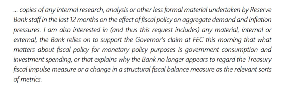
Some mix mystified and frustrated, I lodged an OIA request with the Bank seeking
If they really did have a thoughtful and well-researched new approach to thinking about fiscal policy and the impact on demand pressures, surely they’d be keen to get it out there. It didn’t seem likely there was anything – there were no footnoted references to forthcoming research papers etc – but….you never know.
But we do now. The Bank responded last month (I was away, and then distracted by election things so only came back to it last week). Their full response is here
They withheld in full the relevant sections of the forecast papers that go to the MPC prior to each OCR review. This is a point of principle with the Bank whereby they assert that to release any forecast papers from recent history would “prejudice the substantial economic interests of New Zealand” (I did once get them to release to me 10 year old papers, from my side as point of principle too). It is a preposterous claim – and needs to be fought again with the Ombudsman (or perhaps a Minister of Finance seriously committed to an open and accountable central bank) – in respect of documents that are many months old, but for now it is what it is.
That said, it would be very surprising if there was anything at all enlightening on the Governor’s change of tack in those withheld papers. The Bank’s economic forecasters rarely did fiscal analysis very well and those sections of the forecast papers were often fairly perfunctory (recall that the Bank takes fiscal policy as conveyed to them by the Treasury, just adjusting the bottom line deficit/surplus numbers for differences in macroeconomic forecasts (eg affecting expected revenue for any given set of tax rates)). More importantly, in the documents released there is nothing else from prior to this change of official approach in May – no internal discussion papers, no draft research papers, no market commentaries circulated approvingly, no overseas academic pieces, just nothing.
In fact, the first document dates from 31 July this year, a 14 page note from analysts from a couple of teams in the Economics Department with the heading “Fiscal policy – seeking a common understanding”. Had there been a serious analytically-grounded push for a new approach, you might have expected such a paper to have been prepared and presented to internal groups and to the MPC well before such a change featured in the MPS. But that change was in May…..and the document dates from the end of July (may have been prepared with the then-forthcoming August MPS in mind). It has a distinct back-filling feel to it.
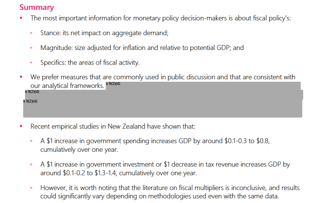
Here is the paper’s summary
You notice that again they are invoking alleged potential jeopardy to New Zealand “substantial economic interests” to tell us which fiscal indicators these two analysts favour – rather weirdly given that the Governor has already told us (in MPSs) and told Parliament’s FEC which ones he thinks matter most.
But that withholding quibble aside, there isn’t anything really to argue about in that summary. I’m not entirely convinced that a fiscal multipliers approach is the best way of tackling the issue, but having done so they report nothing – not a thing – suggesting that what matters for monetary policy is primarily government consumption and investment spending (as distinct from transfers, taxes, or overall fiscal balances). It is an entirely orthodox position, but quite at odds with the line the Governor and the MPSs had been spinning.
(The paper does have a short box noting in the Bank’s economic model – NZSIM – government consumption and investment are identified separately, while the model itself does not have explicit components for tax rates or transfers but – sensibly enough – this gets no further comment in the paper, and does not mean that changes in tax or transfer policy make no difference to the projections the MPC is considering).
There isn’t very much in the paper on the interaction with monetary policy, but there is this
which is all fine and shouldn’t be at all contentious, but none of its suggest that changes in fiscal deficits don’t matter for the extent of monetary policy pressure and that – as the Governor took to claiming in the wake of the expansionary Budget – that all that mattered was government consumption and investment.
At the back of the paper there is a five page Appendix on all the Treasury measures of fiscal policy. Each appears to have been scored for “usefulness for monetary policy purposes” and while the comments have been released they appear to have withheld – jeopardising those substantial economic interests again apparently – scores or rankings of each item.
They do have items for Government Consumption and Government Investment. Under “usefulness for monetary policy purposes” the comment – on both – is simply “Government consumption [investment] provides information about the type and size of government activity”. Quite so, but…..not really about monetary policy.
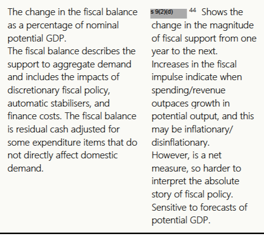
But then we come to the item “Total Fiscal Impulse”. Here is what they say
These analysts from the Bank’s Economics Department are entirely orthodox. I would qualify their comments slightly because – as alluded to above – this new “Total Fiscal Impulse” measure is clearly inferior for purpose than the previous Fiscal Impulse, but they are clearly on the right track. They recognise that changes in fiscal balances can affect the outlook for demand and inflation (and hence monetary policy pressure). They go on to briefly note that the impulse was estimated to be strongly positive in the 2023/24 fiscal year (the primary focus for monetary policy at the time).
It isn’t a startlingly insightful paper, but that is fine. It is largely rehearsing long-established conventional perspectives, and if it was at odds with anyone……well, it was only with the Governor and the MPC. And I guess one can’t really expect junior analysts to take on the powers that be. But it is still just a little surprising perhaps that this 31 July paper contains no reference – not one – to the strange new Orr model that had suddenly overtaken the MPS. One might, for example, have hoped that the Chief Economist might have provided a lead, and even perhaps affixed his name to the paper…..but then he is an Orr-appointee and must have signed up to the weird MPS approach too.
There is one more document in what the Bank has released to me. It is undated, has no identified author, and is headed “Fiscal policy in the August 2023 MPS”, suggesting that there is a reasonable chance it was written specifically for the purposes of responding to my OIA.
There are two parts to this 1.5 page document. The first page lists four statements on matters fiscal from the August MPS and outlines “supporting evidence”. Of those, three are simply irrelevant: there has never been any dispute about the fact that in the 2023 Budget real government consumption and investment was expected to fall as a share of GDP over the next few years (although note that for setting monetary policy in mid 2023, what might or might not happen to some components of the budget in 2026 is simply irrelevant – monetary policy lags are shorter than that).
The fourth is “interesting”
You might have supposed that this statement had appeared in the August MPS. It doesn’t. “Fiscal policy” hardly appears at all (and nothing about what it will be doing over the period monetary policy is focused on) and “discretionary fiscal policy” doesn’t appear at all.
But beyond that it is still just spin. What happens by 2027 is (again) irrelevant to today’s monetary policy, and even if the cyclically-adjusted deficit is still forecast to narrow in the shorter-term the extent of that narrowing by Budget 2023 was materially less than what had been envisaged – and included in the RB forecasts – at HYEFU 2022. Fiscal policy is putting more pressure on inflation and demand than had been envisaged at the end of last year, exacerbating pressures on monetary policy. That was – and apparently is – the point the Governor still prefers to avoid acknowledging…..something Robertson was probably grateful for.
The second half of this little note is headed “Why haven’t we referred to other measures of fiscal policy?”
Of the four bullets, again there is no real argument with three of them
To which one can mostly only say “indeed”, but then no one suggested the central bank should look at either of the allowances – which in any case are only on the spending side of the balance. As for the operating balance, I’m not going to disagree, but……mentioning it would be typically less bad than the highly political mention of only one bit of the overall fiscal balance (direct government consumption and investment).
What of the fourth?
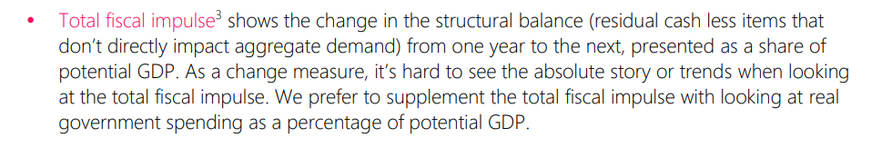
That is just weird. Take that penultimate sentence: it is a change measure that you want when it is monetary policy and inflation you are responsible for. The change is what changes the outlook for demand and inflation. But then there is the rank dishonesty of the final sentence. They prefer to “supplement the total fiscal impulse” do they? But there was no reference to it – or to words/idea cognate to it – in either the May or August MPS. And the claim that they can somehow sensibly supplement as fiscal balance based measure – which already includes taxes, transfers, and real spending – with “real government spending” is, it seems, simply plucked from thin air. It doesn’t describe what they’ve actually done these last two MPSs, it isn’t an approach even mentioned in the Economics Department’s July note (see above), and as far as I can see it has no theoretical or practical basis whatever.
It is just making stuff up.
We’ve had several previous attempts by Orr to actively mislead (Parliament or public) or make claims that prove to have no factual analytical foundations. There was the claim to FEC that the Bank had done its own research on climate change threats to financial stability, claims trying to minimise the extent of turnover of senior managers, claims regarding the impact of this year’s storms on inflation, claims that inflation was mostly other people’s fault (notably Vladimir Putin). Each of these has been unpicked in one way or another – the first via the OIA, the second via a leak, the third via one of his own staff piping up to correct things in FEC, the fourth simply be patiently setting down the numbers and timing. There have also been entirely tendentious claims around the LSAP, including his attempt – repeated in the recent Annual Report – to assert that the LSAP made money for taxpayers, despite the simplest review of the exercise he used in support of this claim showing that it simply didn’t provide any serious support for his view.
Every single one of those was bad, and should have been considered unacceptable, by both the Minister of Finance and the Bank’s Board. A decent and honourable Governor would simply never have done them. But bad as they were, those were self-serving misrepresentations.
What has gone on around fiscal policy this election year seems materially worse. We make central banks operationally independent in the hope that they will do their job without fear or favour, and without even hint of partisan interest. But faced with a Budget that complicated the task of getting inflation down, that was materially more expansionary than had been envisaged just a few months previously, Orr (and his MPC colleagues, reluctantly or otherwise) chose to completely upend the traditional approach to thinking about fiscal impacts on demand and inflation pressures, and tell a story – and a story it was – that tried to gloss over what the Minister of Finance had done, ignoring what mattered in favour of what was at best peripheral. Whether that was for overt partisan purposes is probably unknowable from any documents likely to exist, but it is hard to think of any other good explanation for what was done, espeically when – as this release shows – it was all based on no supporting analysis or research whatever.
The Official Information Act plays a vital role in helping expose events like this. It was never likely there was anything of substance behind Orr’s fiscal spin. But now we know.
(As to the attitudes of other MPC members, who clearly all went along since not a hint of a conventional perspective is in the minutes of the meetings around either MPS, there is a tantalising bit that was also withheld
Only one of the three relevant MPC meetings during this period, but the most recent. Was there some gentle unease from perhaps one member? We may never know, but at least this withholding appears to confirm that there are fuller minutes of MPC meeting, not just the bland summary published with each OCR announcement.)
PS. It is perhaps no surprise that the Reserve Bank has chosen not to put this OIA release out on their OIA releases page, even though that page was updated just a couple of weeks ago. It does not put the Bank in a good light.
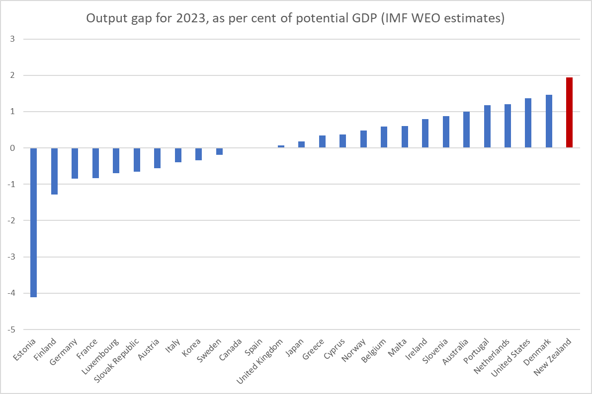
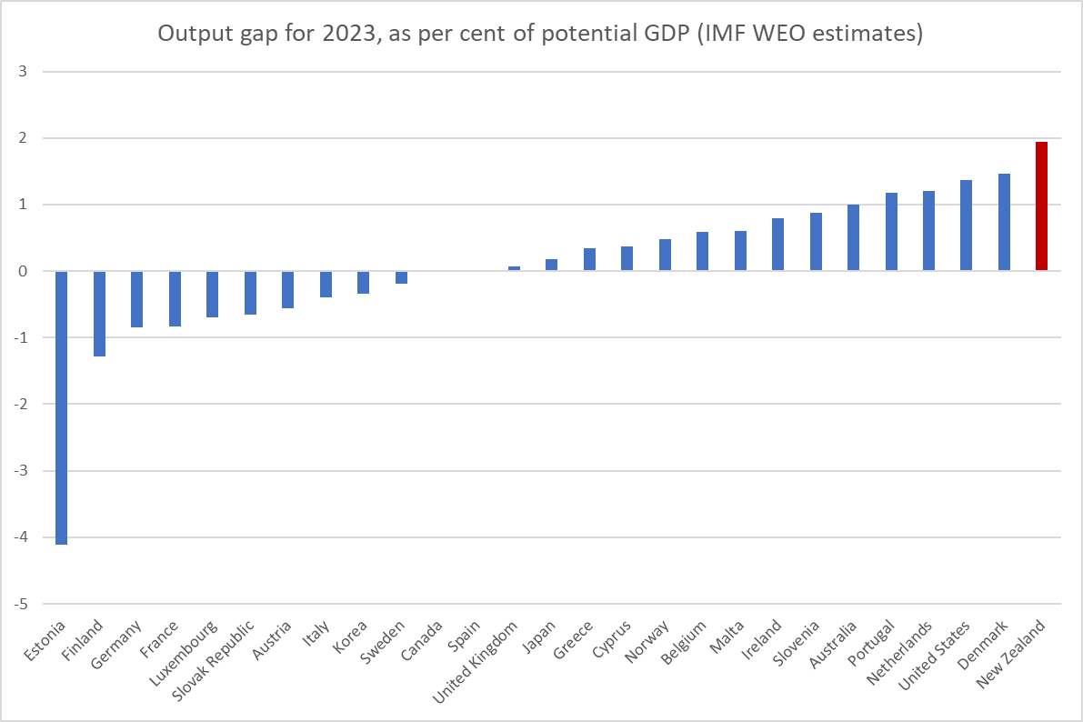
In my post last week on ANZ’s note on the balance of payments, I included this chart from the latest IMF WEO (numbers finalised late last month). On the IMF’s read we had the most overheated advanced economy this year taken as a whole.
ANZ themselves followed up with this chart
In its October World Economic Outlook the IMF estimated that NZ was the most overheated advanced economy in both 2022 and this year, a conclusion that is certainly consistent with observed stubborn non-tradeable inflation. https://t.co/N2PIDOTP5Wpic.twitter.com/ITlQo8SqE9
So as they see things now, New Zealand had the most overheated of any of the advanced economies for two years in succession.
(As a reminder, the output gap is the difference between actual GDP in a period and the analyst’s estimate of potential GDP – loosely, the level of GDP in a particular period consistent with avoiding imbalances emerging (be it inflation pressures or current account ones). Since potential GDP is unobservable (and actual GDP is forecast and subject to revisions), “the output gap” isn’t directly observable, even well after the event. But the numbers that forecasters put in their tables are still useful, because they tell us how those forecasters, and the organisations that employ them, are seeing capacity pressures in the economy. They might prove to be right, or be proved wrong, but it is the view they are signing on to. And the great thing about a collection of national forecasts like those in the IMF WEO is that it is a single organisation with a single broad methodology at a single point in time.)
When there is a large output gap (positive or negative) it is reasonable to start asking questions about the performance of the central bank. The reason we set up central banks with discretionary monetary policy is to reduce the extent or duration of those imbalances, while keeping inflation in check. Sometimes there can be tensions between those goals but in the presence of demand surprises one tends to see both positive (negative) output gaps and high or rising (falling) core inflation at much the same times. A large output gap and inflation well away from target in such circumstances is a mark that the central bank has not done its monetary policy job well.
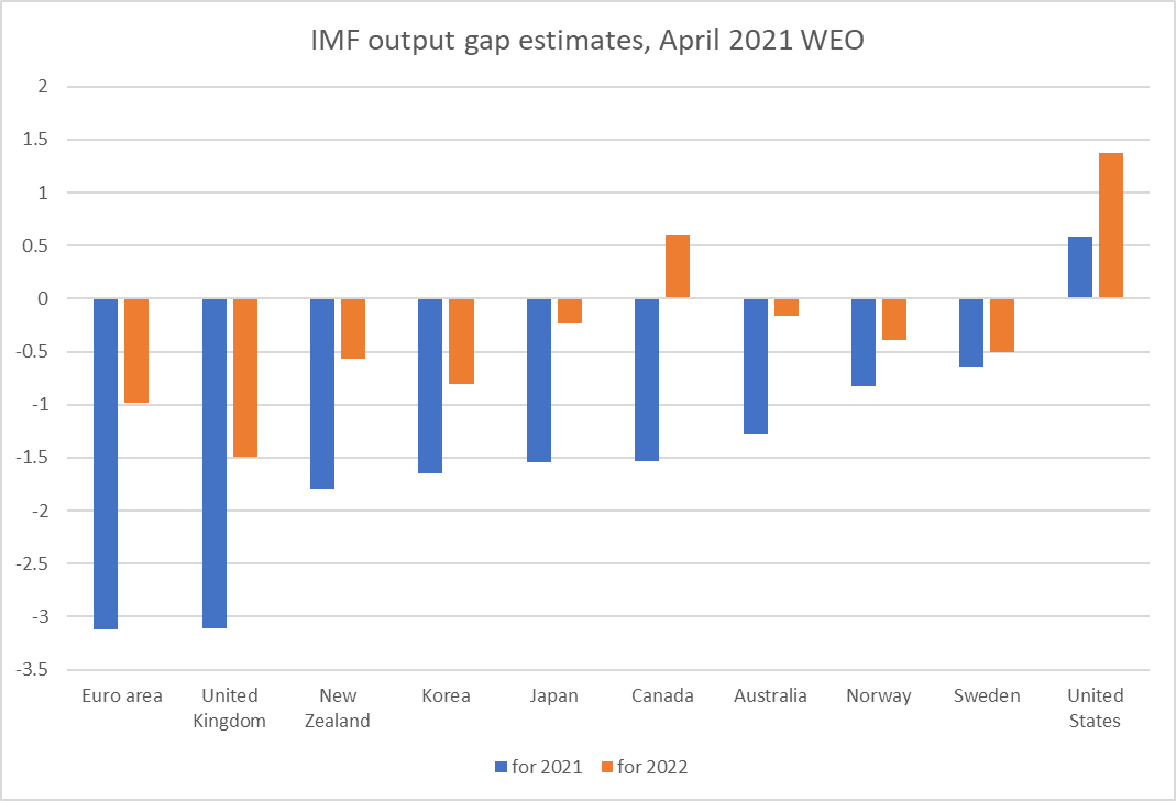
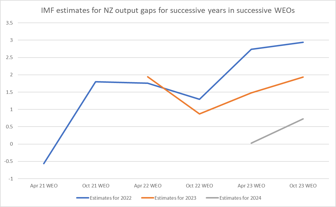
But it was all very well to spot that the IMF now believed the New Zealand economy to have been more overstretched than any other advanced economy for which they run these numbers – not that the IMF itself made this point in their recent Article IV report on New Zealand – but I was curious to see how their own thinking had evolved. Was this a new take on New Zealand’s relative position or not? And so I dug out the IMF output gap estimates/forecasts back to those published in April 2021.
And from here on I’m mostly going to concentrate, and illustrate, only the 10 countries/regions for which there is an output gap estimate and where there is a central bank with its own monetary policy. Most of those European countries in the earlier charts are subsumed in the euro-area estimate.
It is also important to mention that IMF projections are done on a current policy basis, so each of these charts is showing how the Fund thought economies would behave if the policy rate was left as it was at the point the forecasts were finalised.
Here is what the output gap estimates as at April 2021 looked like
New Zealand didn’t stand out, and if anything the Fund thought our output gaps for both 2021 and 2022 would be more negative than for most other countries. Recall that as this time, our domestic economy was recovering quite strongly, but perhaps the Fund was influenced by the likelihood of prolonged border closure (recalling that New Zealand has been a much bigger exporter than importer of both tourism and export education services). Locally, the Reserve Bank estimated in both its February and May 2021 MPSs that we’d have a negative output gap in 2021, but they expected – using endogenous policy rate forecasts – a positive output gap in 2022.
By the next WEO, the IMF’s view on New Zealand had changed quite sharply
By then – still amid the extended lockdown of Auckland – New Zealand was standing out as having, in both years, the second largest positive output gaps, behind only the US. (The Reserve Bank’s forecasts for New Zealand – which included some policy adjustment effect on the 2022 numbers – were pretty similar.)
I’m not going to show you the individual charts for the April and October 2022 and April 2023 WEOs because…..in all of them New Zealand is shown as having the largest positive output gap in both years (eg by 2022 forecasts for 2022 and 2023) of any of those any of these central banks were facing. Here is the October 2023 version though.
Here is how their New Zealand forecasts/estimates have evolved
Recall that all of these numbers were done on policy rates as they stood at the time (0.25 per cent in April 2021, 5.5 per cent in the latest forecasts), and yet the estimates of 2022’s output gap have just kept being revised up and there is no sign yet of their estimates for 2023 (or the few observations for 2024) being revised down, as one should have hoped.
So on the IMF’s telling all last year and this not only have we had consistently the most overheated economy in this set of advanced countries, but if anything the extent of the overheating has been revised upwards. If that was even close to being an accurate description of how things are it would add to the case (already evident in core inflation itself) that the Reserve Bank MPC has done a poor job, both absolutely and relative to its advanced country peers.
Here is the Reserve Bank’s own take over successive MPSs since the start of 2021.
It is telling that as early as February 2021 – eight months before they actually started raising the OCR – the Reserve Bank thought the economy would be stretched beyond capacity (which is basically what the output gap is) for each of the following three years.
It is also worth noting how stable their estimates for 2022 have been for a couple of years now, even as it passed from prospect to history. It isn’t a perspective you hear about from the MPC – a severely overstretched economy, and stretched to a magnitude that (on IMF reckoning) hadn’t been seen in any of these other advanced countries. As time has gone on they’ve increasingly revised up their view of how stretched things were in 2021 as well. None of these advanced economies are thought to have had 2 per cent positive output gaps two years in succession. But New Zealand did.
When we come to 2023 there is a big difference between the IMF view and the Reserve Bank view. Believe the IMF and 2023 as a whole still looks pretty bad – yet another 2 per cent plus output gap. But if you believe the Reserve Bank, for this year as a whole the output gap will have been almost zero (0.2 per cent on average), before the output gap goes deeply negative next year. The IMF of course does not agree with the Reserve Bank – there is a radical difference between the Fund’s view (0.7 per cent positive) and the negative output gap of 1.7 per cent of GDP the Reserve Bank expects for next year. If we simply slotted the Reserve Bank’s number into the IMF table/chart, the New Zealand output gap next year would be more deeply negative than those for any of the other advanced economies.
Now you might be thinking, “well, even if they got things wrong initially, hasn’t the Reserve Bank done a lot since?”
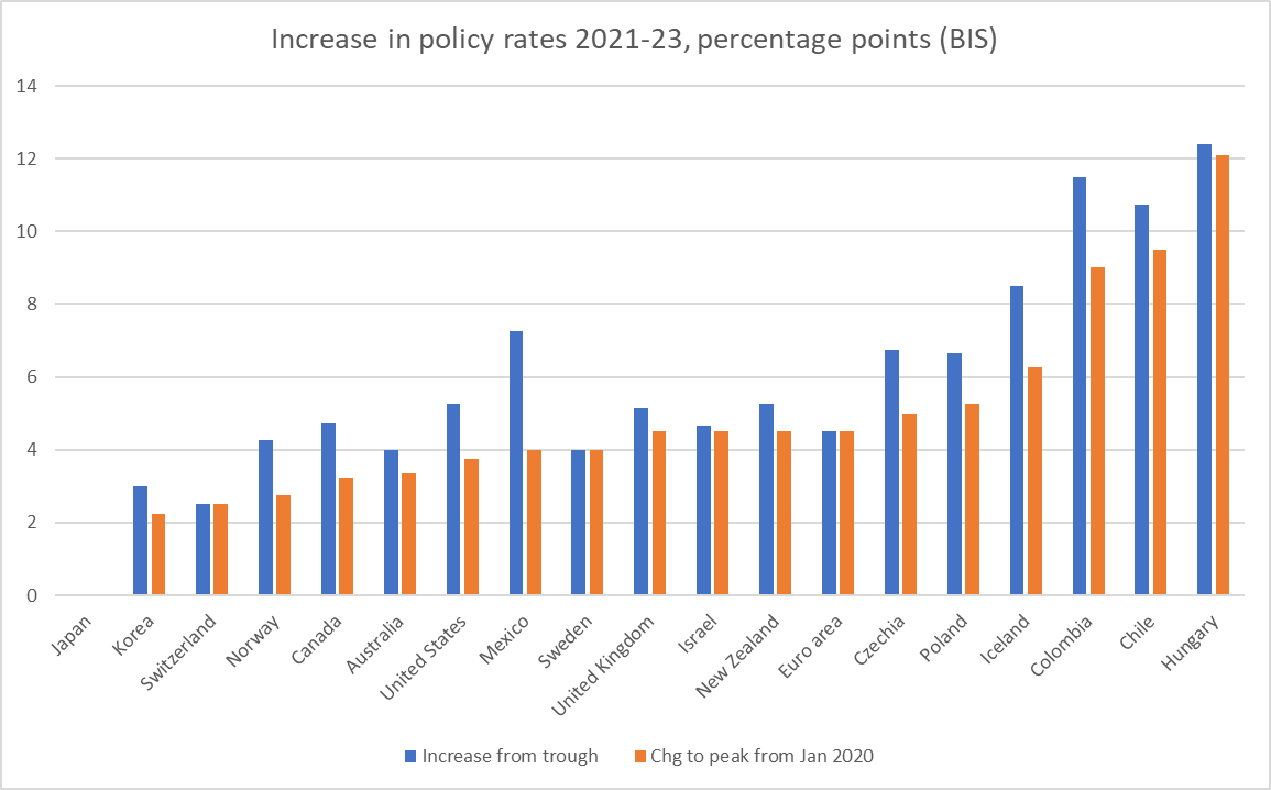
This chart shows the policy rate adjustments for all the OECD central banks in the BIS policy rates database, shown both relative to the Covid trough and relative to the immediately pre-Covid starting level in January 2020
Unfortunately we do not have IMF output gap estimates for the six countries furthest to the right on this chart, but even if we set them to one side there is nothing very startling about the extent of the Reserve Bank’s policy rate adjustment, even though – on its own numbers and those of the IMF – it was dealing with a really severely overheated economy, both in absolute terms and relative to advanced country peers. For what it is worth, in past cycles New Zealand has typically had policy rates quite a bit higher at peak than places like the US, Canada, and the UK. Thus far – and despite the severely stretched economy – that hasn’t proved to be the case this time.
Looking ahead, it is an open question whether the Reserve Bank’s (now-dated) August outlook will prove nearer to the mark than the IMF’s. We (and they) must hope so, given that inflation is still such a long way now from the 2 per cent target midpoint the MPC is supposed to be focused on. This week’s labour market data may provide some helpful hints. If we took the unemployment rate as it has been over the last couple of years and added in the consensus estimate for the September quarter (out on Wednesday) you’d certainly take the view that capacity pressures in 2023 will have been less than those in 2022. But even the IMF numbers tell such a story. But is it plausible to suppose that for 2023 as a whole the output gap will have closed almost completely as the Reserve Bank reckons? It seems a stretch to me, since no one much believes that an unemployment rate averaging below 4 per cent – which now seems almost certain for 2023 – is anywhere near a New Zealand NAIRU. We’ll see, and we’ll see what the Reserve Bank has to say later this month, before the MPC shuts down for their long summer holidays.
Finally, it is worth reflecting a little on quite why New Zealand might have had the most overstretched economy in the advanced world in 2022 and 2023. There were some positive factors, eg we weren’t in the Ukrainian war zone or directly affected by gas supply/price issues. But, on the other hand, despite the reopening of our borders, net services exports have remained pretty weak, acting as a drag on demand.
A good candidate hypothesis for what went on here was fiscal policy. I’ve pointed previously how unusual discretionary fiscal policy has been here in the last couple of years. Most countries ran quite big deficits in 2020 in particular around providing Covid support. We did too. But the median advanced economy also then saw deficits closing quite a lot (the IMF median projection for next year is getting close to primary balance).
By contrast, the (now) outgoing government here chose to run to materially expansionary budgets in both 2022 and 2023. That compounded the challenges facing the Reserve Bank’s MPC, since even if the direction of policy was reasonably signalled, the magnitudes were not. Expansionary fiscal policy puts more pressure on demand (showing up in output gaps and current account deficits) and inflation, which proved very unhelpful when the Bank itself was still realising how badly it had earlier misread underlying pressures anyway.
One might have more sympathy with the Reserve Bank had they beeen upfront about these pressures. But this year in particular they have repeatedly sought to minimise the role of fiscal pressures and fiscal surprises, to the point of attempting to reinvent macroeconomics in apparent service of the political interests of themselves and their masters. But that is topic for another post.
That was the title of a ten page piece published last week by the ANZ economics team (chief economist Sharon Zollner and one of her offsiders, who appears to be a temporary secondee from the Reserve Bank). You can find a link to the paper here.
The gist is captured in the paper’s summary
I found the first line of that final bullet rather jarring – the balance of payments not having been any sort of policy focus for decades now (really since the shift to a floating exchange rate) in 1985.
But what really puzzled me about the note was how little macroeconomics there seemed to be in it, or behind it. It isn’t that there was no interesting material in it; in fact there were a variety of interesting charts on developments and issues in individual sub-sectors, and for anyone interested in these issues it is worth a read. But I thought I’d throw in a few macro perspectives.
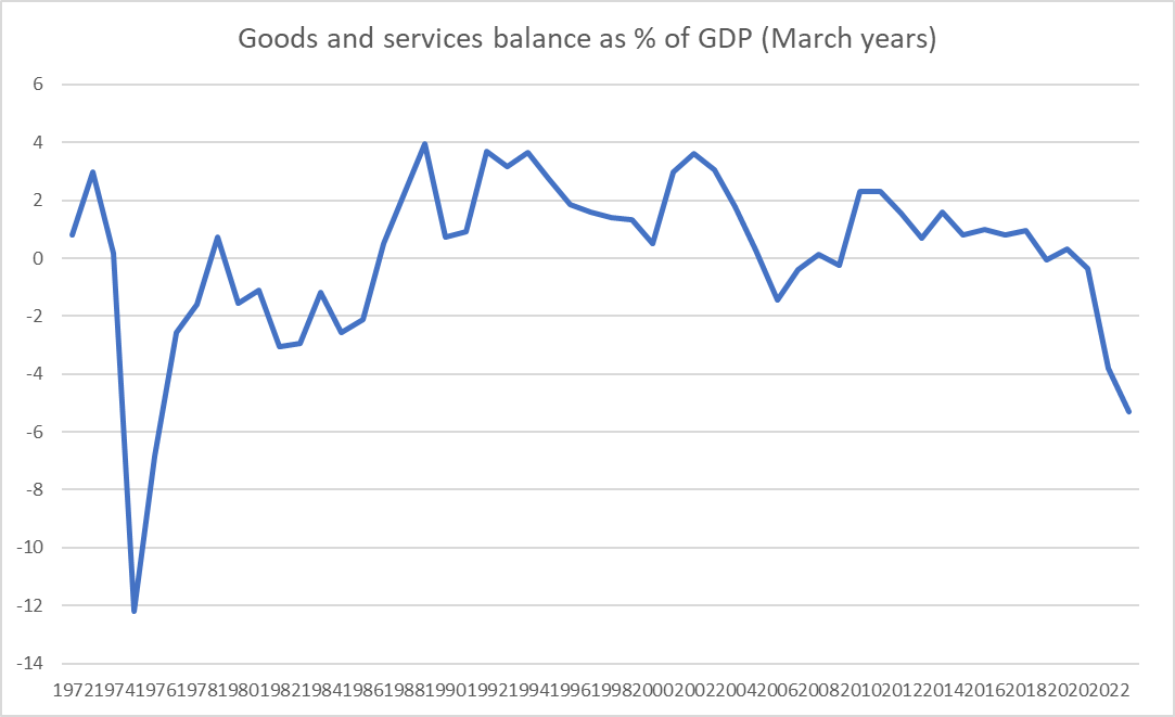
The paper starts with this chart
which is a rather different picture than the one (for the current account) we usually look at. The current deficit as a share of GDP got to about current levels in 2007, but looking just at the goods and services balance what we’ve seen in the last couple of years is without precedent for many decades. Here is the same chart with the longer run of annual data.
I’m not entirely sure why ANZ chose to focus on the good and services balance. It is akin to the primary balance in a fiscal context, which I argued here a few weeks ago it made sense to give more prominence than is often done in New Zealand for a number of reasons. If as a country you are running a goods and services balance (or surplus) it is unlikely that the NIIP position (as a share of GDP) is going to get away on you. (Of course, there isn’t anything necessarily wrong with a widening negative NIIP position – as so often, it depends what is causing the change.)
But one other positive feature of focusing on the good and services balance is that it helps to make clear that the recent sharp widening in the current account deficit – to one of the widest among OECD countries – is down to the spending choices of New Zealanders. The other big component of the current account is the income deficit (primarily in New Zealand, investment income – interest and profits). Interest rates have risen a lot in the last couple of years. But I’d have to confess I hadn’t really noticed that, thus far, the income deficit has not widened much at all as a share of GDP. If interest rates stay around current levels for long that will probably change.
So if it is spending choices that – compositionally – explain the sharp widening of the current account, where do we see that.
Well, the badly mis-forecast sharp increase in core inflation is one place. But step back a little further.
Here, from the IMF WEO database, are investment and (gross) national saving as a per cent of GDP, in annual terms included estimates for calendar 2023.
Another way of looking at the current account deficit is as the difference between saving and investment. And here you see that investment as a share of GDP last year and this has been at the highest we’ve experienced in decades (since the days of Think Big), and while the savings rate isn’t at any sort of record level it has been quite a bit lower than what we’d seen in New Zealand over half decade or so pre-Covid. Saving here is national savings – household, business, government – and we know that government dissaving – substantial operating deficits – has been a feature of the last few years, never more so than in 2022 and 2023 by when the economy was already running beyond capacity.
Beyond capacity? Well, we know the labour market has been stretched beyond sustainable (in the RB Governor’s own words) and both the Reserve Bank and Treasury have talked of positive output gaps.
But absolute numbers for local output gaps don’t get much coverage or grab the imagination. But this chart is from the IMF’s World Economic Outlook a couple of weeks back. The good thing about the IMF numbers isn’t that they are right – few forecasters consistently are – but that they take a fair common approach across a whole bunch of countries. And on their reckoning even this year on average the New Zealand economy is seen as the most overheated – “overheated” means prone to larger than usual balance of payments deficits and higher than usual inflation – of any of the advanced countries they do such estimates for. And that without any surge upwards in the terms of trade of the sort we were enjoying when the economy was last this stretched – in output gap terms – in 2007.
And then here is another chart I’ve shown before to highlight just how unusual domestic demand has been here in recent years.
Domestic demand needed to increase to some extent to fill a void left by the slump in net exports (most notably net services exports) if the economy was to remain fairly-fully employed, but policy (mostly monetary policy, which takes fiscal policy as given) was set so badly that we’ve ended up with astonishing levels of domestic spending, and with it……high core inflation, and a really marked widening in the balance of payments current account and goods and services deficits.
But, and here’s the thing, we still do not need specific balance of payments. Not from government, and not even from you and me thinking we’d best do our bit for the nation. Rather, as the government (eventually) gets the deficit back down again, and as the Reserve Bank eventually does its job, we can expect these imbalances largely to sort themselves out, and certainly not to end up posing severe risks to anything much. And if perhaps Chinese tourism exports never fully recover, we can expect private domestic spending to adjust, as it tends to when (for example) the terms of trade fall and people find themselves less well off than they had thought.
Of course, we shouldn’t rule out an exchange rate adjustment at some point, but we’ve come to forget how common they used to be in New Zealand – common, without being highly disruptive or prompting higher interest rates again. For a couple of decades at the RB we used to spend huge amounts of time trying to make sense of some of the biggest real exchange rate swings in the advanced world…..and then they just stopped (the reasons for that aren’t, I think, well understood or even extensively studied).
The ANZ paper ends with this line
The bottom line is, ‘something’s gotta give’, as the saying goes. We can either be the collective architects of that change or we can wait for changes to be imposed on us by foreign creditors and financial markets.
That seems overwrought, but we should expect our macro policymakers to do their jobs rather better than they have in the last 3 years or so. But perhaps it isn’t the done thing for market economists to call out policymakers too vocally?
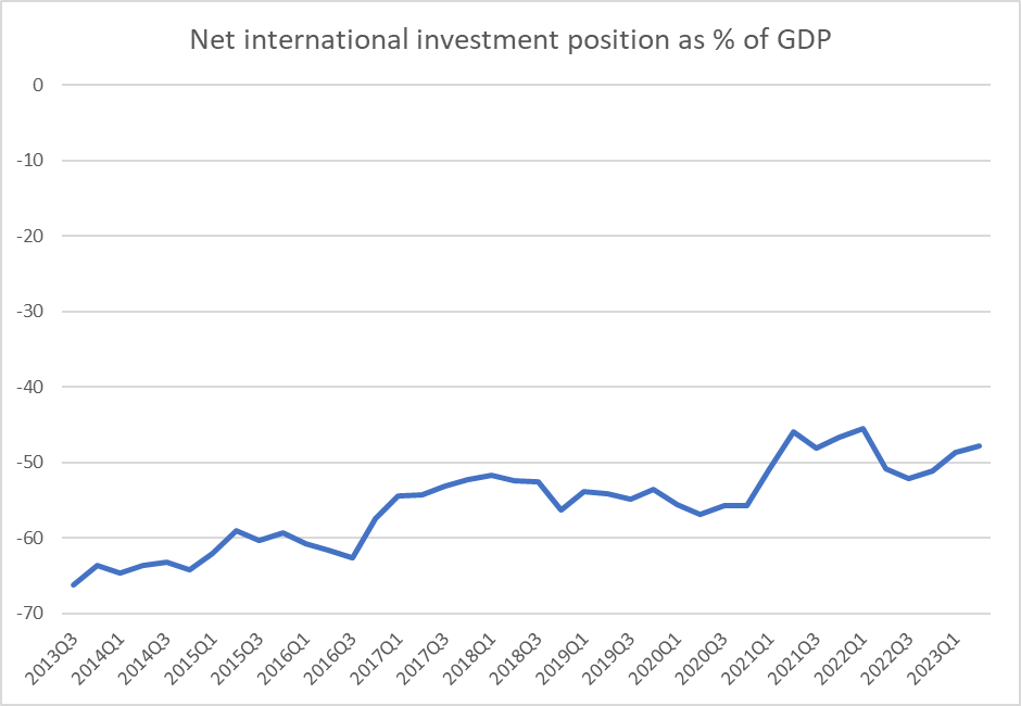
UPDATE: Oh, forgot to include this chart, which does put the last couple of years’ external imbalances in some perspective.
The rest of the world’s net claims on New Zealand residents have, if anything, shrunk a little further as a share of a GDP over the Covid years. It seems unlikely the creditors will be dunning “us” any time soon……which is not to say that if our interest rates end up lowish relative to the rest of the world there might not be some fall in the exchange rate.
The grim events of the last couple of weeks, and a note from a reader last week about a short post I’d written several years ago comparing the economic performance of Israel and New Zealand, prompted me to take another look at the data.
This was the chart from the earlier (2018) post
As I summed it up then “We’ve done badly, and they’ve done even worse”.
Given the inevitable margins for error, especially in estimating PPP conversion rates, the main story was just that neither country had done very well relative to other advanced economies.
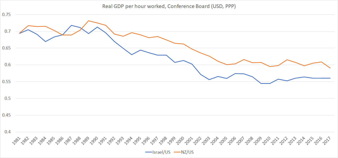
How do things look now? I’ve shifted over to using OECD data (for a number of reasons, including that the Conference Board estimates now only start from 1990 for both countries).
This chart shows the ratio of New Zealand’s real GDP per hour worked to that of Israel (both series also converted at PPP exchange rates).
The last few years seem to have been quite good for Israel’s productivity growth, but I wouldn’t put too much weight on it yet. Not only has this ratio fluctuated over the years with no clear trend, but the biggest single lift in Israel’s reported productivity was for 2020 – the year of the lockdowns, when many countries saw a rise in measured average productivity (as eg low-paying low-productivity tourist jobs were lost) – and more recently many countries (including New Zealand) have seen a reversion to trend. (And it seems unlikely that the final quarter of 2023 is going to be a stellar one for Israeli average productivity.)
The wider story remains one in which both New Zealand and Israel are productivity laggards. In this chart, again using OECD data, I’ve shown the average for New Zealand and Israel relative to eight leading (on productivity) OECD economies (Belgium, Denmark, France, Germany, Netherlands, Sweden, Switzerland and the US).
It would take a 60 per cent lift for New Zealand and Israel to match the average of those eight leading economies. Neither New Zealand nor Israel is a high-performing economy.
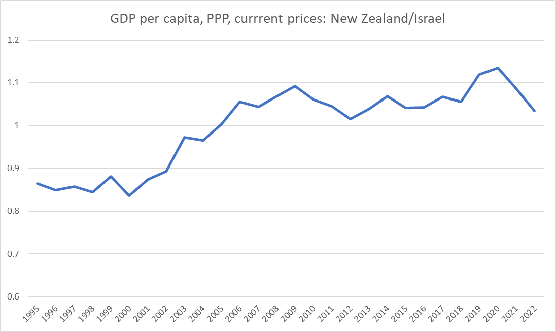
As for GDP per capita comparisons, depending on which data source one turns to the time series charts look a little different, but all three (OECD, IMF, and Conference Board) suggest that GDP per capita in the two countries is much the same. Here is a chart of the OECD data
Historically – and now – the two countries have had very similar rates of investment as a share of GDP, but increasingly divergent national savings rate patterns
The difference is reflected in quite different current account outcomes (Israel’s last current account deficit was in 2001).
But if Israel never seems to manage a better economic performance than laggard New Zealand for long, by regional standards it remains the stellar performer.
For real GDP per hour worked, here are the Conference Board estimates for Israel and (a) its immediate neighbours, and (b) its nemesis, Iran
And here are the IMF estimates for real GDP per capita for the same group of countries, plus an estimate for West Bank and Gaza. (The IMF doesn’t have a current estimate for Syria so I’ve used the ratio of Syria to Lebanon in the Conference Board database. Before the civil war, Syria was still materially less productive than either Lebanon or Jordan).
The economic performance gaps here are materially larger than those (above) for productivity.
(In case anyone is wondering about the oil and gas rich countries of the Arabian Peninsula, the Conference Board productivity estimates for those countries, they are mostly around the current estimates for Israel (and for New Zealand).
Israel is the star economic performer in its sub-region, but that can’t be any cause of complacency given how far behind it lags the leading advanced economies.
And in the longer run, much as I champion and support Israel including as the only functioning democracy in its part of the world, I struggle to be optimistic about its long-term prospects. This was from my 2018 post.
Israel has not lost any of the wars it has fought. But it has to keep doing so indefinitely.
I’ve written a few sceptical posts here over the years about the annual (or so) Technology Investment Network’s (TIN) boosterish reports on the New Zealand tech sector. The overall story was just even close to as upbeat as the reports liked to make out.
Yesterday a link to a new TIN report turned up in my email inbox. This was the bit in the email
There is a clue right there in the reference to chocolate chips. This wasn’t going to be a report about what most people have in mind when they think “advanced manufacturing” but about the manufacturing sector as a whole. All firms in the sector use technology of one form or another, some of it very advanced.
Anyway, I downloaded the full report (you have to register to get it, but it isn’t onerous, and the report itself isn’t overly long, at about 30 pages of substance). It turned out to be the product of a bunch of outfits I’m pretty sceptical of. There was TIN itself which did the work, there was the co-chair of the Advanced Manufacturing Industry Transformation Plan Steering Group (ITPs being that throwback to the 1960s that the outgoing government became keen on) who supplied the Foreword talking up both his group and document, and then there was MBIE which is said to have “commissioned this report” and presumably paid for it. Money was being thrown around in all too many areas under the outgoing government.
Both the Foreword (by Brett O’Riley) and the Welcome (by the Managing Director of TIN) are pretty upbeat. O’Riley makes the bold claim that manufacturing is “the backbone” of the economy (to which I responded on Twitter this way
Just reading a puff piece from a manufacturing industry group describing manufacturing as "the backbone" of the economy. pic.twitter.com/3chXTsxzyj
After noting that the manufacturing sector will soon drop to being only the third biggest greenhouse gas emitting sector (behind households and agriculture) the Welcome ends this way
It all sounds good quite upbeat.
That is, until you read on.
There is a helpful Executive Summary. It also attempts to start upbeat
Advanced manufacturing is a critical engine of Aotearoa New Zealand’s long-term prosperity, making a vibrant contribution to the nation’s economy
But then the pesky data start getting in the way
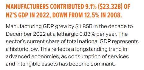
There are still lots of workers
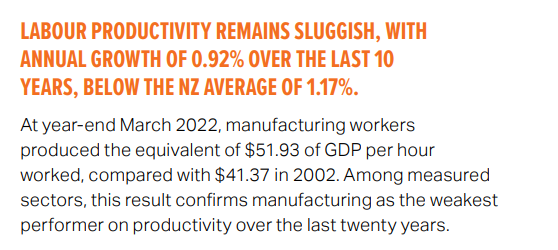
But if your sector is 9.1 per cent of GDP and 11.9 per cent of the workforce, what does that say about productivity?
Low level, and low growth rate. Ouch.
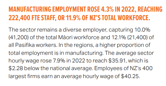
And, unsurrpisingly wage rates in the sector as a whole are below the economywide average.
You might have noticed in that clip at the top reference to 60 per cent of New Zealand’s exports. That is because many of New Zealand’s agricultural exports are processed (dairy factories really are big and sophisticated operations, even if the share of that processing in total dairy value-added is not huge). Anyway, exports….
Not exactly a positive story either.
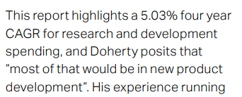
The puff piece at the front was upbeat on R&D (‘over a quarter of national R&D spending comes from manufacturing’) but by the time you get to the Executive Summary a less rosy picture emerges
So that is quite a big drop in the share of national R&D spend, and manufacturing sector R&D staff are almost the same share of total R&D staff as manufacturing employees are in the total workforce (although to be fair one has to wonder a little about whether the comparisons here are all apples-for-apples, since if manufacturing does 27 per cent of the national R&D spend with only 12 per cent of the R&D employees, those manufacturing R&D employees must be doing a lot of work/spend each).
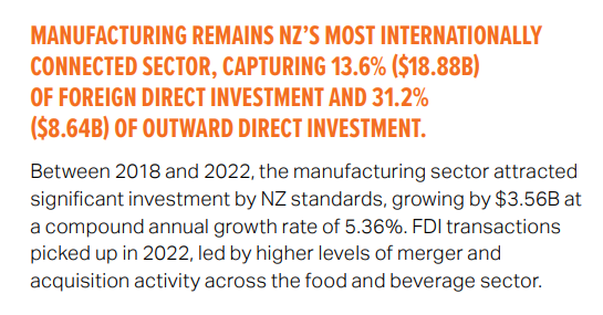
What of FDI? Manufacturing does seem to represent a larger-than-representative share of inward and outward FDI, but…
By my reckoning that compound annual growth rate for inwards investment was less a bit less than the growth in nominal GDP over that period, so not exactly a very positive story for “the backbone” of the economy, “a critical engine” of New Zealand’s “long-term prosperity, making a vibrant contribution to the nation’s economy.
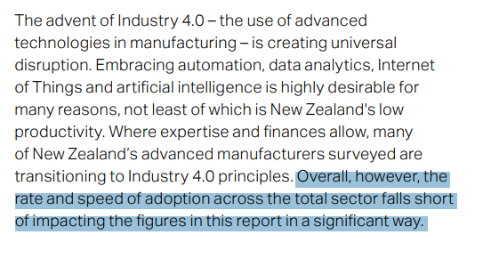
The report would really quite like to be upbeat about new technologies, but….
And those were the last words of the Executive Summary.
There are some more detailed sections that follow. A new snippets:
On international trade:
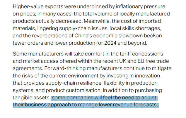
in addition to that wonderfully-understated last couple of lines, note “in many case, the total volume of locally manufactured products actually decreased”, and “[various factors] beckon fewer orders and lower production for 2024 and beyond”
On R&D etc:
Nominal GDP rose faster than that.
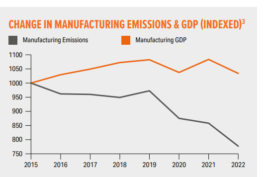
And this grim observation
The exciting news is that emissions have dropped, and not just because of a dismal GDP performance, but that is an input, not the sort of outcome firms go into business to achieve.
What of profits? They grew more slowly than nominal GDP over this period, and represent 7.6 per cent of economywide profits even though the sector is 9.1 per cent of GDP.
The best you could really say for this report is that, underwhelming as the data are, perhaps it provides some sort of benchmark against which to measure where things go from here. But why the spin upfront, and why was the taxpayer paying for the report in the first place?
None of this is intended as a criticism of any specific company in the sector. Companies that survive and thrive in New Zealand, selling to world, deserve a fair bit of admiration and in the case studies at the back of the report there are some really inspiring stories (I don’t include taxpayer-subsidised NZ Steel among them, nor perhaps the company that has been running since 1981 and has a grand total of 115 employees). In all my years at the Reserve Bank one of the best things I ever did was to participate in the regular business visits programme, and it was rare not to come away from each and every company we visited admiring people – often owner-operators – who had everything on the line to make and sustain a business (it was hard not to think they were doing something better or more useful – certainly much more risky – than we were).
But the aggregate story just doesn’t seem to be a very positive one, if such aggregates (“the manufacturing sector”) make much sense at all (the New Zealand “manufacturing sector” is a very diverse thing, including new and cutting-edge firms and legacy companies from the eras of protectionism and Think Big). Beyond the puff pieces at the start, there is a certain grim realism about many of the comments on the numbers (see above), but perhaps it would have been better to have had that upfront, grabbing the headlines.
There is no right or wrong answer as to how much of a “genuinely” advanced manufacturing sector a successful New Zealand economy might be expected to have, but it isn’t surprisingly the sector struggles here when you combine things like distance, high company tax rates, obstacles to foreign investment, and a real exchange rate that for decades has been out of line with relative productivity fundamentals