A cost-benefit approach to thinking about vaccine coercion

One of the (many) disillusioning aspects of the Covid response of the New Zealand government (politicians and public service) has been the apparent total absence of any use of cost-benefit analysis techniques to help inform thinking about policy responses. No cost-benefit analysis on any aspect of the policy response has ever been published (or hinted at), on the couple of occasions I’ve OIAed any such analysis (just to be sure) agencies have been quick to deny any such analysis exists, and when one independent agency (the Productivity Commission) did do a little exercise along these lines at one point last year it was shunned as almost “unclean”. And if there had been any slight excuse early last year about “no time” – not convincing even then – officials have had 22 months now to get toolkits in place. But they (and their political masters) seem to prefer seat-of-the-pants thinking, all with minimal transparency. (On that latter note, it is now three months since the current lockdowns began and not one piece of official advice, not one Cabinet paper has yet been released, despite the enormous economic and social costs of the choices the government has made.)

The point about cost-benefit analysis is not that using those techniques, or that way of thinking about the issue, will generate “the” right answer. On many of these things there is no “the” right answer. The merit lies in a combination of (a) forcing people to write down their assumptions, including which variables (even hard to estimate ones) should be relevant to a particular decision, and (b) then enabling users to get a sense of how much difference a different set of assumptions might make to the bottom line. Using the techniques facilitates disciplined thinking and transparency, the latter itself supporting scrutiny (especially important when such costly and often intrusive/restrictive decisions are involved.

Consultant economist and former Victoria University academic Martin Lally has been one of those attempting to apply a cost-benefit approach to thinking about Covid policy responses. I wrote here about one of his pieces from last year. I haven’t always agreed with his conclusions, but (as above) that isn’t the point. The value in such exercises is to prompt people to think harder about which assumptions they might disagree with, why, whether all the right variables are being taken into account, and what differences different assumptions might make.

On Saturday Lally sent out a short piece he had done, attempting to sketch how one might apply a cost-benefit type of approach to thinking about vaccine coercion (or – ugly Americanism – “mandates”). He has given me permission to reproduce it here, which I will then follow with my own thinking. It is a sketch outline, towards the sort of fuller cost-benefit analysis one might hope government agencies – with access to much more resource – would routinely be doing and revising.

Lally notes that he – like me – is fully vaccinated “without coercion”.

Vaccine mandates for the general population are proving to be extremely controversial.  Opponents point to the right to choose.  Proponents point to the costs that the unvaccinated impose upon the vaccinated, in particular the increased risk of death to some vaccinated people (because the vaccine is not perfect and the more so as the time since the vaccination increases) and the increased load on the health system from unvaccinated people leading to some (vaccinated) people receiving an inferior level of care for non-covid conditions than they otherwise would.

This is yet another example of the trade-offs we face in life, individually or socially, and is therefore capable of being illuminated (and possibly resolved) by cost-benefit analysis. 

To illustrate this, suppose that 400,000 New Zealanders will not be vaccinated unless coerced (10% of those above the age of 12).  This corresponds to the 10% of the over 12s who have not yet had a first dose, and therefore could reasonably be viewed as a lower bound on those for whom coercion will be required to achieve their vaccination.  Standard CBA for health issues involves discounts to QALYs [quality-adjusted life years] for imperfect health status.  For example, a person suffering from type 2 diabetes warrants a discount of about 20% per year of their remaining life.  The same principle applies to coercion, i.e., it reduces the quality of life of the coerced person.  These 400,000 objectors are likely to be of about average age and in good health, which implies about 40 years of remaining life.  Let W denote the annual discount on their quality of life arising from being coerced into vaccinating.  The QALY loss from the coercion is then 400,000 [people]*40 [individual years] *W = 16,000,000*W.

Now consider the costs that the unvaccinated impose on the rest, of the types mentioned above.  Let D be the estimated deaths from the existence of unvaccinated people, if coercion is not adopted compared to adoption of coercion.  The deaths here are of people likely to have low residual life expectancies and health problems that would lower their quality of life even if they didn’t die due to the existence of the unvaccinated.  Suppose the average residual life expectancy is ten years (generous as covid victims [fatalities] have an average of about five years), and the discount for health problems during this ten year period is 20%.

If coercion is adopted, the 400,000 people alive today who will suffer the coercion will experience a QALY loss of 16,000,000*W whilst the vaccinated avoid a QALY loss of D*10*0.8.  So, coercion is warranted if and only if D*10*0.8 exceeds 16,000,000*W. 

For example, suppose W is 5%, i.e., coercion is equivalent to a quality of life discount of 5% per year.  The parameter D would then have to exceed 100,000 for coercion to be justified, i.e., there would have to be at least 100,000 additional deaths amongst those alive today and vaccinated resulting from catching covid from an unvaccinated person or from inferior hospital care resulting from hospital overload due to unvaccinated people requiring covid treatment.  This is not plausible.  Alternatively, if W is 1% (coercion is equivalent to a quality of life discount of 1% per year), then D would have to exceed 20,000 for coercion to be justified, i.e., there would have to be at least 20,000 additional premature deaths amongst those alive today and vaccinated resulting from catching covid from an unvaccinated person or from inferior hospital care resulting from hospital overload due to unvaccinated people requiring covid treatment.  This too is not plausible. 

It is implausible that W is less than 1%, and it is implausible that D would be more than 20,000.  It follows that coercing people into being vaccinated does not seem to be a good policy choice.

If you think I am wrong, I invite you to supply a CBA consistent with your view.  Simply saying that unvaccinated people inflict damage on the rest of us is not enough.

It is a reasonable challenge.

In my case, it isn’t that I think his policy conclusion is wrong. I don’t think either vaccine coercion or the associated (coming) pass laws can be justified by the scale of the threat Covid poses. But I think Lally’s initial exercise – while illuminating – may overstate the case, at least on cost-benefit grounds (there are some – few – things no price should be placed on, or which we should be very reluctant to do so in the face all but the gravest threats).

Perhaps my greatest unease is around time horizons. The approach seems to treat Covid as something that within a few years will settle down to be either non-threatening or chronic/endemic or something society will choose not to do anything much about. Why do I say that? Because otherwise we have no basis for reaching any judgements (plausible or not) for many lives coercion might save – over, say, 50 or 100 years – but also because if it was to be treated as a permanent issue one would have to include effects not just for the current population cohort but for those yet to be born.

It seems a reasonable approach to me for now – and this is a place where real options analysis is relevant, taking account of irreversibilities – but if so then how credible is it to suppose (assume) that those subject to coercion will experience the same reduction in their quality of life for their entire remaining life (40 years on Lally’s assumption)?

As Lally notes when we exchanged (brief) notes on this, there are two classes of people subject to coercion, those who give in to it, and those who don’t. Lally’s approach does not seem to incorporate the effect of or on the latter group at all. I’ll come back to them.

But what of those who do give in to the coercion and get vaccinated? It seems quite plausible that, at least initially, many will be quite resentful and experience the reduced quality of life Lally mentions (a few may be relieved as coercion gets them out of a corner they’d boxed themselves into). Quite how intense that loss is may depend a bit on what motivated each individual resister. But if Covid settles into being a chronic thing that no one pays that much attention to in a few years hence, how plausible is that those coerced now will be still experiencing a significant (same annual) loss of wellbeing 30 years from now? If we, arbitrarily, allowed for this loss of quality of life for just the next five years then that cost would be reduced to only 1/8th of the scenario Lally uses.

What about what the coercion saves? Lally’s initial approach looks at lives saved this way: “additional premature deaths amongst those alive today and vaccinated resulting from catching covid from an unvaccinated person or from inferior hospital care resulting from hospital overload due to unvaccinated people requiring covid treatment”.

Again, this points to an implicit assumption about the issue being medium-term but not long-term. The potential impact on the health system – and thus on mortality risks for non-Covid conditions – is a real one at present, but surely can’t be with (say) a 10 year horizon, since healthcare capability can be added in that sort of timeframe. But although Lally highlights the potential deaths avoided, he does not factor into this simple model the losses from either severe Covid cases among the vaccinated, or the loss of quality of life to those whose treatment for other conditions is delayed. On our current understanding, he is no doubt right to play down the mortality risks from Covid to the vaccinated (probably quite few in number, and most likely to be people with remaining life expectancy well less than 10 years), but I have less of a sense of how large those other numbers might be.

As I noted, Lally’s approach does not take account of those on whom coercion will not work. That number might be small, at least after a few months, but what if it isn’t? And even if most of the resisters eventually given in (a) they are probably the ones who will face the greatest and longest-lasting loss of wellbeing (people who resisted from conviction rather than just hesitation), and (b) we know that people who lose their jobs in recessions can experience lifetime losses of income, a result that could well translate to some of this group.

And although repressive enough pass laws can probably reduce the risk of these resisters (a) getting Covid, and (b) passing it on to other (vaccinated) people, that is going to be a reduced risk not an eliminated one. A full cost-benefit analysis would need to include an assumption as to how many lives the compulsion exerted over this group might save. I’m not in a position to offer a number myself.

The other factor that would need to be taken into account in a fuller cost-benefit assessment is the cost-benefit of alternative options. For example, what if instead of vaccine “mandates” and pass laws, the government mandated the use of rapid antigen tests in places where particularly vulnerable people were present (eg rest homes, hospitals), or – at times when there was much Covid in a community – at the entrance to any large indoor event? Antigen tests are, after all, focused on identifying infectiousness, presumably the main (health) concern. That testing would have costs – there are no cost-free options – but relative to the vaccine coercion options some real savings (re issues discussed above). The Ministry of Health still appears to have some mysterious aversion to antigen tests, but there is no sign their distaste has ever been properly costed.

I don’t purport to know the appropriate parameter values for each of these variables. But it is the sort of exercise – done more fully – that officials should be presenting to ministers, and making available to outsiders for information and scrutiny.

Massive losses, for nothing

All sorts of items of public spending have attracted attention since March 2020 when the Covid-related spending really began. Some of the things money has been spent on – the wage subsidy for example – were large but necessary and appropriate. Some things, often quite small in scale, were pure waste. Others were dressed up under a Covid label but were really just poor-quality (but quite large scale) spending.

One of the items that has had almost no attention is the huge losses that have resulted from the Reserve Bank’s Large Scale Asset Purchase (LSAP) programme. I guess it is a bit harder to report on, since neither the Bank nor the government puts out press releases boasting of losing $4bn or so.

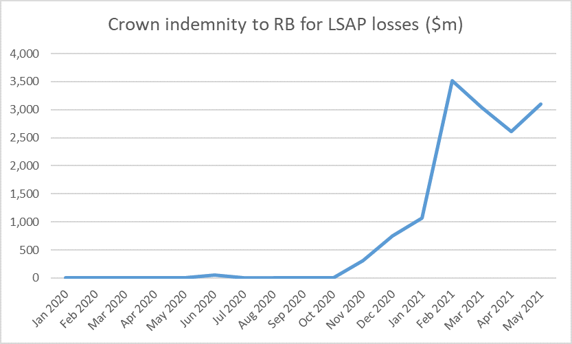
The government has, with no parliamentary authorisation or scrutiny, agreed to idemnify the Reserve Bank for any losses it incurs on the LSAP. That, at least, has the merit of encouraging/requiring some transparency. On the Reserve Bank’s balance sheet there are two line items, show in this chart

LSAP indemnity claims

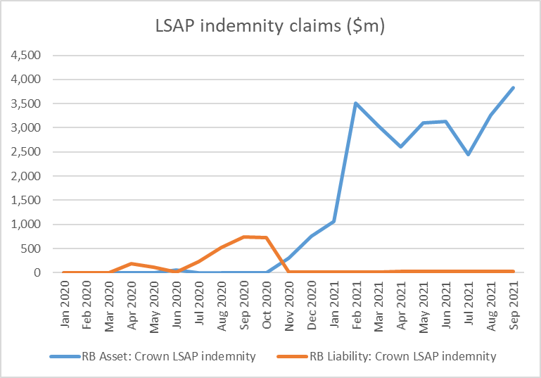
To be honest, I’m not quite sure what the orange line is, since as I read the indemnity the liability is one-way only (Crown pays Bank if Bank loses) but it looks like it may reflect periods early on when the LSAP bonds were valued at more than they had been purchased at (lower yields than is). In any case, it is irrelevant now as the remaining number is tiny. The blue line – the Bank’s claim on the Crown – is where the focus should be. That claim was almost $4 billion at the end of September, and nominal yields have risen further this month.

Since the Bank discloses all its purchases, in principle someone could go through and identify the losses on each and every purchase undertaken over the period (more than a year) that purchases were undertaken. But for our purposes here, suffice to say that government bond yields are a lot higher than they were. Here are few medium-long term government bond yields

govt bond yields

Recalling that bond prices move inversely with yields, September/October last year would have been a great time to have been selling bonds (top of the market and all that). But the Reserve Bank went right on buying more bonds (albeit at a slower pace), all of which will now be valued at less than the Bank paid for them. They were still buying (lossmaking) government bonds right through the June quarter – when core inflation was already above the target midpoint, and unemployment was back at pre-Covid levels – not finally stopping the purchases until mid-July.

Accounting for the LSAP isn’t simple. In some quarters, there is a tendency to say “well, since the bonds are (almost) all government bonds and the Bank is owned by the government it is all a wash, and nobody is any the worse off”. That is simply wrong, as I will demonstrate shortly.

But it is also wrong to simply look at the indemnity claim (blue line in the first chart above). If all the bonds were held to maturity – in some cases 19.5 years from now – the indemnity claim would come back closer towards zero (since, whatever the market value of a bond now, eventually it will pay the full face value). But it would also be quite wrong to deduce from that correct observation that if only the bonds are held long enough no one is any worse off. Bottom-drawing doesn’t address the issue. (It is worth noting that a few of the bonds the Bank purchased have already matured).

Instead, we need to think about what difference has been made to the overall Crown finances as a result of the independent choices of the Reserve Bank and its Monetary Policy Committee. Assume the rest of the government would have made exactly the same choices they did – spending, taxes, bond and Treasury bill issuance- and assess the marginal financial impact of the Bank’s choices and actions.

The government, of course, did quite a lot of spending and quite a lot of borrowing through the course of the Covid crisis. The Reserve Bank publishes tables of the monthly influences on settlement cash (deposits banks hold at the Reserve Bank). There is a weirdly long lag (for data which really should be available next day), but for illustrative purposes between March 2020 and August this year the government issued domestic debt (bonds and bills) on market, net of maturities, that raised $73.2 billion of cash. Over the same period, its cash outgoings exceeded cash revenue by $33.6 billion. In other words, the government issued a great deal more debt than the net spending it needed to fund. As a result, the balance in the government’s account at the Reserve Bank went up sharply. The balance used to be kept just modestly positive, but this is how things have unfolded since the start of last year.

CSA balance

Mostly the government issued so much debt because it expected to need the cash. Tax revenue came in a lot stronger than the fiscal forecasts had allowed, as the economy rebounded more strongly than forecast (and inflation came in stronger than forecast). But the debt issuance plans were about fiscal policy. As it happens, the Crown ended up issuing a lot of debt earlier than it needed to, at yields that were mostly attractive. The gain to the taxpayer arises from the fact that the bonds were issued last year at, say, 0.5 per cent rather than this year (or next year?) at 2 per cent.

But as far as the Reserve Bank was concerned, all that was a given.

And, incidentally, it is also why a large part of the huge increase in the size of the Reserve Bank’s balance sheet since Covid began is also a given, largely outside the Bank’s control.

When the government overfunds (raises more than its net outgoings) all else equals that reduces the balances commercial banks hold at the Reserve Bank. The net of tax payments, settlement of bond purchases, and government disbursements results in money flowing from the private sector (who bank with commercial banks) to the Crown.

But when Covid began, aggregate settlement cash balances held by commercial banks were about $7 billion, and had been so for some years. A net $40 billion drain to the Crown (see numbers above) needed to be funded somehow.

In normal times, if there were to be a persistent drain it would typically be countered by (funded by) a large buildup in the stock of short-term Reserve Bank loans to the financial system (typically fx swaps or repurchase agreements. Those loans would be rolled over quite often, until the underlying imbalance (government borrowing more than it needed to) was remedied. Doing so would have been pretty much of a wash all round: the Bank would be paying something like the OCR on the Crown Settlement Account, and earning something close to the OCR on its short-term collateralised loans. There would have been little or no market risk or credit risk (the loans would have been well-collateralised) and short-term interest rates would have been kept near the OCR. Most likely, the Bank would have made a small profit (monopoly provider of settlement cash is a position of some strength).

But nothing like this happened.

Instead, we had the LSAP. Now, to be clear, the LSAP was not launched with the intention of filling a hole in system settlement cash. No doubt at the time the Bank assumed that the government would, more or less, be borrowing as required to fund its own deficit, and that if anything, borrowing might be a bit less than the deficit at least while the programme was scaled up (recalling the global bond market illiquidity pressures in March 2020). The Bank’s primary intention – this isn’t a matter of dispute – was simply to lower market interest rates, buying bonds and driving (as they expected) a long way up aggregate system settlement cash balances. Had the government more or less funded just what it was spending over the last 18-20 months, then all else equal settlement cash balances now would be a lot higher than the $37 billion they were last Friday. Recall too that the Bank changed its policy in March 2020 such that all settlement cash balances – without limit – now earn the OCR (previously there was a quota system in which the Bank really only fully remunerated banks for the balances they “needed” to hold for interbank settlement to operate smoothly).

The intent of the policy was to take a big punt on interest rates (that is why they sought and obtained a Crown indemnity). The intent was to buy tens of billions of dollars of long-term fixed rate bonds to which the counterpart would be tens of billions of floating rate settlement account deposits. The Bank initially expected that all those deposits would be held by banks, but because the government overfunded the real counterpart is now in the much-increased balance in the Crown settlement account. But it was a large scale asset swap, which would turn very costly if bond yields went up rather than down. It represented a staggering amount of market risk, assumed by unelected (and not very accountable officials) on a scale with no precedent in New Zealand central banking history.

Views will differ on whether the LSAP made (or is still making) any material sustained difference to (mainly) long-term government bonds rates, and whether even if so that made (or is making) any material difference to New Zealand macroeconomic outcomes. I’ve been consistently somewhat ambivalent on the former, although my reading of the international experience with QE leaves me fairly sceptical. But since long-term interest rates do not matter in the transmission mechanism here in a way they do in (in particular) the United States – since very few fix mortgages for more than a couple of years, and most corporate borrowing is swapped back to floating – I’ve been consistently sceptical that the bond-buying programme (heavily focused at the long end) was making any material macro difference (the more so once the Bank decided to pay OCR on all settlement cash balances, actively preventing one possible transmission mechanism from working). Even if I did – which I do not concede at all – that usefulness ended long ago now (given what we know of the subsequent inflation outcomes and the push to raise the OCR quite aggressively now).

Whatever useful macro impact the Bank might sought last year – simply exploring the hypothetical – could as readily have been achieved by cutting the OCR further, including into modestly negative territory. And using that mechanism would not have involved big financial risks for the taxpayer

And instead now they are stuck with tens of billions of dollars of bonds, many with very long-term maturities, sitting on the Bank’s balance sheet, while the cost of funding (the counterpart liability) looks set to rise quite rapidly further.

In the end, what the MPC has done in effect is to neutralise or reverse the gains the Crown would otherwise have made through the good luck (mostly) of issuing so heavily last year when interest rates were so low, over and above what they were spending then. The Crown will borrow less in the next (more expensive) couple of years and the CSA balance wil no doubt over time be returned to more normal levels. Because more than all the excess bond issuance was, in substance, reversed through the Reserve Bank’s action, bringing tens of billions of long-term bonds back onto the wider Crown balance sheet. If they were to sell the bonds now (or in a scheduled programme over the next couple of years) the loss would be crystallised. That might be a good thing, to help sharpen debate and accountability. But whether the bonds are sold back now or held to maturity, the loss has already occurred. (This is not to say that rates might not go lower – perhaps even much lower – again in future, but that is just another bet at the expense of taxpayers, and no more likely than that bond yields rise further from here, deepening our (taxpayers’) losses.

But it as well to keep the choices by two parts of government separate, reflecting the different sets of decisionmakers. In borrowing as it did (and probably largely by luck re the revenue rebound) the government’s overfunding programme saved taxpayers a lot of money (for which there is no line item in the government accounts). By contrast, the Reserve Bank’s choices — quite conscious and deliberate ones – have cost the taxpayer a great deal of money.

The LSAP simply was not necessary, and it clearly was not well thought through. If there was an arguable case for some action in March 2020, that need quickly passed, and any bonds purchased then could relatively easily have been offloaded back to the market – probably at a profit (crisis interventions should generally be profitable) – by late last year. One might blame the Minister of Finance for providing the indemnity, but the main responsibility rests with the (supposed) technical experts at the Bank and on the MPC (albeit appointed by Robertson). It has cost us billions of dollars already – a $4bn loss is $800 per man, woman, and child, and most families could think of better things to do with such money – and the Bank now sits with a huge open market risk position, the value of which fluctuates by the day.

Having outlined my story – on which I will welcome comments – it is worth pondering why this hasn’t been an issue elsewhere or previously. A lot of bonds have been purchased by central banks in the decade after the 2008/09 crisis. Most likely there will have been two reasons. The first may be around transparency. It is great that we have the indemnity claim is reported each month.

But the much bigger factor must surely have been the continuing decline in global bond yields over the decade. This chart shows long-term bond yields for some of the more significant places where central banks reached effective lows on policy interest rates and engaged in large-scale asset purchases.

long bonds

When yields just keep trending downwards, having built up a portfolio of long-term bonds is (a) profitable, and (b) much less likely to be controversial. Who knows how much this was a subconscious backdrop to Reserve Bank (and Treasury/Minister) thinking here.

Finally, throughout this post I have treated government and Reserve Bank choices are separable and assumed both parties would have done what they did pretty much regardless of what the other did (around debt issuance and bond purchases). That seems sound for the most part, although the extent of the Crown overfunding is such that it is conceivable that without the LSAP – pouring huge amounts in settlement accounts – pressure (including from the Bank) might have mounted on the government to wind back the borrowing programme more aggressively than it did. But even if there is something to that argument, it is unlikely it would have become salient for several months – it took quite a while for the extent of the economic rebound to be fully appreciated, and by that time the bulk of the LSAP purchases had already been done.

As for where to from here, the losses from the LSAP have already occurred – the mark to market estimates largely capture that – but that is no excuse for the Bank continuing to maintain a large open position in the bond market. The bonds can’t be offloaded very quickly, but there is no reason not do so in a steady predictable preannounced way over the next year or two (say $2 billion a month). Given the extent of the CSA balance, there could even be merit in considering a partial government repurchase of the LSAP portfolio (say half of it). Doing that would not change the substance, but would put duration choices around the public debt and overall Crown liabilities back more nearly where they belong, with The Treasury and the Minister of Finance.

Vaccinations by age

Still on health matters, I’ve been intrigued for a while at what was happening to vaccination rates stratified by age. For all that politicians and the media burble on, emote even, about differences by ethnicity, the data on Covid itself seem crystal clear: by far the biggest demographic risk factor for getting seriously ill or dying of Covid (and thus of resulting in pressure on the health system) is age. The Hendy et al modelling used this data (from this 2020 paper).

age factor covid death

I’ve seen people suggest these absolute numbers may be out of date, and epidemiologists can argue about that, but my point simply is that no one seems to dispute the significance of age. It isn’t just a linearly increasing risk: the risks for (say) the over-80s are far far higher than those for even people in their 50s.

The government of course recognised this initially in allowing old people to get vaccinated before (progressively) most of the rest of us. If you are my age, it is only about six weeks since one could get a first dose, and so many (like me) will be getting second doses only in the next few weeks. But the very elderly have had a lot of time to have had both doses of the vaccine. And, so you would think, people in that age range would generally have a strong personal incentive to get vaccinated – and their children to encourage them to do so. Public spirit might be necessary to help encourage the young, but for the very old death from Covid is a non-trivial risk (and thus the strict rules one hears rest homes have in place). The rest of us have a strong interest in these old people getting vaccinated because pressure on the health system is one of the key perceived constraints on opening up.

And so I’ve been a bit surprised that the vaccination rates among the elderly have not been higher. The Ministry has come and gone a bit on how much information it makes available, but for now it seems to have settled on promoting this chart.

moh vaccine by age

None of the elderly age bands have yet got to a 90 per cent second dose vaccination rate, and only one (the 80-84 group) has got to 95 per cent for even a first dose. And these people have had months.

But the real situation seems to be even less good than the Ministry of Health portrays it. The denominator they use in all their charts and tables is not the population in that age group as estimated by our official statistics agency, SNZ, but something called the “Health Service User population” (HSU), which is defined thus

The Health Service User population estimate counts the number of people who received health services in a given year. Someone is counted in the population if their associated National Health Index (NHI) number received public health services; or was enrolled with a primary health organisation (PHO). 

I suppose they must have their reasons, but using this HSU measure seems to assume away part of the problem – people unknown to the health system seem, all else equal, less likely to be turning up (to the health system) for a vaccine. Of course, it is a hard count (administrative data) and the SNZ population numbers are only (informed) estimates. But some people just don’t go to the doctor very often (I know in my 20s I prided myself on not having been for a decade).

Anyway, here is the difference it makes

hsu popn

There are some anomalies. I’m not sure how there can be so many more 90+ health service users than SNZ think there are in the country (and they keep track of deaths, and there can’t be that much migration among the over 90s), and the 80-84 band is a bit of a surprise too, but the key point is that both for older ages (65+) and the the 12+ population as a whole, the HSU appears to undercount the population by 3.5 per cent. All else equal then, vaccination rates are a bit overstated.

Here is how the two measures look for first doses for the older age groups

vaccination rates hsu vs snz

Using the SNZ population numbers, not quite 90 per cent of the elderly have yet had a first dose. And yet we hear almost nothing about this from our government, our health bureaucrats (who seem to champion the messaging of politicians) or even – so far as I could see – in the perspectives provided by the opposition political parties.

Here is the same chart for second doses.

2nd dose vacc rates by age

Not much more than 80 per cent of even the 75+ population have had two doses, many months into the programme. And this is the demographic most exposed to serious illness death, and the demographic that thus poses the greatest threat to the health system if/when Covid gets more established here.

Using the SNZ population estimates here are the vaccination rates for each age-band.

vacc rates by SNZ age

Can better be managed? Well, it would appear so from the experiences of other countries. At an aggregate level, for example, Portugal has about 85 per cent of the population with two doses (about 95 per cent of the 12+ population). I’ve been keeping an eye for some time on NHS data for England (and remember that a lot of people in England have already had the virus itself), and they appear to be showing close on 100 per cent of those 70-74 having had two doses (albeit rates tail off somewhat above that age band).

But when it comes to Covid, Australia still appears to be the country most similar to us, including in that they were slow to get their vaccination programme going. This is the latest set of charts

aus vacc rates

Of course, Australian states and territories have a quite diverse range of experiences with Covid (ACT, NSW, and Victoria with ongoing outbreaks) but their record in getting the elderly vaccinated seems to be consistently (NT aside perhaps) better than New Zealand’s, with particularly impressive numbers in ACT (where all but one age-band over 40 have 95 per cent first dose rates, and most second doses done).

Perhaps there are denominator issues in those other countries too, but even if so the bottom line remains one in which the New Zealand elderly vaccination rates are just not that good, given the risks (to their own health, and – indirectly – to the wider freedoms and opportunity of the community more generally).

And there is no sign our politicians are taking this very seriously.

On a final note re age, the Hendy et al modelling released last week (and touted by the government) assumes the same vaccination rate for all eligible age bands. That seems somewhat unrealistic, even if at some point in the middle distance all age bands were to eventually converge to very similar vaccination rates. It seems unfortunate that model estimates using a range of different assumptions about the age pattern of vaccination rates have not been published. Superficially, it would seem that very high vaccination rates among the very old might be more valuable – in reducing death and serious illness, and facilitating opening up – than very high rates among some of the younger cohorts. In a brief exchange on Twitter last week with one of Hendy’s co-authors, he indicated that (a) they had done some such modelling, and (b) that sometimes one could get counter-intuitive results. Which is fine, but it would be helpful for the public to be able to see this sort of material, especially when the government itself if touting the modelling of these particular researchers. In its absence, it looks as though the government should be putting a lot more emphasis on getting elderly vaccination rates well up than is evident at present.

Puzzling over the New Zealand macro data

I have no doubt that our labour market has been tight and that core inflation has been rising (finally above the target midpoint). It won’t make that much difference in the long-run, but it is a shame the “Level 4 lockdown” didn’t come a day or two later because if it had the Reserve Bank would, appropriately enough, have raised the OCR. I also don’t have any reason to doubt that there was a lot of GDP growth in the June quarter.

But that doesn’t mean there aren’t some puzzles.

According to the official data the New Zealand economy is quite a lot bigger than it was pre-Covid, Of the two quarterly measures of real GDP, one was 5.3 per cent higher in the June quarter than it had been in the December 2019 quarter and the other was 4.3 per cent higher. Average the two and the best guess is a lift of 4.8 per cent. That’s a lot, especially for a country that has (a) had at best mediocre productivity growth in normal times, and (b) has had the borders largely closed to new migrants (and quite difficult even for returning New Zealanders) for almost all of that period.

Ah well, perhaps it is all the cyclical stimulus, with fiscal and monetary policy “finally” (as some might put it) coming to the party and giving the economy a well-overdue boost. But……according to SNZ, the unemployment rate in the June quarter was exactly the same as it had been in the December 2019 quarter, and so was the employment rate, so there was no sign that suddenly we’d been able to get hitherto-unutilised resources producing.

So where might the reported growth have come from? Statistics New Zealand does not publish an official quarterly series for labour productivity, but we can derive one ourselves. In this chart I’ve shown growth in labour productivity, using a measure in which the two measures of real GDP and the two hours measures (HLFS and QES) are all set to equal 100 at the start of the chart, and the resulting real GDP per hours worked indicator is calculated and shown.

New Zealand’s productivity growth has been mediocre for a long time – little over 10 per cent in total in almost 15 years – and yet according to this indicator, calculated entirely with official statistics, closing the border (with all its ramifications), and for that matter diverting material resources into testing, MIQ, enforcement etc) has resulted in no deterioration in productivity growth. If anything, productivity growth over the last 18 months has been a bit higher than usual (but such is the noise, and routine potential for revisions we probably should not make too much of that lift).

How can this be? In the depths of lockdowns there was some sign of “averaging up” – low productivity workers (notably in tourism and hospitality) will have been disproportionately likely to have lost jobs/hours, and even if everyone else was only as productive as ever, the economywide average would have risen. But if, as there probably was, there was something to that story 18 months ago (and perhaps right now), it can’t really have been the story in June when – as a already noted – employment and unemployment rates were right back to pre-Covid levels.

So if less than half the reported real GDP growth came from labour productivity, and none came from a reduction in the unemployment rate or increase in the employment rate, where did it come from? The only other possibility is more labour inputs. And (unusually) the HLFS and the QES happen to agree: whether hours worked (HLFS) or hours paid (QES), hours in the June quarter were about 3 per cent higher than they’d been in December 2019 (all data seasonally adjusted). And that isn’t (mainly) individuals working longer hours, as both the HLFS (people employed) and the QES (filled jobs) suggest quite a significant increase in the number of people working.

And why is that? Because SNZ tells us that the population has been growing still quite rapidly: the “working age population” for example is estimated to have been 2.5 per cent higher in June 2021 than in December 2019. The official total population is estimated to have risen by 1.9 per cent over the same period.

How come? Well, this is the story SNZ currently tells.

The orange line represents natural increase (births less deaths), which will be measured accurately. Natural increase is quite stable, and quite modest, at just over 0.5 percentage points contribution per annum. The variability – and the huge measurement uncertainty – comes with the net migration numbers.

According to SNZ we had the three biggest quarterly net migration inflows in the 30 year history of the population series in the September and December quarters of 2019 and the March quarter of 2020 (something not showing in their contemporaneous estimates). And on their reckoning, net migration has been positive throughout the entire Covid period, dipping very slightly negative for a single quarter.

Perhaps it is all true. But here, on the other hand, is the monthly series of net arrivals and departures from New Zealand (all citizenships, all purposes) since the start of last year.

As one might have expected, there were really big net outflows over the three months to April (Covid having first become a significant issue near the peak of the tourist season), but there has also been a steady outflow ever since. In the year to June, for example, a net outflow (all purposes) of 35226 people, with only a single month seeing a net inflow. (The net outflow continued in July and August). SNZ, by contrast, estimate – and it is an estimate, not a full count unlike the air traffic numbers – net migration inflow of about 5000 over that year.

You wouldn’t expect the two series to match exactly. There will have been people (New Zealanders and foreigners) going and coming who were not away for long, but in any sort of net sense those numbers must have gotten very small as the months went on – hardly any holidaymakers for example. Whatever the precise composition we know that there were few people in New Zealand in June 2021 than there had been either in June 2020 or in December 2019, even if SNZ claims that the official resident population has kept on increasing.

If so, it is a bit of a mystery where all those extra hours/jobs are, given that the employment and unemployment rates haven’t changed. One might reasonably suggest that the GDP (and hours/jobs) numbers themselves build on estimates of the population that are more than usually uncertain.

One other way of looking at things is to see how Australia is reported to have done. It helps that the ABS reckons that by the June quarter of this year, Australia’s unemployment rate was also back to pre-Covid levels. As it happens, labour productivity is also estimated to have risen quite a bit in Australia – up by 2.1 per cent over the 18 months to June 2021. Of course, Australian productivity growth has typically outstripped New Zealand’s, but it still seems surprisingly high given that their borders were also closed.

But the ABS also reckons that real GDP in Australia in the June 2021 quarter was only 1.6 per cent higher than it had been in December 2019. And before anyone mentions Victorian lockdowns, NSW Delta, or whatever…..this was June, when things were looking good across Australia and New Zealand (remember the “bubble”).

And if GDP growth was less than productivity growth then….hours worked are estimated to have fallen. by about 0.5 per cent.

So what explains the difference?

Here is the ABS version of the population growth components chart.

Again, natural increase has been low but stable, but (a) Australia doesn’t show anything like the NZ net migration spike pre-Covid (the Australian 2019 numbers looked much as they had for the previous few years), and (b) net migration since the middle of last year has been consistently negative. These data are only to March 2020, but the population number implicit in Australia’s June GDP and GDP per capita numbers is consistent with a small quarterly net inflow in the June quarter.

I don’t have answers, only questions. But recall that (a) over the 18 months from December 2019 to June 2020 Australia had much the same experience of Covid as we did, (b) in both countries, unemployment was back to pre-Covid levels in June 2020, and (c) Australia had very stringent restrictions on its nationals leaving Australia (unlike New Zealand) so it seems a little hard to believe that Australia (the much richer country) has had material net migration outflows while we have had modest inflows. The total arrivals and departures data for Australia also show big net outflows, except in the June quarter of this year.

Perhaps it is true. Perhaps too productivity growth (in both countries) really held up rather strongly through the uncertainty and disruption of Covid. Or perhaps – perhaps especially in the New Zealand case – much will just end up getting revised away. The biggest annual revisions are due over the next three months, and often they have been big indeed. There are other challenges, such as the 3 per cent levels gap between the production and expenditure measures of GDP.

On the productivity front, it would defy almost all conventional economic models if productivity growth was really no worse than usual amid closed borders, rampant uncertainty etc etc (with no discernible cyclical effects either). Those firms in today’s media sending staff abroad uncertain when they can come home clearly don’t believe travel and face to face contact don’t matter.

And then, of course, we have all the uncertainties about SNZ measurement of the latest lockdown to look forward to. As I recall last year, their estimates for last June treated school inputs and outputs as having continued largely unchanged, a story that probably won’t have rung true to most parents, and doesn’t now seemed backed by literature on loss of learning in lockdowns.

Borders

There have been a few stories in recent days about the potential implications for economic activity in the rest of the country of the temporary border between Auckland and the rest of the country. The articles seem to have focused on transition across the border, which is strange since (at least as I understand it) freight itself is largely unrestricted. The issues seem to be more about what activities (including production activities) are able to be undertaken in Auckland while it is still under the government’s Level 4 restrictions (which could be weeks yet). And, of course, the point of Level 4 is that not very much – at least that can’t be done sitting at a computer or producing/distributing food, power, water etc – is supposed to be able to be done. For good or ill (perhaps for ill last year, perhaps for good this year – given the intensified risks with Delta) New Zealand has taken a much more restrictive approach than most countries, and even than Australian states. And if a lot of New Zealand manufacturing is in Auckland that is going to have ramifications for what economic activity can be sustained in the rest of the country in Level 3 (or Level 2).

A reasonable guess – but it is a stab in the dark, since SNZ had real measurement challenges – is that the Level 4 lockdown last year coincided with a 25 per cent reduction in GDP while it lasted, and that probably remains a sensible (but perhaps lower bound) guess for the current situation. See this year’s Treasury assumptions here. For level 3, Treasury estimates that the economy as a whole would experience a reduction of GDP of 10-15 per cent for the duration of those restrictions, but there is less data to go on. Whatever the number, it is still large, perhaps $800 million per week (in GDP losses alone) if the whole country were in Level 3.

But, of course, it isn’t. And in the last year for which we have data, Auckland accounted for 38 per cent of national GDP. In a particular production process, the unavailability of even one component that happened to be manufactured in Auckland but used nationwide could quite quickly – depending on inventory levels held outside Auckland – begin to impair production in the rest of the country that could otherwise quite lawfully occur.

But it seems fairly unavoidable, at least for as long as elimination remains the goal (as no doubt it should for some months yet). The Auckland outbreak has been a serious one, has grown more quickly than those in either Victoria or New South Wales, and existing restrictions have not yet squashed it. It certainly can’t be time for freeing up more activities in Auckland, no matter the possible GDP gains there or elsewhere in the country.

But the other thing that has struck me in the last day or two is the stories about people moving across the border. Of course, freight means people (whether train drivers, truck drivers, pilots), but there are other people too. There have been those extraordinary stories of students flying out of Auckland and encountering no checks either when they purchased the ticket or when they boarded. Essential workers in Auckland who live outside the border have permission to come and go for work. (A few) politicians have been moving. And even hospital patients have been being transferred to other cities to relieve pressure on Auckland hospitals. Reports suggest some of the (few) planes out of Auckland are quite full.

And it appears that not one of those people is subject to frequent testing or any isolation restrictions. I heard on Morning Report that Ashley Bloomfield had mused aloud yesterday that some testing might be a good idea – prompting spluttering from the Managing Director of Mainfreight – to which one could only think “well, indeed, and if only there were senior officials and ministers able to bring it about, and not actively blocking it”. Eric Crampton had a nice piece on his blog yesterday highlighting the extraordinary delays of rolling out government saliva testing, and the prohibitions on the import and use (by firms, by anyone) of the rapid self-tests, which produce results in 15 minutes and could be used before each shift and/or border crossing.

Rapid antigen tests give results in about fifteen minutes. They are not likely to catch cases with low viral loads but are decent at high viral loads – the people who would wind up being infectious. Having workers run a self-test before starting shifts would add an additional layer of protection. But no rapid antigen test has been authorised for use in New Zealand. It is unclear whether MedSafe has even considered any – I have a request in with them for more information. 

This sort of thing is being done in much of the rest of the world, but not here. That is entirely on the government and their officials.

It all seems a part of the sort of issue I highlighted last week of not taking the risks sufficiently seriously (seemingly a bit indifferent to the significant economic losses, and draconian incursions of normal life/freedom, that lockdowns bring).

A matter of weeks ago we had no community Covid in New Zealand but they had community outbreaks in Australia (and Fiji and other places). The focus here was, supposedly, on keeping it out. Arrivals from some places were largely barred altogether, quarantine-free travel from Australia was suspended (so that any future arrivals had to go through MIQ), there was even the charade of a pre-departure testing requirement (a charade because (a) it didn’t apply to NSW, (b) it still allowed up to three days between testing and departure for someone to become infected, and (c) for quite a while the government wasn’t even checking that most arrivals had had tests. And fairly tight protocols were in place around crew on cargo ships docking at our ports.

Now we have a significant community outbreak in Auckland (in per capita terms still worse than that in Victoria), and none of those sorts of protections on the internal borders. The government has restricted the number of people who can cross – essential to the regime of course – but does nothing systematic or rigorous to reduce to an absolute minimum the risks associated with those who do come out of Auckland (in some cases, coming and going every day). It seems unserious and not commensurate with the magnitude of the risks (remember the costs of renewed Level 4 lockdowns). Sure there are Level 4 restrictions in place in Auckland, governing everyone while there, but….there is still community transmission occurring. And once people are out of Auckland the restrictions are much less onerous, especially if much of the rest of the country was to shift to Level 2.

My suspicion is that this is another of those things/risks that just wasn’t properly planned for – despite the government having had months of notice. If it were otherwise, how could they possibly be so cavalier about the risks of cross- (internal) border transmission?

There don’t seem to be public figures on how many people are crossing the border each day*, or how far they are ranging, but it seems certain that the numbers are more than those crossing the external border each day (averaging just over 300 a day even over the last week), and we know that MIQ isn’t foolproof (how Delta got here in the first place), and is potentially becoming less secure than it was, with the vaccination/Delta combination. As yesterday’s events showed, isolation/quarantine hotels aren’t either. And there are no testing/isolation requirements on any of these people moving each day into Covid-free rest of New Zealand.

[*UPDATE: A Stuff story says 2000 trucks a day across the southern border, plus however many – presumably a much smaller number – across the northern border from today.

FURTHER UPDATE: A Herald story states that “of the first 3059 vehicles Police stopped at five checkpoints [on the southern border] just 114 were turned away]

It seems extraordinarily negligent, and inconsistent with the stated goal of elimination for the time being, at least while keeping to an absolute minimum the risk of new draconian lockdowns in the rest of the country. We have managed the risks around goods flow through the ports over the last 18 months, but barely even seem to be trying with internal movement now – when the threat (from Delta) is much greater. It all has the feel of a race between squashing the outbreak in Auckland and the likelihood that on current policies and practices it will get through again to the rest of the country. I’m sure we all cheer for and hope for the former, but it seems quite reckless of the government simply to gamble rather than act.

Which brings me back to Eric Crampton, this time from his Newsroom column quoted in the post

The government could, today, order a couple million rapid antigen tests. They are broadly available. It could distribute those test kits to every essential workplace in Auckland and require that every essential worker be tested every day before starting work.

It could be a condition of a Level 4 modified to suit Delta.

Within about fifteen minutes, each worker’s result would be available. Infectious workers could be sent to government testing stations for confirmation. And workplace transmission would be sharply reduced.

But not just essential workers in Auckland, but everyone crossing the internal border out of Auckland. If they won’t do something like that it is hard to take their words seriously. They are again exposing us to new lockdowns, and recall that the best estimate of a Level 4 lockdown is that lost GDP alone (never recovered) is $1600 million a week, and all that disruption to the rituals of life, including in its toughest and darkest times.

Costs, benefits, etc

Any sort of serious cost-benefit analysis undertaken by officials to advise ministers and inform the public has been notably absent over the 19 months now since Covid has been an issue for New Zealand. You may hazily recall last year that neither Treasury nor the Ministry of Health ever attempted any such disciplined analysis – presumably in the spirit of the senior minister in the previous government who responded to a question I once asked about some expensive initiative he was implementing observing that a cost-benefit analysis wasn’t needed because he already knew the correct answer. There were, of course, a few outsiders who made the effort – from the sceptical side consultant and former academic Martin Lally, and also an analyst at the Productivity Commission (whose efforts seemed to rile up those who already knew the right answer). Earlier in the year when the government extended its regulatory Covid reach, I OIA’ed the Ministry of Health for any cost-benefit analysis undertaken in conjunction with this new restriction. I was quite surprised to get a very prompt response, making it clear that none had been undertaken. Only later did it become clear that the Ministry of Health itself had opposed the initiative.

Of course, for any remotely-complex issue the best cost-benefit analysis in the world won’t produce a single definitive answer that everyone agrees on. But it forces proponents of a course of action (or inaction) to identify and write down their assumptions, think in a disciplined way about how people are likely to behave, think about a wide range of costs, and so on. It should sharpen the thinking of decisionmakers and those advising them, and aid the public scrutiny of ministers and officials,

The thinking that results in this post was initially sparked by seeing a comment in an interview earlier in the week by the Reserve Bank’s deputy chief executive responsible for economics and monetary policy where he claimed that

“Lockdowns have been about delaying the timing of spending rather than taking away spending in total”

and then yesterday I noticed the government’s adviser, and eminent epidemiologist, David Skegg suggest that we might as well push on with the elimination strategy as (words to the effect of) there was no real cost to doing so.

I don’t suppose the Reserve Bank has any real input into Covid policy – and his comment was mostly in the context of output gaps and inflation outlooks perhaps a year out – but Hawkesby is a smart guy, and it was a weird comment, tending to minimise the costs of restrictions.

This chart is an illustration of what I have in mind.

covid GDP losses

Quite clearly what happened was that spending/production returned to more or less normal levels relatively quickly, but “the hole” was never filled in. Real GDP per capita was about 12 per cent lower than otherwise in the June quarter of last year, and 2 per cent lower than normal in March quarter. GDP just prior to Covid had been about $80 billion a quarter, so almost $12 billion of GDP (value-added) we would normally have expected to have occurred in the first half of last year never happened. And there is no sign it was ever made up for later (not surprisingly, since few of the people who couldn’t work at all in April would have gone on to work twice the hours in June). These are really big losses – rather swamping the most recent derided example of planned government waste, the proposed walking/cycling bridge across Waitemata harbour. And those GDP outcomes were held up – to an extent not yet clear – by really huge fiscal outlays, which represents a future burden on New Zealand taxpayers.

Note that I am not citing these numbers to get into a debate about last year’s lockdown, and in thinking about the regulatory restrictions in that period it is vital to recall that many of those losses would have happened anyway (at least given the rest of policy up to mid-March), as individuals were already beginning to take their own precautions. But that was then when – if one wanted to be charitable – one could note that the government and officials were to some extent flying blind.

My concern is more about this year. Ministers and officials now had a good basis for knowing that lockdowns (of the draconian New Zealand sort) did not come cheap. There are all sorts of costs other than the ones captured in GDP – read the heartrending example in Matthew Hooton’s column this morning – but the GDP ones are real enough. I’ve seen mentions that The Treasury is working on an assumption of 25 per cent of GDP lost under “Level 4”, so we’ll use that assumption. Applied to last quarter’s GDP that represents a loss – unlikely ever to be recovered (see above) – of $1.6 billion dollars a week. After 10 days of nationwide level 4 that is already about $2.3 billion – and on a best-case scenario there is probably the best part of another couple of billion to come. $4bn might do as a rough estimate (five cycling bridges) in economic costs alone (and preservation of basic freedoms should itself be valued highly).

Again, I cite these numbers not to question the current lockdown (callously and deliberately cruel and inhumane as parts of it are), but to highlight that officials and ministers have known the cost of this sort of scenario all year. So you’d have supposed they’d have done absolutely everything possible, including spending lots of money if necessary, to make sure it didn’t happen. After all, Parliament had appropriated lots of money in the Covid fund.

Now people might push back and say that it was only in the last few months that the enhanced threat of the Delta variant became apparent, and no doubt that is true. But our politicians and officials are entrusted – paid – with the responsibility to prepare against a wide range of contingencies (just as, say, in a defence and foreign policy context). Similarly, we heard for months public health people bemoaning the alleged “complacency” of the public, but the public aren’t charged with preparing against all such contingencies and the government (politicians and officials) is. And the idea that a more troublesome variant might arise was hardly a new one no one had ever contemplated before Delta.

The only reasonable conclusion is that this draconian lockdown – and the extreme intrusions/restrictions should be priced quite highly – was preventable and the government objectively chose not to prevent it. I don’t suppose they wished it, but – having decided firmly on elimination (and quite probably sensibly so) – with all the resources of the public sector – and the wider base of expertise beyond it – they chose not to do the things that would have made it unnecessary (whether by preventing Delta arriving in the first place, or having the population and systems in a position where much less onerous and costly restrictions might have been appropriate). And I don’t suppose anyone anywhere in the public sector stopped and did some serious cost-benefit type of thinking. Frittering away the Covid fund on wider Labour political preferences must have been so much easier and more fun for the politicians. And as for the officials, who can say, but presumably the quiet and comfortable life suited them. It wasn’t as if they did nothing ever, but that is hardly the test when faced with such a threat.

What might the government have done (and been reasonably expected to have done, not just with the benefit of hindsight)?

There is a pretty standard list by now of things that could have been put in place over months, some of which would have made a difference with certainty, some just probabilistically (but this is a game of probabilities):

  • the astonishing lack of urgency the government displayed in securing vaccines (whether that is about when orders were placed, whether anything could have accelerated Pfizer deliveries, or the choice  – pure choice – to put themselves in the hands of a single supplier),
  •  the neglect of saliva-test options (now widely used abroad, and cheap –  to individuals and governments),
  • the now-apparent failure to put in place systems to prioritise testing (and processing of test of) close contacts),
  • the clear failure to have stress-tested and war-gamed the contact tracing system to ensure that it could really cope with what was being promised.

There were, of course, small things even last week.   Knowing by then, with utter confidence, of how threatening Delta was, when a community case was discovered in Auckland first the Prime Minister and her Covid minister hightailed it out of Auckland (how could they then know whether or not they had been contacts?) but more generally people were allowed to leave Auckland –  with no isolation requirements at all –  for almost 2.5 days after the first Auckland community case was known about.  Now, sure, there would have been contacts outside Auckland anyway, but the government’s choice knowingly added to the problem (some of the Wellington cases were people who left after the initial case was known) –  the numbers, the testing, the processing, the risks (that lockdowns are now designed to contain).

And then there is the border.  They knew the border was not totally secure –  after all, there had been several breaches here over the months.   And it probably could not be made 100 per cent secure –  for every person arriving (by air, or as crew on ships) there was some chance, however individually small, of a breach.  If it wasn’t obvious to them, the Skegg report was telling them a breach was inevitable at some point.   

And yet the government did nothing to reduce to an absolute minimum the number of people arriving.  If anything, it seemed to be constantly giving in to pressures to allow more in (not even compassionate cases, but discretionary sports, business and entertainment priorities of the government).  Just a few days before this lockdown there was the extraordinary proposal to allow home isolation for some (big end of town) vaccinated people, even as the government quite openly told us that any Delta breach would be likely to have an immediate Level 4 lockdown (with attendant cost).  Perhaps there was a case at the time for allowing quarantine-free travel from Australia, but even there they were astonishingly slow –  given what they knew of the cost of lockdowns –  to close down that travel when community cases arose in one or other of the Australian states (they seemed to rely on advice from Australian officials rather than taking the pro-active precautionary approach), and then kept allowing New Zealanders to leave Australia for a time even when the QFT was finally suspended altogether (sure, there was pre-departure testing, but that was more theatre than anything, given that the test could be taken up to three days prior to departure –  and many of them weren’t checked anyway).

(Of course, in any cost-benefit analysis you would want to include the costs to the individuals left unable to travel by a tighter approach at the border at the margin. It is likely to be a small number, relative to the costs imposed on five million of us.)

Given the commitment to elimination (which I am not questioning), it is simply inexcusable that ministers and officials were not doing this sort of cost-benefit calculation/analysis, and routinely updating it in the light of new information (including about Delta). One might not a year ago have put a 100 per cent chance of a new Level 4 lockdown a year ago, but perhaps it would have been prudent even then to have planned for a 30 per cent chance, with that probability clearly rise (to near inevitable in the Skegg report) as the year went on, and planned and prepared accordingly. Perhaps by mid this year it really was too late to do anything much to fix the vaccine problem, but – knowing the likely extreme costs of a lockdown (output never recovered, really high non-economic costs too – it should have led to even more of a focused drive to do everything to stop Delta getting in, and having foolproof, tested and robust, plans to immediately contain the spread (including beyond whatever area the first case was found in), Instead, it is if the lives, fortunes and freedoms of New Zealanders are just playthings for the government and officials – “it doesn’t really matter if we didn’t do our job well, after all, we can simply keep everyone shut up for days longer”. Hundreds of millions of dollars (and equivalent) lost/wasted? Never mind, we are well practised at that. After all, look at where the Covid fund went.

None of this bears on what choices Cabinet should make today, but it has real implications for the path ahead. If the government is committed to elimination for the time being, and holds over us constantly the Damoclean sword of Level 4 lockdowns, they need to take much more seriously minimising to the utmost the risks of future breaches.

$4 billion really is a lot of money – $800 per man, woman, and child – simply gone, and that on relatively optimistic estimates (and many of the costs not dollar-valued at all).

UPDATE 28/8: This Matt Nippert piece from today’s Herald, on the dawning awareness of the Delta variant, despite drawing on authorised officials in the Prime Minister’s own office presumably keen to provide cover for the government/officialdom, really makes my point. Even though the variant (then known as the Indian variant) was first identified late last year, was ravaging India in February, there is no hint in the article that ministers or officials were planning for really bad scenarios, and taking aggressive steps to prevent them being realised, until very late in the piece. It is one thing to hope for the best, but in officials/ministers charged with crisis management – and having themselves deliberately and consciously adopted the elimination strategy – it is no basis for planning. One wonders if there is any dedicated group anywhere in the official system charged with championing alternative (bad) scenarios, with a direct line to ministers.

Should have done better

A couple of months ago the Institute of Directors approached me about doing a talk to their members in Wellington on monetary policy as it had been conducted by the Reserve Bank over recent times. Somewhat to my surprise, my name had apparently been suggested to them by Alan Bollard.

I gave the talk this morning, and although the date was set ages ago it could hardly have been more timely given the labour market data yesterday, which in a way finally marks the completion of not just the last 18 months’ of monetary policy, but in some ways the last 14 years (for the first time since the 2008/09 recession we have core inflation a little above the Bank’s target midpoint and the unemployment rate back to something that must be close to the NAIRU.

The full text of my remarks, and a few more points I didn’t have time to deliver, are here

Monetary Policy in Covid Times IoD address 5 Aug 2021

What I set out to do was to review how the Bank had done, and what monetary policy had (and hadn’t) contributed over the last 18 months or so.  While I was quite critical in places, and headed the overall talk “Should have done better”, I was also willing to defend them, noting that the surge in house prices had little predictably to do with monetary policy, and was neither sought nor desired.

I’m not going to reproduce the full text in this piece, but here are a couple of sections from towards the end

The unemployment rate is now 4 per cent and the inflation rate – the sectoral core measure the Bank tends (rightly) to focus on – is 2.2 per cent.  Those are really good outcomes – first time in 10 years that core inflation had crept above the target midpoint.  After the last recession it took 10 years to get unemployment back down, not 10 months.

But those outcomes to celebrate aren’t much credit to monetary policy, since when the MPC was setting the policy that was having an effect now they thought their policy was consistent with much worse outcomes. 

But where to from here?  The MPC has belatedly terminated the LSAP.  They really should be ending the Funding for Lending programme, which was explicitly a crisis programme, a stop-gap for when they couldn’t cut the OCR further, and which was not operated on a competitively neutral basis.   But more likely the next step is the OCR.

One possible reason for caution is that coming out of the 2008/09 recession, central banks (and markets) were too keen to start getting interest rates back to what was thought of as “normal”.  The RBNZ made that mistake twice, and quickly had to reverse themselves.  But both times there was no sign of core inflation rising and the unemployment rates were still quite high, so quite different circumstances than we have now. 

[Figures 7 and 8]IOD2

IOD1

Some will doubt whether 4.0 per cent is the lowest sustainable rate of unemployment but it is getting pretty close to the cyclical lows of the last two cycles (and some measures may have raised the NAIRU a bit).  Wage inflation is rising faster than at any time since 2008, at a time when there is no productivity growth.    But the real guide – especially amid considerable ongoing uncertainty – is core inflation itself.  If it is above 2 per cent, and no one thinks it is about to drop back, then it is time to start tightening – not necessarily aggressively (there is no harm if core inflation goes a bit higher for a while, as it is likely to do), not part of some predetermined programme, but step by step, review by review, keeping a close eye on fresh data.   They need to be tightening at least a bit faster than inflation expectations are rising (on which new data next week).  And since the world economy could be derailed again, and fiscal policy (here and abroad) may start tightening, and very long-term interest rates are still at or near multi-decade lows, be ready to stop or reverse course if the data warrant that.  The great thing about monetary policy is that when the data change, policy can be altered quickly and easily.

The same can’t be said for fiscal policy.  There are plenty of things only government spending can do.  For example, income support to those rendered unable to earn because of pandemic restrictions.  There are plenty of other programmes for which one might make a careful well-analysed and debated medium-term case for spending taxpayers’ money on.  But cyclical stabilisation policy is a quite different matter.    Many fiscal programmes are – rightly or wrongly – hard to get underway, and slow to start (many of those “shovel ready” projects), some are easy to start but hard to stop.  And almost all involve playing favourites, rewarding one group or another – with other people’s money – according to the political preferences of the particular party in power.   Fiscal announceables, once announced, are very hard to take back off the table. 

By contrast, the MPC can and does act overnight, it can reverse itself, and it coerces no one, and picks no winners. Market prices shift and people and firms make their own choices whether or not more or less spending is now prudent for them.  There has rarely been a better illustration of how much more suited monetary policy is to short-term cyclical stabilisation than the surprises of the last year.  

And an overall assessment

How then should we evaluate the MPC’s performance?

It is clear they were poorly prepared.  There is really no excuse for that. It was always only a matter of time until the next severe shock came along.

When they finally began to appreciate the severity of the Covid shock their actions were in the right direction. 

But they can’t be credited with the good outcomes we are now experiencing – inflation and unemployment – because when policy was being set last year they expected their policy to deliver much worse outcomes, and did nothing about it.  We can’t blame them for the economic uncertainty, but they should be accountable for their own official forecasts and what they did with them[1].

The overall contribution of monetary policy to how things have turned out was pretty small.  Mostly what has happened was down to private demand reorganising itself and holding up much more than expected – notably by the Bank – greatly reinforced by the really big swing into structural fiscal deficits. 

As for monetary policy, the OCR cut was modest, and the exchange rate barely moved. The Bank claimed far too much for the LSAP, which was more noise than substance, and in the process they fed a narrative (“money-printing”) that made trouble for them and the government.  If they really believe the LSAP is as potent as they’ve claimed, perhaps they could make a start on tightening by first selling ten billion of bonds back to market.

And if they accomplished little buying lots of long-term bonds at the very peak of the market in the process they have run up big losses.  They dramatically shortened the duration of the overall public sector portfolio and then rates went back up.  These are real losses – at about $3 billion currently, four times the cost of the Auckland cycling bridge, without even the sightseeing bonuses.

We can’t realistically expect policy perfection but we can and should expect authoritative, open, and insightful communications. But MPC’s communications have been poor:

  • They never published the background papers they promised.
  • They never explained their weird ‘no OCR change for a year’ pledge.
  • There has been no pro-active release of relevant papers (unlike the wider central government approach to Covid).
  • They refuse to publish proper minutes – that actually capture the genuine uncertainties and inevitable, appropriate, differences of view, and which would allow individual members to be held to account.
  • Little serious research is published, and insightful analytical perspectives are rare.
  • From not one of them have we had a single serious and thoughtful speech on how the economy and policy are evolving.

In its first major test, the best grade we could give the MPC “could try harder, needs to avoid other shiny distractions, can’t continue to count on good luck”. Oh, and just as well for them that the individuals aren’t on the hook for those huge losses.

As with so many of our public institutions now, we deserve better.

[1] Note that just under three months ago, in the May Monetary Policy Statement, the MPC unanimously concluded that “medium-term inflation and employment would likely remain below its Remit targets in the absence of prolonged monetary stimulus” going on to note that “it will take time before these conditions are met”.

Those huge losses they have incurred for the taxpayer in running the LSAP – which by their own lights would have been unnecessary if the Bank had been better prepared – have not had much attention. They should. Some are inclined to downplay them on grounds of “think of all the macro good that was done”, but as I argue there is little evidence the LSAP made any useful macroeconomic difference to anything. Others downplay them on the feeble grounds that if the bonds are held to maturity the bond portfolio itself will not realise any losses (bonds are paid out at face value). But we can already see the cash cost to the taxpayer beginning to loom rather directly. The LSAP was simply an asset swap – the Bank bought long-term fixed rate bonds, and issued in exchange variable rate settlement cash deposits, on which it pays the OCR. The strong consensus now is that the OCR is about to rise quite a lot. Even if the OCR rises by 1 per cent and settles there indefinitely, the Bank (taxpayers) will be paying out hundreds of millions a year in additional interest. Of course, it could avoid those payments by selling the bonds back to the market – which it should be doing – but that would simply crystallise the losses on the bonds themselves. The taxpayer is materially poorer for the poor policy and operational choices of the Bank – they could have focused on short-term bonds (which are the maturities that matter in New Zealand), they could have had the banking system ready for negative rates, but instead they choice the flamboyant performative signalling routine of buying huge volumes of long-term bonds at what was (reasonably predictably) close to the very peak of the market. All while accomplishing little or nothing macroeconomically.

In a couple of months we’ll see the last Annual Report from the Bank’s old-style board (to be replaced next year). The Board has spent 31 years providing public cover for management. It is hard to envisage them changing approach at this later date. They really should, but the fact that they almost certainly won’t tells you why it was such a poor governance approach (even if the government’s replacement model if something of, at best, a curate’s egg sort of improvement).

(Circumstances, data, and perspectives do change. Some, but not all, of my views have shifted over the 18 months – as I’m sure everyone else’s has. The text of another lecture on monetary policy and Covid, from last December, is here.)

Thinking about monetary policy

I’m less interested in what the Reserve Bank will be doing at next week’s OCR review, or the one after that (or the one after that) than in what they should be doing. The Bank’s MPC do few/no thoughtful speeches (or really any at all on economic developments and monetary policy), publish little research, and have something of a record at times of lurching unpredictably from one review to the next. Banks employ people who will try to wheedle morsels of information out of Reserve Bank staff and MPC members and read those tea leaves. My interest is mainly in what the Bank should be doing, both absolutely (what is first best policy) and consistent with the mandate they’ve been given by the government of the day. I used to run the line that eventually policymakers will do the right thing (and we will all grope towards knowing what that is, no matter how fervently we champion our individual views), and I guess that is probably still true if avoiding serious outright deflation or runaway inflation is the test. But my confidence has taken a bit of a knock in the last 18 months.

The Reserve Bank went into Covid manifestly ill-prepared. They’d talked up the perfectly normal tool of a negative OCR – used in a variety of advanced countries in the last cycle, regarded as effective by no less than the IMF – only to find just a month or two before the crisis hit that actually banks had technical obstacles (systems issues) that, the Bank concluded, meant they couldn’t use their preferred instrument. It was truly astonishing – not only had they had 10 years’ notice from the rest of the world, and an internal working group that had highlighted to the Governor that specific (work with banks to be ready) issue 7-8 years earlier, but they’d been publishing work and giving interviews on their thinking about the next downturn. And yet they simply hadn’t done the basic operational work to be ready. It was an extraordinary failure, on their own terms – a failure of management (Wheeler, Spencer, Orr, Bascand et al), of the MPC, and of the Board paid to hold the Bank to account on our behalf, as citizens and taxpayers.

Taxpayers? Well, yes, because one of the great things about conventional monetary policy – official short-term interest rate adjustment – is that it costs (and makes) the taxpayer nothing. A key overnight interest rate is adjusted, nothing much about the public sector balance sheet changes, and no material financial risks are assumed on behalf of the taxpayer. The private sector, subject to all the appropriate self and market disciplines, does the substantive adjustments, to spending, investing, saving etc choices. It is one of several reasons to prefer monetary policy as a stabilisation tool – at the other extreme, expansionary fiscal policy just involves writing large cheques with other people’s money.

But unable (so they judged) to take the OCR negative, and unwilling (for reasons they’ve never attempted to explain) to even take the OCR quite to zero, the Bank lurched into the Large Scale Asset Purchase programme (LSAP), in which they have been buying up huge quantities of (mostly) government bonds, heavily concentrated at the highest risk long-end of the bond market where if they affect rates at all they aren’t rates that anyone much in the private sector pays. Short-term rates (out to perhaps a couple of years) are what matter in this market, and the Bank could very easily have managed those rates without (a) many asset purchases at all (market rates respond to expectations of future monetary policy) and (b) without anywhere near as much financial risk (short-term bond prices don’t fluctuate much).

I’ve been running an argument for the last year or more that the LSAP was really little more than performative display (“see we are doing lots, really”), in substance no more than a large-scale asset swap (Bank buys back long-term bonds and issues in exchange short-term liabilities with exactly the same credit risk), in turn exposing the taxpayer to a lot of market/refinancing risk. Of course, the Bank claims otherwise – they claim significant effects on bond rates (but if so, so what) and the exchange rate – but have never provided much supporting analysis. And they have their defenders in the markets – you could read this interesting piece from the ANZ, although you may come away thinking that the ANZ bank thought LSAPs were a good idea as (financial) industry assistance. At best, if there was a case for the LSAP it had long since passed by the end of last year (by when even the Bank recognised that it could have used a negative OCR). And yet they went on – albeit staff (but not the MPC) have been reducing the scale of purchases more recently, partly because there are fewer bonds to buy.

What about that financial risk? The Reserve Bank has about $3 billion of capital, and although capital isn’t a technical constraint on a central bank – it can still run with negative equity – Governors and MPC tend to be reluctant to take on lots of risk for their own institution relative to the amount of capital the institution has. So the Bank persuaded the government to provide an indemnity, covering any losses the Bank ended up making on the LSAP programme. And now there is a line item on the Reserve Bank balance sheet representing those losses, and the claim the Bank now has on the government.

indemnity

The published data are only to 31 May, and as rates fluctuate (down and up) the market value of the losses changes (as of today probably a bit lower than 31 May), and the Bank also continues to buy bonds. But a $3 billion loss looks like a reasonable point estimate. That is about 0.8 per cent of GDP gone and most probably – since there is no reason to suppose rates are more likely to fall than to rise from here over the years ahead – not coming back. Transferred from you and me, to those lucky enough to offload their bonds to the Crown near the highest prices ever experienced. The pedestrian/cycling bridge in Auckland has been a recent benchmark for reckless public spending, but this has cost four bridges – without even the consolation of somewhere to go sightseeing on a holiday to Auckland.

It is almost certainly the most costly (to the taxpayer) Reserve Bank intervention since the devaluation crisis of 1984 – and at least in that case the Bank’s losses resulted from a refusal of the government to follow Treasury/Reserve Bank advice. It swamps the cost of the 2008 deposit guarantee scheme, which some continue to inveigh against to this day. The public sector as a whole could have locked in the long-term debt funding it needed at last year’s low rates. Instead, the MPC, the Governor and the government acted to prevent it, at great and preventable cost to the taxpayer.

Preventable? Recall, they should have been able to deploy negative rates (their preferred option) which would have cost nothing. They could have focused what purchases they did much more heavily on short-dated bonds (on which losses would have been very limited). And they could have stopped the programme eight or nine months ago, once the negative OCR tool was back on the table. (None of this requires second-guessing purely with the benefit of hindsight the Bank’s macro forecasts – this would have been sound advice on their own contemporary numbers.)

Instead, even as recently as the last Monetary Policy Statement they were on record as suggesting

The Committee agreed that the OCR is the preferred tool to respond to future economic developments in either direction.

In other words, they planned to keep on buying up bonds per the ongoing programme even if economic developments meant overall conditions needed tightening. They’d keep on running up financial risk to the taxpayer and raise the OCR at the same time.

We might hope for a rethink next week, but who knows whether it will happen – there is a often a preference for making significant moves at full MPSs – but what they should be doing is discontinuing the LSAP now (not just letting staff run down new purchases, but winding up the programme completely, and publishing plans to manage – ideally relatively aggressively – the unwinding of their huge bond position). An apology for the losses would be nice too, but instead no doubt we’ll have claims repeated about the great gains the programme has offered with – as is now customary – no attempt to a cost-benefit analysis of this or of alternative approaches.

But, expensive as it has been, no one is probably now arguing that continuing – or discontinuing – the LSAP at current purchase rates is now making any macroeconomically significant difference. So whether or not it is ended isn’t really relevant to the macroeconomic question of what to do about the emerging economic data and the inflation outlook. What should be being done about that?

On balance, I think it is now hard to make a compelling case for the status quo on monetary policy (of things that make a difference, the OCR and the Funding for Lending programme). I’m very conscious of the mistakes the Reserve Bank made in prematurely tightening in the 2010s (on two separate occasions), and the way markets here and abroad often got ahead of themselves in looking to tightenings in that decade. And there is always a risk in using as a reference point rates as they were pre-recession – recall how Graeme Wheeler in particular always used to talk about getting rates “back to normal”.

But there are some important differences this time. Take two (quite important ones): inflation and unemployment.

When Alan Bollard started raising the OCR in 2010 core inflation has been falling sharply , the unemployment rate was about 6 per cent, and the employment rate was well below pre-recession levels.

And when Graeme Wheeler started raising the OCR in 2014, talking confidently on his plans to raise it by 200 basis points, the Bank’s preferred (slow-moving) core inflation measure was around 1.2 per cent, the unemployment rate was about 5.7 per cent, and the employment was still well below (although a bit less below) pre-recession levels. Perhaps the strongest elements in his case for tightening then were the strong terms of trade and the ongoing demand effects of the Christchurch repair and rebuild process.

What about now? Well, core inflation just did not fall during last year’s recession, and the best read now is that it is about 2 per cent (the Bank’s slow-moving preferred measure is up to 1.9 per cent). As for the labour market, the latest official unemployment rate was still a bit above (4.7 per cent) where it was at the start of last year, and the employment rate was a bit below (both gaps being much smaller than in 2010 and 2014). Meanwhile the new monthly jobs indicator tells us that the number of filled jobs is now above levels at the start of last year, even as the number of people in the country has shrunk, suggesting the official unemployment rate now (early Sept quarter) is probably not much different than it had been pre-recession.

Those indicators alone – absent any good reason to think neutral interest rates have fallen a lot since the start of last year – would make a reasonably good, entirely conventional, case for getting some monetary policy tightening underway, all reinforced by stories about the high (possibly record) terms of trade, and the very large government deficit (underpinning demand). And if business confidence surveys don’t often have much pure predictive power there is certainly nothing in them to suggest it would be reckless or irresponsible to see official actions sanctioning the rise already seen in market rates. There is nothing good or bad intrinsically in lower or higher interest rates – they are simply the balancing price, reconciling all the other evident pressures in the economy.

What would be unwise would be for the Reserve Bank – or anyone else – to be uttering views about the economic outlook with any great confidence. There are more than a few big uncertainties out there, and it is always rash – as Wheeler was – for central banks to talk grandly about multi-year interest rate adjustment plans. Events have a way of overwhelming such hubris. The MPC needs to be led by the data, and for now – and given the stance of fiscal policy, which MPC has to take as given – the data probably do sensibly point in the direction of higher interest rates. It might not six months hence, but the MPC simply needs to be led by the data as it emerges.

That shouldn’t mean aggressive moves. Recall that core inflation has been below the target midpoint for a decade or more, and for the entire time (since 2012) when 2 per cent midpoint has been a formal focal point in the target document. Against that backdrop, there is no harm in core inflation going a bit beyond 2 per cent for a while – doing so might help cement in longer-term inflation expectations near 2 per cent (market price indications are still below that, although higher than they were a couple of years back). But a modest tightening now might well see core inflation rise above 2 per cent if the more inflationary/expansionist indicators are for real, while preventing it dropping below 2 per cent if they don’t. “Least regrets” was the mantra the Bank liked to chant.

That also doesn’t mean the OCR should be raised. The first step (other than the performative signalling LSAP) should be to end the Funding for Lending programme. It was an extraordinary intervention that, while second best, worked, lowering retail rates relative to the OCR. But it was a non-neutral operation – only banks had access to it – and runs against the principles of competitively neutral interventions. There isn’t that much FFL lending outstanding – $3 billion or so at the end of May – and of course those who’ve already borrowed get to keep their loans to maturity – but there is no evident need for the facility to still be in place now. For those who worry that early Reserve Bank action might drive the exchange rate higher, using the FFL rather than the OCR is (a) quite a bit less high profile, and (b) retail rather than wholesale focused. Frankly, exchange rate concerns would be better addressed with a tighter fiscal policy.

And, almost finally, if there is a case for higher interest rates now, it is entirely cyclical and says nothing at all about the fundamental strengths (or travails) of the New Zealand economy. Border closures are likely to have reduced potential output a bit, and so have a whole raft of other government interventions (some of which may also have raised the minimum sustainable unemployment rate) . But monetary policy isn’t about potential output; all it can (and should do) is influence things around potential, however good or bad potential may be. As it was in the 1970s – when potential growth slowed but interest rates needed to be raised to deal with inflation – perhaps to some extent it is now.

Should the stances of other central banks be a constraint? I don’t think so. We’ve already seen a couple of OECD central banks move to raise official interest rates this year, and if institutions like the Fed, the ECB, and the Bank of England are more cautious, well the recoveries in each of those places lag a bit behind that here. As for the RBA, they seem an odd mix – their Governor almost seems to be running some sort of 1980s cost-push wage-targeting mental model – but bear in mind that core inflation in Australia was well below their target midpoint going in to Covid, and still is today. Circumstances differ, even if end goals are fairly similar.

School holidays loom and we are heading away so no more posts here for a couple of weeks.

Public opinion on Covid policy

I noticed over the weekend that the highly-regarded Pew Research Center had released the results of public opinion surveys undertaken in a range of advanced countries on various questions around Covid and Covid policy, and that New Zealand was included among the countries surveyed. Some of the results were totally unsurprising, some interesting even if unsurprising, and for a couple of questions I wasn’t quite sure what to make of the questions or answers.

This was the first set of results reported

New Zealand (closely followed by Taiwan) was the country in which the largest share of respondents reckoned that over the full course of the coronavirus outbreak the level of restrictions on public activity were “about right”. Of the remainder of the New Zealand respondents, opinion was fairly evenly split between those who say they’d have favoured fewer restrictions and those who claimed they’d have favoured more. That split was pretty even in Australia too. But I found a few things interesting: first that for all that one’s eye is first taken to the US results – the 26 per cent favouring fewer restrictions – and one thinks of the political polarisation in the US, actually the percentage favouring fewer restrictions was very similar not just in much of continental Europe but in Singapore. I don’t know anything about Greece, but Greek respondents are the only ones where a net balance favoured fewer restrictions over the course of the outbreak.

New Zealand wasn’t in previous surveys, but Pew also reports results for 10 countries where respondents rate their own country’s handling of Covid. The public has become less satisfied, but only in Japan, Spain and (by a narrow margin) France do more people now rate the handling “bad” than “good”. For what it is worth, in the current survey New Zealand respondents give a higher “good” rating to the New Zealand government’s handling than those in other countries, except Singapore.

The next question was about national unity/division

Of course, other things have happened in the last 17 months, and the greater division reported in the US is unlikely to be mostly about Covid itself. More generally I found the range of responses across countries quite surprising, and the New Zealand specific ones surprised me too. It is easy to see that the results are loosely correlated with how bad the Covid experience has been, and perhaps there is nothing more to it than that. But had I been one of those surveyed I’d either have said “not much difference” (it is astonishing how small those numbers are almost everywhere – Japan and Taiwan are exceptions to some extent) or “more divided” (there have been lots of conflicting interests, governments have spent billions and billions of public money, restrictions (still in place) affect some not others, and so on).

As it happens, there is quite a correlation between those who think their country is more divided and those who think the economy is in a bad way (and that gap is quite wide in New Zealand too).

And what of underlying political ideology (not sure whether this is self-identified or derived from answers to other questions)?

In quite a few countries there is no statistically significant difference, but (with Greece and the US as outliers) the responses for New Zealand seem fairly consistent with those for a range of other countries (and not just an anti-government reaction because there is a mix of left and right wing governments in the countries shown).

This was the question that really puzzled me. I simply can’t work out what I’d have answered.

Our economy is doing relatively well at present, but I don’t see that as reflecting anything about the strengths of our “economic system” – more a reflection of the elimination strategy (which caused deep initial losses, and then a bounceback) and of huge and continuing macro policy support, and that is a discretionary policy intervention not a feature of our economic system. And, of course, as you know I’m deeply negative on our economic policy and performance more broadly. That said, it was somewhat interesting that Australians were a bit more optimistic on this question than New Zealanders – and that the Japanese were quite so bleak on their responses.

At least in New Zealand’s case, there is probably some hint of what is going on in these responses. Those who think there should have been fewer restrictions are a lot more likely to answer negatively on the economic recovery, suggesting that those people may be emphasising ongoing border restrictions.

And how do respondents in the various countries say their life has changed as a result of Covid?

New Zealand respondents are mostly likely to say “not too much/not at all” – although a third still answer the other way (presumably some mix of people who would have travelled, people in directly affected industries, those who had hoped to buy a house, and harried public servants in places like the Ministry of Health and DPMC). On days when New World refuses to pack my groceries I might be tempted towards answering that way too. Even in New Zealand and Australia, the young are most likely to say that there has been quite an effect on their lives.

In some countries – but not New Zealand – those who are more pessimistic on the economy are more likely to say their lives have changed.

This was the final chart in the summary report. The New Zealand responses had me spluttering with incomprehension and astonishment.

As it happens, the New Zealand results do not stand out in response to this question, but these answers – globally and for New Zealand – seem like an extreme example of recency biases. Because – with extreme interventions and restrictions – health care systems in advanced countries did not get totally overrun this time, the public is confident that responses to any future pandemic – potentially with quite different characteristics – would also be just fine.

In the New Zealand case, for example, we went into the pandemic with a small number of ICU beds (per capita). It isn’t obvious that much has changed on that front. I’d have had no hesitation in answering “no confidence” on this question, whether for New Zealand or any other advanced country I’ve read about.

Anyway, it was an interesting set of results and nice to have New Zealand included in a consistently-compiled survey. And – as was my goal – I got through the post without offering any hint of my views on what New Zealand governments should be (or have been) doing this year or this week.

Making sense of the national accounts

Doing so is more than usually challenging right now. We had the huge disruption of the draconian national lockdown last year, and some more limited sets of restrictions since then. Some of the economic aspects of that were impossible to measure accurately, although no doubt in many areas SNZ will continue to try valiantly to refine their estimates. Largely-closed borders continue and thanks to the ill-judged decision of politicians and bureaucrats to scrap departure cards a few years ago we are now flying quite blind around recent net migration estimates (SNZ use a model, but – like any model – their model struggles to cope with a dramatic regime shift). Some of the difficulties are amplified by New Zealand’s long-term underinvestment in good economic statistics – a choice of successive governments, sometimes aided and abetted by SNZ management.

New Zealand has two measures of quarterly GDP. The expenditure and production-based approaches are both trying to estimate the same thing (as will the forthcoming income measure) but data collection challenges mean that it isn’t for several years that the two series are more or less reconciled (and even then not always that well).

GDP long term

But if the two series are, eventually, more or less reconciled that isn’t much consolation now.

Here is the more recent period, this time per capita and indexed to 100 in 2016q3, the last date for which the current estimates of the two approaches are almost identical.

nz per capita

Over 4.5 years a gap of 3.7 per cent has opened up between the two series. And there is no good ex ante reason to prefer one estimate over the other.

In per capita terms – using the current SNZ official population estimate – that is the difference between 2.4 per cent and 6.2 per cent growth in real per capita GDP over the period shown. One of those numbers is not too bad, the other is pretty dire. For the Covid period – so since the last pre-Covid quarter in 2019q4 – it is the difference between a 0.9 per cent fall in real per capita GDP and a 0.7 per cent increase. I usually simply average the two approaches, so a best stab in the dark is probably that we are back to around pre-Covid levels, but really who knows.

And it is complicated by the fact that the population estimates themselves are a moveable feast. SNZ’s official estimate – using their 12/16 model-based rule. They estimate that the resident population has increased by 6500 over the year to March on account of immigration. But one of the few hard numbers we know is the number of people coming and going from New Zealand (in total, for whatever reason) and those numbers show a net outflow of 56446 people between 1 April 2020 and 31 March 2021. It is at least possible that as the 12/16 estimate converges to hard numbers (SNZ know with confidence what happened 16 months later) that we end up with a rather low contribution from net migration in the last 12 months or so?

A revision along those lines might sound like a good thing – if the resident population was smaller then given GDP average per capita real GDP was higher. But I doubt it is as simple as that because many of the components of the GDP estimates themselves will have been estimated, from sample surveys, that have behind them a view on the population. Revise down the population and it is likely that the subsequently-reported GDP estimates will also be a bit lower.

One of my favourite charts over the years has been on real GDP per hour worked. My normal approach is to use the two GDP estimate and the two estimates of hours (QES and HLFS), index all the series and simply use the average that results. Here is the chart for the last 10 years

real GDP phw June 21

The decade was mostly pretty bad, but who knows what has gone on in the last 12 months. Some of the apparent noise reflects differences in the two hours series: the HLFS estimates hours worked and the QES hours paid. Usually they are much the same thing, but not in the midst of a lockdown with a wage subsidy. But that was mostly a problem for the June and September quarters last year.

No one is going seriously argue that Covid has been good for productivity, so even if the latest estimate looks quite appealing it is unlikely to endure. Now, of course, you’ll recall the divergence in the two GDP measures, so I could show you are a chart with really big differences in the productivity estimates depending which GDP measure one uses.

Perhaps you think that the lift in productivity shown in the chart is mostly a compositional effect. When hours worked dropped it is often the lowest paid, lowest productivity hours that drop off first. But even there our two surveys report quite different things: QES hours in March were (seasonally adjusted) 1.8 per cent lower than they had been in December 2019, but HLFS hours were 1.4 per cent higher. There is, inevitably, noise in these series, but it does leave analysts somewhat at sea at present. And not even sure where the errors, and future revisions, might be. I’m pretty confident that labour productivity has not really increased by 2 per cent in the last 15-18 months, but what that means for the component estimates I don’t know.

I’ve sometimes shown comparison with Australia, especially for real GDP per hour worked.

Aus GDP 2

There is much, much less volatility than in the New Zealand estimates. Of course, it also seems unlikely that underlying productivity per (stratified) worker has stepped up through Covid, but…..hours worked in Australia are estimated to have been 3.4 per cent lower in the March quarter than in the December 2019 quarter, so there is a a somewhat plausible composition story there. In fact this is what happened in Australia in the 2008/09 recession.

aus 08

And as the labour market recovered, productivity fell back to trend.

Some of the measurement challenges are unavoidable, but it does look as if the (highly regarded) ABS is making a better fist of things than SNZ.

We can be confident that the economy is in much better heart than it was last June, but – per official statistics anyway – that really is about all. Fortunately, we have business opinion surveys because perhaps more than usually we really rest on them for anything much of a sense of where the economy is right now. And for some things that matter longer-term, notably productivity, we really are just flying blind at present, backed perhaps by basic theory that whatever good shutting borders has done for public health (a real gain) it is almost certainly at least somewhat bad for productivity.