It is the time of year when both New Zealand and Australian governments hand down their budgets. And these days it seems it is an opportunity for an annual comparison, in which New Zealanders feel rather virtuous about fiscal management here, and many Australians – perhaps especially people on the right – take a turn breast-beating, regretting that they are not, in this regard, as well-governed as New Zealand. Particularly florid Australian commentators are prone to invoking comparisons with Greece and other fiscal disasters.
I don’t find the story particularly persuasive. Both countries had their fiscal blowouts late last decade – in Australia, much of it was initially intended as active counter-cyclical use of fiscal policy under Kevin Rudd, while here it was discretionary choices to increase spending in the late years of the last boom. In different ways, both the Australian Federal Treasury and the New Zealand Treasury were culpable to some extent; the former for enthusiastically embracing fiscal stimulus, when there was still plenty of monetary policy capacity left, and the latter for getting the forecasts wrong (they had told the government that big increases in spending would still leave the budget roughly balanced). In some ways, New Zealand had a rougher time of it: the Canterbury earthquakes were a much bigger adverse hit to New Zealand government finances (a few years back) than anything in Australia. Then again, Australia had to deal with much bigger volatility in – and uncertainty about – the terms of trade.
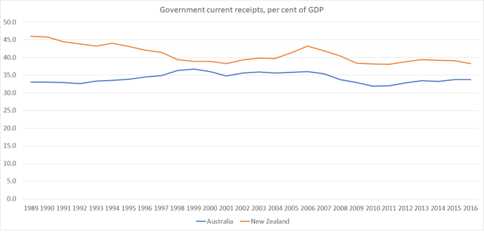
But what do the numbers show? For history, I turned to the OECD’s database, where they have lots of fiscal series going back typically to around 1989. While much of the attention focuses on the Australian federal government finances, it is important for New Zealanders to recognise that state governments are a large part of the overall government mix in Australia. The OECD numbers are for “general government”, encompassing federal, state, and local government (or, specifically, national and local government in New Zealand).
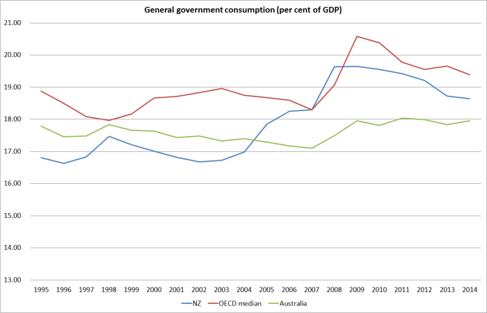
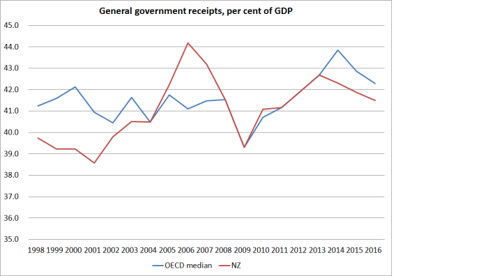
It is also worth remembering that the size of government is smaller in Australia than it is in New Zealand. That is so whether we look at revenue.
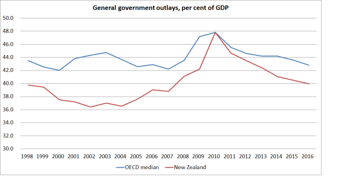
Or expenditure
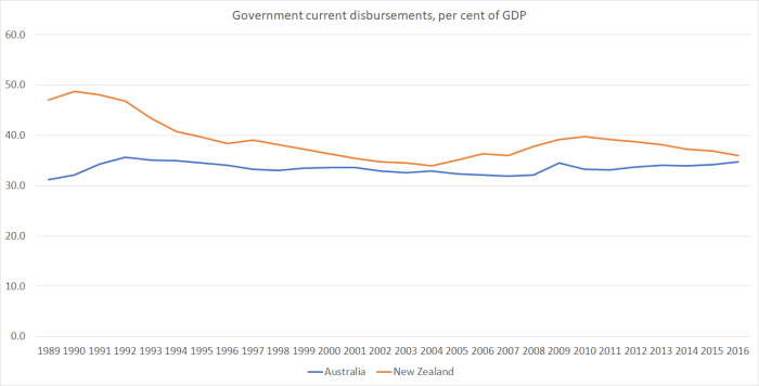
And government spending as a share of GDP has also been more stable in Australian than in New Zealand. In fact, last time I checked government spending as a share of GDP had been more stable in Australia, over decades, than in almost any other OECD country.
What about fiscal balances, adjusted for the state of the respective economic cycles. Here is the OECD’s measure.
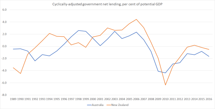
A remarkably similar pattern really. Our surpluses have averaged a little larger (and our deficits a little smaller) than those of Australia in the last 15 years, but there really isn’t much in it. And do note that on this cyclically-adjusted measure, New Zealand is estimated to have been in slight deficit in 2016.
And what of debt? This chart shows gross general government financial liabilities as a per cent of GDP.
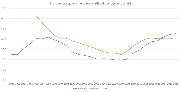
That is certainly a less favourable picture for Australia – gross debt as a per cent of GDP higher than at any time for decades. But here is the – superior for most purposes – net debt picture.
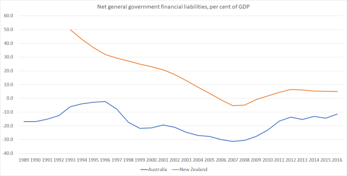
Australian governments have had less debt than New Zealand through the whole period, and if the gap has closed just a little in the last decade, the change is pretty slight. From a public debt perspective, Australia doesn’t seem to have much to worry about, with net financial assets (across all tiers of government) of around 10 per cent of GDP.
We won’t see the New Zealand government’s projections for the next few years until the Budget is released tomorrow. But plenty of commentary focuses on the prospect of rising surpluses for years to come in New Zealand (as if this is somehow a good thing, when debt is already low), in contrast to the projections of deficits in the federal government books in Australia.
But one problem with those comparisons is that they aren’t apples for apples comparisons. Thus, our government accounts for a long time have focused on the operating balance. Relative to more traditional fiscal measures – of the sort typically given prominence in Australia – our deficit/surplus measure excludes capital expenditure but includes depreciation. In a country with (a) a positive inflation rate, and (b) a rising population and rising living standards, government capital expenditure will typically exceed depreciation. That isn’t a problem in itself, but it can make cross-country comparisons harder (the OECD historical numbers in the earlier charts are done consistently).
But here – taken from the Australian official documents – are the federal government deficit measures done the Australian way (“underlying cash balance”) and something very like the New Zealand way (“net operating balance”).
| Underlying cash balance | Net operating balance | |
| Per cent of GDP | ||
| 2015/16 | -2.4 | -2.0 |
| 2016/17 | -2.1 | -2.2 |
| 2017/18 | -1.6 | -1.1 |
| 2018/19 | -1.1 | -0.6 |
| 2019/20 | -0.1 | 0.4 |
| 2020/21 | 0.4 | 0.8 |
As they note in the Australian Budget documents
The net operating balance has been adopted for some time by the States and Territories (the States) and some key international counterparts as the principal focus for budget reporting. All the States report against the net operating balance as the primary fiscal aggregate. New Zealand and Canada also focus on similar measures.
One might feel slightly queasy about how the Australian government is raising additional revenue – that populist bank tax seems to have more to do with utu (the Australian Bankers’ Association appointed a former Labor premier as their Executive Director, much to the annoyance of the Treasurer), and undermining Opposition calls for a Royal Commission into banking, as with principles of sound taxation – but operating deficits of 1 per cent of GDP simply shouldn’t be a matter of concern, in a growing economy with low levels of public debt and relatively modest (by international standards) overall tax burdens.
But wait, as they say in the TV ads, there’s more. The Australian Federal Treasury’s background Budget papers point out that
the Commonwealth provides grants to others (primarily the States) for capital purposes (that is, to acquire their own assets). This spending appears as a grant and detracts from the underlying cash balance and the net operating balance.
In 2017/18, the amounts involved are around 3.5 per cent of federal government spending.
Make that adjustment, and this is what the federal government’s operating balance would look like.
| Underlying cash balance | Net operating balance | Adjusted net operating balance | |
| Per cent of GDP | |||
| 2015/16 | -2.4 | -2.0 | -1.5 |
| 2016/17 | -2.1 | -2.2 | -1.5 |
| 2017/18 | -1.6 | -1.1 | -0.4 |
| 2018/19 | -1.1 | -0.6 | 0.0 |
| 2019/20 | -0.1 | 0.4 | 0.8 |
| 2020/21 | 0.4 | 0.4 | 1.2 |
The adjustment doesn’t change anything about overall public sector finance in Australia. The states will, presumably, in future have to account for the depreciation on these federally-funded capital projects. But if one is looking just at the federal level, it seems like a reasonable adjustment. On that adjusted measure, the federal operating budget in 2017/18 is projected to be very close to balance. Of course, unlike the situation in New Zealand, Australian governments can’t count on getting all their budget measures through Parliament, but on the face of it, the endless angst in some quarters about Australian government finances does seem rather overdone.
The other thing that muddies the water in short-term comparisons is differences in rates of population growth. A few years ago, Australia’s population was growing faster than New Zealand’s – helped by all the New Zealanders going to Australia. For now, New Zealand’s population is growing quite a lot faster than Australia’s – not so many New Zealanders are going to Australia (and we have slightly larger controlled immigration programme per capita than Australia does). In the short-term, unexpected population growth tends to boost demand more than supply, and specifically tends to flatter the government operating balance measures. Consumption tax and income tax revenue both rise quite quickly, and operating expenditure tends to lag behind. Even government capital expenditure tends to lag – notice the recent announcement of more infrastructure spending here, much of which is to catch up with the unexpectedly fast population growth – and you don’t have to maintain, and can’t depreciate (depreciation is in the operating balance), an asset that doesn’t yet exist. That spending pressure will come.
This post isn’t intended as a criticism of New Zealand governments (there are plenty of other grounds for that), or as praise for Australian governments. It is mostly just about making the point that, when considering overall fiscal management, if one stands back a little the similarities are much more apparent than the differences. And that is to the credit of a succession of governments on both sides of the Tasman.
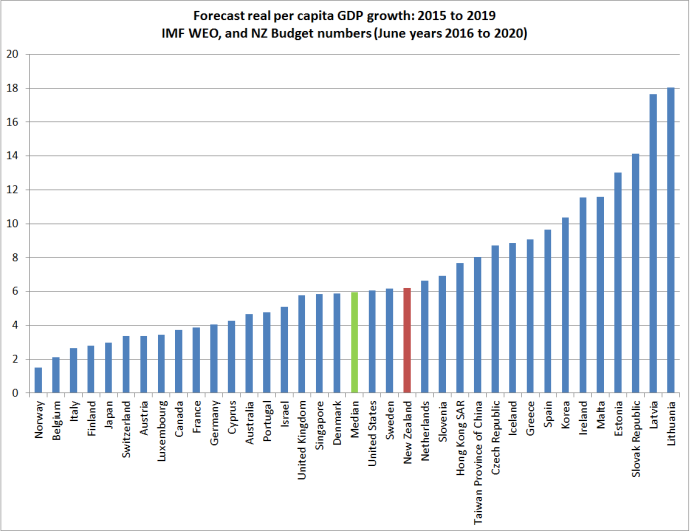
Standing back, here is how the OECD countries ranked last year on net general government liabilities as a per cent of GDP.

O to be Norway one might reasonably conclude. But given the choice, I’d take New Zealand or Australia’s cumulative (and current) fiscal management over those of almost every other country in the OECD. And unlike many of these countries, neither country has huge off-balance sheet (ie not in these numbers) public pension liabilities either.
Productivity (or lack of it) is another story of course.