It was a short list. I couldn’t think of any.

As a conservative, monarchist and Christian, I had been encouraged by the political success of Tony Abbott, and quite seriously underwhelmed at the idea of Malcolm Turnbull becoming Prime Minister of our closest ally, major trade and investment partner, and more generally the most similar country in the world to New Zealand.

On its own the latest round in the Italian-style revolving Prime Ministership in Australia wouldn’t have prompted a post on a blog that is mostly about economics and public policy issues.  But reading stories this morning in which the incoming Australian Prime Minister is quoted as praising John Key’s economic management was just too much.  Turnbull is quoted as saying

“John Key has been able to achieve very significant economic reforms in New Zealand by doing just that, by taking on and explaining complex issues and then making the case for them. And I, that is certainly something that I believe we should do and Julie and I are very keen to do that again.”

I grabbed a piece of paper from my bedside table and starting trying to jot down on the back of the envelope the “very significant economic reforms” in New Zealand over the last seven years.

It was a short list.  I couldn’t think of any.

Perhaps Turnbull had in mind the tax package of 2010?  Some of it might have been useful, but (a) it was pretty small in the scheme of things and (b), as the Treasury pointed out at the time, the net effect of that package was to raise the average tax rate on business income, not lower it.

From almost seven years of a Key-led government, I managed a few other small useful items for the list of reforms:

No doubt there are others, but if anyone can point me to a “very significant economic reform” undertaken in New Zealand since November 2008 I’d be grateful.  I don’t count closing the fiscal deficit.  It is welcome of course, but we’ve had persistent deficits despite record high terms of trade, and simply closing a deficit is not itself an economic reform.   Weak wage pressures across the economy have made fiscal management a lot easier than might have been expected.

And the problem with even the list above is the list of measures that could appear on a  “steps backward” list:

  • Higher effective corporate tax rates
  • The debacle of the earthquake-strengthening legislation
  • The continuing debasement of our skills-based immigration system, both in the way it is administered and in formal announced policy.
  • New overlays of financial market regulation
  • The re-establishment of direct government controls over who banks can and cannot lend to
  • The continuation of a regime of “corporate welfare”, including for example the Sky and Tiwai Point deals, and the smell that the Saudi sheep deal gives off
  • The degree of central government control of the Christchurch repair project, involving both wasteful projects (some of which may not finally go ahead), and the way central government has artificially boosted land prices and impeded the prompt redevelopment of the central city.
  • The continuing apparent decline in the rigour of public sector policy advice, and in the use of robust cost-benefit analyses in underpinning policy decisions.
  • Increased first home buyer subsidies.
  • Undermining housing affordability with mandatory insulation etc requirements for rental properties
  • Continuing increases in minimum wages, from very high levels (relative to median wages) at a time when unemployment is quite high, and policy was supposedly oriented to getting people off welfare.
  • Heavy investment in the newly state-repurchased loss-making Kiwirail

But, mostly, the story is just about the failure to do anything much.   I’ve previously quoted some quite-inspiring Key lines from a speech just before the 2008 election.

I came into politics because I believed New Zealand was underperforming economically as a country. I don’t think it’s good enough that so many New Zealanders feel forced to leave our country each year to seek higher wages in Australia. I don’t think it’s good enough that our average incomes lag so far behind the rest of the world. And I think it’s unforgivable that the Labour Party has done so little to address these fundamental challenges.

I believe that a very big step change is needed in our economic performance to ensure New Zealand can make the most of its considerable potential. Growing the economy of this country continues to be my driving ambition. I stand before you today ready to deliver on that ambition for New Zealand.

You have my personal commitment that if I am elected Prime Minister in eight days’ time I will work tirelessly over the next three years to deliver the stronger economic future our country deserves.

That commitment was made just before the Prime Minister was elected.  A year later, in its first report in late 2009, the 2025 Taskforce, established (and then abolished) by the current government included on one of its front pages another aspirational quote from John Key, now well-established as Prime Minister..  The quote the 2025 Taskforce used (from the SST of 8 Nov 2009) was “Our vision is to close the gap with Australia by 2025”

Fine words, but there has been almost no action.

Fine words, but with no tangible results.  New Zealand has made no progress in closing gaps with Australia over the seven years John  Key has been Prime Minister –  not on GDP per capita, not on national income per capita, and not on productivity either.  If anything, we’ve drifted further backwards.  I put lots of charts in this post last week, but here are just a few reminders:

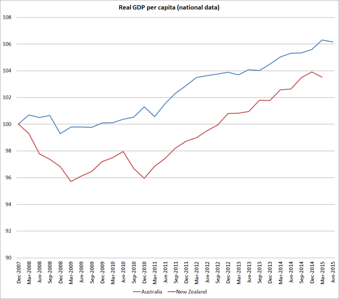
Real GDP per capita for the two countries, where we’ve done a little worse than Australia.

national real GDP pc

And here is real GDP per hour worked.

national real GDP phw

Of course, our Prime Minister has won three successive elections, the last two rather narrowly, and that must sound quite appealing to the backbenchers in marginal seats in the Liberal Party’s caucus.  But if Malcolm Turnbull is serious about economic reform –  which frankly seems unlikely –  he shouldn’t be looking across the Tasman for inspiration and example.

Two central banks on property: a study in contrast

Luci Ellis, head of the Reserve Bank of Australia’s Financial Stability Department,yesterday  gave a speech titled “Property Markets and Financial Stability: What do we know so far?,  at a real estate symposium at the University of New South Wales.

The Reserve Bank of Australia is a fairly hierarchical organisation, and so although Ellis is a department head, there is an Assistant Governor (several of them) and a Deputy Governor and the Governor above her.  It is a reminder of how deep a bench of talented people the RBA has.

I didn’t agree with everything in Ellis’s speech by any means – among other things there is an uncharitable dig at the 1990s RBNZ, and I was surprised to find no references to land use regulation at all –  but it is the sort of speech that one comes away from with plenty of food for thought.  It is thoughtful and balanced, offering some fresh insights, and reframing other material in an interesting way. It will repay rereading.   Taken together with the speech from Wayne Byres, chairman of APRA, that I discussed recently, it is the sort of material that gives one some confidence that the key Australian institutions  have thought carefully and deeply about property market issues and risks.  And that they have sought to use historical experiences, and those of other countries, for illumination and not just for support.  Not everyone in Australia will agree with Luci Ellis’s way of looking at the issues, but it would be foolish not to grapple with the arguments and evidence that people like her advance.

The contrast with our own Reserve Bank is a sorry one. Our central bank does plenty of speeches, but most of them are pretty lightweight affairs.  As they will, and must, market commentators scour them for hints about near-term policy direction, but I don’t think any reasonably well-informed observer comes away from a Reserve Bank speech –  whether from Wheeler, Spencer, Fiennes, McDermott, or Hodgetts – feeling that they now understand the isssues, or even the nature of the questions, better.  Sadly, it isn’t only the Reserve Bank: the quality of the economic analysis from our key economic policy agencies more generally now seems patchy at best.  I bang on here about the New Zealand’s slow continued relative economic decline, but when I look at the quality of the policy advice etc (whether it is MBIE or Treasury on (eg) immigration, or the Reserve Bank) I sometimes wonder if we should really be surprised.

I’m not going to try to excerpt Luci Ellis’s speech, simply encourage anyone interested in the substantive issues to read it.  Little of it is Australia-specific and many of the insights and questions are relevant to the discussions and debates that should be occurring in New Zealand.

Rather than excerpt the core content of the speech, I want to draw attention to just one section about good public policy processes.  Here is what Ellis has to say:

But the policy imperatives inspiring the work make it even more important to be scientific in our approach. By scientific, I mean the idea that the celebrated physicist Richard Feynman talked about in a much-cited university commencement address (Feynman 1974).

“Details that could throw doubt on your interpretation must be given, if you know them. You must do the best   you    can – if you know anything at all wrong, or possibly wrong – to explain it. If you make a theory, for example, and advertise it, or put it out, then you must also put down all the facts that disagree with it, as well as those that agree with it.”

It’s an argument for nuance, for being rigorous about your approach and for being prepared to admit you might be wrong. But I don’t want to understate the challenges this poses in a policy institution.

I hadn’t come across Feynman’s speech previously, but it is also worth reading.   Here is the fuller version of the bit Luci Ellis quoted from.

It’s a kind of scientific integrity, a principle of scientific thought that corresponds to a kind of utter honesty–a kind of leaning over backwards. For example, if you’re doing an experiment, you should report everything that you think might make it invalid–not only what you think is right about it: other causes that could possibly explain your results; and things you thought of that you’ve eliminated by some other experiment, and how they worked–to make sure the other fellow can tell they have been eliminated.

Details that could throw doubt on your interpretation must be given, if you know them. You must do the best you can–if you know anything at all wrong, or possibly wrong–to explain it. If you make a theory, for example, and advertise it, or put it out, then you must also put down all the facts that disagree with it, as well as those that agree with it. There is also a more subtle problem. When you have put a lot of ideas together to make an elaborate theory, you want to make sure, when explaining what it fits, that those things it fits are not just the things that gave you the idea for the theory; but that the finished theory makes something else come out right, in addition.

In summary, the idea is to give all of the information to help others to judge the value of your contribution; not just the information that leads to judgement in one particular direction or another.

The easiest way to explain this idea is to contrast it, for example, with advertising. Last night I heard that Wesson oil doesn’t soak through food. Well, that’s true. It’s not dishonest; but the thing I’m talking about is not just a matter of not being dishonest; it’s a matter of scientific integrity, which is another level. The fact that should be added to that advertising statement is that no oils soak through food, if operated at a certain temperature. If operated at another temperature, they all will–including Wesson oil. So it’s the implication which has been conveyed, not the fact, which is true, and the difference is what we have to deal with.

And this, I think, is what most seriously troubles me about our own Reserve Bank’s contributions to the discussion of property risks etc.  Whether it is speeches from the Deputy Governor, the Governor’s own comments at FEC, consultation documents, and responses to consultation documents, we’ve seen far too little of the sort of scientific integrity that Feynman was talking about.  We might not expect much from advertising agencies, or from politicians.  But we really should expect it from an independent technocratic agency such as a central bank.

We had some glaring examples of how not to do policy in the Reserve Bank’s processes that led to the decision to treat lending on investment properties as riskier than other housing lending.  Ian Harrison documented various examples of selective quotation, dubious use of published studies etc. I gather that the Bank reckons it has found some holes in Ian’s arguments, but it shouldn’t have needed him to be raising the issues at all.  We should expect an organisation like the Reserve Bank to go out of its way to make its case, and to make its case more convincing by showing that it was aware of, and had drawn attention to, any potential pitfalls or weaknesses in the arguments, or case, it was making.

My own concern is much more with the new investor finance restrictions.  Perhaps they are an appropriate response to the situation, but even if so we will never be able to have a well-founded confidence in such a conclusion because of the poor quality, highly selective, case the Bank has made, the secrecy with which it guards the submissions that were made on its proposals, and the cursory or non-existent responses it has made to concerns and criticisms of its consultative document.

My submission to the Reserve Bank  on the proposed restrictions is here. Here is an extract that summarised some of my key concerns

My concerns about the substance of the proposal fall under five headings:

  • The failure to demonstrate that the soundness of the financial system is jeopardised (this includes the failure to substantively engage with the results of the Bank’s stress tests).
  • The failure of the consultative document to deal remotely adequately, with the Bank’s statutory obligation to use its powers to promote the efficiency of the financial system.
  • The failure to demonstrate that the statutory goals the Bank is required to use its power to pursue can only, or are best, pursued with such a direct restriction.
  • The lack of any sustained analysis (here or elsewhere in published Bank material) on the similarities and differences between New Zealand’s situation and the situations of those advanced countries that have experienced financial crises primarily related to their domestic housing markets.
  • The failure to engage with the uncertainty that the Bank (and all of us) inevitably face in making judgements around the housing market and associated financial risks, and the costs and consequences of being wrong.

The absence of any substantive discussion of the likely distributional consequences of such measures is also disconcerting.  Distributional consequences are not something the Reserve Bank has ever been good at analysing.  In many respects they were unimportant when the Bank’s prudential powers were being exercised largely through indirect instruments (in particular, capital requirements) but they are much more important when the Bank is considering deploying direct controls.  In particular, the combination of tight investor finance restrictions in Auckland and the continuing overall residential mortgage “speed limit” is likely to skew house purchases in Auckland to cashed-up buyers.  In effect, to the extent that the restrictions “work” they will provide cheap entry levels.  New Zealand first home buyers and prospective small business owners will be disadvantaged, in favour of (for example) non-resident foreign owners.    At very least, it should be incumbent on the Bank to spell out the likely nature of these distributional effects.

Conclusion 

The restrictions proposed by the Reserve Bank do not pass the test of good policy.  The problem definition is inadequate, the supporting analysis is weak, and the alignment between the measures proposed and the statutory provisions that govern the use of the Bank’s regulatory powers is poor..

The Reserve Bank refuses to release the submissions it receives (unlike, say, parliamentary select committees) and instead published what it loosely describes as a “response to submissions”, together with a Regulatory Impact Assessment(RIA).   I had intended to comment in detail on these documents, but did not get round to it when they came out a few weeks ago, and won’t bore readers with that now.  Instead, lets take a higher level approach.

The RIA is barely five pages long, and two of those pages are largely devoted to three simple charts.  There is no attempt at a cost-benefit analysis, or to quantify any of the judgements. There is also little or no engagement with the relevant statutory provisions of the legislation the Reserve Bank operates under.

The response to submissions was 10 pages long, but most of this is devoted to operational details of the proposal, with only three pages given over to the policy issues themselves (is such a restriction an appropriate, and net beneficial, policy response to a real and substantive issue).  Although the document is described as a response to submissions, most of the points I included in my summary above are not even mentioned, let alone dealt with or responded to.  Since the Bank keeps submissions secret, it is only if submitters themselves choose to publish their own submissions that we can know what points are being made.  We should be able to count on a more honest reporting of the issues that have been raised (there were, after all, only 13 submissions).

The Bank may have a strong case for its position, but all it has done –  in the consultation document and response – is a piece of advocacy work.  It has made no sustained attempt to outline the strengths and the weaknesses of its case. There is, for example, no substantive discussion of the efficiency issues even though financial system efficiency is a key element in the statutory objective and LVR limits cannot but impair the efficiency of the system.  And there is no recognition, or consideration of the implications, of the fact that many countries have had rapid credit growth and high house prices, while avoiding a financial crisis.   It is simply poor science (in Feynman’s terms) and poor public policy.   And the points around the distributional effects of the policy are not even touched on.    Such selectivity speaks poorly of the Bank as a public policy agency.

I don’t want to idealise the Australian institutions, which (being comprised of human beings) have made their own misjudgements over the years.  But at present the quality of the material the RBA and APRA are putting out shows up the Reserve Bank of New Zealand in a particularly poor light.  New Zealanders deserve better from such a powerful institution, and from those who are paid to hold it to account.

Let’s hope they manage a better quality of argument and engagement in the Monetary Policy Statement tomorrow.
Closing the gap with Australia: only the OECD seems to think so

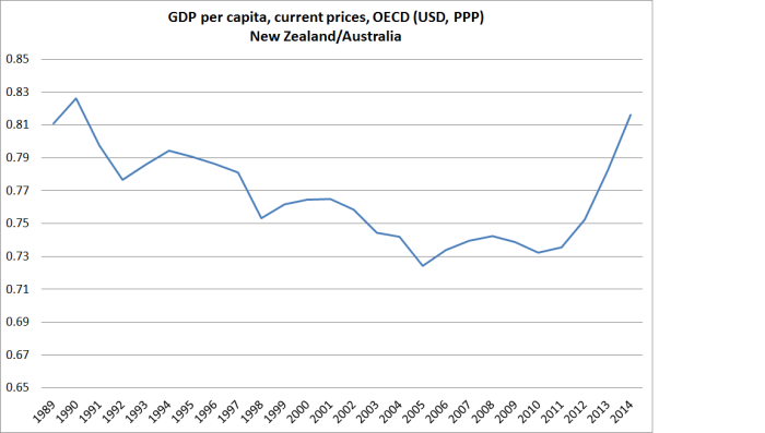
A friend asked me yesterday for the latest GDP per capita numbers for New Zealand and Australia.  His interest was a point estimate, to compare current levels in the two countries.  I went back to him with the series I would normally consider best for that purpose: the OECD’s measure of current price GDP per capita, converted to a common currency (usually USD) using the estimated purchasing power parity (PPP) exchange rates.  Unlike constant price measures, current price measures take full account of changes in the terms of trade –  which aren’t things governments can do much about, but which can materially affect living standards in countries like ours (in which the terms of trade are quite variable).

To my surprise, Australian per capita GDP on that measure was only about 22 per cent higher last year than New Zealand’s (= New Zealand’s being 18 per cent below Australia’s).   And if one believed that measure, the last few years had been just great for New Zealand (at least relative to Australia).  On this measure we’d long been drifting gradually further behind Australia, only to have experienced a startling reversal in the last few years.  It was as if that once-upon-a-time goal of catching Australia by 2025 was coming into view, all without actually doing any significant economic policy reforms.

gdp pc nz vs au

Of course, it was too good to be true.  But it prompted me to have a look at a variety of other measures of how the two countries have done since 2007 (just prior to the global recession).  I started with national data, calculated in local currencies, and deflated by domestic estimates of changes in prices.

Here is real GDP per capita for the two countries, where we’ve done a little worse than Australia.

national real GDP pc

And here is real GDP per hour worked, where the differences are quite extraordinarily large (and not in New Zealand’s favour).

national real GDP phw

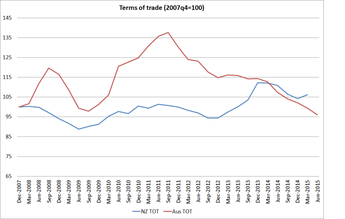
Australia’s terms of trade rocketed up over 2010 and 2011, but have since fallen back very sharply. Over the full period since 2007, we’ve now done a little better than them, and foreign trade is a larger share of our economy that it is of Australia’s.

terms of trade since 07q4

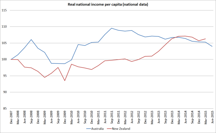
And here are the two countries’ respective measures of real income, which take account of the effects of the terms of trade.  We are now just slightly ahead of them over that full period.

national rgndi

And what about the international databases?  The Conference Board has measures of real GDP per capita and real GDP per hour worked, converted to a common currency using PPP exchange rates.  They have much the same picture as the national data.

Here is real GDP per capita –  we’ve lagged further behind.

conf board real gdp pc

And real GDP per hour worked, where again the New Zealand numbers have been very poor.

conf board real gdp phw

And the OECD’s real (constant price) measures also show something similar.  Here they use 2005 PPP exchange rates.

oecd real gdp pc

oecd real gdp phw

So none of these national or international measures suggest anything particularly encouraging about New Zealand’s performance in recent years.  So far, our terms of trade have held up a bit better than Australia’s, but they are outside our control, and at best all that terms of trade strength has done is offset a lamentable productivity performance.  And most observers expect our terms of trade to fall further (as, of course, may Australia’s).

Which brings us back to the OECD’s current price estimates.  Here is how we are shown as having done relative to Australia since 2007.

current price gdp pc oecd

It looks too good to be true, and it is.

The OECD generates these numbers by converting national data into a common currency using estimated PPP exchange rates.  PPP exchange rates are, broadly, the exchange rates that would equalise price levels in the respective countries.  They can’t be directly observed and have to be estimated.  For established advanced countries you would not expect the PPP exchange rates to fluctuate much, and the biggest influence over time will often be any differences in inflation rates.  Thus, Australia has a slightly higher inflation target than New Zealand does, and Australia’s inflation rate has averaged a little higher than New Zealand’s over the inflation targeting period.  That should have been reflected in a very gradual, quite modest, rise in the NZD/AUD PPP exchange rate.

ppp nzd aud

And that is exactly what we saw until 2005.  But since then the OECD estimates that the exchange rate that would equalise prices in the two countries has risen by 15 per cent.  It simply doesn’t seem plausible – there has been nothing that structural in the two countries that could explain such a change in such a short period of time.  I’ve asked the New Zealand desk at the OECD if they have any idea what is going on, but in the meantime I will be steering very clear of the OECD’s current price estimates.

There is no one “right” international comparison of income/GDP levels. But whatever the “true” difference between Australia and New Zealand – perhaps 35-40 per cent – it remains large.  On some key measures – notably productivity estimates – it has continued to widen.  But then why would we be surprised?  If we keep on with much the same policies why would we expect much different outcomes?  New Zealand has been one of the least successful Western economies in recent decades –  indeed, probably for the last 100 years.  As I’ve highlighted previously, since 2007 many European countries have done extremely badly but even in that period, when floating exchange rate commodity exporters haven’t done as badly, we’ve not managed to make any progress in closing the large gap to Australia.

We can do better, and the failure to even start doing so reflects poorly on our political leaders and their senior official advisers, neither of whom seems to have a credible alternative strategy.

Are we really better off than everyone but the US and Canada?

Yesterday I wrote that

the single economic issue that I care about most is reversing the decline in New Zealand’s relative economic performance that has been going on, in fits and starts, since at least the middle of the twentieth century, if not longer.

A few minutes after posting that I noticed a story about some new work by Arthur Grimes and Sean Hyland of Motu, in which they suggest that perhaps there isn’t a problem at all.   One of the authors was also nice enough to get in touch and alert me to it.   As they put it

“…New Zealand households have amongst the highest material living standards in the world”

They have quite a long technical working paper, which I have dipped into to answer some specific questions but have not read in full. But the seven page Motu Note, “The Material Wellbeing of New Zealand Households” tells, and illustrates, the story in a very accessible way. It also covers some consumption inequality results which I’m not going to touch on here at all.

Grimes and Hyland attempt to develop a measure of material wellbeing, using as their basis the durable goods held by households that have a fifteen year old in them.

This framework is applied to household level data from the OECD’s Programme for International Student Assessment (PISA) surveys, which include questions regarding the presence of household durables in the 15-year-old respondents’ homes, covering 16 consumer goods which range from the inexpensive (books), to expensive consumer durables (cars), whiteware (a dishwasher), utilities (an internet connection), and housing characteristics (the number of bedrooms and bathrooms in the house). This allows us to construct a dataset of household possessions for almost 800,000 households, covering 40 countries in the years 2000, 2009 and 2012.

And here is the picture with the headline-grabbing results. Having had below-average growth for the previous 12 years, these New Zealand households had, on this measure, material living standards in 2012 higher than the PISA-15 year olds households in all the other countries, except Canada and the United States.

grimes hyland

I found the exercise (which has been funded by a Marsden Fund grant) an interesting one, and yet I wasn’t really convinced. Here are some of the reasons:

  • How confident are the authors that PISA sample schools have been selected on the same basis in each country they look at?  PISA isn’t mainly designed to generate wellbeing measures, and any differences there will immediately flow into these durable consumption results.  I have read stories previously of strategic national selection of PISA sample schools
  • The general thrust of recent literature has been towards measuring some concept of wellbeing broader than GDP (or GNI, or –  better still – NNI, the gross income of New Zealanders, less depreciation).  It wasn’t clear to me why this particular subset of types of households, and types of consumption, should be thought superior to even traditional measures of consumption.
  • It wasn’t clear to me why durables consumption should be considered particularly important (except perhaps that the data are available in this sample).
  • Since the authors only look at the possession of these durables, not at the cost of them, they don’t factor in how much the cost of these items might squeeze out other consumption.  As a simple example, Amazon books are much more expensive here than in the United States (on account of transport costs).  We have a lot of them in our house, and less of other stuff than we otherwise would.
  • Perhaps these results might be relevant to child poverty debates, but we are typically more interested in how a country’s economy supports the consumption of all types of households within it.
  • Since the birth rate in, say, New Zealand, is much higher than that in, say, Italy, a typical Italian household with a 15 year old probably has 0-1 sibling, while a New Zealand household has 1-2.  In what sense are the consumption results then comparable?
  • And what about the many other consumption items.  For example, clothes, or restaurant meals, or foreign holidays (the latter more costly here than in, say, Belgium).  Perhaps access to beaches and mountains is a plus here, but access to good newspapers, and great museums and art galleries certainly weighs in favour of people of most of these countries over New Zealand.  And what of health or education spending –  actual individual consumption, but often provided by the state?
  • While it is reasonable to prioritise consumption over production, we know that savings rate vary quite widely across advanced economies.  Today’s savings support tomorrow’s consumption.  GNI (or NNI) measures provide a better sense of the consumption possibilities an economy generates than a particular subset of current consumption.

In wrapping up this post, I’m going to leave you with two charts.

The first is from the 2011 World Bank International Comparisons Programme. They have developed a measure of actual individual consumption, across almost all countries, at purchasing power parity values (ie adjusting for the differences in what things cost across countries). Here are the per capita results for the subset of OECD-Eurostat countries (a slightly larger group than Grimes and Hyland use).

aic

Of these 46 countries, New Zealanders’ average consumption – across types of people – falls squarely in the middle of the pack, well behind most of the older OECD countries. Our ranking here looks quite similar to the rankings people are familiar with from GDP per capita, or even NNI per capita, charts. It isn’t a perfect measure, but it is much more comprehensive that the Grimes-Hyland one, and it isn’t obvious why it is misleading us about the material aspects of life in New Zealand relative to other advanced countries.

The final chart is just relevant to the New Zealand vs Australia comparison. On the Grimes-Hyland measure we score very similarly to Australia. Frankly that seems implausible as a representation of relative material living standards. Why? Because for fifty years large numbers of New Zealanders (net) have been leaving New Zealand, overwhelmingly for Australia.  Very few Australians have come the other way. There is quite a lot of cyclicality in the flow, but the trend is very clearly in one direction only.

cumulative plt since 1960

It wasn’t that way when more traditional GDP per capita estimates suggested that New Zealand and Australian economies were level-pegging. I entirely agree with authors who say that GDP per capita (or even NNI per capita) are not the be-all and end-all. People don’t change countries based on national accounts aggregates, or other international agency wellbeing measures. They are presumably changing countries because they believe the new country offers sufficient better material living standards, for them or their children, to offset the loss of the intangibles of home, extended family, and a culture and institutions one knows.   The choices people make reveal their preferences, and it is unlikely that over decades they’ve got it systematically wrong (after all, they could have come home again, as many did). None of us knows how much poorer material living standards are here than in Australia, but we can be pretty confident they are now, and have been for some decades, worse.

(Real researchers can stop reading here, but..) I helped the 2025 Taskforce put together their first report, on closing the gap with Australia. The report focused on policy, and as the primary underpinning for the analysis used national accounts measures, but at their request I put together this – purely illustrative – box. I stress the words “purely illustrative”- it was a matter of what I could find quickly. It isn’t comprehensive, but – as the box concludes – that is why we have, and try to improve, national income and expenditure accounts. 


Box 1: What do Australians get with their higher incomes?

Digging down to look at what people in the two countries actually consume can give a more tangible sense of the differences between New Zealand and Australian material living standards. Again, what is important in different climates varies, and tastes differ. But comparing living standards in New Zealand and Australia is easier than in most pairs of countries because the tastes and expectations are broadly similar.

These data are sometimes less reliable than the national accounts. Sometimes they are not compiled by national statistical agencies but by industry bodies. Even when statistical agencies are involved, things aren’t always measured exactly the same way in different countries. There is no single decisive fact. This box simply illustrates that across a very wide range of things that different people value or like to consume, the typical New Zealander has less than the typical Australian. Starting with where we live: the average size of a new Australian house or apartment built in 2007 was 212 square metres. In New Zealand, the comparable average was 193 square metres. Or what we drive: Australians have 619 cars per 1000 people, while New Zealanders have 560.

New Zealanders work more to earn our lower incomes: 887 hours a year are worked per head of population, as compared with 864 hours per head in Australia. Australians live longer: 81.1 years, compared with 80.2 years in New Zealand. Fewer people in Australia (111 per 100,000 people) die of heart disease each year than do in

New Zealand (127 per 100,000 people). Many fewer people die on the roads there: 7.8 each year per 100,000 people in Australia, 10.1 each year in New Zealand.  Australians have more televisions (505 per 1000 people) than New Zealanders do (477 per 1000 people). And there are more broadband subscribers (10.3 per 100 people, compared with 8.1 per 100 in New Zealand).

There are more cinemas per million people in Australia (92.4) than in New Zealand (82.2). And more mobile phones too (906 per thousand people versus New Zealand’s 861 per thousand). Australians drink more than New Zealanders: both alcohol (9.8 litres per capita versus 8.9 litres) and fruit juice (34.4 litres per capita versus 24.8).

This isn’t comprehensive by any means – that is why we have national income accounts. And there are some measures on which New Zealanders have more than Australians. Australia has 34.9 McDonalds outlets per million people, but New Zealand has 36.9 per million.

Glenn Stevens on monetary policy

I’ve long had a great deal of time for the Reserve Bank of Australia. It is an institution made up of human beings, so they make mistakes from time to time (for a while, for example, their relentless optimism about China reminded one of a sell-side analyst) but it has been a strong institution for decades, successfully developing successive generations of governors and senior managers. Successful organisations tend to promote from within. The RBA publishes thoughtful analysis, and the speeches of senior managers are usually well-worth reading. I don’t recall any major innovations originating at the RBA, but they’ve avoided policy debacles like the MCI experiment, or rapid policy reversals.  All things considered – and setting to one side the serious issues around Note Printing Australia – I think the RBA has had a reasonable claim to having been one of better advanced country central banks in recent decades. At times, no doubt, fortune has favoured them. And perhaps too, there is a little in the old proverb about the grass always being greener on the other side.

Anyway, I was reading Glenn Stevens’ most recent (and quite short) speech, “Issues in Economic Policy”, on some of the challenges the Australian authorities, and the Reserve Bank in particular, face at present. The Governor grouped his remarks under four headings:

  • Negotiating turbulence (the international environment)
  • Accepting adjustment
  • Maintaining stability, and
  • Securing prosperity (a rather general discussion of the place of microeconomic reform)

What struck me, and prompted this post, was how scarce references to inflation were in the speech.  The Reserve Bank’s primary policy responsibility is the conduct of Australia’s monetary policy.  As the (non-binding) Statement on the Conduct of Monetary Policy between the Treasurer and the Governor put it:

Both the Reserve Bank and the Government agree on the importance of low inflation.

Low inflation assists business and households in making sound investment decisions. Moreover, low inflation underpins the creation of jobs, protects the savings of Australians and preserves the value of the currency.

In pursuing the goal of medium-term price stability, both the Reserve Bank and the Government agree on the objective of keeping consumer price inflation between 2 and 3 per cent, on average, over the cycle. This formulation allows for the natural short-run variation in inflation over the cycle while preserving a clearly identifiable performance benchmark over time.

There are only two references to inflation in the speech.  In the main one he observes:

A period of somewhat disappointing, even if hardly disastrous, economic growth outcomes, and inflation that has been well contained, has seen interest rates decline to very low levels. The question of whether they might be reduced further remains, as I have said before, on the table.

But the thrust of what followed was a bit surprising:

But in answering that question, it is not quite good enough simply to say that evidence of continuing softness should necessarily result in further cuts in rates, without considering the longer-term risks involved. Monetary policy works partly by prompting risk-taking behaviour. In some ways that is good: in some respects, there has not been enough risk-taking behaviour. But the risk-taking behaviour most responsive to monetary policy is of the financial type. To a point, that is probably a pre-requisite for the ‘real economy’ risk-taking that we most want. But beyond a certain point, it can be dangerous.

Deciding when such a point has been reached is, unavoidably, a highly judgemental process. And that is after the event, let alone beforehand. My judgement would be that policy settings that fostered a return to the sort of upward trend in household leverage we saw up to 2006 would have a high likelihood, some time down the track, of being judged to have gone too far. That is not the case at present, given the current rates of credit growth and so on. But the point is simply that in meeting the challenge of securing growth in the near term, the stability of future economic performance can’t be dismissed as a consideration.

It was as if the authors of the BIS Annual Reports had managed to infiltrate the RBA’s speechwriting team. The point of this post is not to make the case for further cash rate cuts in Australia. On the surface, some further easing looks warranted to me, but I’m not close enough to the Australian data to be confident of that view. My point is that the Governor looks here to be risking taking his eye off the inflation ball, and downplaying short-term macro stabilisation for some ill-defined concern about the longer-term. In any economy adjusting to an investment slump a reasonable case might be made that insufficient risk-taking is going on. And since there are no reliable direct benchmarks for the appropriate degree of risk-taking, a simpler benchmark might be levels of excess capacity in the economy. An unemployment rate of 6 per cent – above any estimates of NAIRU that I’ve seen – might reasonably suggest a need for rather more risk-taking across the economy, if the people who are unemployed are relatively quickly to find jobs.

The Governor goes on to note that “policy settings that fostered a return to the sort of upward trend in household leverage we saw up to 2006 would have a high likelihood, some time down the track, of being judged to have gone too far”. Central bankers worry about periods of rapid growth in credit and asset prices, but it is a curious historical episode to cite. After all, Australia came through that period of leveraging up (which had more to do with the interaction of planning restrictions and rapid population growth as with anything to do with monetary or banking policy) rather well. And if some of that was down to the good fortune of the terms of trade, it isn’t obvious that countries like New Zealand or Canada suffered seriously from the aftermath of rather similar domestic credit booms (although of course, post-2007 growth has been weak almost everywhere). There was little or no evidence that lending standards became pervasively and seriously too loose in Australia (or New Zealand or Canada) during the pre-2007 booms

Perhaps I’m over-interpreting the Governor, but his comments have a bit of a feel about them of the Swedish Riksbank’s ill-fated experiment in using monetary policy to lean against household debt accumulation, rather than keeping their eye firmly focused on the medium-term outlook for inflation. Economists and central bankers don’t know that much about appropriate levels of debt or about what macro policy can do about them. By contrast, we have a stronger sense of when the numbers of people unemployed are above normal, and a rather better (although far from foolproof) sense of what monetary policy can do about that, especially in periods when core inflation pressures (domestically and globally) are pretty quiescent (core inflation measures in Australia seem to be at or below the midpoint). And in Australia, the Reserve Bank’s Act explicitly enjoins the Bank to run monetary policy in a way that best contributes to “the maintenance of full employment in Australia”.  For practical purposes that doesn’t override a medium-term focus on keeping inflation near-target, but it does rank rather higher in the statutory list of considerations than visceral unease about the possibility, at some point down the track of excessive risk-taking.

On an unrelated point, for any readers interested TVNZ’s Q&A programme yesterday pre-recorded an interview with me, to be shown tomorrow. The questions were mostly around the Reserve Bank of New Zealand: actions, inactions, and frameworks. Unless I said something I really didn’t mean to say, I don’t think there is anything in the interview that regular readers won’t have encountered before. One question – how worried should we be about the New Zealand economy – caught me a little by surprise, and I’ve been reflecting further on that. I might jot down some thoughts on that here on Monday.
The Productivity Commission looks into immigration

The Australian Productivity Commission that is.

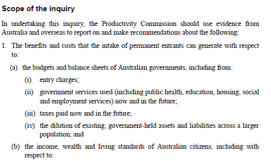
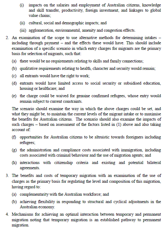
The Australian Productivity Commission has underway an interesting inquiry, initiated by the Federal Treasurer, into immigration to Australia. Here is the scope of the inquiry, taken from the Treasurer’s Terms of Reference.

aus pc1
aus pc2

It is interesting that the Australian government has chosen to initiate another Productivity Commission inquiry only 9 years after the previous large report into the economic impact of immigration. That bulky report concluded that in Australia, the gains from immigration mostly accrued to the immigrants, with little evidence of any material gains to native Australians. Despite the size of that earlier report, there was some aspects of the economic issues (possible benefits, as well as possible costs) that were not covered at all, and the modelling work that was done looked at the medium-term rather than the long term.

The new inquiry has two areas of focus. The first is helping to answer the questions about the costs and benefits of immigration, both to Australian citizens more generally and to the fiscal position of Australian governments more specifically. The second is around the intriguing idea of charging for entry. The idea of rationing entry by price turns up in immigration debates from time to time. “Intriguing” here is my code word for something like “this idea appeals to the economist in me, but yet there is something about it – which I can’t quite put my finger on – that is distasteful, and it seems unlikely to fly”. I can’t see it happening, and yet I’m not entirely sure why it shouldn’t. If we set aside the refugee quota, countries like New Zealand and Australia allow and promote immigration largely for economic reasons, and a price should tell something useful about who could get most value out of permission to live in our country. Perhaps willingness to pay is not overly well aligned to ability to help generate domestic productivity benefits?   But is there good reason not to use price to ration demand for places among those who meet certain basic criteria (age, English language, lack of criminal history etc)? It will be interesting to see what the Commission comes up with in this area.

To their credit, the team working on this immigration inquiry sent a couple of senior people to Wellington this week. New Zealand has quite similar immigration policies to Australia, and for Australia in particular, the largely-free trans-Tasman immigration area also complicates things (as it does for us, in the possibility of people returning home late in life to claim New Zealand welfare benefits). I was among the various groups of public and private sector people they met while they were here, and we had a good wide-ranging discussion.

I noted that I had increasingly come to think that good immigration policy – in countries like ours, with no treaty obligations to allow open access, and (unlike Israel) no national identity/security reasons to promote immigration – is best thought of as an optional complement to economic success. The alternative, which seems to be at the heart of the arguments of immigration advocates in New Zealand, is to see immigration policy as an engine (perhaps large, perhaps small) helping generate economic success.  I can’t think of a country – going back centuries – where immigration has materially improved the economic fortunes of the recipient country. In the last great age of immigration – the decades prior to World War One – migrants flowed to countries that were already economically successful (be it New Zealand, Australia, Canada, Argentina, the United States or even within Europe itself). Economic success allows a country, if it chooses, to support more people at high incomes. And emigration eases the pressures in the source country, lifting living standards among those who remain.

There is, of course, an exception to my story. Immigration has transformed the economic prospects of some physical territories, but only by totally taking over and largely replacing the indigenous population, and the economic institutions of that culture.   New Zealand – like each of the colonies of settlement – is an example of that. And it is an uncomfortable example. My assessment (backed, for example, by the work of people like Easterly, looking at long-term global economic performance) is that Maori average incomes are higher now than they would have been without extensive European settlement, but was the trade worthwhile – across all its dimensions – for the indigenous population? There are huge discontinuities between 21st century New Zealand and 18th century “New Zealand” that don’t exist for, say, the United Kingdom or France.

By advanced economy standards, New Zealand is a classic example of an underperforming country that people should be leaving. And, of course, for decades New Zealanders have been doing so, mostly to more successful Australia.   Of course, we can always attract plenty of people from other (even poorer) countries if we want to. But why would we?     There is no obvious area of the world where the culture and economic institutions are so obviously superior to our own Northern European-sourced ones that we can get the sort of transformative gains (at whatever costs) that Maori may have achieved by allowing extensive European settlement in the 19th century. There is no sign in the data that slightly larger countries grow faster (per capita) than slightly smaller ones.  And there is no reason to think we can somehow attract the very best of possible migrants to a small, remote, underperforming, but pleasant, country.   And if current migration patterns were repeated at scale, or for long enough, we would face the risk of factor price equalisation occurring, but not in the way we want – the typical migrant to New Zealand comes from countries, and economic cultures, that generate materially lower living standards and levels of productivity than New Zealand (or Australia) does.

The draft report of the Australian inquiry is due out in mid-November. I’ll be keeping an eye out for it. Perhaps it might be time for a similar inquiry in New Zealand. I think I’ve mentioned that when I first started raising my arguments about the possible link between immigration policy and New Zealand economic underperformance, there was a lot of discomfort at Treasury. Senior people then talked of the new Productivity Commission as a good place for such issues to be explored. That remains true today, and Treasury has a key role in advising ministers which inquiries to request from our Productivity Commission.

I have had Official Information Act requests in for some time with Treasury and MBIE for copies of advice to ministers on the economic impacts of immigration, and on the target level of permanent residence approvals. As is customary with government agencies, the responses to the requests have both been extended/delayed.   These aren’t particularly time-sensitive requests, but I will be interested to see what the departments have had to say. MBIE is well-known to be strongly pro-immigration, and I have heard reported that current Secretary to the Treasury (himself a temporary migrant) recently reiterated in private a view that “immigration is good; it is as simple as that” (repeating the tenor of comments in a speech earlier this year). Perhaps, but let’s see the argumentation, in the specific context of New Zealand, and in the light of cross-country economic history and experience.

Fiscal policy and how NZ and Australia did in 2008/09

My post the other day about fiscal policy (and why it shouldn’t be eased in New Zealand now), together with a throwaway line about Kevin Rudd’s fiscal policy in the 2008/09 crisis, prompted me to spend a bit of time digging around in the data for the 2008/09 period for both New Zealand and Australia.  This relates to the question “why did New Zealand have a recession and Australia didn’t”

Of course, even that statement is not as simple or uncontentious as it looks.  The shorthand people are using here is the “two consecutive quarterly falls in real (seasonally adjusted) GDP”.  On that measure, New Zealand actually had two recessions (from a peak in 2007q4 to a trough in 2009q2, and not having regained the previous peak, real GDP again fell for a couple of quarters from mid 2010).  By contrast, real GDP in Australia fell in only a single quarter, in 2008q4.

But Australia did not just sail through unscathed:

  • In per capita terms, it took two years for real GDP in Australia to recover to 2008q3 levels.
  • When Australia’s terms of trade fell, real net national disposable income per capita (a measure that captures the direct effects of the terms of trade) fell by around 9 per cent.   The similar measure in New Zealand only fell by around 5.5 per cent.
  • Australia’s unemployment rate rose by around 1.5 percentage points in 2008/09, the scale of increase that might be expected in a mild recession (similar, for example, to the increase in unemployment rate in the New Zealand recession of 1997/98)

So, I don’t want to get hung up on the question of whether Australia had a recession or not.  But it is pretty generally accepted that Australia was less hard-hit than New Zealand (and many other countries).

Some people reckon that the difference is fiscal policy.  No doubt senior figures in the then Australian Labor government (if they could agree on anything) would like people to think so.  The government, egged on by the Australian Treasury, announced two significant fiscal packages in the middle of the global crisis, one in October 2008 and another (much larger) one in February 2009.  By contrast, neither New Zealand government (either side of the November 2008 election) did any material amount of discretionary fiscal stimulus in response to the crisis.

But what I find striking is how similar New Zealand and Australian fiscal policy was, in bottom line terms, during the second half of the 2000s.  If we did not have a crisis-response package in late 2008, we had had a very expansionary Budget earlier that year.  And both countries had been running down structural surpluses for several years.

Here are some charts from the IMF WEO database:

For revenue

revenue

For expenditure

expenditure

For the fiscal balance

net lending

And for the (estimated) structural balance

structural balance

And, perhaps most starkly, here are direct real government purchases (consumption and investment) for the two countries (indexed to 10o in 2007q4).  It is not until the start of 2010 that one can see any material difference between the two lines.  New Zealand’s recession (like those of most other OECD countries, ended in mid 2009).

C+I

Of course, these are highly aggregated numbers, and it may be that there was something in the specific make-ups of the fiscal programmes that meant fiscal policy was much more effective in Australia.  But it isn’t obvious, and it probably shouldn’t be that surprising since in both countries the central banks will have been taking fiscal developments into account in deciding how much to cut their respective policy interest rates.  As it happened (and unsurprisingly) the Reserve Bank of New Zealand cut the OCR by much more (575 basis points) than the RBA (which cut by 400 basis points from the end of 2007 to the trough in April 2009 – having raised the cash rate in early 2008).

So if fiscal policy differences don’t appear to explain why Australia did less badly through this period, what does?  In the New Zealand story, the drought at the start of 2008 didn’t help.

More generally, the terms of trade are very important to both countries, and in both countries they are quite volatile.  In New Zealand, changes in the terms of trade flow more directly into changes in household incomes, since most of the tradables sector is domestically owned (FDI in New Zealand is heavily concentrated in the non-tradables sector).  By contrast, most of the Australian minerals sector (where the terms of trade volatility arises) is foreign-owned, so that Australian residents’ incomes are not so directly affected.  But the Australian minerals sector is very capital intensive, and huge investment programmes drive off actual and expected minerals prices.

What happened to the terms of trade in the two countries?  New Zealand’s increased by around 10 per cent in 2007, and then started gradually falling away again.  But Australia’s terms of trade rose by around 20 per cent in 2008.  The terms of trade then fell away almost equally sharply  before the effects of the Chinese rebound drove hard commodity prices on to their 2011 peak.    But what that timing difference meant was a quite different environment for the Australian economy in 2008 than was the case in New Zealand (or most other OECD countries).

tot 08 and 09

One important place where the difference shows up is in business investment.  Australia’s business investment peaked the same quarter as the terms of trade and – no doubt reflecting long lags on minerals investment projects, and perhaps the sharp fall in the exchange rate – never fell as far as New Zealand business investment did.  As has been pointed out previously, New Zealand’s business investment boom in the 2000s appears to have been concentrated in the non-tradables sector.

business investment

A similar timing difference is apparent in respect of residential investment. New Zealand’s peaked in 2007q3 and Australia’s peaked in 2008q3.  It looks as though timing differences (both domestically and particularly in the terms of trade) were enough to provide just enough momentum for Australia to avoid the two quarters of falling real GDP.

In closing, here is the chart of RGNDI (for NZ) and RNNDI (for Australia), both indexed to 2007q4 (the peak of the last cycle for NZ, the US, and a number of other OECD countries).  It helps highlights just how important that 2008 terms of trade surge was in limiting the slowdown in economic activity in Australia through 2008.

rgndi rnndi

Trade agreements, TPP, and the Australian Productivity Commission

I’m on a tight deadline today and wasn’t going to write anything here, but a reader pointed me in the direction of the Australian Productivity Commission’s newly-published Trade and Assistance Review 2013-14, which devotes an entire chapter to “Issues and concerns with preferential trade agreements” (pages 61-86 here).

As the Sydney Morning Herald summarised it:

The Productivity Commission has launched a scathing attack on Australia’s latest series of free trade agreements, saying they grant legal rights to foreign investors not available to Australians, expose the government to potentially large unfunded liabilities and add extra costs on businesses attempting to comply with them.

Allowing for the relative restraint of bureaucratic language on the one hand, and newspaper style on the other, “scathing attack” doesn’t seem like an unfair description.  Perhaps as importantly, the report raises serious questions about TPP, (although the APC has not seen the documents being negotiated).

As regards rules of origin (whether for goods or services) the APC makes their points about cost and complexity by simply relentlessly listing the different rules of origin in the various Australian FTAs for the item “Bed linen, table linen, toilet linen and kitchen linen”.  They report estimates that “the cost associated with origin requirements could be as high as 25 per cent of the value of goods trade with ASEAN”.  By contrast, unilateral abolition of domestic tariffs, or comprehensive multilateral agreements avoids these costs.  The APC makes quite a lot of the point that time, and political capital, spent negotiating FTAs may be, in part, at the expense of unilateral liberalisation of international trade and domestic competition-enhancing reforms.

The APC report also devotes considerable space to investor-state dispute settlement (ISDS) provisions.  They seem very sceptical of the case for these provisions (and note that 40 per cent of those launched last year were taken against developed countries – presumably countries with robust domestic legal systems).  As they note, signing up to ISDS provisions involves new, unfunded, contingent liabilities for governments while, in their view, there is no sign that the ISDS provisions Australia has already signed have done anything to increase either inward or outward Australian foreign investment.  They also note that the Chief Justice of the High Court of Australia has publicly expressed concern about the risk that ISDS provisions could undermine the authority of domestic courts.

Finally, the APC notes the difficulty of assessing the potential impacts of trade agreements.  They argue that this makes a ‘compelling case for the negotiated text of an agreement to be comprehensively analysed before signing”.  At least in Australia, actual analysis and evaluation appears to have fallen far short of this standard.

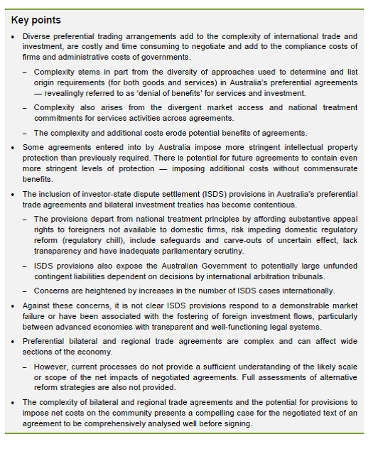
Trade agreements aren’t going to be a much of a theme on this blog, but I found it interesting that as orthodox and pro-market body as the APC felt it appropriate to reiterate its scepticism on FTAs in this way.    Here are the key points from the APC document.

apc

For New Zealand, there still seem to be some important questions to be answered around TPP, and before it reaches a point where a government majority simply votes a signed agreement through the House.   There is no sign yet of material dairy trade liberalisation, intellectual property protections are likely to make us worse off (and perhaps also the ordinary citizens of other countries, even those who host large intellectual property owners), while further ISDS provisions, for which there is no identified market failure, seem set to strengthen the hand of foreign investors relative to domestic ones, undermining the primacy of our own Parliament and courts, for no obvious gain.   I am also uneasy about the provisions that get inserted in these agreements to limit the ability of countries to respond to economic and financial crises.  I was involved in work on these while I was at the Reserve Bank, and again it is not obvious what the problems are with existing multilateral provisions (IMF and WTO).

I remain uneasy that New Zealand might end up signing an agreement primarily because of the momentum in the process, and the desire of our own elites not to self-exclude from “the club”, rather than because there are demonstrable gains to the national welfare of New Zealanders.  If so, it would be cause for concern.  I wonder what sort of robust economic evaluation is envisaged here before MPs are asked to vote on any agreement?

100 years of the New Zealand/Australia exchange rate

Yesterday I looked briefly at some of the recent indicators of relative economic performance for New Zealand and Australia over the last few years.  New Zealand hasn’t done that well.

One item I didn’t mention was the exchange rate.  The fevered talk of parity parties has, fortunately, receded once again, although who knows for how long.  It will probably happen eventually –  after all, New Zealand’s inflation rate averages a little lower than Australia.

We’ve been at parity before of course.  Indeed, for all our history until 1972 a New Zealand dollar (or pound) had been worth as much (or more) as an Australian dollar (pound).  Until 1914 that was all about common gold convertibility, and neither country had a central bank.  This chart starts in 1911.

exchrate1

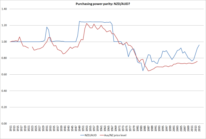
In the long long run, changes in the exchange rates of similarly wealthy countries should broadly reflect differences in the inflation rates of the two countries (relative purchasing power parity). My reading of the literature suggests that empirical support for this long-term proposition has been growing.    But here is what the chart looks like for New Zealand and Australia  (my data source for Australia, Measuring Worth, has a missing observation in 1922).  When I first did the chart a few years ago I was pleasantly surprised by the way the two lines moved broadly together.  When our nominal exchange rate appreciated against Australia’s –  as it did most enduringly in 1948 – it was associated with a rise in Australia’s price level relative to ours.  And, of course, as our high inflation (relative to theirs) became an increasing issue from the mid-late 1960s, our nominal exchange rate fell substantially relative to theirs.  The troughs were in the mid 1980s.

exchrate2

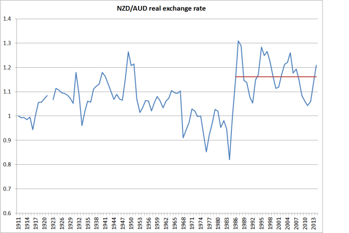
What if we combine the two lines into a real exchange rate series?   Two things strike me?  The first is just how relatively tight a range that bilateral real exchange rate has fluctuated with in over a century.  And second is the way the real exchange rate appeared to be falling in the 1970s and early 1980s, only to step up and subsequently fluctuate around a new materially higher level.  The last observation is for 2014 (annual averages), but the current level would not be much different.

exchrate3

At one level, that higher real exchange rate might look like a good thing.  After all, it means we can buy stuff abroad more cheaply, lifting the purchasing power of our incomes.    The problem is that we have to earn an income before we can spend it.  And there our performance relative to Australia has not been good.

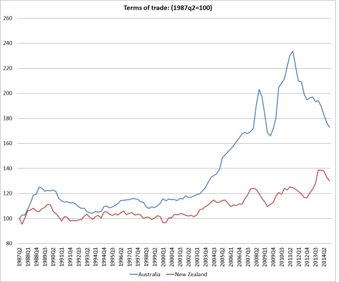
People often point out that the higher terms of trade has lifted the ability of New Zealand firms to compete profitably internationally.  All else equal that should be consistent with a higher real exchange rate.  The problem with that story here is that we are doing a NZ vs Australia comparison and New Zealand’s terms of trade have done less well than Australia’s.

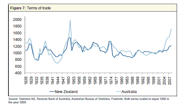
We only have consistently national acccounts deflator for both countries back to 1987, but actually all the differences in the two terms of trade are in that recent period.  This chart shows merchandise terms of trade for the two countries back to the 1920s.  They are remarkably similar until the last decade or so.

2025 TOT

And this chart is the SNA terms of trade for the two countries, drawing from the national accounts export and import price deflators.  Despite the difficulties of the last couple of years, Australia has still experienced the much larger increase in the terms of trade than New Zealand.  All else equal, we might have expected our real exchange rate to have fallen relative to Australia’s.  It hasn’t of course.

TOT since 87

There is also good reason, and some cross-country supporting evidence, for the idea that real exchange rates tend to move to reflect longer-term trends in relative productivity.  That makes sense.  A country with poor productivity growth is likely to need to see its real exchange rate fall, to “compensate” for the impact of poor productivity –  enabling its tradables sector firms to remain competitive, and increasing the relative cost of imported consumption items.

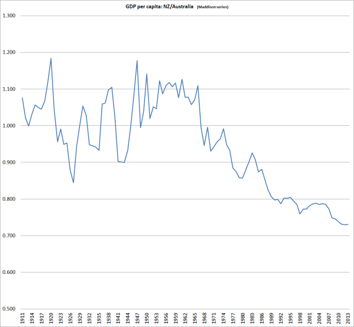
And what is the New Zealand vs Australia story.  We don’t have productivity data back to 1911, but we do have estimates of per capita real GDP, and over the long haul differences in growth rates will mostly reflects changes in relative productivity.  Using Angus Maddison’s estimates, spliced with Conference Board estimates for more recent years, this is the relative GDP per capita picture.  There is quite a lot of year-to-year noise in the earlier period, but painting with broad brushstrokes one could characterise the last century as one of a first half where New Zealand and Australian real per capita GDP growth were very similar (and levels, on these estimates, were pretty similar too).  But since the mid 1960s, the traffic has been almost all one way: New Zealand real GDP per capita has fallen very substantially, and pretty steadily, against Australia’s.  Maybe the worst of the falls are now behind us, but there is no sign of any sustained reversal.

nz vs au since 1911

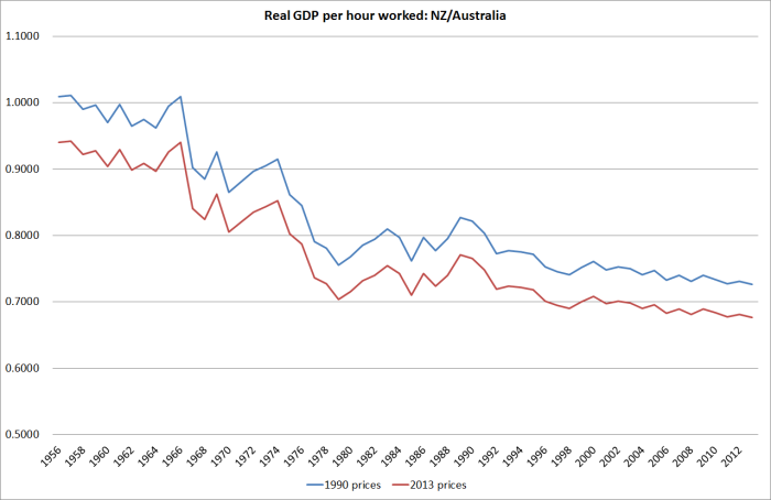
The Conference Board estimates GDP per hour worked for the two countries since 1956.  No doubt there are some heroic assumptions behind the New Zealand estimates in particular (Australia has official quarterly national accounts data back to 1959) but they are the best we have for now.  And the picture is much the same: a sharp decline over the full period, which continues more recently (I showed yesterday the quarterly chart of real GDP per hour worked for the period since 2007).  And the decline in much the same whether one uses the measures calculated on 1990 prices (also the basis for the Maddison GDP estimates) or 2013 prices.

nz vs au since 56

And so we have this somewhat paradoxical position of quite a high real exchange rate (last 20-30 years) relative to Australia, even though our terms of trade have done much less well than Australia’s, and our labour productivity and growth performance have been materially less than Australia’s.  Consumption of tradables is made relatively cheap, while producing for the international market – a key element in longer-term prosperity –  is expensive.  It is perhaps not that surprising that our export share of GDP has remained so weak, and our aspirations to close the income gaps to the rest of the advanced world have shown no sign of being met.

After spending years reflecting on the issues, I’m convinced there is nothing much wrong with New Zealand’s economy that a real exchange rate averaging 20-30 per cent lower for a few decades could not resolve.  Perhaps issues around size, distance, and agglomeration mean we will never again be the richest country in the world, but we can do a great deal better than we have done in recent decades.

Views differ on why the real exchange rate might have been, on average, so strong over the last few decades.  My story emphasises the high average real interest rates that have been needed to balance demand and supply (keep inflation near target) in New Zealand relative to those abroad.  As just one example, the yield on a 20 year New Zealand government inflation-indexed bond has been around 2.2 per cent this month.  The yield on 20 year US government inflation indexed bond has been around 0.7 per cent.  Persistent differences in returns like that, which don’t appear to reflect differences in riskiness, have really big (and quite rational) implications for the exchange rate.

But, to be clear, this is not a monetary policy story.  Long-term real interest rates reflect the pressures on real resources that result from government and private choices.    They are real phenomena, not monetary ones.

For those who haven’t come across my story in this area before, much of it is elaborated in this paper. I included there some charts suggesting that the strength of the real exchange rate, relative to underlying economic performance, is not just an issue for comparisons against Australia.

A transformed country. Really?

I suppose Ministers of Finance don’t always get to approve the promotional material for their speaking engagements.

Yesterday, I got to the end of last week’s Spectator.  I don’t usually notice the back cover, but this time I couldn’t really miss the half page photo of Bill English, with the caption “This man runs harder than Sonny Bill”.  It was a promo for a Menzies Research Centre function next month: for A$220 a ticket our Minister of Finance, “co-architect of their resurgent economy” will “offer some insider tips on their game plan, because rugby isn’t the only thing the Kiwis are good at.  Tips that transformed the country”.

I’ve noted previously my puzzlement at this line from the right wing of the Australian commentator/think-tank community, who talk up New Zealand’s economic reforms, and policies.   I presume it is designed to exert some sort of leverage in Australia (“if even the Kiwis can do it, surely we can”).

Perhaps the rhetorical strategy works.  Perhaps it has a “feel-good” aspect to it.  Perhaps it just enables people to vent some frustration at their Senate. There was something a bit similar in late 80s and early 90s, when policy reform here was more extensive, and perhaps better-grounded in economic principles, than that in Australia.  I well remember that I was to pass through Sydney the Monday after the 1993 federal election.  The Liberals were widely expected to win, and I was lined up to do a lecture at the RBA about the Reserve Bank of New Zealand reforms in anticipation that John Hewson would soon do something similar.  Journalists were even invited.  And so it was all a bit awkward when Keating pulled off a late victory.

Back then perhaps there was a plausible story that we were doing reform better than they were.  Fans of compulsory savings would no doubt disagree.  There are still plenty of areas where I’d rate quality of regulation here better than there –  taxis are my favourite.   But the numbers favour them.  But to anyone looking into the numbers, all this talk now of New Zealand as a “transformed country” over recent years must seem almost completely wrongheaded.

There is one, non-trivial, dimension on which New Zealand might reasonably be judged to be doing better than Australia: our budget deficit is smaller than theirs.   But bear in mind that general government net debt, as a percentage of GDP, is still higher in New Zealand than in Australia (gross debt is identical).  The differences aren’t large, and neither country looks either that great or that bad by international standards.
nzau govt debt
If Australian deficits are still larger than ours, that partly reflects the timing of the respective terms of trade cycles.  Australia had a big boom over recent years that we did not really share in.  The terms of trade went sky high, as did business investment (which also means lots more depreciation expenses to offset against taxable incomes).  Their unemployment rate undershot ours for a while (that doesn’t usually happen) and their policy interest rates went above ours for a while (again, that is pretty rare).   Their terms of trade peaked in 2011, and now are almost back where they were in late 2007 (2007q4 is the conventional date for the last quarter prior to the recession).  New Zealand’s terms of trade didn’t go up so much (but exports are a larger share of GDP in NZ than they are in Australia), and peaked only last year.  Current revenue has until very recently been reflecting those peaks.  There are plenty of optimists around suggesting NZ commodity prices are just about to rebound.  Perhaps they’ll be right, but optimists were taken by surprise in Australia too

tot

I’ve shown before the chart of productivity (real GDP per hour worked) for the two countries.  New Zealand has done really quite badly in the years since 2007 (absolutely and relative to Australia).
ausnzgdp

Neither country’s government has much influence over the respective terms of trade (I’d say none) but for what it is worth, here is the chart showing the real per capita real income measures (that capture the direct effects of the terms of trade) published by the ABS and SNZ.  Each country measures a slightly different thing, but for these purposes they are close enough.

rgndi

Sure enough, using a base of 2007q4, New Zealand is now just a little higher than Australia.  That reflects the way our terms of trade, as at the end of last year, had not yet fallen very much in comparison to the fall in Australia.  But the end-point difference is trivial, and even if the two countries’ terms of trade level peg from here it would take a lot of years for NZ to make up for the loss of income relative to Australia in the previous 5-6 years.  And there is plenty of reason to expect our terms of trade to fall further.

In the end, as I’ve said, before I don’t really understand this Australian meme that somehow New Zealand has been managing itself much better than Australia.  The dominant story of the last 50 or more years is of how New Zealand has fallen behind Australia.  Nothing this government (or its predecessor for that matter) has done so far seems to have made much difference to that picture.  Some Australian commentators laud the 2010 tax package, but even then it is worth remembering that that package raised the effective tax rate on capital income (don’t take my word for it, it was in the Treasury numbers).  If anything, our productivity performance looks to have been drifting even further behind.

The net outflow of New Zealanders to Australia seems, at least temporarily, to have almost ended.  In itself that is encouraging, except that it probably reflects the fact that the unemployment rates in both countries are now quite high – historical relativities have been more or less restored.  And recall that post-1999 New Zealanders in Australia can’t now get welfare benefits when the Australian labour market turns down.

I don’t understand the meme, but perhaps it sells tickets.