I don’t want to comment extensively on yesterday’s Reserve Bank announcement. It may prove to be the right call (or not), but in the data hiatus – 2.5 months since the last CPI, two months since the latest HLFS – they are to some extent flying blind (New Zealand really needs more frequent and timely key official macro data), and it would have been better to have rescheduled the announcements (adding one) as suggested in my post the other day. And the very brief, almost passing, mention of having considered a 75 basis point increase – which would have made a lot of sense this time last year – highlights again just how non-transparent and non-accountable New Zealand’s MPC is, We don’t know whether, in the end, any of the members actually favoured a 75 basis point increase, or did the Committee just toy with the idea briefly so that they could put a hawkish reference in the minutes? In places like the UK, Sweden, and the US we would have much greater clarity, and potential accountability – and potential accountability focuses the minds of decisionmakers who can, under the New Zealand system, collect their fee, turn up for lunch, and never have to do or say anything.
But looking for some other data I remembered an email from the Reserve Bank statistics group a few weeks ago indicating that they were finally going to publish some of the new data from the Survey of Expectations that they have been collecting for the last couple of years.
The survey has long asked about expected near-term policy rates (previously the 90-day bill rate as proxy, more recently the OCR) but in 2020 they added two new questions, asking respondents where they thought the OCR would be in 10 years’ time (describing that as a proxy for a neutral rate), and what they thought the average OCR would be over the next 10 years. I thought they – and especially the first question – were good additions to the survey (if we could get individual MPC members to give us their numbers, akin to the Fed’s dot-plot it would be even better).
Anyway, here are the results (despite the extraneous labels Excel added in these are quarterly data, beginning with the Sept 2020 quarter)
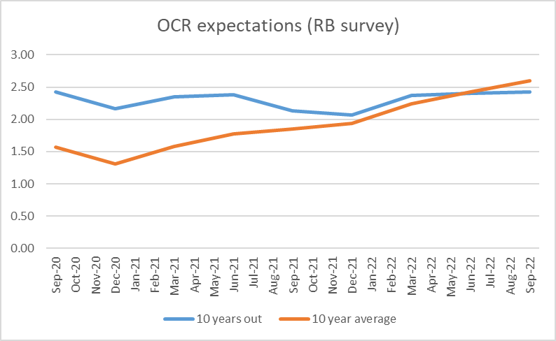
The blue line (expectations for the neutral nominal rate) really took me by surprise. The first observation would have been captured around the end of July 2020 (I filled mine in on 20 July), and the second three months later, about the time long-term bond yields reached their all-time lows (and talk was of a possible negative OCR in 2021). And yet responses in the last couple of surveys aren’t much different – 2.42 per cent in the September 2022 quarter and 2.43 per cent in the September 2022 quarter. If you’d asked me to guess before the question was instituted, I’d have expected a much more cyclical series of responses (consistent with the variability we see in implied forward bond yields). And since the question is about nominal rates I wouldn’t have been very surprised now to have seen expected future nominal rates rising even if the real rates respondents had in mind weren’t changing much (core inflation undershot the target midpoint for the last decade, but perhaps it won’t in future).
The orange line is much less surprising. Back in 2020 there was a general expectation that the OCR would be very low for several years. As it became apparent that wouldn’t be the case, naturally the average expected over the subsequent 10 years tend to rise (and the intense pandemic period passes out of the 10-year window too).
Both questions are about nominal rates. But the same respondents are also asked about their inflation expectations for periods one, two, five and ten years ahead. In this chart, I’ve taken the nominal responses (previous chart) and adjusted them for respondents’ inflation expectations: the 10 year ahead expectation for the blue line, and the average of the two, five, and 10 year ahead expectations for the orange line.
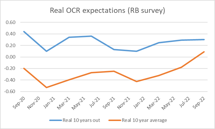
For what it is worth, this group of respondents still think the longer-term neutral real OCR is just barely positive, and their view has hardly changed since near the worst of the Covid shock (first observation), despite the recent huge upsurge in (core) inflation. Average expected real OCRs have increased this year as the OCR has been raised much more rapidly than was expected a year ago.
I don’t have a strong view on whether respondents are right or not (and, on checking, my own responses to the survey questions haven’t been consistently different from the average).
But…..these survey respondents seem to have very different views from the future rates implied by market prices.
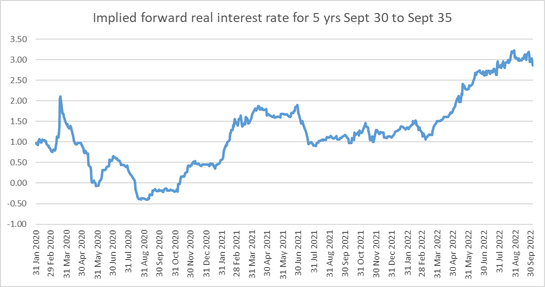
In this chart I’ve taken the yields on the Sept 2030 and Sept 2035 government indexed bonds and backed out the implied real rate for the five year period between Sept 30 and Sept 35 – a period which encompasses the 10 years ahead OCR question for the period the Bank has been running the survey.
At the time of the most recent survey, respondents thought the real OCR 10 years hence would be about 0.3 per cent. At around the same time, the market prices suggested an implied future five year real bond rate of around 2.75 per cent. Sure there would usually be a term premium between OCR and a five year rate, but it wouldn’t typically be anywhere near that large. And our indexed bond markets aren’t the most liquid in the world, but the implied future rates in the chart don’t seem particularly out of line with (for example) implied future nominal government bond rates (using the May 2031, May 32, and Apr 33 bonds all currently yielding a little above 4 per cent), suggesting implied future nominal rates much higher than the 2.4 per cent (or thereabouts) survey respondents expect for the OCR 10 years hence.
I don’t have any answers to offer as to who is going to be proved right – most probably neither (there will be cycles next decade too, as well as whatever structural shocks might unfold) – but it is interesting to see such large gaps between survey responses and market prices. And kudos to the Reserve Bank for collecting (and belatedly publishing) the survey data.
