Walking the path?

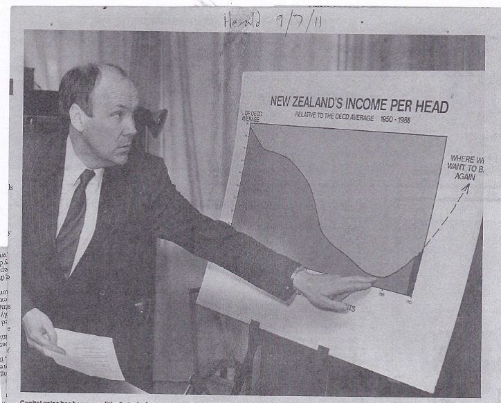
At 11am the New Zealand Initiative released their latest report, by Bryce Wilkinson and Leonard Hong, under the title “Walking the Path to the Next Financial Crisis”. It comes complete with a Foreword from former Reserve Bank chief economist (and former Board chair) Arthur Grimes, under the title “A short walk?”, foretelling doom and repeating his recent attacks on the Reserve Bank’s conduct of monetary policy over the last 20 months, ending with the ominous – and printed in bold – declaration “This time is not different”.

The Initiative was kind enough to send me an embargoed copy yesterday. Perhaps the first thing that rather surprised me – in a document that is really quite critical of both monetary and fiscal policy and aspects of the way the Bank does other things – is that the acknowledgements include thanks to a Reserve Bank MPC member (Bob Buckle) for “valuable feedback and suggestions”, and to a Reserve Bank economist (Andrew Coleman) for “careful comments on a draft version”. Perhaps it is an encouraging sign. Perhaps one day the Governor will also get MPC members to give speeches and openly account for their own thinking and actions. But more likely not.

It is hard to know quite what to make of the report. It probably won’t surprise the authors that my bottom line is that, amid some interesting material, much of it seems a bit overblown. In a way it was captured best in the final paragraph of the authors’ Executive Summary

The less prudent the government, the more prudent individual New Zealanders will need to be. Borrowing heavily to buy property or shares at current prices is like playing Russian roulette with one’s financial future. Portfolios should be
diversified. There are risks of both deflation and inflation.

As an advertisement for inflation-indexed bonds (eg 19 year ones, yielding a real 0.88 per cent yesterday) that final sentence could hardly be bettered, but isn’t it always so? The future is uncertain, diversification is usually prudent, and hedging (in this case against inflation uncertainty) usually is too. As for borrowing at present, well even if the government was running a balanced budget I’d be pretty hesitant myself about taking on lots of debt secured on assets like New Zealand houses but (a) it is much less risky if you are buying a house you intend to live in for 40+ years (hedging etc) and (b) people like me (including successive Governors) having been saying as much on many occasions over the last 30 years. Those with particularly long memories – and I’m sure Bryce is one of them – will recall Don Brash, newly appointed as Governor, refusing to buy a house in Wellington in 1988 given how expensive they were.

As for the government, just how imprudent is it? Well, I’ve been as critical as anyone (well, more than most) of the large structural deficit they chose to run in this year’s Budget, when there was no obvious macro or Covid need for such deficits, but if it is stocks (of debt) you are worried about – which for Wilkinson’s and Hong’s purposes you are – then here is the OECD’s series of net general government liabilities as a percentage of GDP (including the May 2021 forecasts, so there should be an update shortly).

nzi nov 21

Is it more net debt than I’d like to see? Indeed. But on the OECD numbers we’d have the 6th lowest net debt (per cent of GDP) of all the OECD member countries next year, and an absolute level that poses no risk to anyone or anything, even if we were to get a severe recession/crisis in the next few years (the global risk the authors are most focused on).

There are also curiously anachronistic touches to the report. Again from the Executive Summary

The composition of New Zealand’s official overseas reserves should be reviewed, particularly in respect of gold.

For those who aren’t aware the Reserve Bank is among a small number of advanced country central banks that hold no gold at all in their foreign reserves (New Zealand has not done so for decades). What really clear from the report is why the authors think the Bank should do things differently. It can’t be as an inflation hedge, since most of the Bank’s reserves are already hedged (funded with foreign currency liabilities). And since the reserves are held to enable crisis intervention in the foreign exchange market – and thus immediate access to liquidity has always been a priority – it isn’t obvious why we should want our central bank holding a non foreign exchange asset that has a very volatile price. If we must have a New Zealand Superannuation scheme (and I suspect the authors agree with me that we shouldn’t) perhaps that is the place to think about whether gold – or Bitcoins for that matter – have a place in a diversified investment portfolio.

Of the authors’ other recommendations for New Zealand, I’m with them on the idea of a independent fiscal council – although it is hard to see it making much difference given the degraded state of New Zealand government agencies generally. On monetary policy their call is for

The Reserve Bank should have a clear path for reversing its emergency credit creation and lifting its control interest rate.

And I have some sympathy when it comes to the future of that huge stock of bonds the Bank bought in a fit of “look, we are doing something/anything” frenzy but in fairness to the Bank they have (a) stopped increasing the stock of bonds, and (b) were one of the earlier advanced countries to start raising official interest rates. No one really doubts there are more increases to come, but then no one wise will be pre-committing to a particular path for the OCR because no one, but no one, knows what sort of interest rates (real or nominal) will be required a few years from now.

The authors seem quite enamoured of the thesis advanced in a recent book by economists Charles Goodhart and Manoj Pradhan who argue that demographics will drive interest rates much higher in the coming decade. It is an interesting argument – and I’m open to it (if not yet convinced) – but in the same paragraph in which they mention this thesis they cite Germany and Japan (countries with particularly unfavourable demographics). But surely the problem then is that both Germany and Japan have far lower interest rates than New Zealand (or, say, the United States). Sure, asset-buying programmes may influence those rates to some extent, but there is just no sign the market thinks real rates (or nominal actually) are going to go a lot higher, even on a 20 year view. The market could be quite wrong – it has been known – but so could Goodhart, Pradhan, and the NZI authors.

Without trying to caricature the authors I think it would be fair to represent their views in this stylised way:

  • things haven’t been the same since the world moved to fiat money,
  • fiscal discipline has been breaking down globally, but especially in the big Western countries,
  • moral hazard (around government bailouts of failing financial institutions) is an increasing problem

And that, in combination, the way is set that will lead to crisis (globally, even if our financial system itself were to be fine).

There are aspects of the argument I sympathise with. It wouldn’t surprise me if the next serious recession were to see a major euro crisis, and perhaps even the end of the euro. But then that has been my view for a decade now, and yet life goes on. Fiat money has had its downsides – look at how much prices have risen over the last 100 years compared with the previous 100 – and yet the reality of the decade prior to Covid was one of inflation in most of the advanced world repeatedly undershooting targets. And much as I abhor structural fiscal deficits – of the sort established in places like the US, UK, and Japan – it remains true that real interest rates (servicing burden) are extraordinarily low, and have now been low not for a few months but for really rather a long time. Perhaps 3 per cent real interest rates will return and endure, but for now there is little credible sign of such a development anywhere, and quite a bit of what Wilkinson and Hong worry about seems to rest on such a scenario. If I were advising New Zealand’s Minister of Finance today – or his Opposition counterparts – risks around advanced world fiscal debt would not be high on the list of things I’d be worrying about. And I’m not keen on bailouts either, but surely there is at least as credible argument that in much of the world capital ratios are now so much higher than they were that – to some extent at least – the moral hazard argument is less strong than it might have appeared in 2009.

It is good to be challenged, and there is some interesting material in the report including (at least for those less aware of monetary history) on how the current global system came to be. And I strongly endorse the authors’ scepticism about the self-politicisation of our Reserve Bank (and the tendency of many other central banks to want to weigh on on matters simply not their responsibility). Even that weird new central bank ‘network for indigenous inclusion’ gets a mention (I keep waiting for the day when the Icelandic central bank is signed up, their “indigenous people” having settled Iceland just a few hundred years before Maori first settled New Zealand). And counsels of vigilance rarely go astray when it comes to macro and banking policy. But I wasn’t persuaded we were quite as far along the path to perdition as the author’s fear.

Curiously, there is a launch event going on at present at which former Prime Minister John Key (current chair of the ANZ) is speaking (I didn’t tune in). Aside from the name recognition he offers, it seemed curious to have such an establishment figure, known more for his sunny optimism than for his willingness to make hard calls and choices, to be launching this jeremiad. But if Key is persuaded, I wouldn’t want to be a borrower at the ANZ at the years to come, as presumably materially-tighter lending standards would be a corollary of the Wilkinson/Hong analysis?

Half a million a head

In yesterday’s post I drew attention – yet again – to New Zealand’s continued drop down the international productivity league tables. There are all sorts of caveats to the details – PPP comparisons are inevitably imprecise, and the data are subject to revisions – but few seriously doubt that we do much worse now relative to other advanced countries than we did just a few decades ago.

But it is easy to lose sight of what the numbers actually mean for ordinary New Zealanders, so I thought today I might do just a short stylised illustration.

In yesterday’s post – as on various occasions in the past – I’ve contrasted our outcomes with those of a group of highly successful OECD countries (but excluding Norway (oil), Ireland (even their own authorities don’t use GDP as a measure of Ireland’s outcomes) and Luxembourg): Switzerland, Denmark, Belgium, the United States, Sweden, Austria, France, Netherlands and Germany. They can be thought of these days as some sort of “leading bunch”, at least as regards labour productivity.

In 1970, when the OECD data start, our real GDP per hour worked was about 82.5 per cent of the median for this group of countries. By 1990 that proportion was about 64.5 per cent.

In 1990 the confident hope – among officials and ministers, and more than a few outsiders – was that we were on the brink of turning things around. I’ve shown before this photo of then Finance Minister David Caygill’s aspirations/expectations.

caygill 1989 expectations

Let’s suppose it had worked.

The fall in our performance relative to that OECD leading bunch had taken 20 years, so suppose that over the following 20 years we had steadily improved such that by 2010 our real GDP per hour worked was again about 82.5 per cent of that of the leading bunch, and then held at that ratio subsequently. That wouldn’t have made us a stellar performer, but at least on the OECD’s numbers we’d be doing about as well as Canada and a little better than Australia. Since we’d more or less tracked Australia for many decades earlier it wouldn’t have been an unrealistic aspiration at all.

How much difference would it have made?

There are lots of possible moving parts, but I did this little exercise by taking as my starting point actual real GDP per capita for New Zealand each year over the last 30 years and scaling it up by the ratio of the assumed productivity performance to our actual. Fortunately the official GDP per capita series starts in 1991.

This is what the chart looks like.

scenario productivity 1

By the end of the period, the annual difference – per man, woman, and child – is about $20000.

But what does it add up to? After all, every year since 1991 our incomes could have been higher than they were. And $1000 extra from 1991 invested even just at a real government bond rate adds to quite a lot by now (especially given New Zealand’s interest rates over that period). Applying a (stylised) series of real interest rates – falling over time – and applying them to each year’s difference in real GDP per capita, the total difference came – in today’s dollar terms – to a bit over $500000 per man, woman, and child. For almost everyone in New Zealand that would be serious money.

You could produce a different number with different scenarios. Slower convergence would, of course, produce a lower number. On the other hand, using the sort of discount rate The Treasury requires government agencies to use – rather than just a long-term real interest rate – would value past gains more highly and produce a materially bigger number.

The point also is not to suggest that if somehow economic policy had been run better and produced these stronger productivity outcomes that everyone would have banked all the proceeds and be sitting today on an extra nest-egg of $0.5 million. That wouldn’t have happened at all. In a more productive economy, people would have been able to – and no doubt would have- consumed more. Government revenues would have been stronger, and better public services might have followed even at the same tax rates. Some might have chosen to work less (a real gain to them too). The half million is a way of putting a number to the options that much better performance would have created. And the gains would be mounting further every single year. Another way of putting that is that every single year, the failure of successive governments means a median family of five is missing out on another $100000.

To repeat, this exercise is entirely stylised. Depending on one’s view of which set of policies might have delivered these better outcomes. some other things might have been very different. Perhaps our terms of trade would have been different (since probably a somewhat different mix of products). Perhaps our real interest rates would have been closer to world levels. Perhaps…perhaps. The point is simply that decades of economic failure adds up to really large amounts of income (and potential consumption) just lost. In New Zealand’s case, half a million per capita will do to be going on with, mounting at $20000 per capita with each year we languish so far behind the bunch.

And just think of how much better off our country would be – avoiding all the systematic and deeply unjust redistributions – if over the same period successive governments also had not so badly messed up the land market, in a way that has delivered us such extraordinary house prices.

What might have been……

But what still could be if there were to be a government of courage and vision.

Pushing down the league tables

Next Monday morning in Paris, the OECD’s Economic and Development Review Committee will be gathering to discuss the draft of the latest Economic Survey of New Zealand. These mid-level public servants will pose some questions, offer some observations (some insightful, most probably not), and their French and Hungarian members will lead the questioning and – if the past is any guide – get to enjoy a very nice lunch at the New Zealand Embassy. Some weeks later, after the text has been haggled over line by line, we will get to see what the OECD has to say about our economic performance and policies.

But in many respects, the numbers speak for themselves, and the OECD does a pretty good job – one of the useful things it does – of collating and making accessible a wide range of data for its member countries.

The OECD’s series of labour productivity data (real GDP per hour worked (in PPP terms)) starts from 1970. New Zealand joined the OECD in 1973 when it was a club of 24 countries. For all but two (Austria and Greece) of those countries there are labour productivity estimates back to 1970. By 1970, New Zealand had already dropped a bit below the median OECD country, but the countries either side of us were France and the United Kingdom, and we were just slightly behind Germany.

In relative terms, New Zealand’s economic performance was particularly bad in the 1970s. Of those 22 OECD countries for which there was a consistent series of data, over the course of the 1970s New Zealand’s real GDP per hour worked fell from about 95 per cent of that of the median country to about 75 per cent. By 1980 only four of those countries had lower labour productivity than we did, and we were no longer between the UK and France but between Ireland and Finland. To younger readers, Ireland may not sound too bad, but Ireland in those days was still an underperforming economic backwater.

Things didn’t look too different in 1990. The number of countries for which there is data had increased a bit and of the 1973 membership we now stood between Japan and Greece.

The 1990s was an era of opening-up. A variety of countries re-emerged from the ashes of the Soviet Union and Yugoslavia, other countries formerly under the thumb of the Soviet Union began turning themselves into market economies. And the OECD itself started to broaden its membership, looking to Asia and Latin America for new members. That process has continued and there are now 38 OECD countries, and (more importantly for this post) labour productivity data for all of them since at least 2000.

In 2000, 17 of those 38 countries had average labour productivity lower than New Zealand’s. We were still between Greece and Japan.

By 2010, 16 of those 38 countries were below New Zealand. By then we stood between Greece and Slovenia, the first of the former eastern-bloc states to match us.

So far, so mediocre.

But what about the more recent period? 2020 marked the end of another decade.

It takes many many months to get a complete set of annual data (and, of course, many of those numbers – including our own – are still subject to revision). But the full set of 2020 estimates is now available.

I have been quite hesitant about using 2020 data for anything other than Covid purposes. Countries had quite diverse Covid experiences – some good (bad) luck, some good (bad) policies etc but most of any differences probably not telling us much about the longer-term economic performance story. And measurement was a real challenge – both GDP and hours worked. Bear those caveats in mind in what follows, but looking at the data (and checking against trends to 2019) the distortions seem less than I might have thought/feared.

Here is how things looked in this snapshot.

OECD GDP phw 2020

Only 9 countries now do less well than us, and we are bracketed between Korea and Poland (for all the hype around Korea’s economic performance – and it is impressive over several decades – only now has their average labour productivity matched that of underperforming New Zealand). Former laggards Turkey, Slovakia, Slovenia, Lithuania, the Czech Republic and Estonia have now moved past us – some well past us – and mostly just in this last decade.

And if you think this is just a story about other countries doing really well – which we shouldn’t begrudge for a moment, it is something to celebrate – bear in mind that on these estimates New Zealand’s productivity growth rate in the 2010s was less than it was in the 1970s. That’s the New Zealand of Key, English and Ardern – oh, and record terms of trade – managing to underperform the New Zealand of Kirk, Rowling and Muldoon.

If that chart is bleak enough about New Zealand’s standing in the OECD league tables, just think where it might be a few years from now. It is good of the OECD to have welcomed in the four Latin American members – the diversity hires – who will keep New Zealand off the very bottom of the league table for a long time. If Chile is managing pretty good productivity growth. Mexico in 2020 had real GDP per hour worked no higher than it had been in 2000.

But of the five countries below us last year, three are likely to go past us in the next few years.

the next three

Portugal could pass us too, but they’ve been just slightly behind us for 30 years now.

2025 was once – briefly – the year when we were supposed to have caught up with Australia by. Instead, most likely, on this metric the only OECD countries that will be doing worse than us will be Portugal, Greece, and the four Latin American members that don’t even make most lists of advanced economies.

What a woefully bad set of outcomes successive waves of politicians and officials have delivered for New Zealanders. (All while they’ve delivered us some of the most expensive housing anywhere.) And what is perhaps most depressing is that none of this seems to bother either side of politics, and neither political parties nor (so far as we can tell) officials seem to have any real interest in reversing decades of underperformance. These outcomes aren’t some exogenous given, but the outcome of repeated sets of policy choices. And if the policy choices of the previous government in this area were bad (and they were) those of the current lot seem materially worse (exemplified in recent days by the tens of billions of taxpayers’ money they want to spend on glorified trams, as if money were no object).

Incidentally, lest anyone be under the illusion that Australia itself is some sort of success story, Australia (7th in the OECD in 1970) is now close to the middle of the league table – much better than New Zealand, but not exactly a multi-decade success story.

There is a group of countries near the left hand side of the first chart – from Switzerland to Germany – that I’ve often contrasted us with. Even in 1970 we were behind all of them on this measure (basically level-pegging with France). But now, to catch up with the median of those countries it would require a 69 per cent lift in New Zealand average labour productivity.

It could be done – it would take productivity growth averaging 1.3 per cent per annum faster than in those countries for 40 years – but it isn’t going to happen by simply ignoring the issue, hoping for different outcomes, or by adopting sets of policies that are only likely to continue our decades of relative decline.