Cross-country comparisons are often enlightening, even if they just throw up more questions. In matters economic I’ve often highlighted New Zealand/Australia comparisons – both distant, resource-dependent, economies, with a similar legal and political background, market-oriented economies etc.
Ever since the coronavirus issue started to come to the fore it has also seem natural to try to make a little more sense of the New Zealand experience by looking at what is happening in Australia. After all, both countries took the China travel ban route (us dragged along a day later by the Australian choice), both are islands (to the extent that matters at a time of more generalised movement restrictions), both have just come off summer (to the extent that may, or may not, matter) and both typically prided themselves on being open and democratic societies. In both countries, (lots of) returning travellers seem to have accounted for most confirmed cases.
For quite a while, the raw numbers in New Zealand looked quite good relative to Australia. The first Australian case was more than a month before the first New Zealand one (by the time our first case was confirmed they had 25 confirmed cases). When I was running some charts on the comparisons in March they were still perhaps two weeks ahead of us (eg on 21 March we had 13 new confirmed cases, the number (adjusted for population), Australia had had on the 6 March). Quite why there was that difference wasn’t (still isn’t, that I know of), clear, although Australia had been doing more testing per capita. But the gap was beginning to close.
By mid-March some mix of government urgings and conscious voluntary unease and precautions was already inducing quite a lot of behavioural change, and physical distancing (I recall a quick trip to Auckland on 19 March, and coming back through a largely empty Auckland airport domestic terminal with a sense of the world closing down around us) but the extent of official restrictions was still a few days away from being beefed up dramatically. The following week, New Zealand was put into a partial lockdown that went significantly further, in important respects, than the restrictions put in place by state and federal authorities in Australia.
Physical distancing works. There seems little or no doubt about that. Our government seems to have insisted on quite a bit more of it than Australian governments have. And so over the last few days I have been intrigued, perhaps even a little puzzled, to watch the evolution of this chart.

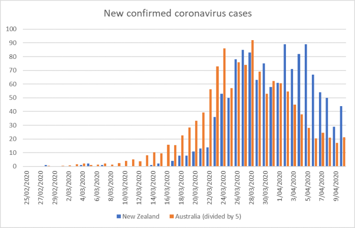
It is an updated version of a chart I’ve shown before, showing new confirmed cases for the two countries, with the Australian total divided by five, to adjust for their much larger population.
You can easily see how their new confirmed cases numbers were well ahead of ours, right through until 23 March. Then they more or less level-pegged for a week or ten days, but for the last week or more their confirmed new cases (per capita) have been running well below the new confirmed case numbers in New Zealand.
I don’t know quite what to make of that chart. I’m genuinely intrigued by it. But a few points are worth making:
- first, confirmed cases reported today do not reflect actions/choices made today, but those made up to, say, 10 days previously (take time for people to get infected, develop symptoms, get tested, and get the results reported),
- second, I’m not sure we can yet put much weight on the idea that Australia’s position is now still worse than ours because they have more deaths and more in ICU. Clearly, their position was worse than ours (the early weeks of the chart), but it takes time for cases to get serious enough for people to get to the ICU stage and/or die (see, most, prominently, the Boris Johnson cases) and three weeks ago we had very few new cases,
- relative to many countries, our confirmed cases so far were for a long time more concentrated among younger people (travellers), where the effects of the virus are generally less serious (I haven’t seen the Australian data on that particular point),
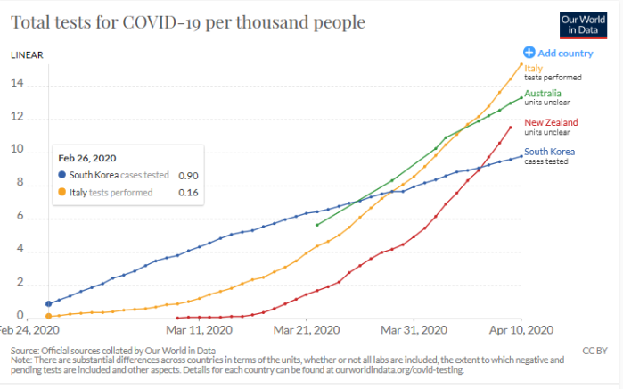
What of testing? Australia has done more tests per capita than New Zealand, but in the last couple of weeks our per capita rate of new tests has been higher than in Australia. In both countries, the rate of confirmed cases to tests done is fairly low (a good sign about how much testing is being done).

Presumably in both countries not all actual cases are being captured in the numbers (this seems to be standard line worldwide), but whatever the “true” situation, all indications are that both New Zealand and Australia have, for now at least (and in some sense), got on top of the situation, and new cases numbers have not only not escalated, but fallen away (sharply so in Australia’s case). In both countries, the reduced flow of travellers from abroad must have helped and (residually at least) the quarantine of the few remaining travellers. Private choices to distance must have made a difference. And so must government restrictions and injunctions.
But it must still be a bit of an open question quite what things explain which bits of the respective slowdowns in the number of new confirmed cases. A detached observer two weeks ago might have looked at the respective regulatory regimes and controls in the two countries and reasonably have expected a much sharper slowing in case numbers in New Zealand than in Australia (that would probably have been what I would have expected). But it hasn’t happened. Perhaps it still will: time will tell.
Is it then possible that, given the extent of the virus in both countries, our partial lockdown – and partial it is – went further than was really necessary, well beyond the point where there were material marginal gross benefits at all? I don’t know, and I don’t suppose anyone does at this point. But in thinking about appropriate next steps it is a possibility that looks as though it at least needs to be explored, teased out and tested. After all, there are gross costs to take into account before any sort of net benefit assessment is possible.
At very least there seems to be very little basis for the sort of all-or-nothing thinking embodied in the Prime Minister’s spin the other day – waving around a chart of case projections from mid-March, contrasting it to the actual new case numbers, and suggesting – at very least by implication – that the difference is all about the extent of New Zealand’s stringent partial lockdown. In principle, only any superior performance relative to Australia should be able to be attributed to the more stringent regime in place here. It is hard to get any sort of clean read on the “true” relative performance, but the prima facie numbers suggest reason to doubt we’ve done better at all.
Finally, and to be clear, I am not championing any particular approach to policy over the next few weeks. There are details of the current regime that I regard as frankly barbaric and inhuman, unworthy of the sort of Prime Minister who endlessly exhorts people to “be kind” (as if we’d ever take our moral lead from Prime Ministers or MPs), but personally I remain somewhat uneasy about any very substantial easing of the economic restrictions in the near future. That is visceral more than analytical. It is also easy for me to say – my life hasn’t changed much through the lockdown (once a week to the supermarket rather than once or twice a day, and that’s about all), I like having the kids around (boring as it may be at times for them), our household income seems secure, and even family members with businesses seem able to run them more or less. I might well feel differently if my livelihood were at stake. My only point here is that we need to keep testing and challenging interpretations, including against what is happening in other otherwise similar countries. And relative to Australia, there are some real unanswered questions and intriguing puzzles.