I’ve just started reading an interesting new book on sovereign debt defaults (including the question of why there aren’t more of them). When I’ve finished the book and done the review I’m supposed to be writing, I might even do a post on that intriguing issue. But on page 3 of the book, this scene-setting chart appeared.

It is a pretty strong upward trend, and the trend isn’t obviously different after 2008.
It is important to remember how dramatically the composition of world GDP has changed since 1980 (think of China in particular, where public debt is much higher than it was).
It is quite a remarkable contrast to New Zealand’s record. This chart uses data from The Treasury’s website, for the longest gross-debt time series they show.

Gross (central) government debt, as a share of GDP, is lower than it was at any time in the 1970s and 1980s.
New Zealand readers are probably mostly aware that our choices have been different from those of many other countries. But I was a bit surprised by quite how unusual.
Consistent historical data are not easy to come by. The OECD has gross government debt data back to 1980 for only 13 of the 35 member countries (not including New Zealand). All thirteen recorded increases in the ratio of general government gross debt to GDP over the period 1980 to 2018. The OECD has data for even fewer countries back to 1972 (when my New Zealand chart starts), and none of those countries have seen a fall in the ratio of government debt to GDP over that full period.
For many, but not all, purposes net government debt is a more useful measure. Long-term historical data are even more patchy for net debt than gross debt, but what there is of it suggests New Zealand’s public debt record doesn’t stand out quite as much: Denmark, Finland, Norway (in particular), and Sweden all recorded falls over 1980 to 2018, as would New Zealand properly measured (the series Treasury reports excludes the assets of the New Zealand Superannuation Fund).
What of the more recent period? The OECD has reasonably complete data for the net liabilities of the general government since around 1995. Here is how New Zealand compares to the OECD total.

Unlike the world series I started this post with, in this chart the OECD total line really does look different after the 2008/09 recession than before it.
But this picture tends to flatter New Zealand. Here is another chart, this time showing the line for the median OECD country, and for the two largest OECD economies (US and Japan).
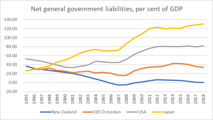
Net debt in New Zealand has fallen while that for the median OECD country is little changed (if anything, there are some reasons why you might think “optimal” public debt would be higher than in the median OECD country) but what really stands out is the deterioration in the net debt ratios of both the US and Japan.
China isn’t a member of the OECD and the IMF doesn’t have net debt data for China, but Chinese gross government debt (share of GDP) has increased substantially – more than for the US – over this period.
And here is one more chart
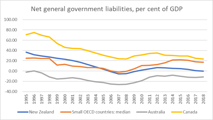
Here the orange line is the median for the small (population 10m or less) OECD countries, including everyone from Norway to Greece). Our net debt as a share of GDP has fallen a bit more than that small country median, but a median of under 20 per cent of GDP scarcely seems troubling or inappropriate. I’ve also shown Canada and Australia – not small but two other Anglo countries. Australia has had consistently lower net debt than New Zealand – despite all the political huffing and puffing there over the last decade – and while Canada is more indebted the fall since 1995 has been larger.
Overall, our ratio of net government debt to GDP is just inside the lower quartile among OECD countries (seven countries have lower numbers). Rising public debt may be a real issue for some countries – and perhaps even for the world, given the possibilities of spillovers if/when things go wrong – but it is hardly a ubiquitous experience.
I don’t have any strong policy point to make with this post. Personally I think fiscal policy in New Zealand has been managed fairly well by successive governments over most of the last 30+ years. On the OECD net debt metric, we show as having an estimated 0.00 per cent net general government debt in 2018.
I’m not a strong supporter of the current government’s budget responsibility rules – although I’m more puzzled at their commitments around spending (very similar to the previous government’s plans) than around debt. But while there are plenty of people out there championing the idea that the government should take on a higher level of debt (especially given that interest rates are low), I remain sceptical of those claims. That is partly because I see little sign that governments spend wisely within current limits (and possible new projects must, almost by definition be less-valuable, lower ranked, proposals), partly because interest rates are low for a reason (not necessarily a fully-understood reason) about expected demand for, or expected returns on, investment, and partly because much about what government do tends to reduce the need for private individuals to save, and in that context a benchmark of something like net zero public debt (which we might fluctuate below in good times, and above in bad times) seems a not-inappropriate counterbalance.
