There has been a longrunning US debate/puzzle around the relationship (or apparent lack of it) between productivity growth and growth in wages/compensation. It was revisited earlier this week in a (very long) post on the excellent Slate Star Codex blog. The author introduces his post with this chart, pretty familiar to anyone aware of this issue.

I’ve always found the issue interesting, but been content to do little more than read the occasional summary article. Arguments often seem to turn on rather arcane measurement issues and I just don’t know the very detailed US data that well.
But as I read through the long post, I noticed something that probably hadn’t struck me previously. The productivity measures used in this chart (and others like it) are those for the non-farm business sector. That is the series that gets the most focus in the US, which makes some sense in that it is (a) regularly published by US official agencies, and (b) if you are interested in the performance of the business sector (and not wanting to be thrown around by climatic effects) it is probably natural to focus on.
By contrast, I tend to focus on measures of GDP per hour worked. That is mostly because (a) it is what is available on a fairly consistent basis for a wide range of countries, and (b) because it is what is readily able to be calculated quarterly for New Zealand, using published data. And my interests tend to be the economy as a whole.
In the US context it can make quite a lot of difference which series one focuses on. In this chart, I’ve shown the two series, starting from 1970 (which is when the OECD real GDP per hour worked data starts from).
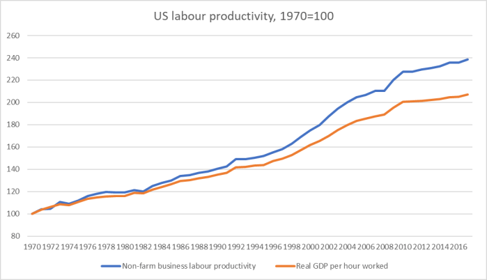
It shouldn’t be much of a surprise that whole economy productivity growth is slower than that for the non-farm business sector: incentives (lack of them) and opportunities (types of activities governments do) both tend to work that way.
And then, of course, I noticed that charts like the first one tend to use real variables, which opens up all manner of issues about the “correct” deflator, including issues as to whether the CPI was well-measured in years gone by (there were some fairly significant biases). But quite recently, I’d compared nominal wage growth in New Zealand to growth in nominal GDP per hour worked, which abstracted from deflator issues (even if it might raise other questions), so I thought I’d do the same for the United States.
I took the compensation per hour series for the US non-farm business sector (official US series) and nominal GDP per hour worked (from the OECD), indexed them all to 1970, and divided one series by the other. This is the the result.

On this measure, US wage growth has lagged a bit behind the growth in the overall economy “ability to pay”. But it is a hugely smaller gap than is suggested by something like the (widely-used) first chart in this post.
Is nominal GDP per hour worked a reasonable benchmark? I reckon it is. Growth in nominal GDP per hour worked captures both real productivity effects and changes in the terms of trade (which have been adverse for the US over this fifty year period). As ever, there isn’t likely to be some mechanical relationship between labour earnings and GDP per hour worked. Market pressures shift over time, and so does (for example) the relative importance of capital in generating what growth there is. Labour shares of the total economy’s output always have, and probably always will, fluctuate over time. But it seems at least as good a benchmark against which to analyse developments as most others on offer.
Since most of my readers are from New Zealand, two final charts as a reminder of how things are here.
First, a chart comparing real GDP per hour worked with the measured sector labour productivity data. We don’t have such long runs of data, so this is just since 1996.

Unsurprisingly, whole economy productivity growth lags that in the measured sector (that excludes much of goverment activity).
And here is a chart I’ve shown previously showing how wages (the analytical unadjusted LCI series) have grown relative to nominal GDP per hour worked.

Whatever the story in the US, wage rates in New Zealand have been increasing faster than nominal GDP per hour worked (loosely, “the ability of the economy to pay”).
That might seem quite good for New Zealand employees. But it is worth bearing in mind that since 1995, we’ve had about 28 per cent growth in labour productivity (real GDP per hour worked) and the US has had about 44 per cent growth in economywide labour productivity. The windfall of a higher terms of trade has helped us, but if your economy isn’t generating much real productivity growth it isn’t a good outlook for anyone much (workers or owners) in the longer term.
