Comment on the Governor’s sprawling speech “Geopolitics, New Zealand and the Winds of Change” (curiously, a speech in which “geopolitics” didn’t appear at all) is held over until tomorrow.
But I was reading an interesting speech from a senior RBA official, Assistant Governor Michele Bullock, which happened to include this chart.
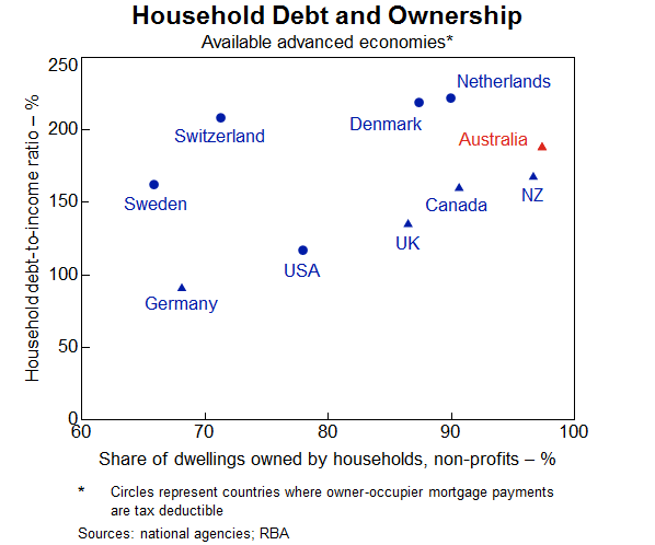
It captures a couple of important points relevant to thinking about household debt. You quite often see comment about how high the level of household debt is in New Zealand. But Bullock’s chart illustrates a pretty straightforward point: when almost all your housing stock is owned by households (whether owner-occupiers or investors) you’d expect that, all else equal, household debt relative to household income (or GDP for that matter) would be higher than in countries where a larger share of housing stock is owned by other sectors. Of the countries Bullock shows data for, New Zealand and Australia have the highest share of the housing stock owned by the household sector. New Zealand is very close to the median country in this sample, notwithstanding the high share of houses owned by households.
The chart highlights another important point sometimes lost sight of in international comparisons (but which our own Reserve Bank sometimes acknowledges). In some countries, interest on an owner-occupied mortgage is tax deductible. That might, all else equal, encourage household to take on more net debt (cost of borrowing and bringing forward consumption is lower), but it certainly tends to encourage people not to rush to pay off the mortgage even as they may be accumulating financial assets (and the tax treatment of some financial assets is also often quite favourable relative to, say, the situation in New Zealand). And so Sweden, Switzerland, Denmark and Norway have much more gross household debt outstanding – but not necessarily any more financial system risk – than countries with similar household sector ownership of the housing stock but a different tax treatment. (The US is a bit of an outlier here, and from the look of it the data may not be fully comparable.)
Of course, what Bullock doesn’t highlight in her chart is two things:
- Australia and New Zealand have high house price to income ratios by international standards, which tends to boost the amount of household debt required to accommodate such prices, and
- Australia’s compulsory private superannuation system will, all else equal, tend to mean that Australian households will more often have substantial financial assets tied up in superannuation schemes while at the same time having large outstanding mortgage debt. (Kiwisaver, more recent and on a smaller scale, will now be tending to have the same sort of effect in New Zealand.)
There was one other interesting chart in the Bullock speech.

For all the talk about households taking on more and more debt, the median advanced country’s ratio of household debt to income hasn’t changed materially in a decade, despite the fall in global interest rates. Of course, all else equal, if interest rates had been higher debt would have been lower, but so would real and nominal GDP, asset prices, inflation (but, pace Lars Svensson, debt to GDP ratios might not have been much lower)…..and unemployment would have been higher. All else is never equal, and it is important to remember that interest rates are low for a reason (or set of reasons) grounded in the fundamentals of the really economy, factors which central bankers and banking regulators have little influence over.
