Yesterday Statistics New Zealand released the quarterly data on building work put in place. The release included this chart.
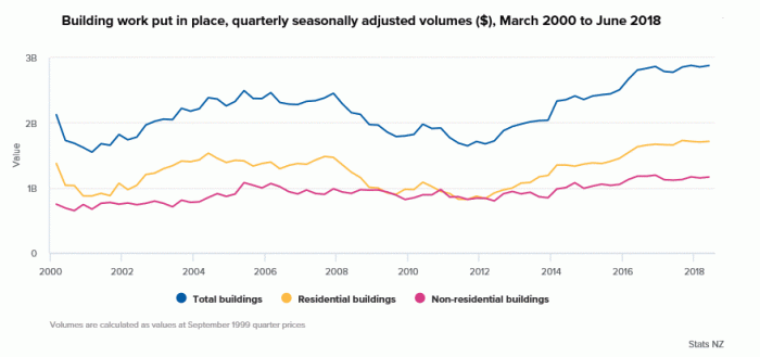
SNZ like this sorts of chart, which tend to reinforce the relentlessly upbeat tone favoured by the department.
But most economic series reach new highs quite frequently, even volume measures. Real GDP, for example, is higher this year than it has ever been before, and almost all future years will be higher again. Knowing that doesn’t tell one much.
For a start, one usually wants to transform these series into per capita measures, particularly in a country whose population is growing relatively rapidly. New Zealand’s population, for example, has increased by just over 25 per cent since 2000, when that SNZ chart starts.
Here is the same data, over a longer run of time, in per capita terms.
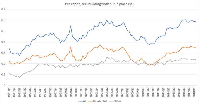
In per capita terms, the volume of building work has been (a) pretty flat, and if anything falling back slightly, for the last couple of years, and (b) around the same level as the previous peaks (around 2004/05).
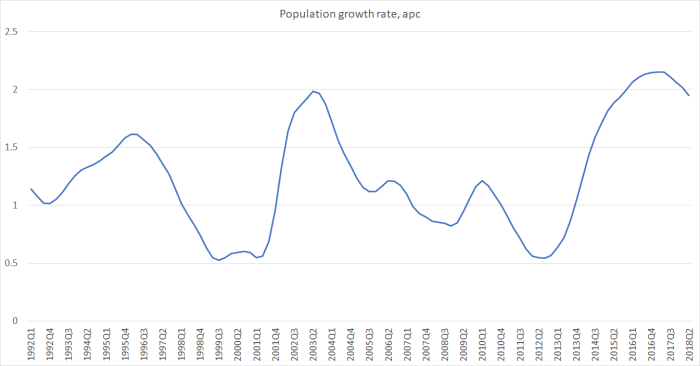
But the demand for new buildings isn’t just related to the level of the population, but to the increase in the population (with a flat population, most of the building work occurring would just be replacing the effects of depreciation of the stock). And population increase is both high and quite volatile in New Zealand, mostly because of the effects of immigration policy and New Zealand emigration.
Just looking at the volume of building activity relative to population growth produces this chart.
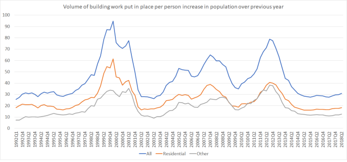 The peaks on this measure happen when population growth is at its cyclical troughs – unsurprisingly, since the normal base level of replacement and improvement work is still going on.
So what if we, somewhat arbitrarily, assign equal weights to the level of the population (influencing replacement/improvement demand) and the growth in the population (key driver of the demand to increase the total stock of buildings). Doing that produced this chart.
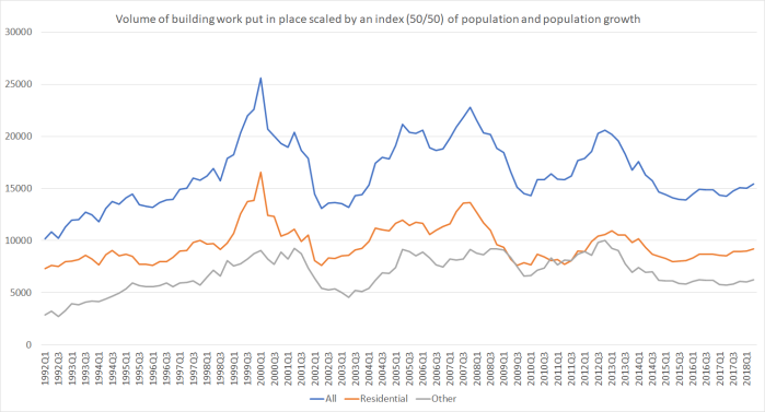
Two of the peaks (around 1999 and 2012) are still when population growth was at its lowest, but there is also a sustained period of strength through 2004 to 2007, a period when population growth was still quite high, but slowing. House (and commercial property) prices were, of course, still rising.
What, if anything, to make of the current situation?
I’ve been sceptical for some time of the claim that there was insufficient building going on. If that were so – demand was persistently and substantially exceeding supply – we would see prices rising strongly. At least in Auckland that isn’t so now. On my telling, high land prices – mostly reflecting regulatory and related constraints – have choked off large amounts of effective demand. There are plenty of people who would like more houses at Houston or Atlanta prices, but not at Auckland (or Wellington or most other places in New Zealand) prices. I’d consume more scallops (eg) at half the price too. There are few/no signs I’ve seen that land prices are falling, so it is difficult to envisage much more effective demand emerging. Unless developers themselves are making super-profits, why would the rate of new supply increase?
Having said that, population growth does appear to be beginning to slow. If that continues and if building activity were to remain around the same levels as the last couple of years, then measures calculated relative to population growth would increase. That seems to have happened over 2004 to 2007, so perhaps it can happen again. But the economic climate seems less propitious now than it was then (credit conditions were looser, incomes were growing more rapidly, the terms of trade were beginning to lift, and so on). And even then, it wasn’t enough to sustainably lower the level of house prices – notwithstanding the temporary fall in the 2008/09 recession – which isn’t surprising, as the core problem (land and associated infrastructure financing) had not been seriously addressed.
