“When I use a word,” Humpty Dumpty said, in rather a scornful tone, “it means just what I choose it to mean—neither more nor less.”
This chart shows the Reserve Bank’s projected future OCR tracks from last November’s MPS and the track from yesterday’s MPS.
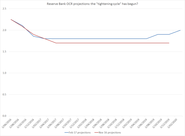
Using the definition of an “easing cycle” they appear to have adopted yesterday, to try to provide some cover for their 2014 misjudgements, this must surely mark the beginning of a new “tightening cycle”? And, yes, the forward track was revised up very slightly. Given that the Bank usually moves in increments of 25 basis points, the first actual OCR increase is currently expected in 2020 (this is the first time we’ve had projections for 2020).
But, of course, you didn’t hear the words “tightening cycle” from the Governor, or his offsiders, to describe what they’d done yesterday. (I missed the start of the press conference, but I’ve seen no references anywhere to the words, or ideas). And that is because it wasn’t the start of a “tightening cycle”. Indeed, if one takes the projections seriously, one must assume there is about as much chance of another OCR cut in the next year to two, as of an increase.
And the Bank’s own official words back up the idea that this wasn’t the start of a tightening cycle. Here are the key final sentences from the press release for the November MPS when, you’ll recall, they cut the OCR.
Monetary policy will continue to be accommodative. Our current projections and assumptions indicate that policy settings, including today’s easing, will see growth strong enough to have inflation settle near the middle of the target range. Numerous uncertainties remain, particularly in respect of the international outlook, and policy may need to adjust accordingly.
and here are the sentences from yesterday’s statement.
Inflation is expected to return to the midpoint of the target band gradually, reflecting the strength of the domestic economy and despite persistent negative tradables inflation.
Monetary policy will remain accommodative for a considerable period. Numerous uncertainties remain, particularly in respect of the international outlook, and policy may need to adjust accordingly.
Parse it as you will, in substance those statements are all but identical. If one wanted to be picky, one could highlight the addition of the words “for a considerable period” – but it was probably aimed at those market participants who the Bank thinks (rightly in my view) have got a bit ahead of themselves in their enthusiasm for OCR increases later this year.
It would simply be nonsensical to claim that yesterday’s MPS was the start of a “tightening cycle”. It clearly wasn’t. The Bank didn’t present it that way, and neither markets nor media have interpreted in that way.
It was even more nonsensical for them now to attempt to rewrite history and suggest that they began an easing cycle in June 2014. They didn’t, they didn’t think that was what they were doing at the time, no one else did then (here, for example, was one of Wheeler’s bigger fans’ own quick assessment at the time) , and no one else does now. They should be embarrassed.
Perhaps some readers will think I’ve made too much of the point. But Parliament has given a great deal of power to the Governor, who has openly argued that the Bank is highly accountable. One of the vehicles for that accountability – a statutory vehicle – is the Monetary Policy Statement. Reasonable people can and do differ over the conduct of policy in 2014, and it is healthy to have the debate – human beings learn from considered reflection and examination. But attempting to twist language to try to rewrite the historical memory isn’t the sort of thing we should be expect from public servants who wield so much power. And while Wheeler himself will soon be history, he has been keen to argue that he governs collegially – emphasising the role of his deputies and the assistant governor. Of them, the deputy chief executive will succeed Wheeler as Governor for six months, and most lists of potential candidates for the next permanent Governor seem to include both the other deputy governor, Geoff Bascand, and the assistant governor John McDermott. The Governor signs the MPS, but McDermott’s department generates the document – text and supporting analysis. An excellent central bank – doing policy well, producing strong supporting research and analysis, being open and accountable (rather than just playing political games), should be doing a lot better than this.
I was also struck by another of the Bank’s attempts in yesterday’s MPS to smooth over its record. They noted in chapter 2 that
“Annual CPI inflation has averaged 2.1 per cent since the current target range was introduced in 2002”.
Which is true, but not particularly revealing. For a start, during the Bollard decade, it averaged 2.5 per cent (excluding the direct effects of the higher GST) and in the Wheeler years it has averaged so far 0.8 per cent. Lags mean Brash (and the old target) was responsible for the first year or so of the Bollard results, and Bollard was responsible for the first year or so of the Wheeler results, so here is a chart showing a three-year moving average of annual CPI inflation (again ex GST). I’ve started from September 2005, so that all the data cover periods when the inflation target midpoint was 2 per cent.
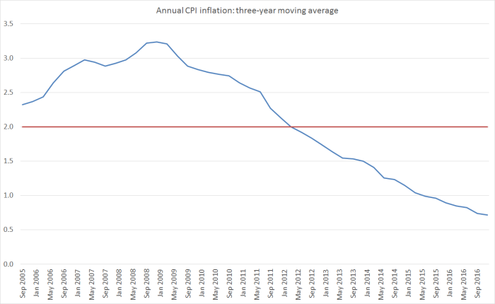
It isn’t exactly a record of keeping inflation near the midpoint, even on average. If the Bank seriously wants to argue that its performance should be evaluated over 15 year periods, they should abandon any pretence that there is serious accountability embedded in the system. Or, they could just play it straight, recognise their own (inevitable) limitations, and participate in some thoughtful, rather than propagandistic, reflections on the past conduct of policy and lessons for the future. We should be wanting – the Minister and Board should be seeking – a Governor who has that sort of open-minded self-confidence.
When I exchange notes with other former Reserve Bank people one common line that comes up is a sense that the analysis in the Bank’s Monetary Policy Statements is often rather tired, and adds little of value to the reader. Someone went as far yesterday as to send me a 20 year old MPS as a standard for comparison. I often caution people that each generation is prone to view their successors that way, and insert the caveat that I hesitate to claim much for a period in which the Reserve Bank had the MCI (and a key senior manager, who fortunately didn’t last long, who often nodded off, just across the table from the Governor, in Monetary Policy Committee meetings). Nonetheless, I can’t help coming to the same conclusion myself. There are defences – for a small central bank, four full MPSs a year is probably too many – simply cranking the handle to churn out the documents take a lot of resource. But it is the Bank that chooses that model – Parliament only requires two statutory MPSs a year. It could be argued also too that most of the value in the document is in the one page press release and a single table – but then why produce 30 to 40 pages? And sadly, even when they do try to introduce new material, I often don’t find it very persuasive or enlightening. And sometimes, the emphases seem quite politically convenient – productivity, for example, (or the complete lack of it in New Zealand’s case) appears not at all in the text of yesterday’s MPS.
I wanted to touch on just two examples from yesterday’s document. A year or so ago, the Reserve Bank introduced LUCI – the labour utilisation composite index, an attempt to provide a summary measure of resource pressure in the labour market. It was interesting innovation, if not fully persuasive as an indicator. They ran the chart in yesterday’s document
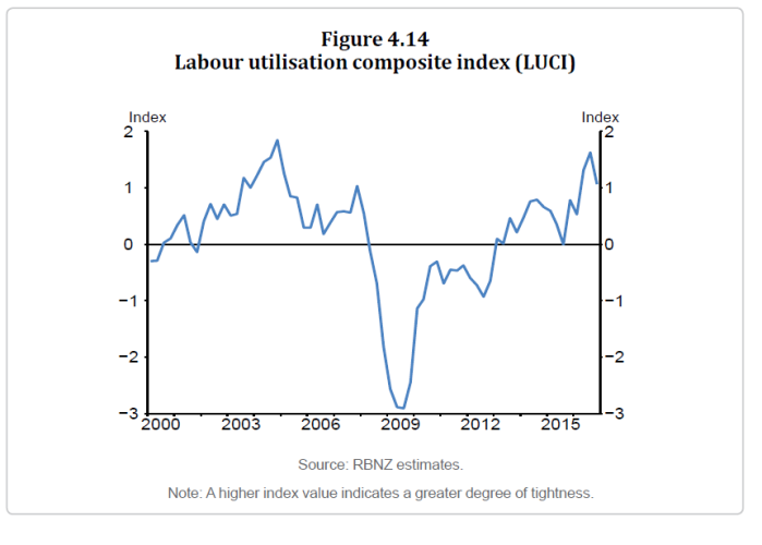
In the text, the Bank simply notes that labour market tightness increased over 2016. But if this indicator is supposed to be a measure of that, how seriously can we take the claim? After all, this index appears to suggest that in the Bank’s view the labour market is now almost as tight as it was at the peak of the previous boom (late 2004?) and materially tighter than it was over say 2006 and 2007 – a period when the unemployment rate averaged less than 4 per cent, and when wage inflation was quite high, and increasing further.
Over the last year, however
- the unemployment rate was basically flat (actually 2016q4 was higher than 2015q4, but lets treat that as possibly just noise),
- wage inflation was flat or falling,
- and in the Bank’s Survey of Expectations, expectations of future wage inflation were flat as well (actually down a bit in the latest survey)
And all this when the unemployment rate has been persistently above the Bank’s own estimate of the NAIRU (which appears to still be around 4.5 per cent), let alone Treasury’s which is around 4 per cent. There is little to suggest anything like the degree of labour market pressure that was apparent in the pre-recession years.
No doubt, there are good answers to some of these questions and apparent contradictions. But the Bank has made no attempt to address them, even though other labour market developments – around immigration – receive a lot of focus. The public, and readers of the MPS, deserve better analysis than that.
The Bank’s immigration analysis has also been rather tortured. Historically, they have worked on the basis, and produced research to support, the common view that the short-term demand effects of immigration exceeded the supply effects. There shouldn’t be anything surprising, or very controversial, about that – immigrants (or non-emigrants) need to live somewhere, and need all the attendant private and public infrastructure of a modern economy. Those pressures tell one nothing about the pros and cons of immigration policy.
But in the last couple of years, the Bank has been going to great lengths to try to suggest that this time things are different: this time the composition of the immigrants is so different (than in every previous post-war cycle) that, if anything, the supply effects outweigh the demand effects, and that high net PLT immigration is part of what is keeping inflation down.
It isn’t totally impossible of course. Fly in labourers, house them in disused prisons, forbid them from spending anything locally, and employ them only in very labour-intensive roles and the supply effects might outweigh the demand effects. But that isn’t the modern New Zealand immigration story (and in case anyone wants to be obtuse, obviously nor should it be).
The Bank likes to illustrate their case with charts like this one, produced again in the MPS yesterday.
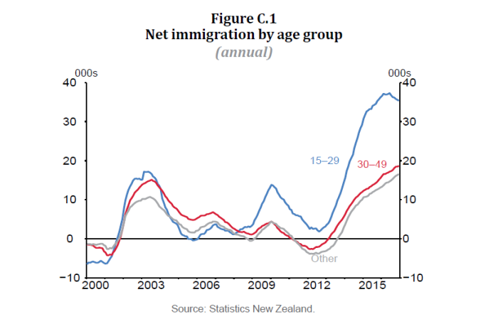
It uses PLT net migration data to purport to show (a) record immigration, and (b) that that record influx is hugely concentrated among young people who, it is claimed, add more to supply than to demand, dampening inflation pressures. The contrast is supposed to be particularly stark with the last big influx in 2002/03. The Bank explicitly states “young migrants and those on student visas represent a much higher share of migration than in previous cycles”.
I’ve covered much of this ground before, especially in this post. The limitations of the PLT data are well known, both in principle and in practice. At my prompting, with the full knowledge of my then RB superiors, Statistics New Zealand produced a research note on the issue a couple of years ago. In that document they showed how the PLT data had materially misrepresented the actual long-term migration inflow to New Zealand in the 2002/03 period (not wilfully – just the limitations of the timely measure). This was their chart.
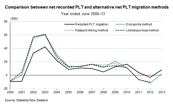
So the best later estimates are that the 2002/03 influx was around 50 per cent larger than the PLT data (including the age breakdown data) the Bank is constantly citing.
We don’t have current estimates from this improved methodology for the current cycle, but one can see the point in just comparing the net PLT inflow with the net total passenger arrivals. It is a more volatile series – things like World Cups and Lions tours help introduce volality.
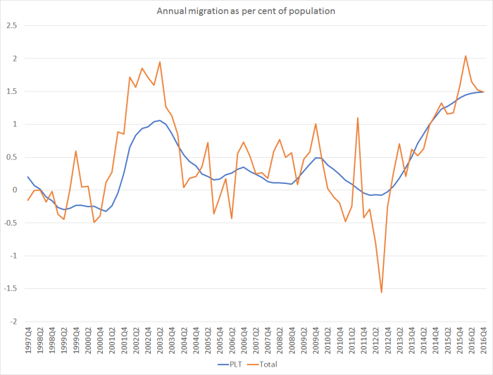
But you can see the big difference between the two series over 2002/03 – and SNZ estimated that much of that difference wasn’t very short-term tourists, it was people who ended up staying longer. Jump forward to the current cycle: contrary to the mythology the influx of people this time round, as a share of the population, hasn’t been larger than it was then. The peaks are around the same, and the peak this time (at least so far) was shorter-lived than it was in 2002/03.
And what of the student story? Well, it doesn’t really hold up either. Here is the MBIE data on the number of people granted student visas each year, as a share of the population.
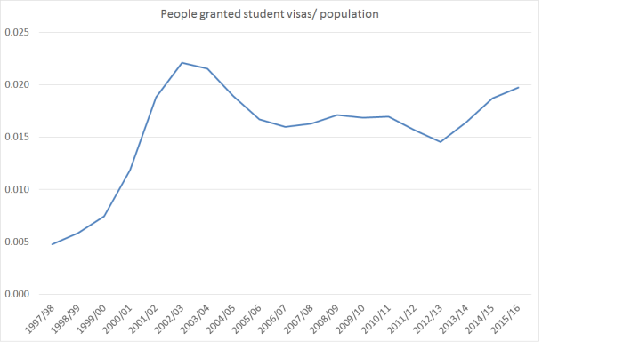
The peak isn’t as high as it was in 2002/03, and the extent of the increase is much much smaller this time. Foreign students add to demand – as all exports do. (Of course, there have been some – somewhat controversial – changes in student work rules, which might have mitigated the demand effects, but curiously the Bank doesn’t invoke that effect as part of its story.)
My point here is not to argue whether my conclusion (net migration tends to boost demand more than supply in the short-term) is right, or the Bank’s (this time is different) is. And as it happens, we see eye-to-eye right now on the current stance of monetary policy. I’m mostly concerned that the Bank seems to just ignore inconvenient data that just isn’t hard to find or use. There might well be good counterarguments to the data points I’ve highlighted here, but instead of making those arguments, the Bank simply ignores them. One might, sadly, expect that sort of standard from political parties and lobby groups. We shouldn’t expect, or tolerate, it from powerful well-resourced public agencies. The Bank’s argument is certainly fairly politically convenient: it keeps the focus off that unemployment rate that is still above the NAIRU (a gap that might be expected to be constraining inflation) and the near-complete absence of productivity growth, which might be deterring new investment (also dampening inflation pressures in the short-run).
There are plenty of complex issues around in making sense of what is going on. I certainly don’t claim to have a fully convincing story myself. But given the level of public resources put into the Reserve Bank, we should expect a lot more from them – not just answers, but evidence of genuine intellectual curiosity, and a desire to evaluate arguments from all possible angles. Their current policy stance is fine, but there doesn’t seem to be a strong and robust organisation, of the sort that would underpin consistently good policy through time, judged by the strength of its analysis and its openness to debate. Yesterday’s MPS is just one more example of that. Turning around that weakness should be one of the key challenges for the new permanent Governor.

115,000 Foreign students do provide fundamental support to the NZD as $1 billion in school fees and another $4 billion in day to day expenses, rents, food, clothing at the start of.a school year around feb, mar, and April. These overseas amounts tend to arrive in large lump sum amounts for expenditure during the year due the restrictive nature of funds transfers from India, China and Korea. Typically around this time, rents start to rise as landlord property vacancy factor reduces and gets replaced with long queues of prospectice tenants.
LikeLike
The problem with net migration is the inclusion of
1. Real residency migrant arrivals
2. Foreign students
3. Foreign workers visa arrivals for Christchurch and Kaikoura disaster recovery
4. Returning New Zealanders that have been away for more than 12 months overseas
5. Long term tourists
LikeLike
The other problem with net migration is also the complete ignorance of the 3.5 million tourists that will buy a record $15 billion NZD a year to spend up in NZ. They too need accomodation and with the rise of Crowd accomodation options like Air BnB who have registered 17,000 residential property for international travellers. In other words they compete with normal tenancies and are a immediate drain on short term resources.
LikeLike
“I never knew that Humpty’s fall
was something that someday
comes to us all.”
― Lee Bennett Hopkins
LikeLike
Completely agree about the rewriting of history, Michael. The record shows a 0.25% increase in June ’14, and a further 0.25% increase in July (between MPSs), which cannot be described as the start of an easing cycle. I dug out that July 24 ’14 increase. It refers to “the monetary policy tightening that has taken place since the start of the year” and to “the tightening in monetary policy to date”: no mention of easing, quite the reverse. It also said that a pause would be a good idea “before interest rates adjust further towards a more-neutral level”, i.e. move higher again. Very very difficult to read ‘easing’ into any of this.
LikeLike
Thanks Donal – useful reinforcement of the point. Not, of course, that the soft-soap interview in the Herald this morning would pose this, or any other remotely uncomfortable questions, to the Governor.
LikeLike
Anyone follow Epsilon Theory’s Common Knowledge theory?…
http://www.salientpartners.com/epsilon-theory/?page=1
LikeLike