Playing around in the consumption data yesterday prompted me to have a look at what had been happening with government consumption spending. Government consumption, in the national accounts, isn’t the same as total government operating spending. The latter includes transfers – the huge amounts modern governments spend on direct payments to households, through the welfare and social insurance systems etc. Government consumption parallels private consumption – it is the stuff governments and their agencies (central and local) purchase directly (excluding capital spending, which is investment). That includes stuff directly consumed by households but paid for by governments – think of lots of health and education spending – as well as stuff “consumed” collectively, or in some sense by governments themselves. The cost of The Treasury, MFAT, the courts, or defence spending are examples of the latter.
Take total government consumption spending first. The OECD has data for all its member countries since 1995, so I’ve focused on that period. Here is how New Zealand and Australia have done relative to the median OECD country over that period.
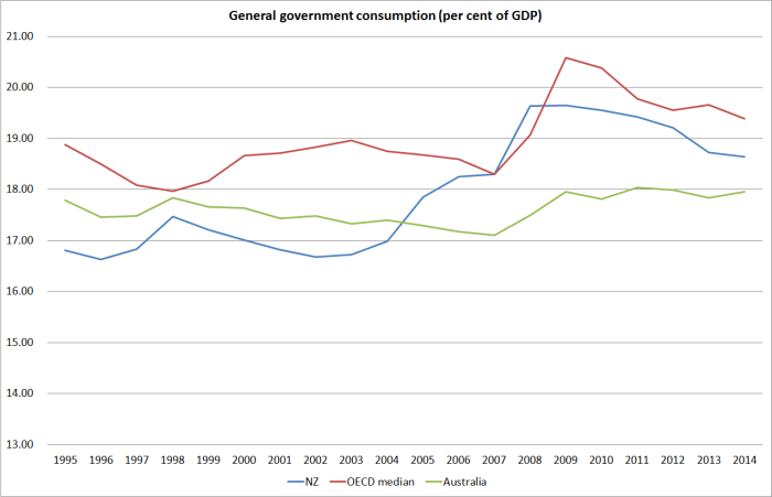
It is sobering to observe (a) how stable the government consumption share has been in Australia, and (b) how much government consumption as a share of GDP has increased since 1995. We were consistently a bit below Australia, and in recent years we’ve been a bit above. Australia may have more pressing fiscal problems right now than New Zealand does, but government consumption has been better held in check there than here. That increase in government consumption spending will have contributed to the upward pressure on the real exchange rate (tending to raise non-tradables prices relative to tradables prices).
And here is the chart for all OECD countries, showing both the 2014 numbers and the average for the full period 1995 to 2014.

A few things struck me. There is, of course, a huge range across quite similarly successful countries – Switzerland and the United States at one end, and the Netherlands, Sweden and Denmark at the other. The same pattern shows up when one looks at total government spending. But what struck me more forcefully this time was that while there was little change in the government consumption share of GDP among the countries in the middle of the chart – say those from Australia to Canada – most of the countries with very high government consumption spending had been increasing that share further over the last 20 year (all seven of the countries furthest to the right). And at the same time, the countries with the lowest government consumption shares had also been increasing that share (five of the seven countries furthest to the left). Only a handful of countries had government consumption shares of GDP lower at the end of the period than the full period average – and there wasn’t anything very obvious in common among those countries (eg Israel, Hungary, Portugal and Latvia).
As I noted earlier, total government consumption spending includes stuff individual households consume directly but the government pays for, as well as the more traditional stuff of government (policy advice, defence, law and order etc). The latter is known by the national accountants as “collective consumption”. Here are the same two charts as above, but this time just for collective consumption.
The New Zealand/Australia comparisons
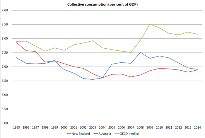
Trends here look quite a lot more favourable for New Zealand (and Australia even more so). No doubt it helps how little we spend on defence, but I think it is generally accepted that – even if there are whole agencies that could be closed with no real loss – that the New Zealand core public sector is fairly lean.
And the OECD as a whole.

Note that the countries at the right of this chart are quite different from those at the right of the total government consumption chart above. The Nordic countries are actually towards the left of the chart – Sweden, Denmark and Norway don’t spend much more running their governments than we or Australia do. The big differences are in the individual consumption the government pays for – be it childcare, health or education. The countries to the right of this chart look a lot more like those which tend to spend a lot on defence – those that really need to (Israel, and increasingly perhaps the Baltics, as well as Greece and Turkey with their historic rivalries and suspicions). It is interesting then how far to the left Korea is – perhaps offset in part by US defence spending and security pledges?
There aren’t any very obvious patterns in the changes between the 1995 to 2014 average and the current level. Overall, the OECD median has increased a little (as the earlier chart showed), but the increases don’t seem to be concentrated in low-spending countries, or high-spending countries, or countries that are militarily exposed, or countries that had strong fiscal positions. And I can’t see such patterns for the countries that have been shrinking collective consumption either.
Reasonable people can differ on the appropriate role for government in income support, or provision of health and education, but this is collective consumption. I’d be keen to learn a little more about how Switzerland manages to run such a successful and well-functioning country with collective consumption of only around 5 per cent of GDP.
