I hadn’t really intended to write anything today – tempted as I was by the topic of so-called “ethical investing” – but yesterday’s post on how best to look at new building consents relative to population (growth) sparked a surprising number of comments so I thought some brief follow-up comments and charts might be in order.
My single main point yesterday was that new building permits per capita, whether compared across time or across TLAs, is not a particularly useful indicator of anything. There are substantial differences in population growth rates – both across time and across TLAs – so that simple comparisons of consents for new dwellings relative to the current stock of population won’t tell observers anything useful about how supply/demand balances are unfolding in particular markets, or how responsive land use and building regulation allow markets to be in particular times and places.
For either purpose – and perhaps particularly for the latter – one really probably needs a more formal empirical model that can capture more of the idiosyncracies of particular times and places, and some of the two-way causation that can be at work (eg population growth generates demand for housing, but a readily responsive housing supply might also make such a locality more attractive to more people). Fortunately, in comparing across TLAs in a single country we can treat a lot of things as constant (applying similarly across all TLAs) – eg the same tax system, the same interest rates, the same banking system, the same trends in divorce rates, or childbirth rates (the latter two have clear implications for the number of houses demanded per capita). But there are still local idiosyncratic features that need to be taken into account at times. The most obvious of these in recent New Zealand history is the impact of the Canterbury earthquakes, which led to the loss of a lot of existing houses, especially in Christchurch city and Waimakariri (Kaiapoi). Even if the population of those places didn’t change much at all, one would expect a lot of new dwelling consents in the years following such destruction simply to re-establish the previously desired volume of housing. Seeing a lot of new dwelling permits in those (and neighbouring) localities might not tell one much about the responsiveness of the regulatory systems in those council areas, but simply about the specific nature of the shock. And – fortunately – we don’t know how other localities (and their regulatory systems) would have responded to a natural disaster of that sort.
Building permits per capita don’t tell us much at all. Building permits for new dwellings per person increase in population tells us more, but it is still a far from perfect measure – especially when, as around Christchurch, there is a sudden need to replace existing lost houses. So in my post yesterday I used the SNZ national data on housing stocks, and compared the (estimated) change in the housing stock to the (estimated) change in population. This was the resulting chart.
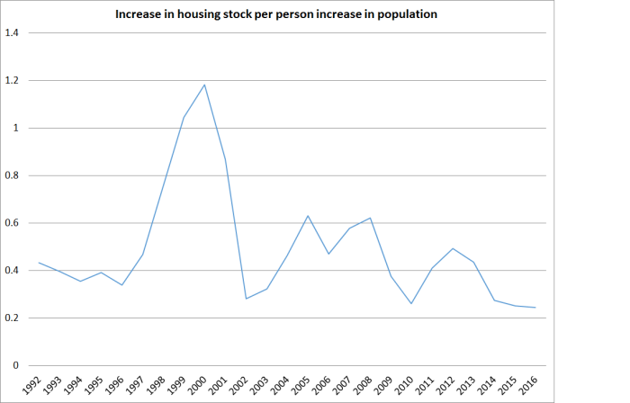
At a national level, the net increase in the number of houses has been very weak relative to (estimated) population growth, and there is no sign of any improvement. It isn’t a perfect indicator – changing birth rates or divorce rates might affect the desired number of people per house – but it is less bad than anything else we have.
What about at the TLA level? We don’t have annual housing stock estimates (that I’m aware of) and the latest annual subnational population estimates are for June 2015. So we are pushed back to using new dwelling consents. Comparing consents with population growth produces silly answers in places with falling populations – where there is usually some new building just to slowly replace the existing stock – or even places with very low population growth rates. So in what follows I’m just going to focus on places that are
- relatively large, and/or
- have had reasonable population growth
but with a particular focus on Auckland, greater Wellington, greater Christchurch, Hamilton and Tauranga. The readily accessible data go back to 1996.
Here is an easy-to-read chart comparing the experiences of Auckland and Hamilton. Both cities have had around a 40 per cent increase in population over the period.

But in only one year of these nineteen were more new houses being built per each new resident in Auckland than in Hamilton. There might be some underlying demographic differences – as I said, ideally one needs a fuller empirical model – but on the face of things it doesn’t reflect very favourably on the land use and building restriction of the Auckland council(s). At least up to June 2015, there was no sign of the gap closing.
Tauranga has actually had faster population growth than either Auckland or Hamilton over the 20 years. Here is what the chart looks like when we add Tauranga.

Pretty consistently higher (apparently more responsive to changes in demand) than Auckland in particular. But what really stands out is the final four or five years on the chart. Auckland and Hamilton are seeing less new building (relative to population growth) than they used to, while activity in Tauranga has held up at around the average for the previous 15 years.
What about Wellington and Christchurch? The population of greater Wellington (Wellington, Upper and Lower Hutt, Porirua, and Kapiti) has grown by only 17 per cent over this period. I never voluntarily defend Wellington local authorities. Perhaps – quite probably – in a climate of heavy land and building regulation it is easier for building to keep pace with more modest population growth. But for the full period, here is the number of new dwelling consents per person increase in population.
| Auckland | 0.32 |
| Hamilton | 0.38 |
| Tauranga | 0.45 |
| Wellington | 0.49 |
Greater Wellington has actually seen more building, relative to population growth, than even the least bad of those northern cities.
Christchurch is a story complicated by the loss of houses as a result of the earthquakes. One would simply expect to see a lot more permits in that region following the earthquakes even if the population changed little. Greater Christchurch encompasses three TLAs – Christchurch city, Waimakariri and Selwyn. The Selwyn council has a reputation for having facilitated growth – including the otherwise improbable meteoric post-quake growth of Rolleston.
If we split the sample and look at the years up to June 2010 (ie before the first earthquake), the number of new dwelling permits in greater Christchurch relative to the (quite strong) growth in population had been higher than in Auckland, Hamilton or Tauranga over the same period – but still a little behind Wellington.
The loss of existing houses muddies the post-2010 data. If we take the full period (1996 to 2015) in the table above greater Christchurch comes out at 0.66 – far above the other large cities. But, of course, greater Christchurch lost lots of existing houses – so the high numbers tell one nothing about supply/demand balances, or responsiveness of councils.
But one interesting angle is to look just at Selwyn. Queenstown apart, Selwyn has had the highest population growth rate of any TLA in New Zealand over the last 20 years (107 per cent). And Selwyn had few houses destroyed in the quakes. This is the chart of new dwelling consents per person increase in population in Selwyn.
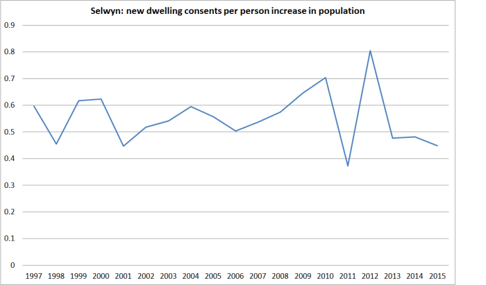
It is certainly a better experience than Auckland’s, but nothing to write home about. In fact, in the sub-period prior to the quakes, the rate of new dwelling consents per increase in population was a little lower in Selwyn than it had been in Christchurch city itself. Of course, an open question is to what extent people moved to Selwyn because of a responsive regulatory system – in turn pushed to its limits – and to what extent because the land itself was more stable, and the new motorway made places like Rolleston very easy to get to and from.
And what if we add fast-growing Queenstown into the mix?
New dwelling consents per person increase in population (June years 1997 to 2015)
| Auckland | 0.32 |
| Hamilton | 0.38 |
| Tauranga | 0.45 |
| Wellington (greater) | 0.49 |
| Christchurch (greater) to 2010 | 0.50 |
| Queenstown | 0.53 |
Of course, much of Queenstown’s construction is likely to be holiday homes, but nonetheless the contrast – in a town with very rapid population growth – with Auckland (and even Hamilton) is striking.
As a final caution, do note that the sub-national population numbers for the period since the 2013 census are estimates, themselves derived from national population estimates. In a couple of years’ time, after the next census, some of the recent population data could look quite different, affecting the interpretation of some of these recent construction numbers. But in most cases, the patterns were well in place before even the 2013 census.
