The current government has a published target for increasing the share of exports in GDP. I’ve argued previously that that was unwise, for a bunch of reasons, including the risk that it can encourage measures that might boost exports (to meet the target) but which don’t pass standard tests of good economic policies. I’d probably put enhanced film subsidies in that category – the export incentives of the current generation. But, equally, setting targets without any supporting economic strategy to deliver sensible results that meet the target has its own problems.
Despite all that, I suspect no one who cares about improving New Zealand’s medium to long-term economic performance is indifferent to the export performance of New Zealand firms, and the New Zealand economy as a whole. After all, the wider world is where most of the potential markets are – especially for firms from smaller countries. Perhaps there are examples, but I’m not aware of cases of countries that have markedly improved their economic performance on a sustainable long-term without a robust export sector (and tradables sector more generally) being part of that success.
I showed a chart the other day with a snapshot comparison of export shares in Australia and New Zealand in 1980 and 2014. New Zealand hadn’t done well. But how have we done over the decades not just by comparison with Australia, but compared with the wider group of advanced countries?
The OECD has data on exports as a share of GDP going back to 1970 for 27 countries, including New Zealand. Here is the chart, comparing New Zealand with the median of those OECD countries.
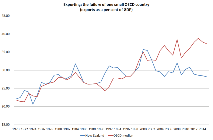
For an individual country, in particular, there is quite some variability. Thus, the combination of the sharp fall in our exchange rate in 2000 with high dairy prices temporarily boosted New Zealand’s exports to around 35 per cent of GDP. But if one focuses on the trends, one could say that broadly speaking we had kept pace with the growth of exports in other OECD countries until around 2002/03. But over the last 15 years, even though world trade growth slowed sharply late in the 2000s and has never really recovered, New Zealand has fallen well behind.
Only rarely is all the information in a single chart. This isn’t one of those times. Part of what has gone on, especially in Europe, is the growth of “global value chains”: whereas previously a car might have been designed and built entirely in Germany, and then exported, now often enough there is a lot of gross cross-border trade in the design and manufacturing phase, before the finished product is sold. That inflates gross exports (and imports) and overstates the growth in economic value-added associated with exporting. We don’t have up-to-date value-added data, nor a good long time series. On the other hand, this didn’t suddenly start becoming an issue in 2003.
We also know that:
- small countries tend to export and import larger shares of their GDP
- far-away countries tend to export and import smaller shares of their GDP
Both these points need to be kept in mind. The first doesn’t have any very obvious implications: were Belgium to split in two, exports and imports as a share of the respective GDPs of Flanders and Wallonia would rise even if no transactions were done differently after the split than before it. But the distance point does have implications. For whatever reason, distance is an obstacle to foreign trade, even that in services (it is probably not typically the dollar transport costs, but something about time taken to ship goods, and the physical proximity of people – customers, potential staff, even competitors), and makes it harder – all else equal – for distant places to prosper. Not surprisingly then, one doesn’t find too many people in very distant places.
But reverting to size, here is how the chart above looks if we focus only on the small countries the OECD has data for. In 1970 only two OECD countries – Iceland and Luxembourg – had smaller populations than New Zealand. We had just under 3 million people, and at the time Norway, Ireland, Denmark, Finland and Israel had fewer than 5 million people.
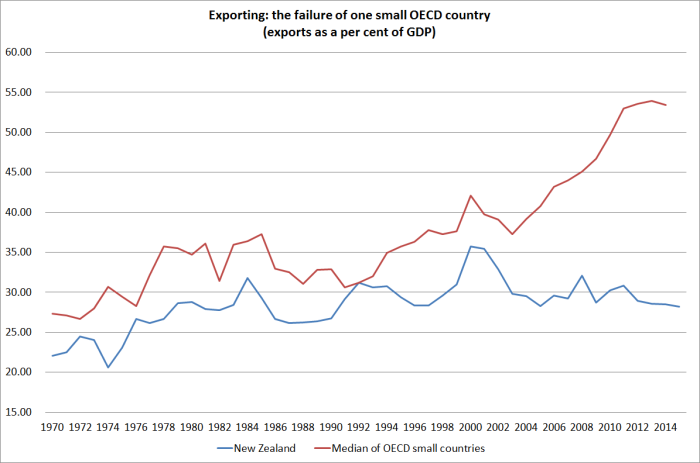
The recent divergence is, if anything, even more stark. Our export share of GDP in 1970 was already low by small advanced country standards – and had shrunk, as one would expect, during the years of heavy protectionism. But the gap has materially widened only in the last 15 years. Some of that will be the (profitable) growth in Europe in cross-border trade as part of the production process. But it certainly isn’t the whole story.
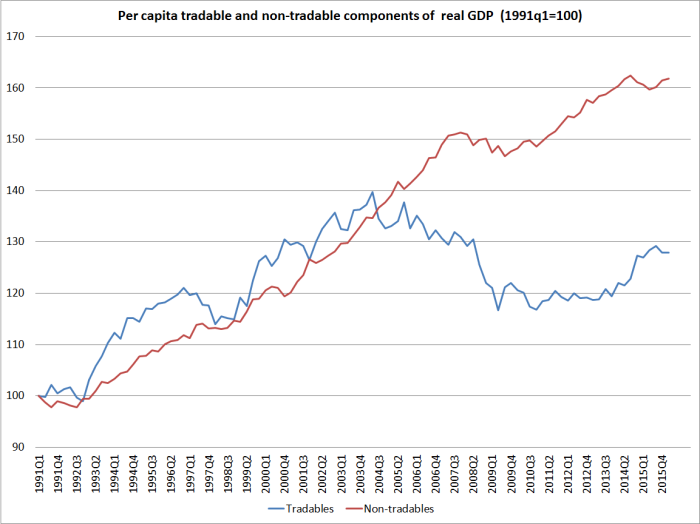
What makes me fairly confident of that claim? Two things really. The first is this chart (which I’ve run before), the indicative breakdown of New Zealand’s per capita GDP into tradables and non-tradables sectors. Something here changed, quite materially, in the early 2000s.
And the second is our exchange rate. Here is the real TWI, using Reserve Bank data updated to capture the last few months.

Our real exchange rate has always been quite variable. But if anything over the last decade or so there has been a bit less variability than in the preceding decades. And probably more importantly, the average real exchange rate since the start of 2004 has been 20 per cent higher than the average over the previous 20 years (the period for which the Reserve Bank has the data).
That would be great if it had reflected a marked improvement in our relative productivity performance. But, of course, it hasn’t. And perhaps unsurprisingly our tradables and export sectors have really struggled.
Of course, the real exchange rate isn’t simply a policy lever governments pull. It is an outcome of other factors – some policy, some market. And quite what those factors were is a topic for other days. For today, I simply encourage to reflect on how poorly New Zealand continues to do, and especially in building and expanding sales to the rest of the world, drawing on the high level of skills of our people, and the talents of our firms.
