The underperforming New Zealand economy

Today’s labour market data seem to point again to the underperformance of the New Zealand economy.  Oh, the headline rates of GDP growth haven’t looked too bad –  although they are quite modest in comparison with previous New Zealand growth cycles –  and employment growth has been strong.  But to what end?  Labour productivity looks still to be shockingly weak, yet another year ends with the unemployment rate well above Treasury estimates of NAIRU, and even as core inflation has picked up somewhat (yesterday’s post) wage inflation seems to be about as subdued as ever.  There seems to be something quite wrong with the economic strategy that presides over such outcomes –  and no sign from the major opposition parties that they have anything materially better or different to offer.

Hours worked, as captured in the HLFS, have increased strongly in the last five quarters, up by 6 per cent (adjusting for the break in the series, because of new methodology in the June quarter last year).  There have only been a couple of periods in the 30 year history of the series that have seen growth in hours worked that rapid.

We don’t have GDP data for the December quarter yet, and of course earlier quarters are always subject to revision.  But for the four quarters we do have, real GDP (averaging expenditure and production measures) rose by 4.0 per cent.   In other words, unless quarterly GDP growth for the December quarter is at least 1.9 per cent, we’ll again have had no productivity growth at all during that five quarters of rapid growth in hours worked.  Few commentators I’ve seen think GDP growth was anything like that strong  –  something a bit over 1 per cent seems closer to expectations.  If so, we’ll have had really rapid increases in hours worked and employment, but the economy will have got less productive at the same time.  (And recall that we’ve now had five years of no productivity growth).

In the past, periods when growth in hours worked have been very strong haven’t always seen rapid productivity growth.  There can be good reasons for that, if (on average) lower productivity workers are being reabsorbed into employment for example.  In the early-mid 1990s we had a couple of years of very rapid growth in hours worked, and over that period productivity growth, although positive, was pretty weak.     But over that couple of years the unemployment rate fell from around 10 per cent to around 6 per cent, and the employment rate also rose by around 4 percentage points.

Here is the unemployment rate (four quarter moving average to smooth through some of the quarterly noise, down and up)

u-rate-dec-16  The unemployment is still slowly trending downwards, but the pace is quite excruciatingly slow.  Over the five years in which there has been no productivity growth, the average unemployment rate has fallen from around 6 per cent to around 5 per cent, and over that period Treasury estimates that the natural rate of unemployment (determined by things like demographics, welfare provisions and labour market regulation) has been falling –  and is now around 4 per cent.

So we’ve had:

  • no productivity growth (perhaps even a contraction over the last year)
  • high and only slowly falling unemployment (and for those inclined to glibly respond that 5 per cent unemployment isn’t high, recall that that numbers mean that any one time one in 20 of those people available for wanting, wanting to work and making active efforts to find work can’t find a job).

And what of wage increases?  Unsurprisingly perhaps, there has been little sign of any recovery nominal wage inflation.    A standard response is that wages will inevitably lag improvements in the labour market, but….the unemployment rate has now been falling slowly for five years or so.

There is a variety of different wage inflation measures.   Here are two from the Labour Cost Index –  both the headline published series, which tries to adjust for productivity growth, and the Analytical Unadjusted index which is more like a raw measure of wage inflation.   In both cases, I’ve shown the data for the private sector.

lci

Of course, if one believes this data (in particular the red line) there must have been some continuing productivity growth in New Zealand, even if at a slower rate than previously.  Quite why SNZ finds (implied) productivity growth here, and not in national accounts (real GDP per hour worked) is a bit of a mystery.

The other measure of wage increases if from the QES. In this case, the annual rate of increase in private sector ordinary time hourly wages.

qes-wages

There is some volatility in this series, and I’m not sure I’d want to put much at all on the reported sharp fall-off in hourly wage inflation over the last year, but…….there is certainly no sign of an increase in wage inflation.

It is always easy to look around and find countries that have done worse than New Zealand –  several of the euro area countries spring readily to mind.    But our performance, and the gains for our people, are nothing much to celebrate.  And while, for example, there has been a global slowdown in productivity growth since the mid 2000s, New Zealand’s productivity levels are so far below those of the more strongly performing OECD countries, that there was no necessary reason why we needed to share in the slowdown.  It should, if anything, have been an opportunity for some convergence.  But there has been no sign at all of that.

I don’t find that particularly surprising –  an economic strategy that appears to involve attracting ever more people to one of the most isolated corners on earth, in an era in which connections, contacts, and proximity seem to matter more than ever, all while producing a very high real exchange rate (again resurgent in recent weeks/months), and the highest real interest rates in the advanced world, is simply a recipe for continued long-term underperformance.  One would like to think that the government –  and the Opposition which seems to support very similar policies –  has been surprised. They can’t, surely, have planned on such a bad performance.  But persistent bad outcomes, of the sort New Zealand continues to see, should be prompting some serious policy rethinks, not just more PR about how rapidly employment numbers are growing.


Weak productivity growth: can composition effects explain it?

One of the charts I’ve run a few times in the last few months has had a bit of extra coverage in the last few days.

real-gdp-phw-to-q2-2016

It is a pretty straightforward chart (although it would be a little easier if SNZ followed the practice of the ABS and reported the series routinely, rather than leaving it for people to calculate).  I simply averaged the expenditure and production measures of real GDP, and divided the results by the total number of hours worked (from the HLFS).  And real GDP per hour worked itself is a pretty standard measure of labour productivity.

The interest, of course, has been in the now four years or so of no growth in labour productivity.  On the face of it, it is a pretty poor performance and tends to act as something of a counterpoint to a focus by the government (and its business and media cheerleaders) on headline GDP numbers –  which are high largely because the population has been growing so rapidly, rather than because resources are being used more productively.  Productivity is, in the long run, almost everything when it comes to improving material living standards.

I would add a few caveats around the chart, some of which I’ve made here before.  The first is that the very final observation should be heavily discounted or ignored.  SNZ introduced a revised HLFS methodology in June, which has resulted in a step up in the number of hours recorded (perhaps by around 1 to 1.5 percentage points).  At some point that might be reflected in a slightly higher level of GDP, but for the moment there is just an inconsistency.  (And, of course, there is always some quarter to quarter volatility in the data too.)

The second caveat is the old warning that when a number looks particularly interesting it might well be wrong.  Four years of no productivity growth at all is not unprecedented here or abroad (on current data, for example, GDP per hour worked in the UK now is only around 2007 levels) but….these series are prone to revision, and while they could be revised either up or down, it shouldn’t greatly surprise us if the picture for 2012 to 2016 looks a bit different when we review the data a few years hence.

The big revisions tend to happen as a result of the annual national accounts.  Statistics New Zealand gets a lot more detailed data, produces full annual data once a year (including revisions to earlier years), and then updates the quarterly series that have already been published.  The annual data for the year to March 2016 are out later this month, and the revised quarterlies will presumably be available with the September quarter GDP release next month.  Expect changes (including in the chart above).

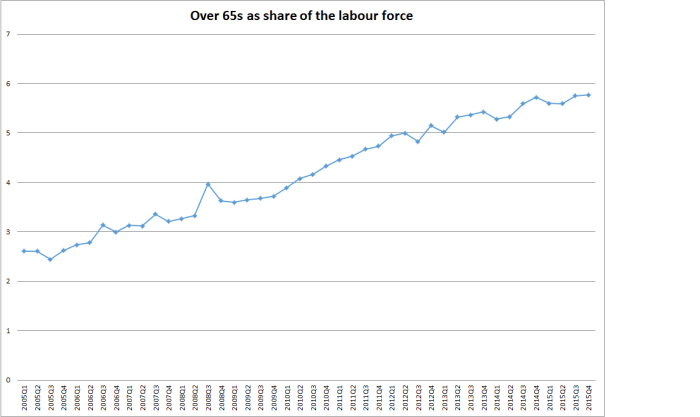
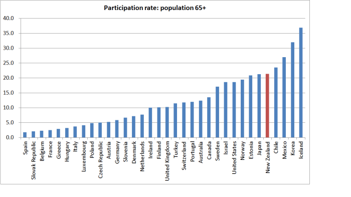
But for now, the data is as it is.  Bernard Hickey gave the chart some prominence, with the editorial comment “We’re just pumping more low wage workers in the economy and working more hours”, and observing “Jobs soaked up by net migration & more >65 yrs working”

That prompted Eric Crampton of the New Zealand Initiative, writing on his Offsetting Behaviour blog,  to produce a post asking whether compositional changes in the labour force might account for some or all of the weak productivity growth in recent years.  As he quite rightly notes, if a lot of very unskilled people started working lots more hours (in total), while higher skilled people worked the same number of hours, at the same real output, average real GDP per hour worked would fall even though no one individually was less productive.

First, Eric noted that the number of people on welfare benefits has fallen quite a bit over the last few years.  If –  as seems reasonable –  those people had been of below average productivity, that might tend to lower overall productivity somewhat.

But here is my problem with that story.

working-age-benefits

Working age beneficiary numbers have certainly fallen over the last few years, but they rose a lot during the recession.  There is seasonality in the data so I’ve only shown one observation per annum (June), but in June this year the share of the population of working age on welfare benefits was almost exactly equal to the share as the recession was getting underway in 2008.  People moving on and off benefits might affect average labour productivity to some extent, but absent any sign of an upward surge in productivity over, say, 2008 to 2010 it is difficult to believe this effect explains much of the recent absence of productivity growth.  (And, of course, the decline in beneficiary numbers doesn’t appear to have been in the faster than in the five years leading up to 2008).

Eric also includes a graph showing changing employment rates for different age cohorts, observing

The youngest workers are least productive. They hugely dropped out of the labour market with the changes to the youth minimum wage, but that decline’s since reversed a bit. There’s been a long trend growth in hours worked among older workers, but typical wage patterns over the lifecycle have wages flattening out from the early 50s or thereabouts. Big increases in employment rates among cohorts with lower than average productivity, or at points in the life cycle where wage profiles (and presumably productivity) flatten out, will both flatten or worsen GDP per hour worked.

What to make of that?  Here is a chart of the changes in employment rates for each age group, both since 2012 (when productivity seems to have gone sideways) and since 2007, just before the last recession –  and it isn’t a misprint/error; we’ve had no change in the employment rate over the full period from 2007 to 2016.

employment-rates-by-age

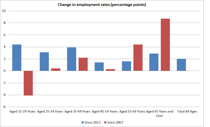
Over the last four years, the least productive age group (15 to 24) had the largest increase in employment rates,  and the 65+ employment rate has kept on growing quite a bit.  But….employment rates for 25 to 44 years olds increased quite a lot too (more than the over 65s).    And if we take the full period (Sept 07 to Sept 16), we’ve had a big drop in the employment rate for the lowest productivity age group.  That fall was, of course, concentrated in the first half of the period, but there was no obvious corresponding surge in average productivity at that time (granting that one never knows the c0unterfactual).

And by New Zealand standards, there is nothing very obviously unusual going in the 65+ employment rates.  Between 2007 and 2016 the 65+ employment rate rose by 8.7 percentage points. In the previous nine years, it has risen by 8.1 percentage points.

Perhaps one could dig deeper (if the data existed) and the impression might change, but it isn’t obvious that the changing age composition of the workforce can explain four years of no labour productivity growth.

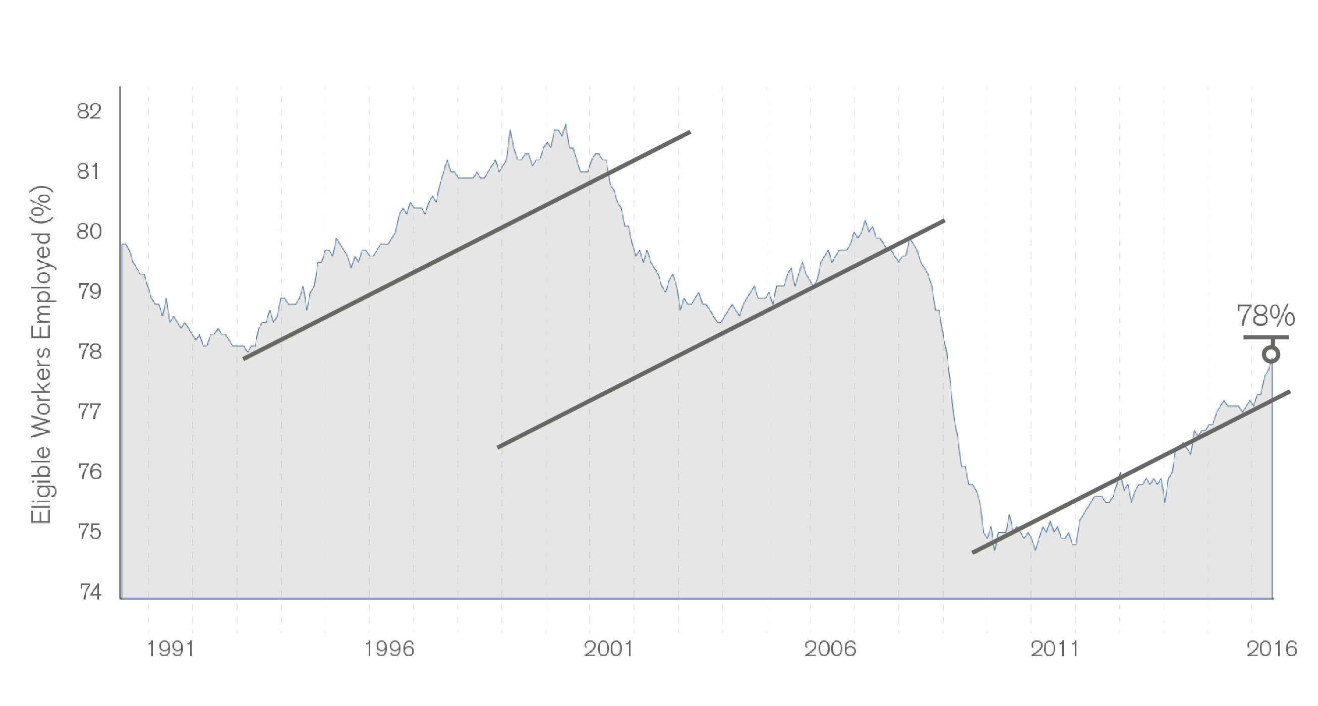
Sometimes people suggest that perhaps our labour market is performing so much better than those of other advanced countries which might in turn explain the poor productivity growth.   But here is a chart showing employment rates for New Zealand, Australia, and the median OECD country.

oecd-empl-rates

There might be something in the story relative to Australia over the last few years.  But comparing New Zealand with the OECD median, our employment rate fell about as much as that median did during the recession, and has rebounded only slightly more since.  Compare New Zealand and the typical employment rate just prior to the recession and almost half of OECD countries have had more of an increase than (the slight rise) New Zealand has had.

Eric also suggests that we need to think about the role of immigration

And, obviously, net migration’s increased over the last few years. New workers getting settled in New Zealand might take a bit to find their feet as well, while still being better off than they were before.

Just two thoughts.  First, around half the huge swing upwards in net inward migration has been the result of the sharp decline in the number of New Zealanders leaving.  They won’t have taken “a bit of time to find their feet”.    Second, for the other migrants, there might be something to the story (although there hasn’t been much variability in the number of actual residence approvals) through, for example, the increased number of foreign students working and people on working holiday visas.  But….the New Zealand Initiative and other business lobby groups can’t really have it both ways. They often tell us it is imperative that we have the sort of immigration policy we have now, because (for example) New Zealanders just can’t, or won’t, do the work (at a price firms can afford). There is a strong hint in that sort of argumentation that immigrants are on average actually quite highly productive relative to natives (even though the data show that for most immigrant groups it can take decades for the earnings to reach those of similarly qualified, similarly experienced New Zealanders).

I wouldn’t rule out the possibility that the compositional effects resulting from immigration are part of the explanation for the latest productivity slowdown (although we didn’t see something similar when Australia had its huge surge) but….if the Initiative is right about the general economic payoff to high immigration, we should be expecting a pretty big lift in average labour productivity (the more so to make up for four years of no growth) really quite soon.

One other lens on the composition issue is offered by our own official annual productivity data (for the “measured sector” rather than for the whole economy).   SNZ produces both labour productivity and multi-factor productivity estimates, and they also produce both series using both total hours worked and an estimate that attempts to adjust for the changing composition of the labour force.   The latter isn’t precise by any means, and won’t pick up all the sorts of issues that have been touched on in this post, or Eric’s, but they are just another angle on the question.  The MFP numbers are valuable because they help get round the question of whether, say, labour productivity is just poor because firms have substituted away from capital towards abundant labour.  Any such substitution would be less troubling if the result was showing strong MFP growth.

Unfortunately, the most recent data are for the year to March 2015.  In the labour productivity data, SNZ weren’t detecting any sign that a worsening average quality of the labour force was explaining the productivity slowdown – they reported much the same improvement in the average quality of the labour force as in earlier years.  And here is the MFP chart.

mfp-measured-sector

On this measure, of labour-quality adjusted MFP, there has been no productivity growth at all since around 2006.    There is some modest growth over 2012 to 2015 (a bit over 1 per cent over three years).

Where does all this leave us?

I remain a bit uneasy about the prospects the data could be revised, but then data revisions are always a risk.  But if the average real GDP per hour worked data are roughly right – and there really has been no average labour productivity growth for perhaps four years now –  I think we should be more inclined to believe that it is telling us something about overall economic underperformance, than that it is simply, or even largely, reflecting compositional changes in the labour force. To repeat:

  • the share of working age welfare benefit recipients has fallen gradually over the last few years, but then it rose in the previous few years, and there was no obvious associated productivity surge,
  • over the last few years the employment rates of the low productivity young age groups have risen, but not noticeably faster than those for, say, the rather large 25 to 44 age group.  Over 65s employment rates are rising more than those for other age groups, but that change has been underway for many years.  There was no obvious associated productivity surge (at least in the reported data) when youth employment rates dropped sharply.
  • there is nothing in cross-country comparative data suggesting employment rate changes here have been unusual, in ways that might help account for unusually weak productivity growth here.
  • compositional effects resulting from increased immigration of non-citizens (especially  working students and working holidaymakers) could be part of the story (averaging down real GDP per hour worked, even if no one individually is less productive), although it would be worth testing that story against other episodes in other countries.  If higher immigration is playing a role in dampening productivity growth, I suspect it isn’t mostly a compositional story, but one about overall pressures on domestic resources, which have contributed to holding up real interest rates (relative to those in other countries) and the real exchange rate.
  • and overall MFP growth –  whether SNZ estimated for the measured sector, with some labour composition effects accounted for, or the Conference Board’s estimates that I showed the other day – also seems to have been weak to non-existent.
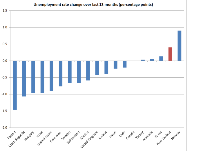
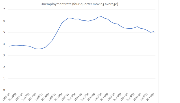


Revising the unemployment rate

Last week, Statistics New Zealand published the backdated results from their revamp of the HLFS.  It didn’t get very much coverage, apart perhaps from the headline result, in which the estimate for the unemployment rate for the March 2016 quarter is now 5.2 per cent, down from 5.7 per cent previously.

The change arises mostly because Statistics New Zealand has reclassified those searching for a job by checking websites as not unemployed –  to be “unemployed” for these statistical purposes one has to be out of work, available to start work, and actively seeking work.  Previously, those using just newspaper adverts were classified as  passively seeking work, while people using other search mechanisms were treated as actively seeking work, and thus included with the officially unemployed.  20 years ago web-based advertising  was either non-existent or almost relevant, and now to a large extent it dominates the market.  Fortunately, SNZ had enough data to produce backdated estimates on the new definition back to 2007 (any differences prior to that appear to be very small).

The change brings the New Zealand definition of unemployment into line with the recommendations of the ILO, and seems sensible on its own merits –  there isn’t any good reason to treat newspaper and web searches differently for these purposes.

The headline difference in the unemployment rate is quite large.  But all the gap opened up some years ago.

hlfs revisions

And here is the difference in the two series.

hlfs revisions 2

So, in essence, the data for the last six years aren’t materially affected by the revision and the new methodology: the new series is lower than the old series throughout, but by a fairly constant margin.  The unemployment rate didn’t fall much from the recessionary peak on the old methodology and didn’t fall much on the new methodology.  For example, on the old method the unemployment rate was 6.1 per cent in December 2013, just before the ill-fated tightening cycle began.  Since then, on the old methodology the unemployment rate has fallen by 0.4 percentage points.  On the new methodology, it was 5.7 per cent in December 2o13, and has fallen by 0.5 percentage points to 5.2 per cent.

But the new series does throw up a couple of questions.  The first is about international comparability.  As I noted, the SNZ release noted that the new methodology was more consistent with ILO recommendations.  That is good on its own terms.  But I was curious as to whether other countries were following ILO recommendations (yet) in this area.  I’ve known of other cases –  household debt was an example –  where we improved New Zealand data, drawing more into line with international standards, only to find that the international comparability wasn’t really improved because most other countries we were interested in weren’t yet following international guidelines.

So I asked SNZ whether they had any sense of how other countries were doing on this particular issue.   I got a full and prompt response from the manager of their Labour and Income Statistics area.   The short answer was that some countries seem to comply in this area, and others don’t.  Perhaps fortunately for us, both Australia and the US appear to treat looking at (newspaper and online) adverts the same way we do –  passively seeking work, rather than actively seeking work.    But, on the other hand, Eurostat treats looking at adverts as actively seeking work.  It is a reminder that simple levels comparisons of unemployment rates across countries often doesn’t involve (strictly) comparing apples with apples.  Comparing changes within over time within individual countries should still be valid.

The other question is how to think about the normal/natural/non-inflationary rate of unemployment.  At 5.2 per cent, our unemployment rate is still a long way above the pre-recessionary lows  (3.3 per cent) –  by contrast in the US and the UK, the recessionary increase in the unemployment rate has been fully unwound.  But the gap between 5.2 per cent and 3.3 per cent is materially less than that between 5.7 per cent and 3.4 per cent (on the old methodology).  Since most everyone thought that the unemployment rate prior to the recession was below the natural or non-inflationary level, does this new data raise questions as to whether the current unemployment rate might be not far from the NAIRU?

I don’t think there is any easy answer to that question.  Only time will tell.  As happened in the US and the UK we –  and the Reserve Bank –  need to see what happens, to wage and price inflation, as the unemployment rate gets down to the mid to low 4s (one hopes the Reserve Bank allows us the chance to see).  But don’t rule out the possibility that the NAIRU itself has been falling –  as it was widely perceived to have done in both the US and New Zealand in the 1990s and 2000s.

One reason why it might fall is the growing importance of old people in the labour market. Of all the OECD countries, New Zealand has seen the largest increase in the participation rate of older people (65+) in the 20 years since 1995 –  rising from 6 per cent to 21 per cent. .And we now have the fifth highest participation rate for the over 65s among the OECD countries.

over 65 participation ratesAnd the unemployment rate among older people is very low indeed   – before the recession and now both around 1.5 per cent.  That makes sense –  older people have New Zealand Superannuation to fall back on, with no work test, so there is typically no urgency to find another job (to be “actively seeking”).  But it is a very different –  and less cyclical –  unemployment rate than that for the rest of the workforce.

And here is the share of the over 65s in the labour force.  Even just over the last decade, the share has increased from 2.6 per cent to 5.8 per cent of the total labour force.

over 65s share

With such a low unemployment rate among this (rapidly growing) part of the workforce, the overall unemployment rate (actual and natural) should be trending lower over time, all else equal.

How material  this proves to be remains to be seen.  But a line I often used to use in debates about unemployment is that if everyone spent a year officially unemployed (available and actively seeking work) in a 45 year working life, that would produce an unemployment rate of only around 2.2 per cent.  For many people, a full year officially unemployed is a very long time –  more than a few people are probably like me, having spent over 30 years in the labour force and not a day officially unemployed.  We need to be guided constantly by the data, but we shouldn’t rule out the possibility that the NAIRU could keep falling quite a long way (and perhaps especially while the NZS age remains at 65).

This is my last post for a week or so.  The school holidays start tomorrow and we’ll be away for a while. I should be back writing here on 18 July –  I might even still find something to say about the speech on housing (and housing finance) Deputy Governor Grant Spencer is due to deliver this evening.


Technology, Bill Gross, and prime-age employment

Bill Gross, the renowned US bond manager, puts out a monthly Investment Outlook opinion piece, a public outlet for some of his ideas and concerns.  I used to read them quite regularly, and although I don’t do so these days, somewhere I saw a reference to the latest issue, and so dug it out.

His focus this month is on the advance of technology and the possible threat to the future employment opportunities of people in advanced countries.  Among his possible solutions is a Universal Basic Income –  as he notes (and despite the recent flurry of interest on the left in New Zealand) it has also had significant support on the right, especially in the US.

The centerpiece of his discussion is this chart

Chart I: Advance of the Robots, Retreat of Labor

Bill Gross March 2016 Chart
Source: U.S. Bureau of Labor Statistics

As he describes it:

As visual proof of this structural change, look at Chart I showing U.S. employment/population ratios over the past several decades. See a trend there? 78% of the eligible workforce between 25 and 54 years old is now working as opposed to 82% at the peak in 2000. That seems small but it’s really huge. We’re talking 6 million fewer jobs. Do you think it’s because Millenials just like to live with their parents and play video games all day? I think not. Technology and robotization are changing the world for the better but those trends are not creating many quality jobs. Our new age economy – especially that of developed nations with aging demographics – is gradually putting more and more people out of work.

It is certainly a rather bleak picture, for the United States.  But it isn’t remotely representative of the experience across the advanced world.

The OECD only has detailed annual labour market data to 2014.    In the US, as Gross illustrates, the employment to population rate in 2014 for the 25 to 54 age group was 3.0 percentage points lower than it had been in 1990.   A handful of countries had done even worse – Estonia, Finland, Greece and Sweden (three of them countries with little or no macro policy flexibility, now inside the euro).  But the median OECD country (for which there was data right through the period) had employment to population rates 2.6 percentage points higher in 2014 –  when most Western economies weren’t exactly buoyant –  than in 1990.  New Zealand did better than the median, being 5.8 percentage points higher than in 1990.

employment to popn change

In fact, in eight of the 34 OECD countries, employment to population ratios for 25 to 54 year olds in 2014 were at the highest levels they had been in the last 25 years.  On the other hand, 14 countries had employment to population ratios for this age group that were more than 3 percentage points below the 25 year peak.  Perhaps unsurprisingly, 12 of them were euro-area countries, plus the United States and Sweden.

But employment to population ratios are quite substantially affected by the economic cycle.  Participation rates  –  those employed and those actively seeking work – are less severely affected.

participation rate 2104 less post 1990 peak

The participation rates for these prime-age people in 2014 were higher than they had been in 25 years for fully a third of the OECD countries (11 of 34, including New Zealand).  And another 13 countries had participation rates in 2014 within 1 percentage point of the peak (participation rates are somewhat cyclical, and in few countries was 2014 a year of intense cyclical pressure on labour resources).  The US was among a very small handful of countries where the participation rate was still well below the previous peak.

And here is how the US experience compares (and contrasts over the last 15 or more years) with that of the median OECD country, in a chart going back to 1980.

e to popn since 1980

Looking at the participation rate, the contrast is even more striking and appears to have begun earlier.

partic rate since 1980

Quite what is going on in the United States is an interesting question, but it looks to have been quite idiosyncratic.

Perhaps the answer lies in technological developments.  In much of the economy, the US represented the technological frontier for several decades.  But as an explanation it doesn’t really ring true when the US experience is contrasted with that of a bunch of similarly high-productivity (GDP per hour worked) northern European countries.

And perhaps there is a future to worry about in which there won’t be jobs for many of those who want them.  But it does seem to have been a recurrent worry, going back at least as far as the Industrial Revolution, and –  so far at least –  the concern hasn’t come to anything very much for the economy as a whole.  Productivity gains enable society to have more for the same, or fewer, inputs: labour once used to, say, connect telephone calls now does other stuff.  In general, therefore, productivity gains are something to celebrate, and if anything the concern in the last decade or so has been how weak underlying productivity growth appears to have been.

Of course, at least when the public sector is concerned, genuine productivity gains resulting from the application of technology don’t always free up any labour anyway.   My local community newspaper reports this week that the Wellington City Council libraries are introducing a new RFID self-service book-issuing system, which will “be quick and make using the library simpler”.  What’s not to like about that?  Cost savings should  flow from that, I thought, which should be welcomed by the ratepayers.  But no.  Instead:

The council’s community facilities leader, councilor Sarah Free, said the upgrade would offer users the best of modern technology.  … “I’m pleased to say there will be no staff reductions as a result of this upgrade”.

Perhaps there really is a revealed need for additional staff who will “focus on helping people find specialized resources or use library services”.  It feels a bit like gold-plating to me –  a council always keen to spend money, and rarely to save it – but in a sense in just illustrates the way in which the nature of jobs changes as technology advances without –  as yet –  any sign that it leaves large chunks of the population, who want to work, unable to find work.


Why isn’t the high unemployment rate bothering more people?

At 6 per cent, our unemployment rate is no longer low.  And yet it seems to excite little interest, whether from  the media, economic commentators, the Reserve Bank, or the government.

I’ve argued that the Reserve Bank’s unnecessarily tight monetary policy over recent years (as revealed by core inflation outcomes) has contributed to the high unemployment rate.  Within a standard model, this shouldn’t be a remotely controversial claim. If, as the Bank reckons, inflation expectations are in line with the target, then actual core inflation outcomes persistently below target will have reflected less utilisation of productive capacity (labour and perhaps capital) than would have been possible.  Put that way, it sounds bloodless and technocratic, but real people are affected here –  people unable to get a job at all, or to get as many hours as they would like.  Lower policy interest rates would have stimulated some more domestic demand, and would have lowered the exchange rate, stimulating some more external demand.  And core inflation would have come out nearer the target.

I’m not going to repeat the debate as to whether, with the information they had at the time, the Reserve Bank could reasonably have run a different stance.  I think so, and said so in writing within the Bank at the time.  But the point here simply is that, at least with hindsight, monetary policy was persistently too tight, and there has been an output and unemployment cost to that –  in a recovery that was, in any case, probably the most anaemic New Zealand has had for a very long time.  And the cost goes on –  even now, the unemployment rate is rising, not falling.

But how do we compare?  I downloaded the OECD data on unemployment rates for the 19 OECD monetary zones (ie 18 countries with their own monetary policy, plus the euro area).

Despite having some of the more flexible labour market institutions among advanced countries, New Zealand’s unemployment rate, at 6 per cent, is currently a bit above the 5.5 per cent median for this group of countries.

And over the last year, only four of these countries have had an increase in their unemployment rate at all.  New Zealand’s increase  has been second only to that in Norway.  The last year has been tough for Norway, with the collapse in oil prices.  The central bank has cut interest rates, by 75 basis points. But they are somewhat constrained.  The inflation target in Norway is 2.5 per cent, and core inflation is at least that high.  The central bank lists four core inflation measures on its website: one is at 2.4 per cent, one at 2.5 per cent, and the others at 2.8 per cent and 3.1 per cent.  Each of those measures is higher than they were a year ago.  Without looking into Norway in more depth, the rise in the unemployment rate (which is still only 4.5 per cent) doesn’t look like something that monetary policy can usefully do much about.  New Zealand is different.

U change since sept 14

New Zealand also shows up at less attractive ends of the charts if we look at how the unemployment rate has changed since either the peak reached in the recessions from 2008 on, or from the trough in the boom years.  On the latter measure, the only area that has seen more of an increase in the unemployment rate is the euro area as a whole (which has pretty much exhausted the limits of conventional monetary policy).  And it is not as if our boom was extraordinarily large –  using OECD estimates, our peak output gap in the boom years (3.2 per cent) was bang on the median for this group of countries.

U chg since recession

U chg since 05-08

So New Zealand’s outcomes look pretty bad.  Relatively high unemployment now in cross-country comparisons, rising unemployment, and by some margin that largest increase in the unemployment rate since the boom years of any country that still has conventional monetary policy capacity left.  It should be a fairly damning indictment.

Of course, Australia also shows up towards the upper end of each of these charts.  Each of the RBA’s core inflation measures is now below their target, although (a) by less than core inflation is below target in New Zealand, and (b) this gap between outcomes and target has only really emerged in the last few quarters.  By contrast, core inflation in New Zealand has been clearly below the target midpoint for more than five years.   I suspect the Reserve Bank of Australia should also be cutting their policy rate further, but at present any error there looks less egregious than the error in New Zealand.

(Defenders of the Reserve Bank could, of course, reasonably point out that the Bank has cut by 100 basis points this year, and that monetary policy works with a lag.  However, since the Bank forecast yesterday that the unemployment rate will still be 6 per cent in March 2017, and inflation then is forecast to be only 1.5 per cent –  even with a material acceleration of growth –  that point is not particularly telling on this occasion.  It simply means that this year’s cuts have stopped the situation getting even worse.)

I’m not entirely sure why the unemployment outcomes seem to be getting no traction in the New Zealand debate.  Perhaps there is something in the insider/outsider story –  neither the bureaucrats making policy nor the market economists commenting on it are unemployed.  And perhaps many of them are, like me, of an age that the 11 per cent unemployment rates in the early 1990s shaped their perspective?  And having spent much of his career abroad, mixing mostly with international agency elites, the Governor may also have a rather limited degree of identification with the New Zealanders at the bottom end who are paying the unemployment price. But none of this seems particularly compelling.

As is widely recognised, the main Opposition political party has been failing, and isn’t helped by having a finance spokesperson who seems to struggle to get to grips with the issues, and to communicate them in a way that either resonates outside central Wellington, or in the House.  And yet, the unemployment rate would seem to be a natural issue for the Labour Party, with its strong union base, and voter base among the relatively less well-off sections of the community.

I suspect the Minister of Finance isn’t very happy with the Bank’s handling of things –  he has hinted as much in several public comments earlier in the year.  But what is in for him to make more of the Reserve Bank’s failing?  The government’s popularity ratings remain high, and the media and business elite continue to retail a narrative in which New Zealand’s economy is doing just fine –  despite near-zero per capita GDP growth, almost non-existent productivity growth (and high unemployment).

Which leaves me wondering whether elite opinion support for large scale immigration –  repeated yesterday by the Reserve Bank Governor –  is part of the story.  The Reserve Bank reckons that the high rate of immigration has raised the unemployment rate and lowered wage inflation –  it is there in the text of the MPS yesterday.  I reckon they are wrong on that: the demand effects of immigration surprises have almost always outweighed the supply effects, and so surprisingly high immigration has, if anything, tended to hold the unemployment rate down in the short-term (in the long-term it is the labour market institutions that determine it).  If you really strongly believe in the benefits of high rates of immigration to New Zealand –  and that has been the elite view, against the evidence of a steady trend decline in New Zealand, for a century or more – but think it is raising the unemployment rate in the short-term, then you might be reluctant to express any serious unease about the high and rising unemployment rate, lest it cast doubt on your preferred immigration policy.  If there is anything to that interpretation, I’m sure it is subconscious rather than conscious.  And I’m not sure if it explains anything either.

This is one of those times when central bank independence is not really serving the interests of New Zealanders.  The logic of the argument was that independent central banks would protect us from high inflation. Now it is working the other way round.   If the Minister of Finance were making the OCR decisions, the political pressure to do something about rising unemployment –  at a time of very low inflation –  would probably be more focused and intense.  The Minister of Finance has to face questions in the House every day, and make himself regularly available to the media and voters.  By contrast, the Governor hides away behind a cloak of technocratic expertise, and a Board which sees its role as to protect and promote the Bank.  That means no effective accountability (remember, real accountability means real consequences for real people).

Flexicurity: the way ahead for New Zealand?

I finally caught up yesterday with Grant Robertson’s interview on The Nation.

There was the odd good aspect.  It sounds as though the variable Kiwisaver policy, as a tweaky tool to supplement to monetary policy, is heading for the dustbin, joining the capital gains tax proposal.  Other bits bothered me –  in particular, the lack of any sense in Robertson’s comments of the importance of markets, competition, relative prices etc.  He is clearly a believer in the power and beneficence of “smart active government”.

And I’m still a bit uneasy when I hear Robertson talk about changing the Reserve Bank Act to place a specific onus on the Reserve Bank to promote employment (or reduce unemployment).  It will be important to see details.  In principle, an amendment to section 8 of the Reserve Bank Act to say something along the lines of “achieve and maintain a stable level of prices, so that monetary policy can makes it maximum contribution to sustainable full employment and the economic and social welfare of the people of New Zealand” might do no harm.  It would, in fact, be not dissimilar to words that have been in the Policy Targets Agreement in the past.  On other hand, requiring the Bank to, say, actively target the lowest rate of unemployment consistent with maintaining price stability would be another matter.  Right at the moment it might be quite good advice to this Governor, who seems particularly uninterested in the plight of the (cyclically) unemployed.  But over time it would risk imparting a bias to the Reserve Bank’s choices that might well lead to persistently higher inflation outcomes over time.  That wouldn’t help anyone.

But the bit of the interview I was most interested in was the discussion around a possible different approach to help facilitate people moving from one job to another, as technology and opportunities evolve and change.  Robertson seems taken with the Danish “flexicurity” approach.  I didn’t know much about it, but in my younger days the idea of active labour market policies had had some appeal, so I thought I would take a quick look.  In some respects, Denmark’s experience is one to try to emulate:  prior to World War Two it was largely an agricultural economy, heavily reliant on agricultural exports to the United Kingdom, but poorer than us.  Now, while agriculture still plays an important part in the Danish economy ,other sectors have become much more important in the external trade and Denmark’s per capita income is far higher than New Zealand’s.

Here is how the Danish government describes “flexicurity”

A Golden Triangle Flexicurity is a compound of flexibility and security. The Danish model has a third element – active labour market policy – and together these elements comprise the golden triangle of flexicurity.

One side of the triangle is flexible rules for hiring and firing, which make it easy for the employers to dismiss employees during downturns and hire new staff when things improve. About 25% of Danish private sector workers change jobs each year.

The second side of the triangle is unemployment security in the form of a guarantee for a legally specified unemployment benefit at a relatively high level – up to 90% for the lowest paid workers.

The third side of the triangle is the active labour market policy. An effective system is in place to offer guidance, a job or education to all unemployed. Denmark spends approx. 1.5% of its GDP on active labour market policy.

Dual advantages The aim of flexicurity is to promote employment security over job security. The model has the dual advantages of ensuring employers a flexible labour force while employees enjoy the safety net of an unemployment benefit system and an active employment policy.

The Danish flexicurity model rests on a century-long tradition of social dialogue and negotiation among the social partners. The development of the labour market owes much to the Danish collective bargaining model, which has ensured extensive worker protection while taking changing production and market conditions into account. The organisation rate for workers in Denmark is approx. 75%.

The Danish model is supported by the social partners headed by the two main organisations – The Danish Confederation of Trade Unions (LO) and The Confederation of Danish Employers (DA). The organisations – in cooperation with the Ministry of Employment have also jointly contributed to the development of common principles of flexicurity in the EU, resulting in the presentation of the communication “Towards common principles of flexicurity” by the European Commission in mid-2007.

And here is a link to an accessible VoxEu piece from a few years ago on the flexicurity approach and Denmark’s experience after 2007.

The Danish “flexicurity” model has achieved outstanding labour-market performance. The model is best characterised by a triangle. It combines flexible hiring and firing with a generous social safety net and an extensive system of activation policies. The Danish model has resulted in low (long-term) unemployment rates and the high job flows have led to high perceived job security (Eurobarometer 2010).

….

The employment protection constitutes the first corner of the triangle. For firms in Denmark, it is relatively easy to shed employees. Not only notice periods and severance payments are limited, also procedural inconveniences are limited. The employment protection legislation index of the OECD for regular contracts is only 1.5. The Netherlands and Germany, countries with employment protection legislation, have an index of 2.7 and 2.9 respectively.

And here I started getting a bit puzzled.  Denmark certainly makes it a lot easier than many European countries to shed employees.  But it is even easier in New Zealand.  On all 4 components of the OECD’s indicators of employment protection legislation, New Zealand ranks as less restrictive than Denmark –  quite materially so by the look of it.

The OECD indicators on Employment Protection Legislation
Scale from 0 (least restrictions) to 6 (most restrictions), last year available
  Protection of permanent workers against individual and collective dismissals Protection of permanent workers against (individual) dismissal Specific requirements for collective dismissal Regulation on temporary forms of employment
OECD countries
Australia 1.94 1.57 2.88 1.04
Austria 2.44 2.12 3.25 2.17
Belgium 2.99 2.14 5.13 2.42
Canada 1.51 0.92 2.97 0.21
Chile 1.80 2.53 0.00 2.42
Czech Republic 2.66 2.87 2.13 2.13
Denmark 2.32 2.10 2.88 1.79
Estonia 2.07 1.74 2.88 3.04
Finland 2.17 2.38 1.63 1.88
France 2.82 2.60 3.38 3.75
Germany 2.84 2.53 3.63 1.75
Greece 2.41 2.07 3.25 2.92
Hungary 2.07 1.45 3.63 2.00
Iceland 2.46 2.04 3.50 1.29
Ireland 2.07 1.50 3.50 1.21
Israel 2.22 2.35 1.88 1.58
Italy 2.89 2.55 3.75 2.71
Japan 2.09 1.62 3.25 1.25
Korea 2.17 2.29 1.88 2.54
Luxembourg 2.74 2.28 3.88 3.83
Mexico 2.62 1.91 4.38 2.29
Netherlands 2.94 2.84 3.19 1.17
New Zealand 1.01 1.41 0.00 0.92

And then I wondered about just how the unemployment rates of the two countries had compared.

denmark U

At least for the last 15 years, our unemployment rate has hardly ever been higher than Denmark’s.

And what of the share of the population in employment.  There the difference in recent years is quite startling, and all in favour of New Zealand.  The sustained fall since 2007 in the Danish share of the population that is employed is among the largest in the OECD, matched only by Greece, Ireland and Spain.

denmark E

Of course, the recent employment (and unemployment outcomes) aren’t just the result of employment protection legislation and active labour market policies.  Demand is an issue too, and by pegging to the euro Denmark gave up the ability to use monetary policy to support demand (and the euro area authorities have largely exhausted their capacity).  I guess the Danish unemployment rate isn’t too bad, but I wasn’t quite sure what the Danish labour market experience had to offer that should attract New Zealand.

I imagine that life on the unemployment benefit is a bit more pleasant in Denmark than in New Zealand, but it isn’t obvious that the Danish structure, as a package, is producing, over time, better outcomes than what we have here.  And their model is vastly more expensive, and more heavily regulated, consistent (of course) with Denmark’s position as the OECD country with the third largest share of government spending as a per cent of GDP (57 per cent).  New Zealand, by contrast, has total government spending of around 41 per cent of GDP

Perhaps more regulation and more spending was Robertson’s point.  I guess we have elections to debate such preferences, but it seems a stretch to believe it would be an approach that would make our labour market function better.  It isn’t obvious Denmark’s does.

Thinking further about employment and unemployment

Just when I’d been writing yesterday that I was puzzled that so many of New Zealand’s elite seem to think that New Zealand has done quite well in recent years, and seemed quite indifferent to the number of people unemployed, along comes another example.

In his column (not apparently online) in this morning’s Dominion-Post, Pattrick Smellie leads with this line

“On any rational analysis, New Zealand’s employment statistics are among the strongest in the developed world”

How could one “rationally” disagree?  Well, it is certainly true that the ratio of employment to population in New Zealand is quite high by international standards (though any table in which, as with Smellie’s, New Zealand is bracketed between Colombia and Russia should probably be a bit of a warning), but by what criteria is Smellie judging this to be “a good thing?  There is no real hint in the article, except perhaps a Stakhanovite sense that more paid labour must somehow be a good thing, for someone.  For“the national interest” perhaps?

But labour is a costly input –  costly not just to the employer who has to write the cheque to pay for it, but for the employee who gives up the time and opportunities he or she would otherwise have.  Some people have a real passion for the paid employment they do, but for most they work because they have to, to provide the basics for themselves and their families, and because the value to them of the things they get to consume (or risks they get to allay) as a result of working outweighs the cost of giving up free time.

I’m disgruntled that our governments have continued to run policies that mean that 10 per cent of working age adults are on welfare benefits (and did I really hear that, despite this, the ACT Party last night voted to raise real welfare benefits?).  I’d prefer that most of those people were providing for themselves –  which for many/most would involve paid employment  A move in that direction would tend to raise our labour force participation and employment rates.

But equally I’m glad that my elderly mother does not (have to) work  A larger share of the population in much older age groups will, quite reasonably, tend to lower labour force participation and employment rates, even if we could get the NZS eligibility age raised somewhat.   And polling data shows that many parents would prefer that one of them was able (financially) to stay home full-time  at least when they had young children –  but our scandalously expensive house prices, especially in Auckland, make that very difficult for most.  Reforming land and housing markets to make housing more affordable might lower participation and employment rates –  and that would seem likely to be a good thing, (given private preferences).

There are reasons to be concerned if public policy measures are unreasonably discouraging people from participating in the labour force.  But a measure of a country’s success is not the proportion of its adult population that is in the paid labour force (or the hours they work – see, eg, Korea). Personally, I counted it as a measure of our family’s modest success that I’m not in the labour force any longer, and have no intention of being regularly in it again.    I get to do for my kids what my mother did for me.  That is gain not a loss.

And that is, of course, why most attention in the labour market data goes on the unemployment rate, because it is a measure of the people who want to work, are actively looking for work, are available for work now, but don’t have a job[1].  As a general proposition, the lower that number is the better.    These people would prefer to be working –  not necessarily in just any job, but in a job  – and are taking active steps to find one.

One can take the economist’s tack and (somewhat queasily) compare people unemployed to goods on the shelf of a supermarket.  I can always buy butter when I want it only because the supermarket stock enough to cope with fluctuations in demand.  Those stocks serve a valuable purpose (which is why the supermarket owners willingly pays the cost). The unemployment story is a bit different; a pound of butter is a fairly homogeneous commodity, and people are not.  The search and matching process –  matchng the “right” job to the “right” worker –  takes time and effort.   Mostly, workers would probably prefer to do that matching while they are still in another job (whereas a pound of butter can’t be in my fridge and simultaneously available for another casual customer wandering into the supermarket), but sometimes unemployment actually allows the time for a more intensive search (or search in a different city).  At the margin, unemployment benefits make that a more feasible option than it would otherwise be (as, of course, do private savings, and the pooling of multiple incomes within a household).

But unemployment is not something we can, or should, be complacent about.  I think there was something profoundly right about the post-war emphasis on achieving full employment, even if it was carried too far, and pursued in ways that were probably detrimental to the longer-term economic performance of the country.  “Full employment” barely even figures in modern discussion, except perhaps when macroeconomists are tempted to treat a NAIRU as something akin.

New Zealand has had a mixed historical record on unemployment.  Here is how our unemployment rate has compared with the median OECD country’s unemployment rate, and that for the median of the other Anglo countries (Australia, Canada, Ireland, US and UK) since the HLFS was set up.

U nov 15

Mostly, we haven’t done too badly –  the big exception being, of course, the late 1980s and early 1990s, when inflation was being brought down and a good deal of structural reform was going on.  Things are not terribly bad compared to these other countries right now, but they aren’t that good either.  The United States and the United Kingdom, both of which went through nasty financial crises, have lower unemployment rates now than we do.  And both had long since more or less exhausted the room for conventional monetary and fiscal policy to do much about helping to deal with any cyclical components of unemployment.  We haven’t.

Even the US unemployment rate of 5.1 per cent is still, as I noted yesterday, consistent with every person spending two years, in a forty year working life, officially unemployed.  Markets look as though they should be able to work better than that.

That should disquiet our political leaders, but it is not clear that it does..  A local political blog the other day highlighted this exchange from the House on Wednesday:

Andrew Little: What responsibility, if any, does he take for unemployment rising to 6 percent?

Hon BILL ENGLISH: Of course, if unemployment was a direct choice of the Prime Minister of New Zealand, there would be none of it. You would just decide to have none. But, of course, it is not.

The flippancy is perhaps par for the course in the House (question time is partly about “gotcha”), but I looked at Hansard and nothing in the answers to the supplementaries gave me any greater confidence that the issue was being taken very seriously.

The question wasn’t about the absolute rate of unemployment, although there must be plenty of structural stuff governments could do to lower that over time, it was about the increase in unemployment that has now gone on for several quarters, and is apparently forecast to go further.

As I’ve noted previously, it is fair for the Minister of Finance to respond that he doesn’t directly control the principal lever of stabilisation policy, which is monetary policy.  But he hires, sets the goals for, and fires the person who does –  the Governor of the Reserve Bank.  We depend on the Minister of Finance to hold the Governor to account, both directly and through the sort of people he appoints to the Reserve Bank Board.  Judging by the Minister’s public silence, by the absence of any concern about the issue in his annual letter of expectation to the Governor, and by the “we look after the Governor’s back” approach taken by the Board in their Annual Reports, unfortunately he associates himself with the errors the Bank has made, and keeps on making.  The Governor’s errors are those of commission and the Minister’s might be those of passivity or omission, but they are choices nonetheless.  The increasingly large number of people unemployed suffer the consequence.

In closing, a final observation on the Smellie article.  He claims that our participation rate/employment rate are remarkable because they are coinciding with “unprecedented” [not actually, but rapid certainly] population growth, reflecting strong net inward migration.  I reckon he has that story the wrong way round.  For decades, every economic forecaster in New Zealand has worked on the basis that the short-term effects of immigration are such that the boost to demand that results exceeds the boost to supply.  Immigrants have to live somewhere, and need roads, schools, shops etc –  so they need day-to-day consumption, and a material addition to the physical capital stock.   That is why the Reserve Bank tends to tighten monetary policy, all else equal, when immigration picks up.  There is lots of debate about the long-term effects of immigration, but there has never been much doubt about the short-term effects.  Immigration to New Zealand doesn’t boost unemployment; all else equal it lowers it.  If we’d not had the impetus from immigration over the last couple of years, we’d be grappling with even weaker inflation pressures and more of a need for the Reserve Bank to have cut interest rates further.

[1] Simply noting here, but skipping over, the wider measures of unemployment and underemployment.

Unemployment – a pretty poor record

The HLFS data came out yesterday, and once again they made sobering reading [1].

The unemployment rate was up a bit further to 6 per cent.

I don’t usually pay much attention to the table at the back of the HLFS release, which compares New Zealand’s unemployment rate with those in other OECD countries.  Since New Zealand’s labour market is generally regarded as more flexible than those of most OECD countries, our unemployment rate has typically been quite low by OECD standards.  But we aren’t looking so good now.  There are 34 OECD countries, and 14 of them now have lower unemployment rates than New Zealand does.

And what about the increase in the unemployment rate?   I downloaded the OECD data since 2000.  I’ve previously done the comparison between the current unemployment rate and the low prior to the 2008/09 recession.  Only fixed exchange rate (euro area) countries have  had more of an increase than us.  But people could (reasonably) object to that comparison, as perhaps we just had a bigger boom at peak than most other countries.  Other indicators, such as output gap estimates don’t suggest so, but as a cross-check I compared the current unemployment rate with a somewhat  longer-term average.  This chart shows the current unemployment rate for each OECD country less the average for the 9 years 2000 to 2008.

U chg from 00 to 08

A depressingly large number of countries have higher unemployment rates than they averaged through those years.  But the New Zealand experience is particularly bad.  Only countries that have no domestic monetary policy (either in the euro or pegged to the euro) have done less well than us.   And, of course, the euro area itself has largely exhausted conventional monetary or fiscal capacity.

It is well-known that fixed exchange rate regimes tend to handle adjustment less well than floating exchange rates.  Our exchange rate fluctuates quite considerably, and yet we now have an unemployment rate near that of the median OECD country, and materially above what we managed over 2000 to 2008.    It continues to baffle me that so many of the New Zealand elite seem to want to believe that New Zealand has done quite well over the last few years.   We’ve had very little productivity growth, not much income growth, and haven’t even been able to get the unemployment rate back down again.

Too often, unemployment rate numbers roll glibly off the tongues of economists.  But it is worth remembering what a 6 per cent rate means.    If everyone spent 40 years in the labour force, and spent one year of that time unemployed, that would still only generate an unemployment rate of around 2.5 per cent.  A 6 per cent unemployment is, in effect, every person in the labour force spending more than two years officially unemployed (not on a welfare benefit, but officially unemployed).  These are really large numbers.  And recall that these are HLFS definitions – to be unemployed, you have to be actively looking for a job and available to start work straightaway.  There will always be some frictional unemployment, but most people leave jobs to move into another one:  not many voluntarily leave to become what the HLFS would define as unemployed.

And bear in mind the possibility that the normal, non-inflationary rate of unemployment may itself have been falling.    Among other considerations, bear in mind that people aged over 55 made up barely 10 per cent of the labour force when the HLFS began in 1986.  That share is now 23 per cent of the labour force, and still rising.   And people aged over 55 have only around half the unemployment rate of the labour force as a whole (3.5 per cent at present)

older workers

A 6 per cent unemployment rate should be treated as something much more serious –  as a failure of some mix of stabilisation and structural policy –  than it currently seems to be.

[1]  Kudos to Statistics NZ for avoiding an “accentuate the positive” headline.