Some Great Depression comparisons

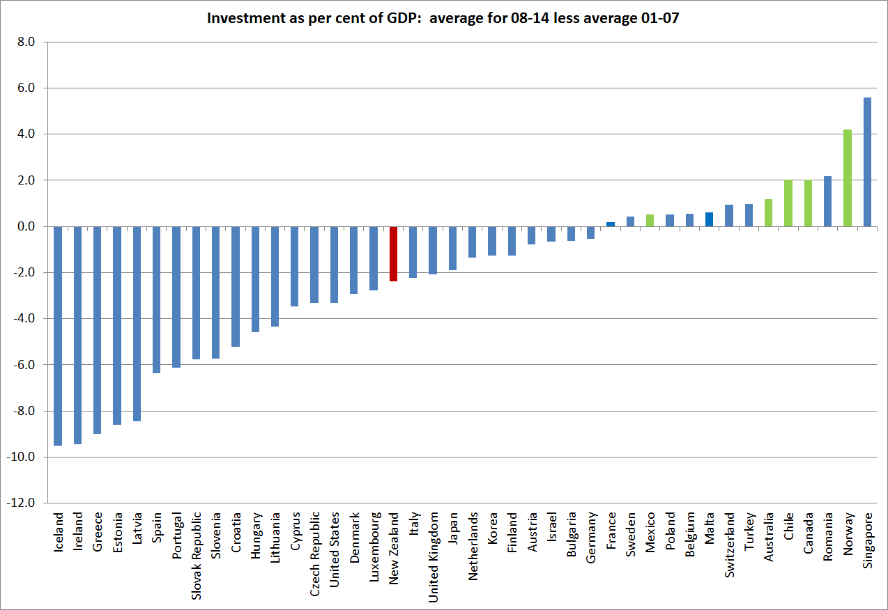
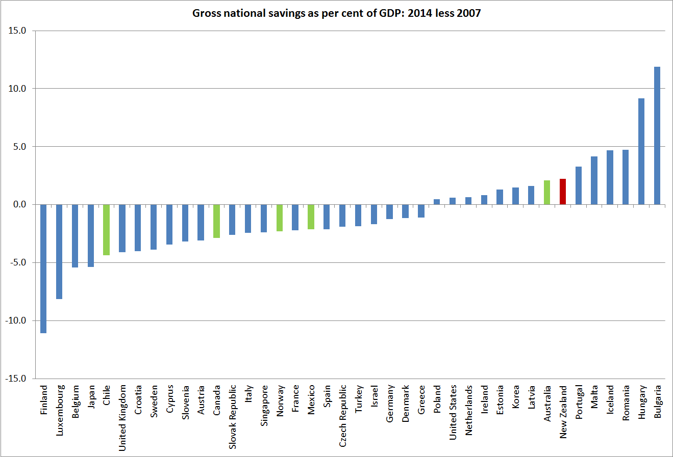
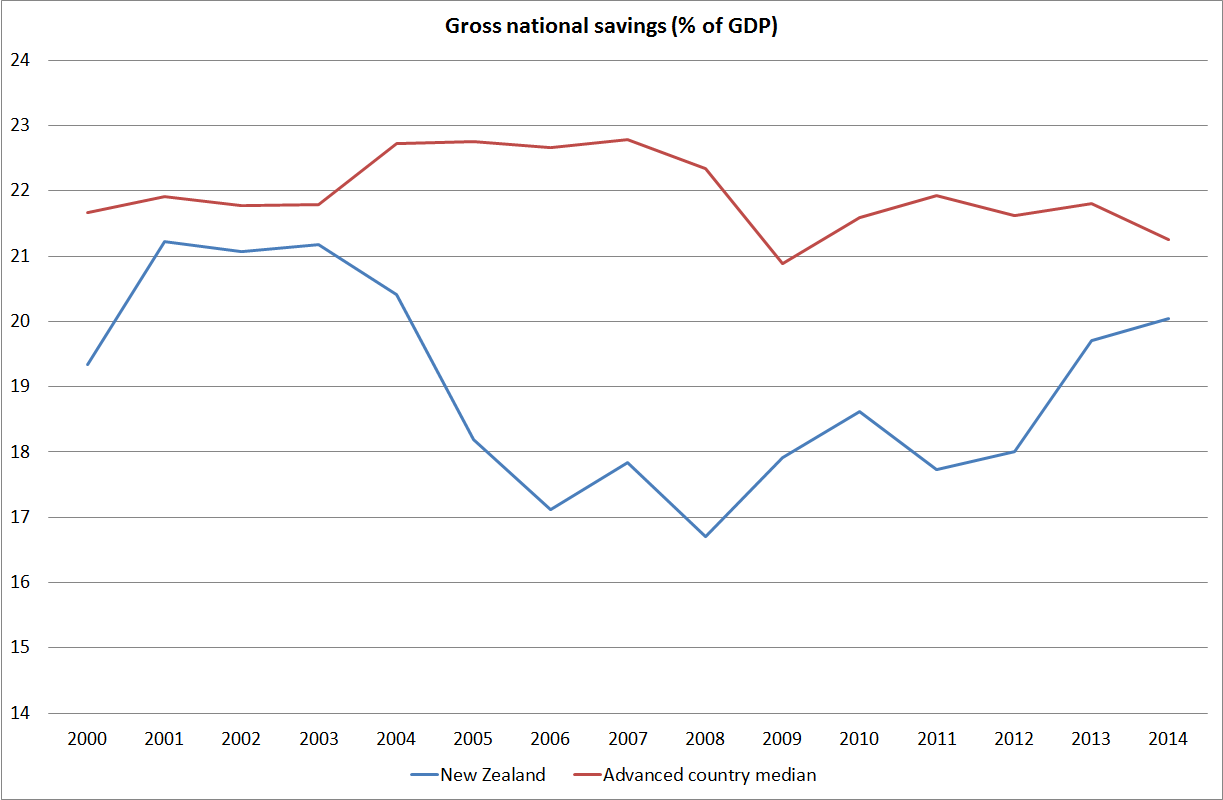
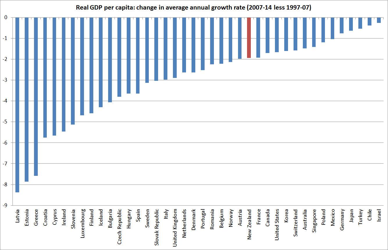
Back in the early days of this blog, I illustrated how for advanced countries as a group cumulative growth in real GDP per capita in the period since the peak of the last cycle (2007) to 2014 had been no better than that in a comparable seven year period from 1929, during the Great Depression.

Here is an updated version of the chart I ran then for all the OECD countries

real pc gdp growth 07 to 14

The median growth rate –  o.22 per cent in total over seven years –  is so small as to be almost invisible on the chart.

And here is the comparable chart, using the Maddison database of historical estimates, for the years 1929 to 1936

1929 to 1936b

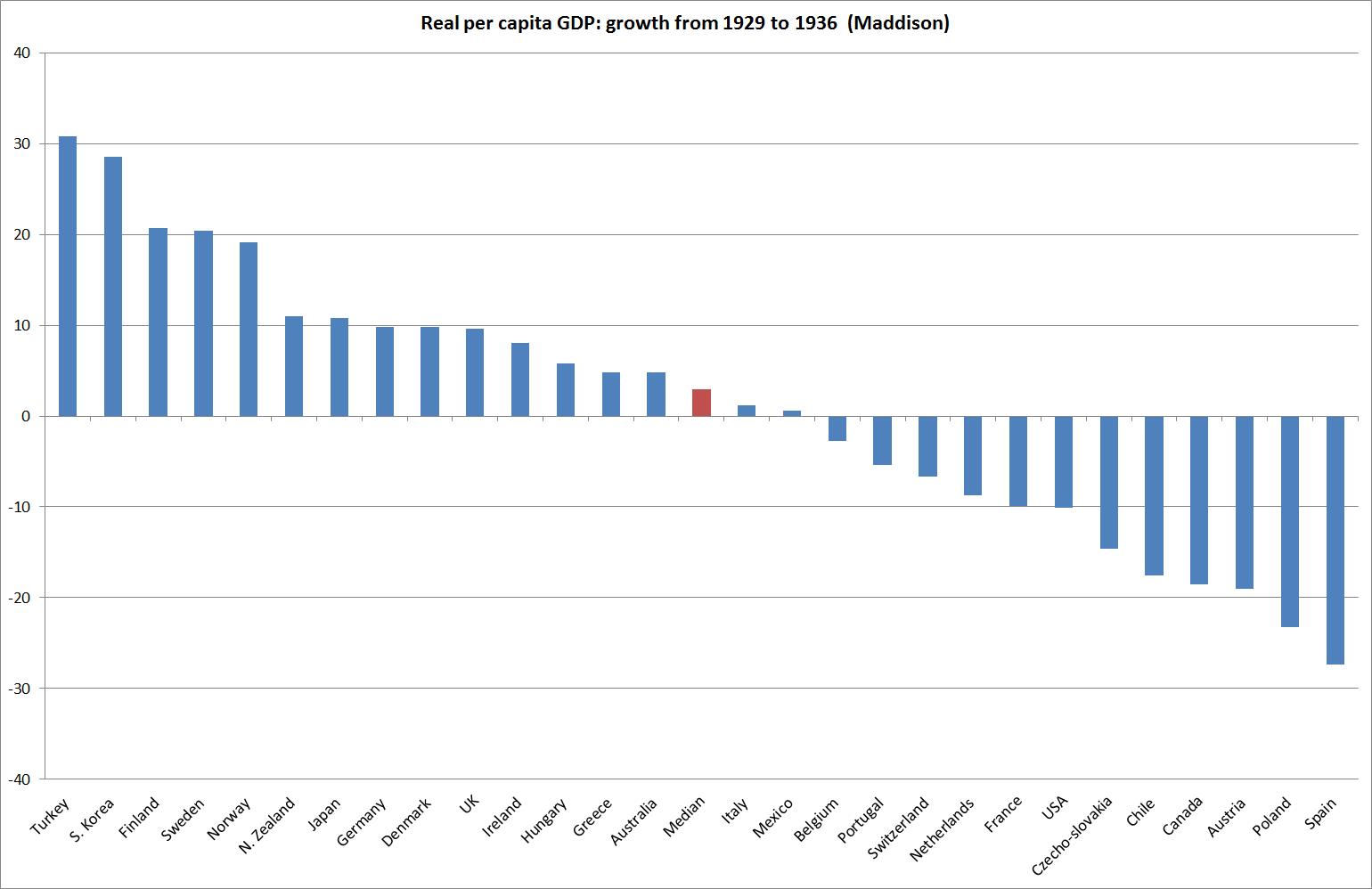
I wouldn’t want to make much of the differences in the median growth rates –  given the imprecision of many of the historical estimates, and the likelihood of revisions to the more recent ones.  I was more struck by the lack of any material real GDP growth per capita in either period.

The Great Depression is seared in historical memory –  and whole generations of politicians came afterwards telling themselves and voters “never again”.  It is too soon to know whether the most recent period achieves the same permanent imprint on historical memories.  Perhaps in part it will depend what comes next.    But I’ll be a bit surprised if this episode has quite the same impact.  The Great Depression hit popular consciousness particularly hard because unemployment rates in so many countries rose very high, and stayed high for a long time, and in an age when government income support for those unemployed was typically less generous than it is today.

There aren’t (at least that I’m aware of) any consistent cross-country estimates of the unemployment rates in the 1930s.  But in most countries, the increases in the unemployment rates were very substantial (in the US, the unemployment rate is estimated to have peaked well above 20 per cent, and remained high for years).

By contrast, here is what has happened to advanced country unemployment rates in the last decade or so.

oecd U since 04

Whether one takes the median OECD country or, say, the total for the G7 countries, there was an increase in the unemployment rate of around 2.5 percentage points, which has been substantially reversed over the subsequent years. Unemployment rates are typically around where they were in 2006.  There are still awful cases –  Spain and Greece still have unemployment rates in excess of 20 per cent –  but the defining character of the last few years has not been very stubbornly high unemployment rates.

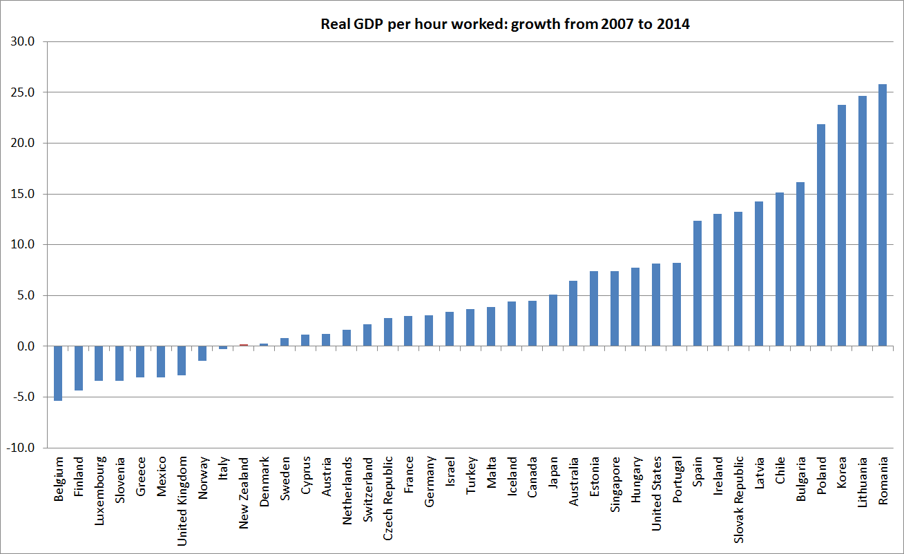
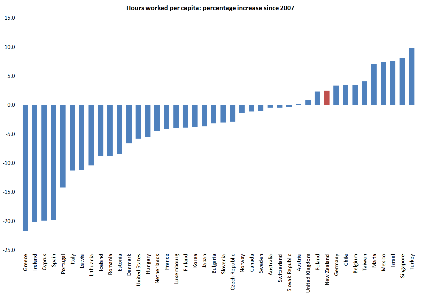
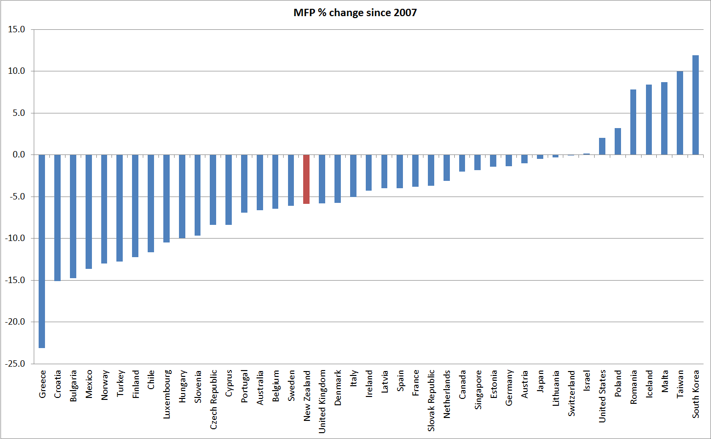
What really marks out the last decade  –  and contrasts it with the 1930s – is how poor the productivity growth has been. Without productivity growth, one can still end up with plenty of jobs, but they tend not to offer much in way of wage increases.

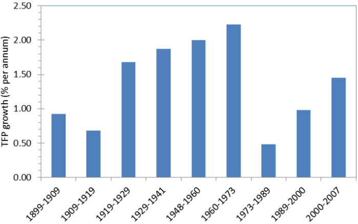
I’ve drawn attention previously to the work of US economic historian Alexander Field, who devoted a book to illustrating the very strong productivity gains (TFP) that the US had achieved in the 1930s.  A few weeks ago, I saw a nice summary of a new study by some other economic historians.   On the basis of their new work, they no longer see the 1930s as the period of fastest TFP growth in US history, but it was still very strong –  reflecting rapid technological and managerial innovations.  Here is the key chart.

Figure 1. TFP growth in the private domestic economy, US, 1899-2007 (% per year)

crafts us productivity

By contrast, here is a picture that uses John Fernald’s (FRBSF) business sector TFP estimates for the US over the last 25 years.

fernald.png

Business sector TFP growth is typically faster than for the entire economy, but for the last 10 years Fernald estimates average annual growth of  just over 1 per cent, dramatically slower than the 7 per cent average growth over the previous 10 years.

The slowdown in productivity growth isn’t unique to the US –  indeed on some measures, the US has done better than most –  and was becoming apparent in the data (again, not just this dataset), if not in the public consciousness, before the great recession of 2008/09 and its aftermath.

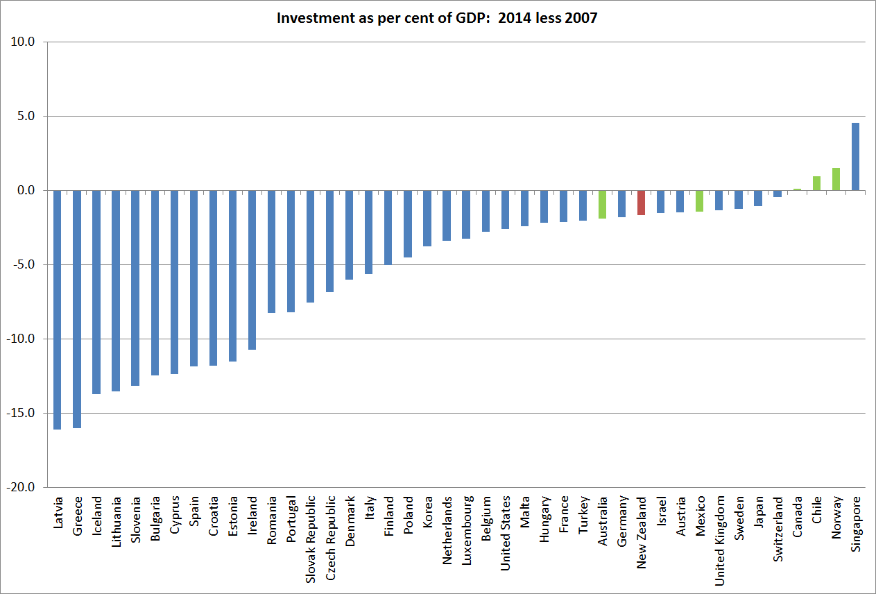
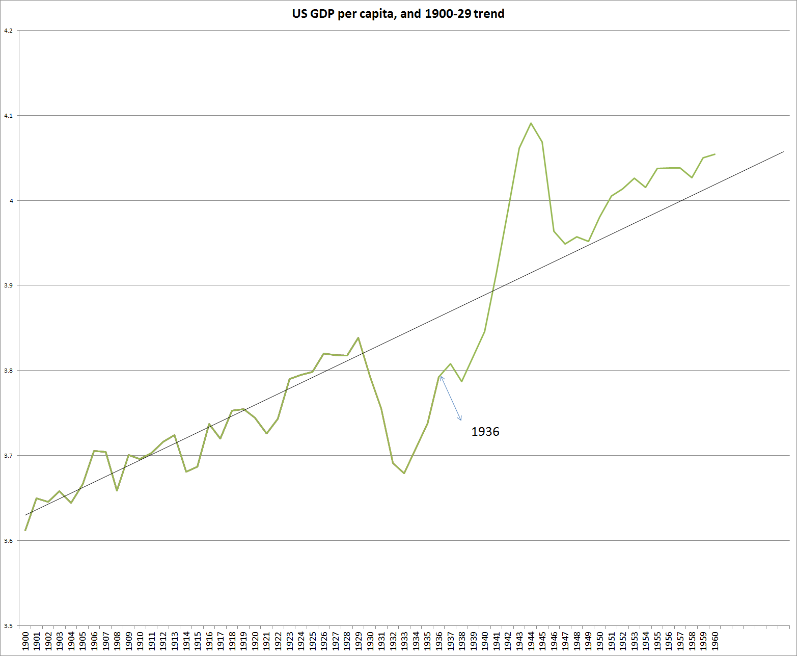
The contrast with the 1930s is striking.  That was, overwhelmingly, a failure of demand and of the global monetary system, and as those constraints were removed, the underlying lift in productivity supported a recovery in investment.  For the US, for example, post-war per capita GDP is on the same growth path as it had been pre-1929: output wasn’t permanently lower.
1936

What about the current situation?  Taken together, falling rates of population growth and falling rates of TFP growth materially reduce the volume of investment that is likely to be required, and profitable, at any given interest rate.  Add in apparently high desired savings rates around the world, and it is hardly surprising that real interest rates have fallen away so much.  Add declines in inflation expectations to the mix, and it has reinforced the decline in nominal interest rates.  The problems are mostly structural in nature, but they have been amplified by the reluctance of central banks to do what is required to keep inflation (or other nominal measures) up around target, in turn driven by a constant focus on a desire for “normalization” and a focus on some sense of where real interest rates “must” (in some sense) be in the very long term.  The reality, and perceptions, of the near-zero lower bound haven’t helped in many countries.

I’m pretty confident that in the longer-term real interest rates around the advanced world will be positive –  land is still fertile, as is the human imagination (so there will be a flow of new innovations and opportunities.  But there is no guarantee of such positive real interest rates in any particular decade (any more, in a New Zealand context, than there is a guarantee that our real interest rates will converge with those of “the world” in any particular decade).  It seems likely that some mix of lower global savings rate, higher birth rates, and structural reforms that create a better climate for productivity growth and investment are likely to be required to put the world economy on a better path –  one that, inter alia, might put us back on a path that supported more “normal” levels of nominal and real interest rates.  But those interest rates will be an outcome of a successful overall policy mix, not an intermediate target in their own right.  Monetary policy –  here and abroad –  in recent years has come too close to treating them as an intermediate target, rather than focusing on, and responding to, the data flow.


SNZ’s productivity growth estimates

Statistics New Zealand released a swathe of annual productivity data yesterday.

These annual productivity data focus on the so-called “measured sector”, whereas most often (for data availability reasons) productivity comparisons are done for the whole economy.  The measured sector currently covers 77.3 per cent of the economy.  It excludes ownership of owner-occupied dwellings, public administration and safety, education and training , and health care and social assistance –  all sub-sectors where market price information is difficult or non-existent.  The measured sector data are good quality but (a) are only available with a considerable lag (data released yesterday are up to the year ended March 2014), and (b) are mostly only useful for looking at New Zealand’s own performance over time (and only limited amounts of time, since the data on this measure go back only to the mid 1990s).  Other databases, typically using whole economy measures, are more useful for timely cross-country comparisons.

The chart below shows measured sector labour productivity and total factor productivity growth since the  year-ended March 1998.  These measures don’t just use a volume measure of labour inputs (eg hours worked) but adjust for the changing composition (improving quality of the workforce).  Simple measures based on hours worked in effect understate the role of inputs and, thus, overstate productivity growth.
measured sector
On this measure, labour productivity growth does not look too too bad.  In particular, although growth since 2007/08 has been slower than it was previously, the slowdown is less marked than many other series show for other countries.  But bear in mind that over the 16 years shown, total growth in labour productivity was only 20.3 per cent –  just under 1.2 per cent per annum.

By contrast, the TFP picture is sobering.  In the 11 years since 2003, total TFP growth has been around 1.5 per cent (little more than 0.1 per cent per annum).  As I’ve suggested previously, perhaps there is something in the notion that the higher terms of trade (since 2004) have undermined TFP growth, changing production patterns to take advantage of the higher output prices but in ways that reduced measured productivity.  Perhaps, but I doubt if the effect can have been quite that large.  And the sectoral TFP data back up those doubts.  Here is the chart for agricultural sector TFP (only available to March 2013).  It is a noisy series (droughts do that), but it looks as though there has been some TFP growth in the sector since 2003, unlike the picture in the aggregate TFP series.

agriculture

Finally, a quick comparison with the Conference Board estimates for New Zealand, which I used in my series on cross-country comparisons since 2007.    Here is the chart.

conference

The Conference Board uses a model to estimate TFP which ascribes more of New Zealand’s growth to the growth in capital services (than SNZ do).  (Like SNZ they make a correction for changing labour quality).   There is no point directly comparing the number from the SNZ measured sector TFP series with the Conference Board TFP series – different models produce different results.  But what is perhaps useful is to note that in both models New Zealand’s TFP growth has tailed-off markedly since 2003.  That should be pretty disconcerting.

And here is the international context for TFP growth, with a focus on the post-2007 period.

“Larry Summers on TPP makes perfect sense”?

Tyler Cowen wrote last night “Larry Summers on TPP makes perfect sense.  I haven’t seen anything on the anti- side coming close to this level of analysis, and in a short column at that.”

I’ve been a bit ambivalent about TPP, so thought that I’d better read the Summers piece.  My problem was that I came away more skeptical than I went in.

My own priors are pretty clear.  Free trade is good –  as a matter of liberty and as a means to greater prosperity.  I’m sure one can find exceptions, but the rule is a pretty good one to live, and make policy, by.

But then Summers tells us that:

First, the era of agreements that achieve freer trade in the classic sense is essentially over. The world’s remaining tariff and quota barriers are small and, where present, less reflections of the triumph of protectionist interests and more a result of deep cultural values such as the Japanese attachment to rice farming. What we call trade agreements are in fact agreements on the protection of investments and the achievement of regulatory harmonization and establishment of standards in areas such as intellectual property. There may well be substantial gains to be had from such agreements, but this needs to be considered on the merits area by area. A reflexive presumption in favor of free trade should not be used to justify further agreements. Concerns that trade agreements may be a means to circumvent traditional procedures for taking up issues ranging from immigration to financial regulation must be taken seriously.

But if free trade is good, the same case can’t be made for “regulatory harmonisation”.  We just don’t know enough about what regulation is sensible, and worthwhile, and we live in democracies where the case for regulation in specific areas should be fought out through domestic political processes.    A diversity of regulatory approaches is often the way we learn.     And protections for intellectual property are typically far too high anyway –  in other words, agreements on such matters risk being (or are by design) generally anti-competitive, anti-market, measures.

In fact, the strongest argument for TPP I could find in the article was one grounded in domestic US politics ( recalling that Summers had been a senior official in both the current and previous Democratic administrations).

The repudiation of the TPP would neuter the U.S. presidency for the next 19 months. It would reinforce global concerns that the vicissitudes of domestic politics are increasingly rendering the United States a less reliable ally.

Really?    We all know that second-term US Presidents, especially those whose Vice-President is not heir presumptive, quite quickly become lame ducks.  Is this presidency really any different?  And where is the pressing demand for TPP?  No doubt there are elites in each of the negotiating countries with a great deal at stake, but where is the popular demand for this agreement?  As Summers puts it, it doesn’t seem to be a free trade agreement anyway.  Which population centre will think worse of the US if negotiations stall?    No doubt some US business groups will be aggrieved, but that is domestic politics, not international relations.  Failure of TPP would be embarrassing for Barack Obama, but that seems less like a national interest issue than a partisan one?

I’ve long been a bit puzzled by what was supposed to be in any deal that would make it economically worthwhile for New Zealand (as distinct from being “inside the club”).  I recall the IMF doing some modelling a decade or more ago on the US-Australia FTA, which had concluded that that agreement had been modestly welfare-diminishing for Australia –  as if a desire for a deal, any deal, and perhaps the momentum that any  process takes on over time had overridden a hard-headed assessment of the economic interests of Australia.   If there were genuine large-scale liberalisation of the global dairy trade, then we might reasonably think New Zealand would be better off from a deal.  But has that ever seemed very likely?  And if only small (or no) trade gains are on offer, how should we weigh that against the losses from strengthened intellectual  property protections?

And how should be think about the incentives on our key political participants?  Having pursued an agreement for so long, what sort of threshold would have to be crossed before they would be willing to walk away from negotiations?  It is not clear that the personal and national interests are necessarily tightly aligned.  Perhaps the US Congress will  vote in ways that mean they never have to make that decision.

To repeat, I’m a free trader.  I think New Zealand should have removed its remaining tariffs, and wound back its anti-dumping regime, long ago.  I’m in favour of a materially more liberal approach to foreign investment.  And I generally favour less regulation rather than more.  But all these are causes that should be fought out openly, and in the domestic political process.    So, I hope there is a better case for TPP than that put forward by Larry Summers, who actually seems somewhat ambivalent if it weren’t for the impact on Obama’s political position, but so far I haven’t found it.

And that before I saw Keith Woodford’s recent column on interest.co.nz.  Woodford knows a great deal about the global dairy industry, and he makes what seem like pretty persuasive arguments that there might not be much in it for New Zealand even if the US and Canada were to move towards an unsubsidised and less heavily regulated dairy industry.

Savings and investment since 2007

Last week, I started showing a few charts about how New Zealand had done against various other advanced economies since 2007, the last year before the recession that engulfed most of the world in 2008/09.

Today I’m going to show the charts for investment and national savings, using the data from the IMF’s WEO database.

First investment.

investment2014

Of this group of advanced countries, only four had a share of investment in GDP higher in 2014 than it was in 2007.  That probably doesn’t come as a great surprise.  2007 was a cyclical peak, and by last year hardly any of these countries would have been considered to have been operating at capacity.  Across the advanced world as a whole, population growth rates are falling, and lower rates of population growth mean less of GDP needs to be devoted to investment for any given level of technology.

But my main interest was the cross-country dimension.  Perhaps unsurprisingly, the commodity exporting advanced economies have all been among the countries with the most strength in investment.  But Germany comes between Australia and New Zealand, and I was surprised to find the United Kingdom, Japan, and Sweden doing better than either New Zealand or Australia.  At the other end of the chart, the 18 weakest economies all either use the euro, or have a currency pegged to the euro.

The New Zealand story itself is a little less favourable than it might first appear. Recall that I noted last week that there had been no sign of a surge in New Zealand business investment in response to the high terms of trade.  And, on the other hand, a significant amount of the strength in New Zealand’s investment in the last few years has been the repair and rebuilid activity in Canterbury.  It counts as gross investment but, since it is mostly replacing capacity that was destroyed or severely damaged, it isn’t adding much to the capital stock.

If we do the same chart comparing the average for 2008-14 with the average for 2001-07, New Zealand drops back to the middle of the field, and well behind the other commodity exporters.

investmentwholeperiod

And what about national savings?  On this chart, any patterns are much less obvious.   Savings rates have fallen in more countries than they have risen, but 16 countries have had increases in their national savings rates.  Euro area countries, for example, are not bunched at one end or the other, and New Zealand and Australia show up as among the countries with the larger increases in national savings rates.

savings

Before anyone starts getting excited about, for example, the impact of Kiwisaver, I should point out that when I compared savings rates for 2008-14 as a whole with those for 2001-07,  New Zealand dropped right back to around the middle of the chart.  Unlike the median advanced country in this sample, New Zealand’s national savings rate fell away sharply in the middle of the last decade, as public (and business) savings rates dropped away sharply.   Our national savings rate is only now back to around the level seen in the early 2000s.

savings2

(And one final note, these are ratios of national savings to domestic product.  In other words, the savings of New Zealanders as share of all that is produced in New Zealand, whether by New Zealanders or foreigners.  In other words, the two series aren’t strictly comparable.  For most countries the difference doesn’t matter, but here national income is materially less than domestic product (the difference is mostly the net earnings of foreigners on New Zealand’s negative net international investment position).  Taking national savings as a share of national income, New Zealand’s national savings rate would be around the median of this group of advanced countries.)

New Zealand manufacturing since 2007

The quarterly manufacturing survey came out this morning.  Noticing that growth in the sector seemed to be levelling off I was curious as to how things looked relative to levels just prior to the recession.

As is well known, the manufacturing share of GDP has been falling for decades in most advanced countries.  China, for example, has picked up a big chunk of global manufacturing, and services have become progressively more important everywhere.

But this chart shows the volume of manufacturing activity (not as a share of GDP, not per capita, just the level) for a few countries/areas since 2007q4.  For the other countries, it is OECD data, while for New Zealand I’ve used the volume of manufacturing sales ex meat and dairy (the rather less noisy series SNZ also publishes).

manuf

I haven’t been paying much attention to these data in the last year or two, but I was interested how far below 2007 activity levels New Zealand manufacturing still is.  As previous Reserve Bank work pointed out, once one strips out meat and dairy, a lot of the activity in New Zealand manufacturing is a derived demand off the back of construction-sector activity.  And the construction sector here has been pretty robust, particularly on the back of the huge volume of work in Christchurch.

But I was also somewhat sobered by how similar the path of manufacturing activity has been in New Zealand and in the euro-area as a whole.  Note that these are not per capita measures, and euro-area population is pretty flat while ours has risen 6 per cent of so since 2007.

The US performance looks relatively good, but in fact is still slightly less good than (flat to falling population) Germany.

I’m not one of those who thinks that the relative decline of manufacturing is a tragedy, but on the other hand I also don’t think that it is a matter of total indifference.  Most likely, the relatively weak manufacturing sector performance in recent years, despite the buoyant construction sector, is a reflection of the persistently high real exchange rate.  Like Graeme Wheeler, I think the real exchange rate is out of line with medium to longer–term economic fundamentals.  A more strongly performing New Zealand economy, one making some progress in closing the gaps to the rest of the OECD, would be likely to see a stronger manufacturing sector.  It might still be shrinking as a share of a fast-growing economy, but a manufacturing sector that has seen no growth at all in almost 20 years doesn’t feel like a feature of a particularly successful economy.

Using the same data series as above, I had a look at what has happened since 1995q1.  Six OECD countries have had weaker manufacturing sector activity than New Zealand.  At least three are current cyclical basket cases (Spain, Italy and Greece), and the gap between the growth rates in manufacturing volumes and in population has been weaker only in Italy, Spain, and France.

Numbers like this certainly don’t suggest immediate policy remedies, but they probably should continue to prompt thinking about just what explains New Zealand’s disappointing economic performance.

Growth 1995 to 2015
Manufacturing Population
Italy -17.6 7.8
Spain -10.7 20.2
France -5.3 11.3
Greece 0 3.3
Japan 0.2 1
UK 1.6 9.9
New Zealand 4.3 22.7

The terms of trade and NZ’s recent economic performance

As people often point out when I run charts like those in yesterday’s post, real or volume measures of value-added are all very well, but they don’t capture the direct effects of fluctuations in the terms of trade.  We can spend what we earn, and what we earn is a combination of volume and price.

For some purposes, ignoring the terms of trade effects can be more useful.  After all, a country like New Zealand is exposed to quite volatile terms of trade, and those terms of trade are almost wholly outside our control, year to year.  Some firms probably have price-setting power in world markets, and there is some evidence that New Zealand droughts have a short-term impact on world dairy prices, but our overall terms of trade are largely beyond our control.  By contrast, productivity measures (labour or multi-factor) are about what New Zealand (firms) do with the hands we are dealt, and the opportunities we make for ourselves.  It is exceptionally rare (probably unknown) for countries to get sustainably rich just  –  or even primarily –  on changes in the terms of trade.

But New Zealand’s terms of trade have done quite well over the last decade or so, reflecting a combination of falling real import prices and good prices, on average, for dairy products in particular.  Here is one chart showing changes in the terms of trade for the 43 advanced countries I discussed yesterday.  There are two different cuts here: the percentage change from 2007 to 2014 and the percentage change from the average level for 2005-2007 to the average level for 2012-2014.  On both New Zealand shows up as having done well.  Indeed, on the measure from 2007 to 2014, we’ve had the largest increase in the terms of trade of any of these countries (no doubt it will fall back somewhat in 2015).

tot crosscountry

How much difference does the terms of trade make? Well, we export and import amounts equal to around 30 per cent of GDP, so a 15 per cent boost to the terms of trade is roughly equivalent to an increase of another 5 percentage points, on top of any growth in the volume of output.  That is certainly a useful boost, but if you look at the first chart in yesterday’s post, it is hardly enough to dramatically transform our ranking.     Looking at the terms of trade does not materially alter the story of how disappointing our overall economy performance has been since 2007.

Statistics New Zealand produces a series of per capita Real Gross Disposable Income.  This series tries to estimate New Zealanders’ real purchasing power.  It takes account of both the direct effects of the terms of trade, and of changes in how much of what is produced here has to be paid to foreign providers of (mostly) capital.  Over the period since the recession New Zealand has enjoyed a strong terms of trade, and low interest rates –  as a country with a high level of external debt, we had an unexpected lift in purchasing power as the servicing costs of that debt fell sharply and stayed low.

Here is a chart of that RGDI series.  At present, RGDI per capita is still around 15 per cent below where it would have been if the 1991-2007 trend had continued.

rgdi

So far I’ve focused on the direct effects of the terms of trade.  But it is a little surprising that the strong terms of trade, boosting incomes and relative prices, has not provided more of a boost to real activity in the economy.  A rising terms of trade (and especially an unexpected lift) would typically be expected to stimulate business investment:  higher prices for the goods and services New Zealand firms sell will encourage more investment in those industries. As Daan Steenkamp has illustrated, the terms of trade boom in Australia helped prompt an enormous surge in business investment, which had no counterpart in New Zealand.  Of course, our exchange rate has been very strong, which might have offset much of any additional incentive to invest in the tradables sector in aggregate.  But the higher incomes (higher real purchasing power) might still have been expected to generate a significant boost to investment in the non-tradables sector.  We haven’t seen much sign of it.

As I’ve noted before, if the lift in the term of trade proves quite short-lived it might prove to be a boon that there was not an investment boom, putting in place long-lived projects on the back of a temporary lift in relative prices in our favour.  But most observers do not seem to expect New Zealand’s terms of trade gains of the last decade to fully unwind.

So I’m still puzzled as to why New Zealand has not done better given the very favourable terms of trade.  At the margin, overly tight monetary policy in the last few years has not helped.  And one other factor is the role of the Canterbury earthquakes and the associated repair and rebuilding process.  As the Reserve Bank recognised right from the start, this represented a major non-tradables shock, and all the more so because most of the cost was being covered by offshore reinsurers.  Real resources had to be devoted to the work in Canterbury, and for the most part we New Zealanders did not have to save more to pay for the work (we’d already paid the insurance premia).  Real resources –  especially labour –  can’t be used for two things at once.  Without the earthquakes and the subsequent repair process, those resources would have been freed up for other uses.  Lower interest rates would have been likely to have resulted in a lower exchange rate, improving the attractiveness of investment in New Zealand’s tradables sectors.

Is it enough to explain why New Zealand has not done better?  I don’t really think so, but the impact of the earthquake is certainly one constraint on New Zealand that Australia has not faced, and may be one reason why we have done less well than Australia on most measures since 2007.

How has New Zealand done, compared with other advanced countries, since 2007?

Before I left the Reserve Bank a couple of months ago I had been working on a paper looking at how New Zealand’s economy had performed relative to those of other advanced economies over the period since 2007.  The advanced world as a whole has done pretty badly over that period, but our interest was just in New Zealand’s relative performance.   The Bank’s work has not been published, so I’m going to run some of the ideas and material here (drawing, of course, only on publically available material).

One obvious question is who are the relevant comparator countries.  The member countries of the EU, of the OECD, and Singapore and Taiwan make a reasonable group.  Data are readily available for almost all variables of interest for almost all these countries back to at least the mid-1990s.  And around half of these 43 countries have higher GDP per capita than New Zealand, and half a lower.  There is another group of countries at least as rich as New Zealand, but whose economic fortunes are almost totally shaped by oil.  For these purposes I have set them to one side.  But my comparator grouping does include several countries whose largest exports are commodity-based: New Zealand, Australia, Norway, Chile, Mexico, and Canada.  No comparator group is ever ideal, and no two economies ever face the same set of conditions, but this group seemed large enough to be interesting and small enough to be tractable.

Another question is what period to look at.  I’m focusing on the period since 2007 because 2007 was for most countries around the peak of the previous business cycle –  and just before the financial crisis and global recession took hold in 2008/09.    One could make a case for starting a few years earlier, but when I looked into starting in, say, 2005, it did not make much difference to the cross-country comparisons.  For some things, I’m going to compare how economies have done over 2007-14 with how they did in the previous decade (1997 to 2007).  Again, that choice is to somewhat ad hoc, but it does reflect (a) the limitations of data (for many of the eastern European countries data starts getting patchy any earlier), and (b) that for New Zealand at least 1997 was also a business cycle peak.

To anticipate one objection, many countries’ economies were stretched to the limit in 2007, running positive “output gaps”.  So we should have expected weaker growth since then than in the previous decade.  But (a) the slowdown in growth rates far exceeds anything that can be explained by initial output gaps, and (b) New Zealand’s output gap was not large (by international standards) in 2007.

As time permits, I will run a series of charts and offer some thoughts on New Zealand’s performance, again in an international context.  As I’ve noted previously, New Zealand hasn’t done particularly well in recent years.   A disappointing performance isn’t new, but New Zealand looked as though it had a number of things going for it in recent years.

So let’s have a look at how New Zealand has done?

The first chart is growth in real GDP per capita from 2007 to 2014 (total growth, not annual average growth). These data are drawn from the IMF WEO database, and are calculated in national currencies.

gdppc

On this measure, New Zealand has done just a little better than the median country, and very similar to a bunch of countries from Japan to Canada.   Of the commodity-exporting countries, however, only Norway did less well than New Zealand over this period.

The second chart shows the change in annual average growth rates: how average growth over 2007 to 2014 compared to that for 1997-2007.  Every single one of the countries for which the IMF has data back that far had slower growth in the more recent period than in the earlier period.    New Zealand did just a little less badly than the median country, but again among the commodity-exporters we did better only than Norway.

gdppcchg

Real GDP per capita is a useful measure for many purposes, and it is the most readily available such statistic.  But it does get thrown around by recessions and booms.  A country in a deep recession (such as Greece) might experience a big fall in its real GDP per capita, but the average productivity of its employed workers might be much less adversely affected.  There are “distortions” even here.  In recessions, relatively less productive workers are more likely to be out of work.  But real GDP per hour worked measures are much less cyclically variable than real GDP per capita measures.

Hours worked per capita data are available for all the countries I’m interested in (except, for some reason, Croatia).  I used them to generate real GDP per hour worked measures, again in national currency terms.

gpdphw

Here, unfortunately, the picture is much less favourable for New Zealand.  Only nine of the countries did worse than New Zealand, and again among the commodity exporters only Norway was worse.

The reconciliation lies in what happened with hours worked per capita.

hours

Only a small number of countries had more of an increase in hours worked per capita than New Zealand since 2007.

Hours worked are an input (which comes at a cost) not an output, so higher hours worked aren’t automatically a good thing.  There are good dimensions to it, if (for example) people are coming off long-term welfare back into the workforce, or older people are keen and able to stay in the workforce.  Hours worked per capita also gets affected by different demographic patterns –  they will be lower in countries with lots of under-15s or over 70s.  But, equally, part of the story of New Zealand in the last 25 years is that we have managed to limit the deterioration in our GDP per capita, relative to that in other countries, by working more.  Productivity would be better.

Over the full period since 1990, here is the change in hours worked per capita for New Zealand and the other Anglo countries, countries with reasonably similar demographics to our own.

hoursanglo

And, then of course, there is multi-factor (or total factor) productivity.  On this measure, which I’ve shown before, most countries have had no MFP growth at all since 2007:

mfp

TFP growth in commodity-exporting countries

On Friday, I took the Conference Board’s productivity data and looked at how New Zealand had done  on TFP growth relative to other advanced countries since 2007.  “Not that well” was the short answer.

The disappointing performance does need to be kept in some perspective.  New Zealand’s productivity growth has been disappointing for a long time. The Conference Board publishes TFP data only back to 1989.  However, a couple of years ago, some IMF researchers were given access to some unpublished Conference Board TFP data back to 1970.   Of the countries they looked at New Zealand had had the slowest TFP growth over the full period 1970 to 2007, and had grown more slowly than the median country in each of the four sub-periods they looked at.

tfp imf

Against that background, our slower than median TFP growth since 2007 perhaps looks slightly less discouraging  (not much less, given the decades of underperformance we might one day hope to start reversing).

As I noted on Friday, we had done a little better since 2007 than some of the other commodity-exporting advanced countries.  Commodity-exporting advanced countries have all had negative TFP growth over the last decade or so.  This chart shows TFP indexed to 100 in 1989 for each of the six commodity-exporting advanced (ie OECD member) countries.  Over 25 years, not one of them has recorded any material TFP growth (on this particular measure of TFP).  As ever, Mexico is the basket case.

tfp commodity

Weak TFP growth is not always and everywhere bad.  High commodity prices encourage producers of commodities to adopt different profit-maximising production techniques.  For example, poorer ore grades become economic to mine, but to do so takes more inputs.  That shows up as a fall in TFP, but presumably an increase in industry profitability.  In addition, massive investment programmes (as in Australia) to take advantage of high commodity prices do not boost output in the short-term (a project can take years to put in place), but involve the application of more resources to the industry.  That will also show up as lower TFP.    What about New Zealand?  We have not seen a business investment boom in response to the stronger terms of trade, but the dairy industry has altered its production processes, with more supplementary being used to produce more milk per cow.  Those choices were profitable, and sensible from the farmer’s perspective, but at the margin they involve using more inputs for each additional unit of output.  That shows up as a fall in TFP.

Quite how much these factors explain is debated , and requires a much more in-depth analysis of the national data to answer with any confidence.  But in New Zealand’s case, TFP is agriculture had flattened off well before the rise in the terms of trade, which didn’t really begin until around 2004.

tfp agric

If it is almost everything, we really haven’t done well

The old line is that if productivity isn’t everything (about economic performance) it is almost everything in the long run.  And multi-factor productivity (or total factor productivity) is typically seen as the best type of productivity (ie not just throwing more inputs into production, but getting more from them).  At least, that is, when it is not just measurement error (and there is inevitably some of that).

In the last few days the Conference Board released the annual update of its productivity estimates.  The Conference Board data are really useful because they use a common methodology across a very wide range of countries.   There might be better estimates for many individual countries in national data, but there are valuable insights in cross-country comparisons.  Many of you may have seen the Financial Times feature on productivity a few days ago (it is reprinted in today’s Herald)

I’ve only had a quick look at the latest data.  For cross-country comparisons, when I can I like to cast the net widely and capture as many advanced countries as possible. In this case, I’ve taken all EU countries, all OECD countries, and added Singapore and Taiwan.  That gives a good range of advanced countries both richer and poorer than New Zealand, and a reasonable number of commodity exporters too.

This chart just looks at MFP growth since 2007, in other words since just before the global recession.  MFP growth has been lousy over that period –  only a small number of these countries recorded any growth at all.  In fact, MFP had been slowing even before the recession, but here I was just interested in the cross-country perspective: who did relatively well, and who did relatively badly.

mfp

As you can see, New Zealand has not done not very well – we are in the lower half of the sample.  On the other hand, we did do better than most of the other commodity-exporting countries (beating Australia, Norway, Chile and Mexico).  The thing that struck me in looking at last year’s version of the chart was how relatively well the United States had done.  The US had been at the epicentre of the initial crisis, and had had multiple failures of financial institutions and disruptions to the intermediation process.  And yet, over these seven years, only six countries did better than the US.  A little surprisingly, half the countries in the euro did better than New Zealand on this measure (although not on actual GDP per capita)

I’ll be writing more on some of this data over the next few weeks. I’ve been intrigued for some time as to why New Zealand, which has had such a good terms of trade, and had no serious home-grown financial crisis has not done better over the last few years.