The International Monetary Fund (IMF) was out yesterday with two major reports on New Zealand. One was the Financial System Stability Assessment, the conclusion of the quite infrequent (the last one for New Zealand was in 2004) FSAP programme of reviews of the regulation of countries’ financial systems. I haven’t read that document yet, but from media accounts there are some recommendation I’d agree with (eg deposit insurance, as second-best) and a great deal (mostly derived from the “nanny knows best” starting point) that I’ll have more problems with.
But this post is about the Article IV report – the (typically) annual review and assessment of a member country’s macro economy.
Once upon a time, these reports were simply confidential advice to the government. These days, at least for countries like ours, it is all out in the open. And, partly in consequence, there often isn’t that much to see. The IMF might be a prestigious organisation full of rather highly-paid economists, but it is striking how weak their surveillance reports often are. Perhaps there just isn’t a gap in the market that can usefully be filled by a handful of Washington-based economists looking at our economy for a couple of months a year.
The challenge is compounded by the fact that no one much cares about New Zealand. We are small, in an age when the IMF is heavily-focused on systemic risk, global spillovers etc. We aren’t in Europe – still over-represented at the Fund – or from one of those Asian countries where governments are hyper-sensitive about anything the Fund says. It is decades since we had an IMF (borrowing) programme ourselves. And, whether this is cause or effect I’m not sure, but for decades no one here has paid much attention to the Fund. As an example, our capital city newspaper this morning has some coverage of the FSSA, but really nothing at all about the Article IV report. If a tree falls in the forest, and no one is around to hear it, does it make a sound? (By contrast, when I was at the Board of the IMF, my Australian boss was very exercised about each year’s Australian Article IV report. He’d get phone calls direct from the Treasurer about it, and the serious Australian media gave the reports a lot of coverage.)
Oh, and of course, the other challenge for those reviewing New Zealand is the features that stand out, and which haven’t readily and convincingly been explained. Thus, we have a lot of reasonably good micro policies, we have pretty good government finances, a floating exchange rate, low and stable inflation, sound banks, high levels of transparency, and low levels of corruption. And yet……having once been among the very highest income countries in the world, we now languish. International agencies find Venezuela’s decline easy to explain. New Zealand’s not so much.
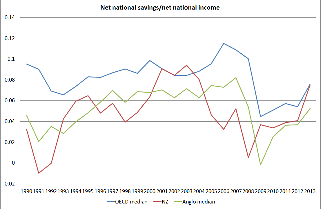
But with all the resources at their command, including the benefit of being an organisation with data and perspectives on all the countries in the world, none of it really excuses the mediocre quality of what gets dished up each year. Or the inconsistency from one year to the next. Last year, for example, we were told that raising national savings rates was “critical” – and it was reported that the NZ authorities agreed – but this year there is barely even any mention of the issue.
This year we are served up some mix of regurgitated PR spin about how well New Zealand is doing, and when it comes to policy suggestions we get a grab-bag of bits of conventional wisdom, or favoured centre-left policy positions, without any discernible sign that the authors (or their reviewers in Washington, or the Fund’s Board) had any sort of robust framework (or ‘model’) for thinking about the New Zealand economy.
It isn’t easy to excerpt a fairly lengthy report, and often it is the omissions that are more striking than what is in the report itself. Thus, the release opens with this
Since early 2011, New Zealand has enjoyed an economic expansion that has gained further broad-based momentum in 2016, with GDP growth accelerating to 4 percent, and the output gap roughly closing. Reconstruction spending after the 2011 Canterbury earthquake was an important catalyst, but the expansion has also been supported by accommodative monetary policy, a net migration wave, improving services exports, and strong terms of trade.
On its face, that all sounds quite good. But countries don’t get rich by rebuilding themselves after disasters – that reconstruction process mostly displaces resources from other, typically more productive and prosperous uses. They don’t get rich through monetary policy either, valuable a role as it has in short-term stabilisation. And although services exports grew quite strongly for a while (a) little or none of it was high value products (lots of tourism, and students pursuing immigration access at PTEs), and (b) in a world in which services exports are becoming steadily more important (as illustrated in eg this recent IMF working paper), for New Zealand services exports as a share of GDP are materially lower than they were 15 years ago.
In fact, you could read the entire Article IV report and not find any mention of the fact that, with total population growing at around 2 per cent annum and working age population growing at around 2.7 per cent annum, per capita income growth in the last few years has been pretty unimpressive. And you’d find no mention – explicit or by allusion – to the almost five years that have now passed since we saw any labour productivity growth in New Zealand. I guess that would have undermined the relentless good news story the Fund staff seemed determined to tell.
Perhaps more surprising is the treatment of the external sector of the economy, typically a subject of considerable interest to the IMF. Readers of the Article IV report in isolation would have no idea that exports (and imports) as a share of GDP have been falling – not just this year, but for some time on average. Nor would they appreciate that per capita real GDP of the tradables sector has shown no growth at all for more than 15 years. The report does note that an overvalued real exchange rate is probably an obstacle to faster growth in the tradables sector, but again there is no hint of any sort of integrated understanding of what is going on with the real exchange rate, and what might make some difference in future.
The complacency, and weak analysis, carries over to the labour market.
The unemployment rate fluctuated around the natural rate of unemployment of 5 percent in 2016
But there is not a shred of analysis presented to suggest that the NAIRU for New Zealand is now anywhere near as high as 5 per cent. It would be very surprising if it were that high, whether in view of continuing very weak wage inflation, the history of the last cycle (in which unemployment got to 5 per cent fairly early in the recovery), and changing demographics which are appearing to lower the NAIRU. Oh, and not forgetting that our Treasury has published its own estimate of the NAIRU, at something close to 4 per cent.
The Fund isn’t really much better on the housing market. They are all very interested in the various tweaky tools the government and its agencies have applied in the last couple of years (LVR limits, tax changes etc) and – contrary to many of the pro-immigration people in New Zealand – they are at least quite clear that rapid increases in population are contributing directly to high house price inflation. But there is no simple and straightforward observation that, at heart, the house price issue is a matter of regulatory failure, and that the current government (like its predecessors) has done little or nothing to fix the problems. Instead, we get banalities along these lines
Tighter macroprudential policies, higher interest rates, lower rates of net
migration, and increasing housing supply should help moderate house price inflation and stabilize household debt vulnerabilities in the medium term.
If you don’t change the fundamental structural distortions that gave rise to the problem in the first place, it is a little hard to take seriously the idea that things will come right even “in the medium term”. You would not know, reading this report, that almost nothing substantive has been done to free up the market in urban land. An organisation with the benefit of cross-country perspectives and databases might usefully have pointed out that this is an obstacle not just in New Zealand but in Australia, the UK, much of the east and west coasts of the US, and other places besides. The silence might suit the current government, but it also makes the Fund complicit in the failure. The Fund’s Board considered the material in the Article IV report on housing. They observed, in conclusion, that
Recognizing the steps being taken by the authorities to address the demand-supply imbalance in housing markets, Directors generally highlighted that further tax measures related to housing could be considered to reduce incentives for leveraged real estate investments by households. Such measures could help redirect savings to other, potentially more productive, investments and, thereby, support deeper capital markets.
Except that very little has actually been done on the supply side, and not much has been done to change the medium-term “demand-supply imbalances”. Perhaps there is a place for tax changes (I’m sceptical, including that any changes would make much difference – where else have they?) but the Board didn’t even seem to recognise that inconsistency in their own advice. Do we have too many houses in New Zealand or too few? Most people, rightly, would say “too few” (a good indicator of that is the ridiculously high prices). And yet the Fund Board thinks that a greater share of investment should go into other things, and a smaller share into housing????? (As it happens, I agree with that, but only on the basis that we have much slower population growth, something there is no hint of in this report).
Buried deep in the report, is a recognition of some of the longer-term challenges facing New Zealand.
New Zealand’s structural policy settings are close to or mark best practice among
OECD economies, but persistent per capita income and productivity gaps remain. Income is lower than predicted by these policy settings, by an estimated 20 percent. Growth in labor productivity has declined, with multifactor productivity growth slowing from the early 2000s, and capital intensity has stagnated recently.
One could question even those details. I wrote a bit about our structural policies a few weeks ago, as illustrated by the OECD’s Going for Growth publication. There are plenty of areas in which we are well away from best practice, and overall at best you could probably say that our structural policies aren’t bad by OECD standards. But there is no doubt that productivity levels are far lower than most would have expected based on those policies.
What does the IMF propose in response? They reckon remoteness is a problem and for some reason, despite that, still seem very keen on lots of immigration. But here is the rest of their list:
- Targeting housing supply bottlenecks more broadly would safeguard the
attractiveness for high-skilled immigration and business.- More central government property taxes, the proceeds of which would be distributed to local authorities.
- Trade liberalization could help to strengthen competition and productivity, including in the services sectors.
- Tax incentives for private R&D spending
- As discussed during the last Article IV mission, there is also scope for tax reform to raise incentives for private saving and discourage real estate investment as a saving vehicle
And that is it.
I’d certainly support fixing up the land supply market and foreign trade liberalisation. I’m a lot more sceptical of the other items. And what about, for example, our high compayn tax rates? But my real challenge to them is twofold:
- first, where is the model or framework that explains how the absence of these policies is at the heart of New Zealand’s disappointing long-term economic performance (because it feels more like a grab bag of ideas they picked from one person or another), and
- second, how large a difference do they really believe these measures, even if they were all implemented flawlessly, would make? Without much more supporting analysis, they have the feel of playing at the margins, as if they felt obliged to offer up some suggestions, any suggestions.
A year ago, the Fund seemed quite taken with the idea that the persistent gap between our interest rates and those abroad was an important issue (they even cited approving my own paper on this issue), but that flavour seems to have disappeared this year. And when they allude briefly to our high interest rates it is to fall back on the discredited risk premium hypothesis.
Of course, the government is just as much at sea. The NZ authorities get to include some responses in the Article IV report. In this section, they begin thus
The government’s ongoing Business Growth Agenda (BGA) aims to help overcome the disadvantages of distance and small market size, in particular by deepening international connections, with a focus on increasing the share of exports in GDP to 40 percent by 2025, and diversifying the export base.
Just a shame that, if anything, things have been going backwards on that count, and show no signs still of progress.
And, finally, from the final paragraph of the Executive Board’s assessment
Directors agreed that measures to lift potential growth should focus on leveraging the benefits from high net migration and interconnectedness.
But there is nothing in the report to show what these benefits might be (recall that the focus here is on potential growth, not the short-run demand effects), let alone what “leveraging the benefits” might involve (generally, I thought the IMF was uneasy about leverage). I guess it is just an article of faith.
It is pretty depressing all round. Supposed international experts fall for the spin, and can offer nothing very profound on even the longer-term challenges. Our own government agencies seem to be at sea, or just happy to go along. Our representative on the Board of the IMF – no longer a public servant, but now the (able) former chief (political) policy adviser to John Key – was happy to go along. In his statement to the Board, published as part of the package of papers, he observed
As staff observe, New Zealand’s structural policy settings are close to, or mark, best practice. Lifting productivity, in the face of New Zealand’s small size and isolation, therefore requires incremental reforms across a broad range of areas. Recognizing this, the Government has established the Business Growth Agenda as an ongoing program of work to build a more productive and competitive economy,
When various major OECD countries have productivity levels 60 per cent above ours, who are they trying to fool in pretending that we have policy broadly right, and just need to keep tinkering (“incremental reform”) at the margin?
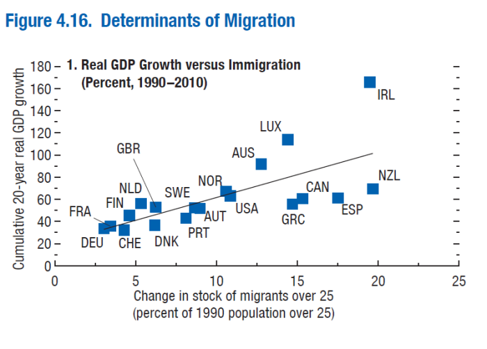
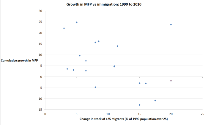
As part of the package of material released with the Article IV report, there is an interesting empirical annex on immigration. It isn’t well-integrated with the report itself, and I will cover it in a separate post. The annex probably should have had some publicity in the local media, given the salience of the issue in New Zealand debate at present.