Why isn’t the high unemployment rate bothering more people?

At 6 per cent, our unemployment rate is no longer low.  And yet it seems to excite little interest, whether from  the media, economic commentators, the Reserve Bank, or the government.

I’ve argued that the Reserve Bank’s unnecessarily tight monetary policy over recent years (as revealed by core inflation outcomes) has contributed to the high unemployment rate.  Within a standard model, this shouldn’t be a remotely controversial claim. If, as the Bank reckons, inflation expectations are in line with the target, then actual core inflation outcomes persistently below target will have reflected less utilisation of productive capacity (labour and perhaps capital) than would have been possible.  Put that way, it sounds bloodless and technocratic, but real people are affected here –  people unable to get a job at all, or to get as many hours as they would like.  Lower policy interest rates would have stimulated some more domestic demand, and would have lowered the exchange rate, stimulating some more external demand.  And core inflation would have come out nearer the target.

I’m not going to repeat the debate as to whether, with the information they had at the time, the Reserve Bank could reasonably have run a different stance.  I think so, and said so in writing within the Bank at the time.  But the point here simply is that, at least with hindsight, monetary policy was persistently too tight, and there has been an output and unemployment cost to that –  in a recovery that was, in any case, probably the most anaemic New Zealand has had for a very long time.  And the cost goes on –  even now, the unemployment rate is rising, not falling.

But how do we compare?  I downloaded the OECD data on unemployment rates for the 19 OECD monetary zones (ie 18 countries with their own monetary policy, plus the euro area).

Despite having some of the more flexible labour market institutions among advanced countries, New Zealand’s unemployment rate, at 6 per cent, is currently a bit above the 5.5 per cent median for this group of countries.

And over the last year, only four of these countries have had an increase in their unemployment rate at all.  New Zealand’s increase  has been second only to that in Norway.  The last year has been tough for Norway, with the collapse in oil prices.  The central bank has cut interest rates, by 75 basis points. But they are somewhat constrained.  The inflation target in Norway is 2.5 per cent, and core inflation is at least that high.  The central bank lists four core inflation measures on its website: one is at 2.4 per cent, one at 2.5 per cent, and the others at 2.8 per cent and 3.1 per cent.  Each of those measures is higher than they were a year ago.  Without looking into Norway in more depth, the rise in the unemployment rate (which is still only 4.5 per cent) doesn’t look like something that monetary policy can usefully do much about.  New Zealand is different.

U change since sept 14

New Zealand also shows up at less attractive ends of the charts if we look at how the unemployment rate has changed since either the peak reached in the recessions from 2008 on, or from the trough in the boom years.  On the latter measure, the only area that has seen more of an increase in the unemployment rate is the euro area as a whole (which has pretty much exhausted the limits of conventional monetary policy).  And it is not as if our boom was extraordinarily large –  using OECD estimates, our peak output gap in the boom years (3.2 per cent) was bang on the median for this group of countries.

U chg since recession

U chg since 05-08

So New Zealand’s outcomes look pretty bad.  Relatively high unemployment now in cross-country comparisons, rising unemployment, and by some margin that largest increase in the unemployment rate since the boom years of any country that still has conventional monetary policy capacity left.  It should be a fairly damning indictment.

Of course, Australia also shows up towards the upper end of each of these charts.  Each of the RBA’s core inflation measures is now below their target, although (a) by less than core inflation is below target in New Zealand, and (b) this gap between outcomes and target has only really emerged in the last few quarters.  By contrast, core inflation in New Zealand has been clearly below the target midpoint for more than five years.   I suspect the Reserve Bank of Australia should also be cutting their policy rate further, but at present any error there looks less egregious than the error in New Zealand.

(Defenders of the Reserve Bank could, of course, reasonably point out that the Bank has cut by 100 basis points this year, and that monetary policy works with a lag.  However, since the Bank forecast yesterday that the unemployment rate will still be 6 per cent in March 2017, and inflation then is forecast to be only 1.5 per cent –  even with a material acceleration of growth –  that point is not particularly telling on this occasion.  It simply means that this year’s cuts have stopped the situation getting even worse.)

I’m not entirely sure why the unemployment outcomes seem to be getting no traction in the New Zealand debate.  Perhaps there is something in the insider/outsider story –  neither the bureaucrats making policy nor the market economists commenting on it are unemployed.  And perhaps many of them are, like me, of an age that the 11 per cent unemployment rates in the early 1990s shaped their perspective?  And having spent much of his career abroad, mixing mostly with international agency elites, the Governor may also have a rather limited degree of identification with the New Zealanders at the bottom end who are paying the unemployment price. But none of this seems particularly compelling.

As is widely recognised, the main Opposition political party has been failing, and isn’t helped by having a finance spokesperson who seems to struggle to get to grips with the issues, and to communicate them in a way that either resonates outside central Wellington, or in the House.  And yet, the unemployment rate would seem to be a natural issue for the Labour Party, with its strong union base, and voter base among the relatively less well-off sections of the community.

I suspect the Minister of Finance isn’t very happy with the Bank’s handling of things –  he has hinted as much in several public comments earlier in the year.  But what is in for him to make more of the Reserve Bank’s failing?  The government’s popularity ratings remain high, and the media and business elite continue to retail a narrative in which New Zealand’s economy is doing just fine –  despite near-zero per capita GDP growth, almost non-existent productivity growth (and high unemployment).

Which leaves me wondering whether elite opinion support for large scale immigration –  repeated yesterday by the Reserve Bank Governor –  is part of the story.  The Reserve Bank reckons that the high rate of immigration has raised the unemployment rate and lowered wage inflation –  it is there in the text of the MPS yesterday.  I reckon they are wrong on that: the demand effects of immigration surprises have almost always outweighed the supply effects, and so surprisingly high immigration has, if anything, tended to hold the unemployment rate down in the short-term (in the long-term it is the labour market institutions that determine it).  If you really strongly believe in the benefits of high rates of immigration to New Zealand –  and that has been the elite view, against the evidence of a steady trend decline in New Zealand, for a century or more – but think it is raising the unemployment rate in the short-term, then you might be reluctant to express any serious unease about the high and rising unemployment rate, lest it cast doubt on your preferred immigration policy.  If there is anything to that interpretation, I’m sure it is subconscious rather than conscious.  And I’m not sure if it explains anything either.

This is one of those times when central bank independence is not really serving the interests of New Zealanders.  The logic of the argument was that independent central banks would protect us from high inflation. Now it is working the other way round.   If the Minister of Finance were making the OCR decisions, the political pressure to do something about rising unemployment –  at a time of very low inflation –  would probably be more focused and intense.  The Minister of Finance has to face questions in the House every day, and make himself regularly available to the media and voters.  By contrast, the Governor hides away behind a cloak of technocratic expertise, and a Board which sees its role as to protect and promote the Bank.  That means no effective accountability (remember, real accountability means real consequences for real people).

A central bank adrift?

What to say about the Reserve Bank’s latest Monetary Policy Statement?

Having just reread my comments on the September MPS, I could simply run most of those comments again.

The Bank’s stance doesn’t really surprise me very much, but it is disappointing to say the very least.  New Zealand is being particularly poorly served by its central bank at the moment.

At least they cut the OCR.  Some had doubted it would happen, but the Bank has now belatedly completed the reversal of the totally unnecessary tightening cycle the Governor and his advisers initiated last year.   Even now, however, since inflation expectations have been falling, the real OCR is still higher than it was at the start of last year.  Over the intervening period, core inflation has stayed well below the midpoint target, and headline inflation has been at or below the bottom of the target range for most of the period.    The unemployment rate has risen, and per capita income growth has slowed markedly.    Somewhat surprisingly, there was not a single question at the press conference about that succession of misjudgements.

I was also a bit surprised that the word “unemployment”  did not crop up at all in the press conference.  The structural unemployment rate is influenced by various structural features of the economy (labour market regulation, demographics, the welfare system etc), but no one really doubts that monetary policy choices affect the short-term fluctuations in unemployment.  When the unemployment rate is above any reasonable estimate of the NAIRU, has been rising, and is forecast to continue to stay high, hard questions should be being asked of the central bank Governor.  They weren’t.    The Governor tells us that he is content not to have inflation back to the midpoint of the target range for another two years.  But there will an output and unemployment cost to that choice.  And a choice it is: the Governor probably can’t do much about inflation in the next couple of quarters, but a lower OCR over the next few quarters would, on the Bank’s own numbers, have got inflation back to target sooner.  But the Governor tells us that, as things appear to him at present, there are no more OCR cuts to come.

On its own numbers (I’ll come back to criticisms of those numbers shortly), the Bank defends its choice by arguing that

with inflation expected to increase steadily, consistent with the inflation target, a much sharper adjustment in interest rates than projected risks being inconsistent with clause 4b of the PTA

Clause 4b reads

In pursuing its price stability objective, the Bank shall implement monetary policy in a sustainable, consistent and transparent manner, have regard to the efficiency and soundness of the financial system, and seek to avoid unnecessary instability in output, interest rates and the exchange rate.

The Bank does not explain how it thinks a more aggressive approach to easing monetary policy would be inconsistent with clause 4b (and no one asked).

Perhaps it is interest rates they are worried about?  But the OCR has been between 2.5 per cent and 3.5 per cent since early 2009.  If they were to cut the OCR to, say, 1.75 per cent, the worst that could happen might be that in 12 or 18 months time they might need to raise interest rates again, probably into that 2.5 to 3.5 per cent range.  That doesn’t seem like particularly substantial variability by any historical standards.

Occasionally the Governor talks about avoiding output variability.  I’m pretty sure the authors of that phrase in the PTA mainly had in mind avoiding unnecessary recessions, but even if we grant that growth could be too strong in some circumstances, it doesn’t seem like a relevant story right now.  After all, on their numbers (Table 2:1) they think per capita GDP growth has been zero this year.  They forecast that growth will pick up, and they have overall GDP growth peaking at about 3.5 per cent in 2017.  Even with slower population growth that isn’t a troublingly high per capita growth rate.  In past cycles, we’ve typically had a year or two of 4 or 5 per cent or higher GDP growth.  Partly as a result of a succession of Reserve Bank misjudgments, we haven’t had anything like in the years since 2009.  If anything, it is what we need now to reabsorb into work the high (and rising) number of people who are unemployed.

More likely, it is the not-very-meaningful statutory provision “have regard to the efficiency and soundness of the financial system” that the Governor has in mind.  If so, he should be more upfront in making his case, and in identifying the tradeoffs involved in holding up interest rates to influence house prices and possible financial stability risks.   The Governor did note that cutting interest rates further would raise the housing risks.  But the Bank has other tools at its disposal to safeguard the soundness of the financial system, even if there were convincing evidence that that soundness was being threatened.  Using monetary policy to try to manage the possible risks around a relative asset price change is a recipe for putting the rest of the economy through the wringer.  The Governor’s monetary policy target is 2 per cent CPI inflation.  The Reserve Bank is continuing to making the same mistake Sweden’s Riksbank made.

Perhaps relatedly, Assistant Governor John McDermott responded to a journalist’s question by arguing that “very very low interest rates increase the risks in the economy”.  It is quite disconcerting to hear the Reserve Bank signing up to this BIS line –  with no supporting analysis.  And we should be wary of this “very very low interest rates “ line when the OCR today is sitting exactly at the level it has most often been at for the last six and half years (a bit higher in real terms).  Like the Governor’s constant claim that global monetary policy is very stimulatory, it depends on assumptions about neutral interest rates that the data increasingly don’t seem to support.  The Bank seems driven by a mental model that is deeply uncomfortable with a 2.5 per cent OCR, rather than by the data –  low inflation, weak per capita growth, rising unemployment, and weak commodity prices.

But are the Bank’s own numbers  even plausible?  I don’t think so.  They are projecting a material increase in GDP growth rates over the next couple of years, but it isn’t remotely clear what that optimism is based on.   The Canterbury repair and rebuild process will be gradually tailing off over that period, some recovery in dairy prices is probably already factored into producer expectations and behaviour, and the rate of immigration is expected to fall away quite materially. Population growth in 2017 is more likely to be 1 per cent than 2 per cent.    Even the Bank believes that the unexpectedly high rate of population growth has boosted GDP over the last couple of years.  So what will counter the impact of a material slowing in the rate of population growth?  It can’t really be the rest of the world’s economy.  The Governor rightly sounds a bit worried about the risks in China –  although the Bank seems blithely indifferent to the global deflationary shocks that China is representing – and there is nothing in the rest of rest of the world to suggest any material acceleration of growth next year.  For what it is worth, global energy and metals commodity prices are continuing to fall –  and while the direct effect of those falls might be modestly positive for New Zealand, they are only mitigating the impact of the weakening global environment.

Of course, forecasting is a mug’s game –  which is why monetary policy probably shouldn’t be driven off medium-term forecasts of things we (and they) know almost nothing about).  So it isn’t impossible that the Bank’s growth and inflation forecasts could come to pass.  But what they’ve given us today is not a convincing story as to how this acceleration is going to happen.  After all, their interest rate projections are no lower than those in September, and as the Governor noted the exchange rate has risen since then.  It rose further this morning.

There were a number of other odd dimensions to the document and the Governor’s comments.

Once again, the prime policy discussion (chapter 1) discussed headline inflation, but not core.  We are supposed to take comfort from headline inflation perhaps getting above 1 per cent early next year –  itself a weaker outlook than they’ve run previously –  but they offered no reasoning at all for why we should expect core inflation to rise.  And yet these are the lines they want the media to use.

In the press conference, the Governor bemoaned the fact that monetary policy decisions were always tricky because everyone in the country has a view (and this is inappropriate why?  It is, after all,  our economy, not the Governor’s).  He then claimed that it was very hard to move inflation expectations up once they start falling, and that this was so because in highly indebted economies people were reluctant to take on more debt.

Perhaps the Governor has not noticed that inflation expectations in New Zealand have already been falling –  on many measures they’ve never been lower, at least since the target midpoint was raised to 2 per cent.  The Bank quotes some carefully selected measures that average 2 per cent to suggest there is no problem, but (a) those expectations have fallen a lot over the last couple of years, and (b) they carefully ignore the indicative information revealed  in market prices.  The gap between indexed long-term government bonds and conventional long-term government bonds is currently about 1.4 per cent.  It isn’t a perfect measure by any means, but it is a price reflecting the choices and assessments by people putting real money at stake.  That is not typically so in the survey measures the Bank chooses to emphasise, which are often heavily influenced by the echo chamber of local market economists and media.

Inflation is very low, inflation expectations have been falling, and the Bank argues that in this climate it is hard to get inflation expectations up again.  So why not foreshadow more OCR cuts to come?    After all, the Governor was again anguishing about the exchange rate being too high.  Perhaps what holds him back is concern about housing, but then as the Governor told his questioner, he thinks people are reluctant to take on very much more debt.  He can’t have it both ways.  Even in New Zealand credit growth and housing market activity has been pretty subdued in the last couple of years, across the whole country, compared with what we saw in the mid 2000s.

The Governor was also asked whether the government should loosen fiscal policy. I assumed the questioner had in mind an increase in government spending which would stimulate demand and perhaps take some pressure off monetary policy. But oddly, the Governor came out with a suggestion that he thought a case could be made for more infrastructure spending, especially in Auckland.  My initial reaction was that reasonable people could differ on the case for more infrastructure spending, but I wondered if the Governor of the Reserve Bank should really be opining on such matters.  But I almost fell off my chair when he went on to explain that more infrastructure spending would increase capacity in Auckland and lower inflation pressures.  Perhaps in the long run, but had it not occurred to the Governor that putting infrastructure in place represents a material net increase in demand over the years when it is being put in place?

Perhaps more importantly, I am also puzzled about the Bank’s stance on immigration, and the evidence base that lies behind it. The Governor is clearly at one with New Zealand elite opinion –  he told the news conference that he thought high levels of immigration were “a good thing for New Zealand” and that he did not think there should be any immigration policy changes.  Views differ on the long-term economic impact of immigration, and many certainly agree with him, but why was this a subject the Governor is commenting on at all?  Historically, the Reserve Bank has been studiedly neutral on the long-term issue, and focused (rightly) on the short-term cyclical implications.  Governors who use the platform they have been given to advocate their personal policy preferences in other areas risk further undermining support for the autonomy they enjoy in respect of monetary policy.

But even the Bank’s view on the cyclical impact of the recent high levels of immigration seems confused.  In chapter one (the press release) they assert that high levels of immigration have reduced capacity pressures and contributed to  a lowering of inflation (ie supply effects exceed demand effects).  In chapter 5, they produce a scenario about the impact of immigration staying unexpectedly high over the next year or two.  In that scenario they explicitly articulate what appears to be their latest new view, in which a change in immigration has no net short-term impact on capacity or inflation pressures (short-term demand effects are just matched by short-term supply effects).  There is no analysis in support of any of this.  And there is no engagement with their own past research, or with the consensus view of New Zealand macroeconomists going back decades that whatever the possible long-term gains from immigration, in the short-term the demand effects dominate the supply effects (which shouldn’t be surprising, since the per capita capital stock requirements of each new person are materially greater than one year’s labour supply).  It was only two years ago that they published a research paper which showed these results.

mcdonald rresults

Demand effects exceed supply effects in the short-run (of several years).

The Bank seems all over the place on these issues. Perhaps they have fresh new research on the issue, but they put out two new Analytical Notes this morning, and there was nothing on immigration. I have asked for copies of any analysis they have produced in support of their new view, including how it might relate to the 2013 research.

It isn’t impossible that the effects of a surprise influx of immigrants could be near zero. If, for example, that influx just reflected the weakness in Australia, our largest trading partner, we’d have losses in demand for our exports to Australia offsetting the positive demand effects of the change in the net migration flow to Australia. But that isn’t an argument the Bank is running.  In fact, we have no idea what their arguments and evidence are.  It simply isn’t good enough, for such a major cyclical variable.

My overall take this morning was of an institution at sea.  Even if their case is in fact strong, neither the Governor nor his Chief Economist seem convincingly able to make the case, despite all the resources at their disposal.  The Chief Economist could not even effectively answer a simple question about why we wanted to get inflation up.   He ended up falling back on line that we want to avoid becoming like Japan.

real gdp phw jp vs nz

But, actually whether one starts from 1989 (the peak of the Japanese boom) or from 2007 (the peak of ours) Japanese productivity growth has somewhat outstripped that of New Zealand.  And recall that one of the lessons of how the Japanese ended up with persistent deflation was that they kept monetary policy materially too tight for much of the 1990s.  We might not have deflation yet, but persistently tight monetary policy –  tighter than it needs to be –  is only increasing our chances of ending up uncomfortably close to an undesirable deflation ourselves.  It is all very well for the Governor to make the (accurate) point that no country has raised its inflation target since 2007.  But in the sort of global climate we’ve now had for years, those who still can (countries that don’t have interest rates at zero) should be making full use of the scope to keep inflation and inflation expectations up.

The Shadow Board on the OCR

Some months ago I wrote about the NZIER’s Shadow Board, a panel of expert and informed observers who are each asked prior to each OCR review to provide a probability distribution as to what OCR is “appropriate for the economy”.  It isn’t quite the same job as the Reserve Bank has –  the Bank has to follow the PTA, and in principle the panel members might, say, agree with the two NZIER economists who recently argued for nominal GDP targeting.

There isn’t usually much information in the results of the Shadow Board exercise.  They usually track remarkably closely with the Governor’s own choice about the OCR, so they are right or wrong about as often as the Governor is.

That pattern continues this month.  The mean expectation across the respondents has dropped a little, from 2.70 per cent in October to 2.67 per cent  this time.  Whichever way the Governor goes tomorrow the Shadow Board will have been close.

shadow board tracking RB

I’ve been more struck by the lack of much diversity in the views (across panel members) and the high degree of confidence with which each panel members appears to hold his view.  This time the lower quartile expectation is 2.5 per cent and the upper quartile is 2.75 per cent.  According to these respondents there is only a 12 per cent chance that something other than 2.5 or 2.75 is the right OCR for the economy.

I don’t really understand how anyone can be that certain, given the uncertainties about the current state of the economy, the future, and about the connections between real activity and inflation (or other nominal variables monetary policy can target).

I told an interviewer this morning that I thought the economy would be better off with the OCR at 1.75 per cent than at 2.75 per cent.  I hadn’t distributed my probabilities then, but I’ve put them in the chart below (and compared them to those of the Shadow Board).  My numbers effectively say that I think there is roughly a 30 per cent chance that the consensus view is correct.

shadow board and me

It would be interesting to know the probabilities the Governor and his chief advisers would assign.  We’ll know the mean tomorrow, but almost certainly will learn little or nothing about the distribution.  Having information of that sort –  whether as a table like the Shadow Board provides, or as fan charts  –  would provide useful information on how these senior officials think about the economy.


What should the Governor do?

Tempting as it is to write about the Ombudsman’s weak report on the OIA, or to carry on looking at the Wellington airport proposal (taxpayer subsidies for long haul holidays for Wellingtonians, the return of a Think Big mentality, as Brian Easton suggested here), it is time to get back to macro.

Tomorrow is the final Reserve Bank Monetary Policy Statement for the year.  The focus, of course, is on whether or not the Governor chooses to cut the OCR, but it is worth briefly looking at what Parliament requires from the Reserve Bank in its MPSs.  That is set out in section 15(2) of the Reserve Bank Act.

The policy statement shall be signed by the Governor and shall—

(a) specify the policies and means by which the Bank intends to achieve the policy targets fixed under section 9:

(b) state the reasons for adopting those policies and means:

(c) contain a statement of how the Bank proposes monetary policy might be formulated and implemented during the next 5 years:

(d) contain a review and assessment of the implementation by the Bank of monetary policy during the period to which the preceding policy statement relates.


As I’ve noted previously, this bit of the legislation needs updating.  But it is the law, and it isn’t typically followed very closely by the Bank.  MPSs tend to be full of data analysis –  important and sometimes interesting –  but light on policy.  There is never much, for example, on the reasons why the Reserve Bank is adopting one particular approach to policy rather than another.   And when there is such discussion it is never very serious –  it is almost always a caricatured or straw man alternative  Scrutiny and accountability involves, in part, the ability to assure ourselves that powerful policy officials have thought seriously about the alternatives.  For example, at the start of last year, the alternative of not raising the OCR.

MPSs never look five years ahead, but then there isn’t much they can usefully say about such a horizon.  Whenever core inflation gets back to target they should envisage keeping it there, absent the unforeseen and unforeseeable shocks.  As I said, the legislation needs amending.

And MPSs don’t often contain much in the way of serious review and self-critical assessment of past policy.  In one respect that is understandable.  Bureaucratic incentives don’t encourage open self-scrutiny. But that is precisely why Parliament puts such provisions in legislation, to lean against the natural self-protective tendencies of powerful agencies.  We’ve heard defensive lines from the Governor –  “of course I was right” –  but little to give us (public, Board, FEC) much confidence that the Bank has really thought hard about its monetary policy performance in the last few years.   Given the target Parliament set for the Governor, it looks as though mistakes have been made.  Contra Donal Curtin, it isn’t a “gotcha culture” to suggest as much, simply a recognition of the difficulty of doing monetary policy consistently well.

But what of tomorrow?    Most economists apparently expect the Governor to cut the OCR, even if market pricing is less certain.  I don’t claim any insight into what he will do, but I am clear that the OCR should be cut.  And that the likelihood of further cuts next year should be foreshadowed.

Liam Dann had a piece in the Herald the other day looking at the pros and cons of cutting now.  I was a bit surprised to see him listing the prospect of a drought this summer as a reason to cut now.  I disagree.  Apart from anything else, it is too late to make any material difference: the biggest impact of further OCR cuts now will be seen next summer, and I doubt anyone has any particular insights on what the weather will be like then (or even on what the after-effects, eg on pasture or stock condition, of this year’s drought might be).

But also, even if a drought were to temporarily knock real GDP, it is not clear it would make much difference to incomes (nominal GDP) –  Reserve Bank research done at the time of the last drought found, somewhat surprisingly, that New Zealand droughts tend to raise world diary prices.  If so,. some people will be worse off, but some will probably be better off.  Monetary policy can’t usefully deal with distributional issues.

And, of course, the fall in real GDP associated with a drought is also a temporary reduction in the supply capacity of the New Zealand economy, so it doesn’t have very obvious implications for the level of excess capacity or of inflation pressures.

Droughts can be nasty things for rural producers, but mostly they are best looked through by monetary policy makers.

I was also a bit surprised by one of the items on Dann’s lists of reasons to hold.  This was the suggestion that the economy had been doing quite well, in maintaining real GDP growth of around 2 per cent, perhaps even picking up to around 3 per cent next year.  I highlight this not to pick on Dann, but because it is such a common line.  People seem to lose sight of the fact that Statistics New Zealand estimates that New Zealand’s population grew by 1.95 per cent in the year to September, faster than almost any advanced country.  In other words, 2 per cent real GDP growth would represent no per capita growth at all. Perhaps we are living in an age of diminished expectations, but since when was almost zero per capita growth a mark of a reasonably well-performing economy?

As a reminder, the unemployment rate has risen back to 6 per cent this year.  With inflation as low as it has been, monetary policy should have been set looser.  If it had been not only would inflation have been a bit higher, but the economy would have been growing rather faster.  That would have been a good thing, not a bad one.  Over the 17 years 1992 to 2008, real GDP growth averaged 0.8 per cent per quarter.  Since then it has averaged 0.5 per cent.    Monetary policy can’t materially influence the longer-term structural performance of the economy, but when inflation is so low we should be expecting to see growth rates materially above potential.  Monetary policy choices have meant that hasn’t happened.

Here is another way of looking at the disappointing performance of the economy in the last few years. The trend line is the path the economy would have followed if it had sustained the average growth rates of 1992 to 2008, and the red line is the actual path.  The gap between the two is now equivalent to around 15 per cent missing GDP.

real gdp pc trend and actual

There is also the argument that the OCR should not be cut because of property price inflation in Auckland (perhaps Hamilton and Tauranga too).  Reasonable people can debate the merits of whether house prices (or perhaps credit growth) should be part of the goal for monetary policy.  But they are not at present.  And the job of the Governor is to implement policy in accordance with the Policy Targets Agreement.

My view is that house prices should generally not be part of what monetary policy is targeting.  High house prices, particularly in a single city (even the largest) are largely a real relative price phenomenon –  in this case, the interaction of supply restrictions and policy-induced population growth.  Monetary policy is singularly badly suited to trying to deal with uncomfortable relative price movements –  doing so involves throwing the whole rest of the economy round to make up for some other microeconomic policy failures.  We should always be vigilant about the possibility of emerging financial stability threats, while being modest about how much we (or the Reserve Bank) really know about those risks.  But if policy responses are needed to contain those risks, there are perfectly good conventional options open to the Reserve Bank –  increasing the risk weights on housing loans and/or increasing overall capital requirements.  Such approaches are effective in limiting the potential damage to the financial system if things go wrong, while imposing minimum distortionary effects on the rest of the economy now.   And, of course, while its gets boring to say so, monetary policy works in part by lifting the demand for, and price of, long-lived assets.

A final line I’ve seen repeated several times in recent days is the suggestion that in any case monetary policy can’t do much to raise inflation.  I’ve not seen any very serious analysis or argumentation in support of that view, and it seems to simply to reflect the fact that inflation is low relative to target in much of the advanced world.  But in most of the advanced world, the scope of conventional monetary policy to do more has been long since exhausted –  interest rates have been at or near zero for years.  Neither we, nor Australia, are in that position.  We can cut the official interest rate.  And even if some are sceptical that lower domestic interest rates will do much to boost domestic demand, lower interest rates would almost certainly lower the exchange rate.  A lower exchange rate will, all else equal, boost domestic prices to some extent. And, more importantly, it will over time encourage more investment, production and employment in the tradables sector of the economy.  There is no reason to believe that something closer to full employment of domestic resources would not tend to lift core inflation.

As I’ve noted repeatedly, core inflation has been below the target midpoint –  the number explicitly highlighted in the PTA –  for several years.  There is no sign that anyone really fully understands quite why or (hence) that the Reserve Bank has been able to adequately correct its models and forecasts to avoid a repetition of this outcome in the future.   Given that, it would be prudent for the Reserve Bank to be acting now in a way that it believes would actually deliver core inflation in the upper part of the target range.  Act on the basis of forecasts that you think will deliver, say, 2.5 per cent core inflation 18 months hence.  If the Bank did that, they might be right and core inflation might end up higher than the midpoint.    If so, as it became more certain that was the case, there would be plenty of time to tighten gradually.  But if the forecasting  (or understanding) errors of the last six years continue, it is likely that core inflation would end up somewhere near 2 per cent.  The latter would be an unambiguously good outcome –  good in its own terms, and also good for the unnecessarily unemployed.

At present, by contrast, and unless the MPS tomorrow reveals some startling new analysis, we have simply to take on faith the Bank’s view that the current approach to policy and forecasting  is enough to get back to 2 per cent, even though it has not been enough for years now.  With the zero-bound no longer that far away, and with nothing in the domestic or global environment suggested any sustained acceleration in growth or inflation pressures any time soon, it is an approach that should have been seriously considered.  And if it isn’t adopted, perhaps in scrutinising the MPS tomorrow, FEC members might ask the Governor about the reasons he has chosen to adopt one policy approach over the other.

Further thoughts on Wellington airport – Part 2

In my first post today, I posed some questions around the plausibility of the assumed increase in international travel into and out of New Zealand if the proposed Wellington airport runway extension was to proceed.

In this post, I want to focus mainly on how the consultants have calculated the net national benefits from the runway extension.

The Sapere cost-benefit analysis estimates net benefits to New Zealand from proceeding with the runway extension now of $2090 million (2015/16 dollars).  These results are summarised in Table 30 of the report.  Of these gains, just under half accrue to New Zealand users of the airport (in respect of both passenger and freight traffic) and just over half accrue to “other sections of the community”.

Even if the passenger number assumptions are correct, the benefits to New Zealand users appear to be somewhat overstated, and the benefits to the rest of the community are largely non-existent.

Take  the users first.    The main benefit to New Zealand users is the lower cost of travel.   Much of that is the cost of time.  The consultants have valued the time of New Zealand travellers using some standard values from an Australian Civil Aviation Safety Authority document, but don’t appear to have allowed for the fact that New Zealand earnings  (and hence the appropriate value of time) are materially lower than those in Australia.  In PPP terms, real GDP per hour worked in New Zealand is only around 75 per cent of that in Australia.  That suggests the consultants have overstated the value of the time savings, and that the actual number would be lower by perhaps 25 per cent.

Concepts of consumer and producer surplus are very important in evaluating the welfare implications of proposals such as this.   The basic idea is illustrated in this chart.

surpluses.png

Consumer surplus is the value from consuming a product or service over and above what the consumer had to pay for it.  For some consumers, the surplus will be large (think of the first refreshing drink on a very hot day), but for the last additional consumer (the marginal) consumer, that surplus should be zero.  People will purchase additional products or services up to the point where the marginal cost to them is just equal to the marginal value of that additional consumption.  We’ll come back to producer surplus shortly.

Sapere have allowed for an estimate of the consumer surplus  that arises from the additional use of air travel services by outbound New Zealand residents ($73 million of the benefits). I’m not totally clear how they derived that benefit estimate   But they consciously do not to attempt to put a value on the additional consumer surplus New Zealand residents gain from the additional goods and services consumed on their additional overseas holidays.  It is hard to estimate such a value, but (as they pointed out to me) this omission does somewhat understate the benefits to New Zealanders of a runway extension that leads to the sort of increased outbound New Zealand traffic the calculations are based on.  However, while this is an omission, the magnitude seems likely to be quite small.  Recall that these are the marginal travellers, for whom a holiday abroad is only attractive because of the option of travelling directly through Wellington.   It is also worth stressing that while these gains are real, they accrue directly to users of the airport, and provide an additional basis on which the airport could recoup the considerable cost of providing the longer runway.

The bigger questions arise around the estimates of the benefits to the rest of the community.

The first of these is the value of the additional GST on sales of goods and services to the 200000 more (by 2060) annual foreign visitors to New Zealand as a result of the runway extension.    That GST is mostly a net real gain to New Zealand (foreigners funding our government spending).    In the Sapere estimates, it would be worth a discounted present value of $184 million, so represents almost 10 per cent of the estimated total economic benefits.

But increased GST from foreigners spending in New Zealand is not the only GST effect likely from extending the runway.  Cheaper travel also works by encouraging more New Zealanders (especially those from around Wellington) to travel abroad.  When New Zealanders travel abroad they pay GST (or the equivalent) to foreign governments.  And the income they spend abroad can’t subsequently be spent at home.  Had they spent the same money in New Zealand, the GST would simply have been, in effect, a transfer from one set of New Zealanders to another.  But with an increase in foreign travel, it is now a transfer to foreign governments. Even on the InterVISTAS/Sapere numbers, around a third of the net increase in foreign travel results from New Zealanders going abroad.  If anything, I’ve suggested that long-haul flights to/from Wellington, if viable, might be more attractive to New Zealanders than to foreigners.  At best, the GST gain is likely to be no more than half the Sapere number.

But much the biggest issues relate to the possibility of benefits to New Zealand from additional foreign tourists buying real goods and services in New Zealand.  Sapere appear to have estimated a total for the likely increase in tourist spending in New Zealand and then subtracted an estimate for the cost of providing those services.  For that they have assumed that 45.5 per cent of the expenditure is domestic value-added (ie returns to labour and capital).  That approach doesn’t seem right and generates highly implausible estimates.

The producer surplus is the gain to the provider of a good or service over and above what he or she would have been willing to provide that service at (see the earlier chart).   The cost of providing the service includes the cost of intermediate inputs (materials etc) but also the cost of the labour and the cost of capital (a normal rate of return).  If the producer sells product at that cost, there is no producer surplus. In this context, there is no net economic benefits –  economiccosts have just been covered.

Over the long haul, in reasonably competitive markets, producer surpluses should be very small (in the limit zero).  For a hotel that budgeted on 80 per cent occupancy, a surprise influx of visitors for the weekend will generate a producer surplus –  the windfall arrivals add much more to revenue than they do to costs of supplying the service.  But over the long haul –  and the airport project is evaluated over the period out to 2060 –  it is fairly implausible that there will be any material producer surplus resulting from well-foreshadowed increases in visitor numbers.  Most of what tourists spend money on in New Zealand are items such as accommodation, domestic travel, and food and beverage.  In all those sectors, capacity is scalable.  One would expect new entrants just to the point where only normal costs of capital were covered.  In the long run, supply curves for most of these sorts of services/products should almost flat.

My proposition is that there are few or no producer surpluses likely to arise from a trend increase in foreign tourism as a result of extending Wellington airport.  But even if there were, any such gains would have to be offset against the loss of producer surplus for New Zealand producer (to foreign producers instead) from New Zealanders taking more holidays abroad.  It makes little difference to the hoteliers if I take my holiday in London instead of Queenstown, while at the some time someone in Manchester takes his in Queenstown instead of taking it in London.

Even if the consultants are right that there would be more additional inward visitors than outward, any producer surpluses from either set of numbers should be small.  And the net of two small offsetting numbers is even smaller.

The safest assumption, in evaluating the WIAL proposal, is to assume that the economic benefits of the proposal all accrue to users, and that there are no material net economic benefits (or costs) to the rest of the community.  Perhaps there is a small amount in the net GST flow, but it is hardly worth focusing on given the scale of the other uncertainties.

Perhaps this point will seem counterintuitive to lay readers and city councillors.  Surely “Wellington” or “New Zealand” is better off from having more foreign visitors (assuming the numbers outweigh the increased outflow of New Zealanders)?  And if so, shouldn’t we –  Councils, government –  be willing to spend money to get those benefits?   The short answer is no.    Good and services cost real resources to provide, and in a competitive market simply providing more goods and services won’t make the city or country better off –  you need to be able to sell stuff that generates more of a return than it costs to provide (including the cost of capital).  Vanilla products and services typically don’t do that.  After all, labour that is used to provide services to tourists is labour that can’t be used for something other activity.  And over a horizon of 45 years we can’t just assume there are spare resources sitting round unused.  Spending public money to generate this economic activity will come at a cost of some other economic activity being displaced (as well as the deadweight costs of taxation, which are allowed for in the cost-benefit analysis).

If, to a first approximation, there are no “net incremental economic benefits” for the “rest of the community” then even if the WIAL/Sapere passenger number estimates are totally robust, the net benefits of the project drop from $2090 million to $954 million.

In my earlier post, I noted that the cost-benefit analysis had been done using a 7 per cent real discount rate.

The authors defend it by reference to the Treasury’s guidance on evaluating infrastructure and single-use building projects (eg hospitals and prisons).

Frankly, I’m sceptical that that is an appropriate discount rate for this project.  And I would be astonished if Infratil –  the dominant shareholders in WIAL – treated their own marginal cost of capital for a project like this as being as low as 7 per cent real.  Perhaps a case might be made for something that low in respect of projects that depend simply on existing traffic (growth) patterns –  eg the current extension to the domestic terminal at Wellington –  but at the margin this runway extension has the feel of a much higher risk project.  After all, they could build it and no one might come.  I’ve written previously about government discount rates, and also linked to a recent Reserve Bank of Australia article suggesting that private sector firms are typically using hurdle rates of at least 10-13 per cent nominal (almost as many in the 13-16 per cent range).

I would reiterate the point here. For a project like this, a much higher discount rate should be being used.  Perhaps if it all goes wrong, WIAL itself might be able to recoup the costs from all airport users (I don’t know the Commerce Commission limitations on that), but even if so, this evaluation is being undertaken from a national benefit perspective.  The risk of all users being lumbered with higher charges to cover the cost of a project gone wrong has to be factored in to any evaluation as to whether public money should be used. A 10 per cent real discount rate seems a pretty reasonable commercial benchmark, and the sensitivity analysis (table 33) indicates that using a 10 per cent discount rate rather than a 7 per cent rate roughly halves the estimated net economic benefits of the project on the “most likely” scenario.

Using a higher discount rate and removing the producer surpluses (that are most unlikely to exist)  would reduce the estimated net national gains of the runway extension proposal –  advertised at in excess of $2 billion – by around three-quarters, even if the passenger number estimates were totally robust.

If one uses the low scenario instead (Table 33), net economic benefits are estimated at $802 million.  But $533 million of those benefits were estimated to accrue to the rest of the community –  and I’ve argued that those producer surpluses just don’t exist to any material extent.   And on that scenario, using a 10 per cent discount rate reduces the net economic benefits by 57 per cent relative to the estimate done using a 7 per cent discount rate.

Perhaps there is a viable proposition in all this for the airport company itself.  I rather doubt it.  I suspect that the additional landing and passenger charges that would have to be levied on the new wide-bodied/log haul services would undermine the additional demand to the extent where it was simply uneconomic to provide those services. Wellington doesn’t look like a natural place for economic long haul services. But that should be the airport company’s call, with their own money at stake

Councils –  and especially Wellington City Council –  should steer well clear of the temptation to put ratepayer money into this proposal.  It is not as if Infratil appears to be proposing to reduce its stake in the airport.  What is apparently proposed is a ratepayer/taxpayer capital subsidy, without the councils gaining any additional ownership interest.    If things go wrong, the airport company itself may well, over time, be able to recover its investment, since many people need to use Wellington airport.  Even if things go right, the Wellington City Council has little way of recouping the cost of its gift/investment.  And if things go wrong, it has no way at all.  Only the chimera of alleged “wider economic benefits” could lure otherwise intelligent people into a proposition with such a weirdly asymmetric payoff structure.


Further thoughts on Wellington airport – Part 1

Shortly after the release of the cost-benefit analysis of the proposed Wellington airport runway extension, prepared by Sapere for Wellington International Airport Limited (WIAL) I wrote a post in which I posed the question “If they build it, what if no one comes?”

Since that post, I’ve been to one of the open day/public consultation meetings, have read and thought about the documents more thoroughly, and have read various pieces written by others, including the new one by Ian Harrison that I linked to yesterday.  I have also had some engagement with Sapere and WIAL, which has helped to sharpen my sense of what the issues really are.

The cost-benefit analysis is not a business case document.  It has been prepared in support of a resource consent application.  What I hadn’t known when I wrote earlier (and was advised of by Sapere) is that  under the RMA the applicants will need to be able to demonstrate national benefits to get permission to fill in some more of Lyall Bay, to extend the runway.

I’m sure that the cost-benefit analysis is not serving as a business case for Infratil, the major shareholder in WIAL.  But since this project is generally accepted to be viable only if there is significant public funding, and any such funding can only be defended if there would be material net public benefits , the Sapere cost-benefit analysis is by default serving as something of a business case at present.  If the numbers don’t stack up, neither the Wellington region councils nor central government should be putting any money into the project (beyond WIAL’s resources, and of course Wellington City Council is a 34 per cent shareholder in WIAL).

In this post, I will offer a few thoughts on the plausibility of the assumed increase in international passenger traffic to/from New Zealand as a result of the extension

Extending the runway at Wellington airport could materially reduce the cost of some forms of international travel in and out of Wellington. If long-haul flights were offered,  lower costs could result by reducing the time taken (eg. by eliminating the one hour flight to Auckland and the stopover time in Auckland, it might reduce the total time for a trip to Singapore (and onward points) by perhaps 2.5 hours).  For those travelling anyway, those gains could be material –  time has an opportunity cost.  In addition, by allowing long-haul aircraft to fly into Wellington, the direct cost of international airfares in and out of Wellington could also be expected to fall –  quite materially, if the numbers Sapere quotes are correct.  Those gains apply not just to long haul routes themselves –  a Wellington-Singapore direct fare should be materially cheaper than the current options via Auckland, Christchurch or Sydney –  but also to trans-Tasman flights, as the longer runway would also facilitate used of wide-bodied aircraft on trans-Tasman routes (as for examples, the Emirates flights between Christchurch and Australia).

Of course, simply building the runway extension does not bring about any of these savings.  They depend on airlines finding it profitable to run additional services.  And although international air travel has increased enormously to and from New Zealand in recent decades, provincial New Zealand is littered with the dreams of local authorities (airport owners) with aspirations to have an international airport.  New Zealand has plenty of attractive places, but one main international airport.

Wellington, of course, has a significant business market, and business travel is typically much more profitable for airlines than leisure travel. And unlike the predominantly leisure travel into Christchurch, the Wellington business travel probably isn’t very seasonal.  So the idea the long haul flights into Wellington could be viable isn’t self-evidently absurd.  But, on the other hand, the economic cost of making such flights technically feasible – lengthening the runway –  is far higher than in many other places.  At $1m a metre, it is considerably more costly than putting some asphalt on some more grassy fields in Christchurch.  Wellington isn’t a natural place for a long-haul international airport.

The WIAL proposal uses modelling by international consultants to estimate likely growth in traffic and passenger numbers with and without the extension.  There are some questions about the baseline forecast, including for example around the potential future impact of climate change mitigation policies.  But my main interest is the difference between these two –  the increase in traffic that would result from the runway extension itself.

It is hard to pick one’s way through all the numbers, but the bottom line appears to be that the cost-benefit analysis is done on the basis that by 2060 there will be an additional 400000 foreign international passengers per annum arriving in Wellington, and an additional 200000 New Zealand international departures per annum through Wellington[1].  Many of these are people who would otherwise have travelled via Auckland or Christchurch, so that the net gain in international travel numbers to New Zealand is around 200000, with an additional 100000 or so New Zealanders travelling abroad.    Many of the gains are forecast to occur early in the period.  Thus, by 2035, the analysis assumes an annual net gain to New Zealand of around 125000 international visitors (relative to the no-extension baseline).

How plausible is this?    The various reports highlight the phenomenon of “market stimulation” –  putting on new air services tends to stimulate total passenger numbers.  That shouldn’t be surprising.  Not only do point-to-point services lower the cost of visiting a particular place, but marketing expenditure raises awareness of the destinations concerned.

On the other hand, one can’t just take for granted that such market stimulation will render long haul flights into and out of Wellington viable.  After all, there are plenty of cities around the world with few or no long haul flights.  Closer to home, Rotorua is an attractive tourist destination and can’t sustain direct flights even to Sydney.

What of Wellington?  The modelling exercise involves lowering the cost of foreigners visiting Wellington –  to some extent artificially, because the costs of providing the longer runway are not passed back in additional charges to those using long haul flights –  but not the cost of them visiting New Zealand (since Auckland and Christchurch fares would stay largely unchanged).   Any long-haul flights into Wellington will almost certainly be from cities that already have flights to Auckland (and possibly to Christchurch).  Is it really plausible that an additional 200000 people per annum (or even 125000 by 2035) will visit New Zealand simply because they can fly direct to Wellington, or (in respect of trans-Tasman traffic) fly into Wellington more cheaply than previously?

Perhaps I’m excessively negative on Wellington.    I reckon it is a nice place for a weekend, but not a destination that many long haul leisure travellers would choose.  What is there to do after the first two days?  And there is little or nothing else in the rest of the bottom of the North Island.   So it is plausible that lower fares resulting from additional competition would attract more weekend visitors from Australia. But no one is going to come for a weekend in Wellington all the way from China or Los Angeles.  And since the principal attractions of New Zealand are either in the upper North Island or the South Island, how many  more people are likely to come to New Zealand just because they can choose Wellington as the gateway for their New Zealand holiday?

And what of New Zealanders travelling abroad?  Since the costs of Wellingtonians (and others in the nearby areas) getting to desirable destinations abroad would be cheaper if there were direct flights from Wellington, it is credible that the total number of New Zealand overseas travellers would increase.  In fact, whereas the modelling suggests twice as many new foreign visitors as new New Zealand international travellers (and in total there are twice as many international visitors to New Zealand as travelling New Zealanders), in this case I wonder if the putative new  routes would not be more attractive to New Zealanders than to foreigners?  One can illustrate the point with a deliberately absurd example: put on long haul international flights to Palmerston North, and they would be quite attractive to people in Manawatu (much easier/cheaper to get to desirable places like New York or London) but not very attractive at all to foreigners (for whom Manawatu has few attractions).

But even if wide-bodied aircraft flights from Wellington did make overseas travel more attractive to New Zealanders, is the effect really large enough to be equivalent to one more trip every year for every 10 people in Wellington and its hinterland?  And would the effect still be remotely that large if passengers (users) had to cover the cost of providing the longer runway (which should really be the default option)?

Reasonable people can differ on these issues. In my discussions, a lot seems to turn on just how attractive people think Wellington is.  I’m pretty sceptical that long haul tourists will ever come to New Zealand to see cities.  Perhaps if one is thinking of visiting New Zealand cities, Wellington is more attractive than our other cities, but even if so Wellington still has the feel of being a logical gateway to nowhere much.  It isn’t an obvious starting point for a “whole of New Zealand” trip, or a North Island one (given that most of the attractions are further north), or a South Island one.   So I’m left (a) sceptical that the net addition to visitor numbers to New Zealand will be as large as the analysis assumes even if the users don’t bear the costs, and (b) suspecting that the boost to the demand for New Zealanders to travel abroad might be greater than the boost to the demand for foreigners to visit New Zealand.

On that latter point, the experts point out that they assume that the new long haul services will be provided by foreign airlines, and that the evidence of recent new air services to New Zealand provided  by foreign airlines is that they disproportionately boost the number of foreigners travelling.  I have no reason to doubt the numbers, but I still wonder if the same result would apply to routes into Wellington.  New flights into Auckland are often the first direct flights offered into New Zealand (as a whole) from that city or country.   My impression is that “New Zealand” is the destination marketed to long haul passengers.  But direct flights to/from Wellington do more to open up the world (more cheaply) to Wellingtonians than they do to open New Zealand to foreigners.   And if so, would the foreign airlines be keen to offer the Wellington services at all?

This post has been about the sort of increased passenger numbers that might be expected if the runway was extended.  In some sense, that should be largely an issue for WIAL.  If they can extend their capacity and attract sufficient users at a price that covers the cost of capital of WIAL and its shareholders, the rest of us might not care much (I’m not much bothered about environmental issues, although my family enjoys the waves at Lyall Bay beach).    But the cost-benefit analysis being used to lure ratepayers and taxpayers into funding much of the proposed expansion suggests that there are very large economic benefits to New Zealand which cannot be captured directly by airlines or airports.  I think they are wrong, and my next post will explain why.

[1] From tables 5.11 and 5.12 in the InterVISTAS report.

The OIA: a rather egregious abuse

The outgoing Ombudsman’s report reviewing OIA practices in the public sector is to be released this week.  The Dominion-Post this morning has a scathing editorial about her tenure, and her approach to the Official Information Act.  As it notes

Her retirement is welcome.  We don’t expect much from her review.

The Ombudsman’s office is badly under-resourced, limiting the extent to which she can do her job properly, even if the inclination was there to do so.  Funding choices are made by politicians, who should be – but clearly aren’t – embarrassed by the backlog of complaints and the way in which that backlog deters others from even bothering lodging complaints.  But the cast of mind the current Ombudsman has brought to the job is something she has control over.  Her approach seems not to be what the country needs from an Ombudsman –  welcome as it might be to some state officials and ministers.  Not long ago, Justice Collins highlighted the way that the Ombudsman appears to misunderstand, and misapply, the provisions and principles of the Official Information Act.

Over the last few months, I’ve highlighted various examples of the Reserve Bank’s abuse of the Official Information Act.  Blanket refusals to release whole classes of documents, deliberate time-wasting, secrecy for the sake of secrecy all seem to have become par for the course.

But today I wanted to highlight a particularly egregious example of abuse from another agency, the Ministry of Business, Innovation and Employment (MBIE).  I’ve only ever lodged one OIA request with MBIE, and apart from the unconscionably long time taken to deal with it, my impression was that they were playing straight.  That certainly wasn’t the case in what follows.

My former colleague Ian Harrison is chair of a group called EBSS (Evidence-based Seismic Strengthening), which among other things has been scrutinising the government’s proposals for seismic strengthening standards.

When Nick Smith, the Minister of Building and Housing, announced his new seismic strengthening policy proposals on 10 May 2015 he said that it would save 330 lives over the next 100 years. This contrasted starkly with the estimate of 24 lives saved in MBIE’s cost benefit analysis that was prepared as part of the 2012 review of seismic strengthening policy.

To get to the bottom of the difference EBSS asked, under the Official Information Act, for the documents that explained how the number was calculated.

And

In May EBSS asked MBIE, under the OIA, for the documents that would explain how the Minister’s number was calculated. The request was initially refused because it would be a  “contempt of the House of Representatives” (presumably  because it had something to do with the Select Committee’s proceedings), and after three months only some partially  relevant documents were provided. The key document  was missing.

We only obtained the document with the analysis by asking the Minister for it under the OIA. His response shows that the analysis paper was received by his Office from MBIE.  It is clear that MBIE did have the document, and we do not believe that MBIE forgot it existed, or misunderstood the request. They simply hid it.

So EBSS asked MBIE why the relevant document, a consultancy reported commissioned by MBIE from Martin Jenkins, had not been released to them in response to the earlier request.

We received a letter with the following response.

 “As detailed in our response dated 2 October, this document was not released to you in our response of OIA 1614 of 12 August 2015 as the information was contained in an e-mail. On 17 July 2015 we wrote to you about the substantial collation your request involved, and proposed refining the scope to exclude e-mails. We received no response, so proceeded on the basis of the refined scope, supplying the substantive material, briefing and aide memoire, but refusing, on substantial collation grounds, the e-mail correspondence”

 This explanation is absurd. MBIE knew exactly what we wanted, e-mails are documents, and it does not provide ‘substantial collation’ to provide a single e-mail trail with a document attached.

The offer to refine the scope of the request (two months after the OIA request was made) was an obvious trap. We did not know that the key document was attached to an e-mail, and were being induced to exclude e-mails from the request to address the ‘substantial collation’ issue. That would have put MBIE off the hook with respect to providing the document.

We did not fall for the trap.  But no matter, MBIE took it upon themselves to ‘refine’ the scope of the request for us. There is no provision in the OIA for them to do so.

I’m not sure why EBSS didn’t respond to MBIE and simply decline to accept the narrowing.  But agencies can’t just refine the scope of a request themselves.  If they could, the Act would be totally undermined –  any request would be only what the responding agency wanted it to be.

MBIE’s explanation was not a botched response from a junior staffer. The letter was signed by Derek Baxter, Acting General Manager, Building System Performance.

What MBIE has not explained was why the Martin Jenkins report on the number of deaths was only available in an e-mail to the Minister. MBIE directed the authors of the report on the methodology, and presumably managed the contract.  Was MBIE so embarrassed by the document that they didn’t want a copy in their files? Or did they deliberately not keep a copy to defeat a possible OIA request?

This looks like pretty egregious behaviour from state officials, working under an Act explicitly designed

to increase progressively the availability of official information to the people of New Zealand in order

(i) to enable their more effective participation in the making and administration of laws and policies; and

ii) to promote the accountability of Ministers of the Crown and officials

What, if any, consequences are there for senior officials at MBIE who allowed this sort of abuse of the OIA to occur?

Of course, this is just one example.  Ian notes the Ombudsman’s imminent review, and argues

We think she should consider the incentives on agencies to comply with spirit and letter of the law.

…..

We think there should be criminal penalties for serious non-compliance with the OIA, which would apply to the chief executive. If there was a risk that a chief executive could be prosecuted for egregious breaches of the OIA, the incentive structure alters radically, and agency cultures would quickly change. This not an outlandish suggestion. The Securities Act provides for criminal penalties for directors and certain other company officers when untrue statements are made in prospectuses and other documents. This risk has a material impact on compliance with that act.

We think that the Securities Act comparison is apposite. Honest compliance with disclosure requirements is part of the fabric that makes markets work more efficiently. The OIA is part of New Zealand’s constitutional fabric and similarly needs to have criminal sanctions in reserve to work well.

It is an interesting suggestion.  To make such a change would require a government with a serious commitment to advancing the cause of open government.  But any such government would presumably already have

  • issued written instructions to all government agencies restating the expectation of the Prime Minister that each of them will comply with the letter and spirit of the Official Information Act
  • asked the State Services Commissioner to ensure that compliance with the letter and spirit of the OIA formed a material part of the annual performance assessment of department chief executives
  • appointed as Ombudsman a person with a strongly independent cast of mind, who did not believe that the requester’s relationship with the relevant chief executive should influence what information they received.
  • adequately funded the Ombudsman’s office to ensure that complaints are consistently dealt with expeditiously, to substantially the incentive to buy time by denying a request and forcing the requester to turn to the Ombudsman.

Criminal penalties would be largely irrelevant under such an administration.  But, of course, most governance provisions are designed to cope with bad circumstances or bad/obstructive ministers and agencies.  Personally, I’d rather that the political culture and conventions underpinned a strong culture of open government –  including a stronger emphasis on pro-active release of papers and reports –  rather than new criminal sanctions on department or agency chief executives.  But sometimes laws are necessary. The Official Information Act itself was.

On another matter, Ian also has a new report out having a careful look at some aspects of the cost-benefit analysis of the Wellington airport runway extension.   He concludes

Impact on cost benefit outcomes

All of the issues raised here go the same way and cumulatively  would reduce the net present value to a number that is much lower then the $2,090 million mid-point. There is a material risk that there could be no net benefits.

The report is available here. I had some initial comments on the cost-benefit analysis here, and will have some further observations and comments in a post tomorrow.


National savings

The annual national accounts data were released a few weeks ago by Statistics New Zealand. They got little media attention, which isn’t surprising, but I like fossicking in the spreadsheets. Apart from anything else, they provide an annual update on some of the longest official time series data we have. Australia has full national accounts data back to 1959, and the United States provides official data back to 1929, all on current methodologies. By contrast, we have real quarterly data only back to 1987, and annual nominal national accounts data back to 1972.

The (flow) national savings rate has had a lot of focus in the New Zealand debate over the years. Indeed, early in the term of the current government, there was even an official Savings Working Group. A lot of discussion focuses on household savings, but I prefer to focus on national savings (ie the savings of New Zealanders, New Zealand-owned companies, and the New Zealand government). It provides a good basis for international comparisons, and isn’t messed up by the somewhat-artificial boundaries between households, corporates, and governments.

I also prefer to use net savings data rather than gross savings (the difference is the estimate of depreciation, or “consumption of fixed capital”).  Net savings is the real resources added to wealth.  And if I’m using net savings data I need to use net national income data.

As I highlighted a few weeks ago, our national savings rate has been relatively low by the standards of the typical OECD country. And it is really quite low when compared with the net national savings rate in Australia – but it has been for decades, including the period well before Australia introduced compulsory private superannuation savings. On the other hand, our net savings rate has been strikingly similar to median of the other Anglo countries.

This is what the chart looks like, starting in the year to March 1972, and end in the year to March 2015.

net savings to nni nz
Of course, the sharp fall in the series at the start of the period really catches the eye. But the other thing that strikes me is just how stable average the savings rate has been over the subsequent 40 years, fluctuating around 5 per cent. As you’d expect, it falls quite sharply in recession (see 1991 and 2008/09) – corporate profits tend to fall in recessions, and fiscal deficits widen – but since 1975 there has been no trend in the series at all [1] .

Which creates difficulties for those looking for explanations for our relatively modest national savings rate:
• Some reckon tax incentives might help. But actually we had a very generous tax treatment of superannuation and life insurance until the late 1980s, and a rather ungenerous one (defenders would say “neutral”) since. But the difference isn’t visible in the aggregate data.
• Some reckon a liberal approach to New Zealand Superannuation might explain something. But in the years to March 1975 and 1976 we had a compulsory private scheme, then we had very liberal universal NZS at 60, then we had means-testing and a fairly rapid increase in the age of eligibility. None of it is very evident in the data.
• Some talk about “wealth effects” from rising house prices dampening savings. But the biggest house price bust in modern New Zealand history was after 1974, and the biggest boom was over 2003 to 2007. None of it is very evident in the data.
• The (non-superannuation) welfare state has got bigger over the period, while tertiary education went from being largely “free” for a small group of people, to really rather expensive for a huge number of people. None of it is very evident in the data.
• Some reckon financial liberalisation will have dampened savings, enabling people to bring forward consumption in ways they couldn’t previously. The real freeing-up of the system didn’t start until the mid 1980s. But the difference isn’t obvious in the aggregate data.

• Kiwisaver hasn’t been compulsory, but the take up was sufficiently large that if advocates had been told in advance that it would be that high most would have thought it would have boosted national savings rates. But neither in the more formal research nor in a simple chart like this is it particularly evident.

I’m not suggesting none of these factors made any difference. I’m sure in many cases they did, and (for example) the increase in the NZS eligibility age helped put the government in the position of running large surpluses in the years leading up to the 2008 recession (which was also the peak in the national savings rate). But it isn’t easy to point to a single factor, or even an identifiable set of factors, to explain New Zealanders’ savings choices. An alternative way of saying that is that it is not easy to point to what one might change if one were convinced (which I’m not) that the national savings rate is a policy problem. 40 years of a constant mean is really quite a long time.  More-formal modelling might shed some light, but I wouldn’t be optimistic.

Discussions of savings often focus on households, and then secondarily on the government’s own finances. But they tend to ignore the role of business savings. I’ve wondered whether the modest rate of national savings partly reflects the perceived lack of profitable opportunities in New Zealand. As I’ve pointed out before, business investment as a share of GDP has been quite low in New Zealand for decades, and less than one might expect in a country with quite a fast-growing population (Austria or Belgium need to devote a smaller share of their income each year to adding new shops and offices etc than, say, New Zealand or Australia do). Firms might save more if the growth prospects were better – if, say, real interest rates were nearer those in the rest of the world, and if the real exchange rate had been lower. But in that case, savings rate wouldn’t be the cause of any problems, but just another symptom.

It is one of those areas where better data might help shed a little further light. What was going on with that fall in the national savings rate in 1974/75? It looks a lot like the impact of the collapse in the terms of trade.  But the savings rate has never recovered, and we don’t even know if it was exceptionally high in the early 1970s.  Contemporary estimates suggest that business savings were almost half of private savings – from perhaps a third a decade earlier. Unfortunately, the earlier estimates aren’t compiled on the same basis as the modern national accounts. For what it is worth, here is a chart for the full period since 1954/55, using data published in the New Zealand Official Yearbooks (in this case the 1975 one). There is a hint of national savings rates rising in the late 1960s and early 1970s, but it is hard to know, and hard to know whether the average savings rate for the last 40 years is really lower than it was in the earlier post-war decades.

net savings to nni 2
Surely we should be funding Statistics New Zealand – or at a pinch some good academic researcher – to produce longer backdated series of our national accounts. Better data on its own probably wouldn’t answer all our questions about New Zealand’s longer-term economic performance, but it surely couldn’t hurt. Would it provide value to the plumber from Masterton? Hard to tell, but good data at least opens the possibility of better policy.

NB: Before anyone comments, this post is dealing entirely with the flow rates of savings from current income.  It is not dealing, at all, with stock measures of wealth, or how they might aggregate to some sort of national balance sheet.

[1]  In the years of high inflation and high public debt, the story is a little complicated because much of what is recorded as interest is in effect a principal repayment.  Grant Scobie (and co-authors) looked at that effect here.

The wealth of nations, and democracy

Yesterday I went to a fascinating guest lecture at The Treasury, by Stephen Haber, a professor at Stanford, who is currently visiting New Zealand as the Reserve Bank and Victoria University professorial fellow in monetary and financial economics.  Haber was the co-author of the very stimulating recent book Fragile by Design: The Political Origins of Banking Crises and Scarce Credit, a comparative study of banking systems. I’ve been meaning to blog about this book for months.  To the extent that Calomiris and Haber are correct (and I’m not sure how far that is) the case for intrusive banking supervision and regulatory restrictions – of the sort the Reserve Bank is increasingly adopting  – in countries like New Zealand is materially undermined.

But yesterday’s lecture was on something quite different.  His topic was “Climate, geography, and the origin of political and economic institutions”.  It is continuing work, building on the earlier observation that stable democracies –  of which there have not been many – cluster in regions of moderate rainfall.  In the words of the abstract of a 2012 working paper:

Why are some societies characterized by enduring democracy, while other societies are either persistently autocratic or experiment with democracy but then quickly fall back into autocracy?  I find that there is a systematic, non-linear relationship between rainfall levels and regime types such that such that stable democracies overwhelmingly cluster in a band of moderate rainfall (540 to 1200 mm of precipitation per year), while the world’s most persistent autocracies cluster in arid environments and rain-forests. This relationship is robust to controls for the resource curse, as well as to controls for ethno-linguistic fractionalization, the percent of the population that is Muslim, disease environment, and colonial heritage. I advance a theory to explain this relationship, focusing on differences in the biological and technological characteristics of the crops that can be grown in different precipitation environments. Variance in the biological and technological characteristics of crops generated variance in producers’ strategies to solve problems of scarcity, giving rise to variance in the distribution of human capital and institutions associated with the protection of property rights. Democracy was more likely to thrive in environments in with a high level and broad distribution of human capital, and with institutions that protected property rights. I test the theory against a unique cross-country dataset, a comparison of democracies and autocracies in antiquity, and a series of natural experiments.

The current work takes these ideas further and builds on the work of plenty of other scholars trying to better understand what accounts for the widely divergent, and apparently deeply-rooted differences in outcomes across countries.   Haber’s claim is that climate and geography explain between a third and a half of the variance across countries in GDP per capita and in where countries stand in democracy rankings.  Here geography is not the ideas of remoteness from the rest of the world I was toying with last week, but something more about the ability to grow, store, and transport (and thus trade) food.  Places with flat land and navigable rivers or coastlines score well.  Rocky valleys don’t.

In Haber’s story, certain climates and geographies pre-condition societies to developing market-based institutions and effective but limited governments that eventually lead to greater prosperity, innovation, and democracy.  In his story, for example,  England is a place where grains can be both grown and readily stored, and transported, and where there are few extreme climate shocks that might historically have threatened whole societies. Trade requires effective enforcement of private property rights.

Others places are more naturally favourable to the development of strong central governments, which can discourage innovation.  Haber here cites both Egypt and China, and argues that the propensity to flooding naturally lead to strong central governments as a risk-management device (the biblical story of Joseph, central managing grain reserves, featured as an example of the “insurance state”). Such societies discourage any innovation that might threaten the perceived self-interest of the state.  Others places again  –  think of Pacific islands –  are prone to severe adverse climatic events, but also have climatic/geographic conditions that don’t allow the production of storable foods (eg grains), and so there are no incentives to develop the institutions that protect property rights and the development of markets.  Stealing vast quantities of grain in northern Europe would have been very valuable – it lasts a long time –  but stealing bananas in Fiji would not.

I don’t lay claim to any great expertise in this area, but for what it is worth much of what Haber had to say rang true in understanding some of the differences across some countries –  England vs Egypt/China vs Vanuatu for example.  But then again, it is not so many centuries since China was the richest (per capita) economy in the world.  Plenty of scholars try to explain the subsequent great divergence.

But I was uneasy about two things.  First, democracy is really rather a new thing, at least in its current forms.  Perhaps in a  hundred years from now it will be the established and standard form of governance everywhere, in which case Haber’s work might be useful only in explaining in which countries democracy developed first.  Then again, perhaps democracy will prove to have been a short-lived fragile flower, and the pool of countries with democratic systems could look much smaller than it does today.  After all, 80 years ago many of the countries of Europe were far from democratic, and if anything democracy might have looked to be in reverse.  Who is to say it couldn’t happen again?  Perhaps it just reflects my economics training, but differences in wealth look more persistent that differences in how much democracy there is, and is probably a better focus.  Apparently, Taiwan is less prone to adverse climatic shocks than mainland China, but the contrast –  for now at least –  between a rowdy democracy on one side of the strait, and the Communist Party’s rule on the other side, cautions against too much geographical or climatic determinism.

But closer to home,, I was uneasy was about whether his story –  whether about democracy or prosperity – could usefully explain much about a country like New Zealand (or Australia, Canada, the United States, Uruguay, Chile, Argentina).   By world standards, each of these countries is pretty well-off –  the last three less so than the others.  The first four have been among the world’s most democratic countries, and even the Latin American countries haven’t exactly been China –  Uruguay and Chile had some well-established democracies, with some brief unfortunate interruptions.

The climate and geography of these countries is much the same as it was 200 years ago, or 500 years ago –  ie in Haber’s terms well-suited to the emergence of democracy and prosperity.  And yet I don’t think there is anything in the pre-history of the territories of those modern countries to suggest that the indigenous societies in any of them had the nascent qualities that were about to lead to the emergence of societies that were among the most democratic and prosperous on earth.

Of course, it isn’t that climate is irrelevant. But the channel is different than Haber seems to recognise.   British settlers were willing to settle en masse in New Zealand or Canada because the climate and geography were conducive (by contrast, when British missionaries went to west Africa in the 19th century it was not uncommon for them to take coffins with them, so high was the mortality rate).  But what would modern day New Zealand or the United States look like if, for some reason, there had been no international migration?  Haber’s hypothesis seems to suggest that they should have been rich and free.  I rather doubt it.  Unfortunately, there are no natural experiments –  countries with good geography and climate that remained largely unsettled by Europeans.  Perhaps South Africa is the nearest example, and I wouldn’t have thought it was particularly supportive of Haber’s case.

There were opportunities in New Zealand, Australia, Canada and the United States which people from rich and successful countries (mostly the UK, but not exclusively – see Quebec, or the Spanish influence in the US) forcefully took advantage of.  The riches and success provided Britain with the military and political strength to enable new societies to “invade” and largely replace the cultures and institutions that had been in those societies previously, but which had not developed technologies that enabled them either to flourish, or to fend off the influx from Europe.  There probably wasn’t too much unique about Britain –  had the Napoleonic Wars gone the other way, more of the colonies of settlement might have been French rather than British –  but the influxes at the time when lowering transport costs made mass seaborne migration feasible were inevitably Northern European. It isn’t a particularly attractive picture, but that is what it was –  those who had developed wealth and power (and the associated successful institutions) displaced those who had not utilised the potential of those climatically and geographically favoured lands themselves.

I’ve been attracted to work of Bill Easterly in this field, who has asked “Was the wealth of nations determined in 1000 BC?” He found that differences in technology levels across countries were remarkably persistent over time, even going back as far as 1000 BC (although his focus was on differences in 1500AD).  But as his work developed, he took explicit account of the role that large scale immigration played in transplanting technology and institutions from one geographical location to another.  People make a difference.

Here is his scatter plot of the relationship between the technology levels in each country and current GDP per capita.  New Zealand, Australia, Canada and the US are in the top left hand corner: poor technology in 1500, but high incomes now.

easterly1

And here is the follow-up chart, incorporating the technologies in 1500 of the peoples who now live in those countries.  Mass migration wasn’t an issue for most countries, but it certainly was for New Zealand, Australia, Canada and the United States.  If you look carefully, you’ll spot a NZL towards the top right hand corner of the chart  (the other colonies of settlement are buried in that cluster too).

easterly

I’ve often been critical of the Reserve Bank and even The Treasury on this blog. But credit should go to them for hosting a fascinating visitor such as Haber, and to The Treasury for yesterday’s open seminar.

Nominal GDP targets for New Zealand?

I urged again the other day that there should be an open process of research and debate leading towards the negotiation of the next Policy Targets Agreement in 2017.  These documents matter.  Monetary policy is the main tool for short-term macroeconomic stabilisation, so the PTA sets the “rule” (well, loose guide) for how the short-term fluctuations in the economy will be managed.  The Reserve Bank –  and the Treasury and Minister –  has often had a tendency to treat deliberations around the PTA as technocratic in nature (which in some ways they are), and hence not something with which to trouble the natives.  The standard Reserve Bank response to any suggestion of greater openness was “but we already tell them what we want them to know”.  But open government is not just about releasing finished products, after the event, in bureaucratically-approved formats.

Two other former Reserve Bank staff, Kirdan Lees and Christina Leung, both now at NZIER, have made a useful contribution to a debate about the future of New Zealand’s monetary policy.  They put out a note the other day headed Time to reassess inflation targeting, which concludes with a pretty strong leaning towards adopting nominal income targeting instead.  I don’t think they will get far with the current Governor on that one – he used to bristle and react very frostily whenever anyone so much as mentioned nominal income targeting  – but he won’t be Governor for ever, in the end the Minister of Finance calls the shots, and whether the Governor likes debate or not, it is an important part of good public policy processes.

However, I’m not convinced by the Lees/Leung argument.  In particular, I’m not persuaded that the form of the rule makes a great deal of difference to assessing the appropriate stance of monetary policy now.  Nor am I convinced it would have made a great deal of practical difference over the pre-recession years.  And if we were going to move away from inflation targeting, I’m not convinced that nominal income targeting is the alternative I would adopt.

Lees/Leung have a number of strands to their argument.

First, they argue that “supply shocks” have become more important relative to “demand shocks”.  Perhaps, but where is the evidence for that proposition in New Zealand or in other countries?  They seem, in part, to be arguing from the presence of a number of phenomena (fracking, the internet etc) which are improving productivity.  All of them are real, but in aggregate productivity growth has been materially slower in the last half dozen or so years than in the previous decade.  And, in any case, the issue for monetary policy would not normally be the trend rate of productivity growth, but shocks –  surprises, which can go either way.   There is, of course, one area where supply shocks have become more important for New Zealand –  terms of trade volatility has been much greater in the last decade than in the previous 15-20 years (apparently driven mostly by the fairly extreme dairy price volatility).  We’ll come back to terms of trade shocks.

Second, they point out that many advanced countries have seen inflation undershoot respective targets.  That is, of course, true, but most of the countries on their chart have largely exhausted the potential of conventional monetary policy.  Interest rates are basically at zero, and have typically been so for quite a few years.  There are reasonable arguments that a different target might make it a little easier to get out of the current “trap”, but they aren’t relevant to New Zealand at present.  Our Reserve Bank has undershot the inflation target not because it couldn’t cut interest rates enough, but because it chose not to.  That failure probably wasn’t wilful –  largely it was because they misread the data.  They (and other central banks) misread the data on the other side during the boom years.  Forecasting is difficult, but it is a problem that bedevils any of the rules under discussion.

Third, they point out the well-known proposition that, in principle, nominal GDP targeting can generate better short-term macroeconomic performance (eg less output variability) in the presence of supply shocks.  In the example they cite, faced with drought, an inflation targeting central bank will tend not to adjust policy (since inflation, and especially core inflation, won’t change much) while a nominal GDP targeting central bank will tend to ease policy to lean against the drought-induced fall in GDP.  But, in fact, whichever rule was adopted, the central bank would almost certainly be reacting to forecasts (whether of inflation or nominal GDP), since monetary policy only works with a lag.  Droughts typically aren’t recognised by central banks until we are in the midst of them, and when they are recognised they are typically assumed to be shortlived.  Faced with the prospect of a drought this summer, the Reserve Bank will typically (and reasonably) assume that next summer will be normal, and since monetary works with a lag they wouldn’t change policy under either regime.

Fourth, they argue that the difference between inflation targeting and nominal GDP targeting is quite material for where the OCR should be set right now.    It is certainly feasible that in some circumstances there could be quite a difference, but they don’t make a persuasive case that this is one of those times.

They compare inflation rate targeting with nominal GDP level targeting.    Either prices or nominal GDP can be targeted in rate of change terms (inflation rates) or in levels terms.  No country in modern times has adopted levels targets for either prices or nominal GDP.  The Bank of Canada looked quite carefully at the option of price level targeting a few years ago, and concluded that it would not represent an improvement over inflation targeting.  One reason levels target don’t appeal to practical policymakers is that if one makes a mistake and prices or nominal GDP rise unexpectedly strongly, one can’t just treat bygones as bygones –  one has to tighten to drive the level of prices (or nominal income) back down again.    Whatever the theoretical appeal of such an approach, it seems unlikely to command much public enthusiasm or support –  and hence seems unlikely to prove durable.

Much of the older literature around nominal GDP targeting was done in terms of rates of change (nominal GDP growth rates).  But since the 2008/09 recession there has been renewed interest in the idea of a level target for nominal GDP.  The argument made, most prominently by US economist Scott Sumner, has been that a target for the level of nominal GDP would have (a) prompted an earlier easing in monetary policy, and (b) would underpin expectations (especially in the US and Europe) that interest rates would stay low for a long time.

Lees/Leung acknowledge that the current inflation targeting framework invites further cuts in the OCR  (we’ll see next week whether the Governor agrees, although recall that it is a forecast-based framework, so OCR cuts aren’t warranted if the Bank can convincingly show that core inflation is heading back to 2 per cent reasonably soon on current policy).  But then they suggest that using nominal GDP levels targeting “interest rates are about right”.

They appear to base that observation on this “illustrative example”.

ngdp

In this chart, they appear to have simply drawn a trend line through actual nominal GDP since 1998 and then calculated the difference between the trend line and actual. That difference is small.

But to adopt a nominal GDP levels target, one would need to define an appropriate trend period first.  And it isn’t clear to me why this is the right one.  Most advocates of nominal income targeting at present argue for using something like the pre-recession trend (since the arguments are about whether policy has been sufficiently loose in the year since 2008).  In a New Zealand context, in both 1996 and 2002 policymakers decided that New Zealand should have a faster trend rate of nominal GDP growth (since they revised up the inflation target).  Alternatively, a common approach in New Zealand has been to look at the entire period since low inflation (and lowish nominal income growth) was established, around 1992.

I’m not sure that a trend starting from 2002 to, say, 2008, is that enlightening.  After all, there was a common view that monetary policy was too loose over at least several years of that period (Alan Bollard has openly acknowledged as much).  But if we used that as the trend, this is what the picture looks like (using logged data).

ngdp 02 to 08 trend

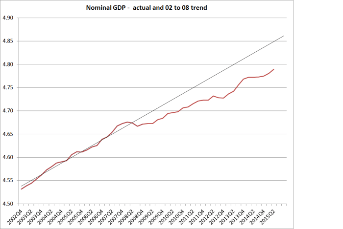
Nominal GDP is well below that pre-recession trend (as it is in most countries), arguing for looser monetary policy now as well.

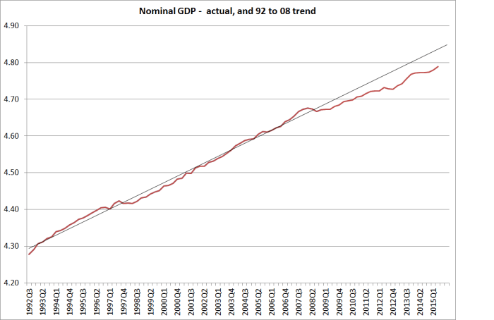
Or we could use a trend done over 1992 to 2008 and one ends with a similar gap.

ngdp 92 to 08 trend

Levels targeting does require identifying a starting level (which is neither easy nor uncontentious).  But what if we just look at nominal GDP growth rates?

ngdp apcs since 92

Not only has nominal GDP growth averaged far lower since 2008 than it did over the previous 17 years, but the most recent observation (annual growth of 3.9 per cent) is right on the average for the post-2008 period.    If we are happy with something like 2 per cent inflation (few have argued for lowering the target) and have a population growth rate of almost 2 per cent per annum, then 5 per cent nominal GDP growth might be a reasonable benchmark.  Current nominal GDP growth is well below that, just as current inflation (headline or core) is well below the 2 per cent inflation target.

So, shifting between CPI or nominal GDP based rules, levels or rates of change, looks as though it would not make much difference to how one thinks about appropriate monetary policy at present, at least on the current data.

But as I noted earlier, central banks aim to base policy on forecasts, so the issue is not so much where inflation or nominal GDP is right now, but where the central bank thinks it will be in a year or two’s time.  My proposition is that most of the mistakes central banks have made in the last decade or two have been forecasting mistakes rather than policy rule mistakes.  Monetary policy wasn’t tightened soon enough during the boom years partly because Alan Bollard was a dove, but partly because the Bank –  and most other forecasters even more so –  recognised the immediate inflation pressures, but forecast that they would soon dissipate.  They were wrong, and as a result inflation and nominal GDP growth were higher than forecast.  Similarly in the last few years, central banks have underestimated how weak both inflation and nominal GDP growth have been.  If one could forecast nominal GDP more reliably than inflation, perhaps the case for change would be stronger, but outside recessions the big source of fluctuations in New Zealand’s nominal GDP is international commodity prices.  They are highly volatile, and the volatility dominates any trend movements over the sorts of period relevant to monetary policy.

An international conference was held in Wellington a year ago this week to mark 25 years of inflation targeting, and the papers have recently been published.  Several academics presented a paper looking at how inflation targeting compared with nominal GDP targeting for New Zealand.  They looked at a variety of different time periods, including the pre-liberalisation period, the transition to a more liberalised economy, and the current period.  The authors were sympathetic to the case for nominal GDP targeting.  I was asked to be the discussant, bringing a practical policy perspective to bear on the issues raised in the paper.  In my remarks, I set out some of the reasons why I’m not convinced that a practical nominal GDP rule would represent a material advance over (practical) inflation targeting.

One of the attractions of nominal GDP targeting is that it prompts a monetary policy tightening when export commodity prices rise, even if there is no immediate rise in consumer prices. But as I noted one needs to think specifically about the characteristics of the particular economy.

In thinking about an export price shock, it might also be important to understand the transmission of the shock across the rest of the economy. A highly open economy, in which a generalized export price shock affected firms across an employment-rich wide-ranging export sector, might look considerably different than a sector-specific shock in a moderately open economy where the commodity production sectors employ relatively little labor (the story in New Zealand dairy, and much more so in Australian minerals and gas extraction). If New Zealand experiences a surge in dairy prices, and much of the proceeds are saved by farmers—perhaps because they are very conscious of the volatility of prices—why would one want to tighten monetary policy against that lift, if there was little or no apparent spillover to domestic (wage or price) inflation? Perhaps if the shock destabilized wage expectations there could be a basis, but there has been little sign of that sort of wage-setting behavior in response to recent export price shocks. The issues are even more stark in Australia, where most of the profit variability in the face of export price shocks accrues to non-Australian owners of capital (whose consumption choices are likely to put few pressures on domestic resources in Australia).

Partly for this reason, over several years I have been drifting towards the conclusion that if one were to replace inflation targeting with another rule, in New Zealand’s case nominal wage targeting might have rather more appeal.   I noted

Much of the academic discussion of inflation targeting focuses on the idea of stabilizing the stickier prices in order to minimize the real costs of adjustment to shocks. Since, as this paper agrees, wages are typically among the stickier prices, perhaps we should be more seriously considering the merits of nominal wage targeting, as Earl Thompson argued decades ago. I have noted elsewhere (Reddell 2014) that such a rule could even have financial stability advantages. Nominal wages are the prime basis for servicing the nominal household debt that dominates the balance sheets of our banks. Faced with adverse shocks, and especially deflationary ones, nominal debt is arguably the biggest rigidity of them all. It would be interesting to see such a rule evaluated in a suitable model.

But…..

If productivity shocks were the dominant source of dislocations in New Zealand, such a wage rule could also have considerable appeal— shifting the variability into the price level rather than into (sticky) nominal wage inflation. As it is, over the last twenty years, wage inflation has followed a rather similar path to core CPI inflation— and does not look much like fluctuations in the path of nominal GDP (or in NGDP per capita, or NGDP per hour worked). So perhaps, at least over that period, policy should have looked very little different under a wage rule than under the CPI inflation targets that successive ministers and governors have agreed upon.

Of course there might be considerable political/communications difficulties with wages-targeting.  But this would be nominal wage targeting: actual real wages and the labour share of income would still emerge from the market process.   But given these communications difficulties, the case for change would have to be stronger than it is right now (although for what it is worth, current wage inflation also probably argues for looser monetary policy –  just like the CPI or nominal GDP).

I have little doubt that inflation targeting is not the “end of history” for monetary policy.  But the choice between inflation, nominal GDP, or wage targets –  in levels or growth rate terms –  doesn’t seem to be the biggest issue we face in designing monetary policy and the related institutions.  In practical terms, each would rely on forecasts, and our forecasts simply aren’t very good.  And each still faces the issue of the near-zero lower bound.  There are arguments that levels targets might help alleviate the ZLB, but only zealots think that in isolation it would make a huge (or sufficient) difference.  We need much more energy being applied to either removing the ZLB constraints (which are essentially regulatory in nature) or raising the target for inflation (or nominal GDP or wages growth) sufficiently so that the zero bound is no longer likely to be binding.  The Bank of Canada is right to be looking at this issue.  Other central banks and finance ministries need to be doing so.

And I still think the other issue is one of just how much accountability there can actually be for autonomous central banks implementing monetary policy.  As I have noted recently in both the New Zealand and US contexts, in practical terms there is very little.    In the United States, John Taylor has argued for legislating something like a Taylor rule as a benchmark against which the Federal Reserve’s judgments can be formally evaluated, requiring the Fed to explain deviations from the recommendations of that rule.  Some on the political right argue for a return to the Gold Standard.  I don’t think either would be desirable, but in a sense both are reactions against the delegation of too much unchecked power to central banks.  The original conception in New Zealand was of a high degree of effective accountability –  an easy test as to whether or not the Governor has done his job. Money base target ideas had a similar conception –  plenty of delegation, but plenty of effective accountability.  It turned out not to be so easy.  But if we cannot meaningfully hold these powerful independent agencies to account –  in ways that mean real consequences for real people –  I suspect the debate will begin to turn again as to whether the power should be delegated to unelected officials at all.  Citizens can vote governments out of office, and that has real consequences for real decisionmakers.