Yesterday’s post outlined some of the fiscal balance numbers that should get more focus in New Zealand but typically don’t (partly because The Treasury does not usually also make their numbers available in internationally comparable definitions and formats).
That post was partly background to today’s, in which I want to show first how the current New Zealand fiscal numbers – as at this year’s Budget, so near-certain to be less favourable next week at least in headline terms – compare with our own experience in recent decades, and then to put New Zealand’s numbers into international comparisons, both across countries (other advanced countries) and across recent decades. It will cover some ground similar to a post a couple of weeks ago, but whereas that week I was writing a series looking at countries which had their own monetary policies (with an inflation lens in view), and thus the euro-area was a single observation, in this post I’ll be looking at advanced countries (using IMF and OECD data) regardless of what monetary policy arrangements they have. The focus here is entirely fiscal.
I’m also not going to be paying any attention to anyone’s forecasts beyond 2024 (ideally 23/24). Fiscal numbers up to fiscal year 21/22 are hard, those for 22/23 are estimates (from the Budget), and those for 23/24 (also Budget) are based on (now) legislated taxes and appropriations. For anything beyond that one can look at cost pressures, one can look at political party promises, one can look at announced (frequently revisited “fiscal rules”) and so on, and do a different sort of analysis. But bottom-line fiscal forecasts several years ahead have little or no meaning.
The first chart shows the government’s (and, apparently, Treasury’s) preferred indicator: the operating balance (OBEGAL) as a per cent of GDP. As a reminder this is a theory-free and total Crown measure. The data go back only to 93/94.

On this measure we had 15 years of surpluses (under governments of both stripes). Then through some mix of poor Treasury advice and severe recession there were deficits, briefly but greatly exacerbated by the fiscal effects of the Canterbury earthquakes. This measure was back to surplus in 2014/15 and (rising) surpluses continued to be run by governments of both stripes for the following five years. Covid meant a loss of revenue and a choice (widely supported) to provide a lot of fiscal income support. A really big operating deficit in 19/20 understandably followed. Renewed lockdowns in late 2021 had a similar but smaller effect on the 21/22 numbers, but by then the economy was running strongly and inflation was rising sharply, and inflation is at least initially a windfall for the fiscal authorities. For the last two years (free of required Covid spending), the deficits are just under 2 per cent of GDP. The economy was more than fully employed in 22/23 and in the Budget forecasts was expected to be around fully employed on average over 23/24 (small negative output gap, unemployment rate averaging a bit below NAIRU).
As I noted yesterday, Treasury doesn’t publish a long-term time series of cyclically-adjusted balances, but this chart back to 2008/09 shows much the same picture

You might reasonably be a little sceptical about whether the cyclical adjustment effects are quite large enough (but New Zealand automatic stabilisers are not typically regarded as overly powerful), but these are the best estimates Treasury was giving us (and the government). There really isn’t much case for running cyclically-adjusted operating deficits (even OBEGAL deficits). It has the feel of borrowing to pay the grocery bill.
Governments (and Treasury) have chopped and changed the debt definitions they like to focus on. For the current (and better) favoured net debt measure, they have only backdated the series as for as 2004/05. But here is the chart, expressed as a per cent of GDP

Still not very high in absolute terms, but now the highest in at least 20 years (and in practice quite a bit longer than that).
And here is one last chart just using Treasury headline series; this one one which doesn’t get much attention but is measured a bit more like the IMF and OECD series we’ll come to later

It is a less rosy story after 2008, as the return to surplus lasted only two years (16/17 and 17/18) and the forecast deficit for the current year (23/24) is about as large as that in 2010/11 (earthquake year), and almost as large as the two peak Covid years. Treasury don’t do cyclical adjustment on this series but any adjustments would be fairly similarly small as those for the operating balance (above).
Those four charts just use series straight from The Treasury’s website. There are no adjustments, no approximations, no derivations, just reportage. And because they are idiosyncratic New Zealand series we can make comparisons only over time and not across countries.
As I noted in yesterday’s post, primary deficit measures (ie excluding interest) are a common feature in international agency perspectives (and databases) on fiscal stances. Treasury does not publish any such measures for New Zealand. We can, however, make an approximation. They are only approximations as the only long-term time series for finance costs that Treasury provides is core Crown while the OBEGAL operating balance is total Crown concept, and while residual cash is a core Crown measure it is cash-based while the core Crown numbers are accruals. In addition, in principle one should exclude interest receipts as well, but the time series data only breaks out only finance costs. It is less than ideal – Treasury, please start publishing some proper primary balance numbers – but I’m going to here adjust both the operating balance and residual cash for core Crown finance costs and keep my fingers crossed that if the levels aren’t quite right the comparisons over time will be more or less valid.

The primary operating balance is all but in balance this year (at least as at this year’s Budget), albeit a very long way below the primary surpluses we once more or less took for granted.
And if one wanted to tell a more favourable (and analytically valid) story one could note that in the last couple of years more than all the finance costs have just been compensation for inflation (eg 6 per cent inflation in the year to June while all government bond and OCR rates have been below that). If we did an inflation-adjusted operating balance series it really would have been probably around balance in 22/23. But that won’t be so in the current year, at least on current Reserve Bank inflation and OCR forecasts.
But at this point I’ve largely exhausted what can be done with official New Zealand data and have to turn instead to the OECD (mainly) and IMF databases, the two main compilations of (as far as possible) consistently-reported fiscal data and estimates/forecasts. These measures are all for the (national accounts) general government concept (which does not map directly to Treasury data for even central government New Zealand data), encompassing all levels of government. We don’t have provincial/state governments in New Zealand, and local government is small, but for valid cross country comparisons general governnment is the way to go. As to timing, the OECD numbers are from June (so probably incorporate budget numbers), but the IMF Fiscal Monitor numbers are from April (but we have a partial update from the IMF Article IV report released last week)
Neither the IMF nor the OECD report operating balances, whether headline or primary. However, if one digs down in the databases one can construct one’s own (as they provide data on current disbursements, current receipts and net finance costs as shares of GDP). Here is how we’ve compared against the 32 OECD countries (not including the Latin American ones) for which there is complete data.
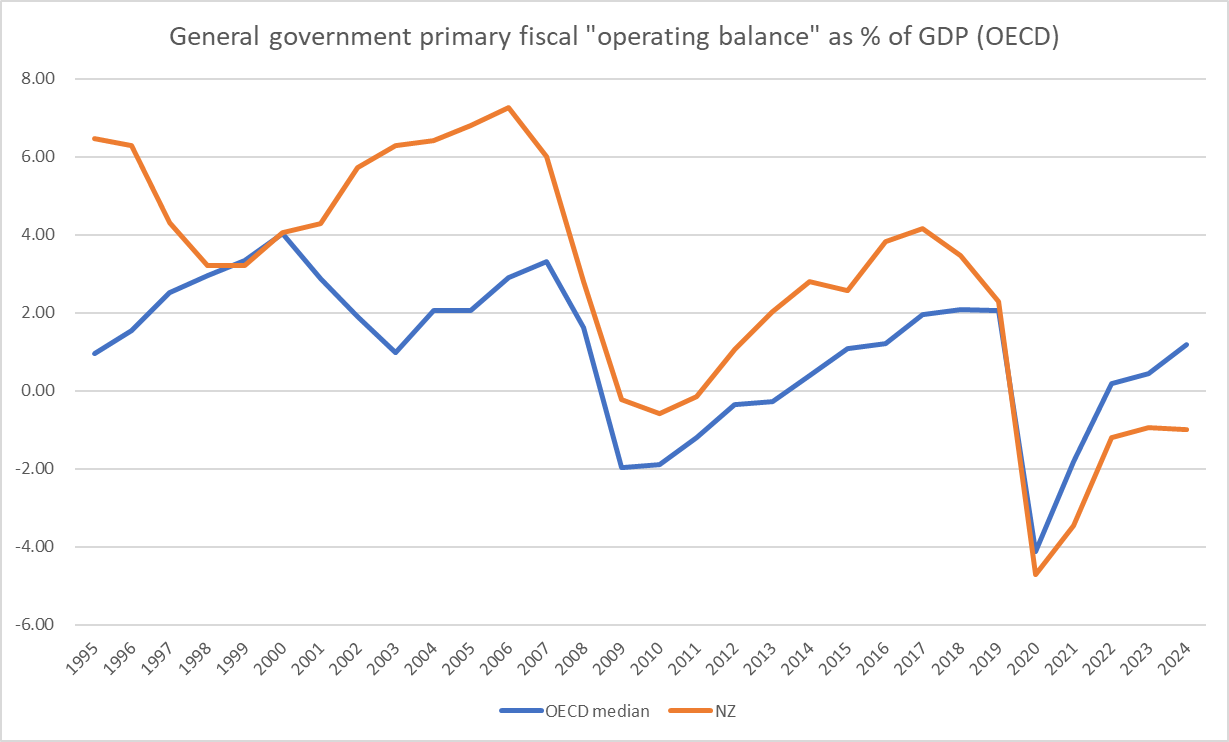
Prior to Covid there was only year in the 25 in which New Zealand’s primary operating balance was even marginally below the OECD median. Since then, we’ve been running larger deficits and if anything the adverse gap was thought earlier this year still to be widening.
For this year, they had New Zealand’s deficit 7th largest in the OECD, and next year 6th largest. That was months ago.

And here is one of the series that the OECD themselves headline, the primary overall balance (current and capital)
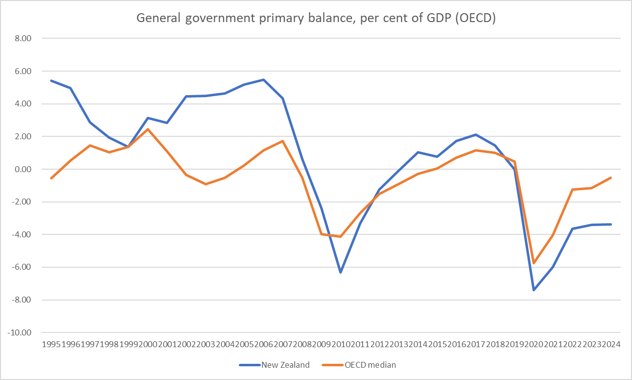
The picture is fairly similar to the (derived) “operating balance” one. Previously the only time we’d been worse than the OECD median was with the Canterbury earthquakes (which put a large liability on the Crown through EQC). We used to better. Now we are worse. (On these forecasts a few months ago, 5th worst this year, second worst next year).
I’ll spare you the cyclically-adjusted version of this chart, just noting that on OECD cyclical adjustment methodology (consistently applied across countries) as at a few months ago the median OECD country was expected to be running a (tiny) surplus next year and New Zealand a substantial (2.5 per cent of GDP) primary deficit. Only Japan was then expected to have a larger cyclically-adjusted primary deficit.
And one last fiscal balance chart. This one shows the national accounts net lending measure for the general government sector

We used to be consistently better. Now (since Covid began and on mid-2023 forecasts even this year and next) we are materially worse. The differences here are not small (a 2 percentage point difference now is roughly $8 billion per annum for New Zealand).
And here is a chart of general government net financial liabilities as a per cent of GDP.

The New Zealand line looks a lot like the (shorter run) of central government Treasury data shown earlier. But it is the international comparison that is interesting. We often here talk about how low New Zealand government debt is, but actually the median OECD country just isn’t that heavily indebted either (although places like the UK, US, Japan, and Italy really are). We are still lower than the median country, but on these projections from some months ago the gap is closing fast. And notice that the median OECD country experienced a one-year blip up for Covid costs (and revenue losses) but now has lower net debt as a share of GDP than in 2019. New Zealand not so much. We have had one of the largest increases in net debt, as a share of GDP, whether one looks at the entire period since 2019 or just the final three years (our need for heavy Covid spending, like that of other countries, largely ended in calendar 2021). It is worth remembering that today’s highly indebted countries were not always so (eg as recently as 2001 the UK had lower net general government financial liabilities as a per cent of GDP than we do now).
Finally we turn to the IMF. They have a smaller set of indicators, but the same headline and cyclically-adjusted primary, overall, and net lending balances, and a net debt measure. To avoid being repetitive, I won’t run all the charts. They don’t provide such a long run of historical data but the broad pictures seem pretty similar to those with the OECD numbers.
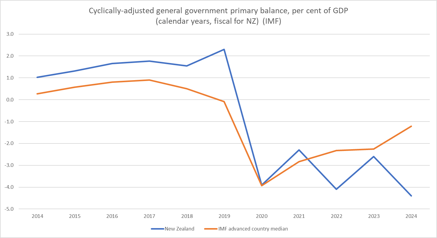
However, in their Article IV report on the New Zealand economy last week the IMF provided an updated forecast series for several fiscal variables. Although the numbers were published last week the report was finalised in July, based on a mission here in June. This was the report that suggested that “frontloaded fiscal consolidation” should be the focus, pointing out in the text that the Budget had been quite expansionary (NB: contrary to the assertions of the RB Governor) that they estimated a cyclically-adjusted primary deficit of 4.4 per cent of GDP for fiscal year 23/24).
Here is a comparative chart for the last decade. We used to better. Now we are (quite a bit) worse. On the IMF’s cyclical-adjustment methodology our primary deficit this year will be larger than in any of the heavy Covid expenditure years,
And for a straight cross-country comparison (using the IMF’s Article IV estimate for the New Zealand 23/24 fiscal year and the average of their calendar 23 and calendar 24 estimates for the other countries.

Looking at the change since 2019, New Zealand has had the worst deterioration in its cyclically-adjusted primary balance as a per cent of GDP of any of these countries. The deterioration in the net lending indicator looks to have been very similar.
And one final chart. The IMF has a different measure of net debt again (and there is a slightly different group of countries than the OECD) but the picture for the last decade is broadly what we’ve already seen from the OECD data.

Here I have shown the IMF’s 24/25 number, not because it is sure to happen (next year’s Budget will be a thing) but because this is the most recent set of official agency numbers, and presumably part of the backdrop to that “frontloaded consolidation” call that both parties seem determined to ignore prior to the election. For this group of advanced economies the median country’s net debt to GDP has increased hardly at all since 2019. Back then the median was far above New Zealand. All it would take is another year or two of New Zealand governments continuing as ours have done in the last few years and we’d have net debt above the advanced country median (whether you like at this IMF version or the OECD one above). I hope there wouldn’t be many takers for that option, in our underperforming low productivity growth economy.
Every single of one of these charts is based on data either up to date to Budget time, or in the IMF’s case perhaps a month later. It is clear that the revenue picture to be revealed in the PREFU will be worse. (Labour’s changes last week to forward operating allowances will limit the damage to forward deficit estimates both those and the departmental baseline adjustments should be treated at this point as little more than electoral vapourware. Lines on graphs do not amount to concrete decisions to cut this or that and keep it cut. And cyclically-adjusted deficits do not fix themselves.)

My thoughts after reading your post:
1. I suspect that we need to have much lower public debt in NZ, due to our massive private sector debt load. Somebody is getting pummelled by our falling exchange rate recently…
2. Watching the election campaign is surreal. Ostriches burying their heads in the sand comes to mind. It is deeply depressing…
3. It is disappointing that New Zealand doesn’t use the same metrics as the rest of the world. For example, the fact that government as a percentage of GDP is 44% using overseas methodology, and is reported as 33% using this rather curious “Core Crown” system, makes me suspicious. Is this different methodology designed to deceive? Why don’t they at least publish both figures? The same goes for primary balances et al.
4. On the subject of bad data – the lack of timeliness in reporting trade data / inflation data is also simply unacceptable.
5. Overall, the data in your post proved my suspicions. Since 2019, we have probably been the worst performing country in the OECD. This does not bode well for the future…
LikeLike
Largely agree. I don’t think there is any intent to deceive, just (these days) very little interest in international benchmarking or comparability. As I noted in yesterday’s post, their reporting is more oriented to accounting than economics. But then Tsy itself doesn’t seem v interested in macroeconomics these days, whether fiscal policy or productivity or…
LikeLike
You say:
“I don’t think there is any intent to deceive, just (these days) very little interest in international benchmarking or comparability.”
Okay, I’ll accept that. My follow-up question would be – has everyone been deceived about the size of government in New Zealand? I think you answered question this in an earlier comment:
“Core Crown has been the focus of all analysts and parties for decades. Total Crown includes a whole bunch of SOEs and Crown entities with their own revenue streams (thus total Crown revenue is also much higher than core Crown). core Crown captures what one is looking for in fiscal policy.”
It sounds like the analysts have been deceived for decades (total Crown is a broad and better proxy for total government spending). As soon as I saw that the so-called “Core” Crown spending excluded bog standard government spending such as ACC, I knew the measure reflected some accountancy legal form, rather than the economic substance of the situation.
I think it matters a lot whether the central government is 34% or 41% of GDP (I’m not sure of the exact figures). Furthermore, I’d add that the economic substance of the situation says the correct figure is closer to the latter.
In summary, I’d say that the Crown accounts are deceptive, whether this was the intention, or not…
LikeLike
I guess I think it depends on the purpose. For accounting purposes they are great, but much less so for economic or political. Has anyone been deceived? I’d be surprised because anyone who is geeky enough to read Treasury tables probably also knows to look to places that have internationally comparable data. Charts featuring IMF and OECD advanced country comparisons do feature in the more intelligent NZ debate (the unintelligent bit tends to use stats, if at all, for support more than for illumination).
LikeLike
Interested: IMF report stated “new fiscal rules….are well calibrated” – so still room to support future shocks? Or, given trends, is the next downturn a fiscal problem such that mon policy does most of the work?
LikeLike
I guess monetary policy does (and should do) most of the work in most downturns (Covid was a different issue because it wasn’t a demand slump, but shutting down the economy deliberately and needing to provide income support). But the risk now is that either we need quite a lot of fiscal consolidation in what could already be quite a severe downturn, or that we don’t fiscally adjust and the debt begins to move above the govt’s ceiling (which of course it or a different govt could easily revise up again).
LikeLike