In preparation for a meeting earlier this morning, I’d downloaded the OECD data on exports as a share of GDP. I thought it might be useful to share of a few of the charts. Most are updates of charts I’ve shown in years gone by, but it is good to be reminded of what has happened in New Zealand and how we compare with other OECD countries. In all the charts that follow I’ve excluded 2020 for two reasons: first, not all countries yet have data (at least in this database) and second, Covid, which affected individual countries quite differently and which should over time prove to be a blip. In all the charts other than the first I’ve shown data from 1995, which is when the OECD has complete data from.
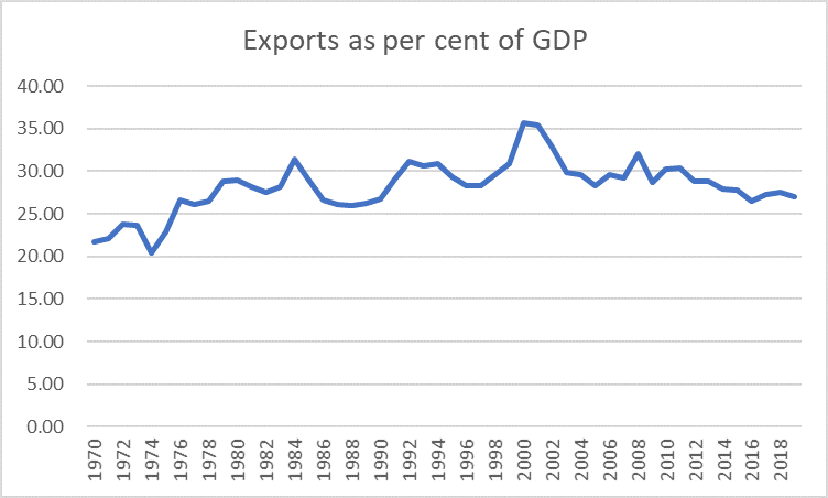
Here, as context, is the New Zealand data since 1970. 1995 was not an outlier, high or low.
Here is New Zealand relative to the median of all OECD countries (note that the OECD keeps doing its best to keep us near the more prosperous part of the OECD, by letting in new poorer countries: the latest country invited in (and now in the data) is Costa Rica).
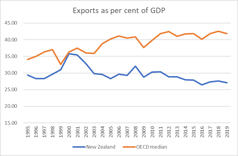
From the beginning of this chart, we’ve always exported a smaller share of GDP than then median OECD country has, and that gap has widened.
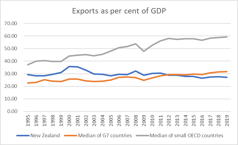
But, of course, one could expect the picture for other small countries to look different than one that included large countries. All else equal, large countries tend to do a smaller share of their GDP in foreign trade, just because there are relatively more opportunities at home (in the US, at one extreme, exports are equivalent to 12 per cent of GDP).
So in this chart I’ve shown (a) New Zealand, (b) the median for the G7 (larger) countries, and (c) the median for the small OECD countries (Belgium on down).
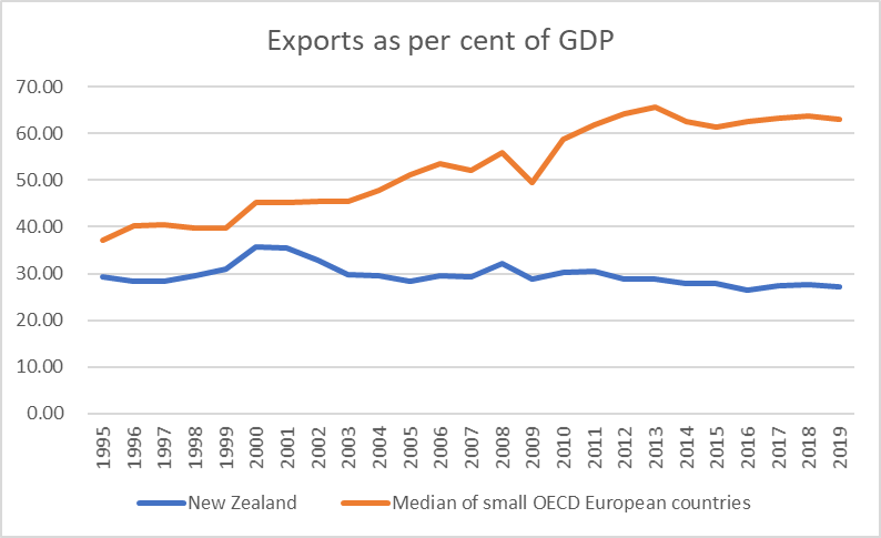
And in this chart I’ve shown New Zealand against the small European countries (including Iceland).
And New Zealand against the former Communist countries of eastern and central Europe, all small except Poland.
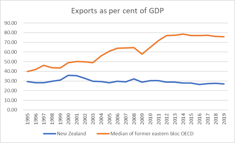
These central and eastern European countries, all part of the EU, and often closely into supply chains for things like the German car industry, have been managed significant productivity growth, closing the gaps to some extent with the OECD leaders, over the last couple of decades.
There aren’t that many OECD countries that are both small and remote. In many respects both Iceland and Israel count, Costa Rica does, and so does New Zealand. Here are the records of those four countries.
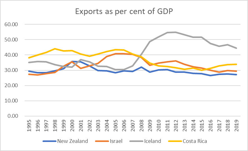
I’ve been increasingly intrigued by Israel which for all the reputation it has for high-tech industries, has done about as badly as New Zealand. Israel has a similar (modest) level of real GDP per hour worked to New Zealand and – coincidentally or not – has had very rapid population growth.
People are sometimes inclined to discount the central and east European story, noting (correctly) that the gross exports numbers used here don’t represent the extent of value-added in the respective economies, and thus may overstate the apparent success.
The OECD reports data on the extent of domestic value-added in gross exports, but only with a lag. The most recent data are for 2016 and that year two thirds of the exports of the median eastern/central European OECD member were domestic value-added, little changed over the previous decade. In New Zealand, by contrast, domestic value-added accounted for 87 per cent of total exports in 2016. The gap – between the export performance of New Zealand and that of the central and east European countries – is (very) real.
As I’ve said often here, exports are not uniquely special – indeed, I could have done the charts of imports and most of the pictures would have been quite similar – but that successful small economies (fast growing productivity growth ones) tend to be ones generating (or attracting) companies that find plenty of buyers for lots of their output abroad as well at home. That simply does not describe the New Zealand experience.
