Statistics New Zealand last week released their annual measured sector and individual sector labour and multi-factor productivity data for the year to March 2019. It isn’t data I tend to focus on, mostly because my interests are substantially in cross-country comparisons and also because my focus is whole-economy rather than on specific sectors and sub-sectors. But it is still useful for thinking about productivity performance within New Zealand over time and we are now beginning to get a reasonable run of time series
(I can’t quickly find the official SNZ definition of the measured sector, but think of it in terms of what it isn’t (non-market bits of the economy like government administration).)
Here is labour productivity for the measured sector. I’ve shown both the actual data (in logs) and the extrapolation of the trend line for the 1996 to 2008 period.
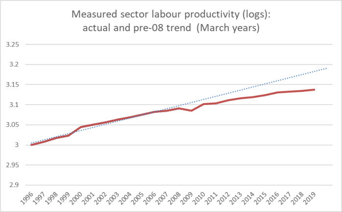
The difference at the end of the period is roughly equal to 10 per cent productivity foregone.
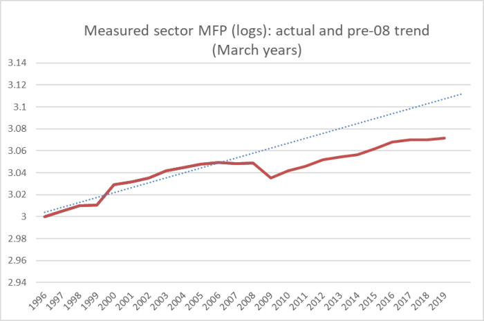
Here is the same chart for multifactor productivity (MFP).
Those who are inclined to minimise New Zealand’s longstanding and ongoing productivity failures will, of course, (correctly) point out that productivity growth in the advanced world as a whole has been slower in the last decade. That might be some sort of excuse for countries at or very close to the productivity frontier – best in pack. It is no excuse at all for a country starting so very far behind the leaders (and, as I’ve pointed out here before, hasn’t stopped a bunch of eastern and central European countries – often now about as productive as New Zealand, having been communist basket cases 30 years ago – continuing to put in strong performances).
What about further disaggregated data? SNZ publishes data/estimates for labour productivity for a wide range of individual sectors and subsectors, in many cases – making up what is known as the “former measured sector” – going back to the 1970s. (Sadly, even if I run the trend line through the data all the way from 1978 to 2008, the gap around the last decade’s performance still looks stark.)
What about some more disaggregation? SNZ show results for three high-level groupings: goods, services, and primary production. The latter can be quite volatile (droughts and the like). Here are the MFP numbers for those groupings.
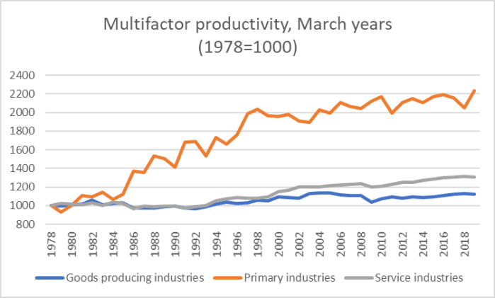
The primary industries performance was pretty impressive – doubling in twenty years – but that good performance itself ran out more than twenty years ago now. Within primary industries, agriculture itself still does quite well relative to productivity growth in the rest of the economy.
And finally a couple of charts on individual sectors. Here is the MFP estimate for something SNZ call “Information and communication technology industries”
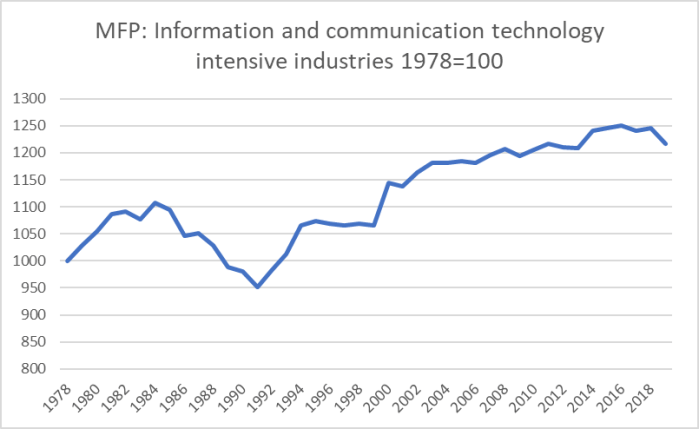
Not much growth this century – in fact, less than for the measured sector as a whole.
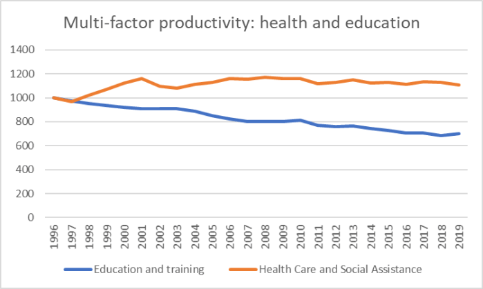
Then again, rather better than the performance in these two sectors.
And for anyone interested, these are the six sectors with the highest (estimated) MFP growth over the last 15 years as a whole.
| Per cent increase in MFP, last 15 years | |
| Rental, Hiring and Real Estate Services | 19.1 |
| Forestry, Fishing, and Services to Agriculture, Forestry and Fishing | 20.1 |
| Textile, Leather, Clothing and Footware Manufacturing | 27.1 |
| Information Media and Telecommunication | 33.4 |
| Retail Trade | 42.6 |
| Wood and Paper Product Manufacturing | 45.2 |
Quite a mixed bag.
Overall, however, the productivity performance of this economy remains dismal. Sadly, there is little sign any of our major parties care.
