Having written here earlier in the week about the reckless and irresponsible way in which the government and Statistics New Zealand are degrading the quality of our very timely net immigration data (itself a major, and quite cyclically variable, economic indicator), I noticed a couple of comments that prompted me to dig out some numbers for this post.
The first, in a comment here, was that the self-reported intentions-based PLT measure probably couldn’t be counted on as very accurate anyway. And the second, in someone else’s commentary, was that at least we will still (I hope) have monthly reporting of total passenger movements (tourists, business travellers etc as well as the permanent and long-term movements) from which a reasonable steer might be gleaned.
The best way of looking at whether the PLT measures are reasonable is to compare them with the new 12/16 method numbers – available with a long lag, but which involve looking back, using passport records, and checking which people actually came (or went) for more than 12 months ((the threshold for the PLT definition). Unfortunately, SNZ is still not publishing seasonally adjusted estimates for the 12/16 method numbers, so one can only really do the comparisons using rolling annual totals. On this chart, I’ve shown the rolling 12 month totals for (a) the 12/16 method, (b) the PLT series, and (c) total net passenger movements for almost 30 years (although the 12/16 method data are only available this century).
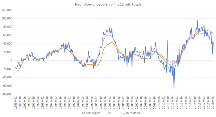
All the cycles are pretty similar, at least if one takes a broad sweep of the data. That isn’t surprising, as most short-term visitors go home again pretty quickly, leaving something like an underlying trend of permanent and long-term movements. And it confirms that the PLT numbers have been a useful – although not perfect – indicator of the actual permanent and long-term movements (captured in the 12/16 numbers). Importantly, the turning points tend to be very similar.
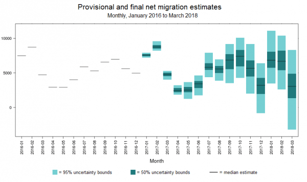
One wouldn’t expect those two series to be the same, as they measure different things: the PLT numbers are about intentions, and if plans change so will behaviour. If lots of people come to New Zealand (or leave for Australia) and things don’t work out and they change their mind, ideally we would want to know. The divergence that looks to have opened up between the grey and orange lines at the end of the (grey) series might prove to have been something like that. But in future we won’t know because (a) we won’t have the PLT data at all, and (b) the grey line will only be available with a reasonable degree of certainty with quite a long lag. As a reminder, here is the new SNZ chart I included in the post the other day, illustrating the huge error margins around the timely estimates SNZ proposes publishing using their new (unpublished and untested) methodology.
But the other thing worth noticing is how noisy the blue line is. There is a great deal of volatility, which makes distilling any signals (about permanent and long-term movements) very hard on a timely basis. That was why the PLT numbers have been so useful. The blue line is thrown around in particular by big sporting events: eg the Lions tours in 2005 and 2017, and the Rugby World Cup in 2011. There are big additional net arrivals, and then big additional net departures a month or two later, with mirror effects in the annual numbers a year later as well. I have found the total net passenger arrivals data useful in the past – in both 2002 and 2011 they pointed to something larger in the permanent and long-term movements than the PLT numbers themselves were reflecting, and that sense was later reflected in the 12/16 numbers (much larger net inflows in 2002/03, and somewhat larger net outflows in 2010/11).
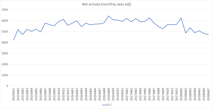
What of the monthly seasonally adjusted data (the stuff designed for high frequency timely monitoring)? Here is a chart of the PLT and total series, with scales set so as not to allow the flows associated with the Rugby World Cup (in particular) to dominate the chart.
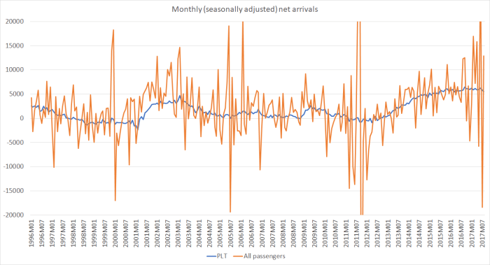
At a monthly frequency, the noise in the total passenger (orange) line totally dominates any signal, while the volatility in the monthly PLT series (that we are soon to lose altogether is very small). What should perhaps be more concerning – and is a bit perplexing – is why the volatility of the total passenger series is itself quite variable across time, even outside the months associated with major sporting events. Right now, for example, the volatility in the monthly series is quite extreme. Here is the same chart for just the last four years or so.
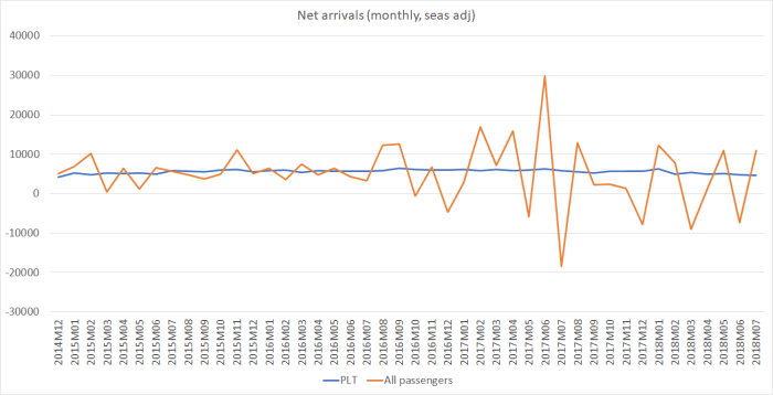
The Lions Tour is very evident in mid-2017, but the heightened volatility goes well beyond that.
All of which leaves me not quite sure what to make of the very first chart. The blue line (annual net inflows of all passengers) has fallen back a long way already (down from around 80000 to around 40000), and similarly-sized falls in the past have often been coincident with, or perhaps a little ahead of, large falls in the PLT numbers (and the 12/16 numbers). There are some reasons to think we might see something similar now. Fortunately, for the next couple of months we will still have the PLT data
But after that – thanks to government and SNZ choices – we will be flying blind. We’ll have good information eventually on what actually happened, but it will be available with such a lag as to be more use to economic historians than to people trying to make sense of, and respond to, contemporaneous economic developments. And the net total passenger movements data is sufficiently noisy that it probably won’t give us much of a steer (and even then with big error margins) before the lagging 12/16 data do.
This is simply reckless behaviour around a major set of timely economic data.
