When I was working on my lecture last month on productivity as the best sure basis for dealing with poverty across a society as whole, I did take the opportunity to read around some of the literature on child poverty in New Zealand. A line that used to be quite common in the New Zealand debate was that we had high rates of child poverty but low rates of poverty among old people, and that this represented some mix of a misplaced sense of priorities and some imbalance in political clout. On checking, I see that I previously used the “low poverty rate among the elderly” argument myself in a published report. On further checking, this was the sort of chart we used to see.
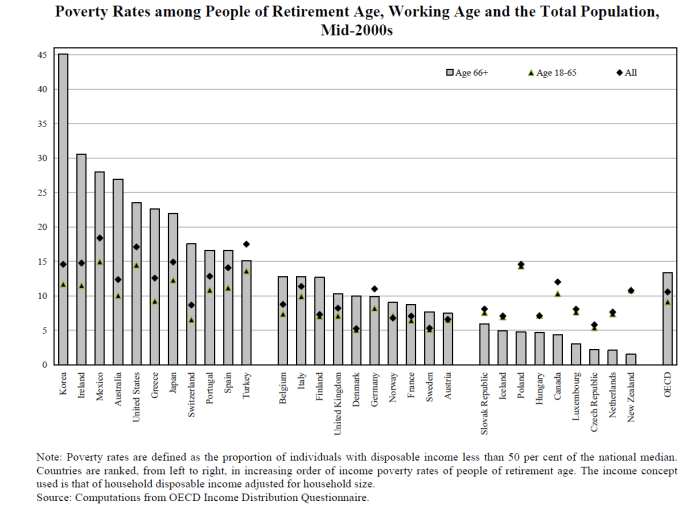
I’m fairly sceptical of these measures of poverty or deprivation. They are mostly measures of (in)equality rather than of poverty, being calculated as the percentage of people in any particular group with incomes less than some threshold percentage (typically 50 or 60 per cent) of the (equivilised) median. Real incomes for everyone could be doubled over time – by some mix of economic good fortune, innovation, and fine management – and yet if the distribution of income didn’t change, we’d be told that exactly the same share of the population was still in “poverty”. Sure, the detailed reports will specify that what they are measuring is relative “poverty”, but (a) that is almost a meaningless concept (whereas income or consumption inequality is not), and (b) the “relative” qualifier is usually too readily lost sight of once we shift from detailed technical reports to political debate and the like. And so, a few months ago we had a (very capable and well-regarded) visiting economist and politician noting in his lecture that child poverty rates (on these measures) were very similar in New Zealand and Australia, while failing to mention that average or median incomes in Australia are much higher in Australia than in New Zealand People will be classified as “poor” in Australian who would be close to the median income in New Zealand.
Of course, there is a place for redistributive policies, but over time lifting overall rates of productivity make much more difference: the difference between the “poverty” most New Zealanders lived with (by today’s standards) when we were the richest country in the world a century ago, and the living standards of today.
But the specific point of this post, was this OECD chart I stumbled when I was thinking about poverty issues. The differences in the differences between male and female rates look as though they could be interesting, but my focus is on the blue bars – the number for the entire population aged over 65.

OECD data used to (see first chart) suggest that New Zealand had some of the very lowest rates of elderly “poverty” anywhere. But, apparently, that is no longer so. On this measure – using the 50th percentile – New Zealand elderly “poverty” rates are still a little below the OECD total, and are actually a little above the OECD median (the countries labelled in italics are not OECD members).
And even in the days when numbers like those in the first chart were widely cited, people used to point out that it made quite a difference whether one looked at the 50th percentile, or (say) the 60th. The widely-quoted child “poverty” measures in New Zealand typically use the 60th percentile.
Somehow I managed to find the underlying data for the elderly on the OECD website. The tables say that there is a new measure being used since 2012 (and thus the difference between the first two charts). Here is an aggregate chart showing the share of the population aged over 65 with income below 60 per cent of median equivilised disposable income (ie the same measure as in the OECD chart above, just using a different percentile threshold). Here are the data for 2015 (or most recent).
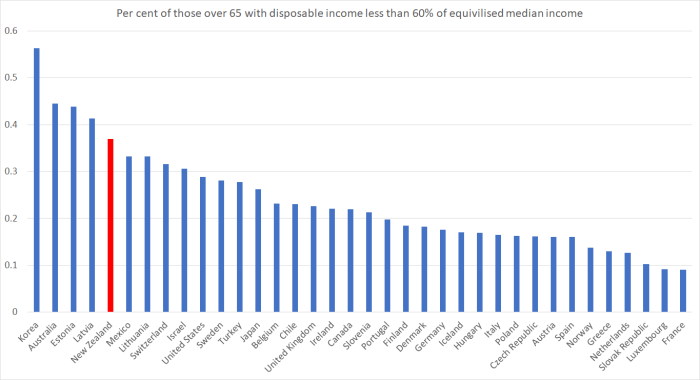
I was quite taken aback when I saw those numbers. The results of this new methodology are so different from those under the old methodology (at least for New Zealand) that one would need to dig into the new and old methodologies to be at all comfortable with the results. After all, it is not as if NZS policy has changed materially over the last 15 years or so, and we know that a relatively high share of New Zealand over-65s are still in the workforce. And given the universal coverage of NZS, I find it a little difficult to believe that our elderly (relative) “poverty” rates are so much higher than those in, say, the United States. Then again, it is interesting to see the Australian numbers – especially when we hear occasional calls to adopt something more like the Australian system (compulsory private savings and a means-tested age pension) here.
But if the OECD numbers are to be taken seriously at all, it looks as if – relative to the rest of the OECD – our child poverty scores might be not much different than those for our elderly. This is the OECD data on child “poverty” using the same 50th percentile benchmark as in the fancy OECD chart above.

New Zealand almost identical to the OECD average.
There will, unfortunately always be pockets of extreme deprivation and perhaps even absolute poverty (often perhaps not well-captured in these sorts of aggregate charts). Some of that – even after welfare system redistribution – will be about culture, some about personal poor choices, and some about misfortune. Some of it will even be about atrocious policies – for example, land use law in New Zealand.
But what we do know, with a very high degree of confidence, is that overall average material living standards – for children, the old, and everyone in between – in New Zealand are well below those in most of the “old” OECD countries, that we used to far exceed. Remember the statistic I’ve quoted previously: it would take a two-thirds lift in average productivity in New Zealand to match that on average in Germany, France, Netherlands, Denmark, Belgium, and the United States. The best way to sustainably – including politically sustainably – and substantially lift the living standards of those at the bottom is to lift productivity across the economy as a whole. And there is little sign that the government or the Opposition have any ideas as to how to turn the decades of underperformance on that score around,

A huge part of the NZ poverty story is the cost of housing. Frequently this is not assessed in official reports.
The average kiwi knows this is the key issue that needs to be addressed -there is good survey data on that (included in my attached report).
Why it is has taken officials so long to even begin to address housing related poverty I find immensely frustrating. I believe there is a huge amount of policy assessment laziness in Wellington -in places like MBIE, MSD etc.
View at Medium.com
LikeLike
Phil Twyford is finding out that it is not that easy to fix this housing issue because we have locked ourselves into a very difficult position, between a rock and a hard place. It started as far back as 30 years ago when Les Mills was the mayor. He begun the revival of Auckland City to create a crown jewel harbour and to encourage residential and businesses back into the city. Prior to that Auckland was a dying city with most people and businesses out in the suburbs of Manukau, Shore City and Waitakeres. Les Mills brought businesses and people back into the harbour and subsequent mayors continued with this trend which have ended up with the logical outcome of a supercity. Of course given that we are sitting on a dormant but still capable of being active at any time, we now are faced with connecting the various parts of Auckland spread too far and spread too thin.
LikeLike
Correction: sitting on a dormant but still capable volcanic field of 57 Volcanos
LikeLike
I remember after the Christchurch earthquake: “Behold. I make all things new”. Unfortunately land was expensive and everything went up in price.
LikeLike
Remember too many oldies live in diverse neighbourhoods because moving is expensive.
LikeLike
Old people are also not dying which means you need a team of younger people to care for old people crippled by old age. And more and more are opting for staying at home. If a house does not vacate then young people can’t move into those homes.
LikeLike
Can you make the graphs, of this and other posts, larger? They are difficult to read.
LikeLike
Making graphs larger
Method 1.
If you are using Internet Explorer and have the IE toolbar turned on you will see down in the Right Hand Corner of the IE Bar the option to zoom in to 200% enlargement
Method 2.
Click in the middle of the graph with the4 right mouse button and you can save the picture to your hard drive and then enlarge it to your hearts content
LikeLike
Or buy a 24 inch, all in one, touch screen computer and you can use your fingers to enlarge. The latest HP 24 inch touch screen with i7 pentium quad core processor costs around $2k. Less if you get a Dell or LG.
LikeLike
“After all, it is not as if NZS policy has changed materially over the last 15 years or so, and we know that a relatively high share of New Zealand over-65s are still in the workforce.”
Yes, it would be nice to have that difference explained. If I read the first two charts for 50th percentile correctly, we move from around 3% (old methodology circa 2000) to 11% (new methodology circa 2015) – that’s an enormous shift.
I wonder if the Office of the Retirement Commissioner can explain. I do know they have put a great deal of emphasis more recently on the importance of owning one’s own home in retirement. The general message I got from that was that their research suggested a disturbing/growing proportion of 65+ yo in relative poverty – which does seem unbelievable with respect to our NZS policy settings.
Perhaps what has changed between 2000 and 2015, is a demographic shift, with a lot more people without property assets now entering the 65+ age cohort? A 65yo in 2015 was a 50yo in 2000. They were at middle working age throughout the period of the neoliberal reforms and a 37yo for the stock market crash. Could it be that perhaps 11% of those around that age cohort never recovered?
LikeLike
Don’t forget that between 2007 to 2010, we had a deep recession engineered by the RBNZ. Mum and dad investors lost $6 billion in life savings when 61 Finance companies funding property development went belly up as the property sector was decimated.
LikeLike
Average rents went up around 33% more than the average income in the period 2000-2016. I’m reasonably sure median and lower income went up less. Housing prices rose 201%, just over triple income, which rose 65%. A demographic shift is inevitable, and only just beginning.
LikeLike
Searching for a definition of poverty on Google is interesting. It also explains why discussion of the subject is frequently at cross-purposes.
An example that has stuck in my mind was said by the Retirement Commissioner on the radio: imagine you are working in say Wellington and carefully budgeting for the essentials of life and someone you really care about dies in Auckland; can you afford to take time off work and travel to the funeral?
Travelling in Europe for the first time in a long while it is clear (anecdotally) that NZ is now lagging behind UK, France, Belgium, Germany and Switzerland. NZ has always had talent traveling abroad for experience but returning to NZ when they start families; if NZ doesn’t get its economy catching up will they continue to return?
LikeLike
[…] as I noted in a post a few months ago some OECD data appear to raise questions about those relative poverty […]
LikeLike