I’ve written quite a bit over the last few weeks about the New Zealand Superannuation Fund. My argument is not that they have done badly – indeed, some evidence suggests that over a relatively short period (since their own self-assessment benchmark is a rolling 20 year horizon) they have done rather well – but rather that what they do isn’t worth doing at all (for citizens and taxpayers). Total returns have been rather risky – interviewed on Radio New Zealand the chief executive called it a “high octane” fund – and don’t stack up that well against rate of return requirements the government generally expected over that period for discretionary investment projects, or with the sorts of hurdle rate private sector entities typically use in evaluating projects.
One reader has suggested several times that I show the data for the ACC investment performance. The value of ACC’s total assets is currently quite similar to that of NZSF.
To give credit to NZSF, their investment performance data is much more easily available (on their website) than that of ACC. But I did track down a couple of charts of ACC’s investment performance and ACC provided me with the annual data behind those charts, going back to the 1992/93 June year.
These are the headline numbers for the two government entities for the 12 full financial years in which both were operating.
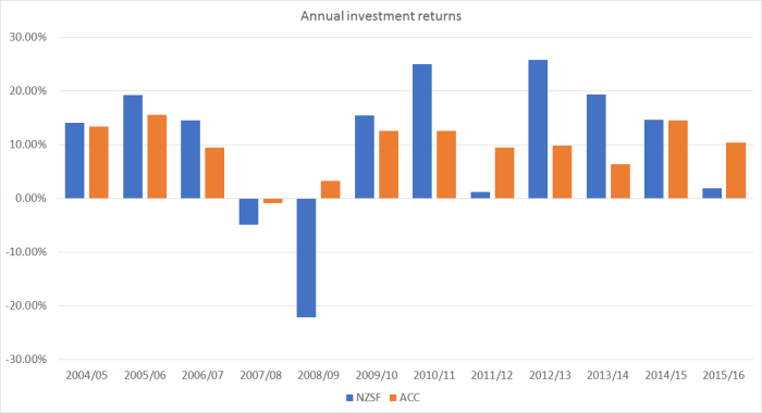
What will no doubt stand out first is that ACC’s returns have been much less volatile – less risky – than those of NZSF. They are very different funds, with very different mandates and different appetites for risk.
The numbers the two agencies supply are not exactly comparable. The NZSF returns data are pre-tax and after costs. ACC is not liable for New Zealand tax, although they note that they pay a small amount of foreign withholding taxes. Their numbers are also reported before allowing for some investment management expenses. This is from their Annual Report
However, returns are shown prior to the deduction of other investment management costs of $42.4 million (including fees paid to external fund managers and the remuneration of our investment staff), which would have detracted 0.135% from investment returns in 2015/2016.
In the remaining calculations in this post, I have silently deducted 0.135 per cent per annum from the ACC returns to produce numbers more closely comparable to those NZSF provides.
Over the 12 years both agencies were investing, NZSF produced (geometric) average annual returns of 9.5 per cent. ACC managed 8.3 per cent average annual returns over the same period. But the big difference was in the volatility of those returns. For NZSF, the standard deviation of the annual returns was 13.9 per cent over that period, while for ACC it was only 4.8 per cent. That is pretty low level of risk. (I’m a trustee of the Reserve Bank’s superannuation scheme. We have historically been a deliberately relatively low risk fund, and over the same period the standard deviation of our returns has been similar to ACC’s.)
You can see in the chart above where it really makes a difference. Over 2008/09, at the height of the recession (here and abroad) and financial crisis, ACC had a bad year. Returns in that June year were -1 per cent. At NZSF, they lost 22 per cent of the value of the assets. Fortunately that was still 22 per cent of not that much.
In an earlier post, I looked at the Sharpe ratios – returns relative to the variance of those returns – for NZSF. It is a commonly used metric in looking at, andcomparing, funds managers.
NZSF’s official performance benchmark is the total returns of the fund relative to the (risk-free) Treasury bill rate. ACC doesn’t use that metric, but lets see how the two organisations compare on it anyway, again over the 12 financial years 2004/05 to 2015/16.
| Average return above T bill(percentage points) | Std deviation(percentage points) | Sharpe ratio | |
| NZSF | 5.7 | 14.6 | 0.39 |
| ACC | 5.2 | 5.8 | 0.90 |
And recall that NZSF’s own document suggest that over the long-term they don’t exepct anything like that level of returns: they aim to produce “at least” 2.7 percentage points above Treasury bill yields.
Both ACC and NZSF like to report on how they have done relative to benchmarks that they themselves have set (the “reference portfolio” in NZSF’s case). That can be useful in assessing their active management returns and allowing the respective managements and Board to assess whether active management is worth doing at all. It matters less to taxpayers, especially in the NZSF case, where there isn’t wealth that has to be managed, but rather we have to take a view on whether having the Fund – funded from taxes and borrowing – is worthwhile at all (and where the benchmark is designed in a way that makes it not too hard for the NZSF to beat). As I noted, the official performance benchmark for NZSF is performance relative to Treasury bill. But for what it is worth, here is the same sort of table for what both organisations might call their ‘active management”.
| Average annual active mgmt returns (percentage points) | Std deviation (percentage points) | Sharpe ratio | |
| NZSF | 1.8 | 3.2 | 0.56 |
| ACC | 0.9 | 0.8 | 1.13 |
ACC’s performance, even on this measure, is pretty impressive, both absolutely and relative to NZSF’s. ACC has a longer-run of data, and the performance over the full 24 years of data is quite similar to that for the 12 years for which we can compare ACC and NZSF.
I’ve tried to ensure that all my numbers are accurate, although there is always some risk of error in combining differently formatted numbers etc. But the key point really is in the headline numbers in the graph above. Over the 12 years to date – when NZSF has done better than they expected – ACC has earned average total returns a bit less than those of NZSF, but they have done so by taking on much less risk.
And as I”ve highlighted in the various NZSF posts, NZSF’s sort of investment strategy tends to lead to very big losses at just the times when Crown finances are put under greatest stress anyway (in severe economic and financial downturns). That is a distinctly unappealing feature, and a risk profile more akin to that adopted by ACC over the years also looks as though it would be a better approach to take to any other Crown investment management subsidiaries. Those with long memories will recall the intense fiscal pressures – some real some exaggerated – in 1984, 1990/91, 1998/99, and 2008/09. In future downturns, the last thing we need is huge investment losses amplifying pressures for politicians to “cut and cut now”. It is fine for technocrats to argue that markets will bounceback. Often they do, but it is a great deal of unnecssary risk for taxpayers to assume, or for them to rely on politicians and appointed technocrats to manage.
As a final note, I’ve been critical of the reshuffle of Kiwibank shares among various Crown agencies, which reduced NZ Post’s share, and resulted in NZSF and ACC owning around a quarter each of a retail bank. In neither agency’s case does that look particularly good. If things go well, both NZSF and ACC might do rather well financially – after all, they were the only credible and politically acceptable buyers. But neither ACC nor NZSF has any expertise in retail banking, and difficulties of handling any potential failure of Kiwibank – and the inevitable pressures for government bailouts – are only compounded by the dispersed non-expert ownership all still on the overall balance sheet of the Crown.

Re your last paragraph, not only do NZSF and ACC have no expertise in retail banking, regarding Kiwibank itself, I shelved plans to even invest in a Kiwibank PIE on their announcement they were entering small business lending. None of the Kiwibank branches, very small high-risk businesses themselves with mono-industry [retail] knowledge only, have any experience or knowledge with business lending. That decision is driven by politics (politicians) and it will be interesting to see the scale of bad debt provisioning in five years.
LikeLiked by 1 person
Nice post. It is a pity that ACC cannot mount a takeover bid on the guardians of New Zealand superannuation!
LikeLiked by 1 person