I didn’t really read the housing section of last week’s Reserve Bank MPS – housing isn’t their responsibility and their analysis of it has rarely been up to much, often lurching unpredictably from one story to another. And their new material on house prices in each MPS only stems from the Remit change Grant Robertson foisted on them early in the year, knowing it would make no substantive difference to anything, but designed to look as though the government cared.
So it was only when the Herald’s Thomas Coughlan tweeted this chart yesterday that I noticed it.
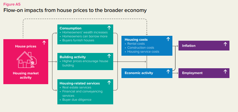
The chart is prefaced with this text
The MPC sets monetary policy to achieve its inflation and employment objectives in the Remit. It considers the outlook for the housing market because house prices can influence broader economic activity, employment, and consumer price inflation (figure A5).
So we are presumably supposed to take this as the best professional view of the seven members of the Monetary Policy Committee. After all, it isn’t a throwaway line from a single member in an ill-considered press conference or interview comment. There is a bunch of different channels identified (and no obvious space constraints – they could easily have added more if they thought others were important), and nothing of substance gets into a Monetary Policy Statement without a fair degree of senior management scrutiny and review.
There are so many problems with this graphic it is difficult to know where to start. But perhaps first with the clear impression a casual reader would take away from this that the seven Robertson-appointed members of the MPC think that higher house prices are “a good thing”. After all, for most of the last decade inflation undershot the Bank’s target (unemployment lingered disconcertingly high for a disconcerting period of time too). More would have been better on both counts. Perhaps a charitable reader might wonder if the MPC really only had some short-term effects in view, but there is nothing in the substance of the chart or its title to suggest that.
And then there is the problem of the left-hand box: they start from “house prices” and “housing market activity” but these things never occur in a vacuum (as, for example, they would no doubt – and rightly – point out if they were talking about any other price (say, the exchange rate). Most often, surges in house prices (at least in New Zealand) have been associated in time with surges in economic activity driven by a range of different (policy and non-policy) factors.
But perhaps the biggest problem is with the claim – almost explicit in the top box of the second column – that higher house prices leave New Zealanders as a whole (remember, this is a whole-economy macroeconomic agency) better off. They don’t.
That they don’t, in principle, is easy enough to see. Everyone in the country needs a roof over his or her head. If I need a roof over my head for the rest of my life, ownership of one house meets my housing consumption needs. What matters is the shelter services the house priovides not the notional value the house might be sold at. Whether my house is valued today as $0.5m (roughly what I paid for it years ago), $1.75m (roughly what an e-valuer site tells me it is worth today) or $3.5m makes not the slightest difference to me. I still want to consume the bundle of services (location, size, sun etc) that this particular house provides.
Now, I might feel differently if I had a large mortgage: after all, negative equity gives the bank the right to foreclose (which can be both expensive and inconvenient), and even if the bank didn’t foreclose (mostly they don’t) it might also make it impossible for me to buy a similar house elsewhere if job opportunities suggested a move.
But this is where one needs to step back and think about the population as a whole. To a first approximation, for every apparent winner from higher (national) house prices there is a loser and for most – perhaps especially middle-aged owner occupiers – it makes no difference at all. There is no more economywide purchasing power created. And real gains that accrue to some people are offset by real losses to others. Owners of rental properties really are better off when real house prices go up. After all, they don’t own houses to live in them, but mostly for the profit they expect to make and the future consumption opportunities for themselves and their families. They can realise their gains and move on, or simply borrow against them.
But on the other hand, there are a lot of people made materially worse off by higher house prices – the people who don’t own a house now who either want to buy one in future or who are, and expect to, keep on renting. Consider someone just graduating from university who, a few decades ago, might have expected to buy a house after a couple of years working. But with real house prices in New Zealand as they are now not only does the deposit requirement push back any feasible purchase date, but the total amount of the lifetime income of the young graduate will have to devote to house purchase costs is so much greater. (Of course, real interest rates are lower than they were decades ago but recall that in the Bank’s scenario we are just thinking about house prices.) Earnings that are (eventually) used for the acquisition of a house can’t be used for other things. Earnings saved now to accumulate a deposit are not spent.
The story isn’t so different for long-term renters since in the medium-term (the adjustment isn’t instantaneous) if house prices are higher one can expect rents to be higher (than otherwise). In latter day New Zealand that has taken the form of rents holding up, or rising a bit, even as real interest rates have fallen a lot, which would otherwise have been expected to lower rents. Earnings spent (and expected to be spent) on rents can’t be spent on other things.
What (mostly) happens when house prices rise is that purchasing power is redistributed – usually towards those who have (houses) and away from those who have not (houses). Of course, it is further muddled by things like the Accommodation Supplement which shifts some of the losses onto the Crown……but that only means that taxes will be higher than otherwise in future. There is no net new purchasing power for society as a whole. (Were one inclined to an inequality story one might note that wealthier people tend to have lower marginal propensities to consume than poorer people.)
Are there possible caveats to this in-principle story? The story I used to tell was that, in principle, we might be better off from higher house prices if we all sold our houses to foreigners (at over the odds prices) and rented for the rest of our lives. But it was a story to illustrate the absurdity (and marginal relevance) of the point, and that was before the current government made such foreign house-buying illegal.
I’ve told you an in-principle story. The Bank likes to claim that the data don’t back this sort of story, And it is certainly true that there will often be a correlation between increases in house prices and increases in consumer spending. But that is mostly because – as I noted earlier – in the real world something triggers house price increases, and that something is often strong lift in economic activity and employment (in turn with triggers behind those developments). When the economy is running hot – and especially when land supply is restricted – buoyant demand, buoyant employment, rising wage inflation, increased turnover of the housing stock, and surges in house inflation are often happening at the same time. And in recessions vice versa. It isn’t easy to unpick chains of causation in the data.
Since higher house prices do not add to the lifetime purchasing power of New Zealanders as a whole, the Bank’s wealth effect story has to rest largely on some sort of view that households are systematically fooled by the house price changes. It is possible I suppose, at least the first time prices surge, but it doesn’t seem very likely. It isn’t as if surges in house prices – nominal and/or real have been uncommon in modern New Zealand.
The Bank also sometimes likes to highlight a story (it is there in that graphic) that even if the population doesn’t feel any wealthier, rising house prices might also boost consumption – at least bring it forward, without boosting lifetime consumption – by easing collateral constraints. In principle, a bank would lend even more to me secured on the value of my house than they might have done a couple of years ago. But again my ability to borrow a bit more has to be set against the reduced ability to borrow of the young graduate who now has to save even more in a deposit to get on the (residential mortgage) borrowing ladder at all. Sadly, in today’s bizarrely distorted housing market, we often find parents with freehold or lightly-indebted houses gifting or lending money to children, net effect on consumption probably roughly zero. With real house prices surging to fresh highs each cycle for decades now, it doesn’t seem that likely that many people are very collateral constrained.
For years I’ve been running a commonsense test over the Bank’s claims. This chart is of New Zealand real house prices
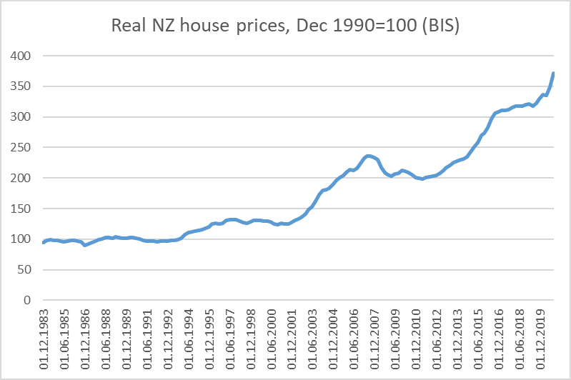
This series ends in December last year, so as of now we can probably think of real New Zealand house prices being four times what they were in December 1990 (I chose the starting point because that quarter was just prior to the 1991 recession getting underway, but you can see that real house prices hadn’t moved much for several years).
These are huge increases in real house prices, some of the very largest (for a whole country) seen anywhere over a comparable period (notably a period in which productivity growth was underwhelming). Were there to be much to the Reserve Bank’s wealth effects story (or its collateral constraints story) at the whole economy level mightn’t one have expected to see consumption as a share of national income rising, savings as a share of national income falling?
Of course there is all sorts of other stuff going on, but this is a really big – unprecedented in New Zealand – change in real (and nominal) house prices. But here is consumption as a share of national disposable income, back to the late 80s, just before house prices began to surge. The data are for March years.
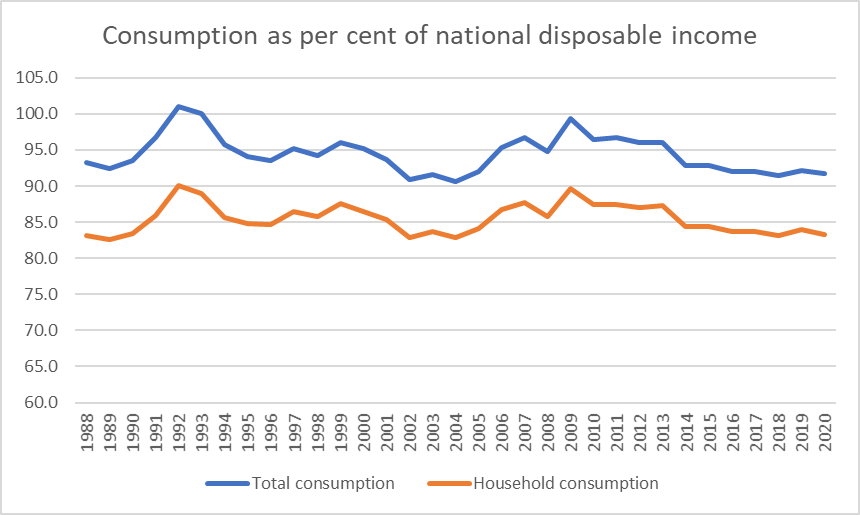
The orange line is private sector (households and non-profits) consumption, while the blue line adds in public (government) consumption spending.
Of course, there are cycles in the series. There are two peaks, during the two big recessions (1991/92 and 2008/09): consumption tends (quite rationally) to be smoother than income. There is quite a dip in the early-mid 2000s, which can readily be shown to line up with the really big surpluses the government was running at the time – the country was earning a lot of income, but the Crown was temporarily sitting on a disproportionate share of that income.
And what of the house price booms. There were three during the period in the data (so not including the last year) – the few years running up to 1996, the period from 2003 to 2007 (particularly the early part of that period), and the period from about 2013 to about 2016. There is nothing in the consumption/savings data over those periods that would surprise someone who didn’t know about the house price surges.
And across the period as a whole, at best consumption has been flat as a share of income over 30 years of unprecedented house price increases. Looked at in the right light perhaps it has even been trending down a bit (private consumption as a share of income was as low in the March 2020 year as it was 16-17 years early when not only was the Crown running huge surpluses but real house prices were much lower.
I’m not suggesting any of this is definitive but when there is (a) no reason to think that New Zealanders as a whole are any wealthier when real house prices rise, and (b) no sign over decades in the macroeconomic data of the sort of effect the Bank likes to talk up, it might be safer to conclude that the effect just isn’t there to any meaningful macroeconomically significant effect.
Of course, as noted earlier there are all sorts of short-term correlations, typically resulting from common third factors at work, but the story the Bank seemed to be trying to tell in that graphic was neither representative of the economy as a whole, nor helpful.
The line I’ve run in this post is not new. In fact, 10 years ago now the Reserve Bank itself published an article in its then Bulletin discussing many of the same issues, and suggesting very similar sorts of conclusions (with, of course, 10 years less data). I was one of the authors of the article but – as was the norm – Bulletin articles carried the imprimatur of the Bank, and were not just disclaimed as the views of the authors.
