Today Queen Elizabeth becomes the longest-reigning British monarch (as others have noted, she became New Zealand’s longest-reigning monarch a couple of years ago).
By 1952 a few places that had been British possessions or protectorates had already become independent (eg India, Pakistan, Israel, Ireland) but the extent of Her Majesty’s territories was still quite astonishingly large. The Conference Board has GDP per capita numbers back to 1950 for a fairly large number of countries. I found useable data for 24 countries (probably fewer than half the total) that in 1952 were either British possessions or (New Zealand, Australia, South Africa, and Canada) were independent but shared the Queen as head of state.
Here is how those countries have grown since 1952. The green bars represent those countries in this sample which have the Queen as head of state today.
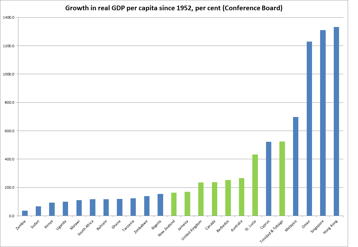
In 1952, on this measure, New Zealand has (just narrowly) the highest GDP per capita of any of the three old dominions. And although the point of this post is mostly whimsical, it is hard to go by without the sad picture of New Zealand’s deep and prolonged relative decline.


The final graph is really interesting.
NZ flat lines roughly from 1972 to 1990, or broadly the period NZ was shut out of the EU, through the Labour and National governments who didn’t address the issues to redirect the economy, 1984 the start of the NZ market deregulation through to the tail end of the NZ sharemarket crash when all the initial reinvestment went into property speculation (Chasecorp etc) rather than sound investments.
The slope prior & since is roughly similar to Australia & Canada. Pretty good empirical evidence that politicians need to stick to orthodox economic policies to keep NZ on track.
LikeLike
Population growth rates in NZ has stayed consistently lower than Canada and Australia.
LikeLike
and….?
I assume you are alluding to my immigration story, but right thru to the late 80s we had much worse micro and macro policies than the other two countries (so every reason to grow more slowly per capita). since then the challenge has been to catch up, which we have totally failed to do. catching up is hard, and lower than average population growth helps achieve it (since 1990 our population growth has been v similar to Aus and Canada’s)
LikeLike
And consistently we have had higher than average exchange rate due to a higher than global average interest rate policy driven by an overly trigger happy RBNZ with a heavy handed upward bias. It is incredulous that the RB is unable to forecast a reasonably accurate 90 day bank bill rate when clearly the key interest determinant is almost a mirror image of the OCR which is a clear indication of the RB having a huge influence on the direction of interest setting in NZ.
LikeLike
That is not correct. Population growth rates from 2005 to 2014 according to World Bank data indicates that NZ population growth rates remain consistently lower than that of Canada and Australia.
http://data.worldbank.org/indicator/SP.POP.TOTL/countries?display=graph
LikeLike
If you overlay population on top of your GDP graphs you would find NZ population growth in comparison to Canada and Australia looks pitiful. No wonder we are falling behind in every economic measure. No domestic demand.
LikeLike