A friend asked me yesterday for the latest GDP per capita numbers for New Zealand and Australia. His interest was a point estimate, to compare current levels in the two countries. I went back to him with the series I would normally consider best for that purpose: the OECD’s measure of current price GDP per capita, converted to a common currency (usually USD) using the estimated purchasing power parity (PPP) exchange rates. Unlike constant price measures, current price measures take full account of changes in the terms of trade – which aren’t things governments can do much about, but which can materially affect living standards in countries like ours (in which the terms of trade are quite variable).
To my surprise, Australian per capita GDP on that measure was only about 22 per cent higher last year than New Zealand’s (= New Zealand’s being 18 per cent below Australia’s). And if one believed that measure, the last few years had been just great for New Zealand (at least relative to Australia). On this measure we’d long been drifting gradually further behind Australia, only to have experienced a startling reversal in the last few years. It was as if that once-upon-a-time goal of catching Australia by 2025 was coming into view, all without actually doing any significant economic policy reforms.

Of course, it was too good to be true. But it prompted me to have a look at a variety of other measures of how the two countries have done since 2007 (just prior to the global recession). I started with national data, calculated in local currencies, and deflated by domestic estimates of changes in prices.
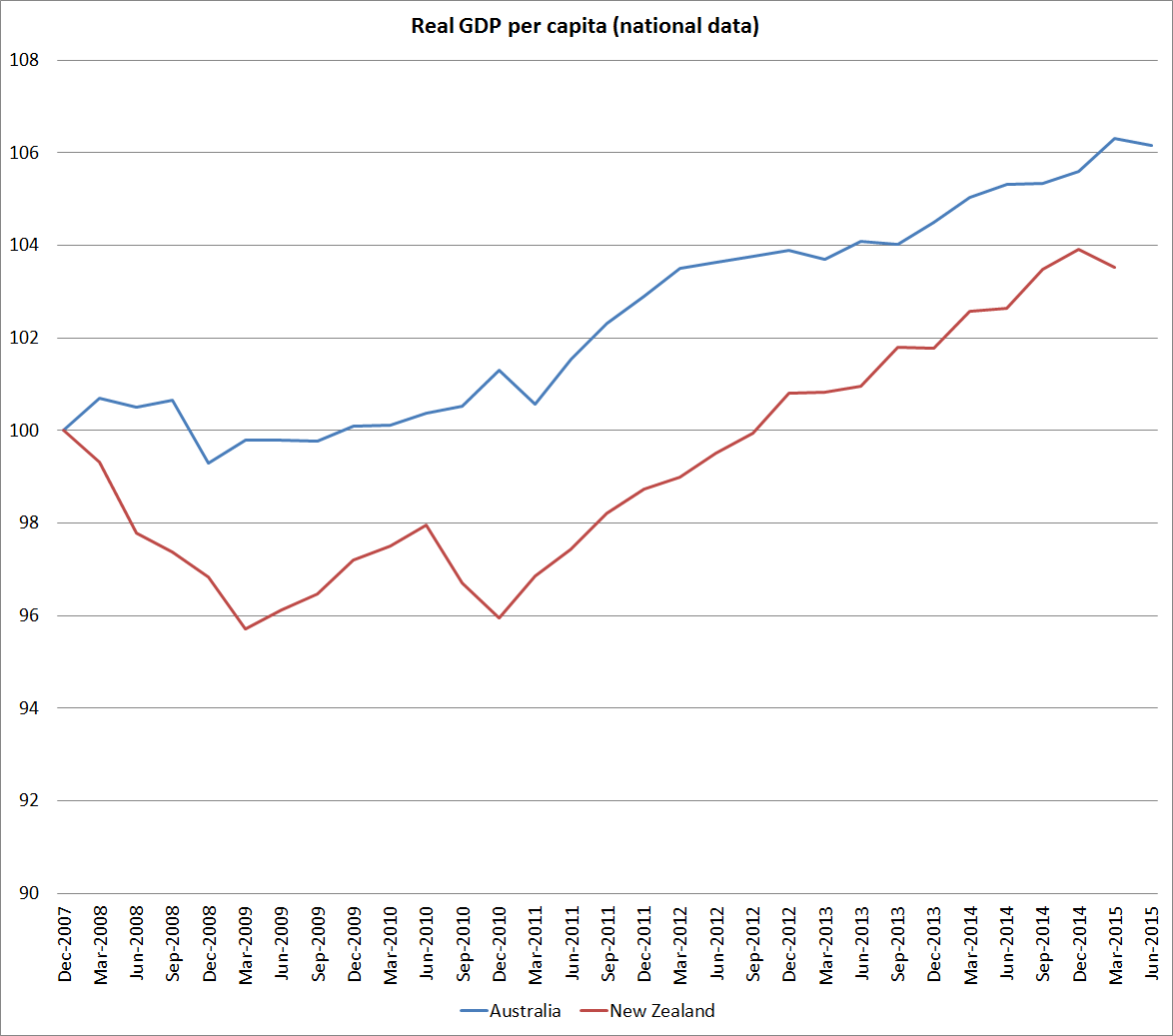
Here is real GDP per capita for the two countries, where we’ve done a little worse than Australia.
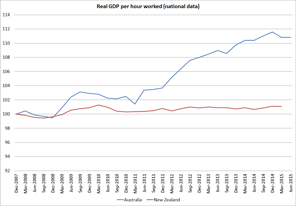
And here is real GDP per hour worked, where the differences are quite extraordinarily large (and not in New Zealand’s favour).
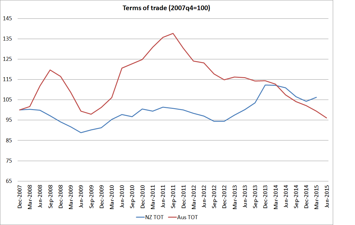
Australia’s terms of trade rocketed up over 2010 and 2011, but have since fallen back very sharply. Over the full period since 2007, we’ve now done a little better than them, and foreign trade is a larger share of our economy that it is of Australia’s.
And here are the two countries’ respective measures of real income, which take account of the effects of the terms of trade. We are now just slightly ahead of them over that full period.

And what about the international databases? The Conference Board has measures of real GDP per capita and real GDP per hour worked, converted to a common currency using PPP exchange rates. They have much the same picture as the national data.
Here is real GDP per capita – we’ve lagged further behind.

And real GDP per hour worked, where again the New Zealand numbers have been very poor.

And the OECD’s real (constant price) measures also show something similar. Here they use 2005 PPP exchange rates.


So none of these national or international measures suggest anything particularly encouraging about New Zealand’s performance in recent years. So far, our terms of trade have held up a bit better than Australia’s, but they are outside our control, and at best all that terms of trade strength has done is offset a lamentable productivity performance. And most observers expect our terms of trade to fall further (as, of course, may Australia’s).
Which brings us back to the OECD’s current price estimates. Here is how we are shown as having done relative to Australia since 2007.
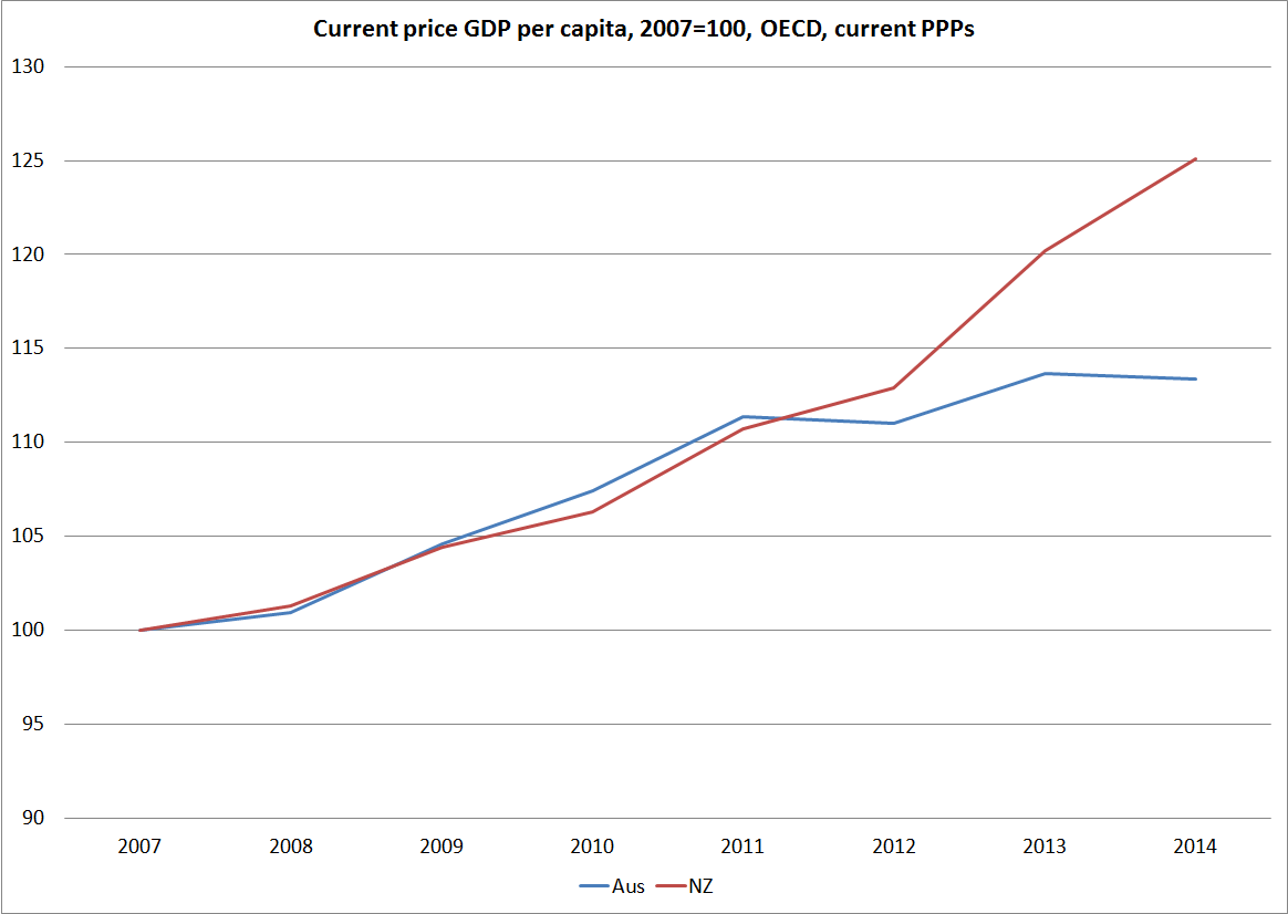
It looks too good to be true, and it is.
The OECD generates these numbers by converting national data into a common currency using estimated PPP exchange rates. PPP exchange rates are, broadly, the exchange rates that would equalise price levels in the respective countries. They can’t be directly observed and have to be estimated. For established advanced countries you would not expect the PPP exchange rates to fluctuate much, and the biggest influence over time will often be any differences in inflation rates. Thus, Australia has a slightly higher inflation target than New Zealand does, and Australia’s inflation rate has averaged a little higher than New Zealand’s over the inflation targeting period. That should have been reflected in a very gradual, quite modest, rise in the NZD/AUD PPP exchange rate.
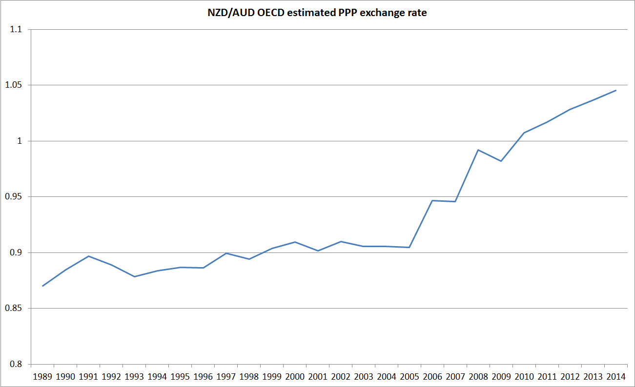
And that is exactly what we saw until 2005. But since then the OECD estimates that the exchange rate that would equalise prices in the two countries has risen by 15 per cent. It simply doesn’t seem plausible – there has been nothing that structural in the two countries that could explain such a change in such a short period of time. I’ve asked the New Zealand desk at the OECD if they have any idea what is going on, but in the meantime I will be steering very clear of the OECD’s current price estimates.
There is no one “right” international comparison of income/GDP levels. But whatever the “true” difference between Australia and New Zealand – perhaps 35-40 per cent – it remains large. On some key measures – notably productivity estimates – it has continued to widen. But then why would we be surprised? If we keep on with much the same policies why would we expect much different outcomes? New Zealand has been one of the least successful Western economies in recent decades – indeed, probably for the last 100 years. As I’ve highlighted previously, since 2007 many European countries have done extremely badly but even in that period, when floating exchange rate commodity exporters haven’t done as badly, we’ve not managed to make any progress in closing the large gap to Australia.
We can do better, and the failure to even start doing so reflects poorly on our political leaders and their senior official advisers, neither of whom seems to have a credible alternative strategy.
