I noticed a piece in the newspaper this morning reporting the latest quarterly welfare benefit numbers, including enthusiastic comments from Anne Tolley, the Minister of Social Development.
The report highlighted that the number of working age benefit recipients had reached the lowest June level since June 2008 – the lowest level in the last couple of decades (even though by June 2008 New Zealand was already two quarters into a recession).
These numbers do look like mildly good news, but need to be kept in context.
First, the Minister encourages us to look at annual changes because “quarterly data was subject to seasonal influences”. So perhaps she could ask MSD to resume the practice of publishing seasonally adjusted data. Other agencies do it.
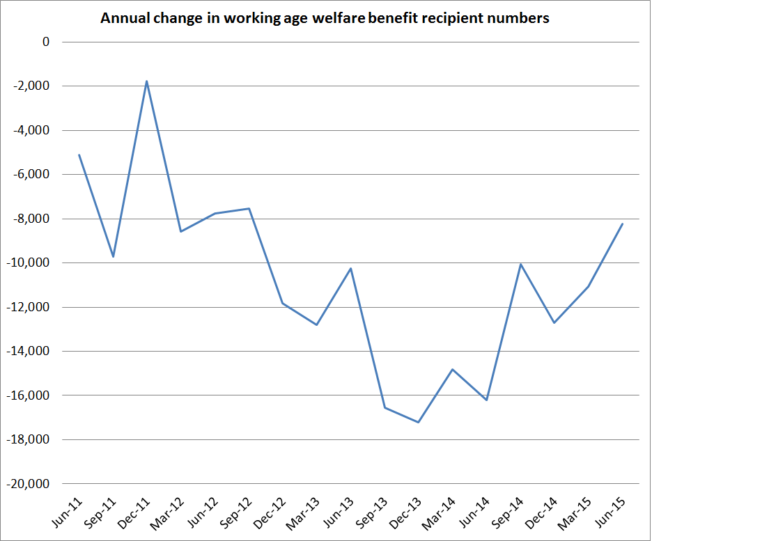
But even focusing on the annual data, these numbers suggest that the best is behind us. Here is a chart of the annual change in the number of working age people on main benefits. At best, a couple of years ago, numbers on benefits were not dropping quite as rapidly as they had been in 2007 (by which time, GDP growth rates were unspectacular). And for the last 18 months or so, the rate of decline in benefit numbers has itself been dropping away. That would be not inconsistent with signs that the unemployment rate has levelled out and, more recently, that the pace of economic growth is slowing. A more robust recovery – not something the Minister of Social Development can do much about – could have made deeper inroads to the beneficiary numbers.
But standing further back, the MSD release notes that 10.3 per cent of the working age population is on one of these main benefits. Repeat slowly: one in ten working age adults is primarily dependent on state welfare benefits for their income. And 74 per cent of those people have been on a main benefit for more than a year.
And how about the ethnicity of recipients. 120000 benefit recipients identified as NZ European and 99000 as Maori. 2013 Census numbers suggests there were just over 300000 people (ages 20-64) self-identifying as Maori. How people self-identify in the Census might be different to how they identify themselves in MSD, but it looks as though almost one in three adult working age Maori are primarily dependent on state welfare benefits. And that in an economy with an unemployment rate of under 6 per cent. It is shameful. I’m not suggesting it is primarily the current government’s fault. But it is not clear how seriously they, or previous governments, take it. Or whether they are really willing to ask hard questions about how this welfare dependence came to be.
Finally, while it is encouraging to see the numbers on working age benefits dropping, and the government has taken some steps that have assisted that process (which is generally dominated by the economic cycle), don’t forget that total welfare benefit numbers are rising each and every year. MSD don’t make it easy to find quarterly data on the numbers receiving New Zealand Superannuation, but they look to be rising by 20000 a year. Working age benefit numbers are now dropping by 8000 a year. That rise in NZS numbers is something that the government could have done something about, by gradually raising the age of eligibility, but has resolutely determined not to do so.
So, yes, there are some mildly encouraging points. But there is, surely, so much more to do. Can any of us be content, longer-term, with a society in which such large proportions of the population rely on state grants for their income?

Hi – I don’t know either where (if anywhere) you can find quarterly numbers on super recipients, but your annual estimate of ~20K a year is pretty close to the numbers in Table 6.2 of the ‘Core Crown Expense Tables’ produced at the Budget. There, for years ending June (I’m pretty sure it’s June not calendar), the numbers are +25K/+26K a year out to June ’19
LikeLike
Thanks. I found some older annual numbers on the MSD site, also in that ballpark.
LikeLike
Hi Michael
I have a bit of a theory that stems from noticing the retirements of baby boomers related to the timing of the onset of lowering demand leading up to the gfc, and also to a certain extent the demographics related to how deep the country involved felt their recession. Eg Japan felt it early and deep, and are struggling to move on.
If that was to show to be the case, then rather than using QE, which seems to just temporarily tilt exchange rates, maybe financial stimulus into pensions would help pick up demand.
Also, should this change have been a key driver for the gfc, then that knowledge could provide key information for planning.
Am I miles off track?
LikeLike
Mark
I think it is highly likely that demographics patterns matter quite a lot. I’m less sure they were a major driver behind the 2008 crisis itself (I’ve written about the specifics of the US, and Spain/Ireland), but as a factor in explaining why real interest rates are so low, and inflation is also so low, I think they are part of the story. Here are a couple of links to research papers from the Bank for International Settlements on related issues http://www.bis.org/publ/work485.pdf, and http://www.bis.org/publ/work318.pdf. I’m not sure raising pensions would materially improve the situation: someone has to pay for them, but perhaps more importantly the powerful role of demography is probably more closely linked to investment patterns (when the total population is flat, or the population is ageing rapidly) there is less demand for new investment (houses, roads, factories, whatever) than when the population is growing rapidly.
LikeLike