I don’t have very much I want to say about yesterday’s Reserve Bank Monetary Policy Statement – although “welcome back from the long holiday” might be in order. Oh, and I noticed a nice photo from my own neighbourhood on page 6 of the pdf.
As so often, I continue to be a bit surprised by the fairly superficial analysis of inflation itself. Thus, they include a chart of various core inflation measures, but all as annual rates. Surely, surely, surely, a central bank Monetary Policy Committee, ostensibly forward looking, would want to be focused as much as possible on the very latest quarterly data. For example, this chart from my own post last month on inflation data.
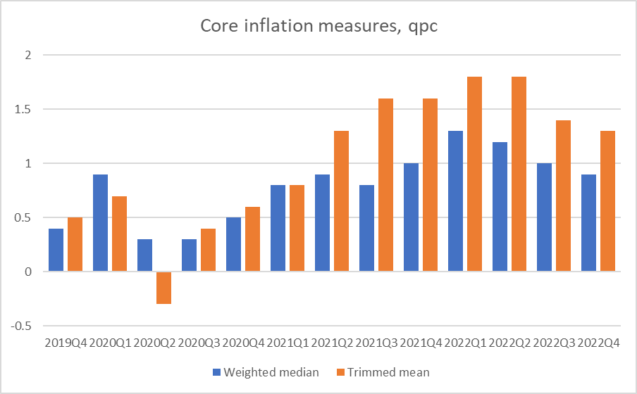
It isn’t impossible that the “true” story is less encouraging than this quarterly series might appear to suggest, but I’d have hoped to hear/see the analysis why or why not from the Bank. As just one example, the data aren’t seasonally adjusted, but the RB is big enough and has enough clout with SNZ that they could either redo the series using seasonally adjusted data or get it done for them (or having looked into it concluded any difference was small enough it didn’t matter). As it is, even if there are some seasonality issues the Q4 numbers for both series were lower than for Q4 in 2021. It looks to be a somewhat encouraging story – still some way to go to get back to annual rates around 2 per cent – but better than it was, better than it might have been.
There is still no sign either – in the MPS or any of the other material the Bank has published in recent months – that the Bank has thought any deeper about what and why they (like many other people) got the inflation (and, thus, monetary policy) story so badly wrong over 2020 to 2022. The Governor was reported this morning as telling MPC that he didn’t think the inflation outcomes represented a “failure”. With hindsight, things might be partly understandable, perhaps even somewhat excusable, but against (a) the targets the government set for the Bank, and (b) the promises of central bankers over recent decades as to what they could deliver, it does not help the advancement of knowledge or understanding (although perhaps it helps MPC members sleep at night) to pretend what has happened has been anything other than a failure. I
I’m not taking a strong view on what the inflation outlook is, or even how much additional monetary policy restraint may (or may not) be needed, but the second point from the MPS that struck me was around their own story and how well it held together.
On their numbers, the output gap was estimated to have been 2.1 per cent of (potential) GDP in the June quarter last year, rising to a new peak of 3.2 per cent in the September quarter. Here are the estimates and forecasts
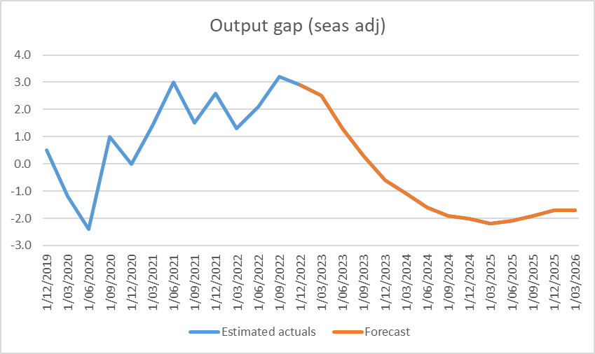
Their forecasts show that they expect the output gap to have averaged 2.7 per cent of (potential) GDP for the Dec and March quarters too. In other words, the period of maximum pressure on resources and of upward pressure on core domestic inflation includes right now (around the middle of the March quarter).
If so, core inflation (quarterly) should have been continuing to rise, something there is no sign of in the data. And a great deal turns on the June quarter, when they expect a sharp fall in the output gap as GDP growth itself turns negative. That is a fairly big call in itself (and of course, actual events will be messed up by post-cyclone repair activity).
But what of inflation? The Bank forecasts that by the December quarter of this year, headline quarterly CPI inflation will be down to only 0.6 per cent. There is some seasonality in the headline CPI numbers, and December inflation tends to be a bit lower as a result. But the difference looks fairly consistently to be only about 0.1 per cent, so that a seasonally adjusted forecast for the December quarter (measured as at mid November, nine months from now) is probably 0.7 per cent. That would be the least bad outcome since 2020, and in annualised terms back inside the target range. (And the December quarter numbers won’t have been thrown around by the end of the petrol excise tax cut or temporary fruit and veg effects of the cyclone). If they deliver that it will be a good, and welcome, outcome. If we apply the eyeballed seasonal factors to their remaining CPI forecasts, by the September quarter of next year, quarterly seasonally adjusted inflation is right back down to 0.5 per cent – slap bang in the middle of the target range.
But I’m left puzzled about two things. The first is that the Bank usually tells us that monetary policy takes 12-24 months to have its full effects on inflation. If so, then why on their story do we need further OCR increases from here when inflation 18 months hence is already back at target midpoint. And then, given that inflation is at the target midpoint 18 months from now, why is policy projected to be set in ways that deliver deeply negative output gaps (not narrowing rapidly at all) all the way out to March 2026? Perhaps there is a good and coherent story, but I can’t see what it is (and I don’t see it articulated in the document). Entrenched inflation expectations can’t really be the story, because as the Bank has often noticed medium to long term expectations have stayed reasonably subdued and shorter term surveys of inflation always tend to move a lot with headline inflation which is expected to be rapidly falling by this time next year.
(My own story would probably put more emphasis on the unemployment rate as an indicator of resource pressures. On the Bank’s (and SNZ”s) numbers, the unemployment rate troughed a year ago.)
The final aspect of the MPS I wanted to comment on was the brief section (4 pages from p30) on “The international dimension of non-tradables inflation”. It is good that they are attempting to include some background analysis in the document, although sometimes one can’t help thinking it might better have been put out first in an Analytical Note where all the i’s could dotted and t’s crossed, and the argumentation tested. We might reasonably wonder what the non-expert members of the MPC make of chapters like this, which they nonetheless own.
The centrepiece of the discussion is this chart, which looks quite eye-catching.
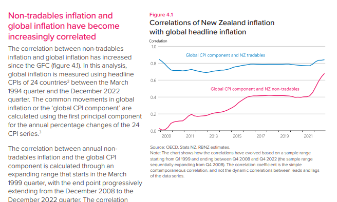
Count me a bit sceptical for three reasons. The first is that I am wary of a picture that starts at the absolute depth of a severe recession and would be interested to know what it would have looked like taken back another three or five years. Perhaps they didn’t do so because the treatment of housing changed (very materially) in 1999, when the dataset they used starts from, but one is left wondering. Second, end-point revisions are a significant issue with the techniques used to derive the global CPI component, and might be particularly so over the last year when headline inflation has been thrown around so differentially depending on (a) exposure to European wholesale gas prices and mitigating government measures. And then there is the question of the countries in the sample. Of the 24, 12 are part of the euro-area (or in Denmark’s case, tightly pegged to the euro) for which there is a single monetary policy. For these purposes, it is like using as half your sample individual US states or Japanese prefectures. I don’t understand why they chose those countries, or why (for example) Hungary is in but the Czech Republic and Poland (all with their own monetary policies) are out. Or why you’d include Luxumbourg – which has the euro as its currency – and not (similar-sized) Iceland with its own monetary policy. And since this is just using headline CPI inflation data why you’d use only these countries anyway and not a range of non-OECD countries with market economies and their own monetary policies. Perhaps it would make little difference, but we don’t know, and the Bank makes no effort to tell us or to explain their choices.
Now, to be honest, if you had asked me before seeing this section I would probably have said ‘yes, well given that a whole bunch of advanced economy central banks made similar mistakes I might expect to see a stronger than usual correlation between New Zealand non-tradables inflation and some sense of “advanced world core inflation”. And thus I wasn’t overly surprised by the right hand side of the chart above.
The Bank attempts to address that question, summarised in this chart, using the same period and same 24 countries as in the earlier one.
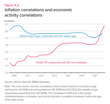
But count me a little sceptical. Almost every OECD country – including their 24 (with all the same issues around selection of countries) – had unemployment rates late last year at or very close to cyclical lows. As New Zealand did as well. But whereas the Reserve Bank estimates our output gap late last year was +2.7 per cent of potential GDP (and, by deduction, the Bank must be using their own estimate in this calculation) OECD output gap estimates have 12 of the Bank’s 24 countries running negative output gaps last year (they don’t even think New Zealand’s output gap was positive last year, despite abundant evidence of resource stresses here). Given the choice between fairly hard unemployment rate indicators and output gap estimates which are notorous for revisions, personally I’d be putting a lot more weight on the labour market indicators where (as the Governor himself has emphasised in the past) all his peers say they have the same issue of “labour shortages”. (The OECD no longer publishes “unemployment gap” estimates but they do publish “employment gap” estimates, and of the Bank’s 24 countries only a handful had (small) estimated negative employment gaps in 2022).
They end the special section with a paragraph “What does this mean for monetary policy?”. I didn’t find their story persuasive – that it would mean monetary policy was harder – but given how little confidence we can have in the charts, it isn’t worth spending more time on that discussion.
