Quite a bit later than almost all other advanced countries we finally got an update on December quarter inflation yesterday. Even then, our quarterly CPI is mostly a measure of the change from mid-August to mid-November, while almost all other OECD countries have data for the month of December.
From the government we heard more of the same old spin, about how low New Zealand’s inflation is relative to that in other countries. At a headline CPI level there is, of course, some truth to that, but (a) we have an independent (of other countries) monetary policy to ensure that we can control our own inflation rate, and (b) New Zealand, mercifully, has not faced the gas price shock most of the European countries have. I presume not even the government is claiming credit for that – it is almost entirely just good luck, a rare advantage of our extreme remoteness.
For international comparisons across a wide range of countries that focus on the inflation central banks and governments can sensibly be held accountable for, really the only available data are for the respective CPIs ex food and energy. It isn’t a perfect measure by any means – and differences in the ways countries put together their CPIs, notably the treatment of housing, also matter – but it is what we have. Here are the latest annual CPI ex food and energy inflation rates for the OECD countries (euro-area shown as a single number, reflecting the single monetary policy). (The OECD has not yet updated their table for yesterday’s Australian CPI, so I use here the very similar RBA series CPI ex volatile items (ie fruit and vegetables and motor fuel).
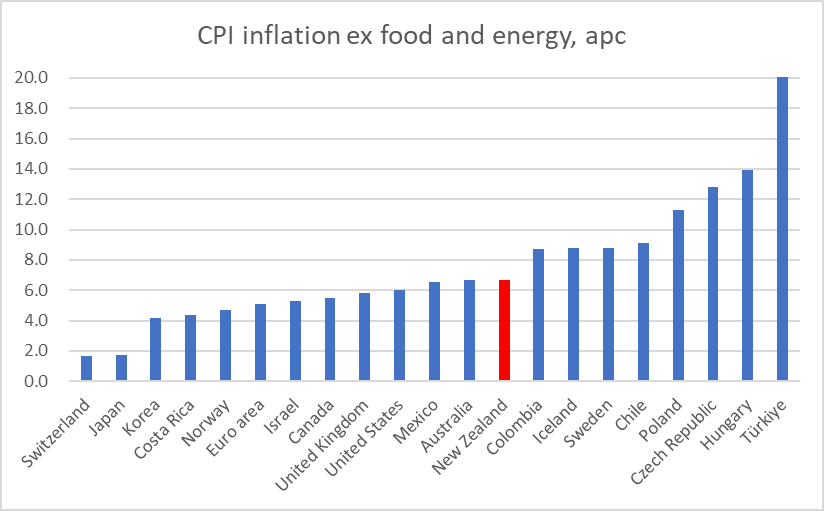
New Zealand and Australia are both at 6.7 per cent, just a touch above the median country. But note that if there are countries that have done worse than us, all the main advanced countries or country groupings (Japan, euro-area, Canada, UK, US – something close to the G7) are now less bad. Most haven’t done very well – 5 per cent core inflation is nothing to be complacent about or comfortable with – but less bad than us, or more specifically our central bank.
On a quarterly basis, the New Zealand exclusion measures of core inflation also don’t look particularly good – the latest annualised rates are around 8 per cent.
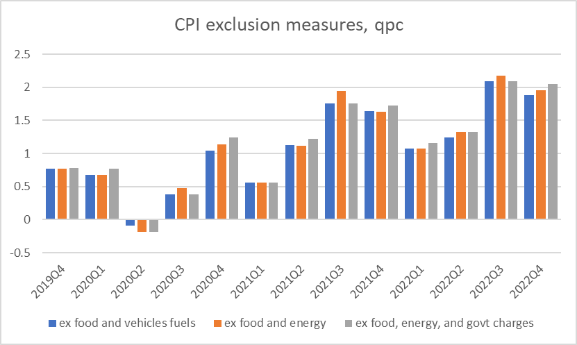
Once one gets away from international comparisons, it is often better to focus on the so-called analytical measures of core inflation. In New Zealand’s case these still aren’t ideal as (unlike the ABS) SNZ does not report these on a seasonally adjusted basis, but eyeballing the series seasonality does not appear to be particularly strong.
These measures either exclude or de-emphasise particularly large price changes and try to get to something more like a central tendency (the Reserve Bank’s sectoral core inflation series also aims to do something like this, but it uses annual data only and is prone to big revisions when the inflation rate is moving around a lot).
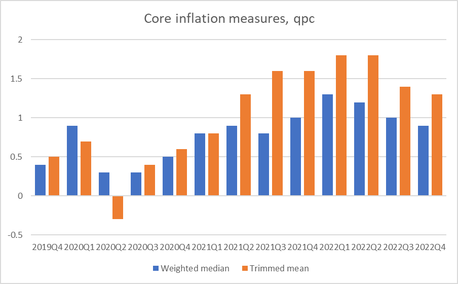
This chart seems to me the most favourable story one can currently tell about New Zealand inflation. There is an unusually large gap between the rates of increase in the two series – which should be a little troubling – but both series suggest that the peak has passed, that quarterly inflation was at its worst in perhaps the March quarter of last year (by when the OCR was still below pre-Covid levels). Given that the unemployment rate stayed at/near record lows all last year – and on all forecasts is expected to increase from here – one could take a reasonable amount of comfort from this chart. (Core) inflation should never have been allowed to get away – that it was is a generational failure by the new MPC – and is still, in annualised terms, a long way from 2 per cent, but things seem to be heading in the right direction.
One of the wild cards in the entire story is the price of air travel, and particularly international air travel (the latter currently 83 per cent more expensive than just prior to Covid)
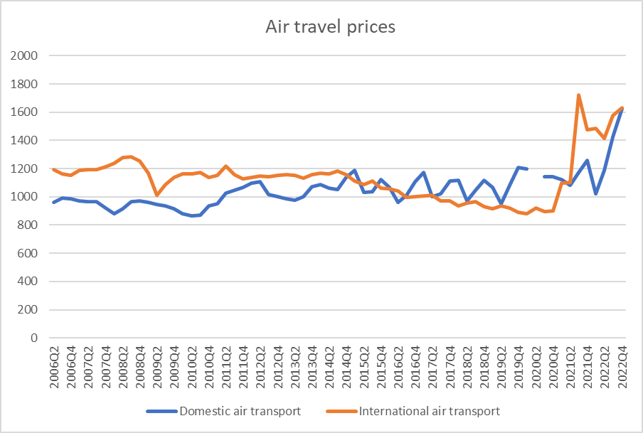
You would have to suppose that in time (real) prices will fall back, and it is in some sense a Covid phenomenon. On the other hand, it is also a classic case at present where excess demand (relative to available capacity) is an issue, and excess demand often shows up more in some places than others (a few quarters back it was domestic construction costs that were increasing at annualised rates of around 20 per cent). High air travel prices aren’t now a direct consequence of current government interventions – and the New Zealand government is actually still in the last few months of subsidising international air freight capacity, having kept air travel capacity higher than otherwise. But you wouldn’t want central bankers aggressively targeting a measure that currently gives a significant weight to air transport prices.
For now, things look to be moving in the right direction in New Zealand. They would need to be, after such a signal policy failure. The forward indicators are for much weaker economic growth quite soon which, all else equal, will continue to pull the inflation rate back towards target – although the question forecasters will need to grapple with is “how rapidly?”. The coming suite of labour market data will be the next piece in the New Zealand puzzle.
Whether or not things are yet on track in New Zealand, this is one of those times when one would much rather be sitting in the New Zealand central bank than at the RBA. Here are the analytical measures of quarterly core inflation for Australia
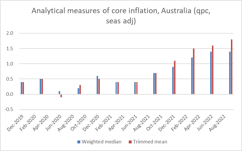
Not only are they now higher than those for New Zealand, but there is no sign they have necessarily yet peaked. It is perhaps not too surprising when the RBA was so late to start raising the policy rate – against a very similar Covid and economic backdrop to New Zealand (and a stronger terms of trade).
