A couple of months ago I wrote a post about the work former Reserve Bank researcher Leo Krippner had been doing – over much of the last decade – on trying to reduce all the influences on the government bond yield curve to a single number, to represent the effects not just of changes in the OCR (or similar rates in other countries) but also what are loosely called ‘unconventional policies’ undertake in the presence of the (actual or effective) lower bound on the OCR itself, whether central bank jawboning or, for example, asset purchase programmes.
As I noted then
This work wasn’t very relevant to New Zealand itself for a long time (there were internal sceptics as to whether it should even be done)….and yet now it is. (In his speech a couple of weeks ago the Governor even suggested the Bank might publish a semi-official series of such a measure.) Leo’s work has been recognised in various places abroad – cited in public by at least one Fed Reserve president, and honoured by the house journal of the central banking community, Central Banking magazine .., Leo left the Reserve Bank last year, but is continuing to update his work and earlier this week circulated a note with a Shadow Short Rate series for New Zealand, now that we operate with a formal OCR floor (and ceiling) and in the presence of the MPC’s commitment to buy $30 billion of government bonds over the coming year.
The size of the LSAP programme has been increased substantially since then.
Still more recently, Leo has updated his models for the other advanced economies he looks at, in a way that enables us to look at consistent estimates of the extent of monetary easing across eight advanced economies/areas.
Here is Leo’s estimate of the extent of the overall easing, as reflected in the Shadow Short Rate estimates for each country, since the end of last year (to the end of May).
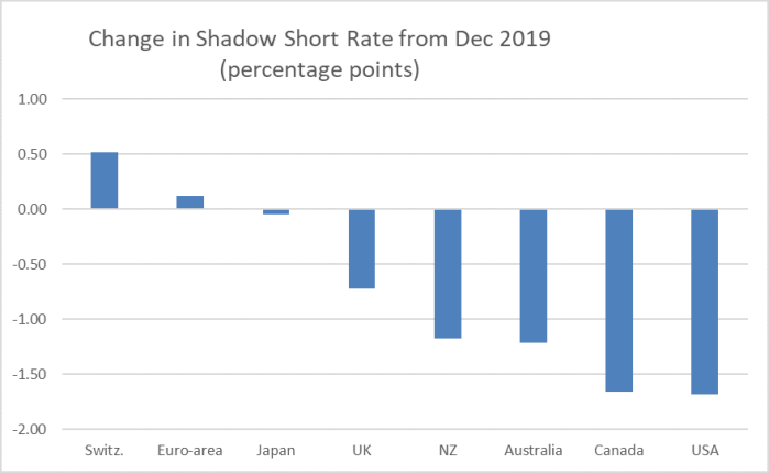
Perhaps three things stand out from this chart:
- little or no effective easing in the countries/monetary areas where the official short-term rate was already negative. Perhaps central bank interventions were relevant in other markets, perhaps for a time they stopped government bond rates rising much, but on this metric, no effective easing relative to the position just a few months back.
- the largest easing has been in the United States and Canada. That is no surprise: official short-term rates late last year were quite a bit higher in the US and Canada than anywhere else in this group of advanced economies,
- Leo’s estimate of the New Zealand SSR suggests an easing equivalent to 117 basis points. Recall that the OCR itself was cut by 75 basis points and so, if one accepts this as a good estimate for how much some mix of the LSAP programme and forward guidance is doing, all the rest is not thought to be worth more than about 40 basis points. Not exactly consistent with the tone of the continued rhetoric from the Governor, who repeatedly insists – he was at again on CNN yesterday (whoever runs their Twitter account seemed breathlessly excited that the Governor was on CNN) – how much difference his MPC’s LSAP programme is making.
Leo has taken his estimates of the SSRs all the way back to the 1990s (the more yield curve information the better for trying to distill what is normal and what is not). So out of interest I had a look at what happened in the previous severe recession.
When the recession of 2008/09 started all these countries except Japan had official policy rates clearly above zero. In those circumstances, the SSR is much the same as the official rate.
In this chart, I’ve shown the median SSRs for (a) the big 4 central banks in the sample (US, euro-area, UK, Japan) and (b) all eight central banks from mid-2007 to the end of 2014.
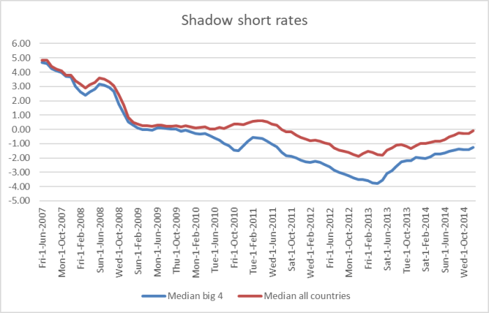
On these measures, monetary policy kept easing (on the whole) until well into 2013 – in some cases by official rate cuts, in some by QE measures, in some cases by forward guidance (or perhaps just growing doubts in markets about when official rates might ever need to rise).
In this chart, I’ve shown the fall in the estimated SSRs for each country from mid-2007 (about the peak in rates, including in New Zealand) to (a) mid-2009, and (b) to the lowest point in the period in the chart.
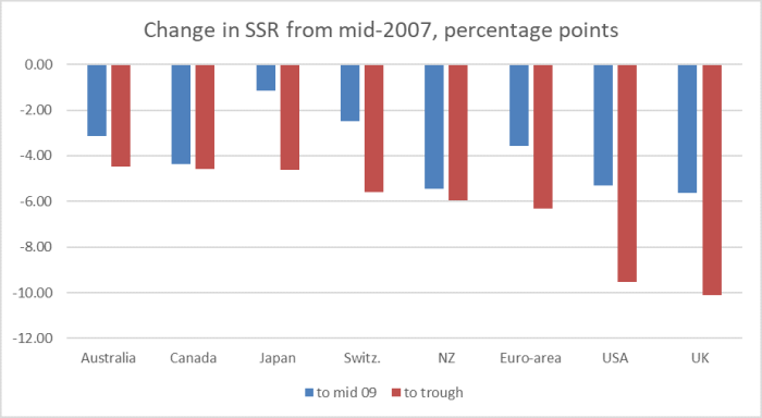
One almost needs a different scale to compare these estimates with those for the – more savage – economic downturn we are now in the midst of (see first chart).
And bear in the mind that in both episodes inflation expectations have fallen quite a lot in many most of these countries. Adjust for that and the differences in the falls in the real (inflation-adjusted) SSRs would be even more stark.
Now it is certainly true that back in 2013 (say) longer-term government bond yields were still quite a bit higher than they are now (in the US, for example, 10 year rates in mid 2013 were about 2 per cent). But then estimates of neutral rates have also fallen over that period.
I’m not entirely convinced by the SSR approach. I set out some of the reasons in my earlier post, and in exchanging notes with Leo I don’t think he would disagree with any of those individual points. Perhaps the simplest to explain point is one Leo himself included in his paper releasing the New Zealand results: the SSR is not a rate that can be transacted (unlike an OCR), and in New Zealand longer-term interest rates don’t tend to directly affect many borrowers other than the government itself (and monetary policy isn’t supposed to be about shaping the government’s behaviour – it is a market mechanism, designed to change relative prices facing private sector firms and households). I’m also a little uneasy about the fact that the Reserve Bank’s LSAP is explicitly targeting mainly long-term interest rates – which, among other things, is impairing what information might be in those rates, which relate to periods well beyond the current crisis – while, say, the Australian and US asset purchase programmes are (sensibly) targeted at the shorter end of the bond yield curve (horizons relevant to this recession, and in a sense trying to mimic what a lower policy rate itself will tend to bring about directly if those central banks were willing to cut their policy rates further).
There is also the point I noted in my earlier post that for New Zealand Leo treats the effective floor on the OCR as being 0.25 per cent. But since that last post, the Governor has explicitly reiterated that it is a temporary floor only – now only 9 months until the commitment expires – as he did again yesterday in his CNN interview. Leo advises that if the effective floor were set a bit lower, the SSR estimate itself would be closer to the OCR. In other words, the extent of the fall in the New Zealand SSR may actually be skewed higher than is really warranted.
If I have my doubts about the indicator, it is still of some value in providing summary estimates across both time and country, it is the sort of methodology the Bank has in the past expressed enthusiasm for (without tying itself to specific numbers), his approach has received approbation from his peers in yield curve modelling etc, and Leo’s estimates are made available, including on his website. And they leave us with the twin points that:
- the extent of monetary policy easing in New Zealand this time is little more than that of the cut in the OCR itself,
- the extent of the falls in the SSRs in all countries (even Japan) is much less than we saw in the period of the last serious recession.
It is fine for central bankers to talk – as the Governor does – of fiscal policy carrying the main load at present but
a) there was significant fiscal support provided in all these economies (including New Zealand) in the last episode as well,
b) fiscal policy operates coercively (relying wholly on the sovereign power to tax) and for many purposes – other, say, than basic income support – is inferior to monetary policy for stabilisation and recovery purposes,
c) in most if not all these countries recovery after 2008/09 – best proxied probably by a return to normal of unemployment rates – took (a) far longer than was expected then, and (b) far longer than most are still envisaging for a recovery now from this more severe downturn, and
d) fiscal policy has its limits (quite probably close to being reached, and more “political” than technical), in a way that monetary policy properly run – ie not imposing an artificial floor on policy rates – does not. It is all the odder that central banks like ours (with the acquiescence of excessively conservative politicians) are acting so starkly to hold up interest rates at time when very weak investment demand and a high precautionary savings demand would almost certainly deliver short-term market-clearing interest rates that are deeply negative (and while “market-clearing” might seem bloodless to you, what it means in practice is clearing the labour market and supporting a prompt return to full employment).

I cannot understand this unquestionable loyalty to Mon Pol. It is very clear to every man and dog on the street that there is already an abundance of cheap liquidity in the market and bank interest rates are already low enough to encourage other more higher risk investments. We do not need negative interest rates. The latest capital raising of $230 million by Skycity casino was fully subscribed both in NZ and in Australia. This is in the face of its casinos in Auckland, Hamilton and Adelaide still half opened or not open at all. The other listed companies like Kathmandu and Vista also were fully subscribed even during lockdown.
The new direct retail investment platforms such as Shareshies and Investnow has now $1 billion in retail investments with almost 200,000 investors
LikeLike