Every three months or so the hard copy Herald comes with a hefty supplement, the OneRoof Property Report. Yesterday was the latest such supplement. I skip straight to the detailed tables at the back which report, at suburb and district council level, the numbers from the OneRoof-Valocity House Value Index. It is a measure of average (not median) prices, draws on “a range of sources, including settled sales data” and is described as “based on a composite of statistical models and are fully stratified”. The numbers are up to the end of October.
What caught my eye when flicking through the tables was that they had not just percentage changes for the most recent quarter and year, but also enabled comparisons to pre-Covid levels and to the Covid-era peaks.
First, a reminder of that extraordinary period (mostly in late 2020 and 2021) when house prices rose sharply almost everywhere. Since I was having to do all these percentage changes manually I mostly only did the larger population places.
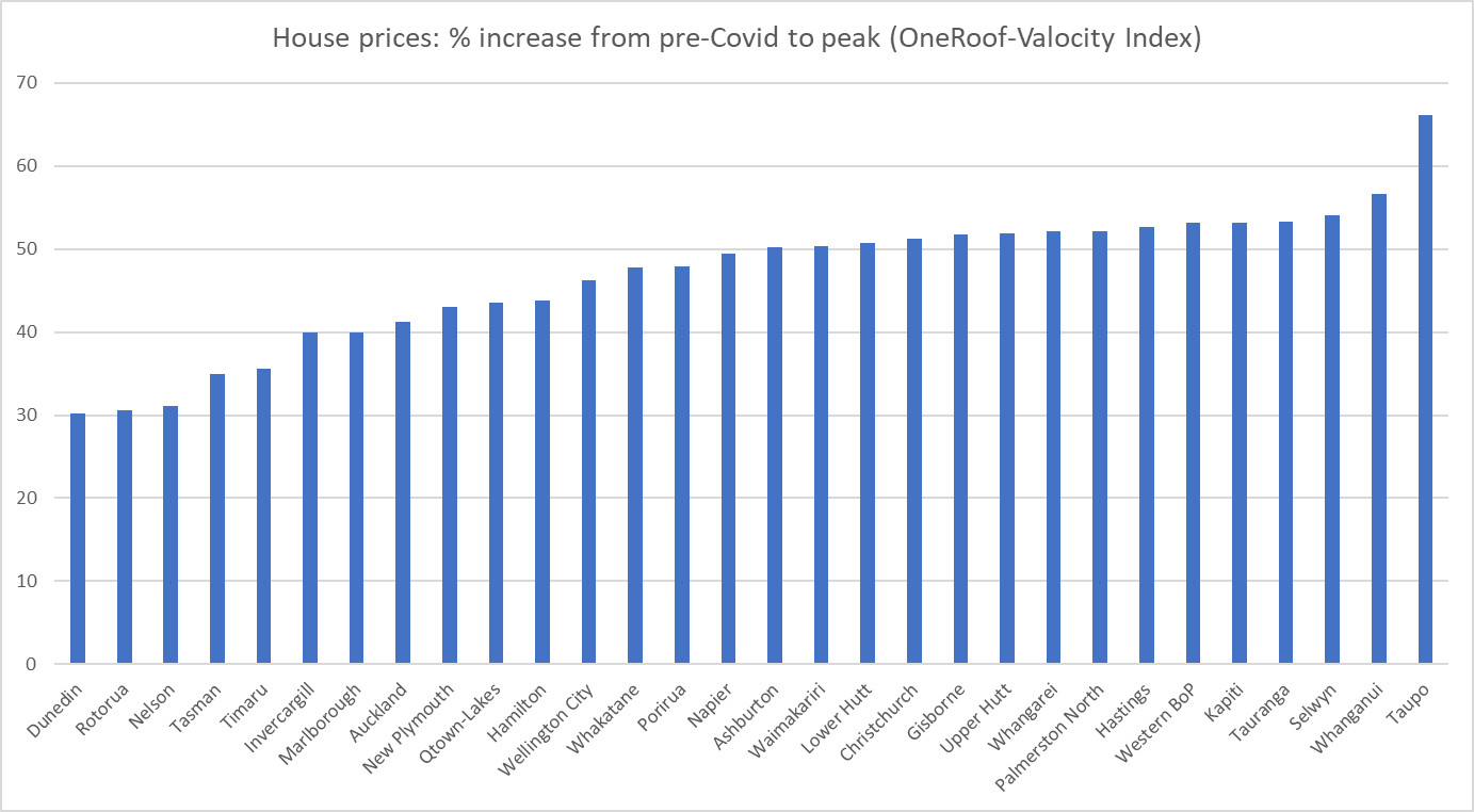
They really were staggering changes. There are a few surprises – I’m at a loss to know why the increase in average prices was materially larger in Taupo than anywhere else – but it is probably more striking just how consistently huge the price increases were, between 40 and 55 per cent, often in little more than a year.
Prices have generally fallen back from those peaks (except in Timaru where the latest observation is also the peak).
But what I was more interested in was where prices were now in real (inflation-adjusted) terms relative to those just prior to Covid. That’s this chart (with the Wellington districts highlighted in red, the Christchurch ones in green, and the mega-region Auckland shown in yellow).
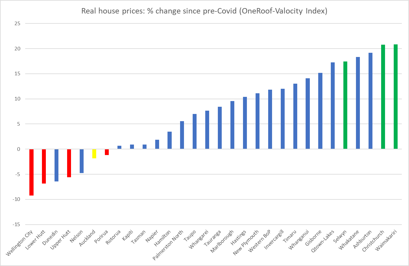
There are really big differences across towns and cities in just a (bit under) four-year period, and no particular bunching around some typical rate of increase (decrease), even bearing in mind that a third of the population is in Auckland.
The dominant story of the 2020/21 increase in house prices seemed to be the toxic combination of extremely low interest rates in a fully-employed and overheating economy in the presence of supply constraints on bringing new residential land and houses to market (all despite an unexpected negative population shock). That story makes a lot of sense, including in the contrast to the 2008/09 recession when much larger cuts in interest rates went hand in hand with lower nominal house prices (there were big negative output and unemployment gaps opening up then).
But as we emerge through the other side of the entire Covid period, it is less clear what explains the divergent pattern of real house price changes over the full period. A non-trivial part of any story about the overall market must be interest rates – the OCR was 1 per cent just prior to Covid and is 5.5 per cent now (with implications for all the retail rates) – but we have an integrated financial market and thus the same interest rates (and tax rates for that matter) in Wellington as in Christchurch.
Supporters of the incoming government might note that Wellington house prices have fallen most in real terms and point out that the prospects of reduced public service numbers might be playing a part. Except that over most of four years public service numbers were rising, often quite strongly, and over the latest three months, when a victory for a National-led government came to seem much more certain, Wellington house prices haven’t done anything materially different than those in Auckland (both up a couple of per cent).
Models which emphasise the importance of supply constraints, land-use restrictions etc (models I champion) suggest that for any given state of economic activity and resource pressure, one should expect to see more responsiveness of house prices to interest rate changes the more binding the supply constraints are. It is an appealing story for Wellington (especially Wellington city) – interest rates have risen a long way- but whether it is really the main explanation would take much more systematic analysis (including trying to take account of the bipartisan limited land use reform legislative change in 2021, and expectations that a new government will alter those measures). But it is hardly as if Christchurch is some paragon of liberal land use.
Perhaps too there is some convergence at work. After all, even now Christchurch house prices are far below those in Auckland, and non-trivially lower than those in Wellington, and people are potentially mobile within New Zealand, especially when the labour market is buoyant.
I don’t purport to have a fully convincing story. The point of the post was mostly just to put the chart out there. And to note that despite the large and rapid increase in interest rates (nominal, but increasingly real too, going by any plausible measure of inflation expectations) real house prices in most of the country are at best basically unchanged from the end of 2019 (in Auckland’s case) or are materially higher than they were then.
