The grim events of the last couple of weeks, and a note from a reader last week about a short post I’d written several years ago comparing the economic performance of Israel and New Zealand, prompted me to take another look at the data.
This was the chart from the earlier (2018) post
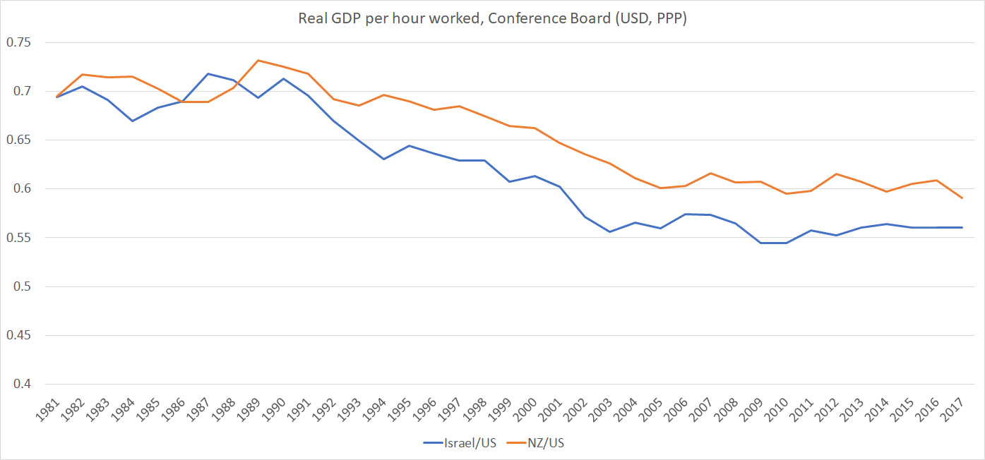
As I summed it up then “We’ve done badly, and they’ve done even worse”.
Given the inevitable margins for error, especially in estimating PPP conversion rates, the main story was just that neither country had done very well relative to other advanced economies.
How do things look now? I’ve shifted over to using OECD data (for a number of reasons, including that the Conference Board estimates now only start from 1990 for both countries).
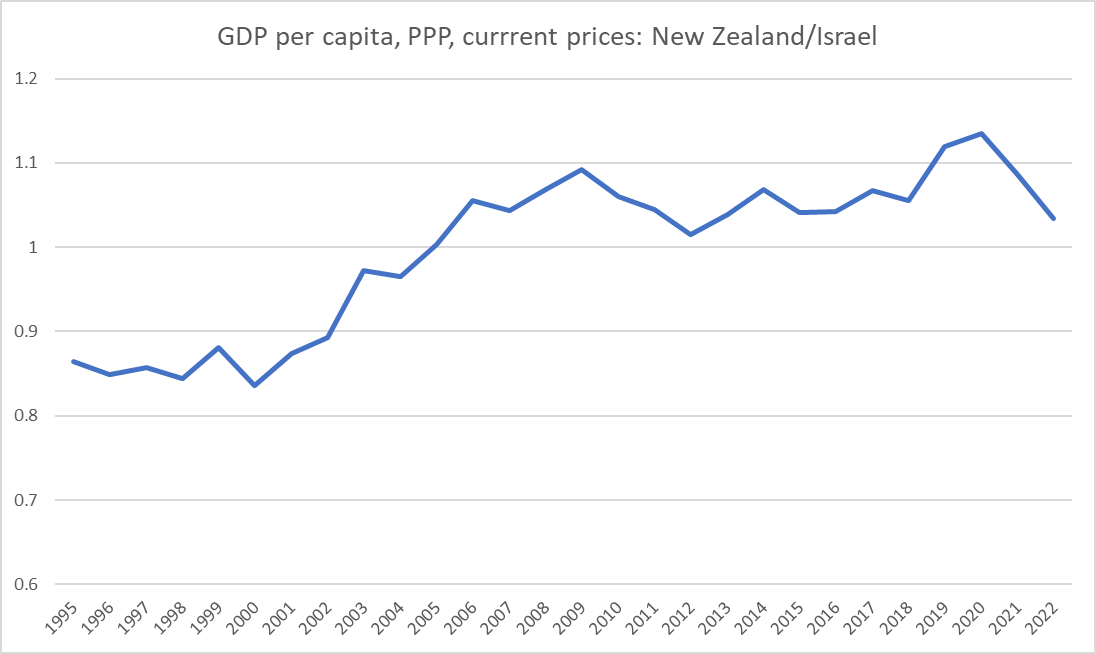
This chart shows the ratio of New Zealand’s real GDP per hour worked to that of Israel (both series also converted at PPP exchange rates).

The last few years seem to have been quite good for Israel’s productivity growth, but I wouldn’t put too much weight on it yet. Not only has this ratio fluctuated over the years with no clear trend, but the biggest single lift in Israel’s reported productivity was for 2020 – the year of the lockdowns, when many countries saw a rise in measured average productivity (as eg low-paying low-productivity tourist jobs were lost) – and more recently many countries (including New Zealand) have seen a reversion to trend. (And it seems unlikely that the final quarter of 2023 is going to be a stellar one for Israeli average productivity.)
The wider story remains one in which both New Zealand and Israel are productivity laggards. In this chart, again using OECD data, I’ve shown the average for New Zealand and Israel relative to eight leading (on productivity) OECD economies (Belgium, Denmark, France, Germany, Netherlands, Sweden, Switzerland and the US).

It would take a 60 per cent lift for New Zealand and Israel to match the average of those eight leading economies. Neither New Zealand nor Israel is a high-performing economy.
As for GDP per capita comparisons, depending on which data source one turns to the time series charts look a little different, but all three (OECD, IMF, and Conference Board) suggest that GDP per capita in the two countries is much the same. Here is a chart of the OECD data
Historically – and now – the two countries have had very similar rates of investment as a share of GDP, but increasingly divergent national savings rate patterns

The difference is reflected in quite different current account outcomes (Israel’s last current account deficit was in 2001).
But if Israel never seems to manage a better economic performance than laggard New Zealand for long, by regional standards it remains the stellar performer.
For real GDP per hour worked, here are the Conference Board estimates for Israel and (a) its immediate neighbours, and (b) its nemesis, Iran

And here are the IMF estimates for real GDP per capita for the same group of countries, plus an estimate for West Bank and Gaza. (The IMF doesn’t have a current estimate for Syria so I’ve used the ratio of Syria to Lebanon in the Conference Board database. Before the civil war, Syria was still materially less productive than either Lebanon or Jordan).
The economic performance gaps here are materially larger than those (above) for productivity.

(In case anyone is wondering about the oil and gas rich countries of the Arabian Peninsula, the Conference Board productivity estimates for those countries, they are mostly around the current estimates for Israel (and for New Zealand).
Israel is the star economic performer in its sub-region, but that can’t be any cause of complacency given how far behind it lags the leading advanced economies.
And in the longer run, much as I champion and support Israel including as the only functioning democracy in its part of the world, I struggle to be optimistic about its long-term prospects. This was from my 2018 post.

Israel has not lost any of the wars it has fought. But it has to keep doing so indefinitely.
