Over the life of this blog there have been a few charts I’ve kept coming back to. There have been some of the obvious ones, for example around the persistent underperformance of the New Zealand economy on labour productivity. It takes a while for a fairly annual data to turn up on the OECD database, but here are the near-complete 2024 estimates.
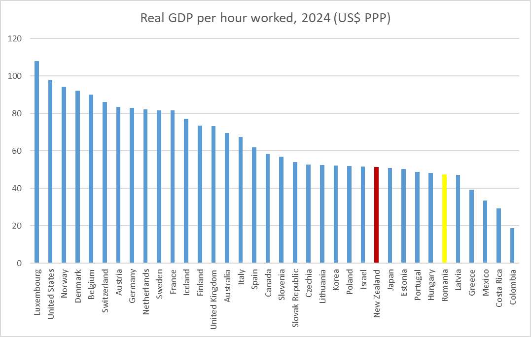
Just two observations on that chart:
First, it would take a 74 per cent increase in average labour productivity in New Zealand to match the average across Denmark, Belgium, and Switzerland (3 small European countries, not heavily reliant on nature’s bounty – unlike, notably, Norway). That margin – the steep hill we have to climb – has slightly increased in the last decade.
Second, Romania isn’t in the OECD but back in 2017 I wrote a long post about Romania and suggested then that if the relative performance of productivity growth in the two countries over the previous decade continued in another 20 years they’d have caught us (the backdrop of course being the absolute mayhem left at the end of the Ceaucescu regime). On present trends now (last decade’s performance), Romania is likely to pass us in perhaps another five years.
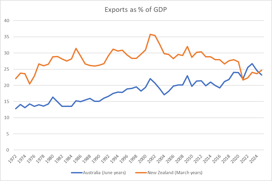
Then there were the foreign trade charts I updated in a post last week.
In a somewhat related vein, every so often I’ve run a chart (first devised for New Zealand by the IMF) that is a rough and ready indicator of the split between the tradables and non-tradables parts of our economy (tradables here being the primary and manufacturing sector, together with exports of services).
This is the latest version
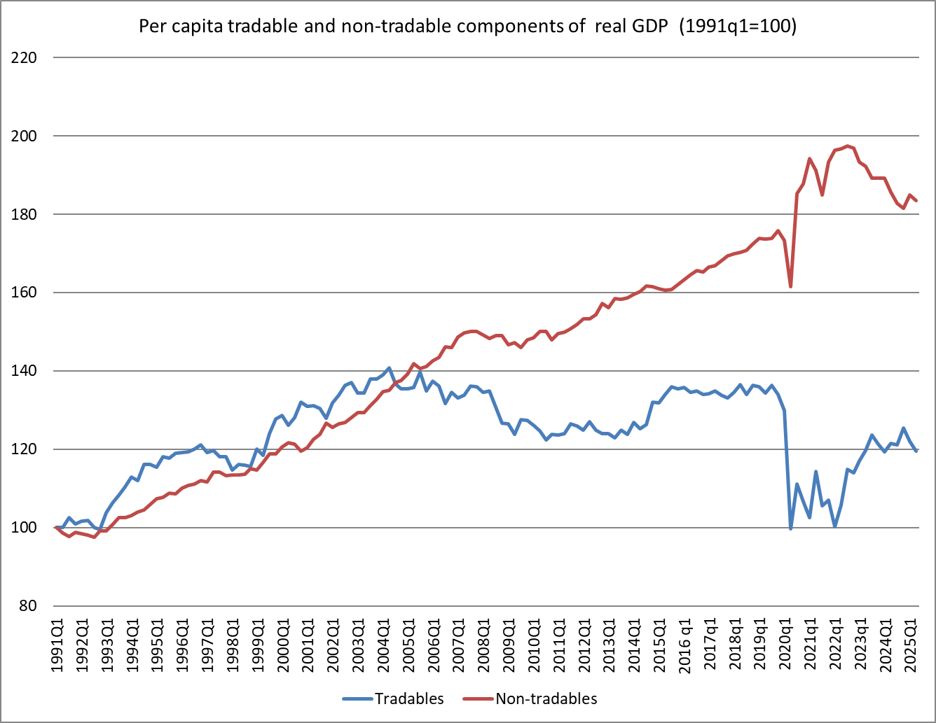
The dismal nature of the picture (and economy) is captured in that blue line. Not only has the pre-Covid level not been regained, but the per capita size of the tradables sector of our economy is way smaller than it was 20 years ago. Meanwhile, the non-tradables sector, after a Covid and overheated domestic economy interruption, seems to keep tracking upwards. It isn’t a sign of a healthy economy.
And finally in this brief update post, what about wages? Every so often I’ve included this chart.
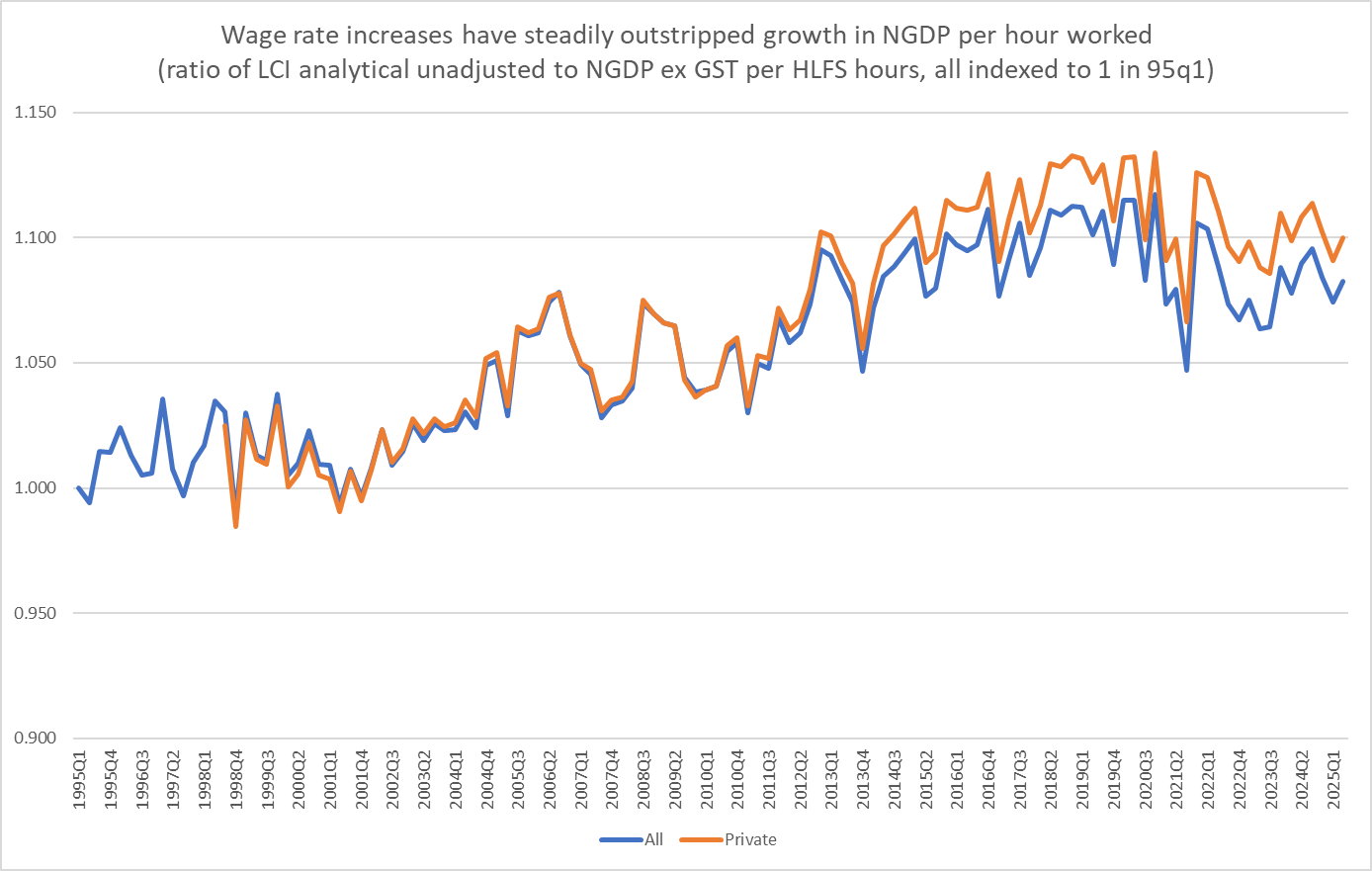
People don’t seem to find it very intuitive, but when the lines are going up wage rates (captured by the LCI analytical unadjusted series) are rising faster than nominal GDP per hour worked. When I first did the chart, perhaps seven or eight years ago, of course what caught my eye was the (quite strong) upward trend over 15+ years from about 2000. I saw it as another way of casting light on real exchange rate or competitiveness issues, and as not inconsistent with the inward skew to the economy apparent in the previous (tradables vs non-tradables) chart. Whatever the causes, relative to the capacity of the overall economy to pay (or generate income), wage rates were holding up strongly.
The series is noisy (terms of trade fluctuate quite a bit, and the hours worked series is also a bit noisy quarter to quarter). But there is also no mistaking that the trend apparent up to the late 2010s, arguably right up to the eve of Covid, has changed since. Wages have actual fallen back relative to nominal GDP, whether on the private sector or whole economy wage measure. (And for those who insist on a partisan lens, it doesn’t appear to be a Labour vs National thing.) The fall back isn’t large, absolutely or relative to the previous rise, but equally it isn’t inconsistent with all those polls suggesting that “cost of living” is still the most front-of-mind public concern.
There is no overall intende message in this post, just that coming towards the end of another year it is worth standing back and reflecting on the more structural aspects of how the New Zealand economy is doing (there will always be cyclical swings). In summary, not well.
UPDATE:
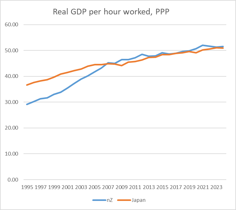
A commenter noted that in the first chart above NZ was just ahead of Japan. On this measure, we have been much the same as Japan for getting on for 20 years now.