In my post yesterday I looked at various New Zealand saving and spending series across time, drawing from the recently-released annual national accounts data. In this post I’m looking just at national savings rates, but across the spectrum of advanced countries, as proxied by membership of the OECD.
Savings rates have been a hardy perennial in discussions of New Zealand macro data and economic performance for a long time. It is perhaps in the nature of the case given that for much of its modern history, New Zealand has drawn fairly heavily on foreign savings (and thus has typically had quite a large negative net international investment position). For much of our more recent (say, post-war) history, economic performance – proxied by productivity or per capita income measures – has also disappointed.
The stylised facts were that, by comparison with other advanced countries, our national savings rates tended to be fairly low. Quite why wasn’t – perhaps isn’t – lways clear. For most of the post-war period – the 70s and 80s were the exception – the government’s accounts tended to be fairly well-managed. And although the tax treatment of household savings tends now to be quite hostile – under the guise of (a false conception of) neutrality – it wasn’t always so (until the changes at the end of the 1980s).
In this post, I’m concentrating on the same indicator of national savings I used in yesterday’s post: net savings as a percentage of net national income. In other words, provisions for depreciation don’t count as saving (they aren’t available to build the capital stock, only to maintain it), and the relevant income measure is the income available to New Zealand residents after providing for depreciation. In other words, the income available to consume or to build the capital stock.
In the paper a few years ago in which I first tried to document and articulate my story around New Zealand’s economic underperformance I included a chart showing that in the early 1970s (when comparable international data date back to), New Zealand had had the sixth lowest national savings rate of the OECD countries for which data were available. Here is a version of that sort of chart.
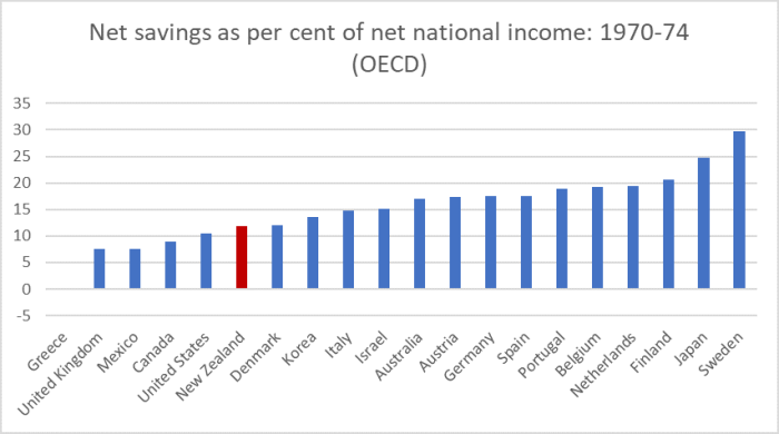
In many ways, it is quite a startling range, and not just for a single year (which can be influenced by different cyclical factors).
One of the points I made in that earlier paper was that New Zealand didn’t look such an outlier if one focused in on just the Anglo countries – not just the ones we often compare ourselves too, but also perhaps the countries with the greatest cultural similarities to New Zealand. In this particular snapshot, we had national savings rates higher than those in the UK, Canada, and the US, while all four countries were materially lower than Australia.
How has that Anglo country comparison unfolded since?
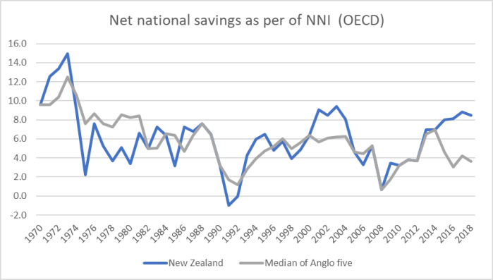
We had national savings rates lower than the other Anglos in the late 70s, but since at least the early 1990s, we’ve never had a national savings rate materially lower than that of the median Anglo country and for two multi-year periods (including the last few years) we’ve been well above that median.
Now, one point I probably didn’t make clearly enough in yesterday’s post is that inflation can distort these numbers, especially for countries with large net international investment positions (particularly large debt positions). In the presence of inflation, some of the interest paid abroad is recorded as a factor income payment when, in economic substance, it is just a compensation for inflation and thus is, in effect, a repayment of principal. This is a well-recognised point, highlighted from time to time by agencies such as the Reserve Bank, but there are no official series making the correction.
For New Zealand in the early 80s, most probably our “true” national savings rate was below that in other countries – there were large government deficits at the time – but at a time of heavy indebtedness and still quite high inflation (most of our debt then was denominated in foreign currency) the gap would be smaller than shown here.
What of the current position? At present, the UK and Canada have NIIP position near zero, while Australia, New Zealand, and the United States are all around -50 per cent of GDP. But the US net position is mostly an equity position, reflecting high share prices (foreign holdings thereof). In the New Zealand case in particular, by contrast net debt is almost equal to (ie in net terms makes up almost all of) the overall net investment position. With a core inflation rate of perhaps 1.7 per cent, our national savings rate would be perhaps 0.8 percentage points higher again if inflation were accounted for correctly. But bear in mind that 15 years ago, not only was inflation (and inflation expectations) a bit higher, but that our NIIP position was also more negative (more like 70 per cent of GDP). The appropriate adjustment then might have been more like 1.5 percentage points.
Bottom line: it is a real issue to keep in mind, but the extent of any adjustment required is less now than at any time since the early 1970s (when inflation was getting up but the NIIP position was small).
What about the simple comparison with Australia? Australia has often been held up – especially in New Zealand – as some bastion of (Anglo) high savings. Champions of compulsory private savings (as found in Australia) are fond of it, even though those champions will rarely acknowledge that the gap between Australian and New Zealand (net) national savings rates has been smaller in the years since Australia introduced compulsory private savings than it was previously.
So how do the simple New Zealand/Australia comparisons look?

There is plenty of variation in the series of course, and you can see (for example) the way the huge surge in Australia’s terms of trade boosted national savings rates up to around 2012. But having had a net national savings rate averaging well below Australia all the way through to the start of the 1990s, we’ve since had net savings rates that are really rather similar on average. This century New Zealand averages just slightly lower than Australia, but for the last few years we’ve had a higher net savings rate than Australia.
In fact, of the five Anglo countries, New Zealand currently has the highest net national savings rate.
(Note that these are comparisons of net savings rates – the share of income available to build the capital stock. Australia’s mining and resources sector is very capital-intensive and comparisons of gross saving rates – which include depreciation provisions – are higher in absolute terms, and Australia’s are higher relative to those in New Zealand.)
And here is the comparison for that whole group of OECD countries for which there was data right through since the early 1970s, this time an average for 2013 to 2017, the most recent five year period for which there is comprehensive data.
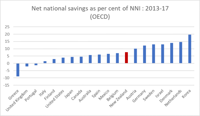
New Zealand in the upper half of the (old) OECD. Not a chart I really expected to see.
Even if we add in the newer OECD countries and look just at the most recent year’s data
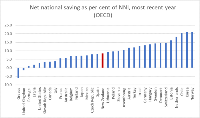
New Zealand is almost exactly the median country.
Now, personally, I wouldn’t get too excited about this. When you are among the handful of countries with the fastest trend population growth rates you would expect over time that your country should also have relatively high (net) savings rates (all that capital stock, whether commercial, public, or residential, is typically owned and paid for locally eventually). And all the countries in the upper quartile of that last chart have modest rates of population growth (or have falling populations – Estonia). But it is a somewhat different emphasis than we’ve been used to seeing.

I’m Confused?
Australian Superannuation Funds total $2.9 trillion
They are compulsory savings
NZ doesn’t come anywhere near that
How do you arrive at AU being less than NZ in private savings?
Australian Super Statistics
https://www.superannuation.asn.au › Resources
Superannuation Statistics Superannuation assets totalled $2.9 trillion at the end of the June 2019 quarter
LikeLiked by 1 person
Three things. First, you are looking at stocks of assets, whereas I’m focused on flow measures (portion of income each year not spent on consumption). Second, you are focusing only one set of assets, not the entire household sector balance sheet (Australians have higher household debt to income, partly because they have higher super assets locked up and inaccessible). And third, you are focusing on (one component of) households’ balance sheets, whereas national savings encompasses govt, business, and household activities. Business savings don’t tend to get anywhere near the attention they deserve.
LikeLike
A very interesting post, thank you.
I wonder if some of the commentary regarding this topic is similar to the punditry regarding the housing market. I.e. comments along the lines of ‘we invest too much in housing’ which as you often point out is not actually the case.
The similarities are perhaps in respect of the comparisons to Australia and as iconoclast points out above the perception that because Australia has such a large stock of savings they must ipso facto save a lot more than o
us. Curious that the analysis shows this not to be the case.
Some questions that I have, does a significant stock of financial assets change behaviour in domestic financial/capital markets? For instance does it result in more financing of local companies because there is capital available to be deployed and due to proximity is able to find opportunities more readily than international capital otherwise might?
It would be interesting to understand what flows and stocks of savings means for decision regarding allocation of real resources, investment and ultimately the impact on productivity.
LikeLike
Interesting questions. All else equal, higher local savings will lower interest rates a bit (supporting investment etc). Our rates are now low, but still a lot higher than in most other advanced countries. Bear in mind tho that much of the swings in savings rates are in business savings- typically retained earnings – which may not much affect local capital markets.
LikeLike
Your statement is incorrect. Retained earnings is not business savings. The asset class is actually “Term Deposits in bank” or “Cash in bank”.
Retained Earnings is a historical record of accumulated profits which a significant portion would have been spent on Fixtures & Fittings, Capital Equipment, Vehicle Fleets and other assets.
Economists really must learn how Financial Balance Sheets work. It is a worry that the RBNZ and Treasury economists run our countries finances without knowing how Financial Balance Sheets work.
LikeLike
You are confusing two things. Savings – in the post – is a flow concept not a stock one, so has little or nothing to do with balance sheets. Business savings – as in the post – are roughly the new retained earnings each year. As you say, much of it will have been used for investment, and in fact business savings rates will tend to be higher when there are more such investment opportunities.
Same goes for households or govt. The (flow of) savings will often be used to acquire real assets – schools, hospitals, roads, houses etc.
LikeLike
The flow of earnings/profits goes directly towards acquiring assets and also towards investments and savings. Without earnings/profits there is no flow of savings.
I think your economists view of savings flow is trying to make a river flow uphill. Natural flow does not work that way.
LikeLike