Every so often I get round to updating my charts of some indicators of the relative performance of the tradables and non-tradables sectors of our economy. With new GDP numbers out yesterday, now seems as good a day as any.
This is my headline chart.
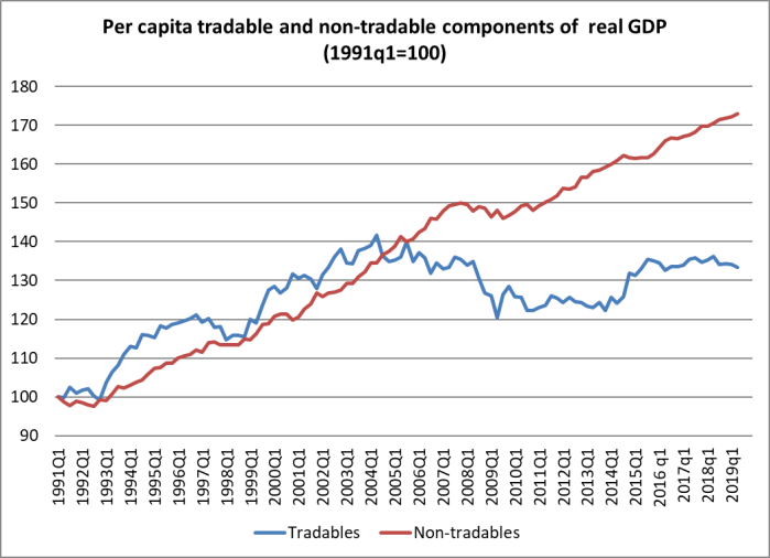
Here tradables is a rough and ready aggregation of primary sector and manufacturing GDP (from the production GDP numbers) and exports of services (from the expenditure GDP series). Non-tradables is the rest (of GDP). The idea is to split out those sectors which face international competition from those that don’t. It is no more than an indicator, and people often like to point out the components of “non-tradables” where, at least in principle, there is international competition. But as a rough and ready indicator, it serves its purpose. It was first developed by a visiting IMF mission about 15 years ago to help illustrate how one might think about the impact of a lift in the real exchange rate.
You will recall my line (oft repeated) that really successful economies tend to be ones with really robust tradables (and exports – although the two aren’t the same thing) sectors. Not because tradables are special, but because success in the (much bigger) wider world market, or against the wider world of competing producers, is an indicator about something going right in your economy.
Whereas in New Zealand, the economy appears to have become increasingly skewed towards non-tradables. In per capita terms, there has been no growth in this indicator of tradables sector GDP since 2002 whereas the non-tradables sector has grown by 40 per cent. There have been a few ups and downs in that tradables line of course. There was some brief encouragement in that lift a few years ago, but the new level is nothing to write home about. If anything, the tradables line looks to be tailing off again, at least a bit.
There are people out there who really really don’t like this indicator. So for them, and to shed a bit more light on what has gone on, here are the individual components of the tradables line.
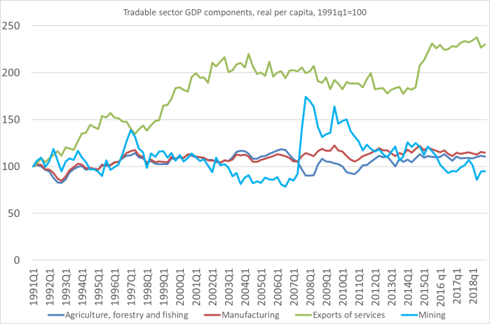
In real per capita terms:
- mining sector GDP is a bit less than it was at the start of the 90s,
- manufacturing sector GDP is just a bit below the level first reached in 1997, 22 years ago,
- for all the dairy intensification, forest plantings etc, the same is true of agriculture, forestry and fishing – just a bit below the level reached 22 years ago.
Actual real GDP for all three sector has risen quite a bit, but there are almost 1.2 million more people than there were in 1997.
What of services exports? They have grown a lot, even in per capita terms. But the growth was a generation ago now: real per capita services exports more than doubled between 1991 and 2002. Since 2002, there has only been about 6 per cent growth, in total. Over 17 years.
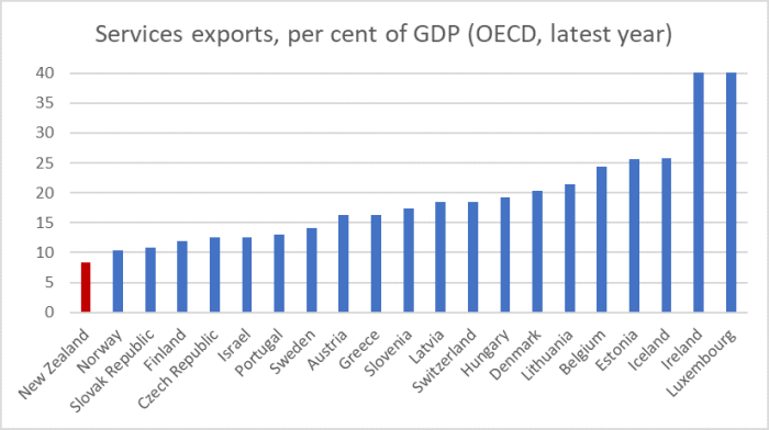
And some context on services exports from last week’s post.
New Zealand has the smallest share of services exports in GDP of all these smallish OECD countries – and by quite a margin. And it isn’t as if we are closing the gap. Over the last 20 years, services exports as a share of GDP have barely changed in New Zealand (with some ups and downs) while for the median of the other smallish OECD countries, the increase was 6.7 percentage points of GDP.
It is hard to (rapidly grow) exports from New Zealand. Distance is a big obstacle (at least for anything other than natural resources), and so are regulatory limits (some probably warranted, others probably not) on the utilisation of the fixed stock of natural resources.
But it always pays to keep an eye on the (real) exchange rate. One way of looking at the real exchange rate is the price of non-tradables relative to the price of tradables. That has been rising substantially in New Zealand. The other is simply to use one of long-term international indices, deflating a nominal exchange rate index by some measure of costs and prices. This is a chart I’ve used every few months
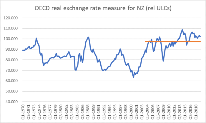
Sure, the exchange rate has been falling a bit in the last few months (the chart is quarterly and thus only up to June) but it is nothing out of the ordinary relative to the average level for the last fifteen years – which was far higher than the average for the previous few decades (since, say, the mid-70s).
There is nothing wrong with a high real exchange rate – in fact, it is a natural outgrowth – if your economy is doing well and generating consistently strong productivity growth relative to the rest of the world. But, of course, that isn’t the situation in New Zealand. The government doesn’t directly set the real exchange rate – and the Reserve Bank has very little influence on it beyond the short-run – but government policy choices have helped skew the economy in ways that mean the tradables sector has been squeezed, such that we’ve had almost no growth in real per capita tradables sector GDP this century.
And no political party in Parliament seems to have any real idea about how to change that, or any real desire to address seriously the issue.

It definitely looks like a break in the trendline for growth in tradeables happened between 2004Q1 and 2005Q1. And it also looks like a sustained period of high exchange rate started in 2004Q3. So it looks like we have the perpetrator.
Next question is, what caused the exchange rate to break higher at that time?
LikeLike
Learnt something new today from you. Thanks, Michael.
1. However, should we expect so much from the government in improving the “tradables” sectors?
If there is local NZ talent that can actually make a difference, we cannot say they face or have encountered any restrictions in launching new ventures and in sustaining them. There’s only so much you can do in bringing your horses to the water?
2. May be useful to know what happened in Luxembourg, Ireland and Iceland that got them to be ahead of the pack. Key drivers and market conditions?
3. How about comparing NZ to Singapore in terms of the tradables and the non-tradables sectors? The background would be the comparable population size, sovereign risk rating, “open” economies with a high dependance on immigrants, easy access to new capital funds and with a credible financial and legal infrastructure. How do you see the success factors that help performance in the tradables?
Hock Chye, 20/9/2019.
LikeLike
Thanks. I’m not suggesting govts can directly grow the tradables sector, but they can remove the roadblocks that lead to such a persistently high exchange rate.
A couple of article/speeches addressing the issue, incl the question of which comparators are useful are
https://croakingcassandra.com/2019/05/22/unsuccessful-public-policy/
https://www.rbnz.govt.nz/-/media/ReserveBank/Files/Publications/Seminars%20and%20workshops/Mar2013/5200823.pdf?la=en
In a very abbreviated response, Luxembourg has a superb location (surrounded by high productivity Belgium, France, Netherlands, Germany) and Iceland has big natural resources and v few people. My story, in essence, is we’d have manage something like Iceland if we had, say, 2m people tapping the big (but limited) natural resources here.
LikeLike
Hi Michael This is great analysis and a issue I am really concerned abou. Can you point me to some of your ideas to address this? I tend to think we need to up our game in how we ‘do’ economic development ie it’s what gets done that counts. Value add would have to be one of the most used terms in our policy rhetoric. Thanks Dave
On Thu, 19 Sep 2019 at 10:27 PM, croaking cassandra wrote:
> Michael Reddell posted: “Every so often I get round to updating my charts > of some indicators of the relative performance of the tradables and > non-tradables sectors of our economy. With new GDP numbers out yesterday, > now seems as good a day as any. This is my headline chart. ” >
LikeLike
Thanks Dave
Easiest starting point is probably this post.
https://croakingcassandra.com/2018/05/25/lifting-productivity-what-id-do/
LikeLike
Slightly off topic but totally productivity related
https://promarket.org/the-cost-of-america-oligopoly-problem/
NZ banking and fuel sales share similar issues.
The ComCom needs its mandate revised.
LikeLike