A month or so ago there was a great flurry of media coverage when the US interest rate yield curve “inverted”. In this case, long-term government security interest rates (10-year government bond yield) moved below short-term government security interest rates (three month Treasury bill yield). This was the sort of chart that sparked all the interest.
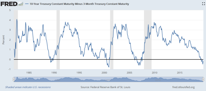
The grey bars are US recessions, and each time the long rate has been less than the short-term rate a recession has followed. This chart only goes back to 1982 but it works back to at least the end of the 1960s. There haven’t been any recessions not foreshadowed by this indicator, and there haven’t been times when the yield curve inverted and a recession did not come along subsequently (sometimes 12-18 months later). Who knows what will happen this time. It is, after all, a small sample (seven recessions, seven inversions since the late 1960s), and there is nothing sacrosanct (or theoretically-grounded) in using a 10 year bond rate. Use the US 20 or 30 year government bond yields and right now the curve wouldn’t even be (quite) inverted.
But there are good reasons why changes in the slope of the yield curve might offer some information. A long-term bond rate isn’t (usually) controlled by the central bank or government and might have a fair amount of information about what normal or neutral interest rates are in the economy in question. By contrast, short-term rates are either set directly or very heavily influenced by the authorities. When the short-term rate is unusually far away from the long-term rate one might expect things to be happening to the economy, whether by accident or design.
Back in the day, when we were trying to get inflation down in New Zealand (late 80s, early 90s), the slope of the yield curve was for several years, off and on, a fairly important indicator for the Reserve Bank. At times we even set internal indicative ranges for the slope of the yield curve (at the time, the relationship between 90 day commercial bill yields and five year government bond yields), and for a while even rashly set a line in the sand of not allowing the short-term rate to fall below the long-term rate. We used this indicator because neither we nor anyone else had any idea what a neutral rate (nominal or real) would prove to be for New Zealand, newly liberalised and then post-crash, money supply and credit indicators didn’t seem to have much content, and we didn’t want to take a view on the level of the exchange rate either. But whatever the longer-term interest rate was, if we ensured that short-term rates stayed well above that long-term rate, we seemed likely to be heading in the right direction – exerting downward pressure on inflation and, over time, lowering future short-term rates as well.
But what about the New Zealand yield curve slope now? Here is the closest New Zealand approximation to the US chart above, using 90 day bank bill yields and the 10 year (nominal) government bond yield. I’ve shown it the other way around – 90 days less 10 years – because that is the way we did it here (partly because of the long period, until 2008/09, when short-term interest rates were normally higher than long-term ones, rather different to the US situation).
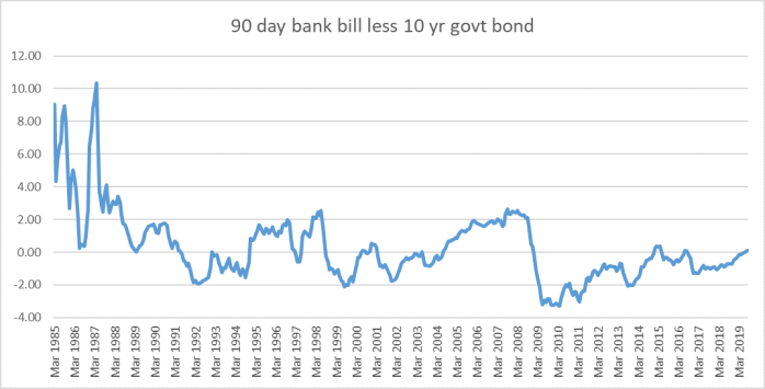
I can’t easily mark NZ recessions on the chart, but there were recessions beginning in 1987, 1991, 1998, and 2009, and each of them was preceded by this measure of the yield curve slope being positive, But, for example, the slope was positive for four years in the 00s before there was a recession. Against this backdrop, there isn’t really much to say about where we are right now (just slightly positive). And take out whatever credit risk margin there is a bank bill yield (20 basis points perhaps?) and the slope of the curve would be dead flat.
But what about a couple of other possibilities. Unlike the 90 day bill rate, term deposit rates and bank lending rates directly affect economic agents in the wider economy, and as I’ve shown previously the relationship between the 90 day bill rate and term deposit (and floating mortgage) rates has changed a lot since 2008/09. 
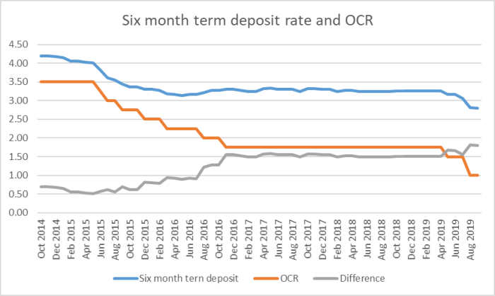
In this chart (constrained by data availability to start in 1987), I’ve taken the six month term deposit rate (from the RB website) and subtracted the 10 year government bond yield).
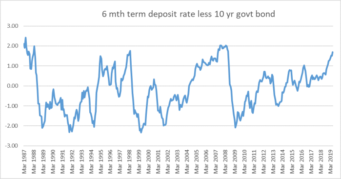
That starts looking a bit more interesting. The level of this variable – even after the recent Reserve Bank OCR cuts – is close to a level which has always been followed by a recession. (It is a small sample of course; even smaller than in the original US chart).
What about the relationship between the floating residential first mortgage interest rate and the 10 year bond rate? Here is the chart.
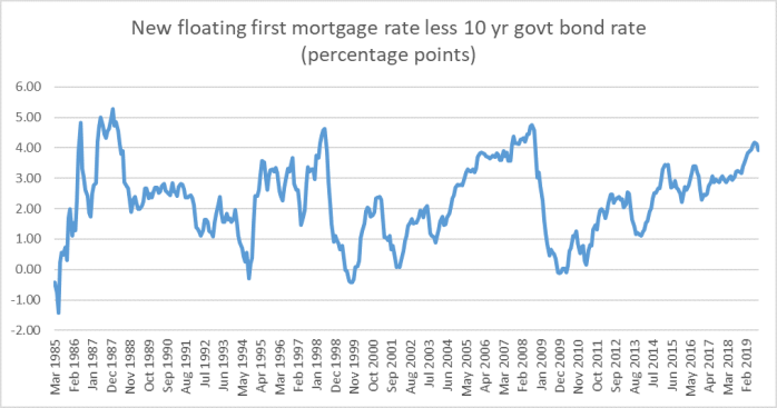
The only times this indicator has been higher than the current level – even after the recent OCR cuts are factored in, as they are in the last observation on the chart – have been followed by pretty unwelcome economic events (the 1991 recession wasn’t strongly foreshadowed by either this indicator or the previous one).
It is a small sample, of course, and there are no foolproof advance indicators. But if I were in the Reserve Bank’s shoes right now, I would take these charts as yet further warning indicators.
On which count, it is perhaps worth keeping a chart like this in mind.
We’ve had 75 basis points of OCR cuts this year but only about 45 basis points of cuts in the indicative term deposit rate (latest observations from interest.co.nz). It is not as if these retail interest rates are at some irreducible floor – retail deposit rates in countries with much lower policy rates are also much lower than those now in New Zealand. It is a reminder that, against a backdrop of a very sharp fall in New Zealand long-term interest rates (real and nominal) – even after the recent rebound the current 10 year rate is still more than 100 basis points lower than it was in December – monetary policy adjustments have been lagging behind. Long-term risk-free rates have fallen, say, 110 basis points (almost all real), and short-term rates facing actual firms and households are down perhaps 40-60 points (floating mortgage rates nearer 60).
The Reserve Bank cannot (especially after a decade of persistent forecast errors) have any great confidence in any particular view of neutral interest rates for New Zealand. With inflation still persistently below target and (as the Governor and Assistant Governor have recently highlighted) falling survey measures of inflation expectations, there isn’t a compelling case for the Bank to have lagged so far behind the market, allowing short-term rates to rise further relative to long-term rates. The Governor has appeared to suggest that the Bank will only seriously look again at further OCR cuts at the next Monetary Policy Statement in November. I reckon there is a much stronger case than is perhaps generally recognised for a cut at the next OCR review next week.

If petrol prices persists in increasing due to the bombed out Saudi pipeline then inflation would start to creep into the price of goods and services. It is not a forgone conclusion that we would continue to see inflation continue to fall. Anyway I think savers interest rates are already too low which will dampen down savers consumer spending considerably and there are more savers individually numerically than there are borrowers.
LikeLike
Just be aware that the argument you are advancing re oil prices is EXACTLY the one hawks at the RB were advancing into 2008, as reason to be reluctant to cut the OCR then (you have been v critical of how hawkish we were leading up to that recession). The climate for inflation expectations etc is much less worrying now (back then core inflation was already heading above the top of the target range set for the Bank).
LikeLike
[…] three-month rate (which had been something of a predictor of weaker economic conditions) I wrote a post here on yield curve indicators in New Zealand. Once upon a time, we used to pay quite a bit of […]
LikeLike