Across the advanced world, exports have been becoming a larger share of most countries’ GDP. This chart shows the median export share for OECD countries going back to 1971.
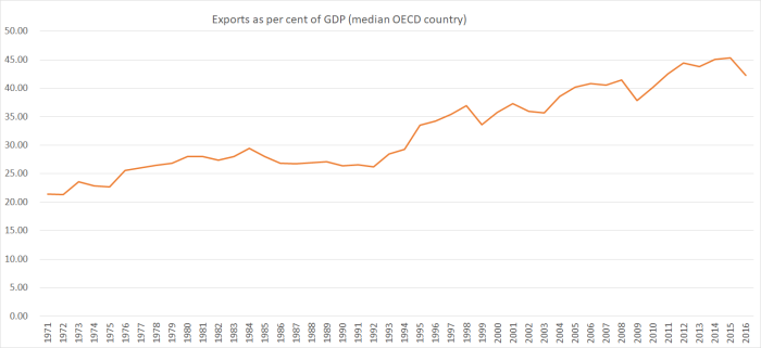
The OECD only has complete data for all its member countries since 1995, but in that time total exports as a share of total OECD GDP have risen from 19.5 per cent to 28.3 per cent.
There is some short-term variability – I’m not sure what explains the 2016 dip – but the trend has been pretty strongly upwards. That’s encouraging: trade (imports and exports, domestic and foreign) is a key element of prosperity.
For quite a while, New Zealand’s performance was very similar to that of the median OECD country
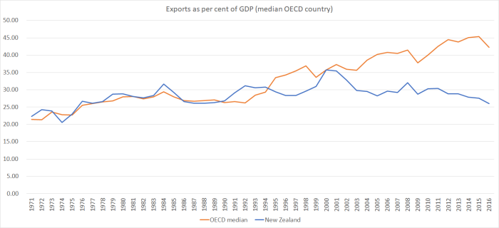
and then it wasn’t. The last time New Zealand’s export share matched that of the average OECD country was around 2000/01, when our exchange rate was temporarily very low (and commodity prices were quite high). At very least, we’ve been diverging for 15 years now, although it looks to me that the divergence really dates back at least 20 years to the early-mid 1990s.
Once upon a time – well before these charts – New Zealand traded internationally much more than most other countries. With a high share of exports in GDP, and a high GDP per capita, a common line you find in older books was that New Zealand had among the very highest per capita exports of any country. These days, not only is GDP per capita below the OECD median, but so is our export share of GDP.
Small countries typically have a larger share of exports in their GDP than large countries. That isn’t a mark of success for the small country, just a reflection of the fact that in a small country there are fewer trading partners. If your firm has a great world-beating product and yet is based in the US quite a large proportion of your sales will naturally be at home. If your firm is based in Iceland or Luxembourg, almost all your sales will be recorded as exports. US exports as a share of GDP are about 12 per cent at present, but divide the country into two separate countries and even if nothing else changes the exports/GDP shares of both new countries will be higher than those of the United States. The median small OECD country currently has gross exports of around 55 per cent of GDP (New Zealand 26 per cent).
On the other hand, we also expect to see countries that are far away do less international trade than countries that are close to other countries (especially countries at similar stages of economic development). That isn’t just a statistical issue, an artefact of where national boundaries are drawn. Distance is costly – there are fewer economic opportunities for trade. That has become over more apparent in recent decades as cross-border production processes have become much more important: in the course of producing a complex product, component parts at different stages of assembly may cross international borders (and be recorded as exports) several times. This has been a particular important possibility in Europe, and has been part of the success of formerly-Communist countries like Slovakia. Distance is an enormous disadvantage – enormous distance (such as New Zealand suffers) even more so.
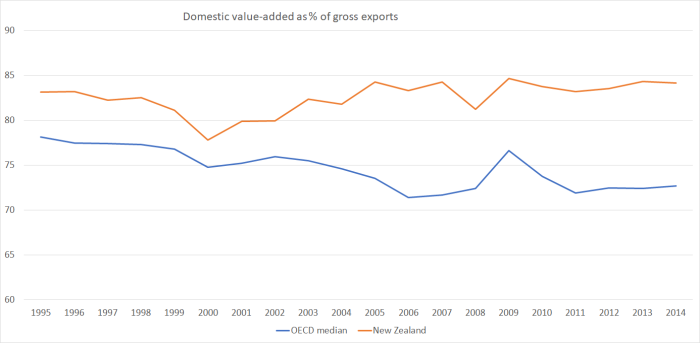
The OECD is now producing data on the share of domestic value-added in a country’s exports. The data only go back to 1995, and are only available with quite a lag (the latest are for 2014) but you can see the difference between New Zealand’s experience and that of the median OECD country.
These opportunities (gains from trade that weren’t economically posssible a few generations ago) generally aren’t available to New Zealand based firms. Then again, a widening in this particular gap isn’t the explanation for the divergence between New Zealand’s export performance over the last decade and that of the median OECD country (since the gap hasn’t widened further).
New Zealand has just been doing poorly.
Here is one comparison I found interesting.
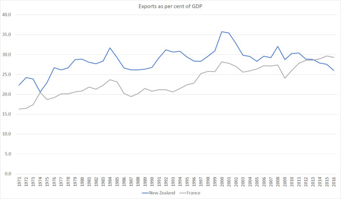
France has more than ten times the population of New Zealand and yet its foreign trade share now exceeds that of New Zealand. The United Kingdom – similar population to France – also now has a higher trade share than New Zealand. And the difference isn’t just down to components shuffling back and forth across frontiers in the course of manufacturing (eg) Airbus planes. New Zealand’s exports have a larger domestic value-added share than those of the UK or France, but adjust for that and all three countries now have export value-added shares of GDP of around 21 per cent. In a successful small country you would expect – and would typically find – a much higher percentage.
Remoteness looks like an enormous disadvantage for New Zealand, at least for selling anything much other than natural resource based products (even our tourism numbers aren’t that impressive by international standards). Here is the comparison with another small remote country, Israel (it is both some distance from other advanced country markets, and made more remote by the political barriers of its location/neighbours).
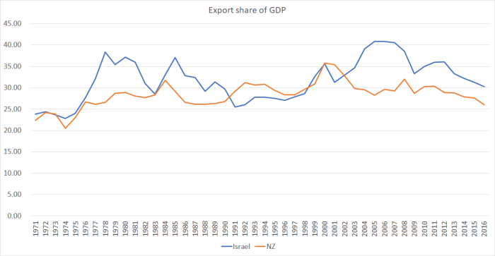
The Israel series is more volatile than New Zealand’s – probably partly reflecting the extreme macroeconomic instability in the Israel earlier in the period – but the overall picture is depressingly similar (and that in a country where R&D spending is now around 4 per cent of GDP). The other similarity with New Zealand: very rapid immigration-driven population growth, into an economically difficult location. As I’ve illustrated in previous posts, Israel has struggled to achieve much productivity growth and has a similarly low level of real GDP per capita.
Looking back over the last few decades, it is sobering to note that natural-resource dependent advanced economies are foremost among those that have struggled to achieve higher international trade shares of GDP. It isn’t some sort of fixed rule: if, like Australia, vast new deposits of minerals become economically exploitable, a remote natural resource dependent economy can see its export share of GDP rise. And if you have enough natural resources and few enough people, you can be very well-off indeed, even if the export share of GDP isn’t rising (Norway is the only OECD country where exports have’t risen at all as a share of GDP since 1971). But if you are very dependent on natural resource exports – and that dependence doesn’t seem to be changing – then you’d probably want to be very cautious about actively using policy to drive up the population unless – as with Australia – there are new waves of nature’s bounty to share around.
New Zealand – apparently structurally unable to secure rapid growth in exports based on anything other than natural resource – looks not only like the last place on earth, but the last place in the advanced world to which it would make sense to actively set out to locate ever more people. And yet is exactly what one government after enough does, apparently blind to paucity of economic opportunities here. They might wish it was different, and perhaps one day it even will be, but for now there is just no evidence to support their strategies. Every year, in following that course, governments make it harder for New Zealanders as a whole to prosper.
Oh, and what changed in the last 20 years or so – to go back to that second chart? After 20 years of quite low levels of immigration, active pursuit of large non-citizen immigration targets became a centrepiece of policy again. Without great economic opportunities here – already or created by the migrants – that renewed population pressures just made it even harder, despite all the good work on economic reform in the previous decade – for outward-oriented firms to succeed, and made the prospects of ever closing the income and productivity gaps to the rest of the OECD more remote than ever.

Could you explain how tourism is treated as an export. A tourist flies in; spends money on accommodation, food and entertainments; buys the T-shirt and other trinkets and then flies out. I can see the T-shirt as an export even if it was imported. Surely getting a foreigner to spend their foreign money to jump off our bridges must be a great export – minimal costs (reusable elastic rope), massive profit. However I cannot see how the statisticians distinguish bungy jumping by Kiwis from foreign tourists.
LikeLike
The data probably comes from foreign credit card reported spend in NZ perhaps.
LikeLike
If tourism is a significant component of our exports then there should be opportunity to increase our tourism exports and to do so more productively. With NZ descending the OECD ladder for GDP per capita and international airfares going down isn’t our typical tourist changing from high to low end? And if so are we tolerating strains on our infrastructure for a reducing national benefit? More hunting from helicopters and fewer freedom campers?
LikeLike
They will use a variety of sources, including expenditure surveys of a sample of tourists and the accommodation survey of places like hotels, camping ground etc (which breaks out NZ and foreign visitors). But you are right that foreigners bungy jumping in Queenstown is an export, as are those same visitors buying their cornflakes or cafe breakfasts. The split won’t be perfect, but we have good data on tourist numbers, length of stay, country of origin etc, all of which helps.
LikeLiked by 1 person
The Israel comparison
Population 8 million
Exports $65 billion
America takes 37% of Israel’s exports
Ten export destinations take 97% of all exports
Apart from US the next 9 destinations are each 5% or less
USA is by far the largest destination
In 2012, ten companies were responsible for 47.7% of Israel’s exports
By comparison NZ does very well with exports of $61 billion (FY 2013) from a population of 4.5 million and no protective sugar-daddy
https://en.wikipedia.org/wiki/Economy_of_Israel
LikeLike
I’m not sure I see the point. The largest item of Israel’s export is polished diamonds and other gems, and I’d be surprised if there was much of a political dimension to that trade. Israel’s exports to the EU weren’t much below those to the US, and with those two being the largest industrial countries/areas there doesn’t seem much unusual about the patterns.
Personally, I’d tell the story the other way round. Israel does pretty well given it has next to no natural resources (altho gas is coming), and the crowding out that results from large defence spending and US aid, while we’ve never been able to move beyond those (practically fixed) natural resources.
LikeLike
Can you please explain for me – I’m getting confused – when I first read your comment and looked at graphic #5 and then researched some of the background data my reaction was considering Israel has a population of nearly double that of New Zealand but exports of just a few $billion more than New Zealand it seemed Israel’s performance is abysmal compared to New Zealand, or alternatively NZ is doing a heck of a lot better than Israel
Secondly – the graphic you have used the export share of Israel shows a peak around 2006 of 42% subsiding down to 31% in 2016 which does not coincide with the following calcs
Thirdly – Both Israel and NZ’s share of GDP have fallen Israel by 11 percentage points and NZ 10 percentage points – NZ peaked in 2000 – Israel peaked 2006 – must have been significant events
Israel
GDP $318 billion USD (2016)
GDP $316 billion USD (2017)
Exports $65 Billion
Percentage of Exports as share of GDP
2016 20.4%
2017 20.5%
The 20% is a significant departure from the graphic at 31%
Graphic #5 Exports share GDP = 42% (2006) at peak down to 31% (2016)
The question is – what’s happening to both Israel and NZ?
Am I misreading all this?
LikeLike
I suspect your problem is using USD data. To calculate shares of GDP you need both exports and GDP in each country to be in its own local currency terms (that is how the OECD data I charted is done). We don’t of course have 2017 data yet.
I don’t know enough about the recent past in Israel to explain how X/GDP got to 42% or why it came back down again. It is quite a variable series.
LikeLike
Further I meant to say Israel’s exports in 2006 at 42% have halved down to 20% in 2017
LikeLike
You have to be careful of Israels people count. They don’t count Palestinians as people.
LikeLike
you do have to be careful re Israel, but as I understand it Israel data (incl via the OECD) includes only activity/people in Israel proper, the Golan, East Jerusalem, and the Israeli West Bank settements. the data typically don’t include activity/people in the rest of the occupied territory.
LikeLike
One (implied) counter-argument is to distance is ICT [Noelle McCarthy’s – A Slice of heaven] ?
Another thing I have read is that we are not a land based economy (are resources and land the same thing?
Another is the unlocked potential that migrants will see but we can’t: “Hawke’s Bay needed jobs, innovation, diversity and connections – all available through immigration”. Paul Spoonley
etc
LikeLike
Yes, the weightless economy/ death of distance arguments have all been advanced…..it is just that there is little evidence (globally, let alone here) of them adding up to much. If anything, distance seems to be more of a problem than ever, and certainly we’ve done very badly on services exports.
We are a land-based economy, but with two caveats: 1) you could add in sea as well (between seafood, and gas/oil production, and 2) it needs smart people, technology, and strong institutions to make the most of the land. We have much the same land as was here in 1817, but the land produces so much more and supports almost 5m of us at reasonable living stds (even if well off world’s best now)
LikeLiked by 1 person
One of the reasons small towns are “dying” (I think) is that farms need fewer people? Which means…? The farm is more productive but since land is fixed it doesn’t solve the problem of people to resources? Optimists (eg when a mine closed on the West coast) say things like “we have enormous potential for tourism”.
LikeLike
When you count the 10 million cows and 30 million sheep perhaps the whole productivity argument based on the number of people is just senseless economics.
LikeLike
I’ve never been to Hawke’s Bay and I’m willing to believe it needs jobs, innovation and connections. But why diversity? Iceland, Norway, Korea and Taiwan lack diversity but travelers tales make them sound interesting.
I’m fairly well traveled; I’ve worked in USA, PNG and UK with business trips to Europe and Australia. Few places are as wild and varied as PNG (make that nowhere) but I still find way more diversity of thought in parts of my UK family than I do in a comparison of the average culture of all those countries. What is the point in a racial/ethnic category when the exceptions out-weigh the commonality? Or don’t they want diversity of thought and lifestyle – just visible appearance: male/female, Black/White/Brown/Yellow, etc? Sociologists are stranger than economists.
LikeLiked by 1 person
The link is here
http://www.nzherald.co.nz/hawkes-bay-today/business/news/article.cfm?c_id=1503458&objectid=11310170
Japan counters his example re connections.
https://en.wikipedia.org/wiki/Sogo_shosha
LikeLike
Napier welders being paid $3 an hour, legally
http://www.newshub.co.nz/home/new-zealand/2016/12/napier-welders-being-paid-3-an-hour-legally.html
Tch, tch, tch
Paul Spoonley
The thing which really annoys me at the moment is the way immigration is framed as a problem.It goes to Alis point [the arguments against immigration are unsustainable] It’s a very simple and inaccurate response to what’s happening in the world. We are globalising; we are part of a new era of globalisation and this country is actually transitioned into that, particularly with it’s connections to the Pacific and Asia in a way that is quite impressive in many, many ways but at the same time we really need to reframe what is happening or provide an understanding and that’s what frustrates me at the moment.
http://www.radionz.co.nz/national/programmes/smarttalk/20170813
The balls in your court Professor?
LikeLike
JH: thanks for the link. I hadn’t seen that Napier welder article. Makes me so angry that this can happen in my country and so little is done about it.
LikeLiked by 1 person
These are not immigrant labour and comes under Specific purpose as indicated by the article like equipment installation. So it is a Immigration policing issue and not a Prof Paul Spoonley issue.
I have been approached by an Australian company set up in the Phillipines that will offer me trained accountants for $10k per annum who can spend up to 180 days in NZ being “trained” each year legally who are actually employed by a Phillipine company is waged in Phillipines full time.
LikeLike
I hate to say it, but the recent increases in the minimum wage (which are not going to go backwards under Labour) are not great for exports.
LikeLiked by 1 person
Can you rule out a positive correlation between the increasing export share of countries in the EU (your first graph) and the degree of immigration flow that occurs between such countries? There have been quite large migrations between some countries (the Polish plumber syndrome in the UK, for instance) -s o would you argue that these have detracted from an even larger export share that might have occurred in their absence?
LikeLike
Of course, my OECD median chart includes both countries that have had quite a bit of emigration (Poland, Estonia, Latvia) as well as those recipient countries. I’ve shown previously a negative correlation between average business investment as a share of GDP and population growth, so there might be something of the effect you describe even within Europe. Then again, natural resources are a much smaller part of european exports, so the argument I’m making specific to NZ doesn’t apply to whole countries there (well, except for rich Norway).
LikeLike
NZ export GDP have not increased even though tourism GDP has increased dramatically. Mainly due to the fall in Dairy GDP and milk prices dropping by 50%. Domestic GDP however has risen mainly due to the almost 100% transference spend from Tourists export GDP to domestic GDP. Most other manufacturing industries have only a 30% to 40% direct transference to domestic GDP.
LikeLike
The obvious factor you didn’t mention is the Eurozone. Around half or more of OECD countries are in the Eurozone, correct? The common currency was phased in over 1999-2003. I imagine (alongside EU regulation harmonization) this would account for an increase in international (but intra-Europe) trade.
Would be interesting to see that same graph comparing NZ international trade to the average of OECD countries outside the Eurozone.
LikeLiked by 1 person
Unfortunately i can’t put a chart in comments, but comparing NZ with the median of the OECD members excluding the indiv euro area countries (but including a single observation for the whole euro area) still shows a big gap emerging between NZ and the other advanced countries over the last 15 years or so. The picture is a bit less dramatic than the one in my post, but still pretty stark.
LikeLiked by 1 person