I wrote the other day about the role that population growth, including that accounted for by immigration policy, plays in influencing house prices, at least in places where regulatory restrictions on land use or construction impair the responsiveness of housing supply. More demand, in the face of lagging supply, seems fairly ineluctably to put upward pressure on prices.
The latest QV house price data, for January 2017, also came out the other day. They produce data at an individual TLA level, which in conjunction with SNZ TLA population estimates, enables us to have a look at whether there has been a relationship (albeit crude and bivariate) between population growth and house price inflation.
In the chart below, I’ve focused on the period since 2007. 2007 was the peak of the last house price boom, and a period for which QV has supplied house price data for each TLA. The population growth data is the percentage increase in population from June 2007 to June 2016 – the most recent SNZ estimates. It is worth remembering that in periods since the last census, population estimates are approximate at best, but these estimates are the best SNZ can do and they presumably use a consistent methodology across the country.
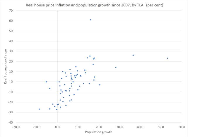
Given that we have pretty pervasive land-use restrictions, it isn’t very surprising to find that areas with the greatest (lowest) population growth also tend to be the areas with the largest (smallest) real house price increases over this period. It isn’t a mechanical, or one-for-one, relationship of course. One factor is likely to be differences from TLA to TLA in how practically constraining the land-use rules are. All else equal, a TLA where land use restrictions are less constraining will see less real house price inflation for any given population increase than a TLA with more-binding restrictions. (I’m not aware of any good land-use restrictions indexes for individual New Zealand TLAs).
The observation on the far right of the chart might be an illustration of this point. That dot represents Selwyn district, on the outskirts of Christchurch. It has experienced a huge population increase – in excess of 50 per cent in nine years – especially since the earthquakes. Some observers argue that the local authority has been relatively liberal in facilitating new housing and business development. Perhaps (I was a little sceptical here), but one other factor is that, at the margin, people considering buying in Selwyn are likely to be considering developments in the rest of greater Christchurch too – and over this period real prices in Christchurch city and Waimakariri only rose 10 and 14 per cent respectively.
The other obvious outlier is the observation at the top of the chart – that for Auckland. Real house prices in Auckland have risen 61 per cent since the 2007 peak. Auckland has had considerable population growth over that period (16.1 per cent)
But the population growth in these TLAs wasn’t that different from Auckland’s experience
Kaipara
Waikato
Hamilton
Waipa
Tauranga
Hurunui
Ashburton
McKenzie
and they all experienced much less real house price inflation (these are the dots more or less directly below Auckland’s on the chart)
There could have been a variety of factors at work explaining how much Auckland prices have risen (even given population growth):
- perhaps Auckland’s land use restrictions are just that much tighter than those in other places,
- perhaps Auckland prices are being influenced by expectations of continuing strong population growth (which isn’t likely in all of those other TLAs),
- perhaps Auckland prices were being influenced by the non-resident purchasers (of whom we have heard so much, but don’t really have good data on).
On the other hand, factors that aren’t likely to explain the difference include:
- interest rates, which are the same across the whole country,
- tax policy, which is the same across the entire country.
- (and, for that matter, immigration policy which is much the same for the entire country)
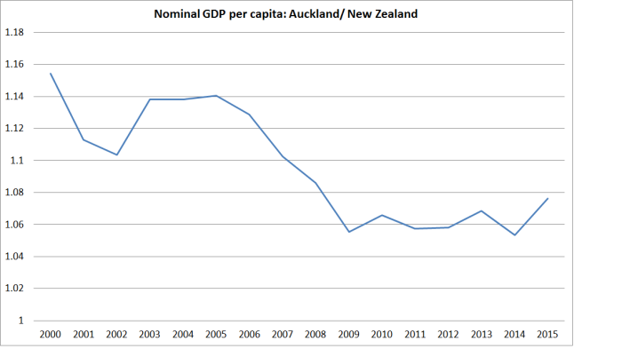
Sometimes people will try to ascribe strongly rising house prices in particular localities to the state of the specific region’s economy. But since 2007, Auckland’s average GDP per capita has grown no faster than that in the country as a whole.
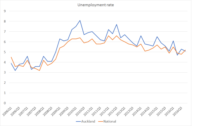
and the unemployment rate in Auckland has mostly been a touch higher than that in the country as a whole.
The other thing that struck me from the scatter plot above was just how many parts of New Zealand still have real house prices lower than those at the peak of the previous boom. Some have had falling populations, but one or two have actually had faster population growth than Auckland (eg Carterton, for some reason unknown to me). These are the places where real house prices are still more than 10 per cent lower in real terms than in 2007.
Clutha
Taupo
Southland
South Taranaki
Westland
Masterton
Central Hawkes Bay
Tararua
Whanganui
Kaikoura
Gisborne
Rangitikei
Buller
Opotiki
Ruapehu
Grey (-27.2 per cent)
It is easy for people in Auckland and Wellington to be dismissive of some of these places, but as I’ve already illustrated, it isn’t as if Auckland’s economic performance over the last decade has stood out as noticeably better for the average person than that of the country as a whole.
On which note, real house prices across the whole country are now around 6.4 per cent higher than they were in 2007. With Auckland accounting for a third of the country, and with real prices up 61 per cent there, average real house prices in the rest of the country are still, fortunately, lower than they were at the peak of that previous boom.

Auckland has 57 sacred volcano mounts which limit heights to 3/4 level heights throughout most of central Auckland. The Unitary Plan is being appealed and legally blocked by Nimby groups, Character Society and Auckland 2040 on 29,000 sites to prevent changes from single dwelling to multiunit sites. In many sites this completely reverses previously higher density sites.
LikeLike
As a result, the Unitary Plan has created expensive fringe houses by pushing its highrise to the fringe, called metropolitan cities, Manukau, Albany, New Lynn, Sylvia Park. However these metropolitan cities are 30 to 40km away which equates to expensive roading and expensive intercity rail. Due to geography and Auckland is hills/valleys, streams and rivers, beaches and coves which means the longer the road/rail tracks the more bridges and tunnels are required to link. By creating high rise fringe property, Auckland Council has created very expensive land throughout Auckland from central to fringe.
LikeLike
I suspect the answer is some combination of the three dot points I listed. Your point is specifically relevant to the first of those, but potentially relevant to all three – since future increases in population, and non-resident purchasers, will only persistently raised house/land prices in the presence of land use restrictions.
LikeLike
You might be interested in a bit of work Local Government NZ did on demographic forecasting by TLA in this publication;
Click to access 42597-LGNZ-2050-Challenge-Final-WEB-small.pdf
LikeLike
Michael what has the real wage increase over the same period? Which towns and cities are workers who are not on the property ladder materially better off?
LikeLike
There is wages data (I’m aware of) at the TLA level.
LikeLike
Median personal income (2013 Census data) by TLA can be found here;
http://www.localcouncils.govt.nz/lgip.nsf/wpg_URL/Profiles-Index?OpenDocument
LikeLike
I guess the most useful contribution to this debate would be for the development of an index of land use restrictions so that can be featured in the analysis… from the data it would seem that Auckland has the worst of it in terms of land use restrictions and a bunch of TLAs have limited restrictions comparatively speaking…
I live in Auckland and know what it is like to get stuff done around here!
LikeLike
Agree. It would a project for several careful academics over several years I suspect.
LikeLike
LINZ has already confirmed that foreign tax resident purchases is around 4% in Auckland and around 3% for the rest of NZ. International students are not included as they are considered as NZ tax residents and of course also considered as Permanent and long term migrants.
LikeLike
A young couple selling their family’s South Auckland home were shocked to learn the property had been “flipped” by an investor on the day of settlement for an additional $81,000.
Hua Wu made $81,000 on the deal in May last year without ever taking possession of the five-bedroom Papakura house, CoreLogic property records show. The Booths’ $819,000 sale price was “pretty good” and higher than they what they had marketed the property for.
“There was nothing in recent sales history anywhere in the neighbourhood that was indicating a price around that figure [$900,000].”
http://www.nzherald.co.nz/business/news/article.cfm?c_id=3&objectid=11813743
It just takes one foreign buyer to pay more than the markets expectations to shift the entire neighbourhood in terms of their own expectations. Valuations for the entire neighbourhood will now shift upwards by $81,000.
LikeLike