I was belatedly reading the speech given earlier this month by the Governor of the Reserve Bank. His speeches often have had a strong tinge of cheerleading for the government – either highlighting the positive indicators ministers and the former Prime Minister liked to cite, or highlighting as areas for concern only those aspects that the government itself had been raising (thus, for example,doing things about improving housing supply is regularly mentioned, but never the option of cutting back on the medium-term target level of immigration).
This speech was a little different. The Governor took the opportunity to note that the current recovery – itself interrupted by a double-dip recession in 2010 – has been the weakest (in terms of average GDP growth rates) in New Zealand for many decades. Under a heading “labour productivity growth has been particularly weak”, he explicitly drew attention to the estimate that “New Zealand’s trend rate of labour productivity growth is in the bottom third of OECD countries”, and also noted just how weak growth in total factor productivity growth has been. The dismal record should be quite a challenge both for the new Prime Minister and Minister of Finance, and for opposition parties thinking about the policy proposals they will campaign on in the next year’s election.
But the paragraph that caught my eye in the Governor’s speech was this one.
New Zealand’s household net savings rate improved by 8 percentage points in the period 2008 to 2013 (from minus 6 percent to positive 2 percent of household disposable income (figure 5)). Over this period, New Zealand’s overall savings rate (ie including savings by the business and public sectors) increased by around 5 percentage points, and this has been an important factor behind the improvement in New Zealand’s ongoing current account deficit and the decline in net external liabilities as a share of GDP (this ratio has declined from 84 percent of GDP in 2009 to around 63 percent of GDP currently).
It prompted me to go and have a look at the recent annual national accounts data (which will have been released just after the Governor gave his speech).
It was the comment on the overall national savings rate that surprised me. Here is a chart of the net national savings rate as a share of net national income.

There has certainly been quite a rebound in the national savings rate since the recessionary trough in the year to March 2008, but it does look mostly cyclical. The latest observation is around the same level we saw in the year to March 2005. There isn’t any sign that overall savings rates in New Zealand, averaging across the cycle, are any higher than they have been on average in recent decades.
Here is a shorter span of history for the household savings rate (also as a share of NNI).

The trough in this series was the year to March 2003, just before the big housing boom of the 00s got underway. There was quite a recovery in the last years of the economic boom and during the recession and immediate aftermath. But the steady fall in the household savings rate over the last few years also suggests nothing very different from history. If the current household savings rate is higher than the earlier troughs, at the same time the government savings rate is lower than it was then.
Here is the chart for the same period of government and private savings rates. “Private” includes – and is typically dominated by – business saving.
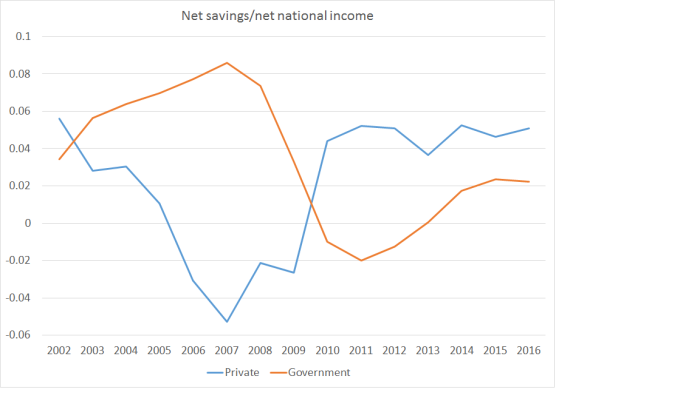
For a variety of reasons, when government savings rate rise private savings rates tend to fall, and vice versa. The really sustained recovery since 2007 has been in business savings – a component of savings that is typically too little analysed.
The Governor’s comments focused on changes in the savings rate(s). But the other side of the equation – particularly as it affects the interpretation of the current account – is investment.
Here is the long-term chart of investment (national accounts definition – gross fixed capital formation) as a share of GDP.

Again, as I’ve illustrated previously, we’ve had a cyclical rebound in investment rates. But it isn’t an impressive rebound. The latest observation – this in an economy which the Bank thinks has perhaps a small positive output gap – is well below the peaks in 1976 and 1986, and around the same level as the peak in 1996. The economy went into the 1990s recovery with a massive overhang of commercial property, so it perhaps wasn’t surprising that overall investment didn’t surge to really high levels. By contrast, in this cycle earthquakes destroyed quite a lot of commercial, residential and government capital stock – necessitating a lot of gross fixed capital formation just to restore the capital stock to what it was pre-earthquakes.
In many other OECD economies, a gradual decline in the investment share of GDP over time wouldn’t seem odd, as the population growth rates have been trending downwards. In many cases those countries now have flat or slightly falling populations, and just don’t need as much new investment to maintain capital/output ratios. But that isn’t the story of New Zealand. Over the period of that GFCF chart there has been no trend decline in New Zealand’s population growth and in the last year or two, our population has grown as rapidly as at any time since the 1950s. This chart is a few quarters old, but it illustrates the point.

I wouldn’t want to make very much of the narrowing in the NIIP position. Again, the Governor referred to a trough in 2009 and compared it to the current position. But the NIIP position tends to cycle, and over 25 years there hasn’t been much change in the trend level.
But if anything, one could run a slightly contrarian position that a better-performing New Zealand economy over the last few years – one where more firms wanted to invest more – the current account deficit would have been wider and the negative NIIP position somewhat larger. Overall, weak investment looks to be a symptom of weak demand – both domestic and external. Firms simply haven’t seen many great opportunities for investment and so, even with all the rebuild and repair work, overall investment levels have been pretty subdued.
And it isn’t as if the economy has been fully employed during that period. The Governor notes in his speech that the unemployment rate is below the 20 year average. But it is above official estimates of the NAIRU and has been for eight years now. It isn’t as if there has been an inflation problem either: core inflation has been below target for years now. And the exchange rate has been extraordinarily high.
There are limits to what monetary policy can do, but stimulating demand – all else equal – is what it can do; in fact, it is the reason why we have discretionary monetary policy at all. The data – current account, investment rate, as well as the inflation and unemployment rates – suggest that monetary policy should have been doing more over the last few years. That it hasn’t is a choice the Governor has made, but having made those choices – consistently mistaken in my view – he shouldn’t be trying to sell as a virtue one of the key symptoms of the persistent weakness of demand.

Hi Michael
Is there any more to this article? It seem incomplete.
LikeLike
yes, sorry. I accidentally hit publish midstream. It is all there now.
LikeLiked by 1 person
Thanks for all your articles Michael. I find the are very informative. I am hoping that we can meet for a coffee when I am in town so that I can learn from you as I develop my own blog. Regards Steffan
LikeLike
Steffan
Happy to meet up. Email me at mhreddell at gmail.com and we can find a suitable time.
LikeLike
That’s ok. Thanks for the article. I enjoy reading your posts.
LikeLike
As someone who has been on the inside, is the cheerleading tone something that is encouraged within RBNZ and Treasury? Or do the staff have a sense of urgency? I can imagine a scenario in which middle management are privately concerned, but the govt succeeds in appointing a series of cheerleader who bring their own senior management clique to ensure the advice doesn’t rock the status quo too much.
LikeLike
I suspect it is mostly not deliberate. Wheeler regards himself as a skilled manager of political relationships/risks etc (on what evidence I’m not sure), and the Bank typically aims to avoid/minimise controversy. Hewing closely to quite conventional lines can help do that, especially with a main opposition party which is much more interested in attacking the government than the Governor – ie they would probably look for any gaps between the Governor and the govt and use them to bash the govt. The overall effect is something that looks like “cheerleading”.
The Bank tends to be quite non-political (ie not just non-partisan, which of course it should be, but more interested in models and technical issues that in the political climate in which it operates).
Recall that the Board largely determines the appointment of Governor, rather than the Minister doing so. I think that is a flaw in the system, but I’m pretty sure they went for Wheeler because they saw him as a superior technocrat with excellent connections abroad in troubled times – in 2012 the euro crisis was still pretty red-hot – rather than for any more questionable motives.
LikeLike
Out of interest, how are KiwiSaver flows captured in the net household savings rate? Straight into ‘stock of saving’? (from memory, ‘too low’ savings was one explanation for relatively high real interest rates within the PC report) And I thought the line on the first graph would be negative / roughly equate the current account deficit? (sorry, think it maybe deprecation v investment but my brain started to power down…)
LikeLike
KIwisaver contributions (to the extent they are actual additional savings, rather than just relabelling money that would have been saved anyway) will have boosted the flow savings measures to some extent. As the household savings rate is not materially different now than it was when Kiwisaver started – and even tho of course there is lots of other stuff going on – one might be a little sceptical (with Treasury’s research) on how much of an overall addition to savings there has been, even tho there are now lots of fund bearing the Kiwisaver label.
Re the current account, it is the difference between savings and investment. It has been narrower than might have been expected because we’ve seen a (largely cyclical) recovery in the savings rate, not fully offset by the (rather muted) recovery in the investment rate.
LikeLike
appreciated!
LikeLike
At the end of the day it is about returns. Paying off a mortgage is worth 4.5%and as the payment is made monthly or quarterly the effect is actually a compounded return which is worth more than 4.5% per annum.
Kiwisaver with a company contribution at 3% and a government contribution adds to your own contribution. A decent kiwisaver fund manager should be able to return 6% on your contribution plus company contribution of 3% gives you a compound return of more than 9% which makes Kiwisaver a savings vehicle that would encourage more savings rather than paying off your mortgage.
It would be rather silly to think that kiwisaver replaces existing savings because no decent person with any financial knowledge would turn down kiwisaver knowing that they would suffer a loss as a result.
LikeLike
Actually the returns are higher because 3% is actually 100% on your own contribution which means that Kiwisaver returns well in excess of 106% per annum.
LikeLike