One of the charts I’ve run a few times in the last few months has had a bit of extra coverage in the last few days.

It is a pretty straightforward chart (although it would be a little easier if SNZ followed the practice of the ABS and reported the series routinely, rather than leaving it for people to calculate). I simply averaged the expenditure and production measures of real GDP, and divided the results by the total number of hours worked (from the HLFS). And real GDP per hour worked itself is a pretty standard measure of labour productivity.
The interest, of course, has been in the now four years or so of no growth in labour productivity. On the face of it, it is a pretty poor performance and tends to act as something of a counterpoint to a focus by the government (and its business and media cheerleaders) on headline GDP numbers – which are high largely because the population has been growing so rapidly, rather than because resources are being used more productively. Productivity is, in the long run, almost everything when it comes to improving material living standards.
I would add a few caveats around the chart, some of which I’ve made here before. The first is that the very final observation should be heavily discounted or ignored. SNZ introduced a revised HLFS methodology in June, which has resulted in a step up in the number of hours recorded (perhaps by around 1 to 1.5 percentage points). At some point that might be reflected in a slightly higher level of GDP, but for the moment there is just an inconsistency. (And, of course, there is always some quarter to quarter volatility in the data too.)
The second caveat is the old warning that when a number looks particularly interesting it might well be wrong. Four years of no productivity growth at all is not unprecedented here or abroad (on current data, for example, GDP per hour worked in the UK now is only around 2007 levels) but….these series are prone to revision, and while they could be revised either up or down, it shouldn’t greatly surprise us if the picture for 2012 to 2016 looks a bit different when we review the data a few years hence.
The big revisions tend to happen as a result of the annual national accounts. Statistics New Zealand gets a lot more detailed data, produces full annual data once a year (including revisions to earlier years), and then updates the quarterly series that have already been published. The annual data for the year to March 2016 are out later this month, and the revised quarterlies will presumably be available with the September quarter GDP release next month. Expect changes (including in the chart above).
But for now, the data is as it is. Bernard Hickey gave the chart some prominence, with the editorial comment “We’re just pumping more low wage workers in the economy and working more hours”, and observing “Jobs soaked up by net migration & more >65 yrs working”
That prompted Eric Crampton of the New Zealand Initiative, writing on his Offsetting Behaviour blog, to produce a post asking whether compositional changes in the labour force might account for some or all of the weak productivity growth in recent years. As he quite rightly notes, if a lot of very unskilled people started working lots more hours (in total), while higher skilled people worked the same number of hours, at the same real output, average real GDP per hour worked would fall even though no one individually was less productive.
First, Eric noted that the number of people on welfare benefits has fallen quite a bit over the last few years. If – as seems reasonable – those people had been of below average productivity, that might tend to lower overall productivity somewhat.
But here is my problem with that story.

Working age beneficiary numbers have certainly fallen over the last few years, but they rose a lot during the recession. There is seasonality in the data so I’ve only shown one observation per annum (June), but in June this year the share of the population of working age on welfare benefits was almost exactly equal to the share as the recession was getting underway in 2008. People moving on and off benefits might affect average labour productivity to some extent, but absent any sign of an upward surge in productivity over, say, 2008 to 2010 it is difficult to believe this effect explains much of the recent absence of productivity growth. (And, of course, the decline in beneficiary numbers doesn’t appear to have been in the faster than in the five years leading up to 2008).
Eric also includes a graph showing changing employment rates for different age cohorts, observing
The youngest workers are least productive. They hugely dropped out of the labour market with the changes to the youth minimum wage, but that decline’s since reversed a bit. There’s been a long trend growth in hours worked among older workers, but typical wage patterns over the lifecycle have wages flattening out from the early 50s or thereabouts. Big increases in employment rates among cohorts with lower than average productivity, or at points in the life cycle where wage profiles (and presumably productivity) flatten out, will both flatten or worsen GDP per hour worked.
What to make of that? Here is a chart of the changes in employment rates for each age group, both since 2012 (when productivity seems to have gone sideways) and since 2007, just before the last recession – and it isn’t a misprint/error; we’ve had no change in the employment rate over the full period from 2007 to 2016.
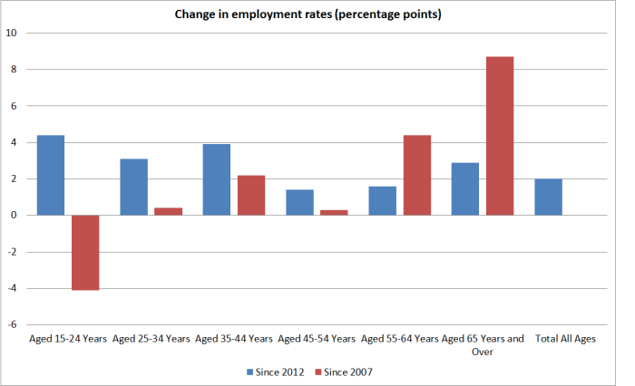
Over the last four years, the least productive age group (15 to 24) had the largest increase in employment rates, and the 65+ employment rate has kept on growing quite a bit. But….employment rates for 25 to 44 years olds increased quite a lot too (more than the over 65s). And if we take the full period (Sept 07 to Sept 16), we’ve had a big drop in the employment rate for the lowest productivity age group. That fall was, of course, concentrated in the first half of the period, but there was no obvious corresponding surge in average productivity at that time (granting that one never knows the c0unterfactual).
And by New Zealand standards, there is nothing very obviously unusual going in the 65+ employment rates. Between 2007 and 2016 the 65+ employment rate rose by 8.7 percentage points. In the previous nine years, it has risen by 8.1 percentage points.
Perhaps one could dig deeper (if the data existed) and the impression might change, but it isn’t obvious that the changing age composition of the workforce can explain four years of no labour productivity growth.
Sometimes people suggest that perhaps our labour market is performing so much better than those of other advanced countries which might in turn explain the poor productivity growth. But here is a chart showing employment rates for New Zealand, Australia, and the median OECD country.

There might be something in the story relative to Australia over the last few years. But comparing New Zealand with the OECD median, our employment rate fell about as much as that median did during the recession, and has rebounded only slightly more since. Compare New Zealand and the typical employment rate just prior to the recession and almost half of OECD countries have had more of an increase than (the slight rise) New Zealand has had.
Eric also suggests that we need to think about the role of immigration
And, obviously, net migration’s increased over the last few years. New workers getting settled in New Zealand might take a bit to find their feet as well, while still being better off than they were before.
Just two thoughts. First, around half the huge swing upwards in net inward migration has been the result of the sharp decline in the number of New Zealanders leaving. They won’t have taken “a bit of time to find their feet”. Second, for the other migrants, there might be something to the story (although there hasn’t been much variability in the number of actual residence approvals) through, for example, the increased number of foreign students working and people on working holiday visas. But….the New Zealand Initiative and other business lobby groups can’t really have it both ways. They often tell us it is imperative that we have the sort of immigration policy we have now, because (for example) New Zealanders just can’t, or won’t, do the work (at a price firms can afford). There is a strong hint in that sort of argumentation that immigrants are on average actually quite highly productive relative to natives (even though the data show that for most immigrant groups it can take decades for the earnings to reach those of similarly qualified, similarly experienced New Zealanders).
I wouldn’t rule out the possibility that the compositional effects resulting from immigration are part of the explanation for the latest productivity slowdown (although we didn’t see something similar when Australia had its huge surge) but….if the Initiative is right about the general economic payoff to high immigration, we should be expecting a pretty big lift in average labour productivity (the more so to make up for four years of no growth) really quite soon.
One other lens on the composition issue is offered by our own official annual productivity data (for the “measured sector” rather than for the whole economy). SNZ produces both labour productivity and multi-factor productivity estimates, and they also produce both series using both total hours worked and an estimate that attempts to adjust for the changing composition of the labour force. The latter isn’t precise by any means, and won’t pick up all the sorts of issues that have been touched on in this post, or Eric’s, but they are just another angle on the question. The MFP numbers are valuable because they help get round the question of whether, say, labour productivity is just poor because firms have substituted away from capital towards abundant labour. Any such substitution would be less troubling if the result was showing strong MFP growth.
Unfortunately, the most recent data are for the year to March 2015. In the labour productivity data, SNZ weren’t detecting any sign that a worsening average quality of the labour force was explaining the productivity slowdown – they reported much the same improvement in the average quality of the labour force as in earlier years. And here is the MFP chart.

On this measure, of labour-quality adjusted MFP, there has been no productivity growth at all since around 2006. There is some modest growth over 2012 to 2015 (a bit over 1 per cent over three years).
Where does all this leave us?
I remain a bit uneasy about the prospects the data could be revised, but then data revisions are always a risk. But if the average real GDP per hour worked data are roughly right – and there really has been no average labour productivity growth for perhaps four years now – I think we should be more inclined to believe that it is telling us something about overall economic underperformance, than that it is simply, or even largely, reflecting compositional changes in the labour force. To repeat:
- the share of working age welfare benefit recipients has fallen gradually over the last few years, but then it rose in the previous few years, and there was no obvious associated productivity surge,
- over the last few years the employment rates of the low productivity young age groups have risen, but not noticeably faster than those for, say, the rather large 25 to 44 age group. Over 65s employment rates are rising more than those for other age groups, but that change has been underway for many years. There was no obvious associated productivity surge (at least in the reported data) when youth employment rates dropped sharply.
- there is nothing in cross-country comparative data suggesting employment rate changes here have been unusual, in ways that might help account for unusually weak productivity growth here.
- compositional effects resulting from increased immigration of non-citizens (especially working students and working holidaymakers) could be part of the story (averaging down real GDP per hour worked, even if no one individually is less productive), although it would be worth testing that story against other episodes in other countries. If higher immigration is playing a role in dampening productivity growth, I suspect it isn’t mostly a compositional story, but one about overall pressures on domestic resources, which have contributed to holding up real interest rates (relative to those in other countries) and the real exchange rate.
- and overall MFP growth – whether SNZ estimated for the measured sector, with some labour composition effects accounted for, or the Conference Board’s estimates that I showed the other day – also seems to have been weak to non-existent.

…any possible impact from a change in composition of employment between ‘manufacturing’ and ‘service’ employment levels? the latter is often quoted as low productivity and NZ is likely becoming more service intensive given the ageing demographic / population growth? that said, high labour input doesn’t mean lower returns on capital: Serco earns 11% on its invested capital which is predominately ‘goodwill’ even if that has been lacking in NZ…
LikeLike
Of course, “services” encompasses a wide range of types of roles and levels of average labour productivity. There is a bit of a (measurement) issue esp around some govt services where output is not easily calculated/valued, and hence productivity is not easily estimated,
That said, the shifts you talk of have been underway for decades, and I suspect are unlikely to explain the specific flat period of the last few years.
LikeLike
It shouldn’t be forgotten that urban planning and the consequent distortions to urban land markets, are a cause of reduced productivity. The urban planners themselves will claim that their policies will be increasing productivity, but their thinking is cargo-cultist in the extreme.
Click to access Sub%20001%20Phil%20Hayward%20-%20Submission.pdf
LikeLike
Our 2 largest industries, tourism and milk employ largely low skilled and part time workers. With tourist numbers growing annually at a rate of 10% to 15% towards a target of 7 million visitors, expect chefs to remain at the top of the list of migrant workers. Cleaning and mopping up the mess created by 10 million milking cows require an army of low skilled cleaners likely drawn from the 7 million tourists arriving soon. Unlike other tourist cities that have theme parks that are designed to extract maximum tourist dollars, we are selling beautiful images, blue skies and fresh air for free. Each theme park in the Gold Coast generates multi billion dollar revenue streams compared to our freebies but the millions of dollars in cleanup costs to the taxpayer.
LikeLike
Agree. Our tourists and cows get too much of a free ride. We should be extracting maximum tourist dollars. And as for dairying, let’s hope that artificial milk takes off (http://www.perfectdayfoods.com/#animalfree). 🙂
LikeLike
The downward spiral in productivity would likely coincide with Dairy becoming our largest export earner.
LikeLike
Are you familiar with the late Sir Paul Callaghan’s presentations, of which there are videos online, entitled “Beyond the Farm and Theme Park”?
He was not an economist, but he nailed exactly what you are talking about. And I agree, BTW.
Richard Florida, “The World is Spiky”, is worth a read too. Pretty much all the growth in wealth in the world economy in the last several decades, is related to “value added”. Primary-exporting focused economies have tended to slide down the national wealth rankings. Paul Callaghan pointed out the unsung success-story drivers of NZ’s future, if we learn the right lessons. Weta, F&P Healthcare, Tait Electronics, Comvita, Marine Air Systems, etc etc. Callaghan points out that if we could quadruple our current high-tech manufacturing, it would make us the richest country in the world. No amount of extra tourism or dairying would do anything except create an increased number of mediocre, low-value jobs.
LikeLike
Even though places like Queenstown is touted as NZ most beautiful destination city, Queenstown is only our 4th direct destination for incoming tourists, around 280k direct flight tourists. Auckland Airport receives 2.5 million direct flight tourists every 12 months and Auckland remains tourism top destination. Auckland airport passenger traffic is 17 million inbound and outbound passengers every 12 months. No wonder all the chefs and waiters work in Auckland and no wonder the traffic jam is horrendous.
LikeLike
Labours training levy or another word for a immigration tax on employers is clearly racist and misguided. Future Labour Party leaders likely have to apologise like Helen Clarke had to apologise to the Chinese community for the Chinese poll tax or to the Polynesian community for the cruel deportation and manhandling of it’s community by immigration officials. Chefs are at the top of the skilled migrant list and would likely remain the top vacancy unable to be filled by locals no matter how much training we give locals. Clearly this is demanded by the incoming 7 million tourists in the future from the growing middle class of Indians and Chinese visitors. The future of job careers is likely a chef. Don’t expect locals to learn Indian cuisine and Chinese or even Korean cuisine.
LikeLike
Donald Trump wins the US presidency. Interest rates to stay lower for longer? The US needs to retain a lower USD in order to regain economic supremacy against China. Looks like US will embark on a massive spend up on infrastructure renewal
LikeLike
Who knows, but for now one of the few notable market movements is a rise in the US 10 year bond rate
LikeLike