The other day I came across mention of a chapter in the IMF’s latest World Economic Outlook on the economics of immigration. It turned out to be only half a chapter (from page 183) but it had some interesting discussion and material. It probably won’t surprise anyone that although immigration is a long way from the IMF’s core responsibilities, the Fund is pretty gung-ho on the benefits. My own stance is, of course, more skeptical: I doubt the economic benefits to recipient countries are typically anywhere near as large as the enthusiasts make out, and in New Zealand’s specific case I think the evidence increasingly suggests that high rates of immigration in the post-war decades (continuing to today, as strong as ever) have been detrimental to the economic fortunes of New Zealanders as a whole.
Whatever the truth is, the IMF might want to be a little more careful as to how they present the material in support of their claim. The World Economic Outlook is one of the flagship documents of the Fund, widely circulated and discussed (including at the Executive Board level) before release, not just some obscure researcher’s working paper.
And so I was interested to find this
There is a positive association between long-term real GDP per capita growth and the change in the share of migrants (Figure 4.16, panel 1).
I noted the careful wording (“association” rather than “causal relationship”) and went looking for the chart.
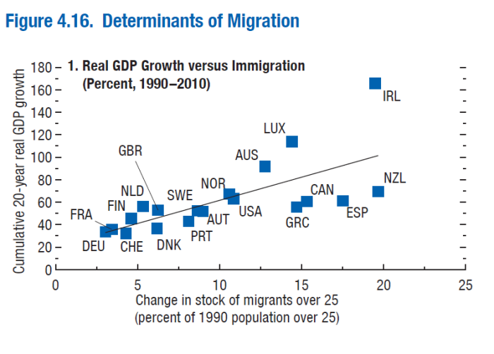
Which left me a little puzzled. The text said there was a relationship, illustrated by this chart, between increases in migrant numbers and real GDP per capita growth. But the chart itself showed only a relationship between total real GDP growth and immigration. That sort of positive relationship was hardly surprising – growing migrant numbers raises the population, which tends to raise total GDP – but the interesting question was surely about per capita growth. And it wasn’t just a labelling error – it was easy enough to reproduce the Fund’s chart, showing what the labels said it showed.
And so I started digging around. The IMF uses a group of 19 advanced countries, the choice presumably limited by data availability (so, for example, Belgium, Italy, Iceland, Japan and Korea – among advanced OECD countries – aren’t included). And they focus on 1990 to 2010, presumably also to ensure that all the data (for some of the background modelling) was available. And rather than total migrant numbers, they look only at migrants over 25. In the charts that follow, I just follow their basic approach/time period. In terms of country selection, I’d note just two caveats: first, a large part of Luxembourg’s GDP is produced by people who don’t live in Luxembourg but commute in each day (so GDP per capita can be a bit misleading) and in Ireland the corporate tax system has helped contribute to a huge gap between GDP and GNI – and it is the latter that measures income accruing to the Irish. Finally, it is worth noting that more than half the countries in the sample are in the euro, and 1990 to 2010 covered the period of convergence to the euro, and then the full effects of imposing a common interest rate on quite different economies.
With those methodological notes out of the way, what did the chart of growth in GDP per capita over 1990 to 2010 look like when graphed against the change in the migrant share of the (over 25) population over that period?
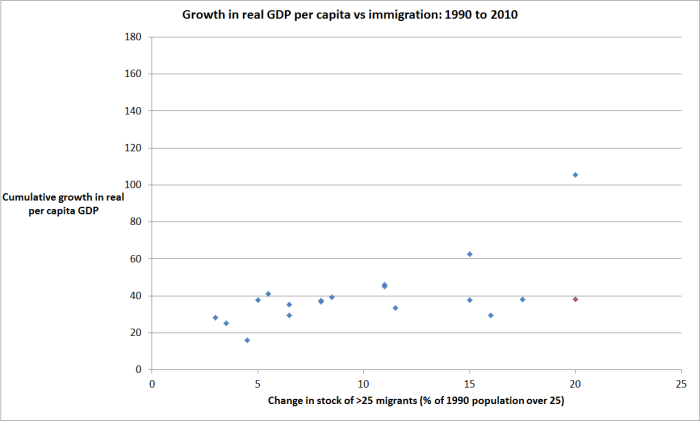
The red dot (hard to see, but lower right) is New Zealand. The outlier (top right) is Ireland. Excluding Ireland, there is almost no relationship at all, and certainly not one that would pass any tests of statistical significance.
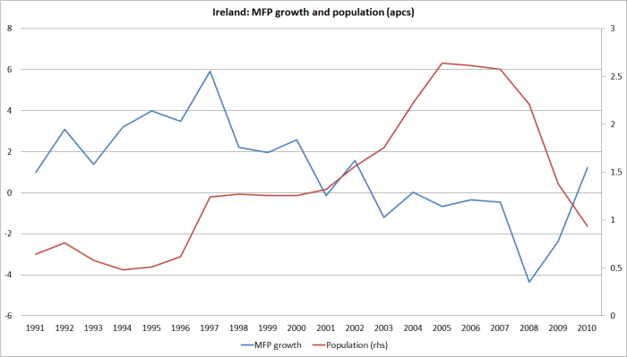
And in case you do want to include Ireland, bear in mind that the big surge in immigration to Ireland came after the most rapid growth in GDP, or GDP per capita.
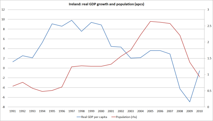
Over 1990 to 2010, Ireland’s strong growth in real per capita GDP was pretty clearly not caused by immigration.
GDP per capita has its limitations, and the Fund – and most immigration advocates – typically argue that the most valuable gains from immigration arise from improvements in productivity. So using, the Fund’s period, the Fund’s sample of countries, and the Fund’s immigration variable, what did the (simple bivariate) relationships look like with, first, real GDP per hour worked growth, and then (often regarded as the best sort of productivity growth) multi-factor productivity (MFP) growth?
(In all these chart’s I’m drawing GDP and productivity data from the Conference Board’s Total Economy Database.)
Here is the relationship with real GDP per hour worked.
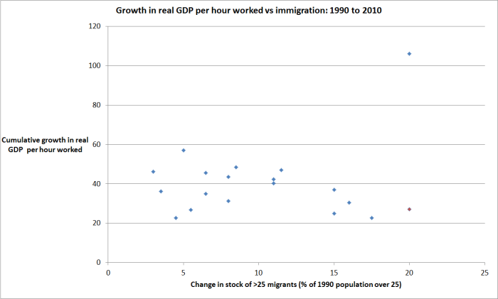
Again, New Zealand is in red (lower right) and Ireland is the outlier.
This relationship might not be very statistically significant either but – at least excluding the Irish outlier – if anything it runs in the wrong direction for the IMF story. Over this period, and on this particular measure/sample, there was a modest negative association between immigration and labour productivity growth.
And what about MFP growth?
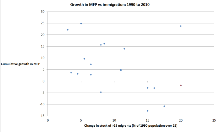
That relationship, especially excluding Ireland, is even more negative than the one for labour productivity. And just to confirm that even on MFP, the immigration surge in Ireland came well after the best of the MFP growth.
All in all, on these measures, for this sample of countries, over this period, there doesn’t seem to be much left of the IMF’s story. Yes, immigration obviously tends to make economies bigger in total, but there is little sign in the informal analysis that it has made them more productive, and thus made the average individual citizen of the recipient country better off.
Of course, where it can the IMF likes to rest its claim on more sophisticated analysis than that. Later in the chapter, they report that
Recent research suggests that migration improves GDP per capita in host countries by boosting investment and increasing labor productivity. Jaumotte, Koloskova, and Saxena (2016) estimate that a 1 percentage point increase in the share of migrants in the working-age population can raise GDP per capita over the long term by up to 2 percent.
The recent IMF “spillover note” that is drawn from is available here. The authors use much the same countries, the same immigration variable, and the same sample period as in the WEO analysis above. They also focus on the level of real GDP per capita, and the level of productivity, not just growth over a particular period. Their approach has a number of advantages over earlier studies (including the focus just on advanced countries) and as the Fund notes, the estimated real GDP per capita gains are less than in some previous studies.
I’m not a technical modeler, so I’m not going to try and unpick the paper on those grounds. My simple proposition is that the results do not, even remotely, ring true.
Here is a chart from the paper showing the stock of migrants in the sample countries.
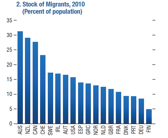
Think about France and Britain for a moment. Both of them in 2010 had migrant populations of just over 10 per cent of the (over 25) population. If this model was truly well-specified and catching something structural it seems to be saying that if 20 per cent of France’s population moved to Britain and 20 per cent of Britain’s population moved to France (which would give both countries migrant population shares similar to Australia’s), real GDP per capita in both countries would rise by around 40 per cent in the long term. Denmark and Finland could close most of the GDP per capita gap to oil-rich Norway simply by making the same sort of swap. It simply doesn’t ring true – and these for hypothetical migrations involving populations that are more educated, and more attuned to market economies and their institutions, than the typical migrant to advanced countries.
(The study produces similar results for real GDP per person employed, but they do not test the relationship with either GDP per hour worked, or with MFP. The authors suggests that the gains from immigration come through an MFP channel, but this seems doubtful – especially over this period, and this sample, given the bivariate MFP growth chart above).
There are other reasons to be skeptical of the results in this IMF paper. Among them is that there is a fairly strong relationship between the economic performance of countries today and the performance of those countries a long time ago. GDP per capita in 1910 was a pretty good predictor of a country’s relative GDP per capita ranking in 2010, suggesting reason to doubt that the current migrant share of population can be a big part of explaining the current level of GDP per capita (and some of the bigger outliers over the last 100 years have been low immigration Korea and Japan and high immigration New Zealand). In fact, I’ve pointed readers previously to robust papers suggesting that much about a country’s economic performance today can be explained by its relative performance 3000 year ago. How plausible is it that so much of today’s differences in level of GDP per capita among advanced countries can be explained simply by the current migrant share of the population?
And then, reverting to bivariate charts (but one from a relatively recent IMF working paper)
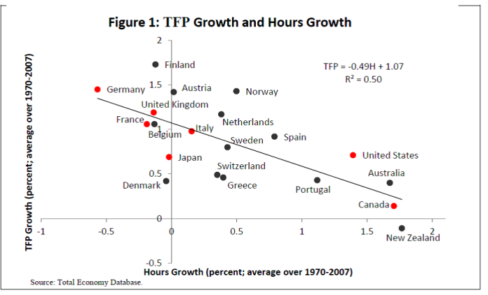
Total hours growth is not just determined by immigration, but differences in immigration rates account for a large part of the differences in population growth, and growth in total hours worked, over long periods of time such as those in this chart. There is just no sign, over that period and those countries, of the longed for link between productivity growth (here MFP/TFP) and growth in anything remotely linked to differences in the volume of immigration.
To revert just briefly to the IMF WEO chapter, one of the advantages of looking at just 18 or 19 countries is that the authors should be able to illustrate their point, at least impressionistically, by reference to individual pairs of countries. If nothing else, it is a bit of a realism check, but it can also help make the overall story seem more persuasive. But there is nothing of that in the IMF’s discussion and advocacy. And nor is there any effort to deal with what might reasonably look like problems for the story. The two countries with the largest increases in migrant share over 1990 to 2010 were Ireland and New Zealand. In Ireland, as I’ve shown, the immigration clearly came after the peak productivity gains – perhaps a case of sharing the gains, but hardly one where immigration looks causative. And New Zealand, well….readers know the New Zealand story. In 1990 we were supposed to be well-positioned to catch up again with the other advanced countries – the sort included in the IMF sample – and we had a big migration surge (by international standards of pretty good quality migrants) and yet over the full 20 years we’ve had among the lowest productivity growth rates (labour and MFP) of any of these countries.
Perhaps there are some other countries, or country pairs, where the intuitive case is more compelling. It is shame the IMF didn’t put in the effort to find them

The error on the graph is well-spotted. However, reasonable people in the world will always prefer to take an empirical study more seriously than just ranting (maybe with the exception of some of your readers). The IMF paper (spillovers one) seems like a rigorous attempt to shed light on this contentious issue. There are always caveats around such analysis. However, the fact that its results don’t align with your anecdotal priors doesn’t make it less useful. You need more than bivariate charts to disprove that.
LikeLike
As indeed I prefer empirical studies to rants. Perhaps you could point me to the rant? Among my various comments on the IMF papers were suggestions as to how they might make their message/results, if truly accurate and structural, more persuasive.
My main issue is the economic impact of immigration specifically on NZ and unfortunately, and as everyone recognises (sceptics and enthusiasts alike) there are really no formal empirical papers that shed much light directly on that.
Also worth bearing in mind that there are a variety of empirical approaches. Careful narrative analysis and critical discussion is a significant part of how economic history, including the history of economic policy, is done and much of the challenge in understanding the NZ experience since WW2 is unpicking the contribution of various (recognized and as yet unrecognized) factors. For the time being, I don’t think there is a strong shared explanation, and that makes it difficult to draw strong shared policy lessons as to how to remedy the situation (if indeed, remedies are possible).
LikeLiked by 1 person
Remedies ?
In another life, in other fields, we have solutions
Strategic Planning is an activity intended to set a goal of where you want to be in 5 years time, then once the target is set, you set about defining the steps necessary to reach that target. They are documented – written down. Then assuming the steps are enacted, there will be an annual review – milestones they are called. Are we on target. do we need to review the plan. If not on target, what went wrong. Did we miss something or was it outside our control and do we need to adjust the steps or should we adjust the target
Commercial Accounting
Organisation sets monthly budgets and annual budgets, built on activities set by the sales department, agreed by the production department etc and so on. Once again, there are monthly meetings that sit down and pull it apart if the targets are missed, examining what changed, what happened what caused the variations, so they can all get smarter
Engineering – not my field – but would expect similar rigour and search for answers
One thing for certain. They do get smarter and seek answers
LikeLike
an example
Many years ago I worked for a daily newspaper publisher in Auckland
Once a week at 11:00 am on a Friday the engineers started up the emergency diesel powered generator
Every week of the year.
Not so many years ago, a close friend happened to be an active working Professor at the Alfred Hospital in Melbourne, one of the largest hospitals in Australia
One day the inevitable happened. there was a city wide power failure that lasted 24 hours
The hospital tried to fire up their emergency diesel powered generators
They failed
The engineering department had never tested them
Let alone on a regular basis
LikeLike
I suppose ‘ranting’ is what happens when people object to illegal aliens raping, murdering, human trafficking, selling fentanyl to the citizenry and massively increasing the government’s welfare budget.
LikeLike
….is there any cross country evidence of a relationship between median income growth and population flows?? (sorry, data stuff not my gig); that aside, I guess those institutions that advocate the free movement of people and ‘capital’ do so on the belief that eventually, on average, citizens of the world will be better of even if there are losers and winners during the process; re the latter, it does seem a few IMF representatives get to follow the sun year round……
LikeLiked by 1 person
It was free movement of capital that created China and sustained by Yuan to USD peg and lifted a billion people out of poverty.
LikeLike
“free movement of capital”……in China…..??? (and especially over the period of the great economic catch-up, but even now most of the movement of private capital is illegal)
LikeLike
Indeed Michael. Did you not notice your Iphone with a made in China tag or the toys your kids play with eg star wars, monopoly, Risk, the branded clothing you wear Nike, Adidas,etc All from mega western manufacturers capital freely injected into China.
LikeLike
foreign investment in China is pretty small beer compared to the domestic Chinese manufacturing industry, often manufacturing components or even finished products for Western brand names firms such as those you suggest. recall that, net, massive amounts of capital have flowed out of China in the last 20 years (the accumulated current account surpluses).
of course, much of China getting out of poverty was just stopping doing really stupid stuff – China remains by far the worst performing Chinese country/region/territory (think HK. Macao, Singapore, Taiwan).
LikeLike
It is small bikkies now but back when the US was the wealthiest superpower on earth all of China manufacturing was mainly peasant farmers holding rifles and digging up the salt hills for foreign currency after the communist first gained power and became more at peace with the world.
LikeLike
If you mean specifically “median disposable income” I’m not sure. Papers like the IMF one, looking at GDP per capita (which over time will be a reasonable proxy for other income measures), are quite common.
Yes, I’m quite sure the institutions do believe citizens of the world will be better off from free movement of people and capital. Much of that is about priors, and some is about formal empirical results or similar sorts of considered analysis. The real challenge is identifying whether there are gains to recipient countries – gains to the immigrants are pretty unambiguous (on average). For some – open borders libertarians – it prob doesn’t matter if there are no gains to natives. For others it is the heart of the issue. But for others again, economics isn’t the issue – some want to celebrate diversity for its own sake, others worry about what the influx (esp of people from different cultural backgrounds) does to “national cohesion” etc.
As It happens, I’m in the camp that reckons free movement of goods and capital is generally beneficial. I’m more skeptical about the gains of people movement, but don’t even have strong views on that more generally. my main issue is NZ, and when people wonder why NZ should be an outlier, I point out sometimes that there are countless places in the world where large numbers of migrants haven’t settled, but might have if they had had their own immigration policies (my standard list, Tasmania, Wales, Scotland, Nebraska (or many other inland US states). But one could add Otago/Southland (say), or the West Coast, to the list.
LikeLiked by 1 person
There is no correlation between immigration and poor productivity. Our drive into Dairy would be the most likely cause of our productivity issue. 10 million cows generate only a meagre $11 billion in export sales. 4.5 million people generate $160 billion in disposable income. It is how we channel people into what industries that determines how productive we are. If we channel people into cleaning up and caring for 10 million cows then we would remain a low productivity nation.
LikeLike